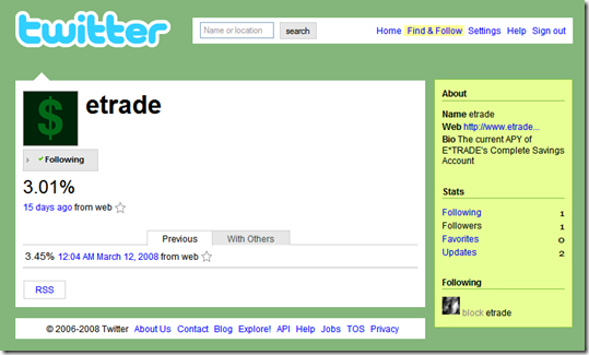
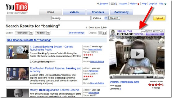
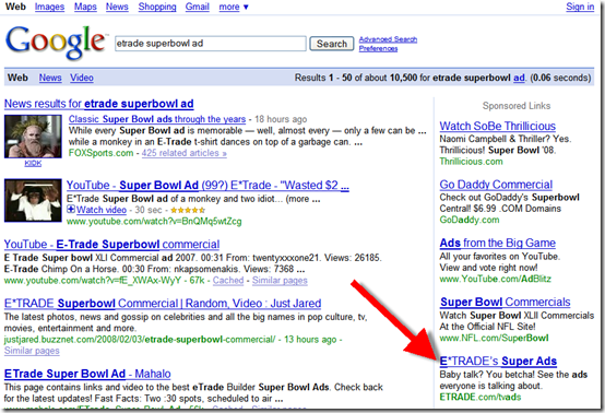
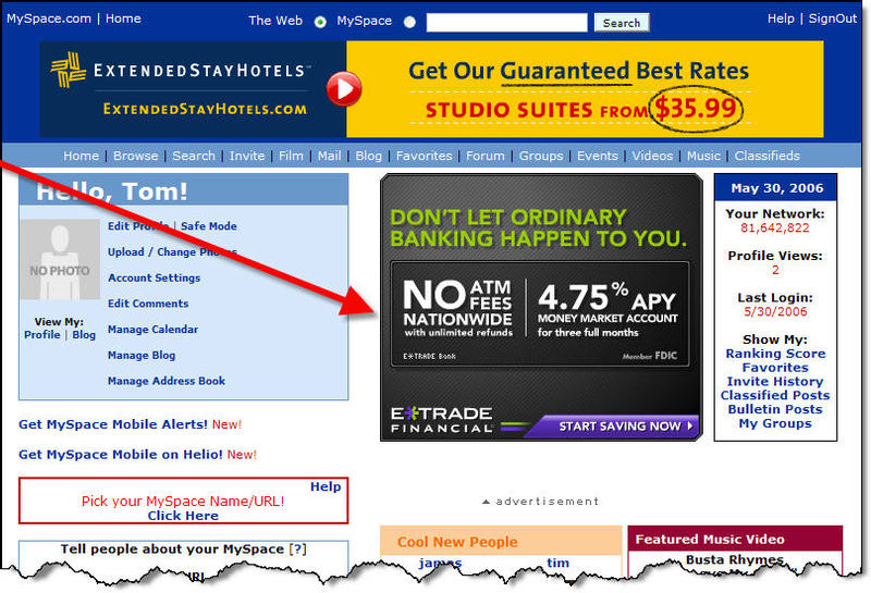
 As customers have adopted ever-more convenient delivery methods, the customer communications process has changed dramatically. Each channel has its own ways of communicating with customers:
- Branch/mail: Signage, statement inserts, chance conversations in line, direct sales pitches
- Phone: On-hold messages, prompts on the phone tree, direct sales pitches
- Online: Email, interstitials, display ads, website content, popups, online chat
- Mobile: Similar to online plus notifications, text messages and app updates (see below)
In the mobile channel, the process for updating native apps provides a unique marketing opportunity that is virtually without cost and guaranteed to be read by a large portion of your mobile customers (previous post). App publishers have a screen of free real estate to explain the benefits of the new feature(s).
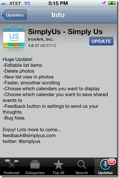
I’ve read thousands of these update descriptions and there is huge variety of approaches. Some publishers take maximum advantage of the “free publicity” to engage their customers (see Yelp below), pump up the new features (see USAA), and seek additional feedback (see Redfin, SimplyUs examples).
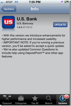
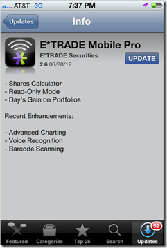
Other publishers don’t pay enough attention to readability (Wells, Bank of America, US Bank examples, see note 1) or just put the minimum effort into a bulleted list (E*Trade).
Bottom line: Each time you push out a new update, use it as an opportunity to educate users and reinforce your mobile brand.
——————————-
iPhone App Update Examples
Good
———
Yelp reinforces its playful brand with USAA is more matter of fact, but
enthusiastic and humorous copy does a good job highlighting new
announcing its v.6.0. features in its v.4.9.
Redfin released a minor bug fix in SimplyUs gets right to its bullet
v.3.3.2 but includes its email address list of features, with just enough
to report any issues. info to explain the v.1.0.17 update.
Nice touch! Plus email and Twitter handle.
Need work
——————
Wells does an OK job, but the first Similarly, Bank of America has an
bullet reads like something lifted from acceptable message for its v.3.3.351.
project checklist. And the second But the copy is a little confusing and
is too long-winded. Plus, a floating has an asterisked point floating mid-page. “Bug fixes” hovers at the bottom
of its v.2.1 update.
US Bank’s v. 1.6.8 message is E*Trade’s 2.6 update sounds like it
confusing. Something about being has a bunch of new features, but
asked to accept a quick update, but
it did nothing but list them with
no specifics on why or what has no explanations.
changed.
—————–
Note:
1. These examples were all taken from updates I downloaded today. They are not necessarily indicative of every update from these companies. At major releases (such as Yelp’s v6.0), most publishers will step up the copy-writing quality.







![image_thumb[12]](http://s3.amazonaws.com/finovate-archive/old/WindowsLiveWriter/RIMsNewBlackberryAppWorldIncludesWellsFa_1042C/image_thumb%5B12%5D_thumb.png)
![image_thumb[2]](http://s3.amazonaws.com/finovate-archive/old/WindowsLiveWriter/RIMsNewBlackberryAppWorldIncludesWellsFa_1042C/image_thumb%5B2%5D_thumb.png)




 I was searching