Bank of America Unveils QR Code Sign-in for CashPro

Bank of America Unveils QR Code Sign-in for CashPro
  • Bank of America launched a new QR code sign-in for its CashPro offering.
  • Paired with biometrics, the new sign-in option takes advantage of the trend in favor of QR code technology as a verification and log-in solution.
  • Bank of America’s CashPro has received recognition from Celent, Global Finance magazine, The Asian Banker, and Treasury Management International (TMI).

One of the surprising fintech trends of the past few years has been the deployment of QR codes as an option to facilitate payments in an increasingly wide range of contexts. Today, Bank of America announced that it has launched a new QR code sign-in for its CashPro solution. This will enable Bank of America’s 500,000 CashPro users to scan a QR code with their mobile device and use their biometric information via the CashPro App in order to access the CashPro website. The new option will also alleviate the need for users to manually enter passwords.

“QR sign-in is a technology that’s familiar to our clients from their personal lives, and now they can use it to seamlessly access CashPro,” Global Product Head for CashPro in Global Transaction Services Tom Durkin said. “The technology kicks off a schedule of enhancements we plan to introduce to CashPro over the next 18 months that will further improve the simplicity and security of our award-winning platform.”

Bank of America’s CashPro offers a complete digital platform for managing payments, receipts, investments, FX, and trade. The technology enables users to conduct their banking business from anywhere via the CashPro App, viewing balances, approving payments in less than a minute, depositing checks remotely, and making payments. Businesses can leverage the CashPro API to access a wide range of treasury activities including payments, fraud prevention, liquidity optimization, and more. CashPro also has a forecasting feature. Powered by machine learning and predictive analytics, CashPro Forecasting provides visibility across all customer accounts – including accounts at other institutions – and helps firms better manage future cash flows. The technology, embedded in CashPro and unveiled at the beginning of the year, provides customizable, machine-generated, daily, weekly, or monthly forecasts and learns over time to make predictions smarter and increasingly accurate.

“Many companies today rely on manual, repetitive work to forecast their cash needs, leaving little time to analyze the data for making strategic decisions, which is the actual objective of the forecasting exercise,” Co-head of Global Commercial Banking, Global Transaction Services for Bank of America Ken Ullmann said. “With CashPro Forecasting, companies can automate their forecasting process while improving the accuracy of their predictions, all without making any IT investment.”

Among the world’s leading financial institutions, Bank of America serves 67 million consumer and small business clients with 4,000 retail financial centers. Bank of America also provides a digital banking experience with 55 million verified digital users. Serving customers throughout the U.S. and its territories, as well as 35 countries around the world, Bank of America is a publicly traded company on the New York Stock Exchange under the ticker symbol BAC. The institution has a market capitalization of $250 billion.


Photo by Pixabay

Should Your Bank’s Chatbot Have a Name?

Should Your Bank’s Chatbot Have a Name?

When Bank of America introduced its chatbot in March it decided to name it Erica (not coincidently, pretty similar to Amazon’s Alexa). I’m a big fan of self-service and pleased that banks are using AI/ML/DL, and common sense, to solve my problems without talking to a human. But do I really want to converse with a robot, or do I just want to have my problems solved?

I’m comfortable talking to Siri or Alexa, but they sit in a different space than a bank’s voice interface. Alex needs to be awakened to do its job. But if you are already on BofA’s mobile app, there isn’t the same need to announce your arrival (see note 1). It’s a good UX improvement to give users the option to make a voice or chat query. But I don’t see the benefit of “naming” the voice response unit. It reminds of Microsoft Clippy, an automatic windows popup “helper” used from 1997 to 2001. I thought it was cute at the time, but people don’t want cute getting in the way of their task accomplishment, they want speed and accuracy. Anything that takes away from efficiency is potentially annoying.

In such a new area, there isn’t a body of research to fall back on when making a decision. But I did find an interesting post from an exec at Intercom, a digital messaging company. Originally, they named their bot, but they found that is was intimidating to users. It wasn’t until they eliminated the name that users began to appreciate the self-service tools.

What we found was surprising. People hated this bot — found it off-putting and annoying. It was interrupting them, getting in the way of what they wanted (to talk to a real person), even though its interactions were very lightweight. We tried different things: alternate voices, so that the bot was sometimes friendly and sometimes reserved and functional. But we didn’t see much change. It was only when we removed the bot name, took away the first person pronoun, and the introduction, that things started to improve. The bot name, more than any other factor, caused friction.

Intercom concluded they needed to make the chatbot invisible so that it didn’t get in the way of the interaction.

Making technology disappear so that it becomes a true tool for humans— like a hammer, or a nail, or a pencil — that’s the true measure of success for today’s designers. And making tools quieter to use, so we can use them more intuitively— that’s the true measure of success for a designer who deals in words.

Moving forward:
You absolutely should be investing in making your banking app and customer service run without human interaction, whether by voice commands, typing or touch controls. Customers want to get their banking done as fast as possible, so the UX improvement and cost savings potential are significant. But put your money into an efficient UX, not a cutesy name (see note 2).

________________________________________________________

Author: Jim Bruene (@netbanker) is Founder & Advisor at Finovate as well as Principal of Fintech Labs, developers of the financial services user-experience standard, BUX Certified


Notes:
1. I’m not talking about Alexa skills here. “Alexa, what’s my Bank of America balance” is a great use of voice technology. But, saying “Alex, ask Erica what my bank balance” is redundant and a bit silly.
2. Bank of America downplays the Erica name in its mobile app. Other than the awkward introduction to Erica when you first start using it, the bank avoids using the name and simply posts a BofA logo in the lower right of each screen (see screenshot right). Pressing it opens up the chatbox interface where you can type or speak your question. That’s great customer service. But I bet they’d get better takeup if they stopped “introducing” you to a robot the first time.

Marketing: Bank of America Reinforces Digital Banking Features, Benefits

Marketing: Bank of America Reinforces Digital Banking Features, Benefits

Hotels.com spokesperson "Captain Obvious"
Hotels.com spokesperson “Captain Obvious”


Sometimes, the most obvious things are easiest to overlook. For example, despite the importance of mobile (and desktop) functionality for website visitors, some banks, even major ones (Chase I’m looking at you), don’t bother to reinforce their features and benefits. That is probably less of an issue for big brands where most customers assume state-of-the-art digital features are readily available. But community banks and credit unions should have mobile and/or online banking listed in primary or secondary navigation. US Bank has always been good at doing just that.

Recently, BofA has been promoting its online/mobile features with a homepage promotion (see screenshot #1 below). I first noticed it while paying my BofA card Friday, but I don’t know how long it’s been running. Clicking the See popular features link delivers you to a page touting features across three categories: Manage Accounts, Payments and Transfers, and Security. The first five are visible on screenshot #2 below:

  • Set up a travel notice (currently the featured feature across top-half of screen)
  • Check your FICO score
  • Redeem credit card rewards
  • Update your contact info
  • Set up custom alerts

The other 11 (not shown in screenshot):

  • Replace card
  • Go paperless
  • Direct Deposit
  • Reorder Checks
  • Bill pay
  • Transfer and send money
  • Pay with a digital wallet
  • Mobile Check Deposit
  • Lock or unlock your debit card
  • Fingerprint sign-in
  • Security Center

Note: I’m surprised Bank of America’s “deals” aren’t one of the 16 features highlighted. Even though you can’t really make it out, the mobile phone at the top of the landing page (screenshot 2) has the BankAmeriDeals section open along the bottom (note the Starbucks logo).

Bottom line: A good explanation of digital features and benefits should be easy to find on your website and mobile app. Even though the features seem straightforward to power users like yourself, it’s all a big mystery to 95+% of your customers who just want to spend as little time as possible banking.


Bank of America invites customers to check out its digital features.
Bank of America invites customers to check out its digital features


Bank of America's extensive digital features explainer.
Bank of America’s extensive digital features explainer (link)

Friday Favorites: Financial Institutions Honor Veterans

Friday Favorites: Financial Institutions Honor Veterans

If there’s one thing Americans can agree on, it’s honoring and celebrating the service of our veterans both past and present. Given the contentious election week in the United States, you’d think U.S. financial institutions would be rolling out the red, white and blue on their websites on Veterans Day today. But there was surprisingly little activity at the major banks. Most had the same old-same old on their homepages. Even Navy Federal Credit Union passed on adding anything extra for the day.

The only top-50 banks with Veterans Day graphics were Bank of America, Zions and of course USAA, all displaying page-dominating graphics on their homepages (see below). We also looked at a few credit unions (at random) and found BMI Federal Credit Union and PenFed honoring vets (see below).

Zions bank homepage featuring Veterans Day homage
Zions bank homepage featuring Veterans Day homage (11 Nov 2016)


USAA homepage on Veterans Day (11 Nov 2016)


Bank of America Veterans Day image on homepage (11 Nov 2016)


penfed-veterans-day-homepage
PenFed Credit Union homepage on Veterans Day (11 Nov 2016)


bmi-fcu-vets-day
BMI Federal Credit Union leads with a Veterans Day announcement (11 Nov 2016)

Video of the Week: Bank of America Demos AI Chatbot “Erica”

Via a chatbot named Erica, Bank of America this week demo’d its upcoming mobile AI capabilities. The feature will be available to the 21 million users of its mobile app via voice or text commands “in late 2017.” While it’s unusual for a major bank to discuss technology a year away from deployment, with all the hype around artificial intelligence and chatbots, BofA must have figured it was a good PR move.

The bank did not disclose whether it was building or buying the technology, but my guess is the latter. We saw a number of Finovate demos last month in this area and expect many more in 2017.

For more info, check out the American Banker story yesterday (free access).

Mobile Monday: The Bank of America “Help” Button

Mobile Monday: The Bank of America “Help” Button

bofa_help_top

I love the minutiae of digital banking. Others may be fascinated with how the blockchain will disrupt global payments or the impact of Dodd-Frank on debit-card rewards. Me, I just need a shiny new button to make my day. And as luck would have it, Bank of America obliged in its latest iOS update (Sep 22, v7.1).

The bank added a Help button centered at the top of the screen on most pages (see above and first screenshot below). Pressing the button leads to a slightly context-sensitive, self-service menu with an “Ask a question” box on top (second screenshot). The search failed my advanced search stress test (Do you have SEP IRAs?, third screenshot), but otherwise seemed serviceable. And it was relatively straightforward to find the right button to connect to an actual human at the call center.

Bottom line: Locating a Help button in a prime position is a good way to show that you care about the customer’s experience. It would be nice if the BofA button led to a better search function, complete with an audio option, and better context-sensitive results (note in screenshot 3, the top result from my SEP-IRA question is “Troubleshooting”). And if I was being totally honest, the button is a little hard to see on a tiny screen, the red on red. But regardless, it’s a good start.

New "Help" button on BofA mobile "transfer" screen
New “Help” button on BofA mobile “transfer” screen

Screen shown after pressing "Help" on Transfer page
Screen shown after pressing “Help” on “transfer” page

Result of search for "SEP IRA" on Help page
Result of search for “SEP IRA” on “Help” page

Solving the False Positive Problem in Credit/Debit Authorizations

Solving the False Positive Problem in Credit/Debit Authorizations

seattle_la
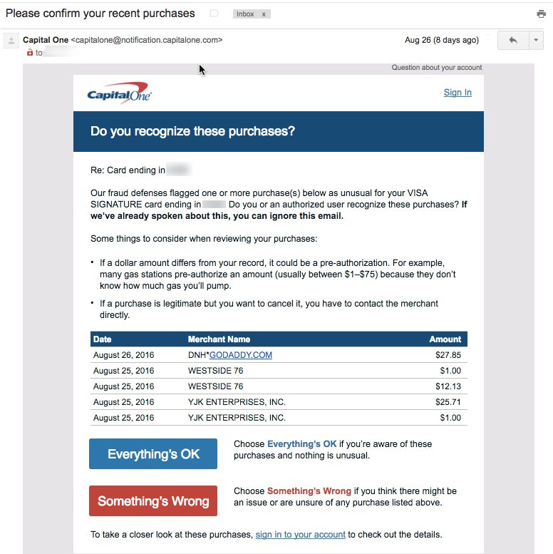
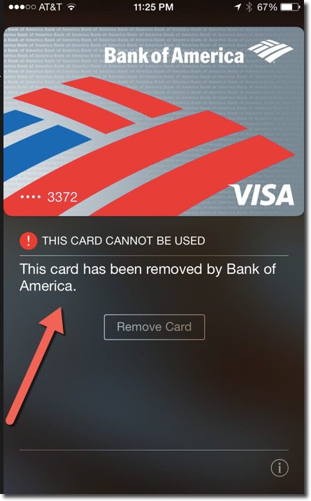
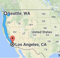
For the third year in a row, I traveled from Seattle to the L.A.-area to drop off my son at college. And for the third year in a row, Bank of America declined my card at Target, buying groceries and incidentals for him. And this time it was an EMV chip-card. Thank goodness I had my trusty Capital One card along, because it seems to do a far better job minimizing false positives (for fraud), at least for my account.

Capital One did have its concerns along the way, though. They sent the following email asking for confirmation that these gas-station authorizations were mine. And even though I didn’t respond right away, perhaps 12 to 18 hours later, they never shut off my card.

capital_one_charge_confirmation

Bank of America also sent a similar email, but it arrived AFTER the card was declined. I understand the bank’s need to terminate suspicious transactions, but is it really that suspicious? For three years running, I’ve shown up in Los Angeles the last week of August (along with visits in between) and gone on a bit of a spending spree to stock my son’s dorm and now apartment (you’re welcome, boys!). Furthermore, I had already used the card to book an L.A. hotel, make some low-level but consistent charges along the way, coffee at Seatac, lunch in West L.A., and so on. But when I try to buy $150 in groceries at Ralph’s or Target, the card is declined, and worse, completely shut off from further purchasing.

Bottom line: My point here isn’t to complain about one issuer’s fraud-handling (although it felt good to get that off my chest), but to implore once again for more integration with smartphones to reduce false negatives. Specifically:

  1. Talk to me on the most immediate channel. Both banks sent emails, but I’m on the road, not checking emails. Pop a notification on the screen and send me a text message. Also, in instances of two account holders, make sure fraud alerts go to both (BofA emailed only my wife).
  2. Know me better. I get that Target in Tustin is outside my normal spending bubble. But I have a history of making charges in that area for 2+ years, so cut me a little slack.
  3. Better yet, know where I am. How many hundreds of millions could BofA save by tracking cardholder whereabouts in the background? I let Starbucks, Google, Yelp, and so on track my location. The benefits of them knowing where I am outweigh the privacy risks. The same goes for my bank.

——————–

iContactHeaderFFNote: Looking forward to seeing everyone at Finovate this coming week. Let me know if there is anything you want to discuss (jim@finovate.com).

Friday Fun: Bank of America’s New Llama Videos #LLOVEYOURAPP

Friday Fun: Bank of America’s New Llama Videos #LLOVEYOURAPP

Bank of America on Wednesday dropped a set of 12 clever video segments called #LLOVEYOURAPP. You can see them all on the BofA YouTube channel. Most have 100 to 200 views, so they are virtually unknown so far. I’m guessing that is about to change as they are pretty clever. For one, a cud-chewing llama is demoing features of the BofA mobile app; for two, they remind me a bit of E*Trade’s baby series that for many years ran in the Super Bowl and elsewhere.

I don’t know what the plan is for them, whether they are to remain a social media play or will eventually run on TV (each one is either 15 or 30 seconds, so made for TV). I first spied them this afternoon via a Google+ promo next to a BofA email newsletter I received yesterday (see screenshot below). And the bank tweeted it once today and replied to a few more with the #LLOVEYOURAPP hashtag.

bofa_googleplus


Tuesday Tactics: Opting Customers In to Proactive Fraud Alerts

Tuesday Tactics: Opting Customers In to Proactive Fraud Alerts

bofa_logoLast week, I logged into my Bank of America accounts—checking, personal credit card, business credit card—and the bank used a pop-up screen to gain my permission for proactive fraud alerts (see screenshot below). I’ve been a mobile user for seven years, so it wasn’t like they needed my mobile phone number. And as far as I know, I’d already selected all the available fraud alerts. So it seems that the bank is looking to get more specific permission, and perhaps uptake, to its proactive security communications.

Customers have a chance to choose text message alerts and/or phone calls. Then there is the usual T&C (terms & conditions) to agree to, and that’s that. It took all of 30 seconds and made me feel like Bank of America was watching out for me. So, if this makes the bank’s lawyers happy, it’s a win-win.

bofa_fraud_optin


Help, My Apple Pay is Not Working

Help, My Apple Pay is Not Working

applepay_launch_bofa

The last few times I’ve tried to use Apple Pay, it’s not worked. And when that happens at the POS, you pretty much look like an idiot waving your fancy phone around and smacking it against the terminal (as if that would help). So yeah, I’m that guy holding up the line, although in my defense, not nearly as long as that person that still uses paper checks.

When Apple Pay is on the fritz, besides my looking like a fool, I’m at a bit of a loss as to what to do next. I tweeted this today:

While it may appear snarky, it’s a serious question. When Apple Pay doesn’t work, there is no clear path to resolution. So here is what happened when I tried the various methods in my tweet.

A. Google it

At first glance, there seems to be promising results, including Apple Support. But alas, its FAQ makes no mention of it “not working,” but it does offer a way to get through the help topics and to an online/phone support area (see C below). And while there is much discussion on the Apple forums, the best advice was to “reboot” your phone, which is surprisingly effective for many.

Grade: Incomplete. While I was able to find Apple support within a few minutes, I had to go to the chatbot for a full diagnosis (see B below)

B. Contact Apple

applepay_support_choices
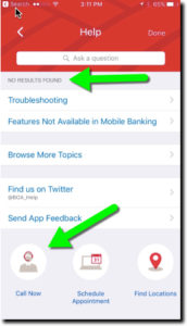
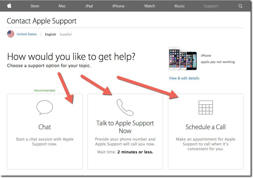
During my Google search, I stumbled into the correct area to get to Apple Care support (see A above). While I had to go through a few screens in the self-service area, it took only about 30 seconds to get to the one that offered a choice of online chat, call center (with 2-minute estimated wait time), or alternatively, I could schedule a call (see inset).

As always, I chose online chat. The chatbot was good (not sure if/when a human stepped in), but it took a full 13 minutes to diagnose the problem (including looking up my serial number at the outset). Apple suggested I delete the existing payment card and add the new one, which was the right answer.

If you try to figure out the problem directly on your phone, a search for “Apple Pay” within the phone, i.e., Spotlight Search, directs users to the Passbook app. If you select the “i” button for more information, you are directed to the bank’s call center (see C below). Alternatively, you can navigate directly to Settings, find Passbook & Apple Pay (below the fold), and locate the bank contact number.

Grade: C >> for the 13 minutes it took through Apple Care chat support

C. Call the bank (BofA)

I had just a single card, issued by Bank of America, hooked to Apple Pay. Although I try to avoid call centers if at all possible, I have been very pleased with BofA call center support in the past, so I called the number on the back. And while SIRI, or whatever their voice recognition is called, was not able to understand Apple Pay questions (“I hear that you want to make a payment, is that right?”) I had passed authentication and was put through to a live operator in about 3 minutes. I’d already figured out the problem during my 13 minutes with Apple Care (old card number), so I didn’t torture BofA and play dumb. But had I not known the answer already, the CSR was prepared to get Apple Pay support on the line for help.

Grade: B- >> for being able to get to Apple Pay phone support within 4 to 5 minutes (though did not test their diagnostic skills)

D. Use the mag stripe

Honestly, if I wasn’t into this stuff for my job, I would have just started using the mag-strip card and forgot about Apple Pay until v2.0.

Grade: A >> for the 5 to 7 seconds it took to get the plastic out of my wallet, swipe, and stop holding up the line

———-

The fix

bofa_applepay_dontuseAs mentioned in B above, my Apple Pay problem could be solved either through the Passbook app itself or through the Passbook settings within the iPhone Settings area.

Here’s what I saw when clicking on my “card” in Passbook (see inset).

And that was the reason why Apple Pay had stopped functioning. Bank of America had revoked my card a few months prior during a breach-related reissue.

But I’m not sure how I was supposed to know that I needed to update my Apple Pay card. I’ve searched my email from Bank of America, but I see no message from them on the subject. While it could have been trapped by the SPAM filters, that would be unusual for messages from my card issuer.

It’s completely understandable why the bank would pull my card out of Apple Pay if it was cancelled and replaced by a new number. But they either need to inform me, along with good instructions on what to do next, or better, simply replace my old card with the new one within Apple Pay, with notification of course (see update below).

But that’s probably v2.0 customer support. Until then, I’m glad there’s still a mag-stripe as backup.

—–

Update 19 Aug 2015: Apparently, Citibank is automatically replacing new card numbers into Apple Pay when the old one is canceled. Not sure if this applies to its entire portfolio or selected customers. Thanks to Ian Kar for the pointer.

The iPad-Enabled Checkout Experience at the POS

The Hideout Coffee House in Austin

A few week ago I spent the weekend in Austin eating BBQ, watching my alma mater get crushed by the University of Texas, and sampling the Sixth Street ambiance.

But the highlight for me was the The Hideout Coffee House. Not only did it have great coffee and eclectic furnishings, but card customers could pay via Square through an iPad mounted in a novel wood stand (see inset; it’s not possible to see well, but the ipad stand is on the counter at left).

The barista took my card and swiped it through the Square reader, which was supported by a wood guide (see similar unit left from Tinkering Monkey). Then he flipped the case over 180 degrees so it faced out towards me (see below).

Tinkering Monkey iPad holder at the POSI selected one of the large buttons for a preset tip amount and then once more to have the receipt emailed to me (I only had to enter my email the first time).

It was easier to use than most in-lane POS readers, even contactless ones, because the barista actually did the swipe. It eliminated the uncertainty about when I should tap/swipe or whether it worked or what I should do next. And I loved being able to put a tip on the card with the push of a button rather than writing it on a piece of paper or digging for change. 

Tinkering Monkey swivel ipad caseBottom line: Eventually payments will be made via proximity and settled in the cloud (my mobile will know I’m in the store and will automatically pair me to the store’s POS). But there is still a long transition period ahead.

Tablet/smartphone card readers are a great interim step for smaller merchants (note 2), especially with the price wars waging at the point of sale (note 3).

Related: And banks, even though you don’t have the POS issue, you can equip your frontline staff with iPad-powered sales tools (note 4). 

——————–

Notes:
1. On one of the Austin freeways, I also saw a billboard for the ISIS pilot. But I didn’t see any merchants promoting it. 
2. And some bigger ones. And of course, the 20,000-store Gorilla, Starbucks, is partnering with Square, though it is unlikely they’ll use iPads at the point of sale.
3. Bank of America recently jumped into the game matching Square’s 2.7% discount rate.  
4. Barclays just bought 8,500 iPads to equip its branch sales staff (Financial Brand post).

Superb Fee Transparency from Bank of America

image Unless you are the low-cost provider, most businesses try to impress prospects with their wonderful features and benefits before talking price. Banks are no different, especially in the checking account arena.

imageBut for a number of reasons — regulations, consumer backlash, competitive pressure — relegating prices to the fine print just doesn’t cut it anymore.

And Bank of America, which last fall suffered perhaps the biggest fee-based backlash in history, is now a leader in fee transparency. It has an entire website dedicated to the subject called Facts About Fees (first screenshot below). The site lists all fees, explains in detail how they are calculated, and even provides good advice on how to avoid them (see inset; note 1). Consumer and small business versions are also delineated.

The bank also includes a comprehensive fee listing in its Checking & Savings product page (second screenshot). A number of banks and credit unions have similar fee schedules posted, but it’s still the exception rather than the rule.

Bottom line: By all means lead with your wonderful features, but keep a comprehensive list of prices a single click away. It’s the right thing to do.

—————————

Bank of America’s “Facts About Fees” (consumer version, link, 15 Nov 2012)
Note: The first page features a Flash-based “cover flow” style presentation along with a talking lady who helps explain the finer points.

image

Fees at a Glance page within the Checking & Savings area (link)

Bank of America "fees at a glance"

———————————————–

Note:
1. There is life after overdraft fee reform. See the latest Online Banking Report: Digital Overdraft Protection (published Oct 2012, subscription).