Mobile UX: A First Look at “Second Look” Transaction Alerts from Capital One

Mobile UX: A First Look at “Second Look” Transaction Alerts from Capital One

capital-one-labs-home

A paradox of the early digital banking era (1995 to 2007) was: Why is Capital One a laggard? The new company (spun out from Signet Bank in 1994) was widely revered as a data-analytics and marketing master. But it was practically a digital no-show for more than a decade, offering just a minimum level of functionality online. As recently as 2010, Capital One was the last major bank to launch a native mobile banking app.

Fast-forward six years. Capital One owns the innovation mantle, at least in the United States. It has Capital One Labs; it runs an innovation center in the Bay Area; and it now offers the most advanced set of mobile apps in the card-issuing business.

Its latest innovation? The first proactive service from a major issuer that alerts cardholders to deviations in spending with recurring charges. It’s called Second Look, and it certainly deserves one.

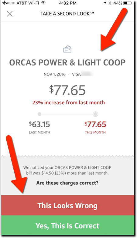
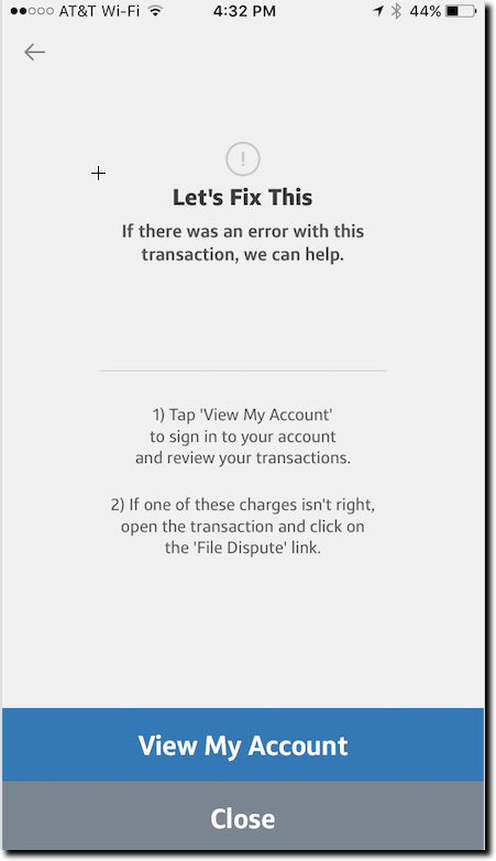
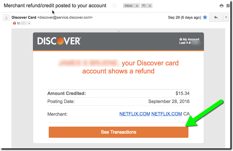
I was introduced to the new feature this week when I received a notification on my iPhone alerting me to a spending increase on my power bill (screenshot 1 below). After swiping through it and logging in via TouchID, the app displayed a chart showing how much my bill had increased last month (screenshot 2). And I was asked whether I was OK with the charge or not (bottom of screenshot 2). If not, the bank provided instructions on how to dispute the charge (screenshot 3). Customers can also elect to receive the alerts through email.

Another thing I really appreciated: The bank gave me enough info in the notification to make an intelligent decision whether I even needed to log in. The bane of the mobile-user experience is dealing with (ultimately ignoring) all the false positives you get through most notification services. I clicked through the notice out of curiosity. But thanks to the detail, I already knew that the $14 increase wasn’t a major problem.

Bottom line: This is just one example of a more proactive approach to helping customers deal with day-to-day finances. It’s still a relatively manual user experience, especially if you want to dispute a charge. However, as banks layer AI on top of their data hordes, outside APIs, and location-based info, we’ll see much, much more. Kudos to Capital One for leading the way.

(1) Second Look notification from Capital One
Exhibit 1: “Second Look” notification from Capital One


Exhibit 2: Second Look transaction analysis
Exhibit 2: Second Look’s transaction analysis


Exhibit 3: Second Look's taking action screen
Exhibit 3: The manual process to dispute a Second Look-flagged charge


Alerts: Discover Card Highlights Merchant Refunds

Alerts: Discover Card Highlights Merchant Refunds

So much of day-to-day banking is either negative or at best, incredibly boring. I spent too much, my payment is late, I can’t remember where that last $40 from the ATM went, and so on. No wonder consumers are less than enthusiastic with their banking relationships.

What to do about it? For one, when you have good news, CELEBRATE! And one of the easiest ways to do that is when a merchant refund appears on a credit or debit card account. For example, Discover does a great job with its email. It’s personalized, and clearly shows the date, credited amount and merchant name (including hyperlink to Netflix). And there is a huge button at the bottom to check out the transaction online (not that you’d really need to).

Discover Card merchant refund notification email (29 Sep 2016)


But after clicking through the email, the user experience (UX) gets a bit gummed up. The first webpage displayed is the main secure homepage (first screenshot below). That makes sense since the email button says See Transactions. However, since my statement cycled since the refund was processed, the $15.34 Netflix credit is nowhere to be seen. (Granted, had I clicked on the message when it first came in, the transaction would have been listed on the lower portion of the screen.)

But now I have to play “guess where to click” with the Discover site in order to find my transaction on the previous statement. Not rocket science, but also not super-intuitive either. The obvious starting point is the big orange “recent transactions” button in the middle. But again, that leads only to the current statement. Astute users will find the link to the previous statement (ambiguously called Current Statement) at the bottom of the page. Clicking that leads to a page with the desired transaction, though it’s not particularly called out, appearing in a slightly different font shade and a Payments and Credits description (third screenshot below).

Bottom line: The email is fantastic (A+). The website has a great layout and look (go, orange). But insisting on displaying transactions on a monthly statement basis is so last decade. For the most part, users want to consume transaction data like email. Make it easy to see everything by paging through them and let me flag, pin, label, and mark as unread, significant transactions. For extra credit, put the most important ones on top like Priority Mail (Gmail) or Focused (Outlook Mobile).


Discover card home page (displayed after clicking on link in email above)
1. Discover card home page (displayed after clicking on link in email above)


Discover Card previous statement page.
2. Discover Card transaction page (displayed after clicking “Recent Activity” on homepage).


Discover Card "current statement" page
3. Discover Card “current statement” page

Tuesday Tactics: Opting Customers In to Proactive Fraud Alerts

Tuesday Tactics: Opting Customers In to Proactive Fraud Alerts

bofa_logoLast week, I logged into my Bank of America accounts—checking, personal credit card, business credit card—and the bank used a pop-up screen to gain my permission for proactive fraud alerts (see screenshot below). I’ve been a mobile user for seven years, so it wasn’t like they needed my mobile phone number. And as far as I know, I’d already selected all the available fraud alerts. So it seems that the bank is looking to get more specific permission, and perhaps uptake, to its proactive security communications.

Customers have a chance to choose text message alerts and/or phone calls. Then there is the usual T&C (terms & conditions) to agree to, and that’s that. It took all of 30 seconds and made me feel like Bank of America was watching out for me. So, if this makes the bank’s lawyers happy, it’s a win-win.

bofa_fraud_optin


Transaction Alerts Need to Get Smarter

fraud word cloud.jpgMy inbox is far from normal. With 25 active financial accounts, all set to maximum notifications, I am drowning in email alerts, push notifications and other helpful communications. But who isn’t overloaded with missives from social media, news feeds, spambots and whatever else is competing for your attention.

Banks need to help users cut down on the noise, by offering smart alerts that don’t bog you down in trivial details. Not to pick on anyone in particular, because all my providers do pretty much the same thing (with the notable exception of BillGuard), but this alert from Bank of America today (see below) is a good example of info overload.
Yes, I’m sure I asked the bank to notify me of any card-not-present transactions. Given the amount of times my card number has been breached in the past five years, it’s a good early warning. But really, do you think it’s necessary to tell me for the 89th consecutive month that you paid my $8.75 Netflix monthly fee? Really, I just want to be informed if it were to suddenly go up or be repeated.
BofA would probably want my permission to stop sending me this monthly alert. So how about a little button that says, “Don’t tell me about this charge if it’s the same next month” or something along those lines. And this should also be an option in the bank’s alert dashboard: “Please don’t alert me to repetitive monthly fees, unless they change.”

Thanks for listening.

——-
Bank of America email alert (18 Feb 2015)
bofa_alert.jpg
——-
Source: Fraud artwork above from NCUA’s MyCreditUnion

Best of the Web: Frost Bank Launches Actionable Two-Way Debit Card Alerts

imageFrost Bank is cool. The $25 billion regional bank has long been an innovator, pushing forward on multiple digital fronts (see notes 1, 2). Its latest innovation quietly rolled out to customers at the beginning of May, is the two-way actionable debit card alert. This service probably seems like a no-brainer to customers, especially those born after 1990, but it’s not at all easy for an FI to pull off.

imageWhile Frost is not the first to position alerts as a two-way communication channel (note 3), it is the first to allow customers to simply reply back to a text message to freeze their debit card against further charges. The action also triggers a call from a Frost banker to resolve the situation.  

Because this “raises the bar” for proactive customer communications around debit card use, we are awarding it our first Best of the Web for 2014 (note 4).

__________________________________

How it works now (v1.0)
__________________________________

image1. Consumer establishes alert thresholds and preferences (inset)
2. Bank sends triggered text-message alert
3. If the user suspects fraud, they reply back with the code provided in the alert (screenshot below)
4. Frost puts a temporary hold on the card
5. Frost banker calls customer and resolves (customer can also unblock account on their own)


image

___________________________________

What’s next (v2.0)
___________________________________

Frost Bank’s new feature is a great customer-centric solution that reinforces the bank’s position of consumer advocacy. It’s a perfect first step to a more proactive fraud-warning system.

But I do have some concerns there will be too many false alarms generated. It is so easy to forget pre-authorized debits; be surprised by charges made by your spouse; or legitimate, but strange-sounding merchant names.

Ideally, there would be a way to first ask for more info on a charge, rather than a black or white hold. It would be great to text back “huh?” and get a plain language explanation of the charge, for example:

  • This charge was made at 1:00 PM at the Subway near Northgate Mall. Are you sure you or someone in your family didn’t buy lunch there this weekend?

or

  • You began paying $9.95 per month to this merchant in February. This merchant markets a subscription music service. Did you, or anyone else in your family, start a subscription to it in the February timeframe?

BillGuard offers quite a bit of this “explanation layer” on card transactions, another reason to be looking at what they are doing (most recent post).

——————————-

Frost Bank’s debit alerts landing page (18 May 2014, link)

image

—————————————-

Notes:
1. We first covered Frost in 2005, when it was offering lifetime statement archives at a time when most banks dropped your data off the site after a few months (June 2005 post). We also loved their PFM-ish Momentum checking account launched in 2008, about the same time as Mint launched (July 2008 post). 
image2. Earlier this month, Jeffry Pilcher called Frost Bank “… one of the most beautiful brand identities … .” (see right, post)
3. In 2010 (post), Chase Bank won Best of the Web for its 2-way text-message alerts; however, that was limited to initiating funds transfers through its normal text-banking service.  
4. This is the first OBR Best of the Web for Frost Bank. Since 1997, our Online Banking Report industr
y newsletter has been periodically giving OBR Best of the Web awards to companies that pioneer new online- or mobile-banking features. It is not an endorsement of the company or product, just recognition for what we believe is an important industry development. In total, 91 companies have won the award. Recent winners are profiled in the Netbanker archives.

UI: Chase Bank Remodels the All-Important "Account Summary Alert"

image Here at Netbanker/OBR, we love to write about the digital future. But we know it’s even more important to address the digital now. If you don’t leverage current technology to your advantage, the future doesn’t much matter, since someone else will be running your business.

Today’s topic, one that we used to harp on constantly, is alerts (see previous “Alerts” posts).  Alerts are the way you maintain the relationship with customers between logins. But too many banks and credit unions take email alerts for granted, and are still using a template from 2004! Those templates were created prior to webmail, and, more importantly, before mobile viewership skyrocketed.

One bank whose messaging template was too long in the tooth is Chase (it’s looked the same since at least 2010; see note 1). But as part of their continued digital remodeling, the bank changed it last week. It’s not going to be confused with Simple or Mint, but it communicates the important information efficiently. And that’s enough for most brands. 

The Improvements 

_____________________________

Following are the before-and-after shots on the desktop. As you can see, the old version was too wide for smaller laptops and lower-resolution computers. On my Mac it looked fine, but on my trusty old ThinkPad, it required horizontal scrolling to see the “total withdrawals.”

What changed:

  • All the information is lined up on the left side so it can be easily read on any screen size; this is especially important on mobile which was previously impossible to read (on iPhone) without pinching and zooming.
  • Got rid of the Go Paperless! banner. Talk about banner fatigue. I understand that it’s a great benefit to convert users to paperless, but really, four-plus years with the same banner? MIX IT UP, please!
  • Changed headline to position “Chase” as the first word instead of the last. That helps users scanning subject lines see that it’s from their bank. 
  • Added light blue background at top to give it a better look.
  • Cleaned up the data table for better readability.
  • Made the website URL more visible.
  • Added toll-free contact number.
  • Added more fine print and caveats (the only item that is a step backwards).


——————————— 

Desktop 

Before (viewed through Gmail, 3 May 2014)

image


After (viewed through Gmail, 12 May 2014)

image

———————————-

Mobile (screen captures from iPhone 5)

Before                                                          After

image        image

—————————————

Notes:
1. The UI described here is for a Chase checking account in Washington State (converted from WAMU). This email alert template may be different in other regions or for other account types.
2. For more info on alerts and messaging, see our 2010 Online Banking Report (subscription).

Email Design: Discover Card’s “Statement Available” Message

image There are a number of financial startups and trail-blazing FIs bringing modern user interfaces to banking. We see dozens of great examples at every Finovate (note 1). And we expect a slew of remodels in the new year as responsive design and other techniques take hold.

But I continue to call out Discover’s design work (previous posts). Partly because I have an account there and see it often and partly because it’s instructive to see how a large full-service bank handles design tradeoffs.

Yesterday’s email from DIscover, reminding me that my monthly statement was ready, shows how the card giant marries good design with useful information.

Most statement alerts are simple one liners asking the user to do all the work: login, find the right tab, click on the correct button, and so on. Discover, on the other hand, positions key summary information right within the body of the email (see screenshot below):

  • Statement end date
  • Statement balance
  • Credit available
  • Minimum payment due
  • Due date

The company includes a button to view the statement at the top, but somewhat buries the payment link near the bottom. 

Analysis: This is one of the better (maybe best) statement-available message I get from the major brands (note 2). But it could still be improved: 

  • Include a Pay Now button.
  • Remind me that I’m on autopay and when to expect the payment in full to be deducted from my bank account.
  • Reword and fix the bottom link. Currently it says “Late and Minimum Payment Warning.” That sounds like there must be a problem with my account. But there isn’t, so I assume that is supposed to link to the alerts maintenance area. However, that link wasn’t working, so I just was dumped onto the main secure account page. It was very confusing.
  • Add a link to customer service, both self-serve and human powered.
  • Add the amount of rewards earned this period. It’s always nice to be reminded of free money received. 

image

————————
Notes:
1. For example, a recent crowd favorites was from Poland’s mBank which demoed alongside Accenture at FinovateFall in September (demo video).
2. We dug deep into this area a few years ago in our reports (subscription):
Email Banking: Revitalizing the Channel (August 2010)
Alerts & Streaming (July 2010)
Paperless Billing & Banking (Nov. 2010)

Gamification & Banking

image I don’t know what we did before the term gamification was coined. Back in the day we just talked about comparisons, metrics, charts and so on (or maybe "game mechanics" if you working on your PhD). But it’s nice to be able to wrap those concepts up into a single term, even if it does have a bit of a frivolous, video-gaming connotation. 

But, let’s not get hung up on the wording. Call it what you want, but the concept of providing detailed feedback about your customers’ use and abuse of their money is a critical part of being a 21st century financial provider. My absolute favorite thing about Mint is the weekly financial summary its been sending me for five years. It’s still the single most important financial tool I use.

Since it’s Friday, I will cut directly to the visual aid (screenshot below). The weekly activity tracking summary from FitBit provides good ideas for a comparable financial version. For example:

  • Totals for the week
  • Daily averages
  • High/low days
  • Badges
  • Color coding: green is good, red is bad
  • Leaderboard (if you are sharing with friends)
  • Thumbnail picture (if you’ve uploaded)

Have a great weekend!

———————————-

Weekly Progress Report from Fitbit (6 Aug 2013)

image

—————————–
Notes:
1. Graphic from WePlay, a London-based marketing consultancy.
2. For more, see the Online Banking Report PFM library (subscription required): PFM 4.0 (June 2012); Alerts & Streaming (July 2010);  PFM 3.0 (May 2010); Social Personal Finance (June 2007); Personal Finance Features for Online Banking (Aug 2006).

Discover Card’s Email Balance Alert is a Thing of Beauty

image While it will never hang in the Louvre, Discover Card’s email alert is a true masterpiece (at least to fintech geeks). The message is nicely laid out with plenty of white space and it’s chock full of links to get more information.

Here’s eight specific elements I like (in no particular order). See the corresponding number on screenshot below:

1. Personalized with first name, last name and last four digits of account number; an important anti-phishing security precaution

2. Big orange button that leads to detailed transaction info

3. Table outlining the key data (yellow highlight is ours):
     – Date of notice
     – Balance limit set by user
     – Current account balance
     – Total credit line

4. Email subject line that explains exactly what’s in the message (important for scanning email messages), "Your balance exceeds the limit you set". Also, note how they ease your fears by saying it’s over the limit "YOU SET," which is much less of a problem than if it was over the card limit

5. Brief explanation of factors that might be impacting the balance (such as car rental holds)

6. Concise pitch for Discover’s mobile app, with text message option

7. Link to log in to adjust alert settings

8. Navigational links to: Statements | Payments | Rewards

—————————

Discover Card email balance alert (4 May 2013)
Note: Yellow highlighting is ours

Discover Card email balance alert

———————————

Notes:
1. We previously blogged about Discover Card alerts here
2. For more info see our report, Email Banking: Revitalizing the Channel (published 2010, subscription).

Crossing Channels: Email Confirmation of Call-Center Conversations

image Someone in our house dropped their precious iPhone onto the floor Friday and cracked the screen into a hundred pieces (note 1). So after grabbing a new 4S model, I proceeded to do the online upgrade. Unfortunately, the new phone was unable to connect to AT&T. So, after a bit of Googling turned up no solid clues for a DIY solution, I was forced to dial the carrier’s 800 number.

It turned out to be an easy fix, simply reading off a pair of of 21-digit numbers from the iPhone box while the CSR flipped a few switches on her end (note 2). And I really liked the AT&T rep, who managed to be efficient yet personable (note 3), so it was a net positive experience with the carrier.

But what really impressed me was the followup email I received shortly after completing the call (see below). It outlined what had transpired and provided several useful links to help in the migration from the old phone to the new. In addition, the company wisely encouraged self-service account management with several links below the signature line. Finally, the company inserted the name of the actual rep I’d talked to at the bottom.

Bottom line: I’m a huge fan of email for financial services communications (note 4). It’s timely, it’s searchable, it’s easy to use, it’s instantly archived, it works on every device and it helps the customer feel like their bank/CU/card issuer is holding itself accountable. And if done right, it can save additional costly service calls. All this goodness for virtually no cost.

—————————————–

AT&T email confirmation of call-center service change (11 Aug 2012)

AT&T call center confirmation email

Notes:
1. I’m not naming names, but she knows who she is.
2. Memo to Apple/AT&T: If you must use 21 digits, please insert some spaces so a human can read them.
3. Even though I have a personal account, I ended up in the "Business Solutions" call center, so their may be a higher level of service in this area.
4. See our report, Email Banking: Revitalizing the Channel published two summers ago (subscription).

Op Ed: When Push (notifications) Comes to Shove

by Michael Nuciforo

Michael Nuciforo is a Mobile Banking Consultant at Keatan. He previously worked at ANZ on a number of developments, including goMoney, and more recently managed the UK retail portfolio as Head of Mobile Banking at RBS.

——————————–

imageOne of the last relics from the dawn of mobile banking, SMS alerts, is fast approaching the end of its use-by date. The service has become a victim of its own success: Consumers embraced the ability to be informed, and costs have risen exorbitantly. SMS alerts were the first tentative steps that most banks took in delivering mobile services. They have now been pushed aside, quite literally, by their younger, more attractive successor – push notifications. The move from SMS to push shouldn’t just be about saving money, however. It’s an opportunity for banks to engage customers in a much more effective fashion.

It is almost impossible to find a bank that doesn’t offer some form of SMS bank alerts. It was easy to deploy, simple to set up for customers, and the costs were negligible (at least in the beginning). Most banks forecast low usage so they did not pass along the cost to consumers. Banks signed pay-per-alert contracts with suppliers that in hindsight were the wrong choice. It was the information age, but banks completely underestimated customers’ insatiable desire to stay informed. Alert volumes grew and grew and the pay-per-alert model suddenly wasn’t so attractive. It was also costing the bank overdue/overdraft fees because customers were more financially informed.

The success of SMS alerts laid the path for the future investment in mobile apps. It validated the long held belief that consumers would adopt mobile banking in droves. As the mobile channel has matured, banks have started to evaluate what worked and what didn’t. At the same time as SMS costs were becoming a concern, push notifications started to hit the mainstream. The pupil was challenging the teacher.

Push notifications are a native capability most prevalently used on Apple’s iOS platform. Push has become so popular that almost every new application asks you to accept their use upon download. They are free and operationally much cheaper to maintain than SMS. Cost reduction, however, is only the beginning of the story. The ability to engage customers at a different level is the main benefit push notifications offer banks. Push allows developers to integrate a notification message deeply into a follow-up activity on an app. This means a consumer can complete an action directly from an alert. There is no copy and paste, selecting links or opening an app. It’s all tied together. Information can be sent, and a customer can act with the tap of a button.

Push notification allows banks to move away from being a one-way communication channel. It allows banks to take advantage of the opportunity to be proactive and engage customers about what is important to them. Customers can move beyond receiving alerts about balances or transactions. Instead, banks can start telling the customer what they should do with their money. I can imagine the day when my rent is due, and if I don’t have enough in my current/checking account, I get sent a push notification asking whether the bank can transfer the necessary amount from savings. I click accept and see the confirmation screen within the app. Problem solved.

The great thing about push is that the business case writes itself. Cut costs and do something more effectively = instant business case-approval. There will be an initial implementation fee, and ongoing management, but beyond that, it’s free, nada, zero. Think about that. Your future most-powerful communications channel is broadly free. Click-through rates on push are higher than traditional channels and messages can be sent in the context of your customer’s situation, location, time and even weather. It can also be used by all parts of the bank, including products, security and insurance.

When push comes to shove, the move away from SMS reflects the broader change required throughout the banking industry. Banking needs to evolve away from just being a set of customer-initiated activities. Banks need to be proactive and do the banking for the customer. Push notifications deliver a simple a contextual banking experience that lifts the mobile banking channel from being useful to indispensable.

Out of the Inbox: Mint.com Pitches Capital One Credit Card in Triggered Email Alert

imagePrecise, content-sensitive advertising is extremely powerful. It’s what made Google a giant. 

In financial services, the biggest advertising-driven success (after BankRate and Google), at least in terms of market cap, is Mint.com. Its revenue stream is entirely made up of targeted offers to customers who aggregate banking transactions on its site.

The company wisely uses email to deliver some of the advertising pitches. As we’ve discussed before, Mint is of the few financial companies directly monetizing triggered alerts.

We were impressed by the latest effort received Tuesday (see below). Having noticed that our Chase business card was used internationally, incurring a $14 transaction surcharge, they wisely pitched us a Capital One no-foreign-transaction-fee card.

Interestingly, we already have not one, but two of those Cap One cards (personal and biz) and they are both aggregated at Mint. So I’m not sure if this alert is more of a reminder to use our Cap One charge when traversing the world or that Mint doesn’t check current product usage when cross selling (or they don’t care). If Mint is only paid on performance (eg. by new accounts generated), then it doesn’t matter to Cap One that they are marketing to an existing customer.

Bottom line: The example demonstrates the marketing value of hosting the aggregated accounts.

————————————–

Mint triggered alert (12 June 2012)
Note: The advertisement is two-fold. The banner with "apply now" is the most eye-catching, but also easier to ignore. There is also a text call to action above it, that looks more like alert copy. It says: "Stop paying extra to use your credit card overseas. Get a card that doesn’t charge foreign transaction fees."

image