New Online Banking Report Published: Email Banking – Revitalizing the Channel

image Each day, the typical consumer household completes several banking and credit/debit card transactions. And 99% of the time, the transactions require little extra attention other than mentally checking them off to ensure you aren’t a victim of fraud, or more likely, human error.

But to stay on top of that routine activity, Americans collectively make hundreds of millions of visits to banking websites each month. This, my friends, is not an efficient use of time.

And it’s mostly unnecessary. There’s really no reason to log in every week to manage my accounts. All the info I really need could be sent to me via email.

That would eliminate the need for most website visits. And if I could initiate transactions right from the email, I’d only need to visit the website every few months to tweak my settings (even that could potentially be done through email interactions).

But as pervasive as email (and text) alerts have become, they are often cryptic messages that make you feel less certain of your finances, creating more anxiety and more website visits (see note 1). This is not what you want from financial providers.

What’s missing is a rich email experience, where a balance summary message can be expanded into a full statement with the click of a link. Where key supporting actions, such as paying a bill, are imbedded in the message. And where it’s easy to resolve issues immediately while you are thinking about them, rather than moving to another channel later on.

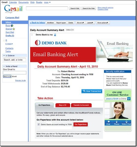
That’s the promise of Email Banking that we explore in the current report (see below). We also look at a new Israeli startup, ActivePath, that is delivering much of this vision with its new email banking service launching in the U.S. later this year (note 2). The screenshot below shows how a password-protected daily account-summary email can become a full-featured account-management tool with numerous links to act on the information presented. 

Finally, in an addendum to last month’s report on email/text alerts, we look at the alert-control panels at five major banks: Bank of America, Capital One, Chase, U.S. Bank and Wells Fargo.

About the report:

———————————————————————————————-

Email banking: revitalizing the channel (link)
New technologies and more thoughtful design could elevate email
to a central role in account management

Author: Jim Bruene, Editor & Founder

Published: 19 Aug 2010

Length: 40 pages

Cost: No extra charge to OBR subscribers, $395 for others here

———————————————————————————————-

Daily account summary email from ActivePath
Note: Embedded buttons to a.) view transactions, b.) role money into a CD,
c.) transfer funds, d.) view transaction detail, e.) chat with customer service

clip_image002

Notes:
1. For more on email alerts, see last month’s Online Banking Report: Email Alerts & Transaction Streaming.
2. See ActivePath, along with 55 other innovators, at FinovateFall, Oct. 4/5 in NYC.
Bank of America Redesigns Email Alerts

image On August 9, Bank of America redesigned its email alerts (note 1). The biggest change came in repositioning, renaming, and highlighting a security feature, “last login time.” The info is now in a prominent gray box at the top called the Security Checkpoint. Previously, it was buried in the middle of the left-hand column (see Before screenshot below).

While the Security Checkpoint is a nice bit of security marketing (note 2), I’m not sure how much additional fraud it will thwart, if any. But it’s good for the bank to appear to be doing all it can to protect customers.

Bank of America already had one of the best alerts in the business, earning an A in our most recent report (note 3). So I’m not sure why they needed a new design; perhaps, it’s just to keep things fresh. However, the redesign did nothing to fix our one criticism of the bank’s alert, the lack of meaningful info in the preview line.

Bank of America email alert preview in Gmail

After: New Bank of America email alert design (17 Aug 2010)

Bank of America email alert with new Security Checkpoint

Before: Previous email alert design (8 Aug 2010)

image

Notes:
1. At least, that’s the first day the new style landed in my inbox.
2. For more info, see Online Banking Report: Marketing Security.
3. For more on email alerts, see last month’s Online Banking Report: Email Alerts & Transaction Streaming.

Launching: Doxo Looks to Dramatically Improve the Ebilling Experience

image Two significant Seattle-based financial startups are gearing up for launch, something I haven’t been able to say since the bubble days. We looked at location-based transaction monitoring company Finsphere last week. Today, we take a peek at Doxo, which is looking to disrupt the ebilling market and bring transactional paper mail into the 21st century.

I met with CEO Steve Shivers and Marketing VP Kevin Frisch last week in their new Pioneer Square office, a nifty location recently vacated by Microsoft. While public details are limited, I’ve had two briefings with the firm and can say that if it works, it could be one of the biggest financial plays in many, many years. Like Finsphere, Doxo is backed by Mohr Davidow Ventures and Bezos Expeditions.

Of course, the ebilling space is littered with failures including many well-funded ventures that pretty much all ended up being acquired by CheckFree (now Fiserv): MSFDC/TransPoint (Microsoft, First Data, and Citibank), Spectrum (Wells Fargo, First Union, and Chase) and Integrion (IBM and 17 banks) to name just a few. And the ebilling service at Fiserv isn’t exactly blowing the doors off, delivering 320 million bills each year (2009), just a sliver of the 40 to 50 billion sent annually in the United States.

All I can say about the startup is that they are creating an online hub where billers can send bills and communicate with customers in a much better way than through snail mail. It’s put together in a way that could really speed estatement adoption. And it’s funded by the billers, who save money immediately by eliminating paper statements to participants.

As demonstrated by the history of failed ebilling ventures, there are huge obstacles to overcome. But the time may be right for ebilling to finally take off. Billers are frustrated with low levels of estatement adoption, consumers are fed up with redundant email and paper communications, and no one wants to waste natural resources (and money) if there’s a viable alternative.

No one has yet figured out how to solve it. Doxo may have the answer. Stay tuned.

US Bank Adds Remote Deposit Capture to Online Banking Menu

imageI saw a new option today when I logged in to my U.S. Bank account:

Make a Deposit

Clicking on the link brings up a screen (see below) promising that DepositPoint, a desktop-scanner-based service, is “Coming Soon!”

From the little info provided, I can see that it’s targeted to home users using existing equipment (all-in-one printer/scanners) and allows checks to be deposited through 6 PM central time for (I assume) same-day credit.

The webpage shown below is the only info available. There’s nothing posted on pricing, when it will launch, or other terms and conditions. And a search for “depositpoint” on the main website comes up empty. Interested customers are asked to “please stay tuned to this page for more exciting information!” While not exactly state-of-the-art lead capture, at least the bank is getting the word out (note 1).

In other news, PayPal moved one step closer to becoming a bank/credit union replacement with the revelation that it will add remote deposit capture to its iPhone app later this year.

U.S. Bank online banking primary navigation (16 August 2010)

image 

Note:
1. I’m putting this in the footnote since it’s not the focus of this post. But seriously, U.S. Bank, this is the best you could come up with from a design and copywriting standpoint? It looks like a webpage from 1996. All that’s missing is the “under construction” sign. How about some color? Graphics? Links to an FAQ? This is a great development, but the customers drawn to this page from the “NEW” button are unlikely to be impressed.

BankSimple Provides Sneak Peek of User Interface on iPad App

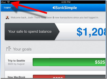
imageThe bank that everyone’s talking about, and no one is using, finally released a few peeks at its user interface. Based on these screenshots posted on the bank’s homepage (see last screenshot), it looks like a killer iPad app (note iPad logo in upper left of first screenshot).

image The startup also unveiled a new logo, moving from the trendy gray/red (left) to a bolder font in a very bank-like and comforting blue.

Finally, the startup has purchased the .com version of their URL, an important, albeit expensive, pre-launch move. Currently, banksimple.com redirects to the old .net version.

Screenshots

1. Safe-to-spend balance appears to incorporate future scheduled payments and displays goals to help users keep the bigger picture in mind, rather than spending the $1,208 on drinks and dinner out.

image

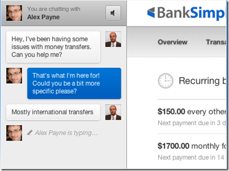
2. The bank’s customer service focus illustrated in chat screen with co-founder Alex Payne. On the right you can get a glimpse of the transaction flow.

image

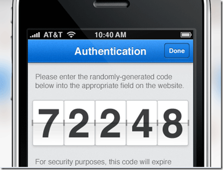
3. My favorite screenshot. It indicates the bank will use out-of-band authentication, a must-have these days. It also demonstrates that BankSimple is really thinking through the UI. Instead of tiny little digits requiring reading glasses, the bank provides the 5-digit code in big, bold numbers. They are also rendered in an attractive flipboard style.

image

———————

Note: HT to Keith Caswell @kthcswll for the tip.

Innovations Don’t Always Work: PayPal to Discontinue Browser Plug-in

image For years I’ve longed for a financial institution-delivered browser plugin that would help manage receipts, verify available funds, complete online forms, and provide secure payment options at legitimate ecommerce sites. The PayPal browser plugin, launched less than three years ago, offered most of that, in theory. 

I used it successfully a few times, but too often it popped up offering assistance when I didn’t need it. So I disabled it. Evidently, I wasn’t the only one who found it not worth the hassle (for more insight into the problems, read the comment thread and updates to the original announcement post). The company is pulling the plug on the service next month.

Now that PayPal’s plugin is off my computer, it’s time to give Billeo’s another try. I used previous versions in the past, but hadn’t given it a thorough test since I moved to a Mac for most Internet browsing.

PayPal login splash screen (link, 9 August 2010)

image 

———

Note: We wrote about plugins, toolbars, and tools in Online Banking Report: Grabbing Desktop Mindshare (published Aug. 2002).

The Need for Context-Sensitive Login Security

image I’m a frequent PayPal user and need access to it on the road while logged in to who-knows-how-secure coffee-shop WiFi. Whenever I entered my password, I was hit with the unsettling realization that this could be the time I handed over my credentials to a hacker.

So a few months ago I began using PayPal’s optional out-of-band, one-time password solution. Each time I log in, a random six-digit code is sent to my mobile phone. That code must be entered to complete the login. And while I feel much more secure, the extra 20 to 30 seconds it takes is a hassle, especially after a decade of password-only access (note 1).

To improve the user experience, while maintaining the extra authentication security, I’d like to see PayPal make the following changes: 

  • Instead of requiring the user to press the “send SMS” button after logging in, just send the SMS code automatically. I’ve logged in at least a dozen times since enabling this feature and I still forget to press the button. I usually look at my phone for 10 seconds waiting for the code until I remember that I must click the button.
  • Allow low-risk transactions to be authorized without the extra SMS code. I bought some iPhone chargers on eBay today for a total of $30. I would have preferred to skip the out-of-band authorization on this low-risk transaction, a small purchase made on eBay through my authenticated eBay account. 

Relevance for Netbankers
The second suggestion (above), what I call “context-sensitive security control,” is an important part of the tradeoff between security and usability. As long as customers are hassled for extra info only when the risk is higher, there’s a much better chance of gaining their cooperation, and attention, in security monitoring. Many banks feed an extra security question when customers log in from an unrecognized computer. That’s a great use of context-sensitive extra security.

Another situation where context-sensitive security controls can be deployed is for determining when an account is locked for excessive login attempts. If a user is logging in from a recognized computer, they should get far more leeway in the number of password attempts before the nuclear option, full lockout, is deployed. Unfortunately for me, Chase Bank has not yet taken this step (notes 2, 3).

————————-

Notes:
1. When we go shopping for a new business-banking relationship, out-of-band authorization capabilities will be a non-negotiable requirement.
2. Yesterday, Chase locked me out, without warning, after just 4 attempts (or was it 3?) from my main computer, which the bank knows very well. That’s ridiculous, from a recognized computer I should be able to try at least 7 or 8 times. I have multiple Chase accounts with different usernames and passwords and with a typo or two it’s easy to surpass 3 or 4 attempts.
3. Yes, I’ve whined about this before, but it’s been 3 years, so I was due.

The Eight Core Functions of Online Banking

image What could be more fun on a gorgeous summer day than boiling down online banking to its core functions?

From the consumer’s perspective, banking is pretty simple. You stash away some money in the bank and then you spend it. Rinse. Repeat.

The online/mobile banking experience should echo that simplicity. Here are eight key things users should be able to do: 

  • See: View balances, checks written, purchases made, images, and so on
  • Sort: Interact with the data by rearranging, categorizing, tagging and so on
  • Save: Store all data, images, and reports for future reference 
  • Share: Allow other authorized users to view/receive selected info
  • Send: Move money to pay bills, transfer funds, pay down loans and so on
  • Select: Choose account options, change service plans, modify settings, and so on
  • Service: Investigate and fix issues
  • Secure: Batten down the hatches for all financial matters

I believe the industry is only about 10% to 15% of the way towards delivering on these eight items. Most online banking services are pretty good with See. And there’s been a lot of work done with Secure and Send, but they are not nearly perfected yet (I spent 40 minutes in the branch Tuesday sending a $3,000 wire, and I still don’t know if the recipient got it). But the other areas are wide open.

Did I miss anything?

Note: Photo credit — Adonis Hunter (Flickr)

BankSimple Scores More Press

image In the history of online banking, has there ever been so many words written about a company before it’s even opened for business? I can’t think of any.

It’s a two-edged sword. Free publicity is great for building a brand. But it can also ratchet expectations up so high that delivering the goods becomes harder.

The BankSimple team is keeping things low-key on its website. You even have to search a bit to figure out how to get on its mail list (see note 1). But some of the press accounts are downright giddy over the yet-to-be-launched-nonbank bank (note 2).

image Case in point: Friday’s Mashable post which generated 1,000 Tweets, 365 likes, 33 comments, and eight Diggs. The author, Jennifer Van Grove gushes about BankSimple, using terms usually reserved for a new Apple i-something launch:

The Banksimple formula is one that puts customers first and focuses on automatic, “worry-free” money management with a digital twist and penchant for social integration.

…the startup’s bleeding-edge approach to banking that we predict will be both controversial and groundbreaking.

And these were the subheads in the article:

  • A New Way to Bank
  • Predictive Money Management
  • Social Media Meets Banking
  • Fee-Free for Real
  • The Zappos of Banks

But after all that setup, the reader comments were predominantly skeptical/negative. I think it all sounded a little too good to be true.

Relevance to Netbankers: Despite the skeptical Mashable comment thread, there is a real appetite in the country (world?) for fresh ideas in the banking sector. But there’s also huge trust hurdles for financial startups. BankSimple is planning a hybrid model. A Web-based, social-media-loving startup running on the banking rails (note 3). It worked for PayPal. It will work again (note 4).

——————————

Notes:
1. Prospective customers must first click on the Join tab on the far right of homepage. Users are asked for their email address (obviously) and something I’ve not seen before, their bank balance. Maybe it’s just me, but that seems a little too forward for a beta invite page and may dissuade some from leaving their name. Also, it seems just a bit out of step with the bank’s populist message. Not a big deal.
2. And given that this is our third post on BankSimple, I guess we are in that category as well.
3. We’ve written about this theme many times over the years; the last time we published a full report was almost ten years ago: Online Banking Report: Building the Amazon.com of Financial Services.
4. This is a general statement. Until I understand what it’s doing, I’m not predicting anything about BankSimple, other than it will get a lot more press.

SmartyPig Allows Customers to Choose Level of Account Detail in Email Communications

image SmartyPig is the first of my personal banking accounts that allows me to choose the level of detail provided in email alerts. The startup just moved away from sending detailed info in all messages to offering the option to receive a general notification that requires logging in for specific balance/transaction info (see below; link to SmartyPig blog post).

This is a basic level of customer choice that every financial institution should put into their product roadmap. For me, and a great many customers, alerts are practically worthless if they don’t include some detail on the transaction. On the other extreme, many customers are not at all comfortable with actual data being included in an email and won’t use alerts if that is the only choice. Most customers fall somewhere in between. 

In the future, it won’t be a black-and-white decision. Users will be able to select varying levels of detail depending on the account, balance level, email address used, time of day and so on.

———————————

And while we are talking about SmartyPig, check out their very thorough security section. The startup covers far more ground than most financial institutions.  Here are the topics covered:

  • White-hat hacker tested via Primeon
  • Verisign Extended Validation SSL
  • Security scanned daily by McAfee
  • TRUSTe privacy seal
  • FDIC info for its banking partner
  • Secure login
  • Firewall
  • Encryption
  • Constant surveillance
  • Technology updates
  • Browser support

Note: For more info on email alerts, refer to our most recent Online Banking Report.

Flash Marketing Addendum: Co-branded Payments

In my post yesterday about flash marketing via Groupon and LivingSocial, I neglected to mention another interesting opportunity: working directly with the marketing companies to add your brand to the service.

imageBecause payments and credit are crucial to ecommerce success, financial brands are a logical addition to the checkout process. And Visa just so happens to be featured today at LivingSocial (see inset and screenshots below).

Anyone who buys today’s Seattle deal, a $25 restaurant certificate for $10, automatically gets a second certificate to use as a gift, if they pay by Visa Signature card (see notes 1, 2). It’s hard to say what Visa is paying for the promotion, but given the massive website traffic and transaction activity, it’s likely a pricey sponsorship (note 3).

Email from LivingSocial with Visa branded add-on offer (28 July 2010)

image

Landing page (link)

image

Notes:
1. Some interesting items in the fine print for the Visa-sponsored comp certificate:
– valid only for Visa Signature cards, which might irritate some non-Signature Visa customers
– offer not valid for purchases made via iPhone (there must be something in the shopping cart that does not work on the iPhone)
2. My saved credit card in the site is a MasterCard; when I went to purchase the deal, there was no mention of the free certificate, nor any prompt to switch to Visa.
3. The merchant is receiving $5 for each certificate issued under the main deal. Visa’s sponsorship would need to cover some compensation to the merchant, but perhaps at less than $5 each, since fewer of the gifted certificates will be redeemed. It looks to be a popular offer, having sold almost 2,600 units (by 7 PM), with almost 10 hours remaining.