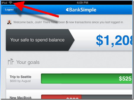
![]() The bank that everyone’s talking about, and no one is using, finally released a few peeks at its user interface. Based on these screenshots posted on the bank’s homepage (see last screenshot), it looks like a killer iPad app (note iPad logo in upper left of first screenshot).
The bank that everyone’s talking about, and no one is using, finally released a few peeks at its user interface. Based on these screenshots posted on the bank’s homepage (see last screenshot), it looks like a killer iPad app (note iPad logo in upper left of first screenshot).
![]() The startup also unveiled a new logo, moving from the trendy gray/red (left) to a bolder font in a very bank-like and comforting blue.
The startup also unveiled a new logo, moving from the trendy gray/red (left) to a bolder font in a very bank-like and comforting blue.
Finally, the startup has purchased the .com version of their URL, an important, albeit expensive, pre-launch move. Currently, banksimple.com redirects to the old .net version.
Screenshots
1. Safe-to-spend balance appears to incorporate future scheduled payments and displays goals to help users keep the bigger picture in mind, rather than spending the $1,208 on drinks and dinner out.
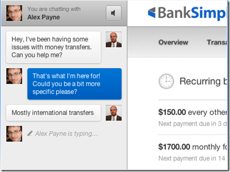
2. The bank’s customer service focus illustrated in chat screen with co-founder Alex Payne. On the right you can get a glimpse of the transaction flow.
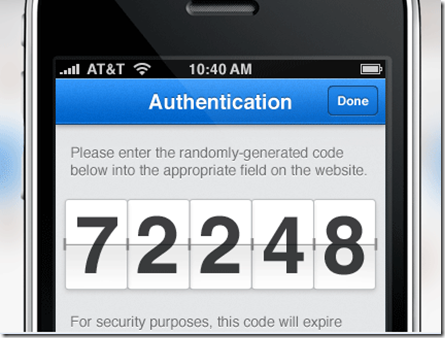
3. My favorite screenshot. It indicates the bank will use out-of-band authentication, a must-have these days. It also demonstrates that BankSimple is really thinking through the UI. Instead of tiny little digits requiring reading glasses, the bank provides the 5-digit code in big, bold numbers. They are also rendered in an attractive flipboard style.
———————
Note: HT to Keith Caswell @kthcswll for the tip.


