US Bank’s Way-Too-Long Customer Survey

US Bank’s Way-Too-Long Customer Survey

usbank-survey

A few months ago I received an email (above) from US Bank where I’m a long, long-time customer. It was a simple request for my opinion on the bank’s products and services. I was slightly put off by the wordy intro, which concluded with a 31-word sentence telling me how important my opinion was. But that’s just the editor in me. As I was about to press the Begin Survey button, I noticed that I was about to enter a 25-minute questionnaire hell. That was all I needed to know, I left it undone and went on to other things.

Twenty-five minutes! That’s just too long for any normal customer. Ideally, keep online surveys to 5 minutes at most or you risk losing the attention and thoughtful answers of your respondents. If you really need a half-hour of your customers’ time, provide some type of thank-you gift, even if it’s just a chance to win $500. Otherwise it’s almost insulting to ask for that much time with no reciprocation.

Bottom line: While you are not going to lose customers with a lengthy survey, you probably won’t get valid results due to so many dropouts. But you most certainly will irritate a good portion of the recipients. Don’t do it.


Is Money the OS for Living?

Is Money the OS for Living?

os-logosSince the day I started writing about financial services 21 years ago (yikes), people have asked me if I’m running out of things to write about. Most people can’t imagine how you’d write four paragraphs on banking innovations, let alone 40,000. But running low on ideas is the least of my concerns. The underlying topic, money, is massive and ever-changing with new technology, regulations, and consumer tastes.

Money impacts us every single day. And for most people, it’s an almost 24/7 pursuit, and defines what they do all day, where they live, who their friends are, how they spend their leisure time, how happy they are (up to $75k annually in the USA anyway), and even how long they live. So if you are in the business of managing money, be it storing it, spending it, maximizing it, or protecting it, you have a vital role.

It’s not a perfect metaphor, but you could call money the operating system (OS) of living. That’s probably overly tech/hipster, but then again that’s what we do for a living. And if money is the OS, then payments, insurance, wealth management, and so on, are all apps running across it. Which kind of makes sense in a Friday afternoon way of thinking.

What does that mean for running your financial services business? YOU ARE SO FREAKING IMPORTANT IN YOUR CUSTOMERS’ LIVES! That’s a blessing and a curse. They can’t live without you, which is great for revenues, but you also can’t afford big mistakes. That means service, security, trust, user experience all have a higher bar than the average tech or service company. And that’s expensive.

But thank goodness for mobile. It’s a miracle device in so many ways. But aside from chatting and photo sharing, its biggest impact could be on financial matters. Mobile is a free, 24/7 connection to money. That could be disconcerting, especially for the majority of consumers with money worries. So it’s the job of the bank, credit union, PFM provider, to use that connection to ease anxiety, rather than exacerbate it.

But that’s no easy task, given that money is the one of the biggest sources of anxiety in the country, accounting for three of the top-10 worries according to a 2015 study conducted by Chapman University (Hi Charlie). Unlike many posts, I don’t claim to have an answer here. But there are strides being made by pioneers who harness spending data to let customers know how much “free cash” they have at the moment (e.g., Simple’s Safe to Spend) or where they stand on their monthly budget (e.g., Moven and Capital One’s new Inform app) as well as chatbots that have your back (e.g., Bank of America’s chatbot Erica demo’d this week).

It’s a great time to be a bank/financial technologist. Enjoy making a difference!!

Video of the Week: Bank of America Demos AI Chatbot “Erica”

Via a chatbot named Erica, Bank of America this week demo’d its upcoming mobile AI capabilities. The feature will be available to the 21 million users of its mobile app via voice or text commands “in late 2017.” While it’s unusual for a major bank to discuss technology a year away from deployment, with all the hype around artificial intelligence and chatbots, BofA must have figured it was a good PR move.

The bank did not disclose whether it was building or buying the technology, but my guess is the latter. We saw a number of Finovate demos last month in this area and expect many more in 2017.

For more info, check out the American Banker story yesterday (free access).

Useful UI: The Dashboard Metaphor

Useful UI: The Dashboard Metaphor

biz-dashboard-definition

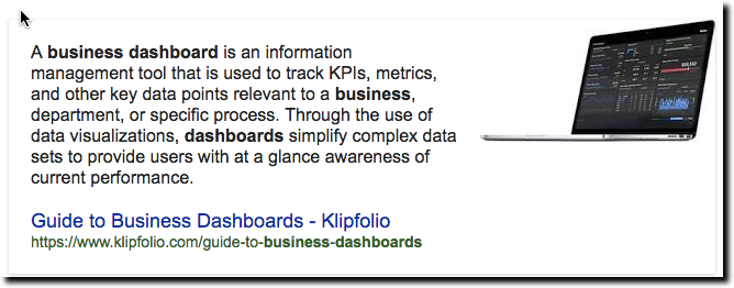
Every now and then a useful term comes into widespread use and it can be hard to decide whether it’s a fad (e.g., home banking) or something that will be around for decades (e.g., ATM). Dashboard is a term we are seeing more and more of. While it’s too soon to say if it will still be around in the next decade, let alone in 50 years, it’s a good word in wide use in consumer and business services today (see definition below).

redfin-dashboard
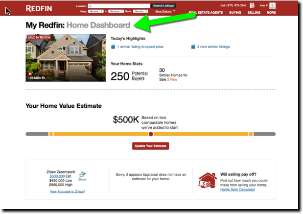
Redfin’s homeowner dashboard

Redfin, for example, sends new homeowners an email suggesting they log in to the Owner’s Dashboard of their new property. Redfin must be matching home-buying records to its user database to make the connections. It’s a nice touch. Who wouldn’t want to sit in the virtual driver’s seat of their most important asset and get a look around. And with home prices appreciating in most parts of the country, it’s a mighty fine view. In the example, the home value is up almost 15% since February.

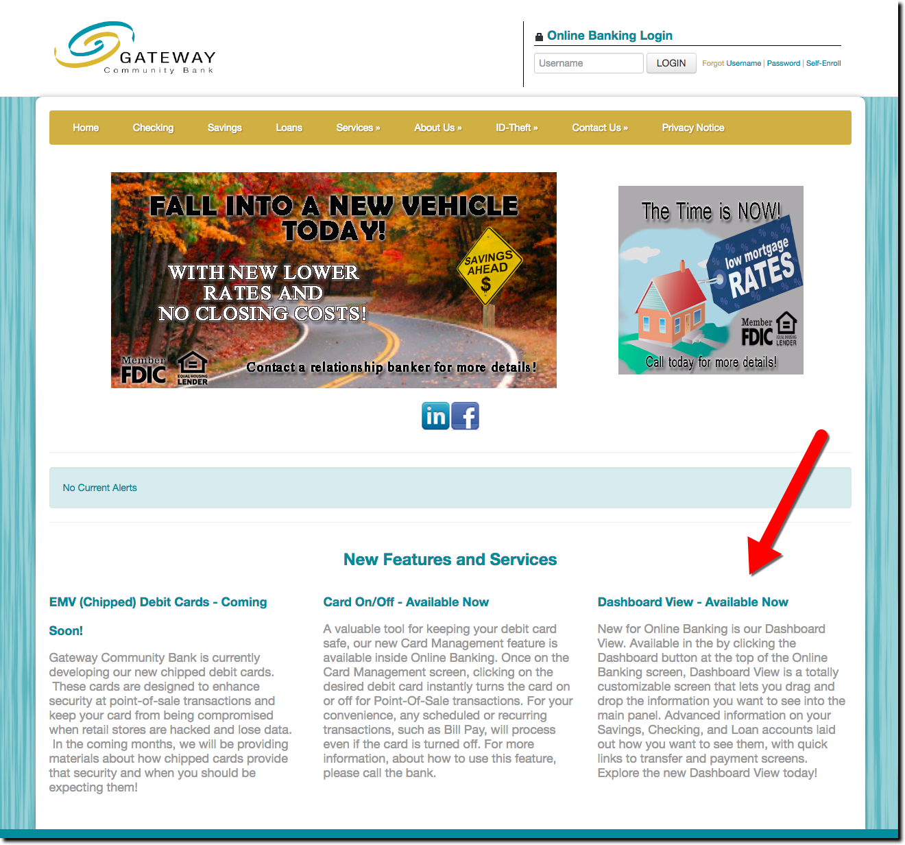
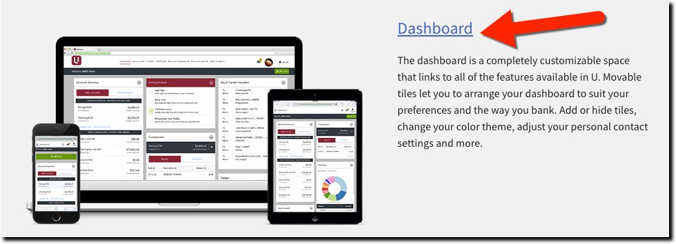
Banks should consider using similar language for their advanced digital banking services. Rather than a fancy name to confuse consumers, use Dashboard, which is not only easy to remember, but also has all the right connotations. One major bank already doing so is BB&T (see below), with its unique customizable mobile and desktop service, U. Another is Ohio-based First Financial Bank as well as $88 million Gateway Community Bank (screenshot below).

———

BB&T's U digital banking is centered around a "Dashboard"
BB&T’s U digital banking is centered around a “Dashboard”

———

Bottom line: The name of a digital service isn’t going to make or break it. But as we struggle with educating users on the features and benefits, the use of known terms can ease the learning curve.

———-

Gateway Community Bank homepage with news of its new "Dashboard View"
Gateway Community Bank homepage with news of its new “Dashboard View”

Opportunity Knocking: Senior Checking Accounts

Opportunity Knocking: Senior Checking Accounts

Despite being AARP-eligible (50+), it took a conversation at Finovate with Theo Lau of AARP (see her guest post last month), to understand how poorly banks market to the older population (a demographic that controls 83% of the country’s household wealth).

senior-clip-artProblem 1: Let’s start with the name. What’s the most common name for accounts geared towards older customers? Senior checking. When I was a 30-something bank product manager, that sounded reasonable to me. But guess what, more than half of older adults hate being called seniors. What name do they like? Baby boomers (favored by 71%). Yet, there is just one lone Baby Boomer Checking account in the country. Step forward Texas Telcom Credit Union, you are the winner!

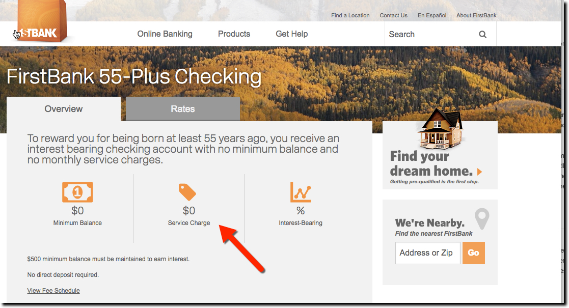
Problem 2: What’s worse than seeing the word Senior splashed across the top of the page? The clip art (sample above). It generally shows a smiling couple looking bewildered at a computer screen, or looking like they are having way too much fun on the golf course. Those images do not make your product more attractive to older customers. They are just tired cliches. We are all for artwork on webpages, but for older adults, we think it’s better to try something other than mature faces. For example, 1st Bank uses a graphic that appeals to all ages and demographic: $0.

1stbank55plusdda

Problem 3: What’s the incremental value? If you are going to market a special account to me, it better have something special. As much as I like 1st Bank’s graphics, there’s really no significant benefits over the bank’s plain old checking account, which are also fee-free. The one difference is interest, but at the current rate of 1 basis point, that’s more of an insult than a benefit (seriously, don’t call it interest-bearing if my after-tax gain is just a nickel per month per $10,000). You can add something simple, even a T-shirt, water bottle, or 2-for-1 dinner coupon. But there has to be something to set it apart.

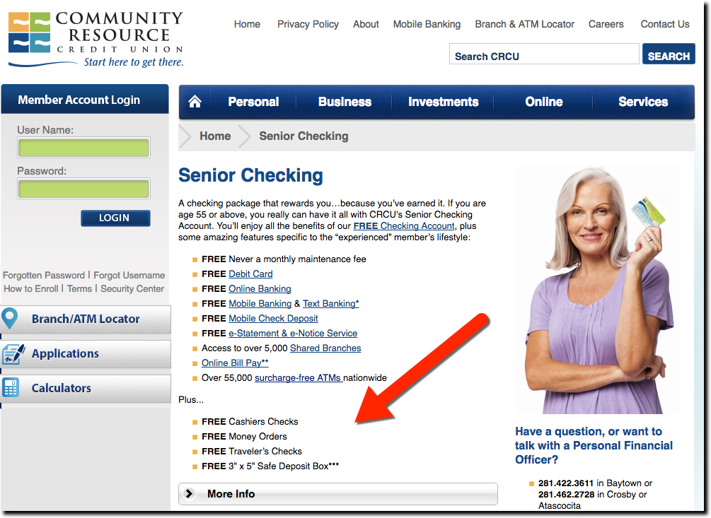
But adding value for the older segment seems rare these days. It took 30 minutes of searching before I found a “seniors” checking account with a tangible benefit compared to the FI’s other checking accounts. Community Resource Credit Union gives its 55-and-older members a free safe deposit box, money orders, travelers, and cashiers checks (see below).

community-resource-sr-dda

Bottom line: Don’t bother offering Senior checking that differs from your other accounts by name only. It’s disingenuous, off-putting to customers, and embarrassing to your staff who have to explain it. But DO offer an account targeted to your older customers, a Baby Boomer account, that includes SOMETHING that sets it apart. Preferably something your older customers truly value, such as extra security or a dedicated customer service support line.

Friday Fun: Berenstain Bears Bring Banking to the Under-10 Set

Friday Fun: Berenstain Bears Bring Banking to the Under-10 Set

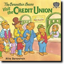
berenstain-cu-book-coverI thought I’d left behind Berenstain Bears 15 years ago when my youngest graduated to Animorphs books. But they made an appearance today when I discovered how they are helping kids get involved with saving and managing money. And before you dismiss their appeal, did you know the Bears have sold 300 million copies in a 54-year run which includes 300 titles!

Three years ago, Franklin Mint FCU, through its CUSO CUNFL, developed a financial literacy program based on the series. It includes a book written by none other than Mike Berenstain himself, called Berenstain Bears Visit a Credit Union. It is licensed to other credit unions to appeal to grade schoolers.

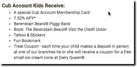
obee-cu-cub-account-benefitsThe book is in use at a number of credit unions, but none more prominently than O Bee FCU in the Tacoma, Washington, area. Its Berenstain-themed Cub Account for under-12 members includes a 7.5% rate on the first $500 in savings, an important feature so you can use something other than pennies to show your youngster the benefits of savings. More impressive for the kids, every branch-deposit earns a free Dairy Queen ice-cream cone coupon (see inset for full list).
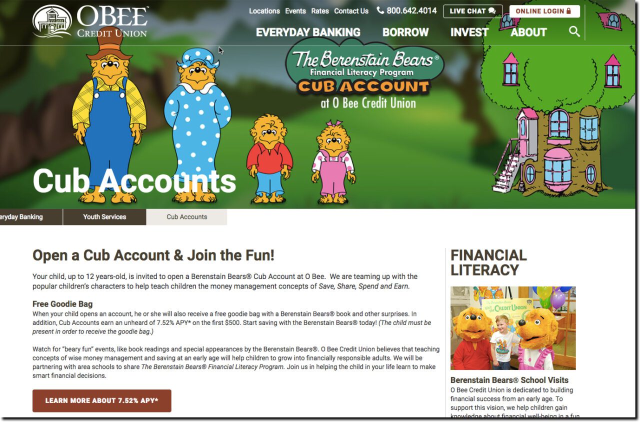
O Bee also offers a classroom financial literacy program with visits from the bears themselves, along with a jumbo version of the book to read to the class.

berenstein-bears-obee-cu
O Bee Credit Union’s Cub Account landing page


Bottom line: Efforts aimed at banking the kids of your customers are a clear win-win. It’s the right thing to do; kids, and their parents, need these services. And it helps keep both the child and their parents as customers for the rest of their lives. See our previous posts for more examples.

Alt-Branch Banking: Be the Home for the Homeowner (or Renter)

Alt-Branch Banking: Be the Home for the Homeowner (or Renter)

the_wallThe writing is on the wall. The bank branch wall that is. In a world of ubiquitous smartphones, bank branch ROI continues to plummet. That leaves many financial institutions wondering how to replace the branch’s historic role as the center of customer acquisition.

There are many strategies:

  • Substantial digital marketing and sales efforts
  • Relationships with major local employers
  • Lending, and banking, small businesses
  • Leadership in K-12 financial education
  • Affinity programs with local retailers
  • Social media and PR champion

None of those are particularly novel. But one you may not have tried recently is becoming the go-to financial institution in your area for homeowners and apartment renters. Being the local bank that helps people meet one of their top priorities in life, having a roof over their head, puts you in an enviable position.

Again, this is a strategy that goes back decades (e.g., Savings & Loans in the United States, Building Societies in the United Kingdom), but digital technologies open up new avenues of integrating partner services into a cohesive “Home for Homes” strategy:

  • Finding a home/apartment: Integrations with Zillow, Redfin, newcomer Faira (which “wrapped” the Seattle Time Sunday paper this past weekend in 3-full-pages ad)
  • Traditional home financing: Standard and jumbo mortgages, purchase and refi
  • Alt-financing home/apartment (note 1): Rehab loans, crowdfunding integrations, rental-deposit loans, and so on
  • Home/apartment repair loans: Smaller loans, potentially more of “emergency” type
  • Traditional home equity lending: Installment loans, lines of credit, and so on
  • Realtor support: While there is no shortage of independent mortgage brokers working with real estate agents, many (most?) can’t provide a flow of inbound leads to the agents; this is where established FI brands can leverage their standing in the community (within RESPA guidelines, naturally)

After you find a new home buyer/renter/refinancer, the hard part begins. How to convince them you are the long-term home for their home? A novel approach, but one fraught with regulatory/risk/ROI concerns, is the lifetime mortgage, e.g., a mortgage preapproval that moves with you from home to home provided you continue to meet down payment and income requirements (NOT the UK meaning, a reverse mortgage).

While reprising the Third Federal Mortgage Passport might not be possible in the current regulatory environment, there are ways to incent customers to move their other bank accounts (though, thanks to Wells Fargo, you better be super careful with sales incentives).

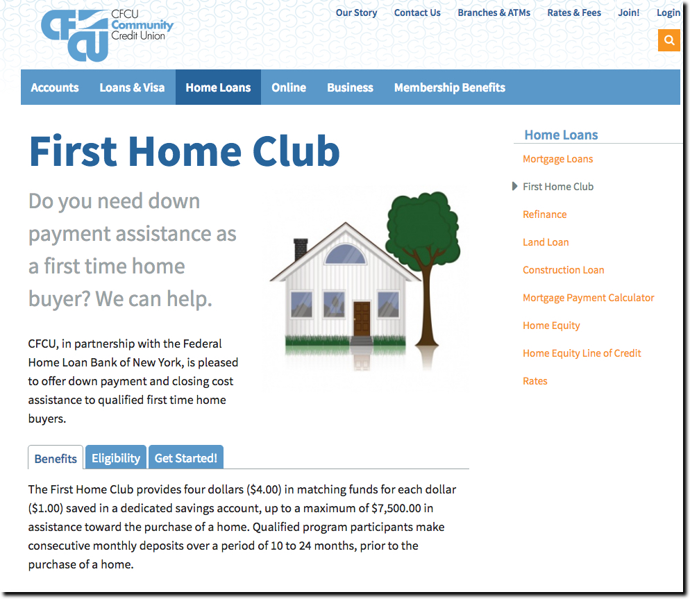
CFCU Community Credit Union's "First Home Club"
CFCU Community Credit Union’s First Home Club, a down-payment assistance program from the Federal Home Loan Bank of New York.

Here’s a list of perks to offer new homebuyers/renters:

  • Homeowners club with content, discounts and offers
  • Systematic savings program to save for down payment or rental deposits
  • Card rewards geared towards home expenditures
  • Significant interest-rate kicker and/or bonuses on the first few thousand in savings (see CFCU Community Credit Union at right)
  • Simple refi process (see PenFed’s program powered by Mortgage Harmony for example)
  • Reward-point bonuses for home-related purchases on your credit/debit card
  • Homeowner/rental insurance
  • Homeowner repair services with financing discounts (integrate with Thumbtack, Angie’s List, etc.)
  • Energy-conservation services with financing discounts
  • AirBnB integration for renting out home/apartment

Bottom line: No matter how well your branches are doing today, most financial institutions need to pursue viable new-account generation alternatives to make up for falling branch traffic.

———

Notes:

  1. findevr-sv16Apartment financing is a relatively new need (see previous post). And the magnitude of it might surprise anyone who hasn’t checked out the urban rental market in recent years.
  2. Looking for more inspiration for your technology stack? Don’t miss our third annual FinDEVr Silicon Valley next week (18/19 Oct).

Lessons from Startups: Leveling Up the Waitlist at Zero Financial

Lessons from Startups: Leveling Up the Waitlist at Zero Financial

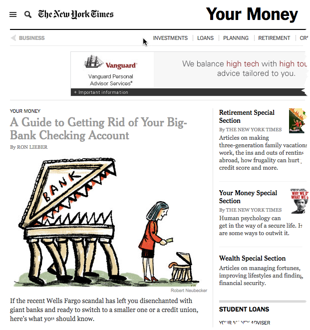
nytimes_yourmoneyOn 8 Oct Ron Lieber’s NY Times column Your Money discussed alternatives for consumers looking to move from major banks (thanks, Wells Fargo). He started with credit unions, touched on community banks and then finished with a major shout-out to an unlaunched fintech startup Zero Financial.

Not being familiar with Zero (other than its recent $2.5 million funding), I visited online, taking the bait to sign up for early access. This is a now-familiar ritual for me. During the past four or five years, startups have made a game of the launch process. Here are the primary elements:

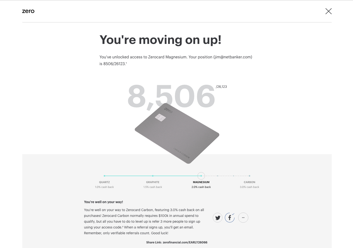
  1. New visitors willing to provide their email address (and sometimes more) are entered into the queue and informed of their numerical spot in line. In my case, I was #26,405 on Friday afternoon (shortly after the Saturday column was made available at NYTimes.com).
  2. Newly wait-listed customers are invited to move up the queue by tweeting, posting on Facebook or otherwise driving signups. I posted a message to Facebook and was immediately moved up 18,000 spots to #8,506.
  3. To supercharge the viral nature, prospective customers are given something of value to incent them to drive referrals. Coin famously offered $10 off the price of the hardware (which otherwise cost $50) for each referral. It worked almost too well as Coin amassed a 6-figure wait-list that grew pretty feisty as the hardware was delayed for a year. Zero’s twist is to boost the level of your cashback rewards. Everyone starts with 1% (called Quartz level), but if you tweet or post the offer on Facebook, you move to the 2% cashback level (Magnesium level). Then, if you get 3 people to sign up with your referral code, you move to the maximum 3% level (Carbon). Apparently, my posting on Facebook drove one referral, because today I’m up another 4,000 spots to #4,099 and have to get only 2 more to move up to the 3% cashback level. (Side note: The total number in the queue rose 6,600 over the weekend, to 33,023 as of 2:00 p.m. Pacific Time, Monday, 10 Oct 2016).


Spot in Zero Financial's waitlist after moving up via Facebook post
Spot in Zero Financial’s waitlist after moving up via Facebook post


Lessons for FIs:

  • Gaming is a great retention device: Across all demographics, consumers like to win. And it’s been proven time and time again, they’ll go out of their way to earn points or even extra chances to get points. FIs have a built-in scoring mechanism, the dollar value of accounts or transactions, so it’s pretty easy to build games with those inputs.
  • Scarcity/exclusivity are powerful marketing tools: Although your FI is unlikely to be a startup, you could play the same game with a snazzy new account or special offer.
  • Pay attention to Zero’s credit/debit card hybrid. Unless (until?) this type of interchange arbitrage is outlawed, look for credit-card sweepstakes-type accounts to gain popularity (read about it near the bottom of last week’s post).


—–

findevr-sv16Note: Looking for more inspiration for your technology stack? Don’t miss our third annual FinDEVr Silicon Valley next week (18/19 Oct 2016).

Alerts: Discover Card Highlights Merchant Refunds

Alerts: Discover Card Highlights Merchant Refunds

So much of day-to-day banking is either negative or at best, incredibly boring. I spent too much, my payment is late, I can’t remember where that last $40 from the ATM went, and so on. No wonder consumers are less than enthusiastic with their banking relationships.

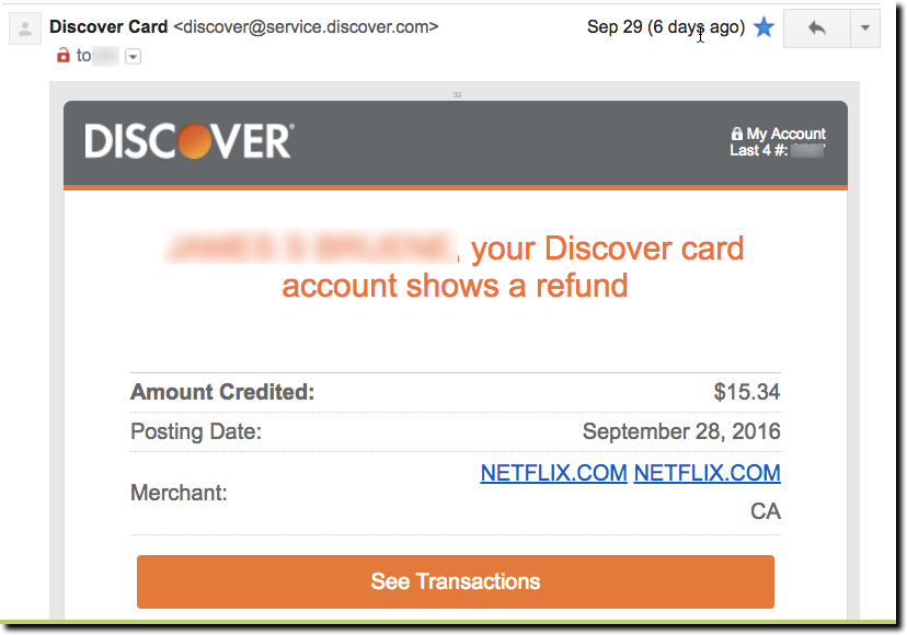
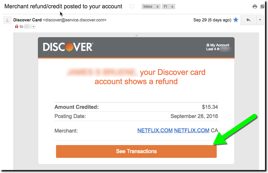
What to do about it? For one, when you have good news, CELEBRATE! And one of the easiest ways to do that is when a merchant refund appears on a credit or debit card account. For example, Discover does a great job with its email. It’s personalized, and clearly shows the date, credited amount and merchant name (including hyperlink to Netflix). And there is a huge button at the bottom to check out the transaction online (not that you’d really need to).

Discover Card merchant refund notification email (29 Sep 2016)


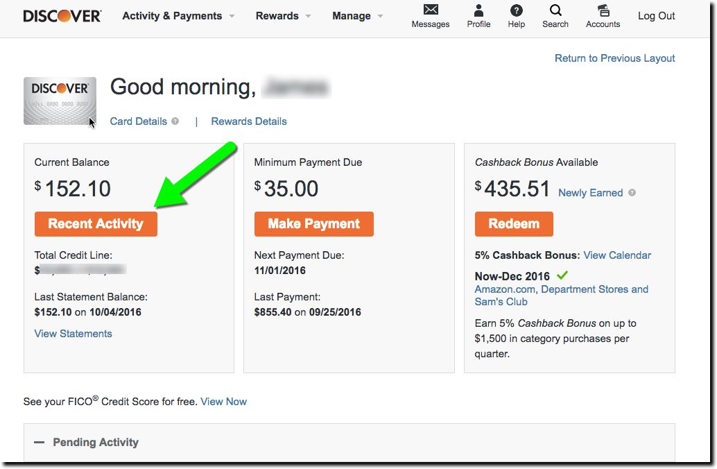
But after clicking through the email, the user experience (UX) gets a bit gummed up. The first webpage displayed is the main secure homepage (first screenshot below). That makes sense since the email button says See Transactions. However, since my statement cycled since the refund was processed, the $15.34 Netflix credit is nowhere to be seen. (Granted, had I clicked on the message when it first came in, the transaction would have been listed on the lower portion of the screen.)

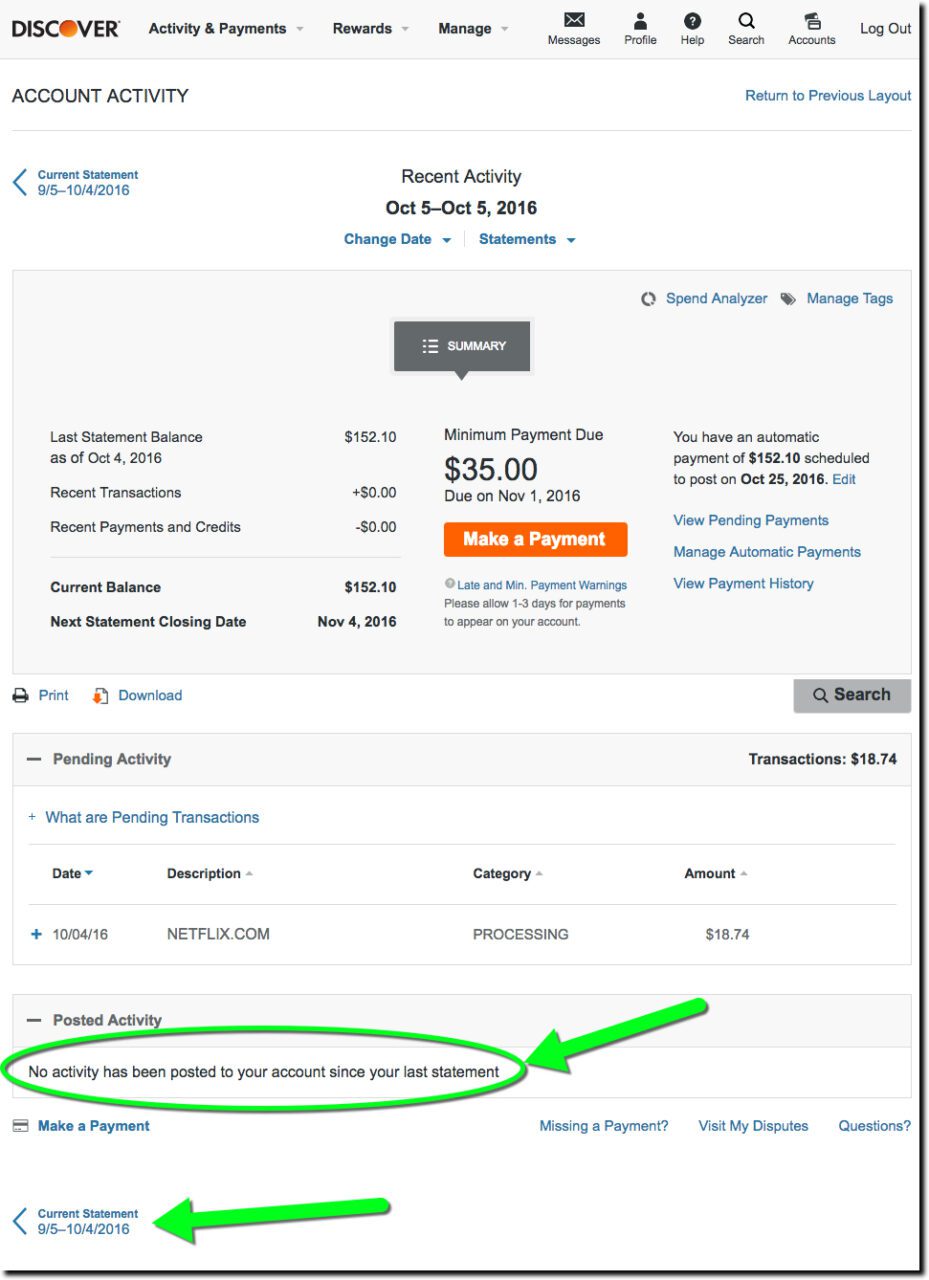
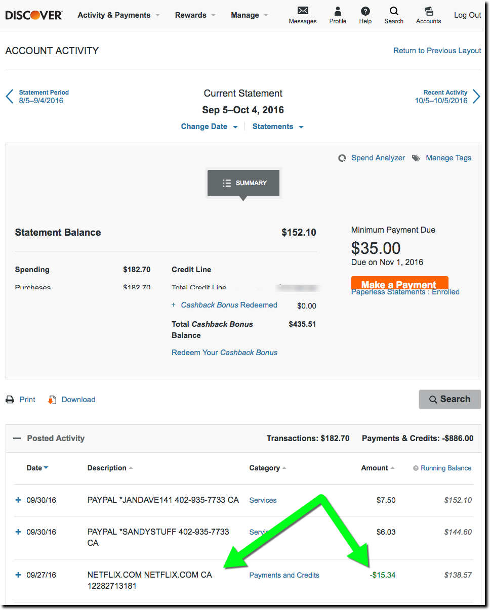
But now I have to play “guess where to click” with the Discover site in order to find my transaction on the previous statement. Not rocket science, but also not super-intuitive either. The obvious starting point is the big orange “recent transactions” button in the middle. But again, that leads only to the current statement. Astute users will find the link to the previous statement (ambiguously called Current Statement) at the bottom of the page. Clicking that leads to a page with the desired transaction, though it’s not particularly called out, appearing in a slightly different font shade and a Payments and Credits description (third screenshot below).

Bottom line: The email is fantastic (A+). The website has a great layout and look (go, orange). But insisting on displaying transactions on a monthly statement basis is so last decade. For the most part, users want to consume transaction data like email. Make it easy to see everything by paging through them and let me flag, pin, label, and mark as unread, significant transactions. For extra credit, put the most important ones on top like Priority Mail (Gmail) or Focused (Outlook Mobile).


Discover card home page (displayed after clicking on link in email above)
1. Discover card home page (displayed after clicking on link in email above)


Discover Card previous statement page.
2. Discover Card transaction page (displayed after clicking “Recent Activity” on homepage).


Discover Card "current statement" page
3. Discover Card “current statement” page

Email Marketing: Third-Party Offers with Deal-Killer Fine Print

Email Marketing: Third-Party Offers with Deal-Killer Fine Print

I’ve complained about similar offers before, but since this arrived in my inbox this morning, I figured it’s time to revisit the issue.

———

Today’s lesson is about third-party offers, where an outside company pays to get in front of your customer base. They are relatively rare in financial services these days because banks and card issuers are wary of being tarred and feathered in social media (or the CFPB) if something goes wrong or the particular marketing permissions were later shown to be lacking.

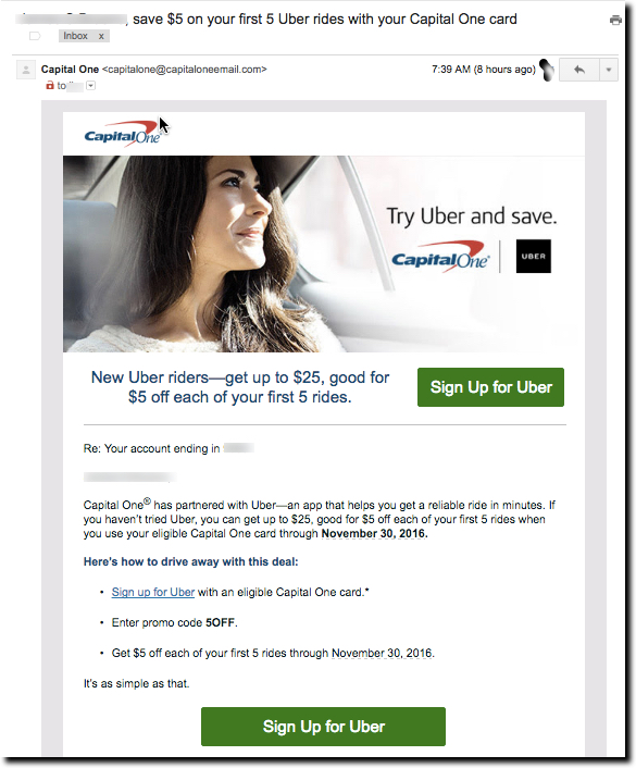
Uber offer from Capital One via email 3 Oct 2016


The offer in question is from Uber. It’s good for $5 off your first 5 rides and requires a Capital One card for payment. That’s a win-win. Uber gets a new customer and Capital One gets its card loaded into the Uber app for years to come.

The problem: It’s only for new Uber customers. I presume Capital One removes cardholders from the mailing who have charged an Uber to its card. But that doesn’t catch people who use another card in their Uber account.

So let’s break down what happens next. Capital One customers get this slick email (see above). They get excited to switch Uber payments over to their Capital One card to grab some $5-off rides. But then, after reading the fine print, or more likely clicking through the message and trying to sign up, cardholders find out they get zip from this deal. Now, they are not happy with Capital One or Uber. What a waste of time and brand loyalty.

Instead, why not give some smaller benefit to existing Uber customers willing to switch their payment card over to Capital One? Even just one $5 off coupon would suffice for most.

Bottom line: Capital One needs to earmark a portion of its commissions from Uber towards existing customers. If there isn’t enough revenue to do that, then it should stop making the offer.

——-

Related: At last mfindevr-sv16onth’s Finovate Fall, MX demo’d, and won Best of Show, for an automated solution called Power Switch to automatically enroll your customers’ cards into e-commerce sites such as Uber, Amazon, iTunes, and so on. Get a behind-the-scenes look at how MX produces its award-winning (six consecutive Best of Shows) at FinDEVr in Santa Clara 18/19 Oct 2016 (register here).

Mobile Monday: The Bank of America “Help” Button

Mobile Monday: The Bank of America “Help” Button

bofa_help_top

I love the minutiae of digital banking. Others may be fascinated with how the blockchain will disrupt global payments or the impact of Dodd-Frank on debit-card rewards. Me, I just need a shiny new button to make my day. And as luck would have it, Bank of America obliged in its latest iOS update (Sep 22, v7.1).

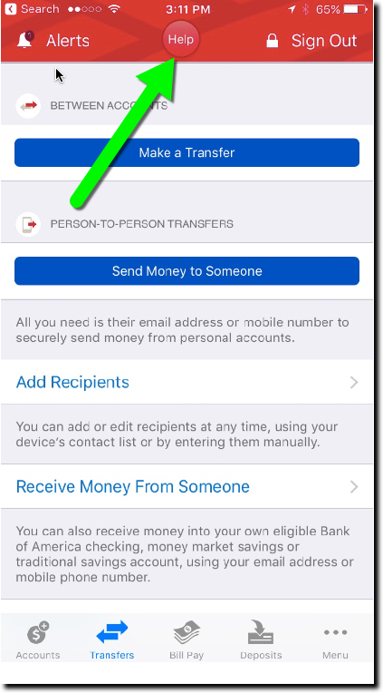
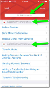
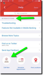
The bank added a Help button centered at the top of the screen on most pages (see above and first screenshot below). Pressing the button leads to a slightly context-sensitive, self-service menu with an “Ask a question” box on top (second screenshot). The search failed my advanced search stress test (Do you have SEP IRAs?, third screenshot), but otherwise seemed serviceable. And it was relatively straightforward to find the right button to connect to an actual human at the call center.

Bottom line: Locating a Help button in a prime position is a good way to show that you care about the customer’s experience. It would be nice if the BofA button led to a better search function, complete with an audio option, and better context-sensitive results (note in screenshot 3, the top result from my SEP-IRA question is “Troubleshooting”). And if I was being totally honest, the button is a little hard to see on a tiny screen, the red on red. But regardless, it’s a good start.

New "Help" button on BofA mobile "transfer" screen
New “Help” button on BofA mobile “transfer” screen
Screen shown after pressing "Help" on Transfer page
Screen shown after pressing “Help” on “transfer” page
Result of search for "SEP IRA" on Help page
Result of search for “SEP IRA” on “Help” page

Mobile UI: Capital One Wallet Reverts to Old-School Navigation

Mobile UI: Capital One Wallet Reverts to Old-School Navigation

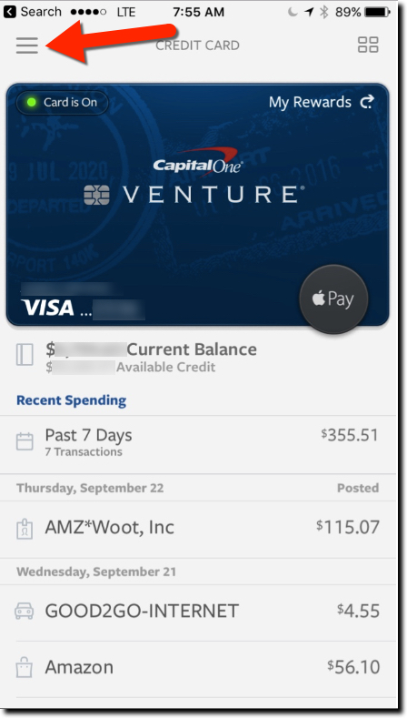
hamburger-menuI am not a huge fan of the hamburger navigation menu. If you are a smartphone native, I’m sure your eyes go right to the little pack of horizontal lines in the corner. But if you got your first smartphone in your 40s, you probably could use a little more help.

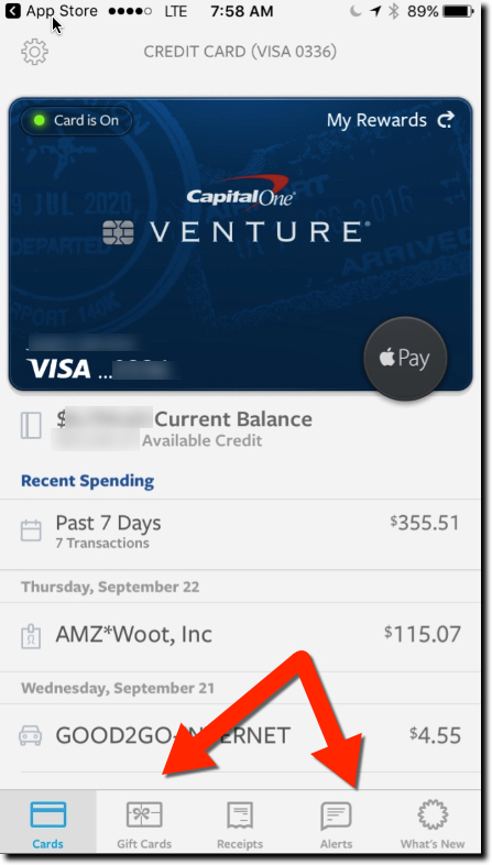
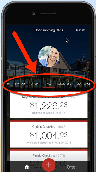
So I applaud Capital One, recently named in Fast Company as one of the best-designed mobile apps (see note 1), which in a 7 September iOS update ditched the so-called hamburger menu for something that’s actually visible on the page. See Fig 1 before and Fig. 2 after. I also learned today that Key Bank made the same decision to ditch the burger, but instead of a lower nav bar, they went with the more web-centric look of a near-the-top nav (Fig 3).
(Update 29 Sep: A reader informed me many banks are ditching the hamburger menu in light of Apple’s design advice here, here and here.)

Capital One Wallet iOS Previous
Fig 1. Capital One Wallet iOS
Previous


Capital One Wallet iOS Current
Fig 2. Capital One Wallet iOS
Current

Unless you are Facebook, Instagram, or other apps where customers spend hours every week, you need to make it easy for infrequent users to find their way through your app. And even though mobile banking is relatively simple, many providers make it needlessly hard to navigate with cute, hidden menus.

I understand why designers minimize the navigation, mobile real estate is precious, and even a half-centimeter devoted to on-screen navigation is a lot. But what’s more important, showing more transactions on the main screen or how to actually do something meaningful?

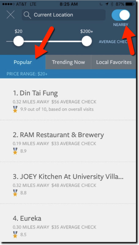
The update also included a new restaurant finder to identify popular eating establishments based on transaction data across all Capital One cardholders (Fig 4). It’s reminiscent of the Citigroup/Microsoft/Morningstar joint venture Bundle (F10), which, not coincidentally, was acquired by Capital One four years ago.

Key Bank iOS app with top navigation
Fig 3. Key Bank iOS app with top navigation


capital-one-wallet-restuarant-finder
Fig 4. Restaurant Finder in Capital One Wallet (iOS)

———-

Notes:
1. Only two financial companies were named in Fast Company’s list of 100+ best-designed products or apps in the October issue. The other was RobinHood, the simple, mobile stock-trading app.