So much of day-to-day banking is either negative or at best, incredibly boring. I spent too much, my payment is late, I can’t remember where that last $40 from the ATM went, and so on. No wonder consumers are less than enthusiastic with their banking relationships.
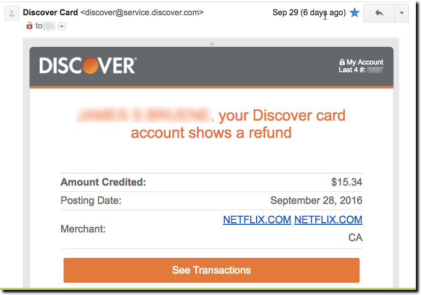
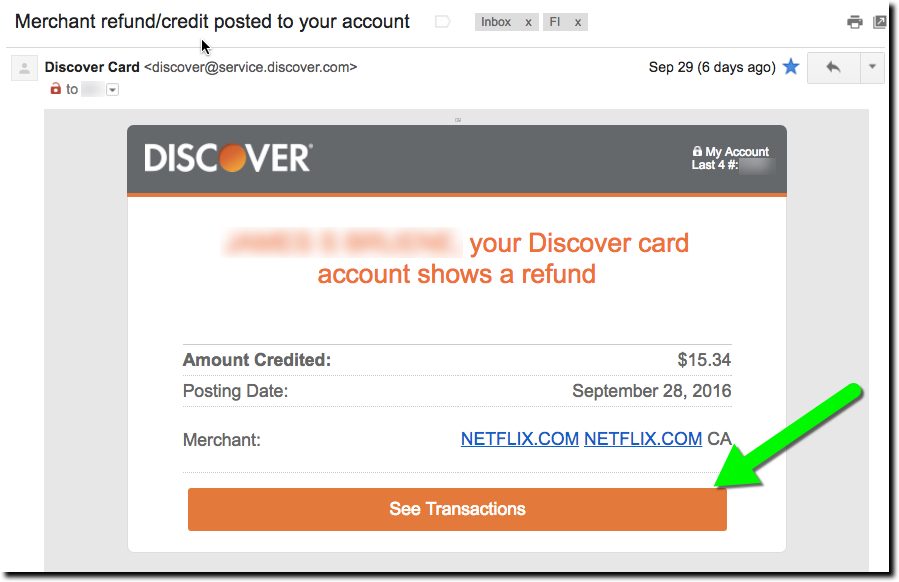
What to do about it? For one, when you have good news, CELEBRATE! And one of the easiest ways to do that is when a merchant refund appears on a credit or debit card account. For example, Discover does a great job with its email. It’s personalized, and clearly shows the date, credited amount and merchant name (including hyperlink to Netflix). And there is a huge button at the bottom to check out the transaction online (not that you’d really need to).
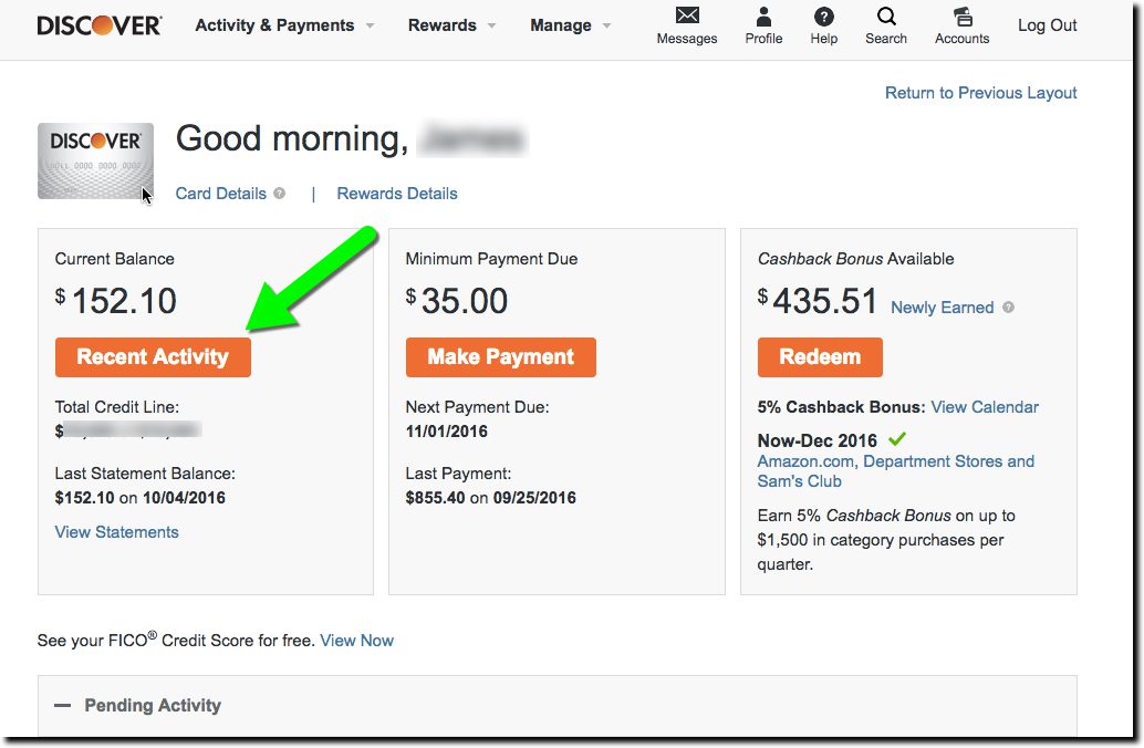
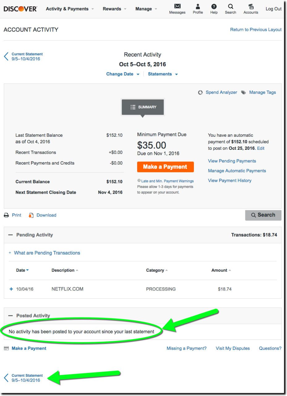
But after clicking through the email, the user experience (UX) gets a bit gummed up. The first webpage displayed is the main secure homepage (first screenshot below). That makes sense since the email button says See Transactions. However, since my statement cycled since the refund was processed, the $15.34 Netflix credit is nowhere to be seen. (Granted, had I clicked on the message when it first came in, the transaction would have been listed on the lower portion of the screen.)
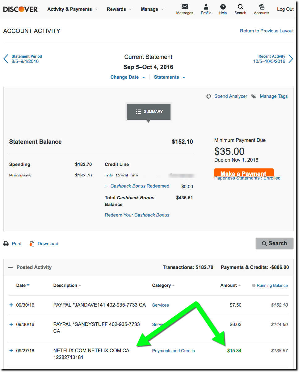
But now I have to play “guess where to click” with the Discover site in order to find my transaction on the previous statement. Not rocket science, but also not super-intuitive either. The obvious starting point is the big orange “recent transactions” button in the middle. But again, that leads only to the current statement. Astute users will find the link to the previous statement (ambiguously called Current Statement) at the bottom of the page. Clicking that leads to a page with the desired transaction, though it’s not particularly called out, appearing in a slightly different font shade and a Payments and Credits description (third screenshot below).
Bottom line: The email is fantastic (A+). The website has a great layout and look (go, orange). But insisting on displaying transactions on a monthly statement basis is so last decade. For the most part, users want to consume transaction data like email. Make it easy to see everything by paging through them and let me flag, pin, label, and mark as unread, significant transactions. For extra credit, put the most important ones on top like Priority Mail (Gmail) or Focused (Outlook Mobile).