Green (Hybrid) Auto Loans from Star One Credit Union

In many ways, hybrid vehicles are the perfect antidote for guilt about our 21st century high-consumption lifestyle. Buy a Prius, and instantly feel better coasting around the city on self-generated battery power. Yet you still get to motor about in a relatively large, well-appointed and air-conditioned steel box (note 1).  

That's why politicians have jumped on this bandwagon in droves. And why it makes a great marketing statement to support energy-saving and/or low-emission alternatives with loan discounts. Not only does it position you as caring about the larger environment, there is a very real environmental education benefit to the efforts.

The most recent exampleStar One Credit Union <starone.org>, a $3 billion (assets), 71,000 member CU based in Sunnyvale, Californiahas a link on its homepage to its hybrid offer. Customers financing a new or used hybrid vehicle save 0.25% on their loan rate. On a $20,000 5-year loan, $139 is saved, enough to fill the tank three, maybe four times. The offer is spelled out here (screenshot below).  

Other financial institutions offering hybrid car loans:

  • UCB Bank (Miami, FL): no payments for 3 months offer here
  • Deedham Savings (Deedham, MA): offer here
  • Sound Credit Union (Tacoma, WA): 0.50% discount offer here
  • Tech CU (San Jose, CA): 0.25% discount offer here
  • Vancity (Vancouver, BC, Canada): Prime rate for low-emission vehicles here

Note:

(1) I'm not trying to be cynical here. As a former engineer, I think hybrid technology is fantastic. Using waste energy to fuel the car is both elegant and efficient, and I look forward to driving one soon.

PayPal Unveils New Homepage (beta)

link to paypal PayPal is offering visitors the option of using a newly designed homepage, calling it a beta version. A small link notched into the top of the screen handily allows users to switch back to the original look.

The design change was needed. PayPal's homepage, which had been so good I often used it as an example of how to focus on user needs, became cluttered over the years. The company now uses "personal" and "business" tabs, a common banking convention that allows the very different constituencies to more easily find what they need. 

The new homepage (below) is dominated by a safety theme, with a large blurred image of a credit card number meant to reinforce its point of being a "safer, easier way to pay without exposing your credit card number." It's a good idea, but the huge blurred image makes me feel like I'm having eye trouble. 

PayPal has also pulled the credit card logos out of the main graphic and put them on their own line. They are easier to see now and will help new users understand they can use PayPal with their existing payment cards.

They also made two subtle changes in the login area:

  • Changed the wording from "member login" to "account login," a more accepted phrase. Most people don't really feel a membership bond from their payment device, and it probably confused a few infrequent users.
  • Added "PayPal" in front of "password," again to make it more obvious to novice users as to what to enter here.

Finally, PayPal finally added a search box (top right), ending its reign as one of the last major holdouts for this common website utility.

Overall, it's a great improvement. And should help with navigation, sales, and support. Given its position as one of the busiest financial destinations on the Internet, we recommend taking a look and comparing it to your own website design. 

For more info on financial institution homepage design, see our Online Banking Report on the subject here.

New PayPal homepage (beta)

New Paypal homepage beta

Current PayPal homepage

Current Paypal homepage

ING Direct Launching in Seattle

I received a mailer yesterday at my Seattle home address announcing ING Direct's upcoming launch in Seattle (see scan below). This version at least was sent only to existing ING Direct customers. Note the inside headline with an appropriate local touch, "Seattle's Getting More Bean for its Buck." 

There are not many specifics in the orange self-mailer, other than "You'll soon be seeing us all over the cityfrom Puget Sound to Lake Washington spreading the savings message." I'll keep my camera handy to capture big orange visuals as the company arrives on the scene.

So, it doesn't sound as if we're getting a famous ING Cafe (see inset, the newest one in Chicago). However, I do have the opportunity to earn a $10 referral bonus by handing out the two detachable cards that came with the mailer (see note 1). The new account holder also earns a $25 bonus. Customers can sign up through the mail using the card, or go online to a special landing page <ingdirect.com/seattle> (see screenshot below).   

Seattle mailer front

ING Direct Seattle mailer front

Seattle mailer back

ING Direct Seattle mailer back

Landing page for Seattle offer <ingdirect.com/seattle>

ING Direct Seattle landing page

Note:

1.  On the above scan, you can only see the top portion of one of two identical perforated referral cards designed to be given to family and friends. Sorry, my 8.5 x 14 scanner didn't capture the entire self-mailer.

Citi Mobile Makes the Homepage

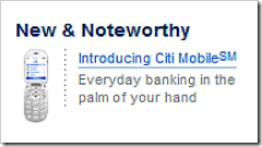
Link to CitiCitibank continues to press its lead in mobile banking services. The banking giant not only runs print and television ads, but also claims valuable left-side real estate on Citi's homepage (see inset for closeup of section; see screenshot below for context; and see note 1).

Since Citi's homepage is relatively cluttered with banner ads, the New & Noteworthy section supported by a small mobile phone graphic should grab a significant number of clicks. The landing page is the same as reported earlier (see previous coverage here).

Citibank homepage 7 Aug 2007

Note:

1. Citibank's homepage as viewed from a Seattle IP address, Aug 7, 3 PM Pacific, from a laptop that has previously visited Citibank.com but that has not accessed a Citi account.

Buxfer is First Banking App to Tap Amazon Flexible Payments System

Today, Buxfer added funds-transfer capabilities to its online personal finance app (see announcement here, previous coverage here). The service is free through the end of August, but could eventually carry 1% to 2% fees to cover transaction costs.

Buxfer co-founder Shashank Pandit has been dangling this bit of news in front of me for the past two weeks. But he would only tell me that they were partnering with a big player to enable funds transfer (note to Amazon attorneys, he did NOT violate the NDA). I figured it would be Chase, Wells Fargo, or perhaps PayPal. Even with the rumors this week of Amazon's new payment services, I hadn't put 2 and 2 together.  

This morning it all makes sense. Amazon.com announced a potentially disruptive payment service, aptly called Flexible Payment System (FPS). And it's announced, in what else, a lengthy blog post at the Amazon Web Services blog (see note 1). The FPS website is here. The company even built an FPS Sandbox where users (see screenshot below), both individuals and companies, can play with the service without moving actual money around.

Buxfer is using Amazon Payments to allow users to settle their debts electronically, a vital piece of a social personal finance app. Online personal finance without payment capabilities is like the Internet without email. Even if the company ends up charging a small fee, the convenience would be worth it for many users. 

Implications
The Amazon service potentially makes it easier for smaller Web-based companies to take on traditional financial institutions. It won't alter the payments landscape overnight, like PayPal did in 2000, but it could usher in a rash of new entrants competing with banks and credit unions for the high-end personal finance customer (note 2). But the big stumbling block: consumer trust still favors incumbent financial institutions. In any event, the game just became more interesting. For more information, see Online Banking Report: Social Personal Finance.  

Buxfer homepage noting Amazon Payments

My default account page at Amazon's payments sandbox (I have not made any transactions, so the ledger is empty)

Note:

1. The post is signed by Jeff, which is Amazon evangelist Jeff Barr, not the slightly more famous other Jeff (Bezos). 

2. Another company using Amazon Payments is FreshBooks, a small-business billing service.

June Online Financial Services Scorecard from Compete

Compete June scorecard

In April, we introduced the Financial Services Monthly Performance scorecard produced by Compete. It summarizes the overall performance of 23 large U.S. financial institutions and lead-generation sites. Refer here for the detailed methodology as well as companies tracked. 

Overall June highlights:

  • Traffic of financial shoppers was up across all product types except high-yield savings which dropped 2%.
  • More important, applications were up across all products ranging from 3% in savings to 26% in mortgage refinance.
  • A total of 2.9 million product applications were booked; 200,000 more than the 2.7 million last month.

Specific financial institution performance:

  • Bank of America improved its credit card conversion rates dramatically, booking a 30% increase in applications despite only 10% growth in shopping traffic.
  • In checking accounts ING Direct, WaMu, and Wells Fargo all increased the volume of prospects looking at checking account options. 
  • Emigrant, HSBC and ING Direct were all able to increase application volumes despite a flat or declining volume of potential prospects.
  • Home equity prospect traffic grew at 12 of 16 providers and conversion rates were improved at 10 of 16. Bank of America, Citibank, Countrywide and Low.com had the largest month-over-month percentage gains in both prospect and application volume (note 1). 
  • In home-purchase mortgages, Low.com nearly doubled its prospect traffic compared to May, while significantly improving lead conversion.
  • In mortgage refinance, Low.com also posted the largest percentage gain in prospects but grew applications at a lower rate, resulting in a significant decline in conversion. Quicken Loans showed greater efficiency, almost doubling application volume with roughly the same number of prospects as in May.

Note:

1. For loan products, leads from lead-generation sites such as Low.com are combined with actual applications at financial institutions into a single "lead/application" category shown in the table.

Welcome Ron Shevlin, Marketing ROI Guru and Guest Blogger at NetBanker

Two weeks ago we introduced you to our first guest blogger, William Azaroff, who has since then posted a couple gems here.

Link to Ron Shevlin's blog

This week we welcome a second guest to the fold, Ron Shevlin, Epsilon vice president and ex-Forrester financial-services research director. Ron blogs about important marketing topics such as ROI, segmentation, and targeting at his blog, Marketing ROI. I named Ron's blog to my "Fave 5" last month (here) and called it "(the) best antidote to all the b.s. circulating online."

There are a number of great marketing bloggers, but what sets Ron apart is his hard-hitting style, strategic thinking, and the frequent use of financial services examples. And as you can tell from the mini-bio appended to his posts (below), he has a keen sense of humor.  

Ron Shevlin is vice president of client solutions at Epsilon. Prior to that, Ron was an analyst at Forrester Research. He opines (translation: rants) about financial services marketing at Marketing ROI: Whims From Ron Shevlin. The opinions expressed here are Ron's, not those of NetBanker, his employer, or any other sane person or party for that matter. 

His first post, Why Banks Aren't Capitalizing on Web 2.0, is here. In the future, you can read all his NetBanker posts by choosing "Shevlin" from our Topic list in the top navigation bar or by searching for "Shevlin" using the site search in the upper left.

Any other industry insiders interested in guest blogging at Netbanker? Drop me an email.

Lending Club’s YouTube Contest Off to a Slow Start

Update July 30: I don't know if it was me or YouTube's search function (probably the former), but I missed at least six other entrants into the Lending Club contest. While I'm still surprised there are so few — as of 11 AM Pacific today, there are 10 total entrants here — that's MUCH better than three. What's more important: several are approriate and relatively clever. The current leader here, and probable winner, has nearly 5,000 views and will be hard to catch. Another thing I missed, the company DID put the contest in its blog here. I apologize for the errors.

Start-up, P2P lender Lending Club is sponsoring a user-generated video contest on YouTube. The most popular video wins $5,000, and in addition to its blog, the contest is also discussed in the lender's Facebook Group (screenshot below). Despite this exposure, the contest doesn't seem to be widely known. We read about it last week on a P2P lending blog called Prosper Lending Review.

Right now, it looks like someone's going to make off with an easy $5k. The contest, which began July 17, and ends on Aug. 10, has only two entrants posted on YouTube, at least using the correct tab "Lending Club." One is recorded so softly, you cannot understand a word of it, another features a guy reading website copy on his couch, and the last one is a dubbed-over 1-minute clip from the Hound of the Baskervilles. I don't want to skew the results by linking to them. Trust me, you don't need to watch them.

And since the winner is the video with the most cumulative plays on Aug. 10, new entrants have less than 2 weeks to rack up more than the 2,000 views of the current leader. 

A few lessons from this effort:

Lesson #1: While the contest is a great idea to generate low-cost buzz, and perfect for a Facebook-based app like Lending Club, the lesson here is that you need to run it longer so the contest can create its own viral momentum. Three and a half-weeks just isn't enough time for the word to get out to enough creative types and for them to get something interesting recorded, uploaded, and for it to catch on with YouTube viewers. In contrast, see our coverage of Intuit's TurboTax Rap which generated more than one million YouTube views (previous coverage here).

Lesson #2: Lending Club was apparently testing the power of FaceBook groups, creating a special one just for the contest called, "Lending Club Contest — Win $5,000." The lender did not mention the contest (see update above) on its website. But unfortunately, the Facebook club has only 57 members after two weeks and doesn't appear to have the horsepower to spike enough word-of-mouth buzz on its own. I'm sure they will do it differently next time.

Lesson #3: You might want to include a clause in the contest rules stating that videos containing pirated content or profanity, are unintelligible or not understandable, are not allowed. That would eliminate all three current entrants. Here's the official rules posted at Facebook.

Bank of America Advertising NSF/Overdraft Protection at TechCrunch

Along with 550,000 other followers of Web 2.0 happenings, I'm a regular reader of Michael Arrington's TechCrunch, although it's harder to keep up with these days as the blog has gone from a couple posts per day to seven or eight. Although I usually read it in an RSS reader, I visit the site once per week or so to read comments.

This week for the first time I noticed financial services advertiser Bank of America, a hardly newsworthy occurrence as Bank of America spent $43 million advertising online last year (here). But the content of the banner proved most interesting (screenshot below); here's what the bank's ad says:

A little knowledge is a powerful thing.
Online Banking Service: Check your balances and account activity so you can help prevent fees.

And the blue button on the right says "Know More Now."

The banner leads to a landing page (here) that discusses a number of topics, but opens to a discussion about overdraft-protection options in the middle of the page (screenshot below). It's very interesting to see a large bank take on this controversial issue in its advertising. It's a good sign that the banking industry is taking the criticisms seriously and is working to educate users on how to avoid fees, even if does impact short-term fee income (see my discussion of how mobile alerts can be used to keep users informed, here).

BofA landing page from TechCrunch ad

LifeLock Buys Full Page in Wall Street Journal

link to LifeLock Want a shock? Open today's Wall Street Journal to p. D3 (West Coast edition).

You'll see a full-page, black-and-white ad featuring LifeLock CEO Todd Davis's social security number in a massive reverse-type, page-dominating format. There is also a 1/4 scale photo of a smiling Davis holding his social security card out to the camera. The ad offers a 30-day free trial using the WALL10 promo code, before reverting to the normal $10/mo price.

The WSJ spread will be less of a surprise if you've seen LifeLock's television spots or website recently, where the same technique has been used for some time (see screenshot below).

Although the ad may partly be for PR in the investment community, the relatively large spend demonstrates just how lucrative, and appealing, financial security services can be. We'll look at LifeLock and the whole identity theft/credit monitoring space in our upcoming Online Banking Report, due out in about 10 days.

Wells Fargo Pushes Mobile Banking on Logout Page

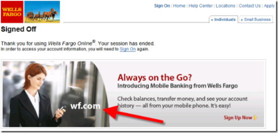
Just two days after announcing its browser-based (WAP) mobile banking service (press release here), it's already showing up in the bank's cross-marketing efforts. When I logged out of my Wells Fargo account this afternoon, I was greeted with this message:

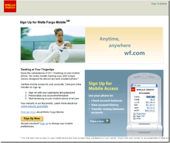
Clicking on Sign Up Now takes you to this topnotch landing page (here). The Take a Tour button in the lower right triggers a short animated demo of the mobile service right on the landing page:

Wells Fargo landing page for mobile banking


Wells Fargo mobile banking login as displayed on Nokia N70Features

The bank is using a new, shortened URL, <wf.com> for mobile access, a huge keystroke advantage over <wellsfargo.com>. Both <wf.com> and <mobile.wellsfargo.com> go directly to a mobile phone-optimized secure sign-in page (see inset). The mobile service offers:

  • account balances for checking, savings, mortgage, home equity, brokerage, auto loan, student loan, and credit cards
  • transaction history
  • funds transfer between Wells Fargo accounts


Note:

1. An interesting side note to the announcement: The first result in a Google search for "wells fargo mobile" still leads to an August 2002 CNet story on Wells Fargo's decision to shutter its original mobile banking platform launched in 2001 (see inset).

Wesabe, Billeo Add Image Capture: Is it the Next Must-Have Online Banking Feature?

Link to WesabeThis past week, two Web-based personal finance firms, Wesabe and Billeo, have announced feature upgrades (Wesabe release here, Billeo here). One common thread: the ability to easily capture screen images of ecommerce transactions and file them for later reference (note 1).

Link to BilleoThe time-saving feature was added to Quicken several versions ago, but it's still not yet supported at any financial institution or credit card issuer (see Online Banking Report: Personal Finance Feature for Online Banking here). While it won't change the world, it sure eliminates one of life's little hassles, the decision each time you transact online as to whether you really should "print out this page for future reference" (and where to store the pesky printout if you do.)

How image capture works today:

  1. Pay a bill or purchase something online.
  2. At completion of the transaction, select "browser snapshot" from Wesabe's drop-down menu or "save & file" from Billeo's toolbar (see screenshots below). 
  3. The image of the transaction confirmation screen is stored within the personal finance area and is available for future reference should there be a problem with the transaction; since it's stored as an image file, it can easily be emailed to a disbelieving customer-service agent. Billeo includes a "forward" button in its vault to make it even easier.

How image capture can be enhanced in the future: 

  1. It will automate the transaction-reconciliation process, scraping data from the confirmation screen and automatically verifying that the transaction was processed against the user's bank or credit account properly. Billeo popup
  2. If not, an email/text alert will notify the end-user of the potential problem.
  3. A template could be provided for communicating with the merchant to rectify the problem.
  4. The scraped transaction data could also be run against a tagging engine to add very specific transaction tags, e.g., the purchase at Amazon could be split into x dollars for music, y dollars for housewares and z dollars for housewares.

Billeo's Screenshot Capture Feature
To save a screenshot of a payment confirmation, or anything else, users select the shopping button on the Billeo toolbar. That causes a popup to appear (see inset for closeup) where the user selects the bank/card account, enters a transaction description if desired, chooses a page type, selects the correct purchase amount from the values scraped from the screen, and edits the date paid if necessary.

Billeo popup provides users a method of capturing payment details along with the screenshot of the page

Billeo page/transaction capture

Page viewed later in the transaction records
Users can view the transaction and/or image file later in two Billeo areas: My Vault (not shown) and MyBills (below). Mousing over the paperclip launches a thumbnail of the page; clicking on it launches a full-size view of the page.


Wesabe's Screenshot Capture Feature

To save a screenshot, users click on the Wesabe button on the Firefox toolbar. A few seconds later, the screenshot loads (second screenshot below) and users choose whether to "upload to Wesabe" or "save to disk" or both. After the picture has been saved, the user closes the screen. In our test, save-to-disk worked as expected, and it was easy to retrieve the file through Windows Explorer. However, although the upload to Wesabe seemed to work, we couldn't figure out how to access the uploaded screenshots within our Wesabe account.

Closeup of Wesabe tool

Wesabe page capture tool 

Full screenshot of page after launching Wesabe screenshot uploader

Wesabe page capture

Note:

1. Billeo has supported page-capture since its 2005 launch, but it was not integrated into the payments-transaction register.