Friday Favorites: Financial Institutions Honor Veterans

Friday Favorites: Financial Institutions Honor Veterans

If there’s one thing Americans can agree on, it’s honoring and celebrating the service of our veterans both past and present. Given the contentious election week in the United States, you’d think U.S. financial institutions would be rolling out the red, white and blue on their websites on Veterans Day today. But there was surprisingly little activity at the major banks. Most had the same old-same old on their homepages. Even Navy Federal Credit Union passed on adding anything extra for the day.

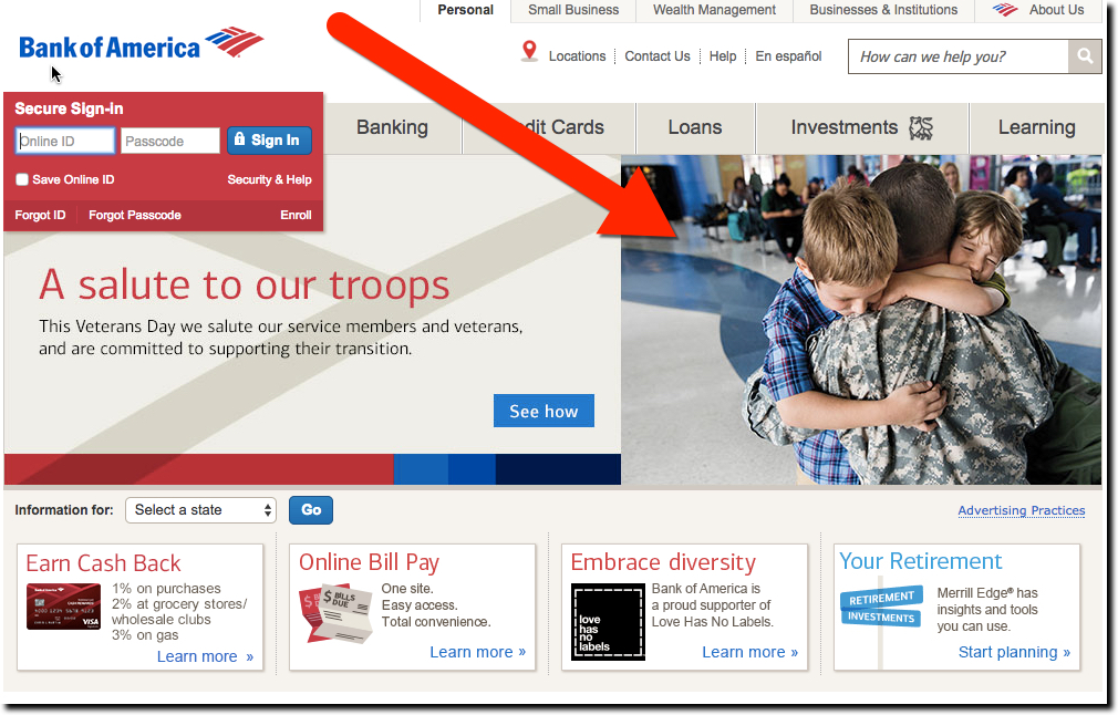
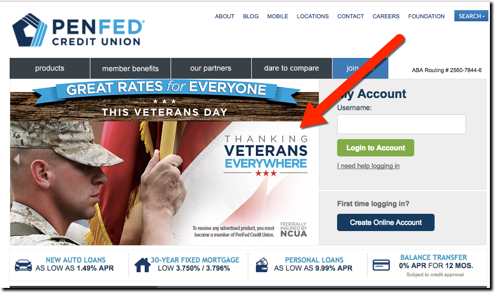
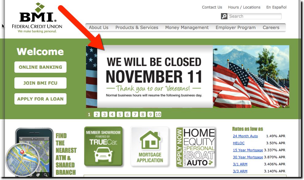
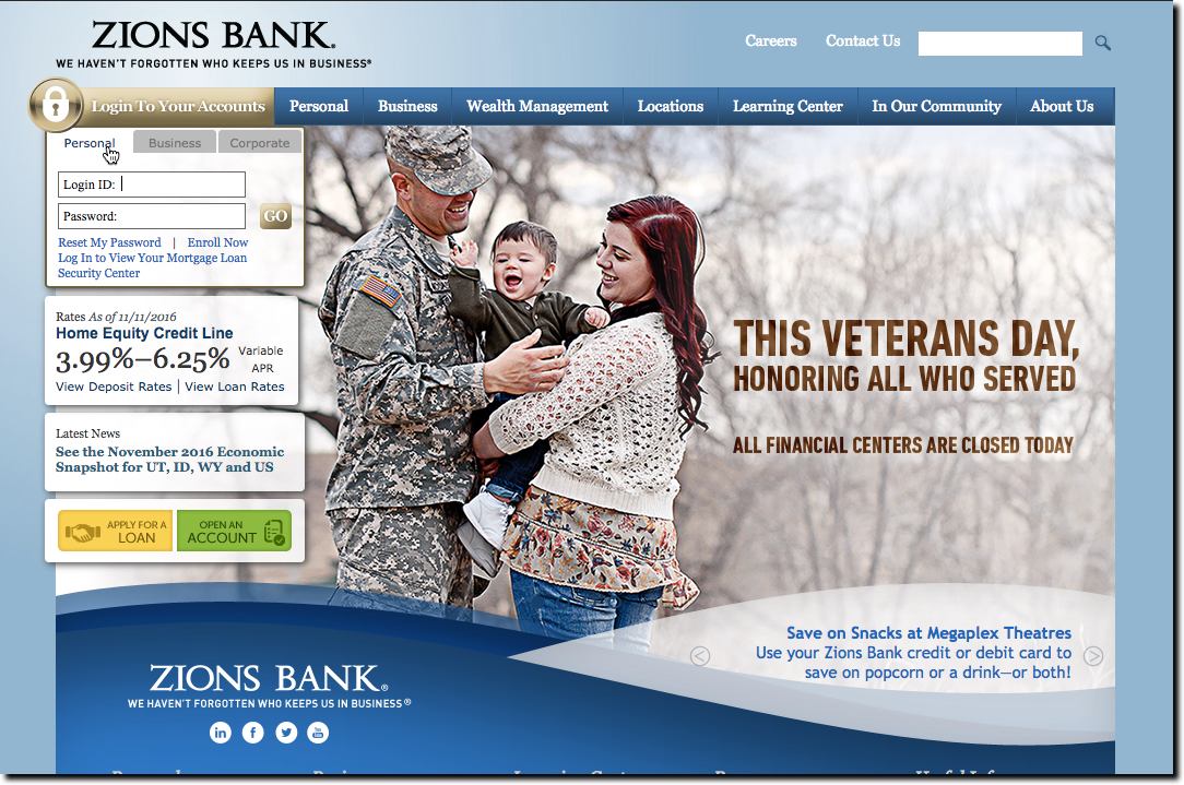
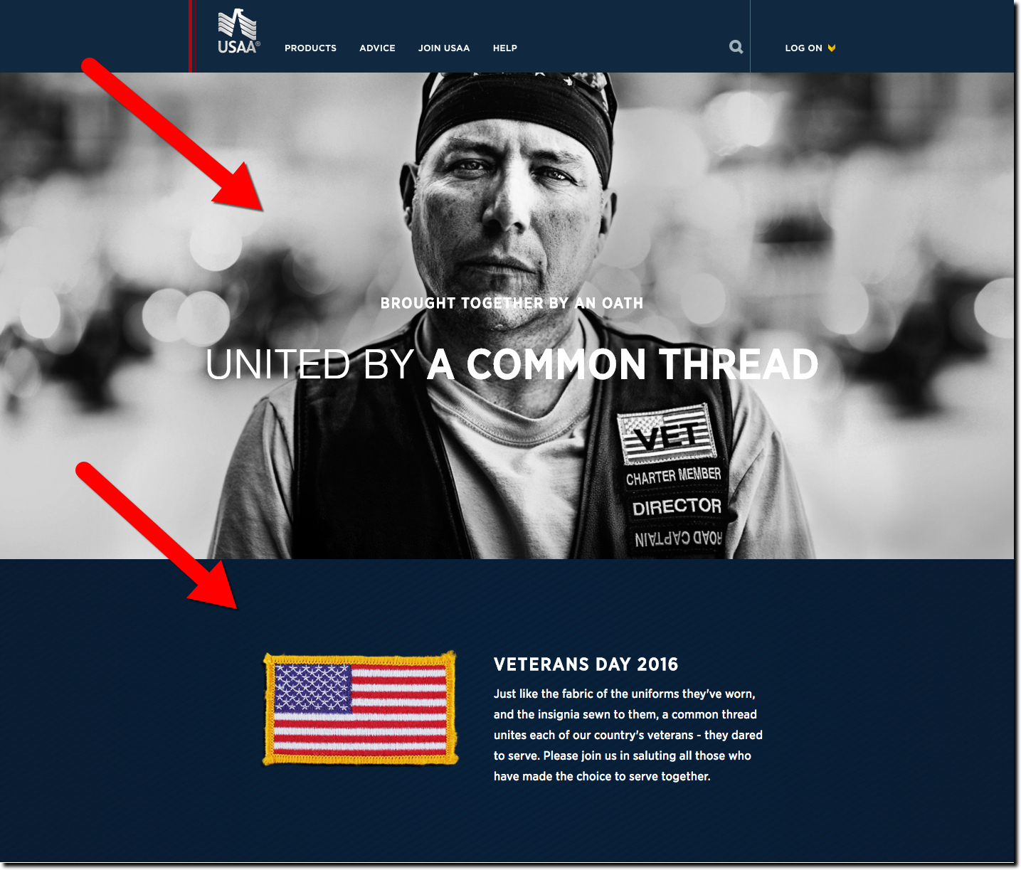
The only top-50 banks with Veterans Day graphics were Bank of America, Zions and of course USAA, all displaying page-dominating graphics on their homepages (see below). We also looked at a few credit unions (at random) and found BMI Federal Credit Union and PenFed honoring vets (see below).

Zions bank homepage featuring Veterans Day homage
Zions bank homepage featuring Veterans Day homage (11 Nov 2016)


USAA homepage on Veterans Day (11 Nov 2016)


Bank of America Veterans Day image on homepage (11 Nov 2016)


penfed-veterans-day-homepage
PenFed Credit Union homepage on Veterans Day (11 Nov 2016)


bmi-fcu-vets-day
BMI Federal Credit Union leads with a Veterans Day announcement (11 Nov 2016)

Mobile Marketing: USAA Embeds Preapproved Loan Offers within Mobile App

usaa_mobile_preapproved.jpg

Now that the U.S. personal credit crisis of 2008 to 2010 is in the rear-view mirror (but still visible), banks and credit unions are getting more aggressive with credit. And guess what new marketing vehicle is available in 2013 that didn’t exist five years ago? Yep, mobile this and mobile that.

So far, the sales component in mobile banking has been minimal. Generally, users must already be a customer of the bank and even pre-registered with online banking. And cross-selling? About the only thing you can buy remotely is an ATM withdrawal.

But that will change as more customers only deal with their bank and cards through mobile apps, a number that is already pushing 30% of the online banking base of Bank of America (see previous post).

Eventually, most financial products will be sold through the mobile app. Not convinced? Look internationally where mobile was a thing even before the iPhone. I still remember Bankinter’s 2007 BAI Retail Delivery presentation where they said 20% of their retail interest-rate swaps were done via mobile phone.

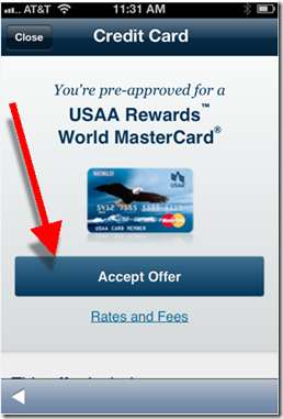
In the United States, we are starting to see banks pushing the envelope. USAA has been the leader in most areas. So no surprise that they are the first (that I know of) to place preapproved credit offers within their mobile app (see screenshots below).

In the bank’s Dec. 2012 update (see inset), it added the ability to:

  • Accept pre-approvals in the app
  • Apply for checking and savings accounts in the app
  • Apply for life insurance after getting a quote in the app

Bottom line: The power of the pre-approved credit offer is well known. Traditionally, snail mail has been the medium of choice. But that’s expensive, time-consuming, and oftentimes not delivered at the optimal moment. Delivering offers via mobile phone can solve all those problems.

And as an added bonus: The sales results will create a better business case for your entire mobile initiative.

——————–

USAA delivers preapproved credit card offer within its mobile app (Dec 2013)
Note: Screenshots shown are from a customer with an existing USAA life insurance relationship.
Price disclosures (right screenshot) displayed after clicking “Rates and Fees” under “Accept Offer” (left screenshot)

image         image

Source: comScore Q4 2012, Mobile Financial Services Advisor

————————–

Note: We cover online mobile delivery and marketing in depth in our subscription-based Online Banking Report.

Mobile Monday: Insurance Companies Expand App Functionality to Keep Users Engaged

imageInsurance companies have put together some of the more engaging mobile apps in the financial space. But  then, really, they have little choice. Unlike banks, insurance carriers (not including health) don’t have the luxury of a locked-in audience checking their account multiple times each week (note 1).

Unless you are in the middle of a claim, how often are you going to pull up your provider’s mobile app? (If you even remember you downloaded it). Maybe when the bill is due, if you are in the minority not on automatic payment. Maybe every few years when you switch out a vehicle or decide to tweak your coverage. But on average, it’s just not going to be top of mind (or phone).

Yet, insurance companies have a big incentive to get you to use it:

Process improvements, cost savings and a better customer experience when filing a claim

imageSmartphone users can do much of the claims process, including online monitoring, right from within their app (see USAA inset). They can even use the smartphone to snap pictures and shoot video right at the accident site. This could have a dramatic impact on claims management and fraud protection. Smartphone apps can also be used to track driver performance to improve underwriting and fine-tune prices.

So, insurance companies go over the top to make the app memorable and engaging. The examples below provide a glimpse of the breadth of insurance company mobile services.

  • GEICO has eight apps. Besides the usual functionality is its main app, users may choose from three different skins (see #1 below). Either the famous gecko lizard, or the newer baby pig, or the standard corporate logo.
  • State Farm has four apps including MoveTools for planning and scheduling a household move (#2 below).
  • Allstate has eight apps ranging from typical policy holder stuff, to apps that track your home inventory (#3 below), driving performance (#4) and motorcycle trips (#5).

————————————–

1. GEICO lets chooser change the app "skin" (26 April 2013)
Note: The default app uses the famous lizard in the background. But I changed it to the pig which is now shown on the main screen.

image      image

2. State Farm MoveTools helps plan a household move (iPad)

image

3. Allstate’s Digital Locker for tracking home inventory

image

4. Allstate’s Drivewise app syncs with special hardware to track driving performance

image     image

5. Allstate’s GoodRide is designed for motorcycle enthusiasts

image        image

———————————-

Note:
1. This is one of the reasons why we believe banks have a huge opportunity in all types of insurance. See our full report here (Dec 2011, subscription)

Mobile Monday: USAA Taps the Mobile Camera for New Account Opening

USAA ipad app offers mobile check deposit The smartphone has already changed the way we work, communicate, find information, and behave. But it’s had a limited role so far in bank-account opening (note 1).

But leave it to USAA, the pioneering bank for all things mobile (note 2) to lead the way again. First reported this week in American Banker, USAA is testing the use of “blank check” capture to make it easier for certain new customers (note 3) to make their initial deposit (note 4).

Customers can snap a picture of a blank check from their old account and then enter the amount to be transferred electronically (note 5). It’s not really any faster, actually probably slower, than simply typing in a checking account and routing number (twice). But given how frustrating data entry can be on a mobile, some users will love it.

More importantly, it introduces users immediately to mobile capture and removes one more barrier to getting that first deposit on the books. And it makes USAA look cool.

—————————————–

Notes:
1. At Finovate, we’ve seen the mobile camera used in a number of interesting ways. oFlows (now a part of Andera), wowed the crowd in 2009/2010 with various paperless account-opening and -processing technologies (for example, check out its FinovateSpring 2010 “Best of Show” demo).
2. USAA launched mobile remote deposit 18 months before any other major bank and a full 3 years before Bank of America (see our 2009 post).    
3. Only certain USAA members are eligible to use mobile deposit (generally, those with military service or their family members who have acceptable credit).
4. Unfortunately, USAA doesn’t yet support full mobile account opening. New customers must first go online and establish a new account and register a username and password. Then they must go to USAA mobile banking, log in, then take a picture of the blank check. Furthermore, only certain USAA members are eligible to use mobile deposit.
5. In the United States, the funds are moved via ACH, a little-understood system that banks could do a better job explaining to customers. See a rundown of the mysteries of ACH from the customer’s standpoint in this enlightening Deposit Account post from yesterday.

Mobile Marketing: Leveraging the iPhone App Update Process

image As customers have adopted ever-more convenient delivery methods, the customer communications process has changed dramatically. Each channel has its own ways of communicating with customers:

  • Branch/mail: Signage, statement inserts, chance conversations in line, direct sales pitches
  • Phone: On-hold messages, prompts on the phone tree, direct sales pitches
  • Online: Email, interstitials, display ads, website content, popups, online chat
  • Mobile: Similar to online plus notifications, text messages and app updates (see below)

In the mobile channel, the process for updating native apps provides a unique marketing opportunity that is virtually without cost and guaranteed to be read by a large portion of your mobile customers (previous post). App publishers have a screen of free real estate to explain the benefits of the new feature(s).

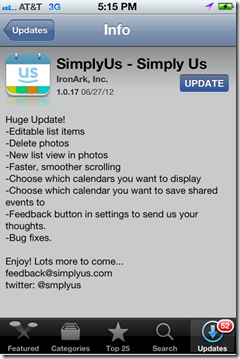
I’ve read thousands of these update descriptions and there is huge variety of approaches. Some publishers take maximum advantage of the “free publicity” to engage their customers (see Yelp below), pump up the new features (see USAA), and seek additional feedback (see Redfin, SimplyUs examples).

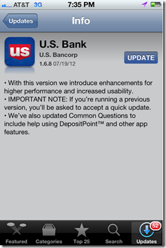
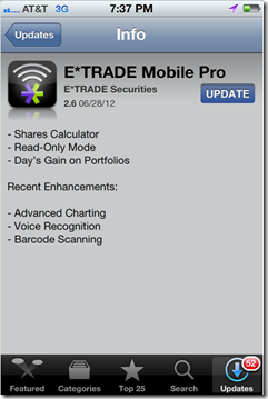
Other publishers don’t pay enough attention to readability (Wells, Bank of America, US Bank examples, see note 1) or just put the minimum effort into a bulleted list (E*Trade). 

Bottom line: Each time you push out a new update, use it as an opportunity to educate users and reinforce your mobile brand.

——————————-

iPhone App Update Examples

Good
———

Yelp reinforces its playful brand with        USAA is more matter of fact, but  
enthusiastic and humorous copy                   does a good job highlighting new
announcing its v.6.0.                                           features in its v.4.9.

image     image

Redfin released a minor bug fix in             SimplyUs gets right to its bullet
v.3.3.2 but includes its email address        list of features, with just enough
to report any issues.                                           info to explain the v.1.0.17 update.
Nice touch!                                                            Plus email and Twitter handle.

image     image

Need work
——————

Wells does an OK job, but the first               Similarly, Bank of America has an
bullet reads like something lifted from        acceptable message for its v.3.3.351. 
project checklist. And the second                  But the copy is a little confusing and
is too long-winded. Plus, a floating             has an asterisked point floating mid-page.                       “Bug fixes” hovers at  the bottom                        
of its v.2.1 update.

image     image

US Bank’s v. 1.6.8 message is                    E*Trade’s 2.6 update sounds like it
confusing. Something about being             has a bunch of new features, but
asked to accept a quick update, but 
         it did nothing but list them with
no specifics on why or what has                no explanations.
changed.

image    image

—————–

Note:
1. These examples were all taken from updates I downloaded today. They are not necessarily indicative of every update from these companies. At major releases (such as Yelp’s v6.0), most publishers will step up the copy-writing quality.

Mobile: USAA Introduces "Stay Logged On" Option for iPhone App

imageI’m not sure if this is normal or not, but I enjoy the process of updating the 100-some apps on my iPhone. I’m always interested in what’s changed and how the company communicates the new info to users. I’ve noted before that banks aren’t good at leveraging this customer touchpoint, but they are getting better.

USAA mobile banking update v4.0 wit "stay logged on" In the latest round of app updates, I noticed a nice improvement from USAA (see inset; note 1). Instead of automatically logging you off whenever you move out of the app, say to take a call or fire off a text, the bank provides the option of staying logged in for up to 20 minutes.

Sure, there’s a tiny risk that if you were to lose your phone or loan it to someone during that time, they could get into your account. But your average smartphone thief is unlikely to click on the USAA button during those first 20 minutes. And even if they did, it’s unlikely they could do much with the info.

Bottom line: I want this option on all my banking apps.

———————

Notes:
1. This iPhone update (v. 4.0) was pushed out, 8 Nov 2011
2. For more on mobile banking, see our subscription publication, Online Banking Report.

USAA Promotes Teen Checking Accounts

image

In doing some initial research for a report we are planning for Q1 on “family bank accounts,” I started where I usually do, on Google. The only financial institution advertising specifically on the term “teen banking” was USAA (see note 1).

The top-of-the-page ad led to a well-designed landing page devoted to Teen Checking (see screenshots below) with a clever call to action: 

We won’t take any of your teen’s allowance.
Teen checking without hidden fees.

USAA even has a dedicated site with its own URL to support its youth-banking efforts: https://my.usaa.com

Relevance for NetBankers: Teenagers may be one of the most lucrative segments to attract to your financial institution. They not only spend billions themselves, but also could literally stick with you for a lifetime.

The thinking goes something like this:

  1. Attracting the children of your customers helps you retain the parents
  2. Retaining the parents helps you retain the kids as they become young adults
  3. Young adults become parents
  4. Repeat

This didn’t work so well in the old branch-based world because one of the first things the kids did when they moved away was open a checking account at the closest branch to their new apartment or dorm room. In an online/mobile-centric world, that no longer has to happen. 

Google search for “teen banking” (see note 1; search conducted at 5:00 PM on 11 Jan. 2011 from Seattle IP address)

Google search for "teen banking"

USAA’s “Teen Checking” landing page

USAA's "Teen Checking" landing page

Notes:
1. First-page organic results included (note, search was limited to items posted in past month) 
— Fremont FCU
— North Shore Bank
— Coast Hills FCU
— U.S. Bank (Visa Buxx)
— S.T.A.R Community Credit Union
— American Riviera Bank (my new favorite bank name)
2. If anyone wants to point out great examples of teen/youth/family banking efforts, please drop me an email jim@netbanker.com or leave it in the comments. Thanks.

Financial Companies Dominate Groundswell Awards in North American B2C Category

imageIt’s not often that financial services companies take home multiple trophies in a cross-industry retail-marketing competition. But last week, they took home almost half the top prizes in Forrester’s Groundswell competition for the best use of “social” techniques in their marketing efforts.

Financial companies won nine of 20 possible honors including three of seven category winners and six of 13 runner-up awards (called “finalists“). Four of the winners were in tax prep, a surprisingly social activity.   

The financial category-winners:

Financial runner-ups (aka finalists):

  • Listening (of 3 total)
    — Listening to the Student Pulse by Bank of America and Communispace
  • Talking (of 2 total)
    — American Family Insurance on Facebook by American Family Insurance
  • Energizing (of 2 total)
    — TurboTax Embraces Customer Reviews for Viral Growth by Intuit, Inc.
    — USAA Implements Ratings and Reviews by USAA
  • Supporting (of 2 total)
    — Get it Right Community by H&R Block
    — Taxes on Twitter: @TeamTurboTax Provides Customer Support and Resources by Intuit Inc.

Intuit’s TurboTax division alone accounted for three of the nine financial winners. USAA bagged two awards and H&R Block, Chase, Bank of America and American Family each received one Groundswell award.

USAA is Amazing

imageHow did USAA become the most innovative bank in America? I guess its big-bank competitors have been kind of preoccupied with other matters the past few years. And because USAA serves most of its 5 million banking customers remotely, it stands to profit from pushing the envelope in online/mobile delivery. 

The latest proof that the bank is both innovative and adored? Posting user reviews right in the middle of the homepage, an inventive and unique approach. And with an average score of 4.7 out of 5 for both checking and auto insurance, the reviews serve as a transparent and effective mass endorsement.

Here’s the breakdown of scores received on 6,350 total reviews for USAA’s free checking account (as of 12 Aug 2010):

     5 stars (excellent) >>> 5,550  (87% of total)
     4 stars (good) >>>>>>    329  (5%)
     3 stars (average) >>>>   154   (2%)
     2 stars (fair) >>>>>>>    110   (2%)
     1 star (poor) >>>>>>>     214  (3%)

Relevance for Netbankers: Frankly, I never thought I’d see user reviews posted anywhere on a bank site, let alone the homepage (note 1). If your customers love you, I mean really love you, customer reviews posted directly to an in-house site is a great way to prove it (note 2).

USAA homepage (12 August 2010)
Note: Ad on top for its new Auto Circle car-buying service, complete with its own iPhone app.


image

Notes
1. Bank of America also posted user reviews on its site, but the feature appears to have been discontinued a while ago. The last reference I could find on Google about the reviews was in Jan. 2008.
2. This would not be an easy project and would require a significant investment in ongoing monitoring and maintenance. More importantly, it requires a thick skin; your organization would have to be comfortable with a certain amount of complaints being posted. As good as USAA’s overall score is, there are still 314 poor reviews posted, 3% of the total. But allowing customers a salient vent-fest on your website may keep them from doing so in more public venues such as Twitter. It also gives you a chance to respond to and resolve posted problems.

Mobile Remote Deposit Capture by the Numbers (thanks USAA)

image I love it when first movers decide to brag about their results. For years, Bank of America has released frequent updates on the size of its online/mobile-banking user base (June 2008 figures). Given the bank’s massive market share, those figures are a great help in sizing the entire U.S. market.

USAA is now doing the same for the fledgling consumer-remote-check-deposit market. USAA was the first major financial institution to introduce the service a year ago. Earlier this month, Chase Bank became the second major bank to offer mobile capture.

In a press release last week, the direct banking giant said that more than 1.5 million checks, worth $930 million, an average of $620 per item, had been deposited through its mobile remote deposit app released last summer. Mobile accounts for about one-third of the bank’s consumer remote-capture volume. The online version, introduced in late 2006, still outnumbers mobile volume 2 to 1.

USAA’s banking division has 5 million customers in total.

Here’s a quick summary of USAA remote-deposit stats:

     1.5 million checks deposited via mobile app (35% of total)
     2.8 million checks submitted via online/scan remote capture (65% of total)
  = 4.3 million total remotely deposited checks (100%)

The current run-rate for mobile-deposited checks is now 2.5 million items annually worth more than $1.6 billion.

The bank also said that 95% of all checks are deposited without a teller. The bank did not provide a breakout of how many non-teller checks came through remote scanning vs. mail.

USAA Makes Mobile Banking Better than Online Banking

image Here’s a test that tells you when you’ve built a successful mobile app:

  1. Place your laptop next to your iPhone/Android
  2. Choose a task
  3. Reach for the device that’s easiest to use for that task 

If you don’t reach for the mobile phone first, you still have work to do on the user experience. 

I’ve always chosen the laptop for banking, even though I’ve ported more than a dozen other routine tasks to the iPhone (note 1). The hassle of logging in with those tiny iPhone keys pushes me to the laptop. But as of Tuesday, USAA’s latest iPhone app, version 2.2, has changed the equation, and there’s no looking back. 

Mobile vs. online banking
The key to making mobile a profitable channel is to make the user experience BETTER than online. And USAA is the only U.S. financial institution doing that today.

USAA’s biggest mobile “wow” is mobile check deposits (see Deposit@Mobile screenshot below) introduced six months ago for the iPhone. While it may not seem novel to those in the industry familiar with scanner-based remote deposits, the average consumer considers an iPhone check deposit to be almost magical. Other than a few small credit unions, no other major banking competitor offers it, so USAA continues to own mobile magic.  

imageBut with Bank of America rumored to be readying a launch mobile deposits, which will no doubt be featured in Apple TV ads, (see latest one here), USAA needs to keep innovating. 

And this week, USAA delivered with a single-PIN login with authentication powered by VeriSign VIP service. The optional 4-digit sign-on process is available now on the iPhone and will be available in April for Android and “shortly thereafter” for Blackberry (note 2).

In a time when it’s more tedious and less secure to log in online, USAA takes us back in time to a simpler day, when you could log in with just a few digits.

And by using techniques that authenticate the mobile phone during login, the bank says that mobile access is more secure than online.

Think about that for a moment. Mobile is MORE SECURE than online. With tens of millions of customers deathly afraid of logging in via their virus-laden PCs, imagine what that could do for mobile adoption.

It will take time to educate the market. Currently, most consumers believe the mobile channel is far less secure. But if they can be convinced the opposite is true, many will kiss online banking goodbye forever.

Notes:
1. According to yesterday’s release, USAA has 1.3 million mobile users, 17% of its 7.4 million customer base.
2. Previously, USAA users were required to sign on with username, password and PIN. The simple sign-on process is optional for those not trusting the simpler process.
3. For more info on financial services opportunities on the iPhone, see our March 2009 Online Banking Report.
Numbers: Remote Deposit Penetration at Randolph-Brooks FCU

image In an article in today’s Austin Business Journal about the coming launch of mShift-powered mobile remote deposit at Randolph-Brooks Federal Credit Union, the CU revealed its penetration number in its EasCorp-powered, home-scanner-based service, eDeposits:

Total members: 300,000
Total checking account customers: 202,000
% of checking using remote deposit: 5%
Number of remote deposit users: 10,000 (derived)
% of members using remote deposit: 3+% (derived)

The San Antonio, TX-based credit union expects more mobile users than in-home users. The product, which debuted at Finovate on Sep. 29, is currently being tested with employees before it rolls out to select customers.

imageUSAA was the first major financial institution to launch mobile remote deposits in August.  But WV United beat them to market in July earning our OBR Best in the Web award. And this week, speaking at BAI Retail Delivery, Bank of America’s Doug Brown was bullish on the feature, leading many to believe that the giant would add the feature to its mobile offering at some point (see note). And if that happens, it’s not inconceivable the feature could show up in television commercials, either from BofA or Apple.

Note:
1. In response to an audience question after his presentation, Brown said that the bank was seeing 1 million envelope-free deposits made at ATMs every day, and “there was an obvious use-case in mobile”. Note that he did not specifically say, or even directly imply, that BofA would launch it, but he also didn’t dismiss the idea.