50 Banks and Credit Unions Have Facebook Pages

imageFour months ago (here) I wrote about how easy it was to set up a company page in Facebook. Even a total novice like myself could create one in a few minutes.
There hasn't exactly been a rush to do it, but approximately 50 financial institutions have posted a free company page on Facebook (see note 1). Although, most are simple "white page" listings with no more than logo, address, phone number and URL, it's still better than nothing.
(Update Mar 7: Please note, I am talking only about Facebook "pages" here. There are several banking "groups," notably Chase +1 with nearly 50,000 members, that are far more active. Also, some FI pages , such as TD Money Lounge and RBC Bankbook, do not show up in my search using "bank" and "credit union." Consider these counts approximations. )

Credit unions have three times as many as banks. Credit union's can often move faster because of their size and culture. Here's the count by financial institution type:

  • 10 North American banks
  • 32 North American credit unions
  • 8 banks outside North America

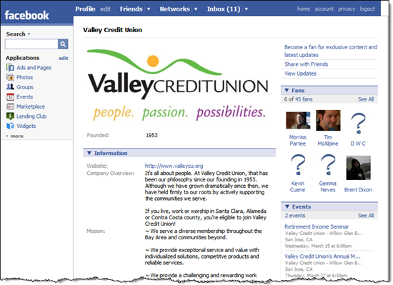
The only banks with more than a handful of fans are Jordan's Arab Bank with 145 and HSBC Bank Egypt with 89. Silicon Valley's Valley Credit Union (screenshot below) leads in the U.S. with 45 fans.

Valley Credit Union Facebook page

There's also one bank branch that's taken the initiative to post a Facebook page. U.S. Bank's Beaver Valley, Ohio branch (here) is one of the few to have posted something interesting, a $100 Super Bowl contest. They've also posted their branch hours (see screenshot below). 

US Bank's Beaver Valley branch Facebook page

Note:

1. I counted financial institution pages by using Facebook's site search for "bank" and then for "credit union." To qualify the FI had to at least post the bank's logo and URL. There were also a few placeholder pages with no logo.

2. For more information on social media and online personal finance, see our Online Banking Report #144/145.

U.S. Bank Uses Login Splashscreen for Security Warning

The best way to get the attention of your online banking customers is by dropping a landing page in front of them right after they login. It’s a bit annoying, but if used judiciously it can be extremely effective. PayPal has been using this technique for most of the eight years I’ve had an account there.

U.S. Bank is fairly new to this technique, using it just a few times a year for service-related messages. The latest, a 100-word message that reads like it was crafted by the legal department, was posted on Nov. 29 and warned customers about fake emails (screenshot below). 

It’s a good idea to remind customers about your email policies to help them avoid scams. However, U.S. Bank only warns against low-tech fakes asking for account info or PINs. Few consumers would fall for that any more. The bank fails to address the more common, and far more effective, approach of sending users to a fake website via a disguised link. The bank should explain what a genuine U.S. Bank email looks like and how to tell it apart from the fakes. 

A few other ways to make this message more effective:

  • Link to an area on website for more info on security
  • Provide an email address and/or phone number to call if there is a question about the validity of a bank message
  • Use a professional copywriter to craft a clearer and more concise message
  • Use a larger font
  • Use a heading or subheading that introduces the specific subject 
  • Add a graphic to make the topic standout, for example the security image from U.S. Bank’s homepage (inset above)

Schwab Promotes 4% APY Checking Account on Homepage

I never thought I'd see the day that Charles Schwab featured a checking account on its homepage (see note 1). Even Schwab, that built its business catering to do-it-yourself individual investors, wants a piece of those cash balances sitting in non-interest checking or low-rate checking/savings accounts.

With many major banks still paying next to nothing on deposits (as low as 0.10% annually on savings, see note 2), direct banks and other non-traditional outlets are still looking to grab deposit share even though most have dropped their promotional rates below the magic 5% mark (previous coverage here). 

Schwab.com homepage (18 Oct. 2007, 11 a.m. Pacific)

Schwab login page (18 Oct. 2007, 11 a.m. Pacific)

Schwab login page with checking promotion


Note
:

1. The bank promotion is on Schwab's main site, NOT a special landing page or Schwab Bank page.

2. Memo to US Bank: Don't you think it's time to raise your savings account rates? I have my checking account at US Bank and was thinking of parking some cash for a few weeks in an interest-bearing account. But I was shocked when I looked at the rates. There is nothing I could apply for online that would pay more than 0.40% and most paid just 0.10% (see inset).  

That's no typo; one-tenth of one percent on savings accounts across all balance levels. That's less than a $1 per month on a $10,000 balance! Pre-tax.

There's only one deposit account that cracks the 1% mark, Maximum Money Market, which pays 2% to 2.5% for balances greater than $10,000. But you can't even apply for that one online, you have to visit a branch. 

I don't care how much you make on the so-called lazy money, a rate page that looks like US Bank's (see screenshot above) is a marketing and PR disaster.  

US Bank Pitches Electronic Statements at Login

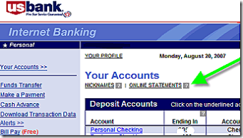
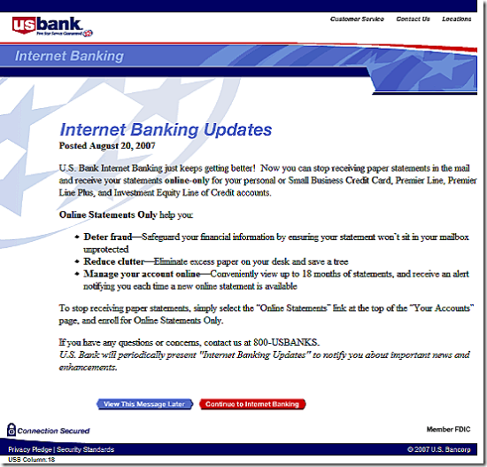
Using a splash screen after logging in to online banking (see screenshot below), U.S. Bank is asking customers to move to electronic statements, specifically for credit card and loan accounts, although the online-only option is also available for checking accounts. I saw the message, dated Aug. 20, for the first time today. I've been a customer of U.S. Bank through the entire online era (note 1) and this is the first time I recall being asked at login to go paperless. Unlike PayPal, BofA, and others, U.S. Bank rarely uses the login splash screen technique. 

Let's look closer at the bank's pitch:

Title: Internet Banking Updates
NetBanker comments: OK…but would be more effective if it directly mentioned the purpose of the message

Opening line: U.S. Bank Internet Banking just keeps getting better! 
NB comment: That's a bad opening line. This is not a new feature. Some U.S. Bank customers have had electronic statements available for 13 years now. Everyone customer has had them for at least 9 or 10 years. The only new thing is that you stop receiving paper statement, hardly the "bank getting better." Most customers know this is a cost savings move for the bank.

Benefit statement (bullets): Online Statements Only help you: Deter fraud, Reduce clutter, Manage your account online….
NB comments: Beside the grammatically challenged opening, the bank did a good job getting the anti-fraud message into the first bullet. The second bullet, "reduce clutter," is OK, but the third is pretty weak. Why are you telling online banking customers they will benefit from "managing your account online?" And only 18 months of archives is hardly going to give customers a good feeling about doing away with their paper statement.

US Bank's online statement signup Call to action: The bank provides specific instructions on how to turn off the paper statement.
NB comments: The specific instructions are good, but a small graphic of where to click would be more powerful (see the example at right). Also, the choice to view the message later is a user-friendly option.

Overall graphic design: The splash screen is laid out like a letter.
NB comments: That's OK, but a graphic image or two would give it a more modern and professional image.

Overall grade: C
NB comments: The bank does a good job getting right to the point. But the overall look and feel along with some of the specific copy points lower the score. This would have been an A- in 1997, but a decade later, Internet users expect and deserve a more sophisticated message.  

US Bank online banking splash screen

Note:

1. Full disclosure: I was the lead product developer on U.S. Bank's online banking system launched in 1994.

Mobile Alerts Can Help Stem the Tide of Overdraft Fee Disclosure Regulation

MarketWatch article It looks like overdraft fees will be a popular target this election cycle (see inset). It's an absolutely predictable, and avoidable outcome, had banks done a better job of helping customers avoid debit card-induced fees (see previous coverage here).

But the genie is out of the bottle now, and the goose that laid the golden egg may soon be dead, or at least restricted to quarters (how's that for a mashup of metaphors in one sentence..sorry, sometimes you just need to get them out of your system).

The most onerous of current proposals making the rounds on Capital Hill calls for real-time notification of pending overdrafts at the ATM and point-of-sale. While that's probably not technically feasible in the short-term, it demonstrates just how expensive the remedies could be.   

Today's Center for Responsible Lending press conference announcing its finding that in 2005 banks levied $17 billion in overdraft fees plus $8 billion in NSF fees (see note 1), is sure to receive plenty of press for the next 15 months or longer. For example, the headline that made it into Dow Jones's MarketWatch today (see above) includes both "gouged" and "abusive," both dreaded terms in banking circles. 

So it's time to be proactive in education about overdraft-protection options. That includes aggressive marketing of systematic protections, such as automatic transfers to cover shortages and early-warning options such as email alerts (see note 2).

Mobile Banking to the Rescue
From a consumer-advocacy standpoint, the weakness of email alerts is that they are either overlooked or are too late to prevent a negative-balance situation. Mobile alerts, on the other hand, are much likelier to be read within minutes of being sent, providing crucial extra hours or even days of warning before balances fall below zero. And with mobile phone usage crossing most demographic and income lines, text messages can potentially reach farther into the lower-income segment of your customer base.  Widespread deployment of mobile alerts could help soothe consumer advocates and lawmakers.

So if you have had trouble getting senior management buyoff on your mobile banking ideas, clip yesterday's American Banker article about the new legislation (here).  Add this post to your business plan and run it up the flagpole (end of tired cliches… promise!).

Notes:

(1) Download the CRL white paper now (here). It's well written, thoroughly footnoted, and will be read by every personal finance and banking columnist in the country. You will want to have every bank exec that speaks to the press become familiar with the arguments. In my view, there are several assumptions that may inflate the industry OD/NSF estimates slightly, but the $124/yr in OD/NSF income per account, in their pool of 4,036 checking accounts, seems solid. And whether the "real" number is $25 billion or $15 billion, it doesn't materially affect their argument.  

(2) And if I were a bank, I'd look very hard at reverting back to FIFO check-clearing so I didn't end up like U.S. Bank, the example exposed in the CRL paper.

US Bank’s Over-Zealous Login Lockout

Looking for the ultimate in frustration? Try this sometime. Go to all of your bank, brokerage and credit card accounts and enter the correct username, then make up passwords and hit enter until you are locked out of your account. 

For research on a previous report in our Online Banking Report (here), I locked myself out of more than a dozen accounts. That was almost four years ago, and I have no plans to do that again, ever. However, yesterday, through a bit of miscommunication with my wife (note 1), we found ourselves locked out of our account at US Bank.

Due to this inadvertent bit of research, I found out that US Bank has added a "lock-out alert" (one step forward) to its messaging services, but fails to tell users what is going on and how to resolve it (two steps backwards). Here's what the alert looks like (see notes 2 & 3):

US Bank lock-out email message

Recommendations:

  • The alert (above) needs to tell users EXACTLY what to do next. US Bank correctly tells the 1% of users what to do if the failed login was not imitated by them (call the bank), but the bank fails to explain to the other 99%, who simply forgot their password, what they should do.
  • The screen displayed after lockout (see below) also must tell users EXACTLY what to do. US Bank's message to frustrated users: "Internet Banking is unable to verify the information you've entered. Please confirm your Personal ID and password." At the very least the bank should empathize with the user and explain the possible causes of the problem and link them to the password reset screen.  
  • Don't lock out users after only three or four attempts: US Bank locked my wife out after 3 or 4 trys, more stringent that the six allowed in our test four years ago. That is just too few. Most users who make a mistake (attempt 1), will retype the exact same info (attempt 2), then try once more paying very close attention to their typing (attempt 3), before trying a different password (attempt 4). So at minimum you must allow four tries. Even better is 5 or 6 or up to ten. The cost in customer service for locking out at 3 or 4 attempts is far more than any fraud that will be prevented with such strict measures.
  • Help users remember they created a new password: In our case, if the on-screen error message had said, "You recently changed your password, are you using the new one?", the whole episode could have been avoided. Instead, US Bank gives no information to its customers (see screenshot below). It doesn't even explicitly tell them they entered the wrong username/password. It just drops them onto this blank page that has a vague message about logging in.
  • Warn users before lockout: Tell users they are about to be locked out, with a warning, "One more incorrect attempt will lock you out of your account. If you've forgotten your username or password, click here." 
  • Let users back in after lockout: The last time we tested, US Bank allowed users to log back in 24 hours after lockout if they remember their username and password (note 4). That's a good policy, but why 24 hours? Why not 12 hours, or 3 hours, or 1. If you have the correct username and password, why should you not be allowed back into your account after a relatively short period of time? 

Enough with the rant. I know these policies are in place to discourage unauthorized entry. But you also shouldn't run up your customer service costs, not to mention irritating customers, with arbitrary lockout parameters.

US Bank's screen after an unsuccesful login attempt gives almost zero info


Notes
:

1. Anyone with a joint checking account can probably recognize that "a bit of a miscommunication," is a euphemism for, "I forgot to tell her I changed the password."

2. An alert is generated for each failed attempt. We receive three identical messages. The email address has been erased from the screenshot.

3. Note the email is generated from the URL, cs.usbank-email.com, which cannot be verified through direct navigation (it results in an error message). That's phishy looking. Emails should carry the normal, user-recognizable URL, in this case, usbank.com. If that's not practical, at least post a page at the email URL verifying that the URL is genuine.

4. It's been about 16 hours since lockout, and we still cannot get back into the account.

U.S. Bank Adds Payday Loans to Online Banking

Here's something we hadn't expected, payday loans from a major bank delivered through its online banking program. Minneapolis, MN-based U.S. Bank, not known for its pioneering work in online banking, quietly added payday lending to its platform recently.*

How it works
Users are alerted to the feature through a green link at the top of their checking-account transaction detail (see below).

DDA trans detail CLICK TO ENLARGE

Clicking on the link returns the well-designed "advance" pop-up screen where users can elect to take an advance from their next paycheck or from one of their pre-existing credit accounts (see below).

After selecting payday advance, users choose the amount and then follow the instructions to complete the loan. Funds are moved in real-time with no credit check. Since we don't have a direct-deposit paycheck, we didn't expect to qualify for an advance. However, we did receive a token "advance limit" of $80 (see "Available Credit" in lower-right box below).

Pricing & Disclosures
The advances are priced at 10% of the advanced amount, with a $20 minimum advance. Advances are automatically deducted from the checking account in one month if not already repaid. The APR if the amount is outstanding for the full month is 120%. Only one advance can be outstanding at a time.

In our example below, we chose a $20 advance and were required to repay $22.

The program is well-disclosed with a lengthy FAQ and Disclosure Statement (click on the continuation link at the bottom to see these documents).

Analysis
Putting an advance button at the top of checking-account transaction data is a great idea. However, at least in our case, the bank's implementation was questionable. Although we maintain as low a balance as possible in this checking account, we often run $10,000 or more through it. Also, we have an open credit limit of $20,000 on a U.S. Bank credit card linked to this account. Offering us an $80 advance limit is ridiculous.

Also, we're not sure that online payday lending is strategically very smart. Why charge 120% APR on small advances of one-month duration, risking customer and press backlash, when you could instead upsell an overdraft line of credit with a reasonable APR? 

The bank would stand to make much more on a reasonably priced overdraft line of credit, which could be delivered nearly as seamlessly. For example, a $2,000 outstanding balance on an 18% line of credit would provide $200 or more of annual profit vs. about $40 for a pair of $200 advances. And the customer will likely be more satisfied with the credit line. 

Although the bank demonstrates in its disclosures (see notes below) that its program is less expensive than an NSF fee or a typical payday loan, the 120% APR will likely create a bit of a furor with consumer advocates lambasting the bank in the press. It appears to have escaped notice so far.   

U.S. Bank deserves a pat on the back for its innovation, but without more consumer-friendly pricing, the payday-advance program may backfire on them.

*We have several accounts at U.S. Bank and noticed it this week for the first time.

End Notes (click on the following link for more information):

Program Disclosures

Usbank_ddaadvance_terms

Program FAQs

Usbank_ddaadvance_faq

US Bank Introduces Email Alerts 2.0

Friday, US Bank <usbank.com> began using a new design for its email alerts. It has a softer, more modern look to it (see before and after screenshots below). The layout and copy are identical to the previous version.

The new look arrived about the time we intended to post a rant about the lack of creativity in bank messaging. One of our examples was US Bank, which had sent us the same basic confirmation message more than 1,000 times over the past three years.

While it's good to see an improved design, it's still pertinent to note that there is more to the lack-of-creativity argument than just the font and background colors. The problem with email alerts is that after receiving them two or three times per week for several years, many users may ignore them. To keep that from happening, financial institutions need to upgrade their messaging system; let's call it Alerts 2.0.

Here are some important features of Alerts 2.0 (for a detailed look at bank messaging, see Online Banking Report #91/92) :

  • Educate about preference changes: Once or twice per year, perhaps more frequently for those receiving a large number of alerts, remind customers about the types of alerts available and how to change them.
  • Provide periodic summaries: Someone getting six alerts each week would likely appreciate a weekly summary of all changes.
  • Change the "look & feel" periodically: Don't wait three years to change the design. Create a template so that the alert design can easily be changed to fit the season or holiday.
  • Gently cross-sell: Alerts should be kept primarily factual. But every once in a while, most of your customers would appreciate a low-key "reminder" of relevant services, such as overdraft protection, credit report monitoring, and so on.
  • Give thanks: As trite as it sounds, don't forget to thank the customer, at least every once in a while. For example, you might add a thank-you when receiving a large deposit (or ANY deposit for that matter). Also, a periodic "thanks for participating in online banking" and/or email alerts would be appropriate. This would also be a good time to ask for feedback on the service.

US Bank email alerts redesign (click on images to enlarge):
New  Usbank_alert_new_1 Old Usbank_alert_old_1

–JB

Free Wi-Fi in Bank Branches? Wi not?

Freewifi_1 Providing free wi-fi is like offering a toll-free number 30 years agoa consumer-friendly way to make you stand out from the crowd. But unlike call centers, which have grown into multi-million dollar cost centers, free wi-fi only  runs about $50 per month per location, a price that is sure to fall over the coming years.

There are two ways to jump on the wi-fi bandwagon:

  1. Offering access to users in branch lobbies
  2. Sponsoring free access at local gathering spots such as coffee shops, community centers, or libraries

AnalysisUmpqua_lobby_3
If you are of the branch-as-a-retail-store mindset such as Washington Mutual's Occasio concept or Umpqua Bank's plasma-TV zones (see right), then free wi-fi is a great way to bring customers into the branch and keep them there (until presumably they buy something). Even more important than the opportunity to sell checking accounts to laptop-toting visitors, is the publicity you'll receive as the first bank in your area to offer such a trendy service. Only 15 U.S. bank branches currently offer wi-fi access according to JiWire (see Appendix below).

If you are concerned that high-schoolers looking for MySpace friends will inundate your lobby, you can let the coffee shop across the street provide the seating while you sponsor free Internet access (through a service provider).

With either approach you can require users to enter a bank-branded screen first, register, and create a wi-fi access username and password for subsequent access. You can then use this information to market your online banking and other services.

-JB

Appendix: Wi-fi in U.S. bank branches
JiWire lists 110,512 wireless Internet "hot spots" worldwide in its online database <jiwire.com>. Fewer than 1,000 are at bank locations, mostly in South Korea. In the United States, only 16 bank branchesout of about 80,000currently offer wireless Internet access to customers, at least according to JiWire (see list below), and six of those are in the San Francisco area:

US Bank – 2 branches in the SF Bay area
Citibank – 1 branch in the SF Bay area
Integra – 1 branch in Indianapolis, IN
Bank of America – 2 branches in the SF Bay area, 1 in Miami, 1 in Norwalk, CT (Fleet)
Union Bank of California – 1 branch in the SF Bay area
First National Bank – 1 branch in San Diego
First National Bank – 1 branch in Hutchinson, KS
Cass County Bank – 1 branch in Queen City, TX
Charter One Bank – 1 branch in Cleveland, OH and 1 branch in Albany, NY
Umpqua Bank – at least 1 branch in Portland (reported in the press, NOT in JiWire listing)

Paper Checks Remain “Business as Usual”

BizchecksWhen the last paper check is dropped in the mail, it will be a business check. All signs point to that day being over the horizon.

Not that no efforts are afoot to squeeze business checks out of the payments system. At least a dozen companies around the world are trying to automate business payments with so-called order-to-pay software systems, including, in the U.S., Bottomline Technologies, Harbor Payments, and Xign Corp.. Various business payment card systems continue to emanate from the nation’s banks. And advocates of routing business payments through the automated clearinghouse have been working diligently at the task for years.

But checks remain stubbornly alive: According to the Federal Reserve's landmark 2004 Payments Study, total check volumes between 2000 and 2003 only declined from 41.9 billion items to 36.7 billion items. And according to the US Census Bureau's 2005 Statistical Abstract of the United States, consumer payments made by check between 2000 and 2003 only declined from 28.8 billion items to 26.8 items. The 10 billion item difference, says a Fed spokesman, can be considered business checks. This suggests some little progress in squeezing paper out of the system, but no reason to write checks’ obituary.

The most progress in eliminating paper checks is seemingly being made in online bill payment. According to the American Banker’s Association, less than half of all consumer bills—49 percent—were paid by check in 2005, compared with 72 percent in 2001. Since bills represent a large fraction of consumer checks written, this suggests an accellerating trend away from consumer checks,.

But if civilians seem to be edging away from checks, business is apparently sticking to the tried-and-true. This is actually counterintuitive, since businesses would seem to have a lot to gain by giving up paper checks, if only for efficiency’s sake, while civilians, who get free checking, have no such incentives.

As usual, things look different once you’re in the weeds. In this case, a superficial analysis ignores simple balance-of-power and treasury-management issues, not to mention the tyranny of sheer habit.

Aside from sheer convenience, consumers have little to gain from paying their bills online, but as indicated by the numbers, that matter alone–combined with minor carrots and sticks from billers and banks–seems to have turned the tide.

Businesses, on the other hand, not only have a lot more power in their financial relationships than a typical consumer, but also are loath, to say the least, to abandon a treasury-management game that businesses have been playing since prehistory: demand immediate payments (even prepayment), but don’t pay yourself until the sheriff is coming up the driveway; meanwhile, use the float for a hundred purposes.

The irony is that the vendors of order-to-pay software systems can make a very good argument that discarding those old-fashioned treasury-management techniques is good business. Companies using order-to-pay systems, they say, free up working capital from their balance sheets, and that what they lose in float, they more than gain from being able to pinpoint exactly how much money they have on hand.

Tom Glassanos, for instance, president and chief executive of Xign Corp., points out that 19 Fortune 500 companies use his firm’s order-to-pay products, including Charles Schwab & Co., MetLife, Pacific Gas & Electric, and The Williams Companies.

But even he will concede that not every company thinks order-to-pay is a good thing. "There are good reasons why this hasn’t happened yet and continues to go slow,” he says. “There’s a certain (business) population that would like to get on board, but can’t get remittances across. And there’s a lot of work involved in telling your suppliers that you’re going to pay them via ACH instead of by check.”

The result, says Glassanos, is that “Just to get it to work, they find out, seems to them to be a lot more work than the value they get back, and they also have to deal with losing some float. So when they add the plus and negative columns, it doesn’t come out to be all that different, and they decide to go with what they’ve been doing.”

Banks are likewise not overly enthusiastic about the order-to-pay idea, except for US Bank, which has a patented order-to-pay product it calls PowerTrack. Even Glassanos concedes that only one bank uses his stuff, JP Morgan Chase & Co., which uses Xign in conjunction with Vastera, the trade receivables system which it bought early last year. Glassanos says two other big banks have recently signed on, but that he couldn’t disclose their names at NB’s press time.

Why the slow uptake at banks? The reasons are pretty simple. Banks make too much money from the various fees attached to business checking to embrace order-to-pay; for one thing, when you can charge your customer for removing every paper clip in a pile of checks, it’s a hard business to give up. For another, there’s no reason to expect checks to be disappearing anytime soon, so there’s little reason to close a profitable department, especially when most banks’ revenues are under pressure in the first place. And, banks tend to view change as something that has to be adapted to the bank’s interests, leading banks to come up with ideas that make sense for the bank, and not necessarily for the customer.

Card-based corporate payments systems, like Bank of America’s new ePayables product, are a good example. Cards would seem to answer a lot of problems for corporations, including digital data streams, easy tracking, and a means to mimic traditional pay-at-the-last-minute treasury-management games.

There’s only one fly in this particular ointment: The payee has to pay to get their money, in the form of interchange. The alternative would be to accept a discounted invoice in order to get paid early. “If you’ve been paying cash or check or anything for a transaction, the payor has been footing the bill, but here the recipient is paying for the transaction,” an unappealing prospect at best, says Penny Gillespie, president of Gillespie International, and one that payees can easily block.

Looked at this way, it’s not surprising that checks will likely linger—some would say malinger—for many more years. But there’s another reason, one that many overlook: Most businesses aren’t the Williams Companies or Pacific Power & Lights of the world. According to the U.S. Census Bureau’s 2001 Statistics of U.S. Business, only 26,000 companies had sales over $50 million, out of a total of 5.5 million; and only 103,000 of America’s 4.9 million firms that have any employees at all had more than 100 employees, although those larger companies employed 74 million of the nation’s 115 million workers.

That’s the real rub. There are some 5 million companies in the U.S. that have little time to  automate their accounts payable and receivables departments, which means that trying to sell them an order-to-pay system is a waste of time. At a minimum, the annual return on such a system is not enough to make a compelling case for expensive, complicated software. And payment cards likewise have little application, since smaller companies tend to pay higher discount rates.

This being the case, banks aren’t foolish to hold on to their business checking departments. And your local Postman probably isn’t headed for the unemployment line. (Contact: Xign Corp., 925-469-9446; Gillespie International Inc., Penny Gillespie, 703-815-0706)


Cash and Cards Are Both Endangered Species

Right around the corner is a world with neither cash nor payment cards. Contactless payments mechanisms—built into cell phones or even jewelry—are helping create this world, and the result will help change banking, thinks Theodore Iacobuzio, managing director of Tower Group’s executive research office.

The reality is that companies that once fed the banks’  payment networks—merchants, for instance—will be future competitors. But banks shouldn’t panic about this, any more than when, not so long ago, the Internet was supposed to be extinguishing banks. And banks won’t be disappearing now, either, thinks Iacobuzio: the anxiety over banking’s future, so prevalent in boardrooms around the country, is overdone.

Continue reading “Cash and Cards Are Both Endangered Species”

New Debit and Credit Card Activation

Usbank_atmcard_activationOur new Visa debit card arrived today from U.S. Bancorp. As we were reaching for the phone to activate it, we noticed a new URL on the holder <usbank.com/activate>.

Curious as to how the bank handled security on the process, we went online for activation. It turns out you must be enrolled for online banking. If so, you simply login, navigate to customer service, choose ATM/debit card options, type in your card number, security code on back, and expiration date (click on the inset to see the full screenshot). .

Analysis
This feature certainly falls into the "nice to have" category rather than "must have." The two-minutes it takes to phone in for ATM card activation once every two years is not on anyone’s pet-peeve list. And doing it online doesn’t even save much time, if any.

But, the bigger issue is making sure that all the routine customer service issues can be handled online, so customers think to go there first to manage their account. Overall, that behavior will save the bank money and if implemented well, improve customer satisfaction.

JB