Mobile Monday: Reminding Customers to Make Mobile Number Primary

image Now that mobile is on its way to becoming the dominant banking interaction channel, we are going to obsess on the nitty-gritty details this year, both here and in our Online Banking Report newsletter. 

First up: How to get better mobile data into your CRM. By now many (most?) readers do a good job grabbing mobile numbers during new customer onboarding. But are you doing the same with existing customers? And even if you have a mobile number on file, is it the primary phone number on the customer’s account?

Capital One 360 (formerly ING Direct) is reminding customers at login to take a look at their account info on file. And furthermore, the bank has added a small reminder to make your mobile number primary, if desired (see screenshot below).

Bottom line: Having the best primary phone number is a small, but important, part of servicing customers effectively. My only quibble with Capital One’s implementation is that the reminder is easy to overlook as it’s buried mid-page in a small font with a blue “i” graphic. A more dramatic graphical treatment would improve the results.

——————————————

Capital One 360 login reminder page (30 Dec 2013)

image

—————

Image source: Mobile First webinar by Ken Fang posted on Howto.gov

Capital One Launches SureSwipe for Gesture-Based Mobile Login

image

One of my pet peeves is mobile banking login. Entering an 8-character alpha-numeric password is clumsy and security overkill for 99% of mobile sessions. Four-digit passcodes used at Simple, Mint and others is a good compromise, but then you have yet another password to remember.

I’ve been especially envious of the no-login, read-only services from Southern Bancorp, Commonwealth Bank (Australia), Bank of the West, Westpac (NZ), City Bank of Texas, Barclaycard and others.

While none of my financial providers has done away with the password entirely, Capital One just rolled out something pretty close, a password substitute that uses a pre-set gesture on the touchscreen to log in (see screenshots below).

I updated my Capital One app (v4.3) over the weekend and am happy to report that it worked as promised. It takes less than a second, and due to its uniqueness, it’s incredibly easy to remember (that probably changes if everyone started using various gesture systems). It’s currently available only on the imageiPhone, but it’s going Android in 2014.

Bottom line: While I think the bank needs to expand its explanation of the new feature (see note 2), it’s a fantastic development for the mobile experience. And we hope it spurs more innovation on the login front. As a result, SureSwipe is receiving our OBR Best of the Web award, the third for Capital One (archives; note 3).  
______________________________________________

How it works
______________________________________________

1. At login, users are asked if they want to start using SureSwipe. If so, they press the “Create Your Pattern” button.

 image

2. Users create their login pattern by running their finger between the nine dots. A minimum of four must be used and a few simple patterns are not allowed.

image

3. The gesture is verified by repeating it, then confirmed by the bank.

image

4. Users have the option of turning it off or resetting the pattern. To change the gesture, users must enter their existing alpha-numeric password.

image

5. At login, users are presented with this screen.
Note: There is an option for alpha-numeric login (bottom left) and pattern help (bottom left).

image


————————–
Notes:
1. Capital One SureSwipe landing page (at top of post)
2. I’m a little surprised the bank didn’t address security concerns on its landing page or within its app. There is no “learn more” when the option is first presented to users. I was super excited to see it, but I’m not sure normal users will be so understanding. I think many will have questions about how secure a pattern is compared to a normal password.
3. This is the third OBR Best of the Web for Capital One, all since 2010, when the card issuer began to really push digital distribution. Since 1997, our Online Banking Report industry newsletter has been periodically giving OBR Best of the Web awards to companies that pioneer new online- or mobile-banking features. It is not an endorsement of the company or product, just recognition for what we believe is an important industry development. In total, 90 companies have won the award.  Recent winners are profiled in the Netbanker archives.

Feature Friday: Capital One 360 Offers Remote Check Deposit via Simple File Upload (no smartphone required)

image I don’t know how I missed this small, but meaningful, improvement to the remote deposit state of the art. Since last April, Capital One 360 (formerly ING Direct) has allowed customers to make deposit via the mobile phone app, and (drum roll) via file upload.  

Yes, you heard it right. Simply snap a picture of the check (front and back), save the files, upload to CapOne360, and your deposit is complete (see screenshot below). That means check deposit is available to everyone, not just those with smartphones or scanners.

Does that mean more work for Capital One operations? Sure, processing an uploaded .jpg will take more time. But for the relatively low deposit volume of its savings-account-heavy base, it’s probably not material. And the idea here is to get more deposits, not save on transaction costs.

Will there be more fraud? There will likely be more garbage (duplicate pictures, fuzzy images, and perhaps even a few suspicious attempts to deposit duplicate images). But will file uploads create a statistically significant amount of actual fraud losses? It seems unlikely, though I’m making an educated guess.

image Bottom line: The decision to accept any old .jpg was brilliant. Make it as easy as possible to do business with you. That’s been a driving force behind ING Direct’s success (that and the bouncing orange ball, RIP).

While it’s not going to make our Digital Banking Hall of Fame (note 1), it’s important enough to grab a belated OBR Best of the Web for “raising the bar” in remote banking (note 2). Nice work.

——————————-

Capital One 360 landing page for its CheckMate remote deposit service (22 Mar 2013)

Capital One 360 checkmate remote depost landing page

Step 1: Users must enter check amount ($) and which account to deposit to (and optional memo)

image

Step 2: Interim instruction page

image

Step 3: Agree to the terms and conditions

image


Step 4: Choose images for front and back of check
Note: Example images, since I didn’t have any checks on my machine

image

Step 5: Review images & click “Deposit Now”

image

——————————-

Notes:
1. The Digital Banking Hall of Fame is updated annually and published in our year-end Online Banking Report (subscription).
2.  Since 1997, our Online Banking Report has periodically given OBR Best of the Web awards to companies that pioneer new online- or mobile-banking features. It is not an endorsement of the company or product, just recognition for what we believe is an important industry development. In total, 89 companies have won the award. This is the second for Capital One (previous winner). ING Direct also won previously. Recent winners are profiled in the Netbanker archives.

Communicating Downtime and Other Tech Problems to Banking Customers

image While digital delivery is pretty stable these days, every business has the occasional service interruption, slowdown or hiccup. Even when inconvenienced, most customers are tolerant if you do a good job of communicating during the crisis.

So, what do good communications look like? It depends on the problem of course, but standard tools include:

  • Tweets and Facebook status updates every hour or two (especially if your main website is down, or crippled)
  • Emails or text messages (depending on customer preferences) at least once per day, or more frequently if there is new info
  • Proactive communications to press and other stakeholders (method varies depends on severity of the problem and communication preferences of recipient)
  • Scripts and on-hold messages on the VRU
  • YouTube video
  • Status updates, FAQs and contact info hosted on alternative website (during an outage)
  • Post-crisis FAQ posted on main website for those impacted to read about how it was resolved

Choosing the medium is the easy part. Crafting the content is much harder. Make sure you cover the basics:

1. Concise explanation of the problem and who felt the impact

2. Apologize for the inconvenience

3. Details of what is being done to fix it

4. Timetable for a fix

5. Where to look for periodic updates to above

6. Contact info for questions

Anecdotally, most financial institutions do pretty good on this scale, hitting three or four of the six. But few get them all.

_____________________________________________________________________

Mini-Case Study: Capital One 360 Mortgage Conversion
_____________________________________________________________________

The most recent example of a service glitch in my accounts came from Capital One 360 (formerly ING Direct USA) a few days ago (note 1). As you can see from the screenshot below, they did a good job of owning up to the situation, providing a special email address for questions, and keeping the message short and sincere. That said, the bank failed to explain the problem, its severity and who was affected. And, inexplicably, they forget the A word, as in “I apologize.” But overall, I’ll rate this a B or B+ in glitch response.

I have a mortgage at Capital One 360 and had no idea there was a problem until I got the message (even Google doesn’t know, according to my recent search). So naturally, the first thing I did was log in to my account. There I found no message or indication that anything was amiss. That was reassuring, but now, I’m triply irritated and slightly concerned that I may have been scammed.

So I used the special customer service email address provided in the customer email (the only contact option provided) which easily could have mitigated my negative feelings. But it’s been 33 hours, and I’ve yet to receive a response (not even an automated reply), so that’s not making me feel any better (note 2).

Bottom line: The Internet (and mobile) gave us the gift of an instant, and virtually cost-free, direct communication line to customers. Use it wisely.

———————————-

Email from Capital One 360 regarding home loan problems (18 Mar 2013)
Note: Special email address for questions

image

—————————

Picture credit: Short Stories for Tech Geeks

Notes:
1. Capital One (and ING Direct) are better than most in the communications area (this one for example) and I’ve never had any complaints during my three years as a mortgage holder. So I apologize in advance for using them to illustrate this post.  
2. The original message was sent to Capital One at 11:20 AM (Pacific) on 20 Mar 2103. Perhaps my email never made it through. Or maybe it’s in their spam folder. It’s a sample of one, so you can’t read too much into it.
3. We’ve tackled remote banking customer service and messaging a number of times in previous Online Banking Reports. The last one was Live Help published in 2011 (subscription).

Feature Friday: Capital One Offers $20 Incentive to Try ShopSavvy Mobile Wallet

image I have been fascinated with mobile wallets for a while (note 4). They’ve been “just a few years out” since the first Finovate (Oct 2007), where multiple mobile banking pioneers laid out their product roadmaps. And now we are starting to see real implementations. Not just Square and Starbucks. But financial institutions are moving forward. 

ShopSavvy app with single-slide purchasingThe latest rollout, the Capital One and ShopSavvy deal, was announced last month (press release). Capital One has already partnered with several major card-linked offers providers (and acquired one), but apparently it is still looking to boost its mobile efforts (note 1).

ShopSavvy is a San Francisco-based startup which has built a mobile wallet, shopping and deals apps. It has raised $11 million, two-thirds from Facebook co-founder Eduardo Saverin.

The company has integrations with a number of online merchants including Walmart, Barnes & Noble, Overstock.com, Target, Best Buy and others (note 2). Those links allow users find online prices, either by scanning a bar code in-store or in-app search, then purchase online with a single slide (see inset).

I got the invite from Capital One Wednesday morning with an eye-catching $20-off offer (see first screenshot below). But this wasn’t like a straightforward card-linked offer where cardholders activate the deal and then buy. 

To bank this savings, users had to power through a three-stage process:

1. Sign up for an account at ShopSavvy using the link in the email. It’s a relatively painless process, taking just a minute or two. None of my personal info was prepopulated (see screenshot #3-5 below).

2. Add the app to your mobile phone by locating the ShopSavvy app in the App store, downloading and opening.

3. Activate the ShopSavvy app by entering your username and password and repeating the info you’d entered online to set up your profile.

Altogether, it’s a somewhat convoluted 5- to 6-minute process, but one that is probably acceptable for early adopters. I did have intermittent problems with the app, network errors, crashes and bizarre search results (note 3). But it seems to have stabilized now after the initial usage spike. 

Bottom line: Once it started working properly, the ShopSavvy features were impressive. The simple search combined with one-click purchasing would make a nice addition to a bank or card issuer’s mobile app. I’m still a little surprised that Capital One is endorsing a third-party wallet. But by getting its card “top of e-wallet,” the giant issuer boosts charge volume, mobilizes its card-linked offers, and gets a foothold in the wallet space.

——————————

Capital One email to customers offering a $20 statement credit to use the ShopSavvy wallet (12 March 2013)

Capital One email offering $20 discount forthe first use of ShopSavvy wallet

Landing page at ShopSavvy (link)

ShopSavvy Capital One landing page

Step 1: Join ShopSavvy

ShopSavvy signup process

Step 2: Add Capital One credit card

ShopSavvy signup, enter Capital one card

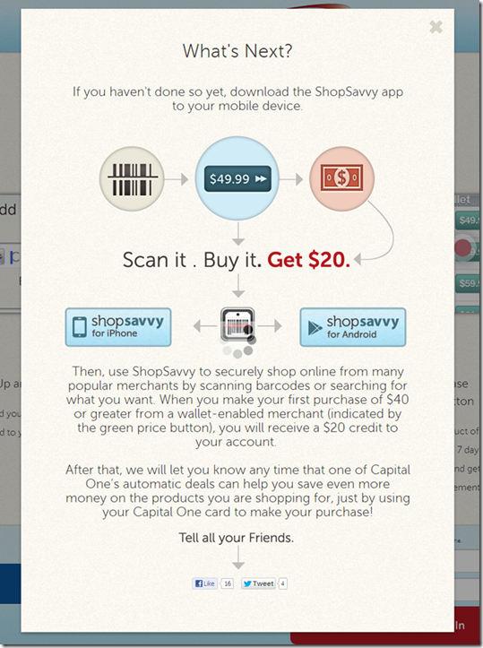
Step 3: Locate, download and activate the ShopSavvy mobile wallet app
ShopSavvy download instructions

——————————–

Notes:
1. Or perhaps this is more of a straight revenue-play for Capital One, with ShopSavvy paying the card issuer for each new customer.
2. Unfortunately, ShopSavvy’s one-click experience does not extend to Amazon.com, but the app does display Amazon prices and it’s just a few more clicks to buy there.
3. Initially, I tried the app with a few barcodes I found at home and it worked, but only on the media stuff. Since I didn’t want to buy anything I already owned, I went to the last remaining bookstore in northeast Seattle and gave it a try. Unfortunately, this store covers the regular barcode with its own, which are not indexed in the ShopSavvy database. But when I tried it again last night, the search function was working so I was able to easily find a DVD set and buy it from Target.com for a competitive price (even before the $20 statement credit). 
4. For mo
re info on mobile wallets, see our most recent Online Banking Report: Mobile & Cloud Wallets (Feb 2013, subscription)

Oklahoma Employees Credit Union Posts Seven Specials for Black Friday and Cyber Monday

imageDuring the past few years we’ve reported on Black Friday and Cyber Monday promotions at financial institutions (last year). ING Direct is the only large bank that has consistently used the post-Thanksgiving holiday in its marketing (see below) and we are glad to see it continue under Capital One ownership.

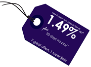
imageThis year we found another new entrant for our database of holiday offers, 42,000 member Oklahoma Employees Credit Union. It has a prominent black tag on its homepage announcing a "Black Friday Money $ale" (see first screenshot). 

And from the looks of it, the CU has created a pretty hot offer, leading with car loans as low as 1.49% with no payment due for 90 days (well after holiday spending subsides). But that’s just one of the seven holiday offers (second screenshot). The CU is also offering:

From Black Friday to Cyber Monday (Nov 23 to 26)

  • 1.49% APR* on New or Used Auto Loans 
  • 1.00% APR^ Off Unsecured Loans
  • Surcharge Free Gift Cards***
Black Friday to the End of the Year (Nov 23 to Dec 31)
  • 90 days no pay**
  • $149 Mortgage Loan Origination Fee^^
  • $49 Credit*^ with New MasterCard
  • 0.49%tt Business Loan Origination Fee

———————————–

    Oklahoma Employees Credit Union homepage with Black Friday specials (Wed, 21 Nov 2012)

      image

    Black Friday landing page (link)

    image 

    ING Direct homepage with Black Friday offers (21 Nov 2012)

    image

    ING Direct Black Friday teaser page (link)
    Note: The bank does not reveal the actual offers until midnight Thursday

    image

    —————————–

    Fine print on Oklahoma Employees Credit Union offers:

      *Annual Percentage Rate. 640+ credit score. Max term 60 months; estimated payment $17.31 per $1,000 borrowed. Min amount $10,000. Existing OECU loan min advance $2,500. Requires automatic payments and eStatements. 
      ** Borrower may defer initial auto loan payment up to 90 days. Interest will accrue from date of advance. 
      ^ Annual Percentage Rate. Reduction from regular earned rate as determined by credit score. 
      *** Up to 5 cards
      ^^ Max 12 years up to $250,000 and 75% loan-to-value as determined by appraisal or AVM. 
      *^ Initial transaction must be made by 1/10/13. Credit to be issued by 2/10/13. 
      tt Owner occupied commercial real estate. Max loan $500,000. Additional closing costs may apply. Normal lending policies apply.

      Capital One 360 Arrives in February

      imageContractually, Capital One had just one year to transition away from the ING Direct name and rebrand with its own creation. Last week, it announced the new name:

                       Capital One 360

      While I like the “360” thing, I’m a little disappointed they didn’t give it a separate brand, like NAB’s UBank. Here’s how the bank explains it to customers:

      Red’s the new Orange. Since Capital One’s colors are red and blue, our new colors are going to be red and blue, too. After all, we’ve got to make sure we’re color coordinated and lookin’ good for the family photo.

      My take: Most financial institutions are best served by overlaying their trusted name on all their initiatives. But given the provenance of ING Direct, a quirky independent anti-bank bank (though it was owned by a huge financial conglomerate), I thought this might be an exception to the rule. But I don’t fault the bank one bit for taking the lower-risk approach. 

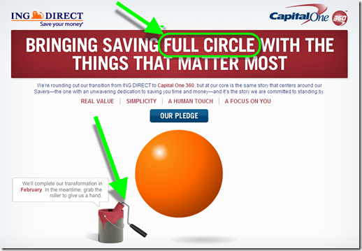
      It will be interesting to see how Capital One positions the 360 brand long-term with its other bank and card divisions. image The “360” implies a full view of your finances, so I wonder if they’ll be dropping PFM features into the account soon. There are no clues on the bank’s “Our pledge” page (accessed via the blue button above the ball). 

      And long-time fans are wondering how much of the old ING Direct quirkiness will be maintained, if any. One promising sign, the landing page at <capitalone360.com>, has a clever play on words along with an interactive feature that allows the user to “paint” over the orange ball revealing a maroon 360 one. Very well done.

      ———————————-

      Capital One 360 landing page before “brushing” (14 Nov 2012)

      image

      Capital One 360 landing page after brushing

      image

      Note: Not that it really matters, but I was expecting the ball to bounce, as it used to on the ING Direct page, after the 360 was revealed.

      Out of the Inbox: Mint.com Pitches Capital One Credit Card in Triggered Email Alert

      imagePrecise, content-sensitive advertising is extremely powerful. It’s what made Google a giant. 

      In financial services, the biggest advertising-driven success (after BankRate and Google), at least in terms of market cap, is Mint.com. Its revenue stream is entirely made up of targeted offers to customers who aggregate banking transactions on its site.

      The company wisely uses email to deliver some of the advertising pitches. As we’ve discussed before, Mint is of the few financial companies directly monetizing triggered alerts.

      We were impressed by the latest effort received Tuesday (see below). Having noticed that our Chase business card was used internationally, incurring a $14 transaction surcharge, they wisely pitched us a Capital One no-foreign-transaction-fee card.

      Interestingly, we already have not one, but two of those Cap One cards (personal and biz) and they are both aggregated at Mint. So I’m not sure if this alert is more of a reminder to use our Cap One charge when traversing the world or that Mint doesn’t check current product usage when cross selling (or they don’t care). If Mint is only paid on performance (eg. by new accounts generated), then it doesn’t matter to Cap One that they are marketing to an existing customer.

      Bottom line: The example demonstrates the marketing value of hosting the aggregated accounts.

      ————————————–

      Mint triggered alert (12 June 2012)
      Note: The advertisement is two-fold. The banner with "apply now" is the most eye-catching, but also easier to ignore. There is also a text call to action above it, that looks more like alert copy. It says: "Stop paying extra to use your credit card overseas. Get a card that doesn’t charge foreign transaction fees."

      image

      Card-Linked Offers in the Wild: Bank of America, Capital One and Fifth Third

      We are starting to see more card-linked offers (aka merchant-funded rewards) in the wild:

      • imageBank of America: Consultant and former bank exec Tom Noyes showed off his BofA offers, BankAmeriDeals powered by Cardlytics, on his FinVentures blog earlier this week.
      • Capital One: For the past four weeks, I’ve been receiving FreeMonee offers from Capital One (see screenshot below).
      • Fifth Third Bank: I don’t know how long it’s been there (the service was announced in late Feb), but today I noticed that Fifth Third has a link up on its homepage to Prewards, the edo Interactive-powered rewards programs.

      Bottom line: Card-linked rewards are great for consumers and banks, and hopefully they will prove to be equally valuable for the merchants who pay for the whole thing. If so, it could usher in a whole new era of ad-supported banking (note 1). In the meantime, it makes for awesome Finovate demos (note 2).

      —————————————–

      Fifth Third homepage features Prewards under "Personal | Bank" navigation (8 June 2012)

      image

      Prewards landing page (link)

      image

      Capital One weekly email with five new offers (1 June 2012)
      Note: Offers are typically good for 2 weeks after email received.

      image

      —————————————-

      Notes:
      1. We wrote about merchant-funded rewards in our Online Banking Report (Feb. 2011, subscription).
      2. We covered the the best new products at FinovateSpring 2012 in our most recent Online Banking Report (May 2012, subscription).

      Capital One Add Rewards to Mobile App, Includes Ability to Redeem for PREVIOUS Travel

      Capital One mobile rewards main page Although it was one of the last major banks to launch an iPhone app, Capital One is now positioning itself to be a leader in mobile. Its April 5 iPhone app update included a new rewards function that’s the best I’ve seen.

      Rewards point totals are clearly shown on an old-school “flip number” display (see screenshot right). But the novel part, and this may be an industry first, is the ability to redeem rewards in real-time, for travel purchases you’ve ALREADY MADE. (You can also redeem for cash or gift cards.)

      I thought this was some kind of typo when I first saw it in the marketing material. So I tested it myself this morning. And sure enough it does exactly what it says.

      Previous travel purchases made on the Capital One card are displayed in the app. Users select the one(s) they want to redeem for mileage points and Capital One provides a statement credit to refund the user for the purchase. Brilliant!

      ———————-

      Capital One’s mobile reward redemption for previous travel (20 April 2012)
      Note: Select a transaction (below left), confirm (below right).

      Capital One mobile rewards screen      Capital One mobile rewards redemption confirm      


      imageI also like Capital One’s new app “home page.” Instead of forcing a login before users can do anything, the bank offers several non-secure content areas:

      • Browse our products
      • Find branch/ATM
      • Mobile banking FAQ
      • Contact us

      These are useful for customers who can’t or don’t want to log in. And of course, for prospects kicking the “mobile tires” at the bank.

      Out of the Inbox: Bon Voyage Email from Capital One

      image Yesterday, I mentioned Capital One’s self-service travel notification process. Another aspect of the service is a follow-up email before you head out of town (see below).

      I like the email for a couple reasons:

      • The well wishes make you feel good about the bank
      • The message provides helpful contact info in case of trouble
      • It’s an an additional fraud check to ensure that it’s really you traveling to Yakutsk next week

      The bank even tells you to call collect. Nice.

      Capital One could jazz up the message with more color and snappier copy (note 2), but it gets the job done.
      —————————–

      Capital One email to customers who’ve told them they are traveling internationally (31 Jan 2012)
      Note: Sent the day before scheduled departure

      Capital One bon voyage email

      Notes:
      1. Picture credit: Greeting card at Zazzle.
      2. I’m surprised Capital One doesn’t use this opportunity to reinforce its travel rewards, mobile app, and zero FX fees. 
      3. We’ve tackled remote banking customer service and messaging a number of times in previous issues of our Online Banking Report. The last one was Live Help earlier this year.

      Service: The Value of a Search Box within Online Banking for the DIY Crowd

      image I’ve always disliked toll-free (telephone) customer service. You have to find the number, identify yourself repeatedly, choose from confusing categories, then wait on hold until you finally get the honor of pleading your sorry case to someone who has all the power. I usually end up feeling like an idiot or a third grader asking for a bathroom pass.

      Before the Internet, call center service was a necessary evil. Going forward, let’s get rid of it. Self-service, whether completely automated or “guided” by real humans, saves money, and done right, can be a more satisfying customer experience.

      Back to my sample of one. When I have a question, I always look for the webform, email address, or even the live chat button; anything that keeps me from dialing 1-800-IMAFOOL.

      But when you want to do something at your bank that’s relatively complicated, such as investigate a suspicious charge, change your credit limit, etc., it can be difficult to figure out how to do that on your own. That’s why I like Capital One’s “Ask a question…” box in the middle-right of all its credit card management pages (see first screenshot).

      Today, I wanted to tell the bank I might be using its card internationally. I was already logged in to pay my bill, so I simply typed “travel” in the right-hand box (see first screenshot) and a link to the correct online form was delivered in the “answers” section (see second screenshot). It worked just like I expected.

      So kudos to Capital One for making it easy to navigate to the right page, and more importantly, handling the entire travel notification process online. Of course, I’d prefer the bank just tracked me automatically via GPS (note 2), but we’ll get back to that another time.  

      ———————–

      Capital One aids do-it-yourselfers with a prominent search box on every page (28 Jan 2012)

      Capital One main account page with "site search" box

      Search results for “travel”

      Capital One site search results for "Travel"

      Notes:
      1. Western Electric ad from 1959 (from eBay)
      2. At FinovateEurope next week, one of the presenting companies, Finsphere, offers just such a technology. Capital One, you should give them a call.