Feature Friday: Discover’s Interactive Checking Account Comparison

Feature Friday: Discover’s Interactive Checking Account Comparison

discover checking comparison

Discover’s responsive page dedicated to selling its Cashback Checking is a thing of beauty from top to bottom (though we have some suggestions on a few of the finer points of the UX). We especially like the interactive comparison to the competition. Discovers starts by comparing its fees to Chase, Citi, and BofA. But the card giant makes it easy to compare against four other major brands (US Bank, Wells, Capital One and Fifth Third). Simply click on the + sign in the empty fifth column on the right and choose one of the brands from the popup (see below).

The table works on smaller screens including smartphones. But you can only compare to one other bank at a time. Users select the competitor with from a drop-down box.

Bottom line: If you clearly offer better price/value, then by all means flaunt it. While Discover makes a great case here for its Cashback Checking, it could be even better with more benefits listed (e.g., mobile deposit for one) and a tool to calculate financial savings and rewards. But overall, excellent work!


Author: Jim Bruene is Founder & Senior Advisor to Finovate as well as
Principal of BUX Advisors, a financial services UX consultancy. 

Mobile Monday: Engaging Prospective New Customers

Mobile Monday: Engaging Prospective New Customers

mobile_phone_lineupHow important are mobile users to your sales efforts? 76% of Facebook’s ad revenue is from mobile (and it was considered by many to be a mobile laggard a few years ago).

Prospective customers are already visiting your website from their smartphones in massive numbers. Are you making a good first impression? Does the UI work across key devices? And more importantly, is there an easy-to-find path to mobile purchase?

This afternoon, I visited 20 leading banking and personal finance sites (as a proxy for popularity, I used the 20 most downloaded free finance apps in the U.S. Apple App Store, see list in footnote). And it was like a trip back in time before (desktop) websites had adopted browser-design standards. By the numbers:

  • Excellent: 19 of the 20 had mobile-optimized sites (Laggard = Navy Federal Credit Union)
  • Satisfactory: 14 of 18 had a visible link for login (2 required a native app to login)
  • Needs work: 11 of 20 had a visible link to download the native app (including the 3 below)
  • Needs work: Only 3 of 20 used an initial “pop-up” screen that prompted download of the app, then the user needed to find a link to the non-app site
  • Needs work: 12 of 20 made a visible attempt to sell something
  • Fail: 6 of the 20 made a pretty marginal first impression, including several of the biggest financial institutions in the U.S. and the world: American Express, Chase, Citibank, Mint, PNC, Wells Fargo

My favorites (from this sample of 20, see footnote):
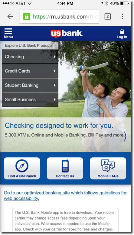
Bank: US Bank
Nice, engaging layout with clear path to more info, but missing a link to download the app
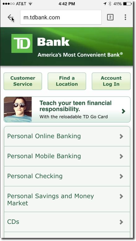
usbank_msite

Runner-up: TD Bank
Easy-to-find customer service, login, location, but missing app-link

tdbank_msite

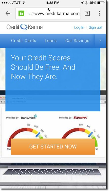
Favorite non-bank: Credit Karma
Good branding, clear get-started button, but no link to native app

credit_karma_msite

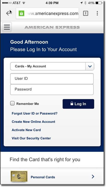
Least favorite FI: American Express (lots of competition for this one)
Too much emphasis on logging in, easy-to-miss card-finder at bottom

amex_msite

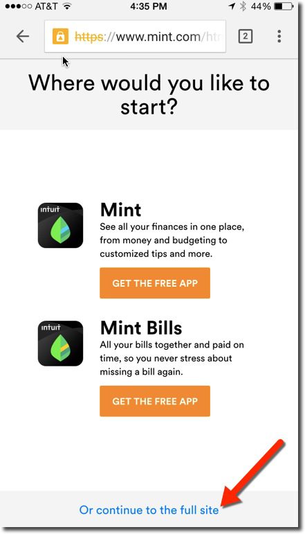
Least favorite non-FI: Mint
Straightforward app link, but needs to better engage new user before offering the two choices; not very graphically interesting

mint_msite

——–

Top 20 apps (in order at U.S. App Store, 5PM Pacific 31 Aug 2015): Chase, BofA, Wells Fargo, PayPal, Capital One, Venmo, Credit Karma, Square, Mint, Acorns, GEICO, Citibank, Discover, American Express, USAA, Progressive, US Bank, Navy Federal, TD Bank, PNC Bank

#RockChalk (for Karl, Joe and Mary)

Feature Friday: Umpqua Showcases the Closest Branch on its Website

Feature Friday: Umpqua Showcases the Closest Branch on its Website

umpqua_personal_home

I’m not a fan of bank branches (except Chase’s Northeast Seattle outpost, Hi Ben). In my view, 80% of what goes on there is better done remotely, and the other 20% just doesn’t provide enough ROI. But if you do have good branches, you should at least use your digital presence to showcase them.

Probably the best example of growing a franchise using branching—at least in the United States over the past 20 years—is Umpqua Bank. It grew from a small community bank to a West Coast regional on the back of its innovative branching strategy. (Warning! Do not try to copy this strategy; it’s not 1995 any more.) So, it’s no surprise that Umpqua is one of the more adept FIs in showcasing their local, branch-based services.

Most large banks require users to enter a ZIP code to personalize the website experience. But even then, you generally have to go to an ATM/branch finder to locate the closest branch. Umpqua wisely automates this process on both its desktop and mobile website, though it works more seamlessly on the desktop (see desktop example, above).

umpqua_open_signThe bank uses visitor IP addresses to showcase branches in their city, but it goes one step further (at least in Chrome), by asking permission to use your location. If granted, Umpqua shows the exact branch closest to you. The branch name, address, and contact info are showcased right across the top of the screen. Finally—and I love this little touch—during open hours, there is an old-school “Open” sign in the right-hand corner. They could go one step further and add the temperature and maybe the time right below.

Those personalization techniques, while quite simple, makes prospective customers feel confident that the bank has a local orientation and really desires their business, whether it be digital or branch-focused.

Not everything Umpqua does is perfect. The bank also attempts to showcase local events on the left-hand column. But in my testing today, they were wildly off base. For instance, it listed a farmers market that was 40 miles away and didn’t mention the one within walking distance.

Sales & Marketing: Preparing for a Future without Bank Branches

It’s been almost a year since my last branch rant (here), so I feel I’m due. As I’ve said before, as founder of a business tied to the success of digital channels, I’m totally biased, so proceed with caution.

————————-

During lunch at the Bank Innovations conference here, I engaged in a spirited debate about the value of branches. And later that week, I enjoyed Optirate’s rebuttal to The Financial Brand’s defense of bank branches. It’s one of the more highly charged, and important, issues of the day.

Here’s what it boils down to:

Branches have value…

         …but not enough to pay the rent

Since customers won’t pay directly for branches (see note 1), banks must cover their costs with low deposit rates, penalty fees and other charges. That has worked for a while, but eventually leaner competitors will figure out how to cherry pick the profitable customers/services. We saw ING Direct siphon off a few billion in deposits during the high-rate years and now we are finally starting to see alt-lenders making a small dent on the loan side ($1 billion or more each being originated this year by Lending Club, Sofi, and OnDeck Capital).

The writing is on the wall. The branch, as we know it, is on the way out (note 2).

But most banks have built their franchises by opening new accounts at branches. So what are the alternatives? There is no right answer as it depends on your strategies and customers, but here are some general ideas (note 3):

  • Provide state-of-the art online/mobile applications and onboarding (note 4)
  • Go after the kids of your current customers, then take care of them through major life stages so they never leave (note 5)
  • Increase your branded-ATM presence in your geographic footprint (apartment lobbies, large employers, etc.)
  • “Power the POS” with free card processing for your cards (if merchants steer customers to your card)
  • Partner with employers to provide banking as an “employee benefit” including a schedule of bank employee “office hours” for advice, help and limited transaction support
  • Focus on small and mid-sized businesses (including startups), and take staff directly to the business location
  • Drive traffic (foot and digital) to your merchant customers with relevant offers
  • Consider roving “mobile banks” that operate like food trucks, moving about the community and parking in high-profile locations (might as well sell cheese and bacon sandwiches too)
  • Participate in crowdfunding/P2P loan platforms to gather new assets (note 6)
  • Provide in-store/dealer financing (real-world and digital)
  • Co-locate with compatible service businesses (insurance, tax prep, real estate, etc.)
  • Have a presence at local events, festivals and street markets (portable ATM, water stations, bathrooms, etc.)
  • Get very involved in local real estate

I am not saying that all branches should be closed. Schwab proved that it pays to have at least one physical location in every major city. But branch costs need to be reduced fast.

It won’t be easy. Change is hard. Layoffs are VERY hard. And unproven digital strategies supplanting longstanding branch-based sales are risky. But I’m not sure there is any realistic alternative for the majority of financial institutions.

————-

Embedded image used with permission of Getty Images.

Notes:
1. It’s true that the same could be said about online or mobile channels. But, for the most part, the digital alternatives operate at a fraction of the per-user cost of branches.  
2. It’s a 40-year process, however (see OBR 128, April 2006, subscription).
3. For 500+ ideas, see our annual planning report (Sep 2013, subscription).     
4. See: Online Account Opening, OBR 168/169 (June 2009, subscription).     
5. See: Youth Banking, OBR 194/195 (July 2011, subscription).     
6. See: Crowdfunding, OBR 216/217 (May 2013, subscription).

The iPad-Enabled Checkout Experience at the POS

The Hideout Coffee House in Austin

A few week ago I spent the weekend in Austin eating BBQ, watching my alma mater get crushed by the University of Texas, and sampling the Sixth Street ambiance.

But the highlight for me was the The Hideout Coffee House. Not only did it have great coffee and eclectic furnishings, but card customers could pay via Square through an iPad mounted in a novel wood stand (see inset; it’s not possible to see well, but the ipad stand is on the counter at left).

The barista took my card and swiped it through the Square reader, which was supported by a wood guide (see similar unit left from Tinkering Monkey). Then he flipped the case over 180 degrees so it faced out towards me (see below).

Tinkering Monkey iPad holder at the POSI selected one of the large buttons for a preset tip amount and then once more to have the receipt emailed to me (I only had to enter my email the first time).

It was easier to use than most in-lane POS readers, even contactless ones, because the barista actually did the swipe. It eliminated the uncertainty about when I should tap/swipe or whether it worked or what I should do next. And I loved being able to put a tip on the card with the push of a button rather than writing it on a piece of paper or digging for change. 

Tinkering Monkey swivel ipad caseBottom line: Eventually payments will be made via proximity and settled in the cloud (my mobile will know I’m in the store and will automatically pair me to the store’s POS). But there is still a long transition period ahead.

Tablet/smartphone card readers are a great interim step for smaller merchants (note 2), especially with the price wars waging at the point of sale (note 3).

Related: And banks, even though you don’t have the POS issue, you can equip your frontline staff with iPad-powered sales tools (note 4). 

——————–

Notes:
1. On one of the Austin freeways, I also saw a billboard for the ISIS pilot. But I didn’t see any merchants promoting it. 
2. And some bigger ones. And of course, the 20,000-store Gorilla, Starbucks, is partnering with Square, though it is unlikely they’ll use iPads at the point of sale.
3. Bank of America recently jumped into the game matching Square’s 2.7% discount rate.  
4. Barclays just bought 8,500 iPads to equip its branch sales staff (Financial Brand post).

Design: Bank of Internet Puts "Request More Info" on New Homepage

image Citibank wasn’t the only one with a new homepage this week. Bank of Internet also launched a new look today.

It’s more traditional than Citibank’s, which isn’t necessarily a bad thing. There’s more copy, but it’s still pleasing to look at it, easy to navigate, and focuses attention on two core products:

  • 1.25% APY rewards checking
  • 4.10% APR mortgage refinance

I like the bank’s new Request More Information box in the lower left corner. It allows visitors to quickly request more info on the following three topics simply by typing in their email address. 

  • Deposit accounts
  • Mortgage loans
  • Multi-family loans

Bottom line: While most financial institutions invite visitors to call, few make it easy to leave your email address for a future discussion. I’m not sure how many people will see this box tucked away in small type below the fold. But with a little more emphasis, it could be an effective sales tool.

————————

New Bank of Internet homepage (6 Oct 2011)

New Bank of Internet homepage (6 Oct 2011)

After submitting an info request the box changes to a thank-you message

after submitting info request, box area changes to thanks

Previous homepage (2 March 2011; Source: Internet Archive)

Previous Bank of Internet homepage (March 2011)

Simplifying Product Search: PickHealthInsurance.com Delivers Relevant, Clean Results in Seconds

image It’s been years since we did a deep dive into what I call “site search,” trying to find answers using a banking site’s own search and navigation tools. While things have gotten much better, most financial sites still have plenty of room for improvement (note 1).

And it doesn’t seem like a monumental problem. Even a large bank has how many retail products? 50? 100? Even if five times that, it’s TINY compared to other ecommerce sites. Amazon.com has 9,070 results just for “toaster.”

Consumers should be able to quickly find appropriate banking products by inputting four or five data points: age, ZIP code, family size, home ownership, annual income (for credit products), and average balance (for deposit products). Then, a list of relevant products should be returned in tabular format with a clear link to more details.

To see how this works, stripped of all ads and cross sales, check out the side project of Seattle entrepreneur Adam Doppelt, PickHealthInsurance.com. Users enter four pieces of info: ZIP code, age, family size, and whether they smoke. A few seconds after pressing Find Plans!, the site returns a table of potential choices (second screenshot).

It’s a very Google-like experience, something you can’t say about most banking sites.

—————————————-

PickHealthInsurance input form (14 Sept. 2011)

PickHealthInsurance input form

Results page

image

Plan details page

Plan details page

Note:
1. Many financial institutions have sophisticated product comparisons, but it’s not always easy to find the tool to begin with.

Online Bank and Mortgage Lead Generation

One subject that doesn’t get enough attention, online lead generation.

Now that most bank websites get more traffic than its branches, at least if you measure total number of visits*, you should be committing resources to maximizing the number of leads generated by your website.

Most banks have the low-hanging fruit covered with prominent phone numbers and website inquiry forms. But what about those prospects less willing to initiate a sales interaction?

Amerisave_logoMy favorite presentation from the recent Net.Finance conference, and one I almost didn’t attend because I thought it would be focused on offline activities, was Evaluating Online Lead Generation and Management, from Dave Herpers, Chief Marketing Officer at Amerisave, an online mortgage originator.

If you ever have a chance to hear him speak, I highly recommend it. Previously he was marketing director at DeepGreen Bank and also did a stint at Bank of America, so he has a great background in online lending.

Besides the fascinating discussion of the methodical generation and processing of online and telephone leads, he provided a number of ideas that financial services companies can use on their website to improve the number of leads available to sales people.

Action Items
As customers research products and use your online tools, allow them to have any of the results emailed to them for future reference. Customers like it because they don’t lose all the work they’ve done and it’s serves as a reminder as to where they found all the great info.

Mr. Herpers suggested the following email functions:

  • Email me the results from the mortgage/refi/HEQ calculator
  • Email me my estimated closing costs
  • Email me the rate info I was just looking at
  • Email me info on the products I was just looking at

Any customer who uses the email functionality becomes a valuable product lead.

Other lead generation opportunities:

  • Contact Me buttons
  • incomplete applications
  • Request a Consultation form
  • Rate Alerts

Amerisave_rate_searchAmerisave reports that there best leads, other than telephone calls which are always first priority, are those from customers preforming rate searches at its website (see inset).

If you’d like to learn more about the best financial online marketing ideas, check out the Interactive Financial Marketing Database from our sister publication, the Online Banking Report.

Citibank’s Impressive Follow-up Sales Effort

Citi_free_ipodCitibank has woken my sick-in-bed wife the last two mornings, calling to remind me to submit my paperwork to fund the new checking account I established online two weeks ago.

She’s not so thrilled with the bank, but I’m impressed with its tenacity.

Here is the scorecard of bank followup efforts:

  • Email = 1 (about 2 weeks after application…almost missed it, thought it was a phish)
  • Mail = 1 (technically not a reminder, it was the sig card and new account kit)
  • Phone = 3 (first about 1 week after application, then number 2 and 3, about 2 weeks after application

It’s an impressive follow-up effort. I’ve applied for a number of accounts over the years and I can recall receiving only one telephone call, from Salem Five back in 1995, and that wasn’t even an application, just a sales lead. The last time I tried to start a checking account, with Washington Mutual, I never heard from them, not so much as a single email or letter thanking me for my application. As far as I know it’s still sitting in limbo on some backup tape.

Sorry for the delay Citibank, I really do want that iPod, so I will be sending my $2500 deposit ASAP.

Action Item
If a company with as much experience as Citibank has found it to be profitable to make follow-up phone calls on unfunded new accounts, you should consider doing it as well. However, you may have more luck than Citi does using email followups. Citibank’s brand in an email message is practically worthless these days after the pounding it’s received from phishers.

JB

Improve Bank Website Usability with Popup Sales Assistance

National_interbank_popup_1 Even with popup blockers wreaking havoc with this marketing technique, it still makes sense to program a popup when users abandon an application or any other important sales page. It’s also possible to program a popup after the user lingers in one area for a certain amount of time.

The popup should ask if assistance is needed and provide at minimum a telephone number and email address. Here’s an example from National Interbank.

JB