Simple’s Twitter Feed Teems with Customer Problems

A month ago, our favorite discerning-technologist-masquerading-as-a-banker Bradley Leimer penned a fascinating post that looked deep into (bank) Simple’s Twitter feed. He drew a dozen conclusions parsing the startup’s back-and-forth with customers over Twitter. Here are a few more thoughts on Simple’s approach.

—————————————–  

imageSimple is the first (virtual) bank to go “open” by entertaining customers’ wants, needs, problems, and various crazy requests on its Twitter feed. The chatter exposes the ugly underbelly of transaction processing, points out the startup’s painful process of scaling up, eats up way too much staff time, and is just a royal pain in the you-know-where.

And I love it.

With every Tweet, the startup shows that it cares, that it is technically savvy, and most importantly, that it has a devoted following.

Bottom line: Customers have many detailed questions that go unasked, and unresolved, because there is no convenient or timely way to get answers. Answering questions in public via Twitter, user forum, blog, Facebook page, etc., can be an effective way to solve them (note 1).

Simple has a unique positioning that is unlikely to be copied by existing banks and credit unions. But everyone can learn from its experiment in openness, frank talk, and use of humor.

———————————-

Simple’s Twitter page (link)

Simple's Twitter page

———————-
Note:
1. We’ve covered various social media outlets in our Online Banking Report during the past few years, including: Banking on Facebook (Feb 2012), Connecting to Customers with Twitter (May 2009), and Bank 2.0 (Nov. 2006). Subscription required.

FinovateFall 2012 Best of Show Winners

FF12_BestofShow_col_high.jpg

Our fifth annual FinovateFall in NYC concluded a one hour ago. After seeing 64 demos over two packed days, the audience voted for their three favorites each day. The top eight overall were named Best of Show (see notes).

The winners (in alphabetic order):

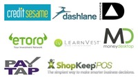
  • Credit Sesame for its Financial Fitness Indicator that gives users a comprehensive view of their financial situation
  • Dashlane for its instant login and checkout feature
  • Dynamics for its Triple Interface card, allowing for tap, swipe, or EMV paymentsFFBOSWinners2.jpg
  • eToro for its social trading index 
  • LearnVest for its certified financial planning capabilities and mobile app 
  • MoneyDesktop for its PFM platform and bubble budgets
  • PayTap for its social bill-payment platform
  • ShopKeep POS for its tablet-based POS

We’ll have videos of all 64 demos posted at Finovate.com as fast as possible (probably two to three weeks out).

Thanks to everyone who presented, attended, tweeted, networked, blogged, tolerated the Internet hiccups and helped push fintech forward. You are the best! 

———-

Notes on methodology:
1. Only audience members NOT associated with demoing companies were eligible to vote. Finovate employees did not vote.   
2. Attendees were encouraged to note their favorites as the day went on and choose three favorites from just the demos of that day. Ballots were turned in at the end of the last demo session each day. 
3. The exact written instructions given to attendees: “Please rate (the companies) on the basis of demo quality and potential impact of the innovation demoed. Note: Ballots with more than three companies circled will not be counted.” 
4. The eight companies appearing on the highest percentage of submitted ballots were named Best of Show.
5. Go here for a list of previous Best of Show winners.

FinovateFall 2012 Launches Wednesday

     image

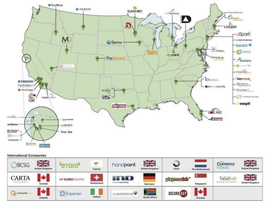
Right now, people from all over the world are on their way to Manhattan for the sixth annual Finovate, which again will be the biggest ever (see presenter map below). We never expected it would grow to 1,000+ in attendance, and we are truly thankful to all!

imageOur very own Julie Schicktanz will be live blogging the event beginning Wed. at 9am EDT on our Finovate blog. And I’ll try to keep up the tradition of tweeting each development as it happens from our Twitter page. And hundreds in the crowd will join in using the #finovate hashtag.

Of course, there’s nothing like actually being there to take it all in live, and talk to the founders and senior execs from the 64 companies pushing the envelope in fintech. Registration is open for two more days here.

And for those of you that can’t make it, we’ll have all the demos posted at our website later this month in the Finovate archives

See you in New York, and thanks again for your support.

——————————

Map of Finovate presenters (click to enlarge)

image

Bank of America Pitches Mortgage Refi Upon Logout

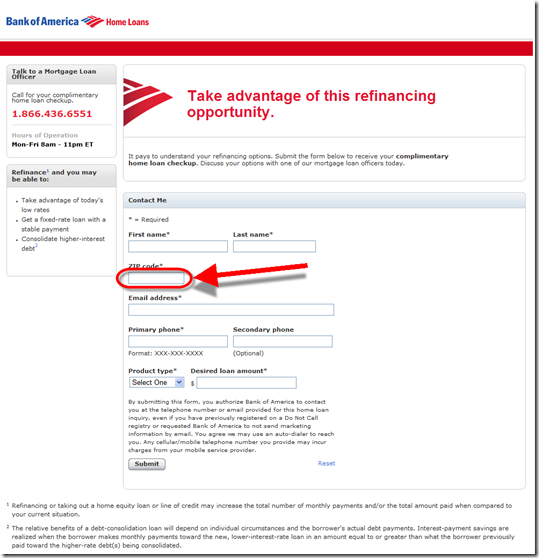
image It’s been awhile since I wrote about a logoff marketing offer (note 1) as they all start to look the same after a while. But after signing out of my Bank of America credit card account today, I noticed its eye-catching graphic promoting mortgage refi (first screenshot below).

But as usual, I was underwhelmed with what followed after the first click. I was taken to a generic lead-capture screen so I could get a call back (second screenshot). There were no chat or online options.

The form didn’t even pre-fill my state or that I was interested in a refi. And it was a dead end. No links, product info, rates, or incentives. I could submit the form to receive a call-back or dial myself right now. (Granted, the bank may have determined from testing that this approach yields the most ROI, but it sure doesn’t work for me.)

It all seems so 1990s. I’ve had a BofA credit card for 20 years, business and personal. They know more about me than my wife does. It’s surprising it doesn’t use at least a sliver of this data to personalize the pitch and/or streamline my request for more info.

—————————————–

Bank of America logoff screen promoting mortgage refinance (6 Sep 2012)

image


Blank refi landing page
(link)

image
———————–

Note:
1. For more information and examples of login/logoff marketing, see our Online Banking Report: Selling Behind the Password (April 2009). 

The Bank Branch as a Retail Sales Channel

Old Bank Hotel, Oxford, England

There has been much discussion about the future of the branch. We’ve weighed in on it a few times (note 2). And of course, we are completely biased towards remote channels.

While it’s clear that branch transactions are headed downwards, many still believe the branch has a reasonable future as a center of for sales and marketing. Logically, this makes sense because most of us opened our primary accounts in a branch way back when. 

But what’s the reality going forward?

Certainly branches are a good source of new accounts. But what is the acquisition cost?  I’m not going to pretend to know the answer, but it’s interesting to look at how many new relationships a typical branch opens in a month.

Ignoring routine cross-sold savings accounts, credit lines and such (important, but usually less dependent on branch sales personnel), how many brand new primary account relationships (e.g., centered around a checking account) are sold in a typical branch each month? Would you guess 50? 100? More? 

What if I told you it was about 2 per month in the United States, if you ignore the top-20% of high-performers? Would that change your thinking about the future of branch-based account opening?

Assumptions
I haven’t seen any figures on this, so bear with me while I do a back-of-the-envelope calculation, which I think proves the point, even if there are a number of unsubstantiated estimates here:

  • There are about 100 million U.S. households with bank accounts
  • Annual account churn is in the 10% to 20% range. Let’s call it 20%, so that’s 20 million households in play each year 
  • There are 100,000+ bank and credit union branches

So it’s pretty simple to see that 20 million new accounts divided by 100,000 branches = 200 new accounts per year per branch, or about 4 per week.

That may sound low, but it’s overstates the value of the typical branch considerably. More refinement is needed:

  • Not every household uses a bank branch to open a new relationship. Let’s say say that online/mobile/call-center captures a 20% share, that cuts the branch number to 160/year. 
  • And of the 160 customers that chose to open a new account in the branch, a good portion would still have opened an account at the same bank even if the branch had not been there (because of the brand’s reputation, advertising, word-of-mouth, employer referrals, etc.). Let’s call that 30% of the total.

So now, we are down to 10 million “net new” accounts delivered by branches, or about 2 each week per branch.

But that’s still overestimates the impact of the “typical” branch. Using the Pareto principal (80% of new-account volume comes from 20% of the branches), then 80% of the 10 million “net new” accounts, or 8 million, were opened by 20,000 high-performing branches. The remaining 80,000 branches opened just 2 million net new accounts (note 3). 

Bottom line: If my assumptions are in the right ballpark, the lower-performing majority of branches (in the 80%) opens just 2 net new account relationships per month. That means on any given day there is only a 1 in 10 chance that a net new account relationship will be established (note 4).

So, ditch that $2 million branch remodel, re-energize your online/mobile services and start driving prospects to your remote channels (note 5).

—————————-

Update (9 PM): A reader (thanks Mr. Pilcher) noted that the business market is also a big factor in branch sales activity. Agreed. Using the same logic as above, assuming 7 million U.S. businesses with employees and 20% annual churn, each of the 80,000 lower-performing branches would add 2 new business relationships per year. But given their value, that could be more important than the 2 new retail relationships added per month. 

Math: (7 mil biz x 20% churn x 80% sold in branch x 70% where branch was deciding factor x 20% going to the lower 80% of branches) divided by 80,000 branches = 2 new biz relationships each year per lower-performing branch

Notes:
1. Photo of the Old Bank Hotel in Oxford (UK), which was a bank for 223 years until purchased in 1998 to be renovated into a hotel.  
2. Our one and only report on the subject was published in 2006 here (subscription). There is nothing wrong with branches. Customers like them and they are important brand ambassadors. But most locations are just not cost effective in an increasingly digital world.
3. I realize that most branches open dozens of accounts every week; but here I’m trying to focus only on “net new relationships.” In other words, new household relationships that would have gone to the competition if the physical branch hadn’t been there. It’s impossible to measure, so this is complete speculation.
4. The higher performing group does about 15x that volume, or 33 new accounts per month.
5. Our latest report published last week, 2013 Guide to Online & & Mobile Banking Products, Pricing & Strategy (subscription), sheds some light on your priorities going forward.

Op Ed: The Convergence of High-Tech and High-Touch in Wealth Management

by JP Nicols

JP Nicols, CFP, is CEO of the advisory firm Clientific and has served in various industry leadership positions, most recently as Chief Private Banking Officer for U.S. Bank. He writes about the intersection of leadership, advice and innovation on his blog at jpnicols.com.

Disruption of long-held paradigms and business models are common themes in fintech generally, and at Finovate especially. Some of the most notable traction to date has been in the payments and personal finance space.

Now, innovative specialty lenders and crowdsourcing platforms are also breaching what had long been banks’ deepest moat — the ability to leverage and monetize their balance sheets.

Wealth management in the digital age
The wealth management business has been less commoditized, and some firms have deployed impressive intellectual capital to help clients grow, preserve and transfer their wealth. Despite the rise of digital personal finance platforms and tools, clients with higher levels of wealth and complexity need and want advice from time to time.

A recent American Banker article cited a KPMG survey that said 9 out of 10 banks were considering a major overhaul of their strategy, and 40% said that wealth management was essential to growing revenue. For good reason. Wealth management operations are typically efficient users of capital, represent lower risk business models and are higher producers of precious fee income.

It makes sense for incumbent firms to increase investment in higher-margin businesses while new entrants are left to focus on lower-cost solutions. This is the classic pattern of disruptive innovation as described by Clayton Christensen and others.

Then as these new entrants gain market share, they inevitably move upmarket. In fact, that is already happening.

From the underbanked to the overbanked
There has been considerable discussion about the unbanked and underbanked, people who either cannot or will not use traditional financial institutions. Prepaid cards, payday loans, check cashing, remittances and other services that fill the gaps have seen new innovations and new investments from both inside and outside the industry.

On the other hand, wealthier households, or the overbanked, have no shortage of providers eager for their profitable business. But disruptive forces are at play here from two areas:

  • Smaller firms which differentiate with high touch, lower client/advisor ratios, better defined market niches and more responsive service.
  • High-tech competitors with better user interfaces, more robust web and mobile tools and sophisticated analytics.

The convergence zone
The effectiveness of those two approaches varies somewhat along demographic lines, but it’s not as simple as assuming all older customers prefer high-touch while the younger set always wants a technology solution. 

Web and mobile adoption rates in older age groups rise with higher income, and affluent customers are looking for something more than a stock jockey with a briefcase full of papers.

On the flip side, even the savviest do-it-yourself millennial wants help from an expert every now and then, and simply replacing the irrelevant stock jockey with a prettier, but equally irrelevant, screen full of dials and charts isn’t enough for many.

So these powerful forces are beginning to converge in a couple of exciting ways:

  • Enterprise solutions have been gaining traction at Finovate. Past alums like InStream and Balance Financial created inviting portals for advisors to manage their business and collaborate with clients in ways previously not possible.
  • A few firms have built their own advice and back-office platforms behind compelling interfaces. Finovate alums like Wealthfront and Betterment  offer low-cost professional money management to every investor.

Three firms to watch at FinovateFall 2012
I will be paying particular attention to three firms that are contributing to the convergence of high tech and high touch at FinovateFall 2012:

  • imagePersonal Capital a Best of Show winner at FinovateSpring 2012, leverages it’s PayPal and Intuit DNA (CEO Bill Harris led those companies too) to create what  they call a "next-generation financial advisor completely personalized around you." Users can easily get started for free with their attractive and useful PFM tool, then upgrade to their money management services.
  • image MoneyDesktop is another Best of Show winner at Finovate Spring 2012 that brings a slick mobile- and tablet-friendly PFM desktop with customizable widgets as a white label solutions for FIs stuck with outdated interfaces. They recently acquired MoneyReef to further bolster their mobile PFM offerings.
  • imageActiance: Fear of running afoul of FINRA, SEC and other compliance requirements is one of the barriers in large wealth management firms’ struggle to  be relevant in social media, and significant intellectual capital too often remains in proprietary channels as a result. Actiance has been a very visible solution provider with their Socialite platform, and at Finovate they will be showing off their integration with Salesforce to further integrate social data.

I will be back after the show with my thoughts on the latest developments in wealth management and track th
e convergence through integrated offerings and enterprise solutions.

Changing the world is hard. Changing bank IT departments takes a little longer.

————————-

Notes:
1. Image licensed from ShutterStock
2. For more on Personal Capital and the rise of the truly virtual financial institution, see OBR #198 (Oct 2011, subscription)

New Online Banking Report Published: 2013 Guide to Remote Banking Products, Marketing & Strategy

image Alright everyone, take a deep breath, summer is over and it’s time to get down to business. You are now officially behind on all the 2012 “stretch goals” that still seemed possible a few months ago.

And for many, September marks marks the beginning of the 2013 planning cycle. We are here to help. First, we moved FinovateFall up three weeks (to Sep 12/13) so you have more time to get those new ideas in to your plans.

Then there’s our annual reference, OBR’s 2013 Online/Mobile Banking Planning Guide. It’s a thorough resource for financial institution product/marketing managers prioritizing next year’s remote-banking efforts.

The latest version was posted online last night. 

______________________________________________

About the report
______________________________________________

2013 Product, Pricing & Strategy Guide for Remote Banking (link)
Embracing new business models for a digital world

Author: Jim Bruene, Editor & Founder

Published: 29 Aug 2012

Length: 76 pages (36,000 words)

Cost: No extra charge to OBR subscribers, $595 for others here

______________________________________________

Table of Contents

The report contains a list of every idea that has appeared in Online Banking Report or this blog (sample page, below). There are more than 1,000 possible online/mobile tactics listed in the current report, divided into the following categories:

1. Product tacticsclip_image002
A. Checking & transaction cards
B. Deposits & savings
C. Loans & credit
D. Personal finance management
E. Insurance
F. Investing
G. Payments & transfers
H. Mobile services
I. Family (children, teens, tweens)

2. Sales & marketing tactics
A. Increase online sales
B. Selling behind the password
C. Enter new markets & segments
D. Attract new residents (movers)
E. Increase referrals and word-of-mouth
F. Social media and Web 2.0
G. PR: appeal to community

3. Service, security & retention tactics
A. Increase satisfaction levels
B. Enroll more online banking users
C. Encourage/reward self-service
D. Encourage paperless adoption
E. Address security concerns

4. Small business products and services

5. Pricing: Fees and subscriptions

6. Messages & alerts

_________________________________________________

Numbers: Sunny Outlook for Mobile Banking (U.S.)

image ComScore’s latest mobile usage numbers provide useful context as you head in to the 2013 business planning cycle. With 42 million monthly smartphone users, mobile banking penetration (38%) is similar to other specialized information services such as sports (39%), news (49%), and movie info (30%).

Granted, banking still trails the gold standard of info services, the weather button, but it’s gaining ground.

————————————

Table: Information services accessed by U.S. mobile users
2012, Q2 monthly average

  Smartphone % Using All Mobile % Using
Total audience 110 mil 100% 230 mil 100%
Weather 75 mil 67% 90 mil 38%
Facebook, Twitter* 71 mil 64% 86 mil 37%
Search 67 mil 60% 80 mil 34%
Map 59 mil 53% 68 mil 29%
News 54 mil 49% 64 mil 27%
Sports 43 mil 39% 51 mil 22%
Bank account 42 mil 38% 49 mil 21%
Entertainment news 42 mil 38% 51 mil 22%
Movie info 34 mil 30% 40 mil 17%

Source: ComScore MobileLens as cited in Advertising Age, 20 Aug 2012; 3-month average ending in June 2012; usage counted is the user accessed info in the category at least once in past 30 days; *any social networking site; percentages may be off by 1% due to rounding of the numbers to two significant digits

Bank Simple Innovations #5 and #6: Message Badge & Message Center

image Following it the third installment on the innovations from Simple. The onboarding process was covered in the first two segments, now we move to the online UI.

Part 1: Innovations #1 and #2: Demo mode after login
Part 2: Innovations #3 and #4: Debit-card mailer

________________________________________________

#5 Red message-waiting badge
________________________________________________

This week, Simple launched Goals, its first budgeting/savings feature. Customers were alerted to the new feature via email (see note 1) and online message. Within online banking, users are notified of new messages by a red badge over the Support button on the top-nav (see first screenshot).

Clicking the button causes the right-side of the screen to turn into an integrated message center (see below).

________________________________________________

#6 Integrated message center
________________________________________________

The Simple message center is integrated into the main online banking UI better than most (screenshot 2). Users have three choices to click on:

  • Call Us launches a popup with a large toll-free number that no user could overlook (screenshot 5)
  • Start a Conversation launches a blank email form integrated into the UI (screenshot 3)
  • 1 Unread Message which then displays the full message along with a place to respond, even for this marketing message (screenshot 4)

The message notification badge is intuitive, especially for iPhone users. And the way it contrasts with the gray nav bar really makes it pop. The integrated message center takes a little getting used to, because it’s not at all what I expected. For example, I thought “start a conversation” would lead to an online chat. And initially I didn’t see where the full message was located. The “1 Unread Message” button looks more like an indicator, not so much a clickable item.

Bottom line: Once I figured out where to click, I appreciated the integrated approach. It is nice to be able to respond to messages without losing site of my main task, checking my balance and transactions.

—————————————-

1. Simple’s main online banking page shows a red number badge in right-hand corner when an unread message is waiting (22 Aug 2012)
Note: Transaction listing includes a tag showing when a tip has been added

Simple's main online banking page shows a red number badge in right-hand corner when an unread message is waiting

2. Simple’s integrated message center

2. Simple's integrated message center

2a. Message center close-up              3. Create new message
Note: All message center functions remain pinned to the right-side of the main online banking page

image       image

4. Full message

image

5. Simple “Call Us” popup

Simple "Call Us" popup

———————————————-

Notes:
1. The email itself was a let down, a generic message requesting that I log in to see what was up.
2. For more info on Simple, see our look at Truly Virtual Banks in our Oct 2011 Online Banking Report (subscription).
3. We’ve tackled remote banking customer service and messaging a number of times in previous Online Banking Reports. The last one was Live Help published last year.

Discover Card Gives Away an iPad per Day to Paperless Cardholders

image After adding my Discover Card to Google’s mobile wallet, I was automatically logged off after a period of inactivity (or what I prefer to call blogging). On the resulting page, the card issuer explained what happened on the left side and told me about their current estatement incentive program on the right (see first screenshot below).

Discover is giving away an iPad every day to its paperless customers (landing page) from June 1 to Nov 30. That’s a total of 183 iPads (official rules). Both new enrollees and existing ones are eligible.

Since I’m a sucker for online sweepstakes, I pressed the button, only to find out that I was already enrolled (see second screenshot). Not only is this annoying and somewhat confusing (am I still in the running for the iPad?), it could be counterproductive. Users are given the option on this page to turn paper statements back on. So customers might mistakenly turn the paper back on thinking that’s how you enter the sweeps. To prevent that, Discover needs to reinforce the sweeps on this page. 

Bottom line: Periodic paperless incentives are a win-win. You show gratitude to existing paperless customers while pushing a few more paper holdouts over the edge. However, be careful how you handle already-enrolled users.

———————————-

Discover Card logoff screen publicizing its iPad giveaway to paperless customers (17 Aug 2012

image

 
After clicking on the "Go Paperless" button I was sent to this screen
Note: Discover should remind me that I’m still eligible for the prizes

image

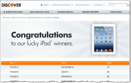
Discover publicizes the winners (link)

image 

———————————–

Note: For more ideas, see our report on paperless billing and banking (Nov. 2010, subscription).

First Look: Google’s Save-to-Wallet API at Discover Card

image This week, Discover became the first to use Google’s new Save-to-Wallet API to seamlessly add its card to the wallet directly from its secure site. This API supports the recent expansion of Google’s wallet to all US-based credit cards. 

To see how it works, I logged in to my Discover Card tonight and looked through account settings and the Help area for details. Coming up empty, I searched for "Google wallet" within the secure site and found a prominent link to the function (see first screenshot below).

The API worked even better than I expected, taking just 15-20 seconds (after I found the right page). Here’s the 3-step process:

  • Press Add Your Card from within the Discover Card secure site (screenshot #2)
  • Enter your Google password into the Google popup page (screen #3; I was already logged into Gmail, so Google had prefilled my username)
  • Accept the API request from Discover (screen #4)

That’s all it there was to it.

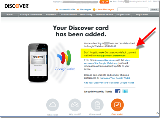
Optionally, users can go back to Google through the link on the Discover page (screen #5) to make it the preferred payment card (screen #6). Finally, Discover closes the loop with an immediate confirmation email thanking me for adding the card (screen #7). Well done.

Bottom line: Unless you are big enough to negotiate financial considerations from Google and/or build your own mobile wallet, you might as well drop this API into your secure site now. It gives your debit/credit card a fighting chance to be the default card in the wallet. While that might provide a slight spending lift, the major benefit is associating yourself with mobile wallets in general and Google in particular.

—————————–

1. Search results for "Google wallet" within Discover Card secure card management (16 Aug 2012)

Search results at Discover Card for "google wallet"


2. Landing page at Discover Card for adding it to Google Wallet

Discover Card landing page for adding to Google Wallet


3. Popup to login to Google account (at Google.com)

Login to Google Wallet through your Google account 

4. Authorization screen (at Google.com)

Google "Add Card to Wallet" API confirmation 

5. Confirmation screen with suggestion that cardholder go to Google to make Discover the default payment card
Note: Highlighting and arrow added for emphasis

Confirmation screen that Discover has been added to Google Wallet 

6. My Google Wallet contains the Discover Card on top

Note: The expired MasterCard below is a remnant of the old Google Checkout that has been replaced by the Wallet

Google wallet containing Discover Card 

7. Confirmation and thank-you email from Discover

Email from Discover Card confirming addition to Google Wallet