Discover Card’s Email Balance Alert is a Thing of Beauty

image While it will never hang in the Louvre, Discover Card’s email alert is a true masterpiece (at least to fintech geeks). The message is nicely laid out with plenty of white space and it’s chock full of links to get more information.

Here’s eight specific elements I like (in no particular order). See the corresponding number on screenshot below:

1. Personalized with first name, last name and last four digits of account number; an important anti-phishing security precaution

2. Big orange button that leads to detailed transaction info

3. Table outlining the key data (yellow highlight is ours):
     – Date of notice
     – Balance limit set by user
     – Current account balance
     – Total credit line

4. Email subject line that explains exactly what’s in the message (important for scanning email messages), "Your balance exceeds the limit you set". Also, note how they ease your fears by saying it’s over the limit "YOU SET," which is much less of a problem than if it was over the card limit

5. Brief explanation of factors that might be impacting the balance (such as car rental holds)

6. Concise pitch for Discover’s mobile app, with text message option

7. Link to log in to adjust alert settings

8. Navigational links to: Statements | Payments | Rewards

—————————

Discover Card email balance alert (4 May 2013)
Note: Yellow highlighting is ours

Discover Card email balance alert

———————————

Notes:
1. We previously blogged about Discover Card alerts here
2. For more info see our report, Email Banking: Revitalizing the Channel (published 2010, subscription).

FinTech at TechCrunch Disrupt

imageThis past week, NYC hosted TechCrunch’s semi-annual tech event. TechCrunch Disrupt covers the entire tech spectrum from software to 3D printers to gaming and ecommerce. Generally, the financial vertical accounts for 2% to 3% of the companies involved. That said, several notable fintech companies have done well there. Notably, Mint won the first event in 2007. And in 2011, both InvoiceASAP (demoing at Finovate next week) and BillGuard (see post) made it to the final round, (with BillGuard finishing second overall).  

_________________________________________________________

Startup Battlefield
_________________________________________________________

This year, three of the 30 "battlefield" companies that made it one stage were in fintech. One of those, Zenefits, was one of seven finalists called back to demo again to the judging panel. Enigma a public-dataset discovery and analytics startup, was the eventual winner.

1. OK’d by PaidPiper (description | demo)

  • Kids payment tracking and authorization service
  • Partnering with Vantiv
  • Mobile first…team has mobile background
  • Can also be used by small biz with their employees
  • Charging parents 5% of value transferred (non-starter…needs to get to monthly subscription)

2. Trustev (description | demo)

  • "Social fingerprinting" to provide a "Trustev score" pulled from social media and other data sources
  • $20 billion lost in 2012 by online merchants
  • 27% of all online orders are reviewed by humans for potential fraud
  • Call themselves "Stripe for fraud"

3. Zenefits — Battlefield Finalist (description | demo)

  • Free, comprehensive HR-benefits platform, monetized with health insurance commissions only
  • Displaces client company’s health insurance broker to fund the free HR services
  • Co-founded by Wikinvest’s Parker Conrad
  • Y-Combinator alum
  • Typically, small customers can pay up to $2,000 per year for similar services

______________________________________________________

Startup Alley Tradeshow
______________________________________________________

The "startup alley" is the tradeshow floor where more than 100+ startups and event sponsors have tables to talk to interested parties. There were eight more fintech companies there:

  • ePaisa: Mobile POS startup
  • EXP Commerce: Futures market for consumer products
  • PayTango: YC company authorizing payments with fingerprint biometrics
  • Peela: Brazilian gift card provider "gift cards on steroids"
  • Purchext: Parental spending control system using sale receipt capture/OCR (now) and/or NFC (soon)
  • Taclaro.com: Brazilian online insurance supermarket
  • TouchtoPay : Fingerprint-based payment system
  • YourCapital: Algorithmic financial advice for DIYers

_________________________________________________

Panel Discussion
_________________________________________________

Financial subjects come up throughout the program, for example three VCs over the three days mentioned that they were putting money into Bitcoin. But there was only one focused financial-services session, a panel entitled, Show Me the Money.

Panel members: PayPal (Hill Ferguson, VP), Stripe (John Collison, Co-founder), Gumroad (Sahil Lavinga, Founder)

  • PayPal launched "login with PayPal" today
  • Stripe is powering Walmart’s new Goodies food-subscription service
  • PayPal used to buy $7 billion annually in digital goods (music, online gaming, etc)

Mobile Monday: Insurance Companies Expand App Functionality to Keep Users Engaged

imageInsurance companies have put together some of the more engaging mobile apps in the financial space. But  then, really, they have little choice. Unlike banks, insurance carriers (not including health) don’t have the luxury of a locked-in audience checking their account multiple times each week (note 1).

Unless you are in the middle of a claim, how often are you going to pull up your provider’s mobile app? (If you even remember you downloaded it). Maybe when the bill is due, if you are in the minority not on automatic payment. Maybe every few years when you switch out a vehicle or decide to tweak your coverage. But on average, it’s just not going to be top of mind (or phone).

Yet, insurance companies have a big incentive to get you to use it:

Process improvements, cost savings and a better customer experience when filing a claim

imageSmartphone users can do much of the claims process, including online monitoring, right from within their app (see USAA inset). They can even use the smartphone to snap pictures and shoot video right at the accident site. This could have a dramatic impact on claims management and fraud protection. Smartphone apps can also be used to track driver performance to improve underwriting and fine-tune prices.

So, insurance companies go over the top to make the app memorable and engaging. The examples below provide a glimpse of the breadth of insurance company mobile services.

  • GEICO has eight apps. Besides the usual functionality is its main app, users may choose from three different skins (see #1 below). Either the famous gecko lizard, or the newer baby pig, or the standard corporate logo.
  • State Farm has four apps including MoveTools for planning and scheduling a household move (#2 below).
  • Allstate has eight apps ranging from typical policy holder stuff, to apps that track your home inventory (#3 below), driving performance (#4) and motorcycle trips (#5).

————————————–

1. GEICO lets chooser change the app "skin" (26 April 2013)
Note: The default app uses the famous lizard in the background. But I changed it to the pig which is now shown on the main screen.

image      image

2. State Farm MoveTools helps plan a household move (iPad)

image

3. Allstate’s Digital Locker for tracking home inventory

image

4. Allstate’s Drivewise app syncs with special hardware to track driving performance

image     image

5. Allstate’s GoodRide is designed for motorcycle enthusiasts

image        image

———————————-

Note:
1. This is one of the reasons why we believe banks have a huge opportunity in all types of insurance. See our full report here (Dec 2011, subscription)

FinDesign: Making it Easy for Visitors to Find Online/Mobile Banking Features

image I know our readers have passed graduate level coursework in digital banking. But sometimes, even the PhD candidates need a refresher in the basics. Here’s a fundamental that too many financial institutions neglect:

Make it super easy for visitors (non-customers especially) to find information about online and mobile banking

Just about every bank has an obvious login button in the top-right or top-left corners (or Chase who has it plastered in the middle). That’s fine for existing customers. But what about those simply shopping banks? You would think that online/mobile capabilities are pretty important to someone checking you out online!

The big-four U.S. banks do a good job exposing online and mobile features. Citibank is especially focused with its “bank online….make memories offline” tagline mid-page (screenshot below).

But finding the online banking features often requires menu hunting (see BofA, Chase, and Wells below) and/or promotion scanning (see Citibank, Wells and Atlantic Regional FCU below). And sometimes, it’s below the fold (Sterling Bank, BECU) or a screen away (see Comerica below).

Bottom line: You don’t want to get too cute with the fundamentals. That’s why we like the direct approach of both U.S. Bank and Bank of American Fork who position Online Banking as the first tab in their primary navigation (screenshots below). Alternatively, startups Moven and Simple use page-dominating screenshots of their mobile app to position themselves with mobile bankers (see below).

————————————-

Bank of American Fork
No, that’s not a typo. This community bank blankets American Fork, Utah, with its 13 branches. It places online banking in its own tab, plus it launches a huge mega-menu detailing all the personal and business online and mobile features. (Plus it has cookies, the kind you eat, in one of the four rotating promotions).

image


US Bank
US Bank is the only one with an “online banking” tab. And it’s positioned in the pole position. Mobile banking is listed in the mega-menu.

image

_____________________________
The big 4 (alpha order)

Bank of America
While it’s not in the main tab, both online and mobile are mentioned on mega-menu displayed when you hover over the “Bank” tab. And there is an online banking promo in the lower left.

image

Chase
Similar approach to Bank of America. However, online and mobile are buried pretty far down the popup mega-menu.

image

Citibank
Citi does not beat around the bush. Their entire homepage is devoted to driving users to online banking (first screenshot). And those that launch the mega-menu, see online banking, billpay & Popmoney at the top (second screenshot). However, the bank has no mention of “mobile” anywhere.

image

image

Wells Fargo
Online & mobile have the top position under “Banking” on the homepage. In addition, there are promotions and links scattered about the homepage.

image

_____________________________
Other examples

Atlantic Regional Federal Credit Union (link)
If you don’t have online banking in the main nav, you need to compensate elsewhere. Atlantic Regional’s BancVue-designed site uses the fashionable full-page graphic to draw attention to its four rotating promotions. Number 2 leads shown below leads directly to online banking info. The CU is also running a mobile banking announcement across the top of the page.

image

Bank Simple
Simple turns the double-play with an excellent welcome video and a snazzy shot of its iPhone app in action.

image

Moven Bank
Moven is all about the mobile, and visitors can’t miss that with the page-dominating visual.

image

Comerica
The bank currently has no mention of online banking on its homepage. However, once a visitor goes to the Personal or Small Business page, it is listed on the drop-down mega-menu.

image

—————————

Note: We cover financial website and mobile design issues periodically in our Online Banking Report (subscription).

In Defense of Bank Branch Doubters

image Since I became an online banking proponent twenty years ago, literally betting my family’s future on it by starting Online Banking Report, I’ve been a bit pessimistic about the future of branch banking. My personal experiences both as a consumer, and small biz owner (one of the segments that supposedly needs the branch the most) have ranged from pleasant to mind-numbingly frustrating.

Yes, consumers like having branches around. Yes, consumers still go there to open checking accounts. And yes, consumers still value branch location when deciding where to bank. 

All those things are nice. And even the biggest branch bear recognizes that those are powerful positive attributes. And for the record, I’ve can’t recall anyone saying that branches will quickly disappear or "die" (at least not in the pre-Brett King era). Most of the doubters have simply said they expect branches to become less relevant over time (note 1).

My main problem has always revolved around the branch’s cost effectiveness. Sure, you open a few accounts every week at the branch, but what would happen if you had 50% fewer branches? Would you lose 50% of your new accounts? Or would 90% of those would-be-customers just go to one of your other branches or open via online/mobile (especially if you offered state-of-the-art online account opening technology). What’s the ROI of a branch network with 50% lower costs that opens just 5% fewer checking accounts? And could those cost savings be moved into efforts that more than made up for the 5% fewer accounts? 

There isn’t a single answer to that question. Some segments need the branch more than others. As Ron Shevlin pointed out two weeks ago, it depends on your strategy and execution.

But for the mass market, especially the next generation of parents, homeowners, and car buyers, the branch’s ROI (if it’s positive at all) will lag a similar investment made in alternative channels. Can I prove it? Nope, there are too many variables. It’s an exercise that must be carried out by each and every participant based on your market and strategies.

Bottom line: The bank branch will still be relevant for another few decades at least. But I’m willing to bet a copy of Bank 4.0 that the number of United States bank branches will fall at least 20,000 (20%) by 2020. Although, it’s not really about the number, it’s about reducing their overall cost. So if banks dramatically downsize the footprint, such as Wells Fargo’s new 1200 sq. footer in Washington DC, the total number of branches may stay at a relatively high level. 

—————————–

Note:
1. In my 2006 report, The Demise of the Branch, I called it a "40-year cycle," specifically projecting a 40% decline in number of U.S. branches by 2025, with total square feet falling by 55%.

StreetOwl Gamifies Driving to Improve Safety and Lower Insurance Premiums

imageDuring the past few years, I’ve unleashed two teenagers on the streets of Seattle (sorry). They are careful drivers, but they are very inexperienced. Both would rather hop on the bus, or let me drive, than navigate the congestion, curves, and freeways of Seattle. StreetOwl's RefuelMe app

The younger one is still in the permit stage, so he doesn’t have free rein quite yet. But once he becomes fully licensed, I’d love to get tangible feedback on his driving to make sure he continues to play it safe. And I bet our insurance company would like that info even more.

So, the smartphone-based auto-tracking systems seems like a win-win, at least for the parents and their insurance company. But San Francisco-based StreetOwl (note 2) has figured out a way to make it a win for the kids too. The company uses an age-old tactic: bribery.

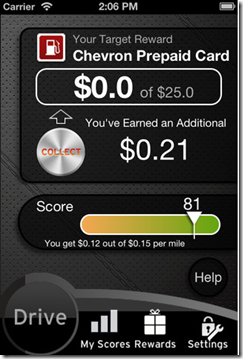
Its RefuelMe iPhone app tracks driving behavior, earning points for proper speed, acceleration, braking and cornering (see below left). It’s a lot like the Fitbit exercise tracker, which I’ve become obsessed with quite fond of recently.

Young drivers earn awards established by their parents. In the example below right, you can see that the driver is about 1% of their way to earning a $25 Chevron card. Results are tracked both in app (parent and child versions) and at the RefuelMe desktop dashboard.

The company plans on keeping it free and is looking to partnerships with high schools and others to get it in the hands of more teens (and their parents).

_________________________________
Analysis

While I think most parents see the value here, it’s also a difficult concept to monetize. There is a real education challenge to get trial, and an even harder problem of getting people to pay for it.

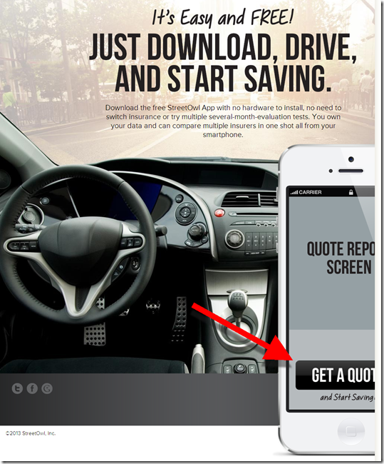
So the company has developed a version that is more tied into insurance savings, which has universal appeal. The idea is that the app can prove to the insurance company how super safe your driving habits are, then you can be rewarded with a lower price. And since Smart Owl is serving as a value-added matchmaker, they can be rewarded handsomely by the carrier (see last screenshot below).

Initially StreetOwl sees this a lead-gen program. But the startup is also in discussions with insurance companies about using the technology in place of dedicated hardware to power usage-based insurance. It could also be bundled with youth banking programs and/or PFMs as a value-add.

You can give RefuelMe a test run now. But the insurance lead-gen product is still in private beta and is expected to be released wider within a few months.   

————————–

RefuelMe iPhone app (18 April 2013)
Left: scoring system                                          Right: Dashboard with rewards

StreetOwl safe driving algorithm     StreetOwl scoreboard app

StreetOwl website

StreetOwl website

——————————–

Notes:
1. Hat tip to Venture Beat
2. StreetOwl is currently raising $750,000 in seed capital through Angel List. Ofer Raz and Jason Hovey are co-founders.
3. For more on banks offering insurance, see our full report here (Dec 2011, subscription)

Duke Energy Advertises Savings Account Alternative on NYTimes.com

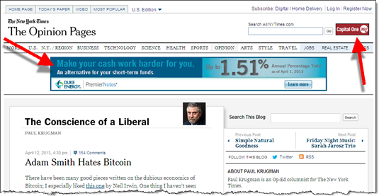
image Above a Paul Krugman Bitcoin commentary on NYTimes.com today, Duke Energy is pitching Premier Notes, a liquid savings account alternative that pays 1.5% for "deposits" of $50,000 or more, 1.3% for $10,000, or 1.1% for less than $10,000 (see screenshot below). Minimum opening amount is $1,000. There is no online application, but you can print a PDF and mail it back with your check.

The timing of the advertisement is no coincidence. March and April are the months when deposit balances swell temporarily with tax refunds. 

The Duke Energy rate is pegged at 0.25% higher than the taxable money market average, though that benchmark is essentially zero right now (2 basis points last week). So, it’s hard to know whether this is a promotional rate that could decline to 27 bps in the near future, of if Duke Energy will keep it above the highest bank rates. That will likely depend on how much money they attract.

The notes were introduced in early 2011, and have carried similar rates since for at least the past year. A May 2012 post at DepositAccounts.com lists the top rate at 1.6% and lowest tier at 1.25%. Apparently, GE and Ford offer similar programs. Those two are both paying 1.0% (for $10k) and 1.1% (for $50k+).

Bottom line: Banks have been competing for deposits with non-insured money market vehicles for decades. So, this isn’t a new threat, nor one that you are going to lose sleep over. But it could become a material issue if more non-financial companies target the retail saver.

—————————————–

Duke Energy banner ad in today’s NT Times website (link, 15 April 2013)
Note: Capital One 360 maintains its NYTimes.com presence in the small upper-right-corner logo

Duke Energy pitches Premier Notes on NYTimes.com

Duke Energy Premier Notes landing page (link)

Duke Energy Premier Notes landing page

—————————–

Note:
1. For more info, see our Online Banking Report (Nov. 2008, subscription) detailing various ways to leverage your online/mobile channel to boost deposits.

Fees: Regions Adds Time-Based Charge to Remote Deposits

image Retail bankers, we’ve had a sighting of that very rare bird, the North American Newfee. It was thought to have gone extinct in the fall of 2011, when anti-bankers shot down the last breeding pair, a malformed $5 debit card fee at Bank of America.

But surprise. Regions Bank has gone out on a limb and put a fee on the newest banking feature to sweep the nation, remote check deposit. And the bank didn’t settle for the standard per-use fee (in trial at U.S. Bank), Regions got creative with a tiered price dependent on how fast you want the money (see note 1 for exact wording):

  • Immediate >>> 1% to 3% of check amount, with $5 minimum
  • Same night (8 pm cutoff) >>> $3 per check
  • Two days >>> $0.50 per check

There is also a potential $1 additional fee to temporarily raise your daily deposit limit to deposit a large check.

My take: I think Regions is smart to add fee(s) for the huge value mobile deposit delivers, though I think it would be better as part of a feature-laden bundle sold on a monthly subscription fee (note 2).

But tiered pricing is a novel idea worth trying. And I like the three options. But its probably too complicated for new users, at least the way it’s presented in Regions FAQ (note 3). Also confusing matters, is the extra buck for checks larger than the user’s limit. It’s asking a lot for customers to decide among three options, especially when having to decipher jargon and timing rules such as "Funds are available during posting."  

image The multi-choice pricing scheme is an example of the paradox of choice. A theory (and direct marketing rule of thumb) that says you should keep choices to a minimum otherwise recipients become overwhelmed and just give up.

I think the bank would be better off starting with just two tiers, normal and expedited. Then introducing the third tier in v2.0 next year. 

But overall, congratulations to Regions for braving the unknown to see if this newfee has wings (note 6).

———————————-

Notes:
1. Here’s how the fee is explained in the FAQ:

image

A somewhat better explanation is included on the mobile banking page:

image

2. For more info on fee-based banking services, our Online Banking Report on fee-based online services (subscription, May 2011).
3. Hopefully, the choices are better explained within the mobile user interface, which I was unable to see.
4. As expected, the initial reviews from Apple app users are harsh. Currently the bank has just a 1.5 star rating on the new version of the app containing mobile deposit. Down from 2 stars previously.  
5. Sorry for the prolonged bird metaphor. Sometimes you get bored at the keyboard (keybored?). It’s also our second bird-themed post on fees. What’s that about?
6. American Banker: http://www.americanbanker.com/issues/178_66/regions-offers-mobile-deposit-for-a-fee-1058090-1.html?

Mobile: Malauzai powers auto-login option at 90 community banks and credit unions

image I keep running across Malauzai Software as I research mobile innovations. They have developed some of the cool stuff at City Bank of Texas (previous post) along with photo billpay at First Financial (previous post).

The software developer has also been pioneering mobile auto-login, a feature I’ve written about a number of times (see note 1). In fact, Malauzai has been offering a no-login option, called SmarText, for almost a year. In terms of installed clients, they are clearly the market leader.

With this optional feature, users that have enabled Auto Login are shown their balance and recent transactions as soon as the native app loads. No login required (see screenshots below). However, to do anything transactional, users must conduct a full username/password log in (see last screenshot). 

Malauzai’s SmarText passed compliance/security scrutiny at its clients since the system is no less secure that text banking. The system takes the balance/transaction info that would normally arrive via text message and displays it within the native app.  

City Bank of Texas was the first Malauzai client to adopt the technology in May 2012. Since then another 125 banks and credit unions signed up for the option, and 90 are live. Here are some stats across all the FIs:

  • 107,000 registered users
  • 145,000 downloads
  • 15% of users are opting for Auto-login
  • Auto-login accounts for 20% of total logins
  • Best of class clients have a 25% opt-in rate

————-

When Auto Login option is selected (left), balance and recent transactions are be displayed immediately

image    image   

However, full login required for transactions

image

—————————–

Note (Who’s on first?):

1. I get pretty excited when reporting new fintech bells and/or whistles. And I like to reward those pushing the envelope by anointing them first. But that can be risky. There can be a number of parties pushing it forward, making the claim of first murky at best.

That goes with the concept of no-login mobile balance lookup. Here’s a timeline of the various firsts in the United States for this technology:

Then there are a couple other "firsts" that I missed at the time:

  • Jan 2013 >>> First bank (prepaid card): Green Dot’s GoBank
  • May 2012 >>> First bank (checking): City Bank of Texas (powered by Malauzai, see above)

OK, I think that sets the record straight. Thanks everyone for innovating past the pesky mobile login problem.

Should You Install Mint@Yourbank?

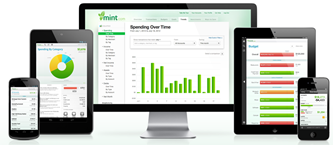
image Yesterday, Intuit announced a Mint-branded PFM that banks can install within their secure online banking sites (press release). Several pilots are beginning shortly, but widespread availability is expected towards year-end.

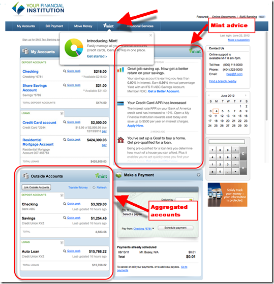
The service will contain similar functionality as Mint offers directly today. However, FI end users will not see third-party offers, unless the bank decides to run them. See the mockup below for what Mint will look like running within a retail bank.

Many of Intuit’s 1,100 online banking clients (500 of which use Intuit’s FinanceWorks PFM) will jump at the chance to integrate Mint. Non-customers will be considerably more wary. See the pros and cons below. 

I was briefed by Intuit’s Mint folks Tuesday, so I’ve had 36 hours to ponder the implications (see note 1). As Aite’s Ron Shevlin blogged yesterday, the move comes as no surprise to anyone. But now that the moment has arrived, banks and credit unions must decide if they want to cede PFM branding over to Mint. There is no right answer, but here are a few pros and cons to ponder: ________________________________________________________________________________
Pros:

  • Mint is THE brand name in PFM. In fact, it’s probably the best known name in all of personal finance, not counting big financial institutions and payment brands. When I tell friends and family what we do at Finovate, I usually get blank stares until I say that we have companies like Mint on stage demoing their new products. Then they get it; everyone seems to have heard of Mint. So it will be easier to educate the market by simply saying, “we offer Mint built right in to your online banking.”
  • Current Mint users can import their history and aggregated accounts right into your bank’s secure site with the click of the button. With 12 million registered users (note 1), that means that about 10% of your customers base has already set up an account there and could be off and running MUCH faster than using your home-grown service.
  • Tax integration: While some may view this as a con, the links between Mint and sister product TurboTax, provide a nice solution for banks to push during tax season. 
  • Attractive UI: While the other players (notably Money Desktop) have caught up, if not surpassed, Mint on the UI front, it still provides a UI that is head and shoulders above the typical banking site.
  • Early mover advantage: If you are the first in your market with Mint integration, it could provide a meaningful competitive advantage while you have that space to yourself. And the advantage could remain if you are thought of as “that bank with Mint” for the next few years.
  • Jump-start mobile money management: Few banks have anything beyond basic balance/transaction info in mobile banking. Whereas Mint is now acquiring almost half its customers in the mobile channel.
  • Your customers already use it: A typical bank has 10% of its customer base registered with Mint (though the active user base is much smaller). Those customers are being served competing offers whenever they login to Mint.com. Those offers are replaced with your marketing messages when using Mint@YourBank

________________________________________________________________________________
Cons:

  • It’s an added expense, potentially a significant one: Intuit declined to get into specifics of the cost, but they said there are per user per month charges. If I were Intuit, I’d start the costs low, and raise it aggressively over time as customers were locked into the platform.
  • Control goes to Intuit: Right now, financial institutions are in the drivers seat. Mint is popular and growing, but it’s unlikely to achieve true mass-market status without better integration into financial institutions. And if it becomes the industry standard, then banks may have less power in future negotiations.
  • Brand confusion: Adding another brand to the mix (i.e., one that competes with your FI brand) is always a tough call. And if other banks offer the same Mint-branded PFM, have you lost the potential for competitive advantage? Furthermore, does driving your customer into Mint actually make you more vulnerable if Intuit or someone else releases a “conversion kit” to move all your account to Mint.com or another bank’s Mint service. And will customers even bother to move from Mint.com to Mint@Yourbank?  

_________________________________________________________________________________
Bottom line: It’s a great move for Intuit. They extend their distribution, potentially dramatically, and better monetize Mint (note 2). And it gives Intuit a platform to develop additional services to sell to client banks. 

Should financial institutions jump on board? Assuming you can overlook control issues, it will boil down to the usual outsourcing issues (cost, support, integration, etc.). So, if Mint@YourBank looks economically feasible, it’s worth putting on your short list. The automatic conversion from Mint.com is a huge benefit. The known brand should make customer/employee education easier. And if you move fast, you can leverage the Mint brand to position yourself as the “personal finance” leader in your market.

But if you want to control your own destiny, avoid conflicting branding, and potentially lower costs (note 3), you may be happier with other solutions. 

————————————-

In this Intuit-provided mockup, Mint appear on main navigation and in two primary sections within online banking (3 April 2013)

image

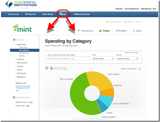
Clicking “Mint” on main nav bar leads to this familiar spending screen

image


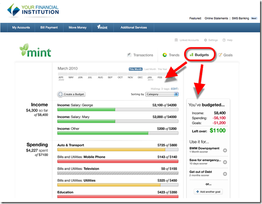
Secondary navigation leads to all the usual Mint functionality, for instance “Budgets” shown here

image

————————————
Notes:
1. For me, Mint has come full circle. I still remember nervous Mint founder, Aaron Patzer, at our first Finovate in 2007 (demo video). He was riding high after his win at the inaugural TechCrunch40 (now Disrupt) two weeks earlier, but he was afraid he’d be caste out by the banking audience he was attempting to disrupt. His fears proved unfounded as the audience voted Mint Best of Show. Now, his former company is making a bold bet that those very banks will now promote the Mint brand to their customers. 
2. According to an estimate by Steven D Jones at Dow Jones (no relation I presume), Mint brought in less than $3 million during Intuit’s fiscal second quarter. However, that does not include substantial cross sales of TurboTax and QuickBooks, which together are a $4 billion annual business.  
3. I’m making the assumption that as the premium name in the business, Mint will eventually cost more than other solutions. That may or may not happen, as Intuit is large enough to subsidize the service for at long as it sees fit.
4. Intuit will be demoing at FinovateSpring in May.
5. For more on balance forecasting and other advanced PFM features, see our Online Banking Report: PFM 4.0 (June 2012; subscription).

New Issue Published: The Finovate Quarterly from Online Banking Report

image For the past year, we’ve been publishing a wrap-up of each Finovate event. Since there is now a Finovate every quarter, we are rolling event coverage into a quarterly publication and expanding it to include other significant fintech developments.

The Finovate Quarterly is complimentary for Online Banking Report subscribers and is imageautomatically delivered to them via mail. Anyone else can purchase here.

The report focuses primarily on the highlights from FinovateEurope, including profiles of the Best of Show winners:

  • Credit-Agricole for its app store where it is wooing outside developers
  • ETRONIKA for its BANKTRON e-channel management platform
  • mBank with Efigence for their Facebook & social platform 
  • Meniga for its PFM platform, including “buy” vs “not buy” feature
  • Moven (Movenbank) for the worldwide launch of its mobile-optimized bank
  • Pockets United for its group purchasing mobile solution
  • SumUp for its mobile point-of-sale system
  • Virtual Piggy for its kids’ payment system with parental controls

The report also contains a run-down of the quarterly highlights and milestones at Finovate alums and other fintech companies. 

__________________________________________________________________

About the report
__________________________________________________________________

Finovate Quarterly  (link)
Highlights of Q1 2013, including a look at the best new products from FinovateEurope

Author: Julie Schicktanz & David Penn, Finovate Group Research Analysts
Editor: Jim Bruene, Finovate Group Founder

Published: 31 March 2013

Length: 64 pages; 10,000 words

Cost: No extra charge to OBR subscribers, US$150 for others here
The printed version will be mailed to subscribers next week.

_________________________________________________________________

Note:
1. See Best of Show methodology here.