Credit Monitoring Needs More Integration with Online Banking

Today I received my first alert (see screenshot below) since subscribing to Experian's credit-monitoring service about 4 weeks ago. While I appreciate the heads up, the user experience is not at all what I want.

Here are the problems: 

1. Cries wolf. All the alert tells me is that there was a "key change" posted to my file. Is it a routine credit inquiry (which I was expecting) or did someone just open an account at Best Buy in my name? The only way to find out is to log in to my FreeCreditReport account, which took three minutes since I couldn't remember the username/password. Please provide more info in the alert so I can better gauge the severity of the situation.

2. Not phish proof: While Experian does use my first and last name in the salutation, thereby improving believability, additional personalization is needed to help users know it's genuine, especially when the company's log-in process requires input of a social security number confirmation after login. 

3. Not enough trust: I've worked with Experian for more than a decade so I know and trust them. However, the average Joe/Jo doesn't really know whether FreeCreditReport is a trustworthy company or not. Credit monitoring alerts are too easy to miss if they don't come from a recognizable and trusted name. It would be much better if they came from the user's financial institution or card issuer, someone with whom they do business on a monthly basis, so the emails don't end up in some spam filter.

4. Not integrated with online banking: I really don't want to remember yet another username and password, nor do I want to spend five minutes of my day logging into another website to verify there are no criminals using my credit files. Credit monitoring and credit scores should be integrated into online banking so I can keep track while doing my normal banking.

5. Doesn't tell me what to do: In this particular case, I knew about the inquiry, but what if I didn't recognize it. The website doesn't provide any info on what to do if I did not authorize the inquiry, which could be the first sign of serious identity takeover (see screenshot below).

For more information, see our recent Online Banking Report on Credit Monitoring Services here.

Email alert from Experian's FreeCreditReport service (24 Oct. 2007)

Web 2.0 Takes Over the Top-10 Internet Domains

Here's a great slide from Mary Meeker's Web 2.0 Summit presentation (download at Morgan Stanley) showing the dominance of social networking sites. If you haven't been able to get management to buy off on your social media plans, circulate this slide.

These are the top 10 domains now compared to two years ago as measured by Alexa. The red sites on the left have dropped out of the top 10 giving way to the green sites. Web 2.0-oriented sites can now claim six of the top-10 slots, including four social networks: FacebookOrkut (Google), Myspace and Hi5, and two user-generated sites:  YouTube and Wikipedia.    

Also according to Morgan Stanley, worldwide Internet use passed the 1 billion mark early last year, and is estimated to hit 1.3 billion this year. The chart also shows the distribution of Internet users by region. Note the dominance of the red part of the bar, and, no, that's not Republicans, it's Asia/Pacific.

New Direct Bank: NewBank from Stockman’s

I'm not sure how new it is, but Bank Deals Blog had its first posting yesterday (here). NewBank from Elk Grove, CA-based Stockmans Bank coincidentally was purchased by PremierWest Bancorp while I was writing this blog post yesterday.

It looks like another deposit play, offering higher rates through the online brand to help it keep rates at the parent relatively low (see comparison below). The direct bank is also offering a $50 bonus for new checking accounts opened with at least $2,500 (see screenshot below).

Here are the rates for a $20,000 balance:  

                             Stockmans      NewBank    Advantage

Interest checking >>> 0.50%         3.50%            7x

Savings >>>>>>>>>>>> 1.35%          4.00%           3x

Money market >>>>>> 2.30%           n/a            1.5x (vs savings)

6-month CD >>>>>>>> 4.30%          5.25%           +22%

First National Bank of Omaha used this approach to bag $1.5 billion in deposits at its Internet subsidiary, FNBO Direct, since its February launch (see previous coverage here). 

Thanks to Bank Deals Blog for the tip (here).

Mint Lands More Press Coverage

Mint has certainly caught the attention of the nation's press. Over the weekend, I watched CEO Aaron Patzer interviewed on San Francisco's channel 5 (video here). Today, the Wall Street Journal ran a Q&A with Patzer in the Lee Gomes Talking Tech column under the headline, Financial Software Moves to the Web (p. B3, see note 1). The WSJ article itself is a throwback to the late 1990s, talking about the advantages of Web-based apps vs. desktop apps. 

The Mint press coverage reminds me of the 2000/2001 period when Yodlee and Vertical One burst on the scene with "account aggregation" services. Mint wisely steers clear of that out-of-fashion term and focuses on the benefits it provides, namely saving users from themselves by pointing out the sometimes substantial money to be earned putting spare cash to work in a higher-yield account.  

We will continue to watch Mint closely, not because its services are unique: Yodlee, Wesabe, Jwaala, Geezeo, Digital Insight (Intuit) and many others provide essentially the same thing. But Mint is the hot new kid on the block and seems to have struck a nerve, at least with the early-adopter financial junkies, which includes the personal finance press. It will be interesting to see how the company builds on its momentum and what implications, if any, its early success has on the broader banking marketplace.  

Note:

1. Thanks, Mom, for the WSJ tip. And no, the "developers conference" mentioned in the article was not our FINOVATE, it was TechCrunch 40 held two weeks earlier. Mint won awards at both.  

Using Mint (part 1): First Impressions

link to mint.comEver since receiving a private beta-invite a month ago, I've been meaning to run new personal finance site Mint through its paces. Then, after it won Best of Show at TechCrunch40 and our FINOVATE conference, I really wanted to see if the product could possibly live up to the expectations created while watching CEO Aaron Patzer give a demo (see previous coverage here, see note 1 below).  

But it takes time to really analyze a website, and I hadn't got around to it until today, when I was inspired by Ron Lieber and his team at the new Dow Jones/IAC site FiLife (press release here) as they reported on their individual results using the Mint's online personal finance tools (see coverage here).

I will file a series of reports as I use the program over the coming weeks. Today, we begin with the first impressions.

First Impressions
Homepage: One thing you notice when you visit Mint.com is that it looks nothing like a banking site (see first screenshot below). That can be good or bad. It's good because it sets the site apart from a normal financial services site. But that can also be a problem because the first, second, and third things users care about at a new financial site is whether it's secure or not. And a bankish "look and feel" can increase consumer trust.

But Mint does an admirable job walking the fine line of creating an engaging look while still reassuring visitors that it fiercely protects their data and privacy. The three large benefit statements in the middle create interest in the product, while the bank logos and the TRUSTe at the bottom provide visual clues that Mint is a serious player.

And the graphic design, leveraging the clever "Mint" name, combined with the light green color scheme, create an inviting site that should do well converting lookers into registered users (active users is another matter, more on that later).

Copy is concise, just 60 words above the fold (see note 2), and completely benefit oriented. Learn more button allows users to drill deeper, and you can't miss the call to action, Sign Up Now in the middle of the page.

Features page: Navigating to the feature page is simple, either click on the "Learn More" blue button in the middle of the page or use the "Features" tab at the top. The page does a great job laying out the key benefits with good use of headers and concise, bulleted lists supplemented with clear, attractive screen-captures of key points (see second screenshot below). Also note the prominent placement of big-name financial brands, Chase, Discover, and E*Trade, to increase trust.  

While the page does a good job highlighting features, it doesn't provide any interactive way of learning about the tool before signing up. Video and audio help goes a long way in demonstrating the features (see Jwaala/Amplify CU Money Tracker video here).

Mint.edu: A nice touch. Instead of calling it "education" or "blog" or something else no one would ever click on, Mint uses the clever Mint.edu (see third screenshot below). That's a URL that will resonate with its younger members and anyone familiar with higher education domain names. And once at the .edu site, engaging blog entries allow users to dig deeper into what is going on with the company and read about personal finance topics in general. RSS and email subscription options are clearly presented in the right-hand column.

Grade: A+

Mint Homepage (19 Oct 2007)

Mint.com homepage

Mint Features page (also accessible via "Learn More" button on homepage)

Mint.com features page

Mint.edu page (19 Oct 2007)

Mint blog page

Notes:

1. The video of Aaron Patzer's FINOVATE demo will be online within the next week at FINOVATE.com. In the meantime, you can see him on the Channel 5 SF news here.

2. Red line in screenshots 1 and 2 indicates the bottom of the screen using 1024 x 768 display on 13.3-inch laptop screen.

High-Rate Savings for Kids, Patelco’s "gr8 r8"

Earning interest is a great incentive for kids to save. Even a couple bucks in "free" money earned on their deposit is a great motivator. But with many savings rates below 1% annually, it doesn't add up fast enough for lower balance levels. At US Bank's 0.10% rate, my son's $1,700 in savings would only earn him $1.70 per year, or 14 cents a month. There is no incentive there.

But at Patelco Credit Union, with its kid-friendly "gr8 r8" account (see note 1, 2), he would earn 8% on the first $1,000 and the going rate on the rest (1.51%). And the 8% is guaranteed through the end of 2008. So his annual return increases to $81, or almost $7 per month, 50x the US Bank return. Seven bucks extra a month is real money to a pre-teen, and gives him a good taste for the benefits of saving and investing for the long-term. Even more important, it positions the CU as family friendly, impressing the parents and maybe hooking the kids as future members as well.

Granted, the business case is tricky. Does subsidizing junior to the tune of $5/mo really benefit the credit union and its members. If the CU had 20,000 of these accounts, that's an extra $1.2 million per year in interest expense. Might the credit union's other 220,000 members prefer an extra $5 in their accounts at the end of the year? I'm guessing most members would support efforts to instill savings discipline in today's youths. And the marketing and PR benefits are excellent. The CU even features the account on its homepage (see screenshot below).

So, overall I r8 it gr8. Thanks Trey (see note 2).  

Patelco CU homepage (19 Oct. 2007)

Notes:

1. Must be under 21 when account opened. No maximum account balance, but only the first $1,000 earns 8%. The special rate is good through the end of 2008, when the account reverts to a regular savings account.

2. I just realized the account name, gr8 r8, is a double entendre, not only being SMS-speak for "great rate," but also with an eight-percent rate. [My family has to spell these things out for me.]  

3. Thanks to Trabian's Trey Reeme for the tip (here). And I agree with him, gr8 r8 savings absolutely must have an SMS component, at minimum a message each month when the "free money" (interest) is added to the account.

Schwab Promotes 4% APY Checking Account on Homepage

I never thought I'd see the day that Charles Schwab featured a checking account on its homepage (see note 1). Even Schwab, that built its business catering to do-it-yourself individual investors, wants a piece of those cash balances sitting in non-interest checking or low-rate checking/savings accounts.

With many major banks still paying next to nothing on deposits (as low as 0.10% annually on savings, see note 2), direct banks and other non-traditional outlets are still looking to grab deposit share even though most have dropped their promotional rates below the magic 5% mark (previous coverage here). 

Schwab.com homepage (18 Oct. 2007, 11 a.m. Pacific)

Schwab login page (18 Oct. 2007, 11 a.m. Pacific)

Schwab login page with checking promotion


Note
:

1. The bank promotion is on Schwab's main site, NOT a special landing page or Schwab Bank page.

2. Memo to US Bank: Don't you think it's time to raise your savings account rates? I have my checking account at US Bank and was thinking of parking some cash for a few weeks in an interest-bearing account. But I was shocked when I looked at the rates. There is nothing I could apply for online that would pay more than 0.40% and most paid just 0.10% (see inset).  

That's no typo; one-tenth of one percent on savings accounts across all balance levels. That's less than a $1 per month on a $10,000 balance! Pre-tax.

There's only one deposit account that cracks the 1% mark, Maximum Money Market, which pays 2% to 2.5% for balances greater than $10,000. But you can't even apply for that one online, you have to visit a branch. 

I don't care how much you make on the so-called lazy money, a rate page that looks like US Bank's (see screenshot above) is a marketing and PR disaster.  

New Online Banking Report Published: 2008 Planning Guide

Link to Online Banking Report 2008 Planning Guide Over at Online Banking Report, we just posted the latest report, our 13th annual Online Banking Planning Guide (2008 version). It includes 60 pages of ideas, tips and tools to help you generate new ideas, plans, and strategies for 2008 and beyond. Subscribers, you may download it now (here) as part of your subscription. Others may purchase (here).

While there are more than 500 online banking product and marketing ideas in the report, we hand-selected 15 to put on the hot list for next year:

  • Alt-mortgage zone
  • Balance transfers
  • Fraud monitoring
  • Green banking
  • High-yield savings
  • Home equity center
  • Long-term archives
  • Microbusiness services
  • P2P loan servicing
  • Personal finance
  • Premium/VIP online banking option
  • Prepaid cards
  • Problem mortgage help
  • Web 2.0
  • Widgets

Online Financial Services Scorecard: August 2007

Compete's online financial services purchase activity

In April, we introduced the Financial Services Monthly Performance scorecard produced by Compete. It summarizes the overall performance of 23 large U.S. financial institutions and lead-generation sites. Refer here for the detailed methodology as well as companies tracked. 

Commentary
In August, the continued rise in interest rates led to a drop in home equity, mortgage refinance, and credit card applications while deposit accounts and purchase mortgage applications were up.

Some highlights from the monthly activity: 

  • Credit Card applications were down 2% overall, but Chase (27%) and Capital One (5%) grew applications and conversion compared to July
  • Savings applications were up across the group with the exception of Citibank which posted a 13% decline
  • For high-yield savings, only HSBC and ING Direct saw both application and conversion growth
  • Home equity application/lead volume and conversion dropped across the group with declines observed at 9 of 16 providers
  • Purchase mortgage  application/lead volume was up over July with Countrywide and Capital One both showing notable growth
  • The refinance mortgage market was flat overall, masking strong application/lead growth at Countrywide, E-Loan and NexTag while declines were recorded at LendingTree/GetSmart, LowerMyBills and Low.com

Virgin Money USA Launches in Boston/NYC Today

Link to Virgin Money USA Ever since Virgin bought CircleLending for $50 million earlier this year (previous coverage here), I've been looking forward to its launch. We hoped they might launch at our FINOVATE conference two weeks ago, but we lost out to the Mortgage Banker's Association's 94th Annual Conference in Boston, where Sir Richard Branson delivered the opening keynote a few hours ago. 

According to today's NY Times, Sir Richard himself will hand out red "dollars" today in Boston's Copley Square while mere mortals will be doing the same in Manhattan. 

We now have answers to several questions about the new venture:

  1. Will Circle Lending's product, person-to-person loan administration and servicing, live on?
    Answer: Yes, in fact it looks identical, but with much more marketing pizzazz.
  2. Will the Circle Lending product be extended into a person-to-person loan marketplace like Prosper and LendingClub?
    Answer: Not yet, but I still expect that to happen.
  3. Will Virgin Money use person-to-person lending as an entry point for a full line of financial services?
    Answer: Not yet, but there has to be more coming.  
  4. Will Virgin Money bring the hip U.K. direct-banking vibe to the United States?
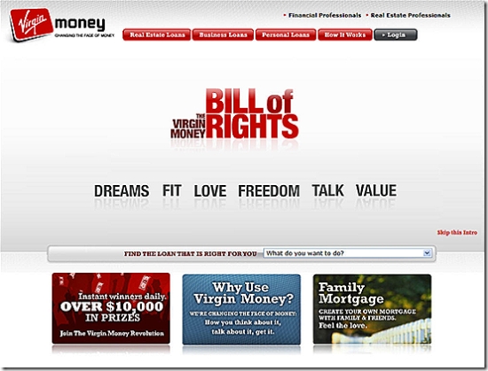
    Answer: Yes, the website is very progressive by U.S. banking standards (see screenshot below). I haven't seen any other media efforts yet. However, the current homepage design is marred by an annoying Flash display that is a real turnoff even on a broadband connection. Once you get off the homepage, the rest of the website is excellent.

According to today's Boston Globe, the company currently employs 30 in Waltham, Mass., a headcount that will double the over the next year as it introduces more services. The only new service disclosed so far is student loans, an obvious fit with the friends and family real estate, business, and personal loans offered today. We'll be following Virgin Money USA closely and will include an in-depth analysis in an upcoming Online Banking Report on person-to-person lending (2006 report is here).

Virgin Money USA homepage (15 Oct 2007)

Virgin Money US homepage

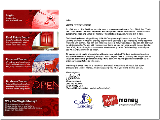
 Goodbye page at CircleLending.com (15 Oct 2007)

Circle Lending referral page to Virgin Money USA

Mint.com Traffic = $17 billion bank

Compete's latest data confirms the spike in traffic at three-week old online personal finance startup Mint. The startup created considerable buzz after winning the $50,000 grand prize at TechCrunch in September (see previous coverage here).  

According to Compete, Mint's 200,000 unique visitors in September equaled that of $17-billion Webster Bank, the 64th largest U.S. bank or thrift holding company according to American Banker (Q1 2007). It will be interesting to see if Mint experiences a dramatic traffic decline after the publicity-driven visits slow down.   

Traffic at Mint.com (blue) vs. Webster Bank <websteronline.com> (red)

Mint vs Webster Bank traffic

Banks Scarier than Criminals. Really?

You know you are losing the PR battle when headlines like this begin to appear:

The point of Tuesday's column from MSNBC's Bob Sullivan, is that consumers fear overdraft fees more than fraud. Hmmm….would that have anything to do with the fact that customers PAY for overdraft fees while the bank picks up the tab for most fraud?

But even overlooking that minor piece of common sense, how does annoyance at overdraft fees equate to being "scarier than criminals?" The headline does a disservice to Sullivan's well-researched and thoughtful column.  

What Banks Should Do
While the headlines will hopefully be a bit more objective, expect more of the same in the coming year. Overdraft fees are becoming a big story. And as the 2008 election cycle kicks in to full gear, expect more grandstanding from politicians on both sides of the aisle. No one wants to be on record as being "for" overdraft fees, or any bank fee for that matter.

Banks need to do two things to head off a PR disaster and avoid pricing caps and/or more regulation from Congress:

1. Look hard at overdraft fee policies including both size and timing of the charges. And if you do find a way to cap/lower or lower overdraft fees, wrap that news in a big bow and deliver it to your customers for the holidays. And if you have a lower fee than the big banks in your market, by all means, let your customers know.  

2. Proactively sell overdraft protection options and balance-awareness services such as online/mobile banking and low-balance alerts via email and text message.

And one more thing:

In press interviews and marketing messages, eliminate all references to "courtesy" and "a service for our customers" in describing overdraft fees. Stay on the message that the onus is on the customer to track their balances. Here's a great response, ABA congressional testimony quoted in the MSNBC article:

The bottom line is that customers are in the best position to know what their actual balance is — only they know what checks they have written, automatic payments they have authorized and debit card transactions they have approved," Nessa Feddis, a spokeswoman for the American Bankers Association, said during congressional hearings earlier this year. "Simply put, consumers are in control of their finances and can avoid overdraft fees.