Should Your Bank’s Chatbot Have a Name?

Should Your Bank’s Chatbot Have a Name?

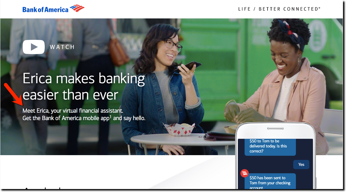
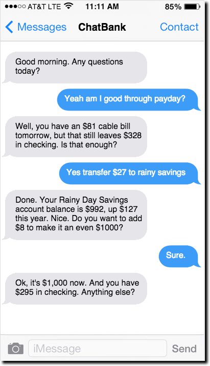
When Bank of America introduced its chatbot in March it decided to name it Erica (not coincidently, pretty similar to Amazon’s Alexa). I’m a big fan of self-service and pleased that banks are using AI/ML/DL, and common sense, to solve my problems without talking to a human. But do I really want to converse with a robot, or do I just want to have my problems solved?

I’m comfortable talking to Siri or Alexa, but they sit in a different space than a bank’s voice interface. Alex needs to be awakened to do its job. But if you are already on BofA’s mobile app, there isn’t the same need to announce your arrival (see note 1). It’s a good UX improvement to give users the option to make a voice or chat query. But I don’t see the benefit of “naming” the voice response unit. It reminds of Microsoft Clippy, an automatic windows popup “helper” used from 1997 to 2001. I thought it was cute at the time, but people don’t want cute getting in the way of their task accomplishment, they want speed and accuracy. Anything that takes away from efficiency is potentially annoying.

In such a new area, there isn’t a body of research to fall back on when making a decision. But I did find an interesting post from an exec at Intercom, a digital messaging company. Originally, they named their bot, but they found that is was intimidating to users. It wasn’t until they eliminated the name that users began to appreciate the self-service tools.

What we found was surprising. People hated this bot — found it off-putting and annoying. It was interrupting them, getting in the way of what they wanted (to talk to a real person), even though its interactions were very lightweight. We tried different things: alternate voices, so that the bot was sometimes friendly and sometimes reserved and functional. But we didn’t see much change. It was only when we removed the bot name, took away the first person pronoun, and the introduction, that things started to improve. The bot name, more than any other factor, caused friction.

Intercom concluded they needed to make the chatbot invisible so that it didn’t get in the way of the interaction.

Making technology disappear so that it becomes a true tool for humans— like a hammer, or a nail, or a pencil — that’s the true measure of success for today’s designers. And making tools quieter to use, so we can use them more intuitively— that’s the true measure of success for a designer who deals in words.

Moving forward:
You absolutely should be investing in making your banking app and customer service run without human interaction, whether by voice commands, typing or touch controls. Customers want to get their banking done as fast as possible, so the UX improvement and cost savings potential are significant. But put your money into an efficient UX, not a cutesy name (see note 2).

________________________________________________________

Author: Jim Bruene (@netbanker) is Founder & Advisor at Finovate as well as Principal of Fintech Labs, developers of the financial services user-experience standard, BUX Certified


Notes:
1. I’m not talking about Alexa skills here. “Alexa, what’s my Bank of America balance” is a great use of voice technology. But, saying “Alex, ask Erica what my bank balance” is redundant and a bit silly.
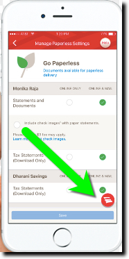
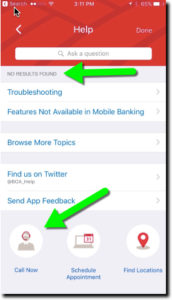
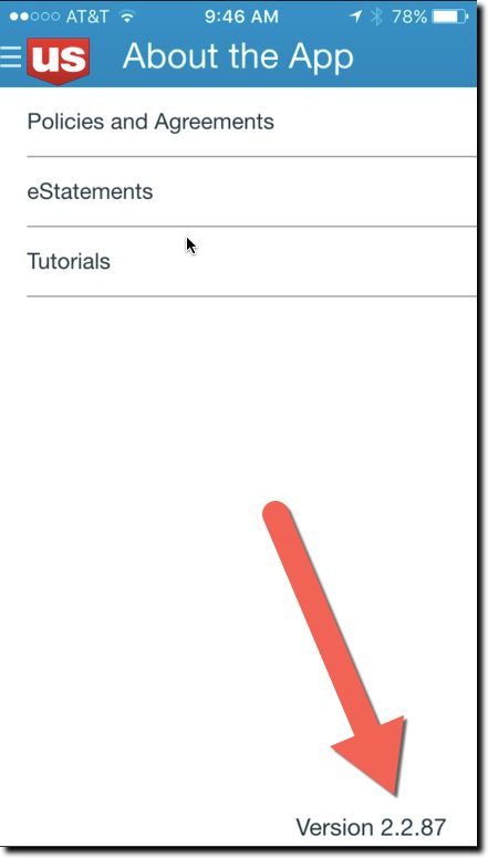
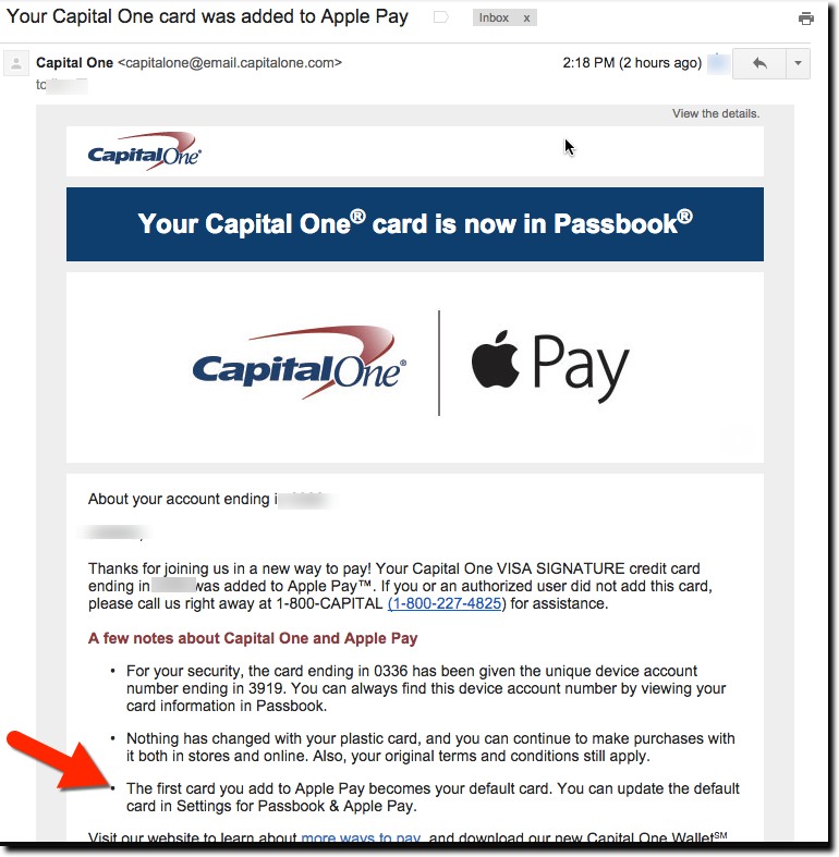
2. Bank of America downplays the Erica name in its mobile app. Other than the awkward introduction to Erica when you first start using it, the bank avoids using the name and simply posts a BofA logo in the lower right of each screen (see screenshot right). Pressing it opens up the chatbox interface where you can type or speak your question. That’s great customer service. But I bet they’d get better takeup if they stopped “introducing” you to a robot the first time.

Turning the Tables: AI Will Help Consumers Fight Bank Fees & Penalties

Turning the Tables: AI Will Help Consumers Fight Bank Fees & Penalties

There’s an interesting article in today’s WSJ about DoNotPay, a free AI-powered chat-based service that was built to help London residents automatically fight parking tickets.  That service has now assisted 400,000 consumers fight off $11 million in fines (more background at TechCrunch).

It’s the brainchild of then 17-year old Joshua Browder (who is now 19, and of course, studying CS at Stanford). But Browder is not content beating the meter reader. He is now gearing up to equip everyone with free AI-powered law tools to take on bigger injustices and issues (see DoNotPay overview video above). His latest work, a tool to make it easy to process a no-fault divorce, something that typically can cost $10,000.

The article mentioned a few more areas ripe for this type of tool: airline restitution for delays and lost luggage and battling telemarketers and landlords.

But one area that’s sure to attract multiple consumer AI startups: bank fees, penalties, credit decisions, and more. What are you going to do when you start receiving hundreds, if not thousands, of cease & desist letters challenging NSF charges, late payment fees, and so on? Or worse, suing you in small claims court or threatening arbitration (see the current default “problem” at DoNotPay, how to sue Equifax for $25,000, inset).

You are not going to be able to afford the legal expense to fight for a $35 NSF fee. Eventually, you’ll have your own AI to fight their AI, but that’s a ways away (though if you saw Tim Huber’s AI talk at FF, it may be closer than we think).

An even bigger issue are all those sketchy charges on bank credit and debit card. It’s not a stretch to imaging the consumer’s AI routinely filing disputes and following up over and over again until you and/or the merchant capitulate.

Bottom line: Make sure your penalty fees are appropriate, well communicated, and understood by customers. And you might want to pay a bit more attention to new technologies available to answer customer queries, and even legal threats, in a semi-automated fashion.

Author: Jim Bruene (@netbanker) is Founder & Senior Advisor to Finovate as well as Principal of BUX Advisors, a financial services user-experience consultancy. 

Mobile Monday: The Bank of America “Help” Button

Mobile Monday: The Bank of America “Help” Button

bofa_help_top

I love the minutiae of digital banking. Others may be fascinated with how the blockchain will disrupt global payments or the impact of Dodd-Frank on debit-card rewards. Me, I just need a shiny new button to make my day. And as luck would have it, Bank of America obliged in its latest iOS update (Sep 22, v7.1).

The bank added a Help button centered at the top of the screen on most pages (see above and first screenshot below). Pressing the button leads to a slightly context-sensitive, self-service menu with an “Ask a question” box on top (second screenshot). The search failed my advanced search stress test (Do you have SEP IRAs?, third screenshot), but otherwise seemed serviceable. And it was relatively straightforward to find the right button to connect to an actual human at the call center.

Bottom line: Locating a Help button in a prime position is a good way to show that you care about the customer’s experience. It would be nice if the BofA button led to a better search function, complete with an audio option, and better context-sensitive results (note in screenshot 3, the top result from my SEP-IRA question is “Troubleshooting”). And if I was being totally honest, the button is a little hard to see on a tiny screen, the red on red. But regardless, it’s a good start.

New "Help" button on BofA mobile "transfer" screen
New “Help” button on BofA mobile “transfer” screen
Screen shown after pressing "Help" on Transfer page
Screen shown after pressing “Help” on “transfer” page
Result of search for "SEP IRA" on Help page
Result of search for “SEP IRA” on “Help” page

Chatbot Banking

Chatbot Banking

2 5 billion peopleTry wrapping your brain around this little nugget. There are now 2.5 billion unique users of messaging apps worldwide. And they are fast becoming news, search and ecommerce platforms on their own.

How does chat morph into ecommerce, let alone banking? In China and other Asian countries, embedded chatbots are all the rage on messaging platforms such as Wechat, WhatsApp, Kik, Telegram and Slack.

Telegram is the only messaging platform to open up its chat API, such that there are now 120,000 bots serving its 5 million users (for example, see @gif and @vid at work here).

Tencent’s WeChat, the most popular messaging app in China … lets users shop, pay bills and book appointments.
Wall Street Journal, 22 Dec 2015 

chatbank_mockupJust yesterday, YC-incubated Chatfuel demoed its platform at W16 Demo Day. And it’s coming soon to Facebook’s Messenger (of course).

Chatbot is hard to define. Google tells us:

chat·bot /ˈCHatbät/
noun
a computer program designed to simulate conversation with human users, especially over the Internet.
“Chatbots often treat conversations like they’re a game of tennis: talk, reply, talk, reply.”

Unlike sales/service “live chat” that’s become commonplace within online banking, chatbot banking is 100% automated and includes a back and forth “chat” designed to hone in on the precise question or request. They are a boon to mobile self-service, where the limitations of screen size make traditional searching less user-friendly.

But chatbots can also handle transactions, especially the repetitive routine ones typical of online/mobile banking sessions. See the inset for how I imagine text banking might work for one of the most common tasks: balance inquiry with a subsequent funds-transfer.

Looking ahead
If you think of online banking via a PC as digital banking 1.0, and mobile as digital banking 2.0, then the upcoming invisible UI (or the “no UI, UI” coined by USAA’s Neff Hudson) using chatbots, AI and machine learning could very well be version 3.0. At least, that’s my hope. It reminds me of my all-time favorite quote about banking (circa late 1990’s), from noted technologist Esther Dyson:

Banking is like vacuuming; it’s vital, but everybody tries to reduce their vacuuming time.

Embrace the vacuum. People pay good money for them (no relation to Esther, I think).

Mobile Monday: Communicating Critical App Updates via Email

Mobile Monday: Communicating Critical App Updates via Email


usbank_mobile_upgrade_email_border

       Email from US Bank to mobile banking customers (12 Nov 2015)

Last week I wrote about how much I liked US Bank’s new native app. So I understand why the bank is anxious to get users ported over to the new version. Customers are going to like it. Guaranteed.

Yet I was a little surprised, just a week into the new version, to receive an email warning that the previous app was about to stop working (see message above). This urgency makes customers question whether something is seriously wrong with the previous version. The message is also annoying in that it doesn’t really give the customer any clue as to whether their version is the current one, or not. It provides only the version number (2.1.76) which is the cut-off between good and bad apps.

This message offers so many opportunities to improve that I was compelled to compile a top-10 list of gripes (plus 2 bonus nitpicks). They are listed, more or less, in priority order:

  1. I had already updated to the new version, so this message was completely unnecessary. And if the bank doesn’t know which version I’m using, it should say so.
  2. There is no explanation of why it was suddenly so urgent to upgrade. Skeptical users were left to their imaginations, not something you want in these days of widely publicized security breaches.
  3. usbank_appversionnumberInstead of talking about version numbers, why not just describe the new app? It looks completely different! A quick description and screenshot would have been understood by 90% of the readers, and would have allowed users to move on with their day, rather than having to engage in a tedious “find the version-number hunt.”
  4. If you must use a version number, then at least explain how to find it. The email failed to address that key point in the body, fine print, or within any links provided within the message. It’s not that simple to find the version number. You must log in, find the hidden primary navigation, choose “About the App” and notice the version number in the lower right corner (see inset). 
  5. If you are going to make such a big change, use a whole number for the new version of your app. In this case, it would be easier to say, “Use v3.0 or later.” 
  6. The links provided to update the app did not go to the iTunes app-update page, but instead went to a marketing page at USBank.com. And the marketing pages, while well done, also did NOT link to the app store’s update pages. In fact, to confuse things still further, the marketing page said the new version “was coming soon.”
  7. The only way to get help was to make a phone call to the general 800 number; no direct line to tech support was given. And not even an FAQ page, email address, chat, or any other type of digital link was provided for help in responding to this matter.
  8. The email message was not optimized for mobile. It was hard to read on my iPhone 6.
  9. It does not specifically address what happens if you don’t update within the next few days; “discontinuing support” has a number of meanings from simply not getting tech support to completely not working.
  10. The bank’s message concluded with thanks for being a mobile banking customer, but they could have also thanked me for taking time out of my day to deal with this “Maintain access … update now” emergency subject line in my inbox.
  11. <Nitpick #1> The first sentence of the second paragraph uses “new” three times.
  12. <Nitpick #2> The closing sentence repeats the “enhanced convenience” copy point. This is a generic benefit at best and shouldn’t be invoked twice in a 150-word message. The resulting inconvenience to update makes their value judgment of questionable importance.

Bottom line: Customer communications are not easy, especially with newer technology. So make sure to test them with some less-savvy users before hitting publish.

Mobile Monday: Helping Customers Understand EMV & Mobil Payments

Mobile Monday: Helping Customers Understand EMV & Mobil Payments

emv_dipThis week’s EMV “liability shift” in the United States is expected to be a boon for mobile payments. We are undergoing a massive expansion in number of NFC-enabled terminals, at a time when Apple and Android Pay are not only measurably faster than the more time-consuming “chip dip”, but also more secure. That’s a HUGE change in the “relative UX” between the two options.

Savvy issuers should seize on the negative publicity and confusion around EMV plastic cards and push NFC options, both within the native app and on desktop and mobile websites.

But from what I saw today during a tour of several dozen major bank and credit union mobile sites (using iPhone 6), very little is discussed about this change. In fact, none of the 25 largest banks address it on their mobile homepages. I finally found one mid-sized credit union that addressed EMV (First Tech Federal Credit Union) and another that mentioned Apple Pay, albeit a few screens down (Stanford Federal Credit Union), but neither of them addressed both issues (see screenshots below). Both CUs have responsive homepages, so the messaging was the same on both the desktop and mobile web.

Most issuers address basic EMV questions when sending new chip-cards to customers. But I’m guessing that:

number of cardholders who read the EMV instructions
x
the number that understood it
x
the number that remember it
=
zero

This is a good opportunity to get your cardholders on board with Apple Pay and Android Pay. And don’t forgot to help them understand how to make your card the default in the Apple Wallet (previously called Passbook). Refer to Capital One’s email explanation sent to cardholders after adding their card (screenshot below).

———–

Mobile website homepages from Stanford Federal Credit Union (left) and First Tech FCU (right)
As seen on iPhone 6 at noon, 28 Sep 2015

stanford_FCU_mobilehome 1sttech_mobilehome

———-

Capital One email sent to cardholder minutes after adding card to Apple Pay and authorizing through Capital One mobile app (28 Sep 2015)

capitalone_applepay_email2

——–

FinDEVr2015LogoV2DateWe will be addressing issues in EMV, mobile payments, and much more at Finovate’s second annual developers’ event, FinDEVr, 6/7 October in San Francisco.


Tuesday Tactics: The Art of Bank’s Own-Site Search

Tuesday Tactics: The Art of Bank’s Own-Site Search

37948595_sOne area that’s long been marked “needs improvement” on most banks’ digital report cards is site search. But it’s getting much better. Five of the 10 largest U.S. banks—BofA, Wells, Citi, Capital One, PNC—now offer “autocomplete suggestions” something even Google didn’t fully implement until 2008.

That’s great progress, but even at these digital leaders the search results can fall short. Most FIs still present a laundry list of results with some sorting for relevance. For easy searches such as “checking,” all the majors deliver relevant results. But only one takes it to the next level, Capital One (also an honorable mention to BB&T for including thumbnail pictures, making results look much more interesting, and to PNC, for including product recommendations for some searches, e.g., “checking”).

capitalone_search_suggest1

Of the 10 U.S. megabanks, Capital One is by far the winner in our search for good search. They do five things in the initial search that most others do not:

  1. Since search is often related to branches/ATMs the bank includes a link to that at the top of the search page (see #1 in screenshot)
  2. The suggested search terms are well curated (see #2)
  3. Most-likely product-results are included at bottom with eye-catching graphics (see #3)
  4. The bank does not automatically assume you are a consumer. In this example, they showed links to both consumer (interestingly, only to the 360 products inherited from ING Direct) and business checking (see #4)
  5. The UI is very Google-like with lots of white space and no distractions

————–

In addition, Capital One’s search-results page is laid out in a user-friendly manner:

capitalone_search1

There are five key sections (noted above):

  1. Capital One assumes all searches are “questions,” so it provides the most likely answer in a shaded box at the top of the search results
  2. Other curated FAQs related to the search-term
  3. Full site-search results
  4. Contact Us section for more help
  5. Feedback loop

———-

Interestingly, unlike the other nine mega-banks, Capital One does not offer site-search directly on the homepage. A search icon is prominently located on the top right, but the bank takes you to a separate page to begin the search. I prefer searching directly on the homepage, but that’s not nearly important as delivering relevant and well-structured results.

———

Note: We looked at these major U.S. retail banks: Bank of America, BB&T, Capital One, Chase, Citibank, HSBC, PNC Bank, Suntrust, US Bank, Wells Fargo

———-

FinDEVr2015LogoV2DateWe’ll be delving deep into issues like this at the second annual FinDEVr event for digital bank builders on 6/7 October in San Francisco.


US Bank Adds “Thank a Banker” to Homepage

US Bank Adds “Thank a Banker” to Homepage

usbank_thankabanker_boxUS Bank has been on a roll lately, appearing in our blog more times this summer than in the previous three years. Its latest novelty? A unique “thank a banker” function, complete with smiley face emoji, prominently located at the bottom-middle of homepage (below the fold on my 13-inch laptop). It’s shown to both customers and non-customers.

I wasn’t sure what to make of it. While I don’t see the harm, it would seem to be a fairly low-usage feature to warrant homepage real estate. But the more I thought about it, the more I liked it. It’s great brand positioning, essentially saying, ‘Hey, look. we aren’t one of those impersonal banks. Our customers love us so much we have to put a box on our homepage to collect all the compliments.’

And then if anyone actually does use it, the bank gets a stream of attaboy/girls to send out to staff. Clever. Hopefully, the bank sends the customer a nice thank-you email (I hadn’t received one 30 minutes after submitting form).

The website function is outsourced to an employee-recognition specialist, OC Tanner. An ewardcenter.com URL is displayed to US Bank customers as they fill out the 13-field form, a hefty 9 of which are required fields (see second screenshot below).

—–

More importantly, I like the Labor Day loan sale at the top of the US Bank homepage (see below). It’s traditionally a big car-buying weekend, so it’s a great time to promote vehicle lending, especially with the still ridiculously low APRs available here.

—–

US Bank homepage (3 Sep 2015, 10:00 a.m. Pacific):

usbank_home_0915

US Bank “thank-a-banker” form (link):

usbank_thankabanker


Feature Friday: Umpqua Showcases the Closest Branch on its Website

Feature Friday: Umpqua Showcases the Closest Branch on its Website

umpqua_personal_home

I’m not a fan of bank branches (except Chase’s Northeast Seattle outpost, Hi Ben). In my view, 80% of what goes on there is better done remotely, and the other 20% just doesn’t provide enough ROI. But if you do have good branches, you should at least use your digital presence to showcase them.

Probably the best example of growing a franchise using branching—at least in the United States over the past 20 years—is Umpqua Bank. It grew from a small community bank to a West Coast regional on the back of its innovative branching strategy. (Warning! Do not try to copy this strategy; it’s not 1995 any more.) So, it’s no surprise that Umpqua is one of the more adept FIs in showcasing their local, branch-based services.

Most large banks require users to enter a ZIP code to personalize the website experience. But even then, you generally have to go to an ATM/branch finder to locate the closest branch. Umpqua wisely automates this process on both its desktop and mobile website, though it works more seamlessly on the desktop (see desktop example, above).

umpqua_open_signThe bank uses visitor IP addresses to showcase branches in their city, but it goes one step further (at least in Chrome), by asking permission to use your location. If granted, Umpqua shows the exact branch closest to you. The branch name, address, and contact info are showcased right across the top of the screen. Finally—and I love this little touch—during open hours, there is an old-school “Open” sign in the right-hand corner. They could go one step further and add the temperature and maybe the time right below.

Those personalization techniques, while quite simple, makes prospective customers feel confident that the bank has a local orientation and really desires their business, whether it be digital or branch-focused.

Not everything Umpqua does is perfect. The bank also attempts to showcase local events on the left-hand column. But in my testing today, they were wildly off base. For instance, it listed a farmers market that was 40 miles away and didn’t mention the one within walking distance.

Help, My Apple Pay is Not Working

Help, My Apple Pay is Not Working

applepay_launch_bofa

The last few times I’ve tried to use Apple Pay, it’s not worked. And when that happens at the POS, you pretty much look like an idiot waving your fancy phone around and smacking it against the terminal (as if that would help). So yeah, I’m that guy holding up the line, although in my defense, not nearly as long as that person that still uses paper checks.

When Apple Pay is on the fritz, besides my looking like a fool, I’m at a bit of a loss as to what to do next. I tweeted this today:

While it may appear snarky, it’s a serious question. When Apple Pay doesn’t work, there is no clear path to resolution. So here is what happened when I tried the various methods in my tweet.

A. Google it

At first glance, there seems to be promising results, including Apple Support. But alas, its FAQ makes no mention of it “not working,” but it does offer a way to get through the help topics and to an online/phone support area (see C below). And while there is much discussion on the Apple forums, the best advice was to “reboot” your phone, which is surprisingly effective for many.

Grade: Incomplete. While I was able to find Apple support within a few minutes, I had to go to the chatbot for a full diagnosis (see B below)

B. Contact Apple

applepay_support_choices
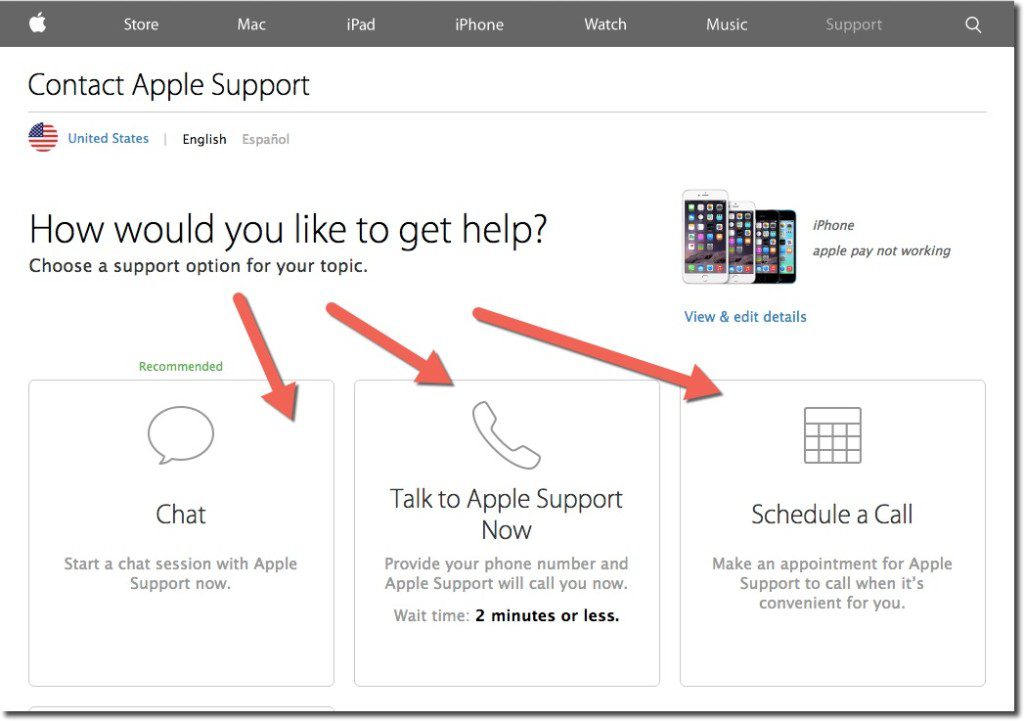
During my Google search, I stumbled into the correct area to get to Apple Care support (see A above). While I had to go through a few screens in the self-service area, it took only about 30 seconds to get to the one that offered a choice of online chat, call center (with 2-minute estimated wait time), or alternatively, I could schedule a call (see inset).

As always, I chose online chat. The chatbot was good (not sure if/when a human stepped in), but it took a full 13 minutes to diagnose the problem (including looking up my serial number at the outset). Apple suggested I delete the existing payment card and add the new one, which was the right answer.

If you try to figure out the problem directly on your phone, a search for “Apple Pay” within the phone, i.e., Spotlight Search, directs users to the Passbook app. If you select the “i” button for more information, you are directed to the bank’s call center (see C below). Alternatively, you can navigate directly to Settings, find Passbook & Apple Pay (below the fold), and locate the bank contact number.

Grade: C >> for the 13 minutes it took through Apple Care chat support

C. Call the bank (BofA)

I had just a single card, issued by Bank of America, hooked to Apple Pay. Although I try to avoid call centers if at all possible, I have been very pleased with BofA call center support in the past, so I called the number on the back. And while SIRI, or whatever their voice recognition is called, was not able to understand Apple Pay questions (“I hear that you want to make a payment, is that right?”) I had passed authentication and was put through to a live operator in about 3 minutes. I’d already figured out the problem during my 13 minutes with Apple Care (old card number), so I didn’t torture BofA and play dumb. But had I not known the answer already, the CSR was prepared to get Apple Pay support on the line for help.

Grade: B- >> for being able to get to Apple Pay phone support within 4 to 5 minutes (though did not test their diagnostic skills)

D. Use the mag stripe

Honestly, if I wasn’t into this stuff for my job, I would have just started using the mag-strip card and forgot about Apple Pay until v2.0.

Grade: A >> for the 5 to 7 seconds it took to get the plastic out of my wallet, swipe, and stop holding up the line

———-

The fix

bofa_applepay_dontuseAs mentioned in B above, my Apple Pay problem could be solved either through the Passbook app itself or through the Passbook settings within the iPhone Settings area.

Here’s what I saw when clicking on my “card” in Passbook (see inset).

And that was the reason why Apple Pay had stopped functioning. Bank of America had revoked my card a few months prior during a breach-related reissue.

But I’m not sure how I was supposed to know that I needed to update my Apple Pay card. I’ve searched my email from Bank of America, but I see no message from them on the subject. While it could have been trapped by the SPAM filters, that would be unusual for messages from my card issuer.

It’s completely understandable why the bank would pull my card out of Apple Pay if it was cancelled and replaced by a new number. But they either need to inform me, along with good instructions on what to do next, or better, simply replace my old card with the new one within Apple Pay, with notification of course (see update below).

But that’s probably v2.0 customer support. Until then, I’m glad there’s still a mag-stripe as backup.

—–

Update 19 Aug 2015: Apparently, Citibank is automatically replacing new card numbers into Apple Pay when the old one is canceled. Not sure if this applies to its entire portfolio or selected customers. Thanks to Ian Kar for the pointer.

Feature Friday: Capital One Helps Users Identify Recurring Charges After Card Reissue

Feature Friday: Capital One Helps Users Identify Recurring Charges After Card Reissue

capitalone_mobileCard reissues after a data breach, or lost/stolen situation, are annoying for cardholders. But it’s even worse for the issuer who has to pay for a new card, hound the customer to activate it, handle customer-service calls, and then risk losing recurring revenues from now-broken automated pre-authorized charges.

So kudos to Capital One for taking an important step in solving this problem.

Earlier this week I received a new card and number from Capital One, presumably because my card had been involved in a breach. I am not aware of any unauthorized attempts to use it.

In a followup email this morning, the giant issuer reminded me to activate the new card. That’s a fairly typical technique these days. But the help didn’t end there. The bank provided a list of likely merchants where I may need to update card info to avoid the charge being denied (see screenshot below).

That’s great customer service and something I’ve not seen before. But of course I want more. The list I received was primarily merchants where I made one-off payments. Who has a recurring charge with United Airlines? So it needs to be scrubbed better. And it would help to include the most recent charge amount and number of charges to help identify actual recurring charges.

And ultimately, it would be even better if the process was semi-automatic. Let me respond to the email with a simple yes/no response for each merchant indicating if I wanted them to continue the automatic billing under the new card number. Or at least provide links to reduce the friction of the task.

But all-in-all, a welcome improvement.

———

Capital One email to cardholder (19 June 2015)

capitalone_email_recurring_new