Movenbank Provides a Peek at its User Interface

imageTech startups help define the future in many traditional industries. Amazon in books, Expedia in travel, Tesla in automobiles.

But there’s been less disruption in retail banking than most industries, especially in the U.S. We saw ING Direct take some share in savings accounts, but not enough to really shake up the status quo. 

But we have some new players looking to change that and Movenbank is one of the most interesting. The Brett King-founded startup, armed with $2.4 mil in seed funding, is beginning to release more details as it prepares for its launch at our FinovateEurope event in two weeks.

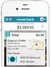
In an email to customers today, the startup provided a few peeks at its Geezeo-powered PFM interface (screenshot below):

  • MoneyPulse: A snapshot of the your current financial situation with green/yellow/red dial so you know in a glance if there are problems.
  • Movenbank MasterCard PayPass sticker MoneyPath: More of a typical budgeting piece.  
  • Account aggregation: Beta users can already add accounts from several-hundred banks and credit unions; so unlike Simple, it appears Movenbank is supporting account aggregation out of the box
  • Spend | Save | Live: Primary navigation across the top of the dashboard

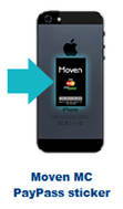
In addition, the "how it works" section shows a MasterCard PayPass sticker used for contactless payments (inset).

————————————-

Movenbank interface (from customer email, 28 Jan 2013)
Note: "Spend | Save | Live" navigation across top.
This appears to be a PC user interface, but it could be a tablet UI.

Movenbank user interface w PFM features

PFMs Are Top Browser “Money” Plugins for Google Chrome

image While they are overshadowed by the hundreds of thousands of mobile apps, there is a growing eco-system of plugins and apps for use with desktop browsers. I recently poked around in the Money section of Google’s Chrome Web Store.

Not surprisingly, Google Finance was the most popular with almost 300,000 users. Mint was second at about half that (160,000 users). No one else was close (see table below).

Of the top 11 money plugins, six were PFMs: Mint, Finance 41, CashBase, PocketSmith, Easy Envelope Budget, and Toshl. Four were investing related, and Zillow tracks residential real estate (note 1).

One surprise: There was just one U.S. financial in the store. BofA? Fidelity? PayPal? No, it was Mountain America Credit Union (screenshot below). There were several international financial institutions in the store as well (Maybank, BBVA, Bradesco).

Bottom line: With 700,000 total users across the top-11 apps, this is a niche market so far, and could remain that way. But interestingly, it’s another place where Mint dominates.

—————————-

Table: 11 Most Popular Chrome Extension
in the “Money” Category

Name Users Type
1. Google Finance 283,000 Investing
2. Mint 161,000 PFM
3. Zillow 49,000 Real estate
4. Finance 41 41,000 PFM
5. Cash Base 35,000 PFM
6t. Pocketsmith 34,000 PFM
6t. Wikinvest 34,000 Investing
8. WealthLift 28,000 Investing
9. Free Stock Charts 20,000 Investing
10. Easy Envelope Budget 18,000 PFM
11. Toshl 15,000 PFM
TOTAL 710,000

Source: Google, 18 Jan 2013

——————————–

Mountain American Credit Union extension for Google Chrome browser (link)
Note: The app currently has 127 users

Mountain American Credit Union extension for Google Chrome browser

PFM Toshl featured in the Google Chrome Web Store (link, 18 Jan 2013)
Third-party PFM Toshl was one of the featured apps in the broader Lifestyle Category. They have about 15,000 users, making it the 10th most popular app in the Money category.

PFM Toshl featured in the Google Chrome Web Store  

—————————-

Notes:
1. And Finovate alums are well represented. In addition to Mint, Pocketsmith and Wikinvest, BillGuard, FutureAdvisor, Xero, ImpulseSave and SmartyPig (previous post) have plugins.
2. For our take on PFMs, see our May 2010 Online Banking Report (subscription).

Card Transaction Data is Rich, Who Will Help Users Mine It?

image A few days ago, my wife and I were trying to remember the name of a restaurant where we ate on vacation several years ago.

The answer didn’t really matter, but I shouldn’t have needed to tax my meager memory cells because someone with perfect recall already knows its name, location, and how much was spent. In this case, Bank of America. I used its credit card.

I should be able to hit BofA’s mobile app, type or speak “orlando,” and instantly see the dozen or so charges I’ve made in Central Florida. Even better, I should be able to access the entire paper trail of card charges from that trip and to get a quick refresher of our itinerary four years ago.

Yes, this is the vision of personal financial management and we are slowly getting there. But it’s still a lot of work to manage the data flowing to third-party PFMs. And logging in to yet another program to find a small bit of info can be tedious (see note 1).

Bottom line: We can debate all we want about how many people will use the mythical thing called PFM. But most people want to know something about a past transaction at least once in a while. They shouldn’t have to subscribe to a third-party service find it.

So, listen up, financial institutions. Follow Simple’s lead (and Jwaala which pioneered it five years ago), and make long-term searchable transaction archives a core part of online and mobile banking (notes 2, 3).

———————————–

Simple’s natural-language search is an important feature (15 Jan 2013)
Note: Hashtags make subsequent searches even more powerful

image

Jwaala search

image

——————————–

Notes:
1. Though, for me, Mint’s QuickView Mac app, has made transaction look-up much faster by doing away with the login.
2. And you can make “transaction search” a profit center. See Google’s business results for ideas.
3. For info on fee-based financial services, see the Online Banking Report (subscription) on fee-based online services (May 2011); paperless banking and online storage (late 2010); and lifetime statement archives (2005).

Making Banking Interesting

image When did banking become boring? Probably when all the gold doubloons and pieces of eight were replaced by paper checks and computer bits.

But it doesn’t have to be this way. Most people have at least a passing interest in where their money is going. Sure, there are some negative issues around money, but the place where you track your spending and savings should at least be engaging. And that’s rarely the case today.

But Bank Simple (and others) are making good progress.

______________________________________________________

Simple Innovation #8: Full transaction annotation
with on-the-fly categories

______________________________________________________

As the startup continues to push the UI envelope (see note 1), it now lets users annotate transactions with uploaded images or PDF files (for a pic of that tantalizing dinner or the receipt for expense reimbursement), free-form memos, and categories created on the fly (#category like on Twitter).

That allows customers to create a historical record around their purchases. Or as Mechanics Bank’s Bradley Leimer put it:

“I love it. It’s like Pinterest or Instagram in your banking application.”

For a more thorough look at the UI, check out the new video posted on the Simple blog.

——————————————

Fully annotated transaction at Simple (19 Dec 2012)

image

————————–
Notes:
1. See previous seven Simple innovations here.
2. Expensify offers similar photo capture and memo annotation capabilities
3. For more info on Simple and other Truly Virtual Banks, see our Oct 2011 Online Banking Report (subscription). image
For more on balance forecasting and other advanced PFM features, see our recent Online Banking Report: PFM 4.0 (June 2012; subscription).
4. According to Apple iTunes, Simple app downloaders are also “buying” Schwab, PageOnce, and Mint apps.

Launching: MetroMile Launches Mileage-Based Auto Insurance

image One of the dumber things I’ve ever done financially is buy an old two-seat convertible on eBay. Who would have guessed that you just don’t get a chance to drive that thing much in Seattle? But next July, when the sun comes out again, I’ll be very happy to have it.

In the meantime, I have this nasty monthly insurance bill. Really, $60 per month to have the car sit idle in my garage? It’s throwing good money after bad. I should call my agent and turn the insurance off. But what if there’s a sun-break this month or our other car is in the shop? Then I’ll need it.  

From the insurance company’s perspective, they don’t want me calling to activate/deactivate insurance multiple times per year (though they love my current zero-miles-per-winter full-pay status). The subsequent labor and fulfillment cost would wipe out much, if not all, the profitability on my account.

So, I’m the perfect candidate for pay-as-you-go insurance, and I’m happy to see it launch in Oregon, thanks to MetroMile, a VC-backed Bay Area startup (note 1). Hopefully, it will make it’s way north to Seattle very soon.
_____________________________________________________________

How it works
_____________________________________________________________

imageMetroMile charges a smaller fixed monthly fee, then adds a variable charge based on the number of miles driven (with a cap at 150 miles in a day).

To calculate the mileage fee users plug a small device called a Metronome into their on-board diagnostic port (note 2). It measures miles traveled and tracks GPS location to create a rich history of your touring (see inset & screenshot 1, note 3).

Oregon residents can get a lightening-fast quote (screenshots 2 to 5) and complete the app online (screenshot 6). The quote on my convertible came was $29/mo plus 2.3 cents per mile (screenshot 4). This would be an amazing deal for me, cutting my insurance costs by 50% annually (note 4). I would save money every month I drove less than 1,300 miles. 

_______________________________________________________________

Opportunity for financial institutions 
_______________________________________________________________

It’s going to take a massive education process before this new type of insurance becomes popular (assuming state regulators allow it). Show customers that you are innovative and can deliver superior value by introducing them to a financial product that could save them $20 per month for the rest of their lives. And one that delivers a rich history of their car travel (which can eventually be plugged into the bank’s PFM).

You could even package it with other bank products (checking, savings, car loans, etc) to continue to remind customers that you helped save them big time. Even more interesting, would be bundling the insurance with mileage-based auto financing to provide an even bigger incentive to save money by driving fewer miles. 

Right now, in the United States, only Oregon FIs could participate (note 5). But as the product spreads nationwide across multiple providers, it could make a nice, profitable product addition to your web and mobile offerings.  

—————————-

1. MetroMile dashboard showing GPS data compiled from tracking device (5 Dec 2012)

image


2. MetroMile homepage features 2-minute quote
(5 Dec 2012)
Note: Unlike virtually all insurance quote sites, no contact info is required to find the actual price. And you for one car and one driver, you can fill out the form in as little as 60 seconds, my actual time the third time I tried it.

MetroMile homepage features 2-minute quote (5 Dec 2012)

3. Step 1: Enter primary driver info

image

4. Step 2: Enter vehicle info

Step 2: Enter vehicle info

5. Step 3: The final price is delivered in the the third-pane of the application

Step 3: The final price is delivered in the the third-pane of the application

6. Finalize online app with contact info

6. Finalize online app with contact info

——————————————–
Notes:
1. Hat tip to Pando Daily.
2. The port is available on all cars built since 1996.
3. The device could also be used to measure average speed, but GPS data collection is optional and is not currently used by the company.  
4. I was comparing my current Seattle price to a Portland quote, so that could be a portion of the difference.
5. We don’t know if MetroMile is will pay for referrals at this time.
6. For more on banks offering insurance, see our full report here (Dec 2011, subscription)
Launching: KeyBank’s “myControl Banking” Provides Balance Forecasting via Mobile App & Online Dashboard

imageKeyBank is launching a new online banking and mobile service called myControl Banking. The mobile app became available today in iTunes (link).

The service is centered around myMoney Forecast, a real-time balance forecast shown at the top of the screen (see inset below). It’s a vital PFM function that looks a lot like Simple’s Safe-to-Spend.

But there is one significant difference. Key Bank users can make the forecast more accurate by manually entering Money In or Money Out transactions before they clear the bank (for example, a just-written check, see bottom of first screenshot). The bank automatically nets out any pre-scheduled bill payments, transfers, or ACH items and adds in recurring regular paychecks and transfers in.

Key Bnak mobile myMoney ForecastThe interface also includes a weekly cash flow calendar so users can monitor the flow of their funds. And up to five goals can be established and tracked within the app and/or online dashboard.

The mobile app does not (yet) replace Key Bank’s regular mobile app. Before using MyControl, customers must sign up for it within online banking.

Analysis: The introduction of MyControl Banking is a fantastic move. It delivers the key missing component of online banking, a peek at what’s about to happen with cash flow, without making users slog through a bunch of PFM features they don’t understand.

imageIt provides Key Bank with meaningful differentiation, and gives them a platform to add more PFM content in the future.

Because Key Bank’s MyControl raises the bar in digital delivery, we are giving it our OBR Best of the Web award (note 2). We are also retroactively naming Simple as a co-winner since they commercialized a similar balance forecast earlier this summer.

——————————————

Mobile checking & savings balance visualization with integrated transfer button (left) and goals (right)

Key Bank myControl Checking     KeyBank myControl Savings mobile

Key Bank myControl Banking landing page (link, 20 Nov 2012)

image

————————-

Notes:
1. This post was developed from info available within the app, in the product video at Key.com/mycontrol and in the FAQs. But I don’t have an account at Key Bank, and there is no interactive demo yet, so I haven’t used the service with live data.
2. Since 1997, our Online Banking Report has periodically given OBR Best of the Web awards to companies that pioneer new online- or mobile-banking features. It is not an endorsement of the company or product, just recognition for what we believe is an important industry development. In total, 88 companies have won the award. This is the first for Key Bank and Simple. Recent winners are profiled in the Netbanker archives.
3. For more on balance forecasting and other advanced PFM features, see our recent Online Banking Report: PFM 4.0 (June 2012; subscription).

Op Ed: The Convergence of High-Tech and High-Touch in Wealth Management

by JP Nicols

JP Nicols, CFP, is CEO of the advisory firm Clientific and has served in various industry leadership positions, most recently as Chief Private Banking Officer for U.S. Bank. He writes about the intersection of leadership, advice and innovation on his blog at jpnicols.com.

Disruption of long-held paradigms and business models are common themes in fintech generally, and at Finovate especially. Some of the most notable traction to date has been in the payments and personal finance space.

Now, innovative specialty lenders and crowdsourcing platforms are also breaching what had long been banks’ deepest moat — the ability to leverage and monetize their balance sheets.

Wealth management in the digital age
The wealth management business has been less commoditized, and some firms have deployed impressive intellectual capital to help clients grow, preserve and transfer their wealth. Despite the rise of digital personal finance platforms and tools, clients with higher levels of wealth and complexity need and want advice from time to time.

A recent American Banker article cited a KPMG survey that said 9 out of 10 banks were considering a major overhaul of their strategy, and 40% said that wealth management was essential to growing revenue. For good reason. Wealth management operations are typically efficient users of capital, represent lower risk business models and are higher producers of precious fee income.

It makes sense for incumbent firms to increase investment in higher-margin businesses while new entrants are left to focus on lower-cost solutions. This is the classic pattern of disruptive innovation as described by Clayton Christensen and others.

Then as these new entrants gain market share, they inevitably move upmarket. In fact, that is already happening.

From the underbanked to the overbanked
There has been considerable discussion about the unbanked and underbanked, people who either cannot or will not use traditional financial institutions. Prepaid cards, payday loans, check cashing, remittances and other services that fill the gaps have seen new innovations and new investments from both inside and outside the industry.

On the other hand, wealthier households, or the overbanked, have no shortage of providers eager for their profitable business. But disruptive forces are at play here from two areas:

  • Smaller firms which differentiate with high touch, lower client/advisor ratios, better defined market niches and more responsive service.
  • High-tech competitors with better user interfaces, more robust web and mobile tools and sophisticated analytics.

The convergence zone
The effectiveness of those two approaches varies somewhat along demographic lines, but it’s not as simple as assuming all older customers prefer high-touch while the younger set always wants a technology solution. 

Web and mobile adoption rates in older age groups rise with higher income, and affluent customers are looking for something more than a stock jockey with a briefcase full of papers.

On the flip side, even the savviest do-it-yourself millennial wants help from an expert every now and then, and simply replacing the irrelevant stock jockey with a prettier, but equally irrelevant, screen full of dials and charts isn’t enough for many.

So these powerful forces are beginning to converge in a couple of exciting ways:

  • Enterprise solutions have been gaining traction at Finovate. Past alums like InStream and Balance Financial created inviting portals for advisors to manage their business and collaborate with clients in ways previously not possible.
  • A few firms have built their own advice and back-office platforms behind compelling interfaces. Finovate alums like Wealthfront and Betterment  offer low-cost professional money management to every investor.

Three firms to watch at FinovateFall 2012
I will be paying particular attention to three firms that are contributing to the convergence of high tech and high touch at FinovateFall 2012:

  • imagePersonal Capital a Best of Show winner at FinovateSpring 2012, leverages it’s PayPal and Intuit DNA (CEO Bill Harris led those companies too) to create what  they call a "next-generation financial advisor completely personalized around you." Users can easily get started for free with their attractive and useful PFM tool, then upgrade to their money management services.
  • image MoneyDesktop is another Best of Show winner at Finovate Spring 2012 that brings a slick mobile- and tablet-friendly PFM desktop with customizable widgets as a white label solutions for FIs stuck with outdated interfaces. They recently acquired MoneyReef to further bolster their mobile PFM offerings.
  • imageActiance: Fear of running afoul of FINRA, SEC and other compliance requirements is one of the barriers in large wealth management firms’ struggle to  be relevant in social media, and significant intellectual capital too often remains in proprietary channels as a result. Actiance has been a very visible solution provider with their Socialite platform, and at Finovate they will be showing off their integration with Salesforce to further integrate social data.

I will be back after the show with my thoughts on the latest developments in wealth management and track th
e convergence through integrated offerings and enterprise solutions.

Changing the world is hard. Changing bank IT departments takes a little longer.

————————-

Notes:
1. Image licensed from ShutterStock
2. For more on Personal Capital and the rise of the truly virtual financial institution, see OBR #198 (Oct 2011, subscription)

Mint Launches Mac App: Mint QuickView

imageI’ve been a big fan of apps ever since I first pressed the weather button on the iPhone in 2007. After 12 years of http://www.blahblah.com/blah.htm, it was refreshing to just press a button and get the necessary information quickly, perfectly rendered and distraction free.

So I like Mint’s latest move, putting a similar user experience onto the desktop (see note 1) with an app for the Mac (link) that provides a quick overview of balances, transactions and alerts (see email announcement below).

Once installed, Mac users simply click on the Mint icon on the top and/or bottom of their desktop, and it immediately opens to a display of the latest balance-and-transaction info. Like iPhone apps, the icon also shows the number of unread alerts on the badge (see first screenshot). 

Other novel features:

  • A search bar along the top of the transaction search
  • Optional password protection: You can choose to look at your data without logging in (after the first time)
  • Timed password protection: Users can select how long they can look at the data before the password prompt is shown  

I’ve used it for only a few minutes, but it looks like it will become my primary method of accessing Mint. Unless you need to run a report, it has most of what you need available immediately, shaving 30 to 40 seconds or more off the time to retrieve info from the full website version.  

image Bottom line: Mint is the first PFM or banking app to hit the Mac store, beating all the major financial brands to the punch. And it’s been rewarded with “featured app” status which has propelled it to the very top of the Free Apps ranking in the Mac App Store (see inset above).

Because it raises the bar in the delivery of banking info, we are bestowing it with our fourth OBR Best of the Web award for 2012 (see note 2). 

———————————–

Mint QuickView app pops up after clicking on icon along the top

Mint QuickView uses dropdown from top icon on Mac


Transaction search from top line

Mint QuickView features prominent transaction search

Net income view

Mint QuickView


Email from Mint announcing Mac QuickView
(16 July 2012)

image

Notes:
1. We wrote about moving online banking info to the PC desktop in our Online Banking Report in 2002 (subscription).
2. Since 1997, our Online Banking Report has periodically given OBR Best of the Web awards to companies that pioneer new online- or mobile-banking features. It is not an endorsement of the company or product, just recognition for what we believe is an important industry development. If anyone knows of other financial institutions offering a similar feature, let us know and we’ll update the post. In total, 86 companies have won the award including Mint in 2007. Recent winners are profiled in the Netbanker archives.

New Online Banking Report Published: Personal Financial Management 4.0

image While personal financial management (PFM) may be THE most important feature of online/mobile banking going forward, it’s time to stop thinking of it as "product."

PFM is part of every thing you do when communicating account info to customers. The paper statement is a PFM tool. The call center offers PFM. Even the branch helps certain customers with their financial management.

But those old-school tools have limitations. They are expensive, difficult to customize, and aren’t always timely or available.

So online banking has been a boon to personal financial management. Can you imagine going back to the world where you actually had to keep track of your balance in your check register?   

But 17 years after Wells Fargo put the first customer statement online, most customers are still stuck looking at an online rendering of their circa-1960 paper statement. It’s an area ripe for disruption, and Mint.com, with 3% to 4% penetration of U.S. households, proved that users want better-looking, more functional online info.

However, unlike record stores, newspapers, and travel agents, incumbent banks and credit unions have a much better chance to stay relevant and hold on to their market share. Other than early-adopter types, few customers will entrust their money to Internet-based startups (Bank Simple may be poised to prove me wrong, we’ll see). And even if consumers have the desire, it’s often too much of a hassle to make the switch. 

As long as financial institutions stay up-to-date in online/mobile delivery, keep prices in check, and provide decent service, there are no compelling reason for customers to ever leave.

For banks, a big part of staying current is helping customers stay apprised of their financial situation, and helping them improve it. We are lumping those things together and calling it PFM. One of the biggest changes coming, thanks in part to Bank Simple making it central to their UI, is the forward-looking "balance forecast" (or Safe-to-Spend balance in Simple-speak). See last Friday’s post for more on that.

But that’s just the tip of the PFM iceberg. There are dozens of needed new features to bring online banking up to 2012 "web standards." 

In our new 54-page report we cover:

  • 23 primary PFM functions
  • 40 promising PFM features
  • Another 100 potential features
  • PFM forecast (U.S. household usage by PFM type)
  • The business case
  • Putting it all together in multiple service bundles, including fee-based premium options
  • PFM availability at the 30 largest U.S. banks and credit unions including our first look at Citibank’s Financial Tools
  • Mobile PFM
  • PFM for couples

__________________________________________________________________

About the report
__________________________________________________________________

Personal Financial Management 4.0 (link)
Moving forward with the most misunderstood financial
service of the online era

Author: Jim Bruene, Editor & Founder

Published: 25 June 2012

Length: 56 pages, 12 tables, 16,000 words

Cost: No extra charge to OBR subscribers, US$495 for others here

__________________________________________________________________

Sample screenshot
__________________________________________________________

HelloWallet combines budget status (e.g., at "coffee shops") and a macro "left to spend" balance on its mobile view

HelloWallet "left to spend" balance

Feature Friday: Bank Balance Forecast

imageAs Simple begins the 6-month process of converting its 100,000-person wait list into paying customers, I expect much attention will be given to its flagship UI innovation, a forecast of your “free cash” after accounting for upcoming transaction. Simple has trademarked the feature as the Safe-to-Spend balance (screenshot below).

We’ve discussed it a number of times in our Online Banking Report (subscription), but we haven’t explored it in Netbanker. Here’s why balance forecasting is so important:

  • Intuitive UI: Hundreds of millions of people worldwide log in to their bank accounts at least weekly. Why? To see their balance and to make a mental calculation of whether things are on track. Whether they consciously think it or not, they are making their own calculation of what’s left in the account to spend. And given how horrible the average person is at making complex math calculations in their head, it makes so much sense to put that number right in from of them at all times.
  • Advocacy: Doesn’t everyone want to believe that the place where they entrust their live savings is looking out for their best interests? But events of the past five years have seriously eroded consumer confidence in financial institutions, especially large banks. Providing a new tool that really helps consumer understand their financial position, and reduce the chances of overdrafting, could go a long way in restoring confidence that the bank is not the enemy.
  • Gateway to advanced PFM services: Doing important calculations on the consumer’s behalf is what PFM is all about. So showing that you have the wherewithal to make this important calculation, can be the entry point for delivering more advanced PFM services, hopefully at a profitable monthly fee (note 1).
  • Great competitive weapon: Want to compete with Bank Simple? Want to show you are ahead of the curve. This is a perfect, tangible feature/benefit.

Bottom line: This is not the easiest feature to add. Maybe one of the hardest. And you should expect to spend quite a bit of time explaining it to employees and customers. But it absolutely will be part of every online banking system and third-party PFM service (see also, HelloWallet’s “left to spend below).
————————

Simple makes it impossible to miss your “Safe-to-Spend” balance (22 June 2012)

Bank Simple "Safe to Spend" balance

HelloWallet’s mobile app has a “Left to Spend” balance for both in total and for the specific budget category (22 June 2012)

image

—————————

Note:
1. We are putting the finishing touches on an update of our PFM report (May 2010, subscription). You’ll see an announcement here next week.

Out of the Inbox: Mint.com Pitches Capital One Credit Card in Triggered Email Alert

imagePrecise, content-sensitive advertising is extremely powerful. It’s what made Google a giant. 

In financial services, the biggest advertising-driven success (after BankRate and Google), at least in terms of market cap, is Mint.com. Its revenue stream is entirely made up of targeted offers to customers who aggregate banking transactions on its site.

The company wisely uses email to deliver some of the advertising pitches. As we’ve discussed before, Mint is of the few financial companies directly monetizing triggered alerts.

We were impressed by the latest effort received Tuesday (see below). Having noticed that our Chase business card was used internationally, incurring a $14 transaction surcharge, they wisely pitched us a Capital One no-foreign-transaction-fee card.

Interestingly, we already have not one, but two of those Cap One cards (personal and biz) and they are both aggregated at Mint. So I’m not sure if this alert is more of a reminder to use our Cap One charge when traversing the world or that Mint doesn’t check current product usage when cross selling (or they don’t care). If Mint is only paid on performance (eg. by new accounts generated), then it doesn’t matter to Cap One that they are marketing to an existing customer.

Bottom line: The example demonstrates the marketing value of hosting the aggregated accounts.

————————————–

Mint triggered alert (12 June 2012)
Note: The advertisement is two-fold. The banner with "apply now" is the most eye-catching, but also easier to ignore. There is also a text call to action above it, that looks more like alert copy. It says: "Stop paying extra to use your credit card overseas. Get a card that doesn’t charge foreign transaction fees."

image