HoneyDue Tackles Major PFM Challenge: Collaborative Spending

HoneyDue Tackles Major PFM Challenge: Collaborative Spending

Managing a relationship is stressful enough without introducing unnecessary miscommunications about day-to-day spending. This is one reason why many couples maintain separate spending accounts with pre-defined responsibilities (e.g. you pay the rent, I’ll pay the utilities, etc.). But that doesn’t alleviate the need to communicate, especially when one person has more “discretionary” funds. And separate accounts can lead to more trouble if one person is more of a free spender than the other, or if one has more trouble avoiding overdrafts and/or tapping out accounts well in advance of payday.

Joint accounts have the advantage of keeping funds in a single bucket which is statistically easier to keep above zero compared to stretching funds across two or more accounts. And joint accounts by definition require the couple to work together as a team to manage spending. But many couples, especially early on, aren’t entirely ready to cede “control” over their paychecks. Overall, it’s an area ripe for disagreements and resentment.

That’s why we love Simple’s best-of-both-worlds solution, the Simple Shared plan which offers 3 accounts: an individual spending account for each person, along with a joint account for the pair. While that’s a great foundation, it still doesn’t address the day-to-day communications necessary to keep both partners on the same page.

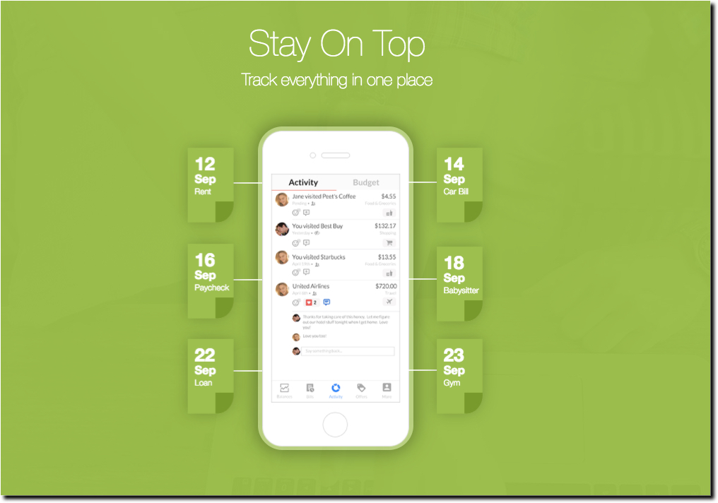
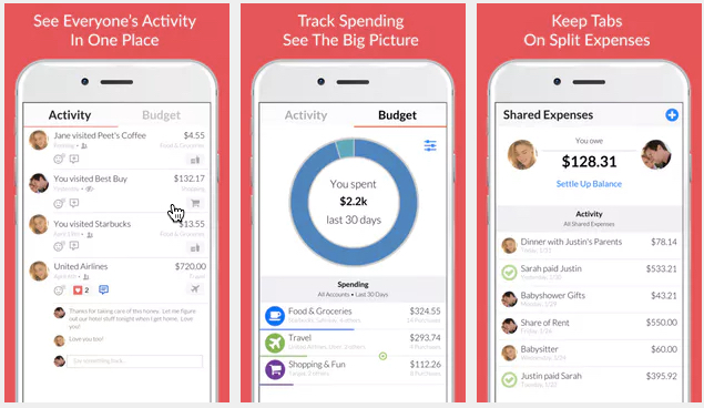
Enter the newest PFM player, HoneyDue (formerly WalletIQ), currently toiling away in Y Combinator’s summer class (S17). After a stint as one of Apple’s favorite apps in May, the company already has 20,000 registered users, 60% of which are female. The app debuted on Product Hunt two days ago, and was the most popular product of the day (currently 820 upvotes) and so far is fifth highest of the week. You’ll be hearing more about them in two weeks when they officially debut at the incubator’s demo days (Aug 21-23).

HoneyDue uses Yodlee (probably) to aggregate transaction accounts across multiple FIs into one mobile app. Then it provides tools to make it easy to annotate expenses and communicate with each other about what they were.

Bottom line: Collaborative spending tools are an attractive account management option that absolutely should be offered by every bank, credit union, card issuer and PFM provider. HoneyDue is a good example of how the UI can work. And banks, consider joining the company’s seed round, if only as an R&D effort (strategic seed investing).

Feature Friday: Editing Transactions in Online/Mobile Banking

Feature Friday: Editing Transactions in Online/Mobile Banking

One basic feature missing from most online and mobile banking services is the ability to edit/annotate transactions. Some banks, BMO Harris for example, support transaction and/or category editing in their PFM modules. But it’s very rare to see it within basic digital banking.

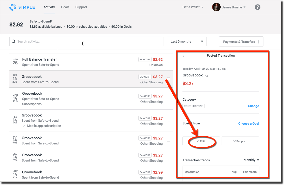
One exception, is BBVA Compass’s Simple banking unit. Simple allows full editing of the transaction name, category, and goal. And users can add a memo and an attachment to individual transactions. Clicking on a transaction brings up the detail section along the right (see screenshot below). The feature is functional on the desktop, but it’s easier to use, and more robust, on a mobile phone where the built-in camera aids photo attachments. And the transaction is visually more appealing after editing on mobile (see After mobile screenshot).

Thoughts: While it’s a little harder to use than I’d like, it feels wrong to complain about UX issues at Simple, when the vast majority of FIs don’t allow any editing whatsoever. But my job is to whine, so I’ll make this suggestion. The best user experience is to edit directly within the transaction record rather than following commands over to the right. And on mobile, voice editing should be supported.

Bottom line: While Simple’s transaction editing may not quite live up to the digital banking pioneer’s name, it’s head and shoulders above the competition. And that’s no simple feat.


Transaction editing on the desktop

Step 1: Select transaction on left; if desired, change category (#1), or funding source (#2), then press “edit”

Step 2: Annotation options (1) Edit name, (2) Add memo, (3) Upload image, (4) Add location


Transaction editing on mobile

Before edits                                                             After edits


Author: Jim Bruene is Founder & Senior Advisor to Finovate as well as
Principal of BUX Advisors, a financial services user-experience consultancy. 


Startup Watch: Clarity Money Makes a New Run at PFM

Startup Watch: Clarity Money Makes a New Run at PFM

clarity money in ios app storeWhile the term PFM is dead, the concept, employing software to watch over your finances, is more widespread than ever. It’s just called AI, spending management, or nothing at all since it’s now baked into many digital banking offerings.

However, automated spending management is still not widely used by customers because the big players don’t make it available by default, except Wells Fargo’s My Spending Report. So there is still room for new companies in this arena, especially if they invoke AI in their value proposition. And it doesn’t hurt to have celebrity business connections either.

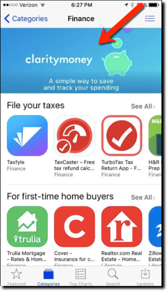
Enter Clarity Money into the crowded field. But with Michael Dell’s brother Adam as founder, and $3.5 million in funding from VC heavyweights Soros Fund, Maveron Partners and Bessemer Venture Capital, the mobile PFM startup has attracted a slew of press mentions (NY Times, TechCrunch, Business Insider, Bank Innovations, and a dozen more). But the biggest help to the fledgling business came a few weeks ago when Apple namclaritymoney_mint aded it a “new app we love” that pushed the app from nowhere to #16 (USA app store, free Finance apps). Today it is number 56 (see above).

The mobile-only free service reminds us of BillGuard (acquired by Prosper) married to Moven, with a sprig of Mint on the side (see image posted to Clarity’s Instagram left). The value proposition is around monitoring transactions to save money on unneeded recurring services and/or bloated bills (in which the company takes a one-time commission on savings) while building a small nest egg in an integrated FDIC-insured savings account.

Bottom line: There’s much to learn from Clarity’s marketing messages, value proposition, and mobile-first build. If you don’t offer these benefits for customers, someone else will.


claritymoney value prop 1Consumer value prop

  • Save money on bills
  • Build a savings account
  • Don’t get ripped off by unauthorized or unneeded recurring charges
  • Keep your spending organizes

Business model

  • Consumer loan lead gen (e.g., a Chase credit card is shown on a screenshot)
  • Deposit spread
  • Commission on bill savings
  • Offers

Team (co-f0unders)

  • Adam Dell, CEO, brother of Michael Dell (yes, THAT Michael Dell)
  • Hossein Azari, Chief Data Scientist and formerly of Google Research
  • Matt Jacob, VP of Engineering, formerly of CommonBond

Service providers:

  • BillShark for bill savings
  • Experian for credit and transaction monitoring
  • Wells Fargo for savings accounts

Advisors:

Product roadmap

  • Investing
  • 401(k)s

Author: Jim Bruene is Founder & Senior Advisor to Finovate as well as
Principal of BUX Advisors, a financial services UX consultancy. 

Useful UI: The Dashboard Metaphor

Useful UI: The Dashboard Metaphor

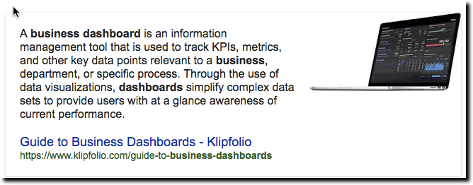
biz-dashboard-definition

Every now and then a useful term comes into widespread use and it can be hard to decide whether it’s a fad (e.g., home banking) or something that will be around for decades (e.g., ATM). Dashboard is a term we are seeing more and more of. While it’s too soon to say if it will still be around in the next decade, let alone in 50 years, it’s a good word in wide use in consumer and business services today (see definition below).

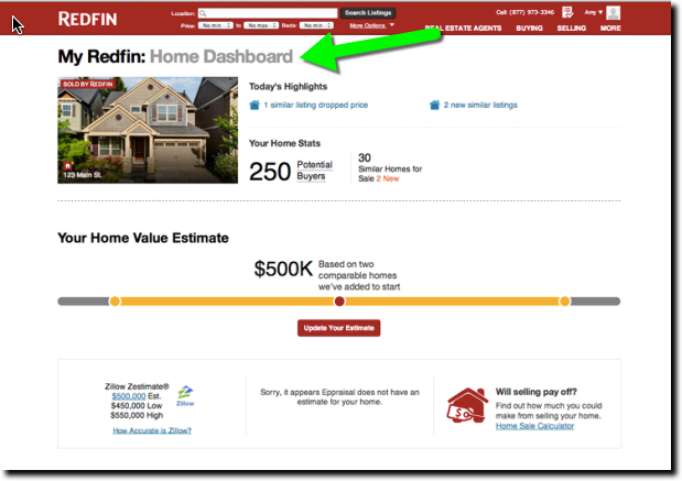
redfin-dashboard
Redfin’s homeowner dashboard

Redfin, for example, sends new homeowners an email suggesting they log in to the Owner’s Dashboard of their new property. Redfin must be matching home-buying records to its user database to make the connections. It’s a nice touch. Who wouldn’t want to sit in the virtual driver’s seat of their most important asset and get a look around. And with home prices appreciating in most parts of the country, it’s a mighty fine view. In the example, the home value is up almost 15% since February.

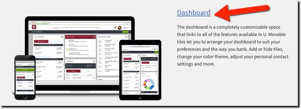
Banks should consider using similar language for their advanced digital banking services. Rather than a fancy name to confuse consumers, use Dashboard, which is not only easy to remember, but also has all the right connotations. One major bank already doing so is BB&T (see below), with its unique customizable mobile and desktop service, U. Another is Ohio-based First Financial Bank as well as $88 million Gateway Community Bank (screenshot below).

———

BB&T's U digital banking is centered around a "Dashboard"
BB&T’s U digital banking is centered around a “Dashboard”

———

Bottom line: The name of a digital service isn’t going to make or break it. But as we struggle with educating users on the features and benefits, the use of known terms can ease the learning curve.

———-

Gateway Community Bank homepage with news of its new "Dashboard View"
Gateway Community Bank homepage with news of its new “Dashboard View”

Telling Personal Stories via Bank Transaction History

Telling Personal Stories via Bank Transaction History


paper receipt pile

One of the initial aims of personal financial management (PFM) was making sense out of your spending. For a variety of reasons, most consumers view that as just too much work for too little in return. But, since the launch of Mint nine years ago, much progress has been made on that value equation. Thanks to mobile technologies and various APIs, tracking is easier as well as more data rich, resulting in output that is much more useful.

For example, Simple’s Safe to Spend predicts when you will run out of cash with virtually no user input. It’s a great benefit for numbers-oriented customers who already pay close attention to their balances. But what about the other 90% of the world? Can PFM services deliver value for those that will never appreciate an animated graphic of their 10-year moving average of Starbucks purchases?

I believe the answer is yes.

PFM services need to broaden their role and help customers track their “financial stories.” Think about it. Unless you are an obsessive Facebook/Instagram/Foursquare poster, where else can you look back and find out where you ate last year in San Diego, what souvenirs you brought back for the kids, and which car rental company you want to avoid next time?

All that info, and much more, is locked away in your credit/debit card transaction history. Just being able to search your transactions helps tremendously (thanks, Mint). But what if you had ready access to all the information on your receipt? Then you could see not only where you ate, but also which entree you loved (since you would have made a note on the receipt at the time).

Currently, integration with camera phones, such as that offered by Expensify, do this for highly motivated users, such as those with a large financial incentive to track their reimbursable expenses. But what about everyone else?

That’s where startups—such as Finovate alums Ready Receipts, Shoeboxed, Xpenditure, as well as dozens of PFM providers and mobile payment specialists—come into play. They are devoted to getting the transaction detail on receipts aggregated into a single, easily accessible source.

piper_home

We recently met another startup that seems to have good traction solving this problem (and happens to count Expensify as an investor), Washington D.C.-based Piper. Most of our conversation was off the record, but I love what they are doing, working with the POS players to reach critical mass in a difficult two-sided market—one in which retailers don’t want to spend money on enhanced receipts unless there are users, and users won’t bother unless they see a sizable number of receipts available.

Piper has also narrowed in on a business model that charges fees to the portion of the ecosystem that stands to gain the most from better receipt management; namely, the merchants, card issuers, and transaction acquirers who benefit massively from the 30% reduction in chargebacks that the system has proven in early tests.

I look forward to the time when Piper and the others have changed the PFM story.

——

Note: Y Combinator’s latest batch (W16), debuting this month, contains another receipt provider worth watching, FlexReceipts

What Do We Call PFM as it Becomes Part of Digital Banking?

What Do We Call PFM as it Becomes Part of Digital Banking?

mx_pfm_dead

The term PFM has gotten a bad rap. Clearly, Personal Financial Management is not a consumer-friendly term. You can’t use an acronym unless it’s ingrained in society (IRS, FBI, etc.). And stringing together three 3-syllable words to spell it out is too cumbersome (and doesn’t fit on a smartphone menu anyway).

So what do we call this thing formerly known as PFM? Today, I saw “money manager” used at America First Credit Union (an MX client). That’s a 56% reduction in syllables, but I fear it, and its longer sibling, digital money management, are still too generic to be meaningful for consumers. When you think about it, every single time you log in to your bank you are doing some type of “money management,” so that term doesn’t really call to mind the advanced feature set we in the industry have called PFM.

The best approach may be to simply not give it a name. PFM is really just additional features integrated into online or mobile banking. As those features become fully integrated, and relatively common, they become harder to single out with a unique term.

So here’s where I net out. Just between you and me, let’s keep calling it PFM within the industry (on our blog alone we’ve mentioned it in almost 500 posts). But when talking to consumers, let’s not create another confusing term. Especially since personal financial or money management is already an assumed benefit of digital banking.

Then, when looking to create more interest, use the classic marketing terms attached to “online” or “mobile” banking, for example:

  • Advanced online banking
  • Enhanced mobile banking
  • Do more with online banking
  • New-and-improved mobile banking
  • Features added to online banking
  • v2.0 mobile banking
  • Manage your money better with mobile banking

amex_cardsThat still leaves the problem of what to call it on a menu, or in a tab, if you offer a stand-alone service. Outside of banking, I think the most common term today is Advanced as in Google’s Advanced Search. Or, if you are potentially going to charge a fee, Pro is commonly used. If that seems too specific, it could be Premium or Select. Even the old credit card standbys, Gold, Platinum or Black, could be used.

Bottom line: FIs should use descriptions that fit with their other branding. Here, we are going to stick with PFM, with the understanding that the term should not be used on your website.

——-

Opening graphic is from MX on the cover of its white paper on Digital Money Management.

Mobile Monday: Fintech Through the Ages

Mobile Monday: Fintech Through the Ages

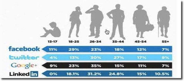
social_media_by_age
There’s a big, missing piece with today’s money management (aka PFM) offerings:

Age appropriateness

What I mean is that most FIs offer a one-size-fits-all mobile app and that just won’t cut it going forward. As capone360_teen_checkingdevelopment costs drop (see Building it Out, below), it will be easier to cost-justify tightly segmented apps. One of the better examples (from the desktop), is CapitalOne 360’s Teen Money a program it inherited from ING Direct (which launched it exactly four years ago with a $10 million ad campaign).

How will this multi-app trend manifest itself? One of the more likely initial phases will be segmenting by life stage. For example, here’s a common example of 10 stages, along with key money-management issues along the way:

  • Pre-teen: learning, saving, chore management, light spending
  • Teen: learning, saving, college planning, spending
  • College: learning, spending, expense sharing with roommates/parents, automobile
  • Singles: spending, renting, insurance, expense sharing with roommates, investing/401(k), saving, credit
  • Young marrieds: mortgage, insurance, expense sharing with spouse, investing, saving for home
  • Family with little ones: insurance, spending controls/budgeting, investing, tuition, home equity
  • Family with teens: spending/budgeting, investing, saving for college, sharing expenses with kids, retirement planning
  • Empty nest: retirement planning, asset management, investing
  • Active retirees: asset management, estate planning
  • Homebound seniors: sharing control with kids, health insurance management, estate planning

All of those segments will likely have their own app or at least a way to easily customize a general app in a way that syncs with their needs without the clutter typical of many banking websites (though they are getting much better as building for mobile (responsive design), demands prioritizing features/content.

Building it out

Given the 6, 7 and even 8-figure costs of major mobile initiatives, building 10 apps may seem ridiculously expensive. And it would be if it weren’t for cost savings enabled by third-party and SaaS services fed through APIs, a subject we touched on recently in a post about the coming Golden Age of Fintech APIs.

If you are willing to forgo branding, you could provide age-appropriate apps for virtually no cost. For example, some smaller banks gladly refer their customers to Mint for budgeting/money management help or Credit Karma for credit management. It’s not a bad strategy. Sure, they’ll see targeted financial advertising, but that’s not going to matter if you provide a valuable service.

But we expect most banks and credit unions will eschew custom development and choose a full white-label solution such as MX, Backbase or dozens of others. Or alternatively, go with a hybrid co-brand, such as BancVue’s Kasasa or FamZoo for the teen/pre-teen crowd.

——FinDEVrwithDate

We’ll be looking at these issues and more at our second annual financial services developers event,FinDEVr, in October.

——

Graphic source: Linkedin

Friday Feature Request: Banking/Card Transaction Annotation via Email

Friday Feature Request: Banking/Card Transaction Annotation via Email

simple_annotation

On Fridays, I try to post a new digital banking feature I’ve recently discovered. But with nothing to report this week, I will instead take the easy route and make a request for a new feature:

Feature: Transaction annotation by email

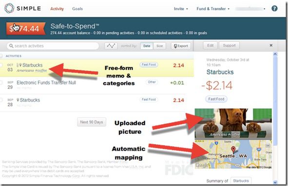
BBVA’s Simple has been a leader in adding richness to transaction detail. We reported here on its web-based solution for annotating transaction in late 2012 (see screenshot at top of post). Basically, that capability needs to be ported to email for, forgive me, simpler access.

The specs:

  1. After each transaction that hits my account (preferably ALL my aggregated accounts), I get an email confirmation of each transaction with whatever data the bank/PFM can already provide on it (amount, date, merchant, category). Using a free-form field, I add whatever text I want to the description, attach a photo or file (if I so choose), and categorize it (if I’m that kind of a user).
  2. Depending on how the feature is implemented, I press enter or hit reply and my annotations are recorded into my permanent transaction archives at the bank/PFM. Note: You must have a long-term archive solution in place for this feature to have value.
  3. The transaction details must be in the email message itself so that I can use my email client to forward the message to others, flag for later attention, or file.
  4. The same thing could be done via text (with a link) or notifications, but email is the key for me.

Bottom line: For me, this would be one of the best things a bank, card issuer or PFM could do to cement my loyalty—and perhaps even cough up a modest subscription fee. I want my transaction history to be both a personal diary, e.g., traveling or dining out; a tax record, for business or charitable transactions; and a searchable resource for future questions, e.g., What did I pay last month for cable?

——–

Note: Hit me on Twitter (@netbanker) if you know someone already offering this.

Yodlee Brings “Sense” to Forward-Looking Bank Balances

Yodlee Brings “Sense” to Forward-Looking Bank Balances

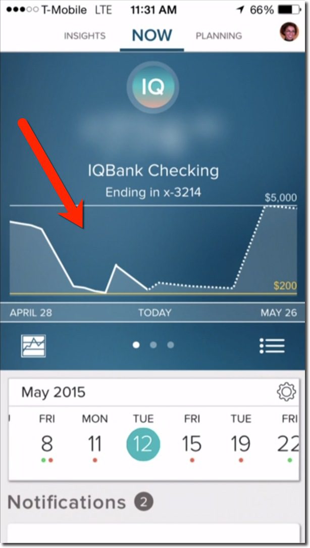
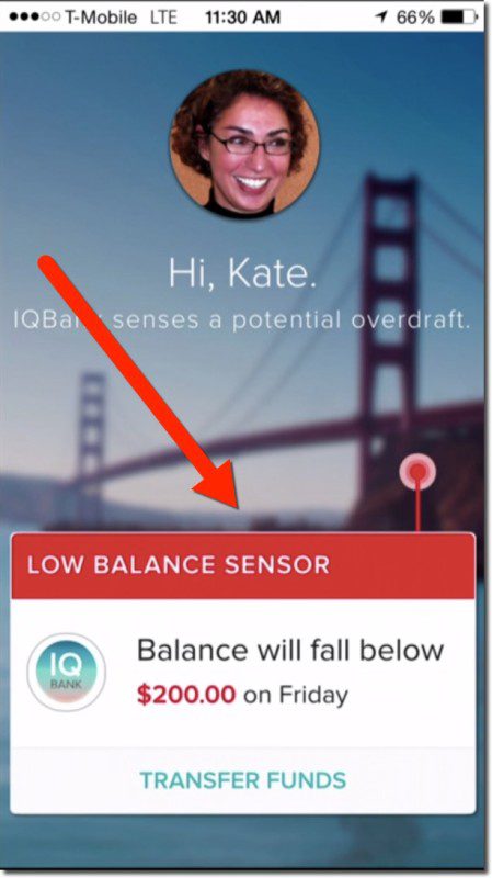
yodlee_sense_lowbalFor several years I’ve used the forward-looking balance feature from Simple’s “Safe to Spend” and Key Bank’s MyControlBanking as a great example of where banking/PFM is headed (see notes 1, 2, 3). But this seemingly vital PFM feature has not been adopted by other major players.

My hypothesis is that banks are (rightly) afraid of the cost (customer service, litigation, fines, CFPB backlash) if it doesn’t work perfectly. The false positive problem is especially daunting (note 3). You tell customers they are good to go and then Monday morning you bounce two of their checks collecting $70 in OD fees.

Enter Yodlee’s version of the forward-looking balance summary, Sense. The service made its industry debut at FinovateSpring last month (video here and below). With 15 years’ experience providing mega-banks with data aggregation and PFM services, it may have the necessary credibility to power forward-looking banking features for its client banks.

Bottom line: Regardless of where the algorithms are sourced, I hope banks come to their senses soon, and offer seamless money-management guidance.

——-

Yodlee Sense demo at FinovateSpring 2015 (13 May)

——–

Notes:
1. U.K.’s stealthy banking startup Mongo appears to be working on a similar function.
2. Simple was acquired by BBVA Compass in 2014 for $117 million.
3. Moven provides a compelling alternative-spending feedback/prediction system which is less likely to produce false positives. The neo-bank startup constantly compares your spending velocity with historical trends, to provide a real-time green-light/red-light indicator when you are headed towards overspending (see its FinovateSpring Best of Show 2015 demo here). For extra credit, the Moven app makes it easy to lock away the extra cash saved in the lower spending months.

BankSeeds: HomeSlice is an Expense & Chore Management App for Roommates

BankSeeds: HomeSlice is an Expense & Chore Management App for Roommates

seed_invest_logoEditor’s note: We are starting a new series showcasing very early-stage
startups of interest to banks and other financial institutions considering
Strategic Seed Investing. We have no financial relationship
with the companies mentioned, but we hope to see them at Finovate soon.

—————

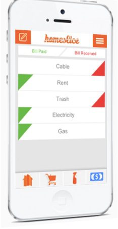
homeslice_appHomeSlice is targeting the 15 million college students currently sharing their lives with one or more roommates. The San Luis Obispo, California, company has created a “micro social network” for a single household where roommates can track chores, supplies, bills due, and payments made. HomeSlice’s “whiteboard function” captures all activity in a social network-like news feed (see inset).

In March, the company reported 6,000 active users across 2,000 households. In total, they’ve tracked 26,000 bills and 80,000 household supply items. The app is currently has no transactional integration so you can’t actually buy items or pay bills, but presumably that is on the way. The startup was recently visiting PayPal’s Venmo unit, a logical partner.

Fundraising: According to its Angel List profile, the company is currently raising a small round. The first investor is MatchFire (23 April 2015 press release), a data supplier to the app.

homeslice_billsWhy it’s a good strategic bet for financial institutions: Students and young adults are an attractive, albeit difficult, segment to win over. Yet, they are the future, and could be customers for 70+ years. So helping them with early money-management problems could pay huge dividends over time, assuming you are able to upsell profitable financial products. Furthermore, if a “parent view” could be added to the functionality, the app could be appealing to the income-producing part of the family.

And why it might not work: Young adults, students especially, are generally not big spenders for financial management and/or productivity apps. Nor are they interested, so it won’t be an easy sell.

Finally, remember this is a seed stage opportunity. The HomeSlice app is an MVP (minimal viable product) relying on manual data entry with no financial integration. There is a ways to go before you are sharing with your customers (or board).


Game On: What Banking Can Learn from Fitbit

Game On: What Banking Can Learn from Fitbit

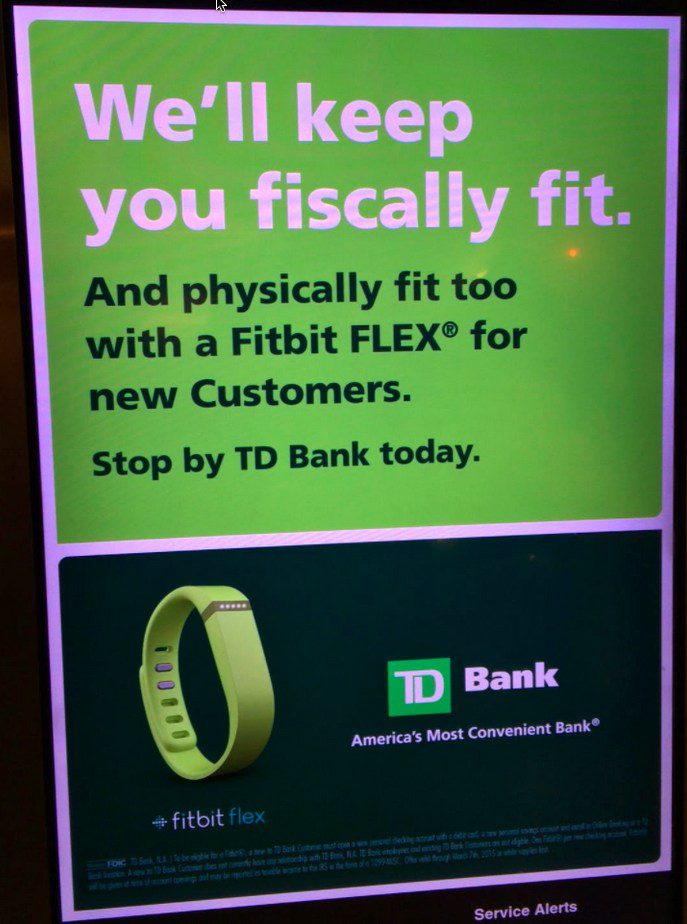
TDbank_fitbit_signageI’ve always been a “wanna be” tracker. I like watching the stats closely, but I also lose interest if the process, either capturing the data or compiling it, becomes tedious. But thanks to mobile (including wearables), the drudgery is disappearing and that has big implications for banking and financial services.

Some examples: I’ve used Mint since 2007 for personal and business expenses, so I have a massive database of transactions, which in theory should make it easy to locate just about anything I’ve charged to a credit or debit card in the past eight years. However, it’s never quite perfect because I will go for long periods without doing the required maintenance to keep every aggregated account flowing. Recently, I just fixed one of my main credit cards which has been on hiatus for two years. So, there are big holes in the data.

Then there’s BillGuard, another service I love and have been using for years. I love how it alerts me to questionable items as they hit my card accounts. However, BillGuard’s database is so good, that I rarely hear from them any more. This is good news for me (no questionable items), but less so for them. Because what’s invisible, loses its perceived value.

And I’ve tried tracking other things over the years, both financial and personal. And nothing seems to stick. Until now. I just hit my two-year anniversary using Fitbit, usually glancing at its tiny readout several times per day. So what is it about Fitbit that makes it addictive? And more importantly, how can financial institutions do the same for money management?

capitalone_uber1. Make it easy to use: While Fitibit requires zero maintenance once you get it activated, you do have to remember to keep it on you. The same goes double for a bank’s credit or debit card. You not only have to remember it, but also must choose to use it at the point of sale.

Action item: Incent users to get your card loaded into digital ecommerce sites such as Apple Pay, Amazon, iTunes, PayPal, Uber, Spotify and others. Capital One just unleased a great, albeit expensive, program with Uber to credit back 20% of rides to its cardholders (link).

2. Make it easy to see exactly where you stand in real-time: Fitbit provides feedback literally every step of the day. It’s extremely motivating, though at times discouraging when you fall way behind in personal goals. Card issuers today do something similar delivering real-time alerts right to the smartphone homescreen (and soon to the Apple Watch). But transaction alerts still don’t tell you where you are.

Action item: Make notifications smarter by including daily, weekly, monthly transaction summaries and/or credit available. They could be included in the notification, or enabled with a swipe of the transaction alert.

3. Make it easy to compare to previous periods: This is still a missing piece of my ultimate Fitbit experience. The mobile app makes it easy to scroll backwards or look at bar charts to see how you are doing over time. But there are no simple month-over-month or year-over-year comparisons to see your progress in similar time periods.

Action item: Create single-click views of financial activity and balances compared to one month ago, one year ago, two years ago, etc.

Fitbit email

4. Provide ongoing incentives: Similar to saving money being its own reward, burning calories by walking and climbing is clearly its own incentive to bump up your Fitbit numbers. But it doesn’t hurt to provide extra incentives along the way. An incentive can not only keep customers engaged, but also appreciative of the game provider. Unlike BillGuard, which so quietly goes about its business that I forget about it, Fitbit delights users with badges and pop-up notifications, for hitting various daily or lifetime milestones. (Fitbit actually needs to do more incentivizing, as experienced users can rarely get a new badge; I haven’t had a new one since last November).

Action item: The badges may be cheesy, but the email congratulations are powerful (see inset from Fitbit the first time you walk 20,000 steps in a day). This has to be one of the simplest things you could do to reinforce good money management. Send an email congratulating a customer when their savings balance, rewards points, interest earned, or whatever, increases compared to a month ago or a year ago. Who doesn’t appreciate an “atta boy or girl” every now and then (even if it is from your bank).

5. Get social: While I’m not of the social media generation, I do understand its appeal. Just today, Fitbit sent me a reminder to add friends. This allows users to compete against friends and family, a potentially motivating way to get you off the couch and moving. And while I’d never share Fitbit data with friends, I do enjoy a friendly competition with my wife. The key is to make sharing highly selective, customizable, and easy to switch on and off.

Action item: While financial information is not as readily shareable as fitness data, Venmo has proven that it has potential. The youthful set who’ve taken to using Venmo (see the Venmo line), enjoy sharing payment activity, but only without revealing the actual dollar amount, and allowing for maximum snark in the share. And there are also plenty of serious use-cases for sharing financial data, such as employees with their employers, kids with their parents, etc. Card issuers should add optional sharing to all card-management platforms.

——–

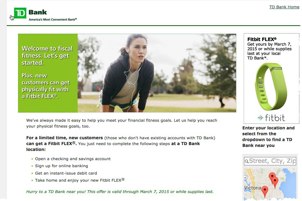
Screenshot: TD Bank landing page (22 April 20015, link)
tdbank_fitbit


—————–

Picture Credit: TD Bank has been giving away Fitbit Flex trackers to new checking account customers (screenshot above). A reader from MaximizingMoney.com contributed this upper-right photo of TD signage in the NYC subway.


Mobile PFM: Tracking Automobile Trips

imageLast week, MileIQ cracked the top-50 in Apple’s “Finance | Free” category. Think of it as Fitbit for cars, running in the background automatically logging all car trips (and killing battery life). 

At the end of each trip, users categorize the trip by swiping left for personal or right for business (see screenshots below). Users can also annotate transactions by “flipping” them over and typing basic details (see screenshot 2 below).

That’s basically all there is to the mobile part. Users go to the companion desktop dashboard (screenshot #5) to further categorize trips, stitch the various segments into a single trip, delete items, add parking and toll fees, edit the tags, manually add a trip and create reports.

You can also create a quick email report at the push of button from within the app (screenshot #6).

It’s free for 40 trips per month, but then costs $5.99/mo or $60 annually. It could make for a nice auto loan/lease premium item.

___________________________

Relevance for FIs
___________________________

This feature would be a nice, fee-based value-add for personal financial management (PFM) programs. But the more interesting aspect is the UI. Banks could provide a similar function for handling all transactions. Users swipe to the left to categorize a transaction as tax-deductible/business or right if not. Later, just the left-swiped transactions could be tagged with more specific categories (business travel, charitable contributions, etc).

This simple approach ever so slightly “gamifies” mobile-transaction processing, helping users save money and better manage their finances. 

———————-

Screenshots
Mobile UI

#1 (left) Main page shows drive(s) to classify
#2 (right) Annotation available on the “back” of each drive card

 image        image

#3 (left) Congratulations for handling all transactions  
#4 (right) Pricing options

 image       image

#5 Desktop dashboard

image

#6 Quick email report, generated by button in mobile

image

————————

1. We’ve tackled PFM numerous times over the years in our Online Banking Report. Most recently here (subscription).