UW Credit Union is First to Tap the Mobile Browser for Remote Deposit Capture

imageimageThere are a few dozen financial institutions I follow closely for inspiration. And one of my favorites is University of Wisconsin Credit Union. The 180,000 member, $1.6 billion asset CU, always seems to be at the forefront.

Its latest feat: Remote deposit capture from the mobile web <m.uwcu.org>. That’s not a typo. Mobile deposit capture WITHOUT a (native) app!

UWCU is the first in the world (as far as we can tell), that allows smartphone users to deposit checks right from the mobile web (see the CU’s blog post for more info). The CU taps new controls in mobile browsers (iOS and Android) to operate the mobile camera to capture paper checks. Image processing and fraud detection technology is powered by Ensenta (with Mitek IP).

The in-house UWCU dev team so far has eschewed downloadable apps in favor of mobile-optimized designs that work cross platform. They are working towards full responsive design, so any user can visit the UWCU site from any size device and receive the optimal design, complete with touchscreen controls when applicable. They are targeting year-end completion for the full package.   

But as much as Eric Bangerter (VP Ecommerce & Internet Services) and his team believe in the mobile web, they plan to bow to member pressure and offer a simple native app so they have a presence in the app stores (note 1). As Bangerter notes in a recent interview at BankInfoSecurity.com, “Not being in an app store today is kind of like not having a Google (search) result.” 

Bottom line: I’ve been a huge believer in native apps. It’s how legions of smartphone users have been trained to access services (see note 2). Many normal people don’t even understand the “browser construct” in a mobile phone. That said, I see the logic in UWCU’s approach. Like most businesses, they must prioritize their investments. And now that the mobile browser can tap the camera (and GPS), it makes sense to push its mobile power users to the mobile web. But I’m glad the CU is also creating a lightweight native app to satisfy the rest.

————————————-

UW Credit Union’s mobile-browser based deposit capture in action (4 June 2013)
Note: Watch the full 90-second demo posted in the UWCU online banking blog, Source Code.

 image       image   

———————————
Note:
1. The lack of a native app has seemingly not slowed down its mobile growth. The CU has 36,000 mobile users, an impressive 20% of its member base.
2. For more info, see our recent Online Banking Report: Digital & Mobile Wallets (published Feb 2013, subscription).

Mobile Marketing: USAA Embeds Preapproved Loan Offers within Mobile App

usaa_mobile_preapproved.jpg

Now that the U.S. personal credit crisis of 2008 to 2010 is in the rear-view mirror (but still visible), banks and credit unions are getting more aggressive with credit. And guess what new marketing vehicle is available in 2013 that didn’t exist five years ago? Yep, mobile this and mobile that.

So far, the sales component in mobile banking has been minimal. Generally, users must already be a customer of the bank and even pre-registered with online banking. And cross-selling? About the only thing you can buy remotely is an ATM withdrawal.

But that will change as more customers only deal with their bank and cards through mobile apps, a number that is already pushing 30% of the online banking base of Bank of America (see previous post).

Eventually, most financial products will be sold through the mobile app. Not convinced? Look internationally where mobile was a thing even before the iPhone. I still remember Bankinter’s 2007 BAI Retail Delivery presentation where they said 20% of their retail interest-rate swaps were done via mobile phone.

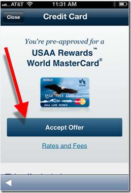
In the United States, we are starting to see banks pushing the envelope. USAA has been the leader in most areas. So no surprise that they are the first (that I know of) to place preapproved credit offers within their mobile app (see screenshots below).

In the bank’s Dec. 2012 update (see inset), it added the ability to:

  • Accept pre-approvals in the app
  • Apply for checking and savings accounts in the app
  • Apply for life insurance after getting a quote in the app

Bottom line: The power of the pre-approved credit offer is well known. Traditionally, snail mail has been the medium of choice. But that’s expensive, time-consuming, and oftentimes not delivered at the optimal moment. Delivering offers via mobile phone can solve all those problems.

And as an added bonus: The sales results will create a better business case for your entire mobile initiative.

——————–

USAA delivers preapproved credit card offer within its mobile app (Dec 2013)
Note: Screenshots shown are from a customer with an existing USAA life insurance relationship.
Price disclosures (right screenshot) displayed after clicking “Rates and Fees” under “Accept Offer” (left screenshot)

image         image

Source: comScore Q4 2012, Mobile Financial Services Advisor

————————–

Note: We cover online mobile delivery and marketing in depth in our subscription-based Online Banking Report.

Metrics: Mobile Banking, Payments, Insurance and Investment Usage

imagecomScore is compiling a wealth of digital usage data, both for desktop and mobile (see previous post). And luckily, they have agreed to let me share some of it here (see note 1).

The following chart is financial services usage data across 230 million U.S. mobile phone users aged 18 or older (note 2) in the United States as of year-end 2012. It includes any type of financial content, secure or public (i.e. this is not limited to secure access by account holders).

The data shows that 62 million (27%) of mobile users accessed financial content during the prior month (Dec. 2012 figures). The vast majority of those (87%) accessed bank content. Credit card or electronic payments (e.g. PayPal) were each used by about half the segment. And brokerage or insurance content was accessed by about 20% of mobile financial users.

Observation: The banking numbers have been widely circulated, but I hadn’t seen recent breakouts in insurance and brokerage. Both were surprisingly high, especially insurance. If you assume there is generally one mobile financial user per household, that means that about 10% of all U.S. households are using mobile insurance info. Same on the brokerage side.

image
Source: comScore, compiled Dec. 2012

————————————

Notes:
1. If you have requests, drop me a line and I’ll see what I can find.  
2. Users of any type of mobile phone, smartphone or otherwise. Also includes text-message queries.

Fees: Regions Adds Time-Based Charge to Remote Deposits

image Retail bankers, we’ve had a sighting of that very rare bird, the North American Newfee. It was thought to have gone extinct in the fall of 2011, when anti-bankers shot down the last breeding pair, a malformed $5 debit card fee at Bank of America.

But surprise. Regions Bank has gone out on a limb and put a fee on the newest banking feature to sweep the nation, remote check deposit. And the bank didn’t settle for the standard per-use fee (in trial at U.S. Bank), Regions got creative with a tiered price dependent on how fast you want the money (see note 1 for exact wording):

  • Immediate >>> 1% to 3% of check amount, with $5 minimum
  • Same night (8 pm cutoff) >>> $3 per check
  • Two days >>> $0.50 per check

There is also a potential $1 additional fee to temporarily raise your daily deposit limit to deposit a large check.

My take: I think Regions is smart to add fee(s) for the huge value mobile deposit delivers, though I think it would be better as part of a feature-laden bundle sold on a monthly subscription fee (note 2).

But tiered pricing is a novel idea worth trying. And I like the three options. But its probably too complicated for new users, at least the way it’s presented in Regions FAQ (note 3). Also confusing matters, is the extra buck for checks larger than the user’s limit. It’s asking a lot for customers to decide among three options, especially when having to decipher jargon and timing rules such as "Funds are available during posting."  

image The multi-choice pricing scheme is an example of the paradox of choice. A theory (and direct marketing rule of thumb) that says you should keep choices to a minimum otherwise recipients become overwhelmed and just give up.

I think the bank would be better off starting with just two tiers, normal and expedited. Then introducing the third tier in v2.0 next year. 

But overall, congratulations to Regions for braving the unknown to see if this newfee has wings (note 6).

———————————-

Notes:
1. Here’s how the fee is explained in the FAQ:

image

A somewhat better explanation is included on the mobile banking page:

image

2. For more info on fee-based banking services, our Online Banking Report on fee-based online services (subscription, May 2011).
3. Hopefully, the choices are better explained within the mobile user interface, which I was unable to see.
4. As expected, the initial reviews from Apple app users are harsh. Currently the bank has just a 1.5 star rating on the new version of the app containing mobile deposit. Down from 2 stars previously.  
5. Sorry for the prolonged bird metaphor. Sometimes you get bored at the keyboard (keybored?). It’s also our second bird-themed post on fees. What’s that about?
6. American Banker: http://www.americanbanker.com/issues/178_66/regions-offers-mobile-deposit-for-a-fee-1058090-1.html?

Mobile: Malauzai powers auto-login option at 90 community banks and credit unions

image I keep running across Malauzai Software as I research mobile innovations. They have developed some of the cool stuff at City Bank of Texas (previous post) along with photo billpay at First Financial (previous post).

The software developer has also been pioneering mobile auto-login, a feature I’ve written about a number of times (see note 1). In fact, Malauzai has been offering a no-login option, called SmarText, for almost a year. In terms of installed clients, they are clearly the market leader.

With this optional feature, users that have enabled Auto Login are shown their balance and recent transactions as soon as the native app loads. No login required (see screenshots below). However, to do anything transactional, users must conduct a full username/password log in (see last screenshot). 

Malauzai’s SmarText passed compliance/security scrutiny at its clients since the system is no less secure that text banking. The system takes the balance/transaction info that would normally arrive via text message and displays it within the native app.  

City Bank of Texas was the first Malauzai client to adopt the technology in May 2012. Since then another 125 banks and credit unions signed up for the option, and 90 are live. Here are some stats across all the FIs:

  • 107,000 registered users
  • 145,000 downloads
  • 15% of users are opting for Auto-login
  • Auto-login accounts for 20% of total logins
  • Best of class clients have a 25% opt-in rate

————-

When Auto Login option is selected (left), balance and recent transactions are be displayed immediately

image    image   

However, full login required for transactions

image

—————————–

Note (Who’s on first?):

1. I get pretty excited when reporting new fintech bells and/or whistles. And I like to reward those pushing the envelope by anointing them first. But that can be risky. There can be a number of parties pushing it forward, making the claim of first murky at best.

That goes with the concept of no-login mobile balance lookup. Here’s a timeline of the various firsts in the United States for this technology:

Then there are a couple other "firsts" that I missed at the time:

  • Jan 2013 >>> First bank (prepaid card): Green Dot’s GoBank
  • May 2012 >>> First bank (checking): City Bank of Texas (powered by Malauzai, see above)

OK, I think that sets the record straight. Thanks everyone for innovating past the pesky mobile login problem.

Mobile Monday: Bank of the West is First in USA with No-Login Pulldown Balance Lookup

imageTwo years ago the above headline would have sounded suspiciously like an April Fool’s post. But it’s no joke, we really are seeing banks offering no-login options and I hope it spreads. The latest innovator: Bank of the West.

Last week, the bank’s mobile exec Matt Krogstad gave me a behind-the-scenes look at their new mobile banking service. In February, the bank replaced its previous mobile banking service with a new one powered by Fiserv (formerly M-com, see note 1). In the process, the bank added four important new features:

  • Mobile remote check deposit: A mobile requirement in 2013.
  • Bill payment: Another needed feature for users who prefer go mobile only, a number approaching 30% at first movers such as BofA and Chase
  • Single PIN login option: Users have the option of logging in with their full online banking credentials or selecting a six-digit PIN to replace both the username and password
  • No-login "pulldown" balance option: Swiping the Bank of the West logo down reveals the account balance of up to two accounts (see next section).

The bank also increased its mobile presence with Android and iPad versions.

The initial results are impressive. In less than two months, Bank of the West has had a 70% increase in active mobile users and a tripling of logins per day. And that was before the bank began pushing it last week (see website screenshots below).   

Bank of the West pioneers no-login option in USA
Bank of the West is the first U.S. bank with a no-login mobile balance lookup option (see others who have it here). After it’s been enabled, users can simple pull down the logo at the imagetop of the home screen. Within 1 to 3 seconds (depending on connection speeds), the balance from up to two accounts is revealed at the top of the page.

Requiring users to swipe before showing the balance provides a nice mix between privacy and usability. It is super simple to use, yet it leaves your balance "hidden" if your kids, or friends, pick up your phone. 

Since, no-login lookup is basically the same as an SMS balance inquiry (something the bank already offered), the bank’s security folks were able to approve it. Naturally, it’s turned off by default. Users must enable it within mobile banking, something that about 5% of mobile users have done in the first month or so.

————————————

Bank of the West mobile users "pull" the logo down to reveal account balances (1 April 2013)

image     image

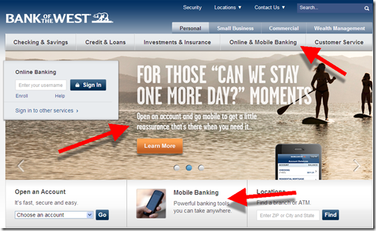
Bank of the West’s homepage has strong mobile branding (1 April 2013)
Note: Surprisingly few banks or credit unions have elevated mobile banking (or online banking for that matter), to the primary navigation

image

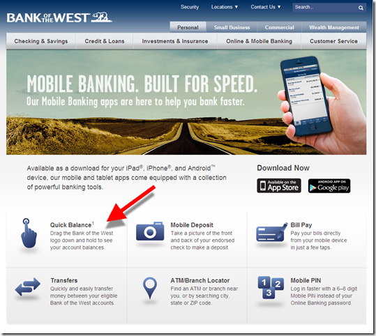
Bank of the West mobile banking landing page (link)

image

————————————–

Note:
1. Matt Krogstad was an early employee at M-com, which Fiserv acquired several years ago. He was involved in biz dev at Fiserv until his move to Bank of the West a year ago.

Metrics: Mobile Traffic at the 10 Largest U.S. Banks

imagecomScore just enhanced its website traffic reporting by showing both the mobile and desktop  audience at major websites. They call it Media Metrix Multi-Platform. The top-50 U.S. sites are available here.

Unfortunately, there are no banks in the top-50 and just one fintech company (Intuit, note 1). But comScore forwarded us a list of the top-10 banks to share with readers (thanks, see table below).

Highlights:

  • The mobile-only group is becoming a significant segment, amounting to about 20% of the desktop banking group (across all banks)
  • However, BofA and Chase have much higher mobile-only groups, 50% higher than any other top-10 bank
  • Across all banks, 40% of mobile users are “mobile-only” while 60% also use desktop online banking
  • But at BofA and Chase, about 2/3 of their mobile base is “mobile-only”

Bottom line: It is no surprise that mobile usage is significant. But what I didn’t realize is how quickly mobile users are giving up desktop online banking. Look at Chase and BofA, which have had mobile the longest. Only 1/3 of their mobile users went to the desktop during February. Partly, that’s because many are single-service credit card customers. But it’s strong evidence for what many have hypothesized: once users become accustomed to mobile convenience, they have much less need for desktop access.

——————————-

Table: U.S. desktop and mobile traffic at the top-10 busiest U.S. banks
millions of unique visitors, age 18+ (Feb 2013)

Feb 2013 (USA) Total Desktop Mobile* Mobile Only Mobile Incremental**
Total U.S. Internet 236 221 127 14.5 7%
Banking total 102 85.1 39.1 16.4 19%
1. Bank of America 31.5 24.1 11.7 7.4 31%
2. JPMorgan Chase 28.3 21.9 9.9 6.3 29%
3. Wells Fargo 22.2 20.0 3.5 2.2 11%
4. Capital One 15.4 12.7 3.8 2.8 22%
5. Amex 15.3 12.6 3.8 2.7 21%
6. Citi 11.8 10.4 2.0 1.4 13%
7. Discover 7.8 6.5 1.7 1.3 20%
8. HSBC 6.5 5.5 1.3 1.0 19%
9. US Bank 5.5 4.8 0.9 0.7 14%
10. PNC 4.8 3.9 1.1 0.8 21%

Source: comScore, March 2013 (methodology)
*Includes smartphone and tablets, native apps and mobile Internet
**Mobile-only divided by desktop base

———————————————–

Notes:
1. Intuit placed #42 of all U.S. digital properties with mobile audience of 15 mil, desktop of 29 mil, and total 38 million. It had 8.9 million mobile-only users, 31% of its desktop base.

Mobile UX: Barclaycard Adds No-Login Transaction “Peek”

One of my pet peeves is burdensome login procedures on smartphones. There is no rational reason to force cardholders to log in to see basic transaction data (unless they want to). We’ve covered it here, here, and here.

imageBut this is the first time a major U.S. issuer has opened up mobile transactions. Barclaycard’s iPhone app update released today (v. 3.1.4267, see inset), contains the new Peek feature which:

….provides a quick-view of key
account details prior to login 
(selected cardholders only)
 

It’s not discussed on the Barclaycard (U.S.) website, so I don’t have an action screenshot. And the “selected cardholders only” probably means its not available across all of its 35 different portfolios.

Bottom line: No-login transaction history is a good way to improve customer satisfaction, help move your card top of wallet, and possibly reduce costs from fewer password resets, fraud, and customer calls. I hope we see other major issuers follow suit soon.  

First Financial, US Bank Launch First Photo Billpay Services

imageI started this post Monday, before I knew US Bank would be making headlines today as the first “major” bank with photo billpay. I got that news last night, when I updated my US Bank iPhone app (see inset).

But First Financial Bank (Abilene, TX; $3.7 billion deposits) actually imagebeat US Bank ($235 billion) to market by more than a month with its 22 Jan 2013 launch (press release; YouTube video). The bank said it had 12,000 bill uploads during the first 10-days of availability.

 US Bank mobile photo billpayBoth services use the Mitek engine to read the image and handle the OCR work. But First Financial also uses Allied Payment Network to process images that don’t get properly digitized on the first pass and Malauzai Software for app development. 

Like remote check deposit, the system will improve over time as it learns the nuances of the thousands of billing statements fed into the front end. But today, there is still work to be done on the minority of statements that don’t read correctly (see note 1).

First Financial features the new service front and center on its homepage (see first screenshot below) with a clever:

Tell your bills to say, “Cheese.”

US Bank has no mention of it on the front page (nor in site search), but if you navigate to its mobile banking page, you can’t miss it (third screenshot below).

image Bottom line: I’m not sure how many people will ultimately use photo billpay (though First Financial seems to be off to a good start). It’s an interim technology until we can convert the country to ebills.

But since that may be a decade from now, using your smartphone to snap-and-pay is the best answer for now. So, we are bestowing our first OBR Best of the Web of 2013 to First Financial  for raising the bar in remote delivery (notes 2, 3). And an honorable mention to US Bank for getting it out to a broader market.  

——————————————

First Financial features its new photo billpay on its homepage (6 Mar 2013)

First Financial Bank homepage featuring photo billpay powerd by Mitek


First Financial landing page (link)

First Financial Bank landing page for photo billpay

US Bank’s mobile page features photo billpay prominently (link)

US Bank mobile banking page featuring photo bill pay

—————————-

Notes:
1. Just today, the Chase ATM couldn’t read the amount on a computer-generated check we fed into its deposit slot. So we had to manually add.    
2. This Best of the Web goes to First Financial since it was first. Mitek already won when it introduced the technology in 2010 (see our Online Banking Report on Paperless Banking (subscription).
3. Since 1997, our Online Banking Report has periodically given OBR Best of the Web awards to companies that pioneer new online- or mobile-banking features. It is not an endorsement of the company or product, just recognition for what we believe is an important industry development. In total, 89 companies have won the award. This is the first for First Financial. Recent winners are profiled in the Netbanker archives.

Movenbank Provides a Peek at its User Interface

imageTech startups help define the future in many traditional industries. Amazon in books, Expedia in travel, Tesla in automobiles.

But there’s been less disruption in retail banking than most industries, especially in the U.S. We saw ING Direct take some share in savings accounts, but not enough to really shake up the status quo. 

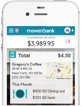
But we have some new players looking to change that and Movenbank is one of the most interesting. The Brett King-founded startup, armed with $2.4 mil in seed funding, is beginning to release more details as it prepares for its launch at our FinovateEurope event in two weeks.

In an email to customers today, the startup provided a few peeks at its Geezeo-powered PFM interface (screenshot below):

  • MoneyPulse: A snapshot of the your current financial situation with green/yellow/red dial so you know in a glance if there are problems.
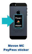
  • Movenbank MasterCard PayPass sticker MoneyPath: More of a typical budgeting piece.  
  • Account aggregation: Beta users can already add accounts from several-hundred banks and credit unions; so unlike Simple, it appears Movenbank is supporting account aggregation out of the box
  • Spend | Save | Live: Primary navigation across the top of the dashboard

In addition, the "how it works" section shows a MasterCard PayPass sticker used for contactless payments (inset).

————————————-

Movenbank interface (from customer email, 28 Jan 2013)
Note: "Spend | Save | Live" navigation across top.
This appears to be a PC user interface, but it could be a tablet UI.

Movenbank user interface w PFM features

Mobile Monday: USAA Taps the Mobile Camera for New Account Opening

USAA ipad app offers mobile check deposit The smartphone has already changed the way we work, communicate, find information, and behave. But it’s had a limited role so far in bank-account opening (note 1).

But leave it to USAA, the pioneering bank for all things mobile (note 2) to lead the way again. First reported this week in American Banker, USAA is testing the use of “blank check” capture to make it easier for certain new customers (note 3) to make their initial deposit (note 4).

Customers can snap a picture of a blank check from their old account and then enter the amount to be transferred electronically (note 5). It’s not really any faster, actually probably slower, than simply typing in a checking account and routing number (twice). But given how frustrating data entry can be on a mobile, some users will love it.

More importantly, it introduces users immediately to mobile capture and removes one more barrier to getting that first deposit on the books. And it makes USAA look cool.

—————————————–

Notes:
1. At Finovate, we’ve seen the mobile camera used in a number of interesting ways. oFlows (now a part of Andera), wowed the crowd in 2009/2010 with various paperless account-opening and -processing technologies (for example, check out its FinovateSpring 2010 “Best of Show” demo).
2. USAA launched mobile remote deposit 18 months before any other major bank and a full 3 years before Bank of America (see our 2009 post).    
3. Only certain USAA members are eligible to use mobile deposit (generally, those with military service or their family members who have acceptable credit).
4. Unfortunately, USAA doesn’t yet support full mobile account opening. New customers must first go online and establish a new account and register a username and password. Then they must go to USAA mobile banking, log in, then take a picture of the blank check. Furthermore, only certain USAA members are eligible to use mobile deposit.
5. In the United States, the funds are moved via ACH, a little-understood system that banks could do a better job explaining to customers. See a rundown of the mysteries of ACH from the customer’s standpoint in this enlightening Deposit Account post from yesterday.

Mobile Monday: Top 50 iPhone and iPad Apps in the Finance Category

app store logo.jpg

I knocked around Apple App Store last week researching our year-end Online Banking Report. Below are the current top free finance apps in the U.S. store (note 1). While there are not a whole lot of surprises, several are notable:

  • Credit Karma maintains its top-10 ranking (#9)
  • Intuit has three of the top-10 apps (#4, 6, 8) plus #30
  • Two of the top-5 financial institution iPhone app providers (PayPal and Capital One) do not yet have iPad apps
  • Three credit-monitoring apps are in the top 32 (Credit Karma #9, Intersections #23 and Experian #32)
  • Two banks each have two apps in the top 50: Capital One (#6 and #34) and PNC (#25 and #42)
  • Five fintech startups made the top 22 (Credit Karma #9, LearnVest #15, Lemon #19, Pageonce #20, Manilla #22); all but Lemon are Finovate alums (note 2)

Methodology: I first listed the top 50 iPhone apps from the “Free Finance” category (column 2). Then I went to the iPad store and found their corresponding iPad app rank (column 3). I then listed all the remaining iPad apps in the top 50 and their corresponding iPhone rank (last 20 rows below).

———————————-

Top iPhone/iPad Finance Apps in Apple App Store (USA)

Company iPhone Rank iPad Rank
PayPal 1 none
Chase 2 3
Bank of America 3 1
Mint (Intuit) 4 5
Wells Fargo 5 2
TurboTax (Intuit) 6 31
Capital One 7 none
TaxCaster (Intuit) 8 16
Credit Karma 9 none
American Express 10 7
Discover 11 13
Citibank 12 10
USAA 13 8
State Farm 14 47
LearnVest 15 none
Yahoo Finance 16 11
Easy Envelope Budget 17 42
US Bank 18 26
Lemon 19 none
Pageonce 20 23
Fidelity 21 12
Manilla 22 none
Identity Guard (Intersections) 23 none
Navy Federal FCU 24 none
PNC 25 19
iSpending 26 116
Barclaycard 27 35
Mortgage Calc (Zillow) 28 20
TD Bank 29 none
Quicken Money Management (Intuit) 30 17
TD Ameritrade 31 27
FreeCreditScore.com (Experian) 32 55
Pocket Expense 33 15
ING Direct (Capital One) 34 none
Quicken Loans 35 none
E*Trade 36 33
Spending Tracker 37 28
SunTrust 38 none
Western Union 39 none
iSpreadsheet 40 9
BB&T 41 46
Virtual Wallet (PNC) 42 40
Bloomberg 43 22
Budget 44 none
Expensify 45 53
Ally Bank 46 none
HSBC Personal 47 none
H&R Block 48 24
Bluebird (AmEx) 49 none
Seeking Alpha 50 none
Below top 50 iPhone    
Craigslist mobile not in finance 4
Money Magazine none 6
ShareBuilder (Capital One) 114 14
CNBC 55 18
Real-time stock tracker 64 21
Vanguard 58 25
Morningstar Stockinvestor 198 29
Personal Capital 92 30
Regions Bank 54 32
Visual Budget 62 34
Merrill Lynch 84 36
Bloomberg TV 125 37
Mortgage calculator (Trulia) 102 38
SmartMoney Retirement Planner (Dow Jones) none 39
Bills for iPad (iBear) not in top 300 41
Budgets for iPad (iBear) 162 43
Checkbook free 53 44
Smart Budget 120 45
TD Ameritrade Mobile Tracker 86 48
EZ Financial Calculators 63 49
Schwab 60 50

Source: Netbanker observation of Apple App Store directly from iPad and iPhone around 6 PM Pacific, 7 Jan 2013

None = No app listed with the App Store for that device

——————————

Note:
1. The Apple ranking system is a bit of a black box. But it’s generally believed to weigh heavily recent download activity.
2. Easy Envelope Budgeting (#18) is from a San Francisco-based Web developer Dayspring Technologies founded in 1998.