Mobile Monday: Communicating Critical App Updates via Email

Mobile Monday: Communicating Critical App Updates via Email


usbank_mobile_upgrade_email_border

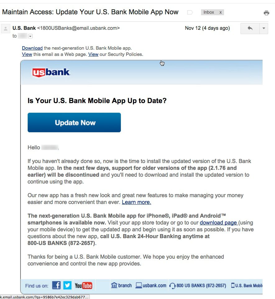
       Email from US Bank to mobile banking customers (12 Nov 2015)

Last week I wrote about how much I liked US Bank’s new native app. So I understand why the bank is anxious to get users ported over to the new version. Customers are going to like it. Guaranteed.

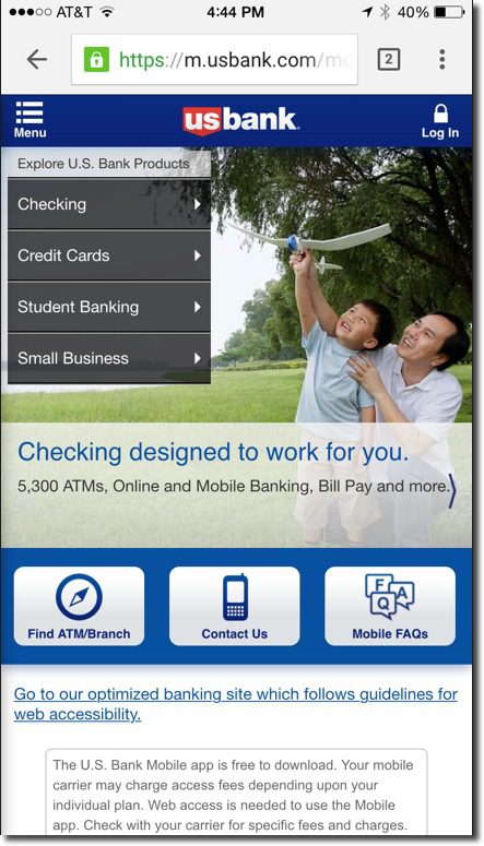
Yet I was a little surprised, just a week into the new version, to receive an email warning that the previous app was about to stop working (see message above). This urgency makes customers question whether something is seriously wrong with the previous version. The message is also annoying in that it doesn’t really give the customer any clue as to whether their version is the current one, or not. It provides only the version number (2.1.76) which is the cut-off between good and bad apps.

This message offers so many opportunities to improve that I was compelled to compile a top-10 list of gripes (plus 2 bonus nitpicks). They are listed, more or less, in priority order:

  1. I had already updated to the new version, so this message was completely unnecessary. And if the bank doesn’t know which version I’m using, it should say so.
  2. There is no explanation of why it was suddenly so urgent to upgrade. Skeptical users were left to their imaginations, not something you want in these days of widely publicized security breaches.
  3. usbank_appversionnumber
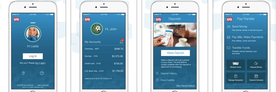
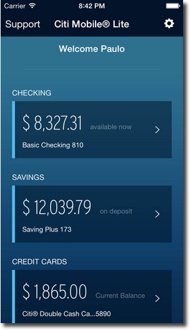
Instead of talking about version numbers, why not just describe the new app? It looks completely different! A quick description and screenshot would have been understood by 90% of the readers, and would have allowed users to move on with their day, rather than having to engage in a tedious “find the version-number hunt.”
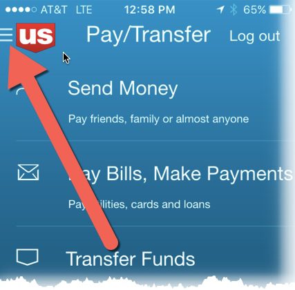
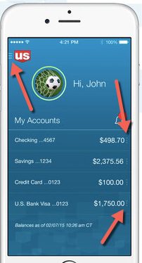
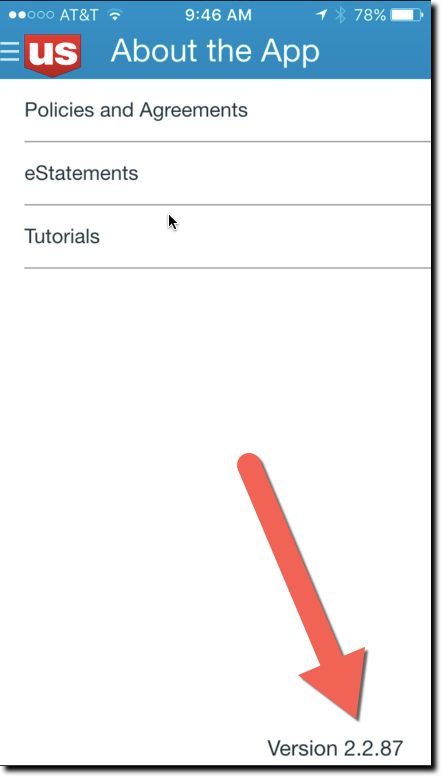
  4. If you must use a version number, then at least explain how to find it. The email failed to address that key point in the body, fine print, or within any links provided within the message. It’s not that simple to find the version number. You must log in, find the hidden primary navigation, choose “About the App” and notice the version number in the lower right corner (see inset). 
  5. If you are going to make such a big change, use a whole number for the new version of your app. In this case, it would be easier to say, “Use v3.0 or later.” 
  6. The links provided to update the app did not go to the iTunes app-update page, but instead went to a marketing page at USBank.com. And the marketing pages, while well done, also did NOT link to the app store’s update pages. In fact, to confuse things still further, the marketing page said the new version “was coming soon.”
  7. The only way to get help was to make a phone call to the general 800 number; no direct line to tech support was given. And not even an FAQ page, email address, chat, or any other type of digital link was provided for help in responding to this matter.
  8. The email message was not optimized for mobile. It was hard to read on my iPhone 6.
  9. It does not specifically address what happens if you don’t update within the next few days; “discontinuing support” has a number of meanings from simply not getting tech support to completely not working.
  10. The bank’s message concluded with thanks for being a mobile banking customer, but they could have also thanked me for taking time out of my day to deal with this “Maintain access … update now” emergency subject line in my inbox.
  11. <Nitpick #1> The first sentence of the second paragraph uses “new” three times.
  12. <Nitpick #2> The closing sentence repeats the “enhanced convenience” copy point. This is a generic benefit at best and shouldn’t be invoked twice in a 150-word message. The resulting inconvenience to update makes their value judgment of questionable importance.

Bottom line: Customer communications are not easy, especially with newer technology. So make sure to test them with some less-savvy users before hitting publish.

Mobile UI: US Bank Tackles New Navigation Conventions

Mobile UI: US Bank Tackles New Navigation Conventions

usbank_mobile_screens

As I was taking a tour of US Bank’s gorgeous new mobile app (above), I was reminded of an ongoing problem in mobile UI, lack of navigational consistency. For anyone over 30, you’ve seen this play out before. It took nearly a decade (1995 to early 2000’s) for websites, especially in financial services, to conform to pretty straightforward navigation conventions (tabs on top, login in upper right, etc.).

usbank_previousWhile responsive design—one website for desktop and mobile—has made things a little less standardized, desktop browser navigation is still pretty easy to figure out. And there’s always the back button to get you out of a jam.

Not so on smartphones. First-generation mobile banking UIs generally used the bottom of the screen to showcase 3 or 4 navigational choices, often with a More button to expand the choices. This worked OK since early apps usually had limited functions.

But as banks redesign their apps to a more modern esthetic, the bottom navigation bar is disappearing. That looks great, but how do users find key functions?

That brings me back to US Bank’s new app. When I finished admiring its newly sleek design, I was momentarily thrown for a loop on how to get out of the main page. The familiar buttons at the bottom were gone (see older screenshot right). And initially I didn’t see the “hamburger menu” in the upper left corner—a stacked column of three bars (upper left), or a stack of small dots (following line items)—which have recently become fairly common design conventions.

usbank_nav_closeupusbank_mobile_nav_optionsSo it turns out that US Bank has located navigation options in two spots, neither particularly easy to see on a phone.

(1) The hamburger menu is there in the upper left, but it’s small and looks like it’s part of the logo (see screenshot at left and closeup at right)
(2) The smaller context-sensitive menus are positioned directly to the right of each account. Deposit accounts have three navigation choices (Pay/Send, Transfer Money, Deposit)

Bottom line: US Bank has delivered what may well be the best looking big-bank mobile app yet, at least in the United States. It is also packed with new features such as no-login balance inquiry and customizations. So kudos to the team at US Bank, which also led the pack on desktop UI more than a decade ago!

That said, the almost-hidden primary navigation is a case of the design getting slightly ahead of its users. While users may soon get used to the new nav links, I recommend a few adjustments in the meantime:

  1. Add navigation instructions to the “feature tour” when users open the app for the first time.
  2. Make the hamburger menu stand on its own by increasing its size and placing it away from the US Bank logo (below the logo, or in the upper right which is wide open).
  3. Consider adding the word “menu” below it for a few months, at least until users get the hang of it.

——–

Update 16 Nov 2015: Digital design guru Jakob Nielsen just published an overview of mobile navigation echoing our concerns with the hamburger menus.

Feature Friday: “Combine Usernames” from Capital One

Feature Friday: “Combine Usernames” from Capital One

Capital One just updated its Wallet iPhone app to include gift cards. That seemed like a good candidate for this week’s Feature Friday.

capital_one_combine_usernamesBut on the way to checking out the gift card feature, I ran into another new Capital One feature I love. It’s called Combine Usernames and it does just that. The option appeared automatically on the first screen when I first logged into the latest issuer’s standard mobile banking app (not the newer Wallet app) (see inset). The card giant noticed I had two usernames registered and offered to automatically combine them. It’s not something I’ve run into before, and it’s super convenient for those of us who can’t keep their digital life in sync. After selecting Combine Usernames near the bottom of the main screen, you are directed to a new screen with instructions to swipe to combine. I swiped and it worked immediately, although the page warned it could take up to 72 hours. I wasn’t sure what was lurking under my other username, but it turns out it was my old ING Direct (now Capital One 360) account. Now, everything’s visible on the app, and I’m in sync at Capital One. ———– I’ll cover the gift card function after I test it at Starbucks. Enjoy your weekend.

Features: Capital One to Add Receipt Capture to Mobile App

Features: Capital One to Add Receipt Capture to Mobile App

capitalone_reciept_capture

Capital One sent an email (see below) to customers two days ago promoting a new version of its Wallet mobile app. Although it’s not mentioned in the email copy, when you click “Get Started” the resulting webpage (see above) reveals that the bank is about to add receipt-capture to its app.

Normally, I’d save this news for a Feature Friday post. But I’m so excited to finally have integrated receipt capture on one of my cards, I just had to hit publish. Of course, it’s “coming soon” so I can’t give you any insight into how it works, or if there is an OCR component. But the website copy does mention some level of integration, just not whether it’s automatic (OCR) or manual:

Simply snap a photo to connect a receipt with a charge in the app.

American Express offers this capability, Chase on its Ink small-biz app, as well as Expensify and a few other fintech startups. But Capital One is the first big Visa/MasterCard consumer issuer (that I know of) with the feature. I’ll let you know how it works.

—–

Capital One email announcing the remodeled native Wallet app (31 Aug 2015):

capone_email_redesigned_app


—–

Update (3 Sep 2015): I omitted the Chase Ink card in the original post.

Mobile Monday: Engaging Prospective New Customers

Mobile Monday: Engaging Prospective New Customers

mobile_phone_lineupHow important are mobile users to your sales efforts? 76% of Facebook’s ad revenue is from mobile (and it was considered by many to be a mobile laggard a few years ago).

Prospective customers are already visiting your website from their smartphones in massive numbers. Are you making a good first impression? Does the UI work across key devices? And more importantly, is there an easy-to-find path to mobile purchase?

This afternoon, I visited 20 leading banking and personal finance sites (as a proxy for popularity, I used the 20 most downloaded free finance apps in the U.S. Apple App Store, see list in footnote). And it was like a trip back in time before (desktop) websites had adopted browser-design standards. By the numbers:

  • Excellent: 19 of the 20 had mobile-optimized sites (Laggard = Navy Federal Credit Union)
  • Satisfactory: 14 of 18 had a visible link for login (2 required a native app to login)
  • Needs work: 11 of 20 had a visible link to download the native app (including the 3 below)
  • Needs work: Only 3 of 20 used an initial “pop-up” screen that prompted download of the app, then the user needed to find a link to the non-app site
  • Needs work: 12 of 20 made a visible attempt to sell something
  • Fail: 6 of the 20 made a pretty marginal first impression, including several of the biggest financial institutions in the U.S. and the world: American Express, Chase, Citibank, Mint, PNC, Wells Fargo

My favorites (from this sample of 20, see footnote):

Bank: US Bank
Nice, engaging layout with clear path to more info, but missing a link to download the app

usbank_msite

Runner-up: TD Bank
Easy-to-find customer service, login, location, but missing app-link

tdbank_msite

Favorite non-bank: Credit Karma
Good branding, clear get-started button, but no link to native app

credit_karma_msite

Least favorite FI: American Express (lots of competition for this one)
Too much emphasis on logging in, easy-to-miss card-finder at bottom

amex_msite

Least favorite non-FI: Mint
Straightforward app link, but needs to better engage new user before offering the two choices; not very graphically interesting

mint_msite

——–

Top 20 apps (in order at U.S. App Store, 5PM Pacific 31 Aug 2015): Chase, BofA, Wells Fargo, PayPal, Capital One, Venmo, Credit Karma, Square, Mint, Acorns, GEICO, Citibank, Discover, American Express, USAA, Progressive, US Bank, Navy Federal, TD Bank, PNC Bank

#RockChalk (for Karl, Joe and Mary)

Mobile Monday: Fintech Through the Ages

Mobile Monday: Fintech Through the Ages

social_media_by_age
There’s a big, missing piece with today’s money management (aka PFM) offerings:

Age appropriateness

What I mean is that most FIs offer a one-size-fits-all mobile app and that just won’t cut it going forward. As capone360_teen_checkingdevelopment costs drop (see Building it Out, below), it will be easier to cost-justify tightly segmented apps. One of the better examples (from the desktop), is CapitalOne 360’s Teen Money a program it inherited from ING Direct (which launched it exactly four years ago with a $10 million ad campaign).

How will this multi-app trend manifest itself? One of the more likely initial phases will be segmenting by life stage. For example, here’s a common example of 10 stages, along with key money-management issues along the way:

  • Pre-teen: learning, saving, chore management, light spending
  • Teen: learning, saving, college planning, spending
  • College: learning, spending, expense sharing with roommates/parents, automobile
  • Singles: spending, renting, insurance, expense sharing with roommates, investing/401(k), saving, credit
  • Young marrieds: mortgage, insurance, expense sharing with spouse, investing, saving for home
  • Family with little ones: insurance, spending controls/budgeting, investing, tuition, home equity
  • Family with teens: spending/budgeting, investing, saving for college, sharing expenses with kids, retirement planning
  • Empty nest: retirement planning, asset management, investing
  • Active retirees: asset management, estate planning
  • Homebound seniors: sharing control with kids, health insurance management, estate planning

All of those segments will likely have their own app or at least a way to easily customize a general app in a way that syncs with their needs without the clutter typical of many banking websites (though they are getting much better as building for mobile (responsive design), demands prioritizing features/content.

Building it out

Given the 6, 7 and even 8-figure costs of major mobile initiatives, building 10 apps may seem ridiculously expensive. And it would be if it weren’t for cost savings enabled by third-party and SaaS services fed through APIs, a subject we touched on recently in a post about the coming Golden Age of Fintech APIs.

If you are willing to forgo branding, you could provide age-appropriate apps for virtually no cost. For example, some smaller banks gladly refer their customers to Mint for budgeting/money management help or Credit Karma for credit management. It’s not a bad strategy. Sure, they’ll see targeted financial advertising, but that’s not going to matter if you provide a valuable service.

But we expect most banks and credit unions will eschew custom development and choose a full white-label solution such as MX, Backbase or dozens of others. Or alternatively, go with a hybrid co-brand, such as BancVue’s Kasasa or FamZoo for the teen/pre-teen crowd.

——FinDEVrwithDate

We’ll be looking at these issues and more at our second annual financial services developers event,FinDEVr, in October.

——

Graphic source: Linkedin

Mobile Monday: Turning Spending Management Into a Positive Experience

Mobile Monday: Turning Spending Management Into a Positive Experience

moven_wheelMany people closely track their spending because they have to. They live paycheck to paycheck and there is no choice. A few track it because they are masters of control, and they love the sense of order that results from processing each transaction. But almost no one tracks spending for fun or fulfillment.

If a bank, card issuer, or fintech startup cracks that barrier into entertainment, they would surely be en route to fame and fortune (or at least a demo slot at Finovate). If I knew how to make expense tracking fun, I wouldn’t be writing about it here. I’d turn it into a startup, or at least a consulting practice.* So for what it’s worth, here’s my five-point plan for making banking fun.**

1. Go all-in on mobile
This is probably obvious to most readers. But I still encounter people who still believe that money management is best done on a desktop. True, it’s easier to design for the big screen, and real keyboards are nice, but it’s just NOT how people interact with digital providers today. For example, 76% of Facebook’s and 88% of Twitter’s ad revenue last quarter was on mobile (source). What more do you need to know?

2. Remove the login
You cannot engage mobile users multiple times per day with a standard username/password system. Thankfully, logging in via fingerprint is becoming a handset standard. Bank of America said last week it was about to adopt TouchID on iOS, so the log-in problem should eventually be going away. And for non-biometric handsets and/or users, a 4-digit PIN entry is a pretty good workaround.

3. Stream the transactions
Users should not have to do any work to see each new transaction in reverse chronological order. It should be just like an email system showing new transactions at the top. Unread ones should be super-easy to identify by staying boldface until viewed. For extra credit, adopt the gmail standard, identifying Priority transactions at the top of the stream.

4. Gamify the spend
Once you’ve laid the groundwork with #1, #2 and #3, it’s time to do the tough part of making tracking fun, or at least interesting enough to hook users. I look to Fitbit and Starbucks for inspiration. I probably look at my Fitbit app 7 to 10 times per day to see how I’m doing against my weekly goals; in comparison, I probably open a mobile banking app about 1 or 2 times per month. Why does Fitbit get 20x the engagement? Because it’s a POSITIVE experience. Every time I open it up I’m literally steps closer to my goal. That’s positive reinforcement. In comparison, every time I look at my banking app, I’m one more step removed from my goal of spending less. That’s a negative.

Banking is never going to be as fulfilling as step tracking, but it doesn’t have to be a downer at every login. FIs need to provide positive reinforcement instead of negative. Moven does as good a job as any along these lines by showing a red/yellow/green color-code rating on each expenditure to help users instantly understand what they are doing. And there are lots of ways to begin quantifying spending once users stop being afraid to log in for fear of always getting bad news.

5. Reward the save
Once users start seeing tracking as a positive experience, positive behaviors can be rewarded. Starbucks does a great job getting me to change my behavior by delivering custom offers and rewards to the mobile app. Before the mobile app, and more importantly, mobile ordering, I was a once-or-twice per-month customer. Now, it’s my seventh day in a row inside a store in order to win “14 bonus” stars (value about $7 if I use them to score a sandwich).

Until interest rates get back to something that you can actually measure, financial institutions need to overhaul their rewards programs to provide incentives for beginning savers. I realize how challenging that is based on the near-zero margins currently in the deposit and debit-card business. But there are ways to do this, such as providing retailer discounts when savings goals are reached. See SmartyPig/Social Money (post) or Finovate demo.

—–
*Just kidding, Finovate employees do not invest in or advise fintech startups (outside the Finovate event-coaching process).
**By “fun,” we are not saying money management will compete with television or Facebook. The aim is to make banking useful on a daily basis, perhaps the equivalent of checking the weather forecast.

Mobile Monday: APIs to Power Thousands of Banking Apps

Mobile Monday: APIs to Power Thousands of Banking Apps

money_mgmt_appstore

Not long after the dawn of the app age—when Apple opened up its very closed iOS garden to third parties in summer 2008*—we predicted 20,000 to 30,000 mobile banking apps would be available by 2025. My thinking was that banks would offer multiple apps for their various customer segments especially commercial, small business, mortgage, credit card, and so on.

While most banks still offer a single app for all customers—two if you count iOS and Android—it’s not because they don’t desire multiple apps. It’s because multiple, high-quality apps are still too expensive for all but the largest banks—American Express, for example, has eight in the U.S. store alone—to build and update apps for single segments. This should be a perfect opportunity for third parties to step in and provide white-label solutions. We’ve seen a bit of that, but it’s not yet taken hold for one very good reason: The integration with back-end systems to deliver timely account information is too costly.

The rest of the ecommerce world has developed a good workaround to integration headaches. It’s called an API (application programming interface). While not unheard of in banking, APIs are just beginning to take hold. Early leader Credit Agricole two years ago unveiled its API app store at FinovateEurope. And just last week, Silicon Valley Bank acqui-hired the Standard Treasury team to push forward on the banking API front (press release).

When banking APIs become SOP, we will see an explosion of niche apps for every demographic segment, product offering, industry segment and life stage. It’s going to make banking and money management more approachable, and valuable, for a wider range of customers. I have little doubt we’ll reach that 20,000+ app count. And with universal APIs, we could see two to three times that number.

————FinDEVrwithDate

We’ll be looking at these issues and more at our second annual financial services developers event, FinDEVr, on 6/7 October.

————

*Source: “Online Banking Report: The Case for Mobile Banking,” p. 6 (published March 2010)

Friday Features: Mobile Order-ahead Cash

Friday Features: Mobile Order-ahead Cash

commenwealth_cardless_atm

The so-called cardless ATM has been around for awhile. I remember seeing one at the Wincor Nixdorf booth at BAI Retail Delivery four or five years ago. I thought it was a good idea at the time, but not something that would change my behavior. I mean, how hard is it to swipe your card and type in a PIN at an ATM?

But I’ve done a 180 and now think it will be a standard and widely used mobile banking feature (at least until we get cash out of widespread use). Two recent events changed my thinking:

1. I began using Starbucks mobile ordering. When I first heard about the pilot, I thought it would be useful for busy urban locations, especially Manhattan. But since we rarely have a line at Starbucks in our neighborhood, I didn’t expect it to change my behavior. But I was wrong and find myself addicted to it (the mobile ordering, not necessarily the coffee). When we were in San Jose earlier this month, I kept reaching for my phone to order ahead, forgetting it hasn’t rolled out nationwide yet. And it was a bit annoying. It’s just a better consumer experience to order from your saved transaction list, rather than reciting the whole thing at the counter.

2. FIS SVP Doug Brown gave me a live demo at a functional ATM of their Cardless Cash Access solution shown at Finovate two weeks ago (FIS demo video here). As with Starbucks mobile order, a small, yet noticeable, improvement in user experience can be detected. Privacy is improved, control is better, and login is easier. But the most important benefit is improved security. Instead of feeling vulnerable fumbling with a wallet or handbag at a machine, you just swoop in, scan the barcode, and the money spits out. FIS data from the Wintrust pilot showed that time at the ATM was reduced from 40+ seconds to 8 or 9 seconds (does not include the time it takes on the mobile app to order the cash). And as a nice side benefit, cardless access also removes the whole issue of ATM skimming.

—–

Other than in the Chicago area (FIS clients BMO Harris and Wintrust), cardless ATMs are not in widespread use in the United States. Some major rollouts around the world include:

But when it does come a bank in my neighborhood, count me in. In the meantime, it’s time to fire up the Starbucks app and order another Americano.

—-

Other mobile ATM demos at Finovate:
1. FIS first teased cardless cash access in a joint mobile-wallet demo with Paydiant, now part of Paypal, at FinovateSpring 2013 (video here; cash-access piece begins at 5:41).
2. PrivatBank launched a mobile-access-only ATM at FinovateSpring in 2014 (video here).


Mobile: Citibank Remains Committed to No Login with Newest “Lite” iPhone App

Mobile: Citibank Remains Committed to No Login with Newest “Lite” iPhone App

citibank_lite_app_frontFlipping through the top-100 iPhone apps in the Finance category, I noticed Citibank’s new Lite version at #90. It has been ranked as high as #31 in the past month (see chart below). In comparison, the core Citi Mobile app is ranked #14.

The app was released 29 March 2015 to support the Apple Watch app. But it’s more than just a watch app. It can be used by anyone who wants a simple, always-logged-in way to track banking and credit card transactions (see inset).

The app includes current balance and last 15 transactions (5 on Apple Watch) for checking, savings and credit cards. Users log in once, then the app stays logged in indefinitely. There is no transactional functions in the app, so the security risk is almost non-existent. This may appeal to certain security-conscious customers still wary of mobile transactions. Customers can log off at any time to protect their privacy.

The bank provides the same benefit with the Snapshot feature in its full-featured mobile app. So, Citi Mobile Lite may be a temporary workaround until the bank integrates Apple Watch support into its main app. But the bank may find a strong core audience for a nontransactional app and keep it around for many years.

The Lite app is not currently listed in the bank’s mobile banking section. The only way to find out about it is through the bank’s site search or through Apple’s App Store. Here’s the landing page found via a search for “Apple Watch” (see screenshot below).

Citibank now offers a suite of seven separate apps to U.S. customers: Citi Mobile, Citi Mobile Lite, Cit Private Bank in View, Citi News, Citi Velocity, CitiFX Pulse, Citi on Campus. Additionally, local Citi Mobile versions can be found across at least 18 other countries.

—–

Citi Mobile Lite ranking in Finance category of Apple App Store (U.S.)

citi_lite_app_ranking

Source: AppShopper, 27 May 2015

——–

Citibank desktop landing page

citi_applewatch_lander


Tuesday Tactic: Communicating via Mobile Updates

Tuesday Tactic: Communicating via Mobile Updates

Here’s an unintended consequence of mobile banking.

I learn more about my bank by reading the description of the changes in its latest mobile (iOS) update than all other channels combined. And since I’ve downloaded about 100 banking and financial apps (and manually update them all), I read a LOT of mobile updates.

Very few financial service apps use that space to communicate creatively. Often, it will just be something terse like, “fixing bugs.” Now, I like succinct copy, but at the time of a mobile update, you have the undivided attention of your customer, if only for a few seconds. Use it! (though don’t abuse it).

billguard_update1While a number of web companies do a good job (Yelp, Redfin come to mind), the best financial services communicator on my phone is BillGuard (see inset). BillGuard not only spells out changes being made now, but also recaps prior major improvements, and reinforces their brand with a friendly sentence or two of often unrelated information. They also sign off each update with a real person and Twitter handle. Credit Karma and USAA have also recently posted interesting update information (see below); Citibank, not so much (last screenshot)

Bottom line: I know it takes extra time to get approvals for the “marketing copy” on an app update, but this is a great chance to improve user perceptions. And you can recycle that approved copy into other media as well (blog posts, email newsletters, employee training, etc).

——-

Mobile update examples:

billguard_update2 usaa_update2

credit_karma_citi_update