Tablet vs. Smartphone Mobile Banking Usage Data from Malauzai Software

image I’ve always been a numbers junkie, so it’s much appreciated when companies send along snippets of proprietary data to share with readers. I have a few more items in the pipeline, so keep your slide decks handy.  

Today, we get a look at tablet vs. smartphone usage, courtesy of Malauzai Software. The data is from June 2013 (note 1) aggregated across 99 smaller banks and credit union clients with 98,000 total active mobile users (note 2). Some user behavior is significantly impacted by the Malauzai-powered app’s specific design while other behavior is more applicable to mobile banking users in general (see the comments below from Malauzai).  

  • Login frequency: In June, 1.2 million total logins occurred across 98,000 active iPad and smartphone (iPhone/Android) users. Both types logged in at the same rate of 3x per week.
  • Login failure: Surprisingly, the login failure rate is higher on iPads, 27% vs. 15%. 
    Why? It is mainly due to “fat-fingering” as most users are successful on their second login attempt. Malauzai believes that tablet users are less comfortable with their keyboards.
  • Session duration: iPad users spent 50% more time per session (105 seconds on average) compared to smartphone users (70 seconds).
  • Logging off:  On the smartphone, 21% regularly log off the device vs. 80% on the iPad. 
    Why? It may be due to the iPad being more of a shared device in a family or household. Also, the logoff button is more prominently displayed on the iPad.
  • Internal funds transfers: iPad users made transfers valued at 2.3x that of smartphone users. The average iPad user transferred just under $900 vs. about $400 via smartphone. 
    Why? Malauzai speculates (although they do NOT have customers’ balance-data to verify) that iPad users tend to keep higher balances and therefore have higher transfer volume. 
  • Transaction history: Transaction details are used by 73% of iPad users vs. 37% for smartphones. 
    Why: Malauzai believes it is caused by the transactional data being more readily available on the iPad due to its more-prominent display and larger text.
  • Branch/ATM lookup:  iPad users look up branches/ATMs 3x more frequently than smartphone users. 
    Why? The Locator on the iPad UI is more prominent, more user-friendly and has bigger graphics.

——————————

Notes:
1. Malauzai has been publishing metrics for five months; see previous months here.
2. Clients include Air Academy FCU, Ameriana Bank (see inset), Centier Bank, City Bank of Texas, First Financial, Greater Texas FCU, and Walden Savings Bank. See our most recent post for more info.

Mobile Monday: Top 50 iPhone and iPad Apps in the Finance Category

app store logo.jpg

I knocked around Apple App Store last week researching our year-end Online Banking Report. Below are the current top free finance apps in the U.S. store (note 1). While there are not a whole lot of surprises, several are notable:

  • Credit Karma maintains its top-10 ranking (#9)
  • Intuit has three of the top-10 apps (#4, 6, 8) plus #30
  • Two of the top-5 financial institution iPhone app providers (PayPal and Capital One) do not yet have iPad apps
  • Three credit-monitoring apps are in the top 32 (Credit Karma #9, Intersections #23 and Experian #32)
  • Two banks each have two apps in the top 50: Capital One (#6 and #34) and PNC (#25 and #42)
  • Five fintech startups made the top 22 (Credit Karma #9, LearnVest #15, Lemon #19, Pageonce #20, Manilla #22); all but Lemon are Finovate alums (note 2)

Methodology: I first listed the top 50 iPhone apps from the “Free Finance” category (column 2). Then I went to the iPad store and found their corresponding iPad app rank (column 3). I then listed all the remaining iPad apps in the top 50 and their corresponding iPhone rank (last 20 rows below).

———————————-

Top iPhone/iPad Finance Apps in Apple App Store (USA)

Company iPhone Rank iPad Rank
PayPal 1 none
Chase 2 3
Bank of America 3 1
Mint (Intuit) 4 5
Wells Fargo 5 2
TurboTax (Intuit) 6 31
Capital One 7 none
TaxCaster (Intuit) 8 16
Credit Karma 9 none
American Express 10 7
Discover 11 13
Citibank 12 10
USAA 13 8
State Farm 14 47
LearnVest 15 none
Yahoo Finance 16 11
Easy Envelope Budget 17 42
US Bank 18 26
Lemon 19 none
Pageonce 20 23
Fidelity 21 12
Manilla 22 none
Identity Guard (Intersections) 23 none
Navy Federal FCU 24 none
PNC 25 19
iSpending 26 116
Barclaycard 27 35
Mortgage Calc (Zillow) 28 20
TD Bank 29 none
Quicken Money Management (Intuit) 30 17
TD Ameritrade 31 27
FreeCreditScore.com (Experian) 32 55
Pocket Expense 33 15
ING Direct (Capital One) 34 none
Quicken Loans 35 none
E*Trade 36 33
Spending Tracker 37 28
SunTrust 38 none
Western Union 39 none
iSpreadsheet 40 9
BB&T 41 46
Virtual Wallet (PNC) 42 40
Bloomberg 43 22
Budget 44 none
Expensify 45 53
Ally Bank 46 none
HSBC Personal 47 none
H&R Block 48 24
Bluebird (AmEx) 49 none
Seeking Alpha 50 none
Below top 50 iPhone    
Craigslist mobile not in finance 4
Money Magazine none 6
ShareBuilder (Capital One) 114 14
CNBC 55 18
Real-time stock tracker 64 21
Vanguard 58 25
Morningstar Stockinvestor 198 29
Personal Capital 92 30
Regions Bank 54 32
Visual Budget 62 34
Merrill Lynch 84 36
Bloomberg TV 125 37
Mortgage calculator (Trulia) 102 38
SmartMoney Retirement Planner (Dow Jones) none 39
Bills for iPad (iBear) not in top 300 41
Budgets for iPad (iBear) 162 43
Checkbook free 53 44
Smart Budget 120 45
TD Ameritrade Mobile Tracker 86 48
EZ Financial Calculators 63 49
Schwab 60 50

Source: Netbanker observation of Apple App Store directly from iPad and iPhone around 6 PM Pacific, 7 Jan 2013

None = No app listed with the App Store for that device

——————————

Note:
1. The Apple ranking system is a bit of a black box. But it’s generally believed to weigh heavily recent download activity.
2. Easy Envelope Budgeting (#18) is from a San Francisco-based Web developer Dayspring Technologies founded in 1998.

The iPad-Enabled Checkout Experience at the POS

The Hideout Coffee House in Austin

A few week ago I spent the weekend in Austin eating BBQ, watching my alma mater get crushed by the University of Texas, and sampling the Sixth Street ambiance.

But the highlight for me was the The Hideout Coffee House. Not only did it have great coffee and eclectic furnishings, but card customers could pay via Square through an iPad mounted in a novel wood stand (see inset; it’s not possible to see well, but the ipad stand is on the counter at left).

The barista took my card and swiped it through the Square reader, which was supported by a wood guide (see similar unit left from Tinkering Monkey). Then he flipped the case over 180 degrees so it faced out towards me (see below).

Tinkering Monkey iPad holder at the POSI selected one of the large buttons for a preset tip amount and then once more to have the receipt emailed to me (I only had to enter my email the first time).

It was easier to use than most in-lane POS readers, even contactless ones, because the barista actually did the swipe. It eliminated the uncertainty about when I should tap/swipe or whether it worked or what I should do next. And I loved being able to put a tip on the card with the push of a button rather than writing it on a piece of paper or digging for change. 

Tinkering Monkey swivel ipad caseBottom line: Eventually payments will be made via proximity and settled in the cloud (my mobile will know I’m in the store and will automatically pair me to the store’s POS). But there is still a long transition period ahead.

Tablet/smartphone card readers are a great interim step for smaller merchants (note 2), especially with the price wars waging at the point of sale (note 3).

Related: And banks, even though you don’t have the POS issue, you can equip your frontline staff with iPad-powered sales tools (note 4). 

——————–

Notes:
1. On one of the Austin freeways, I also saw a billboard for the ISIS pilot. But I didn’t see any merchants promoting it. 
2. And some bigger ones. And of course, the 20,000-store Gorilla, Starbucks, is partnering with Square, though it is unlikely they’ll use iPads at the point of sale.
3. Bank of America recently jumped into the game matching Square’s 2.7% discount rate.  
4. Barclays just bought 8,500 iPads to equip its branch sales staff (Financial Brand post).

Westpac Launches iPad Banking with Drag-and-Drop Transfers

image Touchscreen technology isn’t particularly game changing in banking. For the most part, users simply look at transactions, type a few numbers, and press a button or two. Touchscreen or mouse, it works pretty much the same. 

However, Australia’s Westpac Bank (creators of Cash Tank and Impulse Saver) has figured out a way to use the swipe motion to simplify the funds transfer process. In its new iPad app (launched today), each account is shown on the screen in a small summary box.

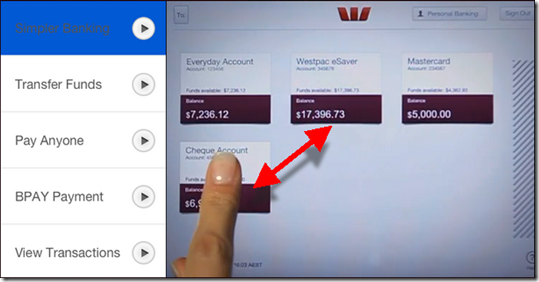
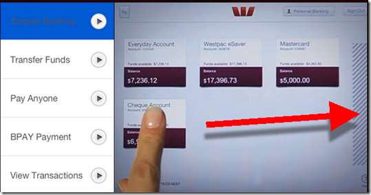
To initiate a funds transfer, users move the summary box for account A over the summary box for account B, then type in the amount (see first screenshot below). Similarly, to initiate a payment, users drag the summary box over to the “payments zone” on the right to begin a bill payment (second screenshot).

Bottom line: While pushing a box around on a screen may not be faster than using a mouse in desktop online banking, it’s an intuitive way to use an iPad app. Kudos to Westpac for incorporating it into their app.

—————————-

Westpac (AU) iPad funds transfer (10 July 2012)
Simply drag the “from” account box over “to” account to begin the funds transfer

image

Westpac (AU) bill-payment process
Drag to “from” account over to the payment zone on the far right to begin a payment

image

First Look: Bank of America’s Just-Launched iPad App

image A little more than a year after the iPad launched, Bank of America finally made it their own with a native app. It appeared in the iTunes store around midnight last night and has already climbed to #42 on the list of most popular free apps across all categories (5 PM Pacific; see update below and notes 1, 2).

I took it for a spin a few minutes ago and it’s about what you’d expect for the first version. The most important functions are all there: view recent transactions, transfer funds, pay bills, find ATM/branch locations, and contact customer service. It also includes the ability to apply for a new account within the app, something that is still relatively rare (and not included in the bank’s iPhone app).

Analysis: Overall, it’s a solid, if somewhat tardy, initial effort and will be adequate for most users. However, BofA has a reputation for being an online leader, and there is nothing in the app so far that supports that brand positioning. But, then again, simply having an iPad app puts it ahead of most competitors (see list of top banking apps as of last week).

A few other notable features:

  • Users have the option to store their username, so subsequent logins can be accomplished by simply entering a password (screenshot 1)
  • Pressing anywhere on a line item in the statement brings up a small popup with additional transaction detail (screenshot 2)
  • While it won’t win any design awards, the app gets a passing grade with an overall look and feel that is consistent with other iPad apps with relatively intuitive navigation. At least it’s not simply an expanded version of its iPhone app (like the Chase iPad app)

It also disappoints in a few areas:

  • I tried to pay my credit card bill, but the iPad app doesn’t support payment via external checking account (regular online banking does)
  • It times out after 10 minutes (good), but leaves your account balances visible until you dismiss the popup (screenshot 4)
  • I was not able to access business credit card statement data (system unavailable) but was able to get personal card data
  • The squares didn’t quite fit the screen right in portrait mode (screenshot 4)

Update: At 11 PM Pacific, the BofA app has reached #22 among all free iPad apps.
——————————————-

1. Initial iPad app sign in (3 May 2011)

 Bank of America iPad app login screen

2. Transaction details popup

  Bank of America iPad app transaction details

3. New account app

Bank of America iPad app: New account app

4. Time-out warning still shows account balances

image 

Notes:
1. The app still shows up as #32 in the finance category. So clearly, the top list among all apps is refreshed more often than the individual category lists.  
2. There is no mention of the app on the bank’s website as of 5 PM.
3. For more info on mobile banking, see our previous Online Banking Reports.

2010 Saw 40-Fold Growth in the Number of Financial Institution iPhone Apps

image As hard as it is to believe, last year at this time only 30 financial institutions had apps in the U.S. iTunes App Store (note 1). And that was a full 18 months after Apple’s phone had opened its OS to third-party programs. A few in the industry still questioned whether smaller banks and credit unions would ever need a native iPhone app.

I think that question has been answered: In the past 12 months, the total financial institution app-count has rocketed upwards to more than 1,200, a 40-fold increase. That’s 100 new apps per month for the past 12 months.

In raw numbers, the past seven days have been relatively unremarkable with just 17 new FI apps. But it’s been one of the biggest weeks in terms of major launches:

  • BofA Merrill Lynch research library for iPad only (note 4; iTunes)
  • Capital One, whose app was released on Sunday, went to #5 Monday and is up to #4 when I checked a few minutes ago (see inset; note 2; iTunes)
  • NetSpend (iTunes)
  • Schwab, both v1 of its iPhone app (iTunes) and an iPad version of its On Investing magazine (iTunes)
  • SmartyPig (pending Apple approval)
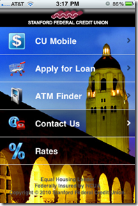
  • Stanford Federal Credit Union, which used a striking background for its app home page (see below; iTunes)

imageAnd while it’s not nearly as crucial as the iPhone, we are waiting for a slew of iPad apps. Apparently, BBVA Compass demo’ed a cool unreleased iPad app at a mobile conference (note 4). And just today, Schwab released its monthly magazine in iPad format, an industry first.

——–

Notes:
1. See Online Banking Report #176, Table 18 (link subscription required)
2. Rank is of free apps in the Finance category in the U.S. store. The apps above it are #1 Bank of America, #2 Chase, #3 PayPal
3. HT David Eads in Mobile Manifesto
4. At the same conference as note 3, Bank of America revealed it hit the 6-million mark in active mobile banking users.

Out of the Inbox: Cascade Bank Drives Customers to Branch with One-Day iPad Giveaway

image I’ve long been an admirer of Cascade Bank, a $1.7 billion bank headquartered in Everett, WA. A friend was marketing director there for a number of years, and I learned a lot from her about community bank marketing and management.

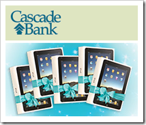
While I used to have a mortgage at Cascade, I don’t have any accounts now; hence, the email I received earlier this week. The bank invited prospective customers to come to one of its 22 branches (today only) and enter their name in a drawing to win an iPad. Five iPads were being given away bank wide.

And while in the branch, hoping to pick up a free ipad, the bank dangled an attractive duffel bag in front of visitors as a premium for opening a new checking account. And Cascade promised to drop an extra $25 in your account if you traded in your old check register from the competition.

Bottom line: Thanks to the iPad and some great graphic design, the mailing had a stunning visual, good title, and compelling offer. Excellent work.

Email announcing the giveaway (received 30 Nov. 2010)

Cascade Bank Email announcing the giveaway (received 30 Nov 2010)

Cascade Bank homepage (3 Dec. 2010)

Cascade Bank homepage (3 Dec 2010)

Landing page pitches free checking with duffel bag premium and $25 bonus 

Cascade Bank Landing page pitches free checking with duffel bag premium and $25 bonus

Note: For more ideas, see Online Banking Report: Growing Deposits in a Digital Age.

BankSimple Provides Sneak Peek of User Interface on iPad App

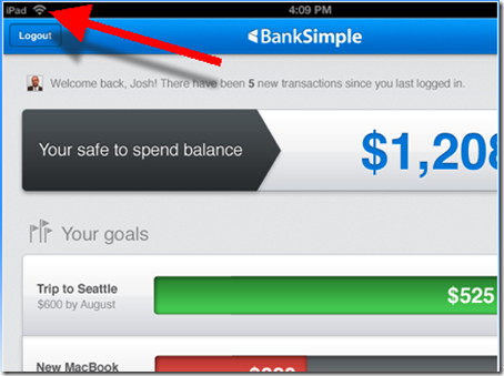
imageThe bank that everyone’s talking about, and no one is using, finally released a few peeks at its user interface. Based on these screenshots posted on the bank’s homepage (see last screenshot), it looks like a killer iPad app (note iPad logo in upper left of first screenshot).

image The startup also unveiled a new logo, moving from the trendy gray/red (left) to a bolder font in a very bank-like and comforting blue.

Finally, the startup has purchased the .com version of their URL, an important, albeit expensive, pre-launch move. Currently, banksimple.com redirects to the old .net version.

Screenshots

1. Safe-to-spend balance appears to incorporate future scheduled payments and displays goals to help users keep the bigger picture in mind, rather than spending the $1,208 on drinks and dinner out.

image

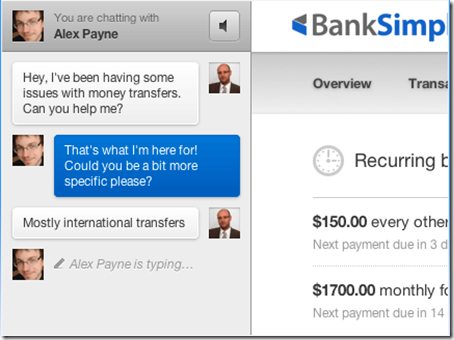
2. The bank’s customer service focus illustrated in chat screen with co-founder Alex Payne. On the right you can get a glimpse of the transaction flow.

image

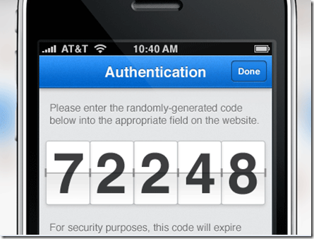
3. My favorite screenshot. It indicates the bank will use out-of-band authentication, a must-have these days. It also demonstrates that BankSimple is really thinking through the UI. Instead of tiny little digits requiring reading glasses, the bank provides the 5-digit code in big, bold numbers. They are also rendered in an attractive flipboard style.

image

———————

Note: HT to Keith Caswell @kthcswll for the tip.

Chase is First U.S. Bank with a Native iPad App

Last week, Spain’s BancSabadell and “la Caixa” became the first banks in the world with iPad apps. But the U.S. was still shut out until today, when Chase became the first U.S. bank with a native iPad app (iTunes link). It doesn’t yet show in the Finance category of my iPad. But if I search for Chase, it appears as a download option.

imageIt successfully downloaded, and about 60 seconds later, I was looking at my Chase account. Unlike some banks, it was not necessary to activate the app in online banking. First-time users log in to the app with their online banking credentials. Then an 8-digit code is sent to a pre-existing phone number or email address. Users then enter this code into the iPad.

Chase’s app is basically a stretched-out version of its iPhone app. But the extra real estate does make it easier to accomplish tasks, such as sending a bill payment (right screenshot). But the biggest initial benefit of the iPad app is all the blog posts and news articles it will generate. 

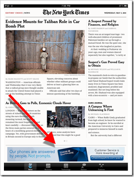
Chase is betting big on the iPad platform, taking a reported six-figure sponsorship of the NY Times iPad app (see inset, click to enlarge). The bank really had no choice but to support that advertising expense with a banking app of its own. Chase launched its iPhone app in Dec. 2008.

Chase Bank’s native iPad app (5 May 2010)

image    image

Note: For more on mobile banking and payments, see the most recent issue from Online Banking Report.

The iPad: One Million Shipped in First Month, but Still No U.S. Bank or Credit Union Online Banking Apps

image Apple today said it has shipped one million iPads (one of which went to a lucky Mint user, see inset). I don’t think that’s a surprise to anyone who’s even mildly interested in tech.

It’s debatable whether the iPad is a laptop killer, but if nothing else, it’s a really capable portable media and game player. Given its appearances on The Grammys, Modern Family, Lettermen, and so on, and with Apple’s cachet, how could the iPad not sell a million?

But the iPhone arrived with even more hype, and it took more than two months to sell a million back in the summer of 2007. But it was much more expensive considering the price of the phone and $800+ per year to AT&T. And there was no App Store back then: it was just email, SMS, Safari, YouTube, stock tracking and of course, my personal favorite, the weather button.

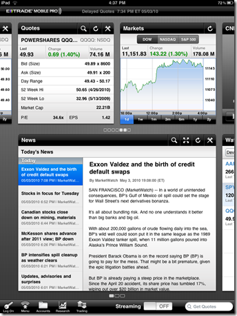
So I’m not surprised the iPad has consumer appeal. But I am surprised that no major U.S. financial brand, other than E*Trade (see screenshots below) has a native iPad app yet in the U.S. store (notes 1, 2). I expected at least a half-dozen by now. But there have been very few new apps in the iPad store across all categories. Only nine new apps have launched since April 3 in the finance category, bringing the total to 39 (see note 3; original post here ).

So, it may not entirely be the fault of the FIs. There is probably a logjam of apps waiting for approval from Apple. We look forward to seeing what the FIs and PFMs bring to the iPad throughout 2010.

E*Trade Apps: iPhone vs. iPad
Note: Relative size is accurate; see CNET’s comparison of iPhone vs. iPad versions across 20 popular apps (previous post on why you need an iPad app here)

image      image

Notes:
1. Square also had its app available at launch, although they have yet to launch credit card processing, so it’s not really functional yet. Card processing is expected to launch later this week when the iPhone app becomes available.
2. (Updated May 4 with “la Caixa” info and search info) They don’t show on my U.S. iPad, but Spain’s “la Caixa” added an iPad app to the U.S. store a few days ago (link) and Banco Sabadell has one in the U.S. store (link). Also, I just learned (May 4) that if you search specifically for the Spanish banks on my U.S. iPad, they do show up and have been successfully downloaded.
3. There are many mysteries of the App Store. One new one is the discrepancy between what’s shown on my iPad vs. what’s in the iTunes store. On my iPad, 30 finance apps showed on April 3, and there are now 39, for a growth of 9. iTunes shows 61 available today, up 18 from the 43 available on April 3. None of the extra 22 in iTunes are from financial institutions.
4. For more on mobile banking and payments, see the most recent issue from Online Banking Report.

Why You Should Build an iPad Banking App (Even Though You Don’t Need To)

One week into the iPad era there are still no banks or credit unions with iPad-specific apps (note 1). There also aren’t any major PFM or other financial brands present, other than Square and E*Trade. Mint’s not even there yet.

What’s going on? On Friday, The Financial Brand’s Jeffry Pilcher tweeted the question that’s on a lot of bankers’ minds:

                     image

While I suspect Jeffry is mostly being provocative, it’s a question worth discussing. Should financial institutions build an iPad app?

The Web experience on the iPad is outstanding. It has a lightening-fast Safari browser built in. It loads my bank’s webpage as fast or faster than my MacbookPro or Thinkpad X41. The iPad virtual keyboard makes it easy to type username and password. And for the most part (Flash is a problem), websites look and perform perfectly on the iPad (use ipadpeek.com if you want to see what your webpage looks like in an iPad layout).

So yes, online banking works fine on iPads. But you can say the same thing about most evolutionary products. Telephone calls work fine on corded phones. Cars work fine without cup holders. Refrigerators work fine without ice makers. And so on.

An iPad app isn’t about utility, it’s about a great user experience. The ability to click on a banking button on the main iPad screen and launch a perfectly sized online banking app shaves 30 to 45 seconds off the traditional browser-based approach (open Safari, navigate to my bank, and find the login button). There are also things you can do with an app, such as location-aware ATM/branch finder, that make it a better experience (note 2). 

So here’s why most major financial brands should have an iPad app now:

  • Free publicity (part 1): As of today, there are only 39 iPad apps in the Finance category. Each of the 562,000+ iPad owners, and millions of others browsing the iTunes App Store, would see your brand showcased there.
  • Free publicity (part 2): There was, and is, a tremendous amount of hype around the iPad. Being the first bank/CU in your country/state/region/city/neighborhood with an iPad app will net you numerous mentions online and in print.
  • It’s cool: While financial institutions are rightly focused on the basics right now, there is still considerable value in being seen as a technology leader.
  • It’s inexpensive: Building a basic iPad/iPhone app is a relatively simple project. If it did nothing more than connect to online banking and show nearby ATMs/branches, you’d receive most of the benefits listed above.
  • It’s the future: Apps and widgets will play a large role in banking info delivery going forward, especially in mobile banking. You should be designing apps for every significant platform. In the U.S. that means the iPhone and Android, then iPad and Blackberry after that (see note 3).

And one final note for the 67 U.S. financial institutions that already have iPhone apps. Yes, you still need an iPad one. While the iPhone app runs fine, it is displayed in a small window the size of an iPhone. Users can press a button in the lower-right corner to doublesize the app, but images and text become fuzzy, and it just doesn’t look right (although it is functional as you can see in the screenshots below).

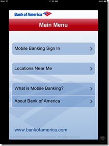
Bank of America’s iPhone app displayed on iPad screen (5 April 2010)
Note: Click on the images below to see the quality difference

              Normal size                                                             Double sized

 image      image

Notes:
1. As of 11 PM Pacific April 10, the only major financial brand with an iPad app is E*Trade MobilePro, which is more about stock trading, not banking.
2. For more on financial apps and the iPhone, see our March 2009 Online Banking Report.
3. For more on the importance of mobile banking and payments, see the most recent issue from Online Banking Report.
4. Hat-tip to Banking Kismet for blogging on the subject.

Banks Shutout on iPad Opening Day, But Square is There

image After months of hearing about the iPad, I finally got my hands on one Saturday afternoon. It’s a great piece of technology, but if you have an iPhone, you pretty much already know what it’s like.

While the iPad runs all 150,000 apps available for the iPhone, developers are encouraged to produce iPad-optimized versions to take advantage of the significantly bigger-screen real estate.

When you open the App Store on the iPad, it focuses almost entirely on iPad apps. You have to do a specific keyword search to find non-iPad apps that work on the iPhone.

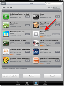
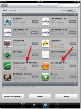
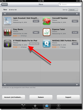
And I was surprised that neither banks nor credit unions are represented among the 30 Finance category apps available on April 3 (see screenshots below), a situation likely to be rectified with a flood of banking and credit union iPad apps during the next few months. It’s definitely a place you want your brand represented (note 1).

imageThe only big financial services brand that made it to bat on opening day was E*Trade MobilePro (which hit the store last Thursday), and another trading app, iStockManager, to be used with TD Ameritrade.  Bloomberg, too, had its popular info app available on day 1 (see screenshots below for all 30 finance apps).                                       

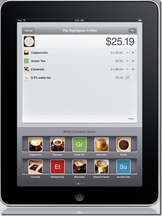
The biggest surprise in the iPad Finance category was Square, the much-touted card-to-card payments service from Twitter’s founder, which released its iPad app on April 1 (see inset). We’ll be testing Square this month and hopefully using it to take last-minute credit card payments at our upcoming FinovateSpring Conference.                                                                                  Square’s iPad app

The 30 iPad finance category apps available on the launch day (3 April 2010)
(Note: Organized by “featured”)
Page 1: Apps 1-12                                                     Page 2: Apps 13-24image   image

Page 3: Apps 25-30

image

Note: For more coverage of mobile banking and payments, see the most recent issue from Online Banking Report.