Email Marketing: Third-Party Offers with Deal-Killer Fine Print

Email Marketing: Third-Party Offers with Deal-Killer Fine Print

I’ve complained about similar offers before, but since this arrived in my inbox this morning, I figured it’s time to revisit the issue.

———

Today’s lesson is about third-party offers, where an outside company pays to get in front of your customer base. They are relatively rare in financial services these days because banks and card issuers are wary of being tarred and feathered in social media (or the CFPB) if something goes wrong or the particular marketing permissions were later shown to be lacking.
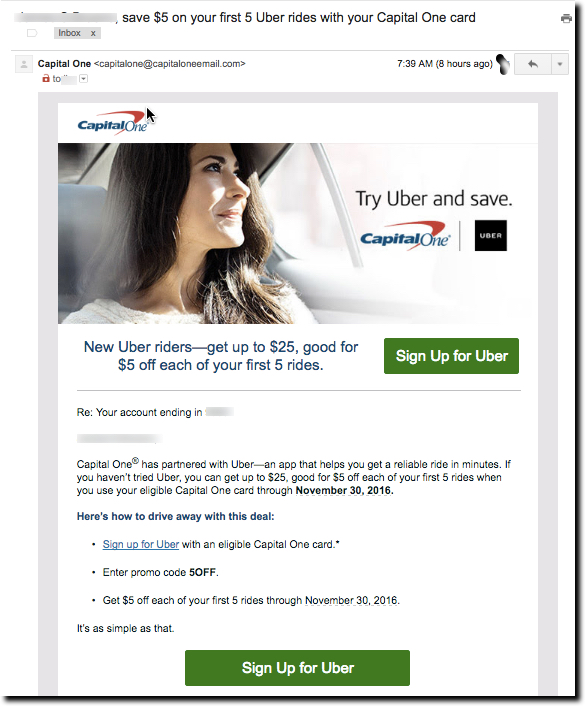
Uber offer from Capital One via email 3 Oct 2016


The offer in question is from Uber. It’s good for $5 off your first 5 rides and requires a Capital One card for payment. That’s a win-win. Uber gets a new customer and Capital One gets its card loaded into the Uber app for years to come.

The problem: It’s only for new Uber customers. I presume Capital One removes cardholders from the mailing who have charged an Uber to its card. But that doesn’t catch people who use another card in their Uber account.

So let’s break down what happens next. Capital One customers get this slick email (see above). They get excited to switch Uber payments over to their Capital One card to grab some $5-off rides. But then, after reading the fine print, or more likely clicking through the message and trying to sign up, cardholders find out they get zip from this deal. Now, they are not happy with Capital One or Uber. What a waste of time and brand loyalty.

Instead, why not give some smaller benefit to existing Uber customers willing to switch their payment card over to Capital One? Even just one $5 off coupon would suffice for most.

Bottom line: Capital One needs to earmark a portion of its commissions from Uber towards existing customers. If there isn’t enough revenue to do that, then it should stop making the offer.

——-

Related: At last mfindevr-sv16onth’s Finovate Fall, MX demo’d, and won Best of Show, for an automated solution called Power Switch to automatically enroll your customers’ cards into e-commerce sites such as Uber, Amazon, iTunes, and so on. Get a behind-the-scenes look at how MX produces its award-winning (six consecutive Best of Shows) at FinDEVr in Santa Clara 18/19 Oct 2016 (register here).
Mobile Monday: Communicating Critical App Updates via Email

Mobile Monday: Communicating Critical App Updates via Email


usbank_mobile_upgrade_email_border

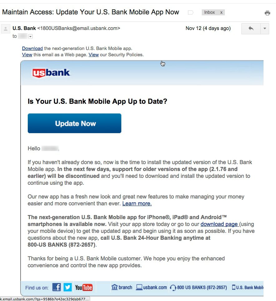
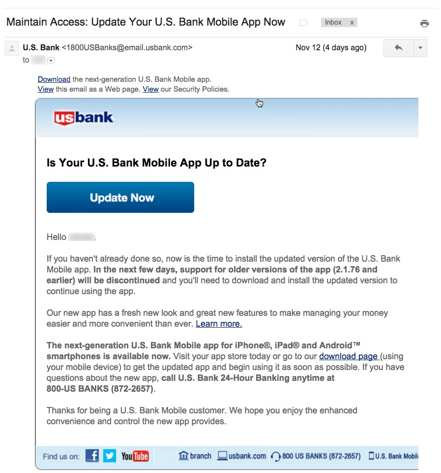
       Email from US Bank to mobile banking customers (12 Nov 2015)

Last week I wrote about how much I liked US Bank’s new native app. So I understand why the bank is anxious to get users ported over to the new version. Customers are going to like it. Guaranteed.

Yet I was a little surprised, just a week into the new version, to receive an email warning that the previous app was about to stop working (see message above). This urgency makes customers question whether something is seriously wrong with the previous version. The message is also annoying in that it doesn’t really give the customer any clue as to whether their version is the current one, or not. It provides only the version number (2.1.76) which is the cut-off between good and bad apps.

This message offers so many opportunities to improve that I was compelled to compile a top-10 list of gripes (plus 2 bonus nitpicks). They are listed, more or less, in priority order:

  1. I had already updated to the new version, so this message was completely unnecessary. And if the bank doesn’t know which version I’m using, it should say so.
  2. There is no explanation of why it was suddenly so urgent to upgrade. Skeptical users were left to their imaginations, not something you want in these days of widely publicized security breaches.
  3. usbank_appversionnumberInstead of talking about version numbers, why not just describe the new app? It looks completely different! A quick description and screenshot would have been understood by 90% of the readers, and would have allowed users to move on with their day, rather than having to engage in a tedious “find the version-number hunt.”
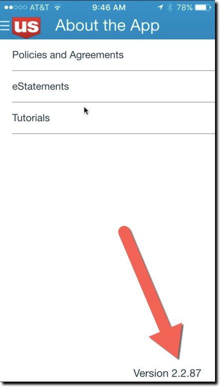
  4. If you must use a version number, then at least explain how to find it. The email failed to address that key point in the body, fine print, or within any links provided within the message. It’s not that simple to find the version number. You must log in, find the hidden primary navigation, choose “About the App” and notice the version number in the lower right corner (see inset). 
  5. If you are going to make such a big change, use a whole number for the new version of your app. In this case, it would be easier to say, “Use v3.0 or later.” 
  6. The links provided to update the app did not go to the iTunes app-update page, but instead went to a marketing page at USBank.com. And the marketing pages, while well done, also did NOT link to the app store’s update pages. In fact, to confuse things still further, the marketing page said the new version “was coming soon.”
  7. The only way to get help was to make a phone call to the general 800 number; no direct line to tech support was given. And not even an FAQ page, email address, chat, or any other type of digital link was provided for help in responding to this matter.
  8. The email message was not optimized for mobile. It was hard to read on my iPhone 6.
  9. It does not specifically address what happens if you don’t update within the next few days; “discontinuing support” has a number of meanings from simply not getting tech support to completely not working.
  10. The bank’s message concluded with thanks for being a mobile banking customer, but they could have also thanked me for taking time out of my day to deal with this “Maintain access … update now” emergency subject line in my inbox.
  11. <Nitpick #1> The first sentence of the second paragraph uses “new” three times.
  12. <Nitpick #2> The closing sentence repeats the “enhanced convenience” copy point. This is a generic benefit at best and shouldn’t be invoked twice in a 150-word message. The resulting inconvenience to update makes their value judgment of questionable importance.

Bottom line: Customer communications are not easy, especially with newer technology. So make sure to test them with some less-savvy users before hitting publish.

Marketing Minute: Optimizing Emails for the Small Screen

Marketing Minute: Optimizing Emails for the Small Screen

Recent email marketing research found that two-thirds of Americans regularly check email via smartphone and a significant number of total opens (as high as 70%) are now opened on a mobile device. Since most emails that look good on mobile look fine on a desktop (but NOT vice versa), you can pretty much disregard the desktop when creating a design template for your email alerts and marketing messages.

Here’s a few examples from my inbox during the past few weeks. Both Capital One and BBVA’s Simple use appropriate font size and a good mobile layout. Simple does an especially good job at grabbing attention with a small animation at the top of the message. In comparison, the BankDirect pitch is not well optimized for mobile, though it’s readable if you work at it. But it does nothing to grab your attention visually.

——–

Bank email samples (viewed on iPhone 6)

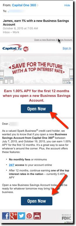
First: Business Savings account promo from Capital One
Easy to read opening line and big Open Now buttons on first screen and below the fold

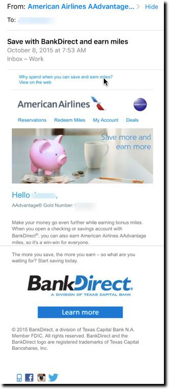
Second: BankDirect to American AAdvantage mileage club members
Harder to read the small type, and call-to-action is below the fold

Third: Simple announces its 100%-no-fee policy change
Grabs attention with small animated graphic at top with big “Hi FirstName” visible on first screen. The remainder of message is in a font easily read on a mobile phone:

capitalone_email bankdirect_americanair_email simple_email2

UI: Chase Bank Remodels the All-Important "Account Summary Alert"

image Here at Netbanker/OBR, we love to write about the digital future. But we know it’s even more important to address the digital now. If you don’t leverage current technology to your advantage, the future doesn’t much matter, since someone else will be running your business.

Today’s topic, one that we used to harp on constantly, is alerts (see previous “Alerts” posts).  Alerts are the way you maintain the relationship with customers between logins. But too many banks and credit unions take email alerts for granted, and are still using a template from 2004! Those templates were created prior to webmail, and, more importantly, before mobile viewership skyrocketed.

One bank whose messaging template was too long in the tooth is Chase (it’s looked the same since at least 2010; see note 1). But as part of their continued digital remodeling, the bank changed it last week. It’s not going to be confused with Simple or Mint, but it communicates the important information efficiently. And that’s enough for most brands. 

The Improvements 

_____________________________

Following are the before-and-after shots on the desktop. As you can see, the old version was too wide for smaller laptops and lower-resolution computers. On my Mac it looked fine, but on my trusty old ThinkPad, it required horizontal scrolling to see the “total withdrawals.”

What changed:

  • All the information is lined up on the left side so it can be easily read on any screen size; this is especially important on mobile which was previously impossible to read (on iPhone) without pinching and zooming.
  • Got rid of the Go Paperless! banner. Talk about banner fatigue. I understand that it’s a great benefit to convert users to paperless, but really, four-plus years with the same banner? MIX IT UP, please!
  • Changed headline to position “Chase” as the first word instead of the last. That helps users scanning subject lines see that it’s from their bank. 
  • Added light blue background at top to give it a better look.
  • Cleaned up the data table for better readability.
  • Made the website URL more visible.
  • Added toll-free contact number.
  • Added more fine print and caveats (the only item that is a step backwards).


——————————— 

Desktop 

Before (viewed through Gmail, 3 May 2014)

image


After (viewed through Gmail, 12 May 2014)

image

———————————-

Mobile (screen captures from iPhone 5)

Before                                                          After

image        image

—————————————

Notes:
1. The UI described here is for a Chase checking account in Washington State (converted from WAMU). This email alert template may be different in other regions or for other account types.
2. For more info on alerts and messaging, see our 2010 Online Banking Report (subscription).

Moven Offers Free Ride, but Only to New Uber Customers

image Despite more holiday hate over surge pricing, Uber is one of the more high-profile up-and-coming digital brands in the world. As the new year dawned (3 Jan 2014), Moven ran an eye-catching promo offering a free Uber ride (up to $30).

I flagged the email because I thought it was a great activation move. Moven appeared to be offering me $30 to get moving and complete my new account authentication (note 1). And more importantly, to get my Moven card in play in an app that offers a future stream of interchange revenues.

But unfortunately, the offer is limited to new Uber customers only (disclosed in small type at the bottom, that’s my red arrow in the  inset). And surprisingly, it appears that you can enter any credit/debit card number into the signup form as it’s not Moven-specific.

Here’s a quick rundown of the pros and cons of the promotion:

________________________________________

Analysis
________________________________________

1. Offer
Good: Free Uber ride is cool and valuable and a good company to associate with the Moven brand. The $30 offer beats what Uber served me on a Google search by $10 (see second screenshot below).      
Bad: A significant number of those interested in the offer will already be Uber customers and unable to participate (note 2).      
Fix: Allow existing Uber customers to participate (perhaps with a lower dollar cap); if that’s not economically feasible, it’s time to showcase a more prominent “new Uber customers only.”

2. Fulfillment
Good: Encourages users to enter their Moven card number into the Uber app.       
Bad: The form, and offer, can be used with any credit/debit card.      
Fix: Require the ride be charged to the Moven card to qualify for the free credit.  

3. Design
Good: The email design was attractive and easy to read in a desktop browser window.
Bad: Headlines were good, but copy and fine print were not readable on a mobile (iPhone 5) without zooming (see inset above).      
Fix: Design for mobile window

Bottom line: Despite these drawbacks, it’s still a good promo. And its cost to Moven is likely zero (note 3), a very important factor for a startup. So I’d rate it a B+ overall in terms of execution, but an A for value (to Moven), assuming Uber picked up the tab. 

—————————-

Email from Moven (3 Jan 2014)
Note: Displayed in iPhone 5

image  


Google offer under “uber” search (2 PM from Seattle IP address, 14 Jan 2014)

image

————————————–

Image source: Placeit

Notes:
1. I signed up as soon as I got a Moven invite, but I got caught in the authentication loop, still needing to find those trial deposit-amounts and feed that to Moven.  
2. Also the fine print says “new users only.” Originally, I took this to mean “new Moven users” since the message came from Moven, and I was new to Moven and not new to Uber.  
3. It’s highly likely there was no cost to Moven, and it’s possible the startup is earning a commission for each new Uber customer.

The Best Card/Banking Activation Email Ever? Simple Innovation #7*

image As a long-time student of the black art of marketing, I knew that I’d be in for some tricks and treats from Simple. And my first marketing message from the startup did not disappoint.

The eye-catching subject line practically guarantees a view:

Have you been cheating on us?

And the all-important opening line draws you in further:

So you’ve deposited money into Simple, and you’ve swiped a few times, maybe paid a bill. Not to get all clingy, but what’s up?

The email (below) goes on to make the case for switching to Simple including a testimonial centering on the startup’s spending map. Brilliant.

——————————-

Simple activation email (25 Oct 2012)
Note: The fine print at the bottom of the message is limited to just
“Unsubscribe from Simple outreach emails.” 

Simple card/banking activation email

————————–

Notes:
1. See previous six Simple innovations here
2. 1953 Curtis ad for sale on eBay

Out of the Inbox: Mobile Banking Marketing Messages from Wells Fargo and Bank of America

image Yesterday was mobile day in my inbox. In the span of two hours, both Wells Fargo and Bank of America hit me up with email reminders of how great their mobile services were. 

Of the two, Wells Fargo’s was the more interesting, telling me about its revamped, mobile-optimized site, <wf.com> (see first screenshot). But since I’ve been using their iPhone app for three years, I’m not sure why I’d be super-interested in its mobile site.

In fact, the message is confusing for app users. Until I reread it for this blog post, I thought the bank was touting a new and improved app, which I was looking forward to checking out.

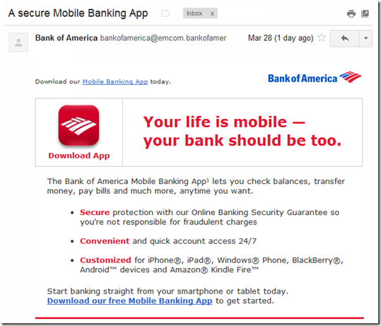
Bank of America’s message was completely generic, saying that mobile banking is secure, convenient, and customized. And the call to action was to download its app, which I did almost four years ago, so I’m not sure why I received this message (note 1). I have also used the bank’s iPad app and Kindle app.

Bottom line: The email messages were well-designed and short, so the creative scores well. But the targeting was sub-par, especially BofA, which seemed to completely miss the mark. And while Wells Fargo’s message could have been better adapted for app users, the bank gets points for acknowledging that I use the mobile channel (note 2). 

——————————————-

Wells Fargo customer email (28 March 2012, 11:37 AM Pacific)
From address: wellsfargo@wellsconnect.wellsfargo.com
Note: Account holder name blurred out.

Wells Fargo customer email

Bank of America general mobile banking customer email (28 March 2012, 1:34 PM)
From address: bankofamerica@emcom.bankofamerica.com

image

Notes:
1. A month ago I had to replace my BofA card (again!) due to fraud, so possibly this was a misguided on-boarding message.
2. The Wells Fargo message was clearly targeted to mobile users: “Thanks to suggestions from mobile users like you.”

Out of the Inbox: Prosper Markets to Small Businesses

image Everyone says that business startups are a huge driver for economic growth. So, when was the last time you received a solicitation for an unsecured loan to start a business (note 1, 2)? It may not be unheard of, but it’s rare, especially since 2008.

So today’s email from P2P loan pioneer, Prosper, really grabbed my attention (see screenshot below). Not only were they targeting a segment that’s generally overlooked, they were doing it an effective way. The direct subject line, striking graphic, and concise copy, are guaranteed to get the message out.

My only concern is the reliance on the super low, 6.59% rate showcased (for AA borrowers, see highlighted section below). While it’s not a teaser rate, it’s also one that’s not readily achievable for most people needing $25k to start a business. I’d rather see Prosper list the rate for a more typical borrower, or at least show a range of applicable rates.

Still, I give it an A-, because most borrowers savvy enough to start their own business understand that "….starting at" means something higher at the end of the process.

————–

Prosper email to registered users (1 March 2012; 1 PM Pacific Time)
Note: Social media call to actions at bottom of message.

Prosper email to business startups

Landing page
Note: Interested borrowers are dumped on a generic signup/login page. It seems like there should be some tie-in here to the email call to action.

Prosper landing page

————————-
Notes
:
1. Chase offered a great program in 2010 where business borrowers were given a lower rate for hiring new employees. However, it wasn’t targeted to startups.
2. I’m not on their mail list, but I know Silicon Valley Bank aggressively pursues startup businesses for financing deals.  
3. We’ve covered P2P lending a number of times in our subscription service, Online Banking Report including updated U.S. forecasts in our Jan. 2012 report.

Out of the Inbox: Betterment’s New Year’s Resolutions

imageThe new year is a special time for financial services. Many people throw their spending discipline out the window during December — buying gifts, entertaining, and hitting the sales for themselves. Then there’s the New Years Resolution game where you vow not to do for the rest of the year what you just spent the past month doing.

So it’s a good time for financial providers to remind customers about advanced tools available such as alerts, mobile banking, budget tools and so on.

You can also take the approach of Betterment, and provide a wide-ranging list of apps to assist in achieving goals for the new year. The investment startup sent an email to customers on Dec 27 recommending these 5 apps:

  • Runkeeper to track your exercise
  • Manilla digital file cabinet
  • Skillshare to pick up a new skill
  • Goodreads to help you find new books
  • Sonar for social and business networking

Betterment closed with a pitch for its own simple investment platform and a free webinar scheduled for Jan 5, and personal finance blogging roundup.

It’s a great effort, although maybe a little too much for a single email. I didn’t even see the pitch for the webinar and blog compilation until I posted it here. Overall though, a strong A.   

————————————

Betterment New Years email (27 Dec 2012)
Note: Google+ link on top

Betterment New Years email: top half
image    image

——————————-

Note: For more info on online investing see our 2008 report.

Multi-Channel Messaging is a Mess

Image licensed from Shutterstock Last month, I reported that my “aha moment” at BAI’s Retail Delivery was the realization of just how challenging it had become to manage customer messaging across multiple channels and products.

Consider this 9×12 matrix of 108 product/message options a bank could conceivably use to reach a couple about their banking and loans. The whiteboard in the marketing conference room just won’t cut it any more as the master scheduling tool. 

Product/
Channel

DDA

Card #1

Card #2

OLB

Loan #1

Loan #2

Mtg

Invest

Insure

Voice home                  
Voice mobile (Sue)                  
Voice mobile (Joe)                  
Email pers (Sue)                  
Email pers (Joe)                  
Email work (Sue)                  
Email work (Joe)                  
Website message                  
Text (Sue)                  
Text (Joe)                  
App (Sue)                  
App (Joe)                  

If that wasn’t complicated enough, unique regulations can govern each channel and/or product.  Some exa
mples: new mortgage rules for a single source of contact; time-of-day preferences (don’t text me while I’m asleep); and privacy issues (don’t alert my spouse to card charges).

And this table gets bigger if you add mail, in-branch, ATM messages or more products such as small business accounts, savings/CDs, and accounts held jointly with other family members. You could also add inbound vs. outbound calls/messages.

But one person’s mess is another’s opportunity. Fintech companies are hard at work on  solutions that turn multi-channel snarls into opportunities to increase satisfaction and/or cut costs.

imageOne key player is Seattle-based Varolii, which delivered my aha moment last month. In a followup last week, I had a chance to sit down with CEO David McCann and have a wide-ranging conversation about customer messaging in the age of the voice/email/text/notifications. I was impressed, both with the enormity of the challenge of coordinating customer messaging, and with the solutions it offers (note 1).

image Then yesterday, I met with Amit Ashman, Marketing Director at Nice, who happened to be here on a whirlwind visit from their headquarters in Israel. His company, which booked $200 million in revenues last quarter, provides call-center technology for large U.S. financial institutions. They have developed a very cool call-center/mobile-app solution about to be unleashed on the world. It blends self-service with agent support in a relatively seamless fashion that I suspect will be the industry standard five years from now.

It’s convinced me to write a report on Multi-Channel Customer Support for our Online Banking Report (note 2). We are also looking to recruit more companies in this area to 2012 Finovate events. So, please email suggestions for solutions providers and/or financial institutions who are tackling the problem.  

————————————-

Notes:
1. Great tagline, “Better return on interactions”
2. The multi-channel report won’t be published until early next year. However, we’ve tackled remote customer service and messaging a number of times in previous issues of our Online Banking Report. The last one was Live Help earlier this year.

Out of the Inbox: First Tech CU Pitches Auto Loans

image As the country heads back to work and school, it’s a great time to remind customers that you have killer rates for auto loans. So, First Tech Federal Credit Union’s marketing email to members yesterday promoting a 2.99% rate was well timed. And I love how the message is direct and to the point.

While the email could use a little more visual punch (graphics/typography), First Tech nailed the timing, product, price, and headline. So it is 90% there even before reading the copy. However, that’s where the effort falls a bit short. Here’s why (numbers correspond to screenshot below):

Minor issues in copywriting:
1. The second sentence in the opening paragraph is awkward because the phrase “keep that new auto loan payment in check…” is hard to understand. If you pair “check” with “payment,” it sounds like you are referring to a checking account, not a low-payment amount.

2. Be careful with how you talk about rate discounts. They way First Tech wrote it, “.25% rate discount” sounds like the loan rate is going to be chopped by a full 25% instead of 25 basis points. It would be better to put a zero in front of rate, e.g., “0.25%” and perhaps call it a “rate reduction” instead of discount to be perfectly clear. 

Weak “offer acceptance:”
3. It’s too hard to find the loan application in order to take advantage of the great rate. Members are directed back to the First Tech homepage where they must search for an loan app. The CU should either take members directly to a specific landing page for this offer, or at least drop them on the auto loan page. It does help that one of the four rotating homepage banners is for auto loans, but it’s third in the rotation and only stays in view for 15 seconds or so.

In addition, not everyone wants to research and/or apply online. A phone number, at least for more information, would be a welcome addition to the message.

Finally, there is no sense of urgency, e.g., “the rate is guaranteed through the weekend” or even “act now before rates increase.”

Overall grade: B

———————–

First Tech Credit Union email to members promoting 2.99% auto loans (31 Aug. 2011; 9:28 AM Pacific)

First Tech Credit Union email to members promoting 2.99% auto loans (31 Aug 2011; 9:28 AM Pacific)

Out of the Inbox: Chase Invites Business Clients to a Free Webinar with Google

imageOn the one hand, it’s easy for a bank to get the attention of business clients and prospects. Just announce a streamlined commercial loan-app process. But since that’s unlikely to happen in the wake of the Financial Meltdown, a Webinar with Google is a pretty solid Plan B.

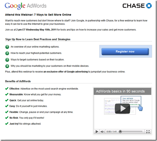
Chase has a winning effort here. The topic, 7 ways to sell online, is so compelling that Google is tossing in a $100 AdWords credit for attendees (see note). And it never hurts to associate with a powerful and well-regarded Internet brand.  

The email design is good with an interesting subject line, an email to ask questions, and a big green button for the call-to- action. The copy is a bit predictable, but it’s short and to-the-point and doesn’t distract. There are small quibbles regarding design-layout; perhaps, a Gmail issue; and they forgot to capitalize the W in AdWords, but those are minor glitches.    

Grade: A-

Chase email to existing business clients (6 May, 10:33 AM, Pacific)

Chase Email to Existing Business Clients announcing webinar with google

Landing page hosted by Google and co-branded with Chase (link)

Registration page hosted by Google and co-branded with Chase 

——————————-

Notes:
1. Google usually offers the $100 only to new clients, but I don’t seen any fine print limiting the bonus. I hope they don’t add a restriction after the fact, which could negate the positive energy Chase generates from the Webinar offer.
2. For more info on the space, see Online Banking Report: Micro- and Small Business Online Banking (published Oct. 2009)