RIP Debit Fees: The Winners and Losers

image The debit card fee debacle was an interesting drama to watch. I’m sure there are lots of lessons here for a future biz school case study. But really, was $5/mo for a service that many consumers use daily, such a big deal that even Obama had to call BofA out? We spend two or three times that each month on extra pizza toppings alone, but I don’t see anyone bad mouthing the pepperoni industry.

While it’s clear in retrospect that BofA should have played this differently, rolling out the price increase gradually for instance, or upgrading its debit card product at the same time (note 1), the bank was at least being up-front with its pricing and reasons.

And the whole episode is not just a loss for BofA, but for the whole industry, as one its most popular products is turned into a regulated utility with Durbin controlling prices on the merchant side and public opinion squashing fees on the consumer side.    

Here’s the winners and losers from BofA’s capitulation on debit card fees:

Losers

  • Big banks/shareholders: Obviously, the big banks who were all (except Citi) testing various fee options, miss out on added revenues in 2011 and for however long it takes before they implement other less-transparent price increases. And of course, BofA loses the most as it took the brunt of PR damage and now every pricing move it makes will be put under a microscope. 
  • Small banks and credit unions: The $5 fee was a windfall for small FIs in their marketing war against the big banks. Now what’s the rallying cry for Bank Transfer Day? (And many small FIs would eventually have hopped on the fee bandwagon once the consumer backlash faded.)
  • Government/taxpayers: The big banks employ millions directly, and millions of other jobs are indirectly supported by banking revenues. If this leads to an industry-wide layoff (note 2), it could add hundreds of thousands to the unemployment roles just in time for the 2012 elections. And the whole anti-bank rhetoric from Congress and the Administration, along with the implied threat of more price controls, makes it harder for banks to raise capital, weakening an already fragile ecosystem. Does anyone really want to risk a repeat of 2008?

Winners

  • Merchants: Widespread debit card fees would likely have caused a reduction in their use and a corresponding increase in the use of cash, checks and credit cards which would have driven merchant costs up.

Mixed

  • Consumers: Short-term it’s a win. The grass-roots victory feels good and avoiding the $3 to $5 monthly fee is nice (it just about covers that Netflix price increase…so you can keep getting the DVDs in the mail). But longer-term, it’s probably a wash. Banks need to improve revenues, or they will either have to cut services, lay off employees, and/or find sneakier ways to raise prices ($40 overdrafts anyone?).

———————-

Notes:
1. We recently looked at optional fee-based services banks could build using remote banking value-adds. See our May 2011 Online Banking Report (subscription). 
2. I’m not predicting layoffs. Honestly, I have no idea. There are way too many factors at play to make a direct connection. But certainly, the one-two punch of interchange price controls combined with the fee backlash, make cost cutting seem the more palatable course of action to improve profits. And to the extent that smaller players pick up incremental business, they could hire a good chunk of those laid off.

BillGuard’s Monthly Credit/Debit Card Scan Report

image We’ve been impressed with BillGuard since we first learned about it earlier this year. And they wowed the crowd at Finovate two weeks ago with a great demo, dynamic presentation and more importantly, a product that resonates with consumers across many demographic segments.

One great thing about becoming a trusted consumer watchdog, like identity theft monitoring services, is that your monthly emails are actually read by customers. And unlike FICO scores which usually don’t fluctuate that much month-over-month, there’s usually something new to look at when BillGuard scans a month’s worth of card transactions looking for oddities.

For example, my scan for September across two credit card accounts showed the following activity (see first screenshot below):

  • Green: 61 transactions that were identifiable as "normal" activity
  • Orange: 2 transactions that were "unknown"
  • Red: None were flagged red indicating suspected fraud

Clicking through to the website, I can mark legitimate transaction "OK" and that information is fed back to the network and disseminated to other via the Merchant Transaction Reliability score (see second screenshot). 

Bottom line: This is the kind of value-added service that FIs could bundle with other products, even a debit card for example, that could help justify a monthly fee. $5 perhaps? 
(Note: BillGuard is currently offering free of charge to expand the customer base.)

—————————-

1. BillGuard emails a monthly Scan Report to customers (4 Oct 2011)

BillGuard monthly transaction scan report

2. At the BillGuard website, each merchant’s score across all users is tracked
Note: Apparently, 17 BillGuard customers are using Quickbooks Online and none have flagged the transaction (which makes sense)

BillGuard Merchant Transaction Reliability score

Capital One Pays to Play in Zynga’s Virtual Worlds

imageLike most, I’ve been amazed at how fast Zynga was able to build a 250+ million user base for its social games. But I’d never actually played one.

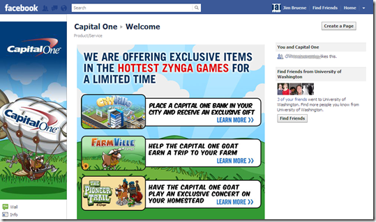
Until now. So make that 250 million and one users, because I couldn’t resist checking up on Capital One’s new product placement in three Zynga games (more on what players could do). The bank’s Facebook page, which has grown to 2.3 million likes, has details on the promotions (screenshot 1).

image Although, it appears I may have missed my chance to interact with the CapOne goat, Visigoth statute or a virtual branch (the promo only ran one week), there are still credit card ads and mystery gifts available, at least in Farmville, the only game I tested.

Capital One viral gift & banner ads
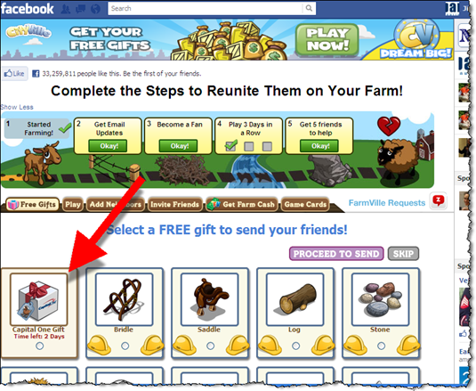
Capital One may have ended the in-game elements for now, but they still have a presence in the game. Starting Farmville for the first time, I was greeted by a number of social elements, one of which is sending a Capital One gift (screenshot 2). There is no indication of what the gift actually is. Maybe that’s part of the fun, but it seems like a weakness to me. Am I sending someone a virtual goat or a solicitation for a CapOne card (mystery solved)? 

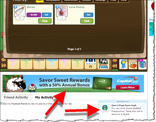
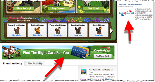
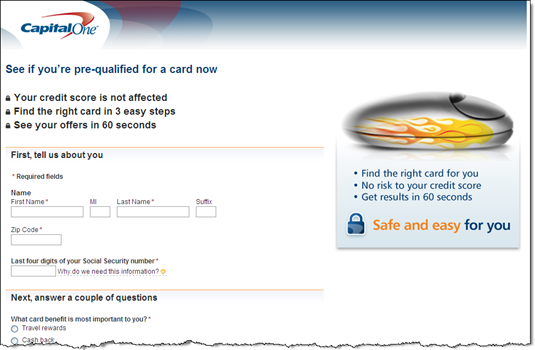
The company is also running banner ads within the game (screenshots 5 & 6). Clicking on them takes users to the usual Capital One pre-approval page within a separate browser window (screenshot 7). Once you land on the CapOne site there is no mention of Farmville.

Discover Card & Citibank bonus offers
Game players are encouraged to buy all kinds of virtual goods. They can earn virtual currency in a number of ways, including using real world cash to buy credits. But users can also earn currency by participating in sponsored activities.

Both Citi and Discover are offering users virtual cash to apply, and be approved, for a credit card. Discover is offering virtual currency worth about $75 and Citi is handing out about $50.

My take: With 250 million users, the large brands owe it to their shareholders to see if they can make hay in Farmville and any other popular virtual world. And I suspect there will be a positive ROI for the right mix of promotion/offer. I have no idea what the magic formula is, but you know the direct marketing wizards at CapOne, Citi and the others will figure it out sooner rather than later (note 1).

———————————————

1. Capital One Facebook page (27 Sep 2011)

1. Capital One Facebook page

2. Capital One "free gift" in Farmville (27 Sep 2011)

Capital One "free gift" in Farmville (27 Sep 2011)

3. Choose friends you want to receive the gift

2. Choose friends you want to send the gift to

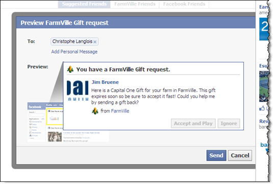
4. Before you send the gift, you have the opportunity to see what the notice looks like to the recipient, and you can add a personal note

3. Before you send the gift, you have the opportunity to see what the notice looks like to the recipient, and you can add a personal note

5. When I got back to the game, there was a large Capital One banner
Note: Starbucks promotion in lower right

4. When I got back to the game, there was a large Capital One banner

6. Another Capital One banner ad served while playing Farmville
Note: Bank of Internet ad on right

5. Another Capital One banner ad served while playing Farmville

7. The banner ad in Farmville, led to Capital One’s usual pre-qualification form

6. The banner ad in Farmville, led to Capital One's usual pre-qualification form

8. Discover Card and Citibank have powerful offers in the "earn cash" area.
Note: Discover offers 475 Farm Cash (worth about $75) for card approval, Citibank 300 (about $50). 

image

9. The first screen after choosing Discover’s offer

7. Discover Card and Citibank have more powerful offers, though it's buried in the "earn cash" area. Discover offers 475 Farm Cash (worth about $75) for card approval, Citibank 300 (about $50).

10. Clicking Continue above leads to standard Discover Card app (in new browser window)

8. Clicking Continue above leads to standard Discover Card app (in new browser window)

———————-

Note: If you are interested in a fictional look at where the commercialization of Internet gaming is headed, I highly recommend Cory Doctorow’s For the Win.

Reviewed: The American Express Gift Card Store and its New eGift Card Option

imageThe banking website is a unique animal. Part account management. Part service. Part sales. Part consumer. Part business. And it all must pass muster with the CEO, IT, marketing, customer support, heads of business lines, the board, and about 2,000 regulatory agencies. It’s no wonder that it can be difficult to keep up with ecommerce Web-design standards. 

When I started this post, the intent was to show how American Express had overcome typical banking shortfalls and was doing ecommerce right. I liked what I saw at first glance. But after diving in and actually using the gift card site, I have to say that the company still has quite a ways to go to equal Amazon.com, Buy.com or even Etsy.

My take: Overall, it’s a good structure for selling gift cards. But there are a number of things to clean up, mostly in the purchasing and fulfillment process. And the mobile option didn’t work at all, at least on the iPhone 4. For now, I’ll give it a B+ for layout/design and a C- for execution.

Let’s start with the good parts:

  • New virtual gift card costs $1 less ($2.95), has no shipping charges (which range from $2 to $8.95 per order), and can be emailed in near real-time
  • Option to create a “gift card account” to save payment info and make purchasing into a “1-click” process (only available to AmEx cardholders though)
  • Easy to find business or personal options by choosing the correct tab near the top
  • Shopping process uses cart system to order multiple designs and denominations
  • Ability to shop for cards for specific occasions (birthday, wedding, etc.)
  • Signup for email offers (bottom of main page)
  • Mobile shopping link to open a mobile-optimized site (bottom of page…which actually didn’t work on my iPhone 4, see below)
  • Personalization options including uploaded photos and recipient name embossed on card
  • Click-to-call (powered by Oracle) offered when arriving via Google AdWords ad
  • Link to purchase gift cards with Membership Rewards points
  • Unlimited next-day shipping option. Pay $99, and for the next year, all gift cards will be delivered for no charge via next-day shipping
  • Link to buy Gift Cheques for old-school users

What needs to be improved:

  • Inconsistent fee disclosure: Although the site discloses the $2.95 to $6.95 processing fee as items are selected, this fee is NOT shown in the cart totals before checkout. And I couldn’t find an answer on the site to the simple question I had: Is it $3.95 per card or per order?  
  • Card terms not explained: There is lots of confusion in the gift card market about expiration dates, monthly fees and such. In the traditional plastic gift-card area, AmEx does virtually nothing to help users understand what they are buying; however, it’s new virtual gift card is explained well.
  • Lack of direct customer service: When navigating to the site through organic search, there is no way to get a quick question answered via live chat or email. Users must follow the Contact Us link in the upper right to find contact info.
  • Obtrusive banners: The banner section (in upper left) is too large for a focused microsite and distracts from the task at hand. And one of the three is way off topic, touting an AmEx award from PayBefore for the “Best Web Sales Channel.” That has absolutely zero interest to buyers and is one of the odder banner ads I’ve ever seen run on a major financial website (although I expect AmEx tested it and found some sales lift). 
  • Clunky checkout process: The form-design itself is adequate, but is missing a few features such as an immediate error message if you type in a dollar amount that does not work. I also found myself clicking Continue at the bottom of the page which won’t work until you first press Add to Cart.
  • Slow website: I tested the site several times over a two-day period and consistently had trouble completing an order. Without more research, I don’t know if it’s an AmEx issue or just unfortunate timing on my part; in either case, it was pretty frustrating. 
  • Too many navigation options: The top of the gift card page contains AmEx’s normal page navigation options: My Account | Cards | Travel | Rewards | Business
    While those are helpful for cardholders looking to access other services, they distract from the task at hand, selecting a gift card(s). 
  • Boring gift card email (screenshot #3): The email went out right away and there was nothing technically wrong with it. But I would have expected a little more excitement and design pizzazz. After all, it’s not every day that someone sends you real money. Also, I was really surprised that the email did not contain the amount of the gift card or the personal message that I composed. That info eventually shows up during the activation process.
  • Bizarre activation screen using Google Chrome for PC (screenshot 4): At first the page came up with a congratulations message, and an error message, even though I hadn’t completed the authentication step of entering the captcha info. However, after the page fully loaded, all the extraneous messages disappeared. Also, it looked fine on Chrome on my Mac (I didn’t test other browsers).
  • Virtual card itself is a “low-tech” PDF (screenshot 5): I’m not sure what I was expecting at the end of the process, but having a PDF version of my virtual gift card seems anti-climactic. And the PDF popup (again in Chrome) doesn’t have the usual save/print function along the top, so initially I was stuck as to how I would remember the card info to actually use it. By accident, I found that if I moved my mouse over the lower right part of the popup, that the print/save functions all of a sudden appeared as floating controls. It would be a whole lot better for the user if the card info was simply contained in the original email or if you could at least email the info to yourself after activation. I think a lot of these cards are going to end up lost as PDF files on the hard drive, the modern equivalent of the old paper travelers cheque being socked away in a drawer for decades.
  • Mobile site was unusable (unless logged in): On the online site, there’s a link promoting mobile ordering of gift cards by navigating to <americanexpress.com/gift> on their phone. I manually entered that URL in my iPhone 4 and was taken to a site dominated by a login screen (screenshot 6). There is a link to gift cards below the fold, but pressing it just reloaded the same page (evidently you have to log in first). This was a total mobile fail.

———————

1. American Express Gift Card landing page <americanexpress.com/gift-cards> (8 Sept. 2011)

1. American Express
Gift Card landing page <americanexpress.com/gift-cards>

2. Personalized photo gift card order form
Note: Shipping fees are disclosed at the bottom, and the purchase fee pops up after you select a dollar amount.

Anex Personalized photo gift card order form

3. Recipient email notification they’ve received an eGift Card

3. Email to recipient of American Express eGift Card

4. Activation process starts with a bizarre screen that eventually renders correctly, but not before thoroughly confusing the user
Note: Eventually the lower half of this screen disappeared and only the top activation portion remained

4. Activation process started with a bizarre screen

5. The virtual card is downloaded as a PDF which can be printed or saved by the recipient

5. The virtual card is downloaded as a PDF which can be printed or saved by the recipient

6. The American Express “Gift Card site” as seen through an iPhone 4

6. The American Express "Gift Card site" as seen through an iPhone 4

Out of the Inbox: Discover Card’s Birthday Present

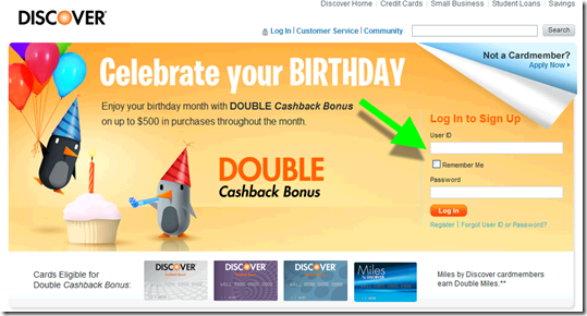
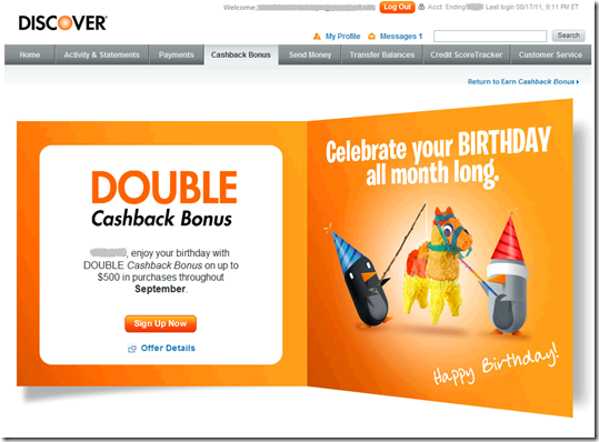
Although worth only $5 at most, Discover Card’s month-long Double Cashback Bonus (on the first $500 spent) sure sounds impressive. And combined with the cute penguin visuals, it’s an effective birthday greeting. And probably the first one you’ll get since it’s sent two weeks in advance of the first day of the month of your birthday.

Recipients must register to receive the bonus, a common technique to keep costs down. The card issuer continues to display dazzling graphics throughout and even sends a confirmation email (below). Great attention to detail.

It would be nice if you didn’t have to do a full login to register. But for extra reward points, most users will put up with the hassle.

Grade = A-

Discover Card birthday email (18 Aug. 2011, 2 weeks in advance of the birthday month)

Discover Card birthday email (18 Aug 2011)

First landing page: Log in (link)

Discover landing page

Second landing page: Register (link, must be logged in to your Discover account)

Second landing page: Register

Confirmation screen

image 

Confirmation email

image

Notifying Card Issuers that You Are Out of the Country

image We were lucky enough to take a quick trip to Europe this summer and one of the many rituals of modern travel is convincing your card issuers not to block international transactions. The conventional wisdom is to notify issuers in advance. While not an absolute necessity, it is said to improve your odds.

The process is very straightforward. All the bank needs is your travel dates and where you are visiting. However, it is tedious over the phone due to redundant authentication requirements.

Consequently, it’s an ideal service to automate with online, or even better, mobile form. I wrote about it the last time I traveled. But this time I put a clock on the process, just to see exactly how much time was wasted, for both the consumer and bank, on the phone. 

Summary: It took about 1 minute per card to register online at Capital One and Chase. Over the phone, it took 6.5 minutes at Wells Fargo and 9.5 at U.S. Bank. No one has it in their mobile app yet (see details below).   

I realize that online travel notifications are not a high priority these days. But, it’s such a win-win service, I wish more banks offered it. However, the real end game is to build automatic location notification into mobile-banking apps. Even if customers won’t agree to being tracked 24/7, there could be a button in the app that users press to submit their GPS location whenever they land in a new city or country. 

That gives customers total control, but makes it super easy for them to communicate. And it gives you a highly  secure method of knowing your customers are in the same location as their card. 
__________________________________________________________________________________

Capital One: Online — 2 minutes to register 2 cards (see screenshots in previous post)
__________________________________________________________________________________

Luckily, Capital One, my go-to card abroad with no international transaction fee, has an online form to do this. It’s not easy to find, but I’d written about it before so I knew roughly where to look. The form is a little convoluted; if traveling to multiple countries, you have to keep pressing “add another destination,” but it took less than a minute to add the five countries were we passing through.

I have Capital One personal and business cards which are integrated into the same online banking platform. But unfortunately, you have to do each card separately, so total time expended, including login, was about 2 minutes.

Capital One gets extra credit for sending me an email on my scheduled departure day asking me whether I needed anything and providing their international call-center instructions. _________________________________________________________________________________

Chase Bank: Online — less than 1 minute for 2 cards (see screenshot in previous post)
__________________________________________________________________________________

I couldn’t remember whether Chase had an online option, so I logged in, didn’t see it on the right-hand column of common links. So I went to customer service and found it on the list of available tasks. The form was super-easy; I could do both of my cards at once and just free-form input the countries. Total form-completion time was under 10 seconds, but if counting login and function-search, it took just under a minute. __________________________________________________________________________________

U.S. Bank: Phone: 9.5 minutes on phone + 2 minutes searching online for 1 debit card (with 2 different account numbers)
___________________________________________________________________________________

I first checked online to see if travel notifications had been added since the last time I checked. No such luck, so about 2 minutes were wasted. Because we needed ATM access abroad, we had to have this card working, so I reluctantly called the 800 number on a Friday evening, and was told that wait times were approx 4 minutes. I think they were only half that, but it still took me a full 9.5 minutes to get my ATM cards registered. About one minute of that was spent finding my wife’s debit card, which I now know has a different number than mine.

Why the agent couldn’t handle both ATM cards from a joint account without needing the other number is beyond me, but he insisted.

Total time expended was 2 minutes online and 9.5 on the phone: 11.5 minutes total.

Extra credit goes to the U.S. Bank agent who activated my new debit card that had recently come in the mail. My old card would have expired during the trip.  
___________________________________________________________________________________

Wells Fargo: Phone: 6.5 minutes on the phone + 2 minutes searching online for 1 card
___________________________________________________________________________________

My wife carries a Wells card at all times, so usually she handles travel notifications. But since I was already on a roll, I took on the task. Although I didn’t recall ever seeing it, I assumed Wells would have an online option, but after a search of the site, I found that my hunch was wrong and that I’d wasted a few minutes.

I called the 800 number and was able to complete the process in about 6.5 minutes. Much of that time was spent listening to menu choices and current balance info (which I didn’t want). Had I known how to skip through the menus, it would have taken only about 3 minutes. The agent was friendly and efficient, although she twice asked if she could also activate my debit card even though I don’t have a checking account there. But I appreciate that she was trying to be thorough. ___________________________________________________________________________________

Bank of America: Phone — 2 minutes, 0 cards
___________________________________________________________________________________

I was going to take my Bank of America card along, but after searching customer service I could not find an online form to complete, so I decided to leave it at home. Score 1 for the more online-savvy approach at its competitors.

Amazon.com Shoppers Prompted to Select Discover Card as Default Payment Option, with a $1 Million Carrot

image A few months ago, American Express provided five free song downloads as incentive for its cardholders to make Amex the default card option within the iTunes store (previous post).

Today, I noticed Discover offering an eye-opening incentive to get their card listed as the default option for one-click purchases on Amazon.com:

A chance to win $1 million every time you pay

This offer is part of the year-long Discover Everyday Giveaway usage sweeps. 

———————————

Discover Card’s $1 million promotion on Amazon.com (12 Aug. 2011)
Note: A small ad first appeared in the upper-right part of the screen, this is what it looked like after I chose “Expand”

 Discover Card's $1 million promotion on Amazon.com

How it works (link)
Note: This screen presented when clicking on “Learn more” from above banner

image

Chase Bank Offers 0% Balance Transfer and Easy Online Transfer

(Ed. note: The original promotion shown below was made by Chase in early April, right before U.S. income taxes were due. But the bank is still offering similar balance-transfer options, as outlined below).

imageWhen I logged in to my Chase credit card account, I was greeted with an imageattractive interstitial ad promising to save me money if I transferred a credit balance to the bank (see Figure 1).

The bank offers two or three choices of terms and rates. Obviously, you can’t beat 0%, but evidently some customers prefer to lock in a lower rate longer. Last week, we had the following choices:

  • 0% for 11 months (thru June 2012)
  • 1.99% for 17 months (thru Dec. 2012)
  • 5.99% for 22 months (thru May 2013)

Each choice also required an immediate 1% fee on the transferred amount (note 1).  
_____________________________________________________________________

Analysis
_____________________________________________________________________

The interstitial ad grabs your attention and the pricing is aggressive, so I expect Chase is getting good takeup. More interesting to me is the actual online transfer process which appeared flawless, though I didn’t actually move any money. My only major criticism is that the prices are a little hard to find, especially the transfer fee.

It’s a great offer and lets the customers see the total price right away. Overall, I give it an A-.

Good:

  • Great, eye-catching graphics
  • Copy is very concise, passing the 25-word “Google homepage” mark
  • Clear benefit, “save/saving” used twice in the 15-word ad
  • Clicking through leads directly to the transfer page where users can accept the offer (see Figure 2 and 3)

Not so great:

     On interstitial ad (Figure #1):

  • Not super clear where to click to take advantage of savings
  • The actual value of the “Great low rate” is not disclosed until after you click-through to transfer page (second screenshot)
  • The laptop graphic image is not particularly interesting

    On the transfer page (Figure #2), :

  • Two choices are virtually identical (0% though Feb. 2012 or 0% through March 2012) and one that’s clearly less appealing (2.99% through Aug. 2012).
  • There is no specific disclosure on the first page of the transfer fee (which I believe is 4%), just the famous “additional terms apply” (the fee comes in step 3, Figure 5)

Recent offers: On my original April 1 test (Figure 1 & 2), I didn’t go through the entire process. So I went back last week to see when Chase discloses the transfer fee. The user is told about the 1% transfer fee (see note 1) during the second step (Figure 5) when they are asked to agree to terms and conditions. The go-to rate after is also listed.
——————————————-

Figure 1: Chase interstitial ad at credit card login (1 April 2011, 8 PM Pacific)

Chase login ad

Figure 2: Landing page to begin balance-transfer process (1 April 2011)

Landing page after login

—————————————————–
Retesting the service
(21 July 2011; 10 PM Pacific)
Figure 3: Step 1 — Select an offer

Step 1: Chase credit card balance transfer process

Figure 4: Step 2 — Enter transfer details (card number and amount)

Step 2: Chase credit card balance transfer process

Figure 5: Step 3 — Agree to the terms and conditions

Step 3: Chase credit card balance transfer process

——

Note:
1. Chase’s 1% transfer fee is much lower than the 4% seen in most other offers. The bank should highlight that number since it’s a selling point.

Finally, a Facebook Credit Card Connection to Really Like (Thanks American Express)

image Since Facebook became the de facto social operating system a year or two ago, I’ve been a little surprised the financial powers haven’t jumped on board more aggressively (note 1). But the card companies have had their hands full dealing with the credit meltdown, so it’s understandable.

But now that “big cards” are moving forward again, we’ll see a burst of activity leveraging Facebook and other social networks during 2012 and beyond (note 2).

Link, Like, Love from American Express  is a great example of what’s to come.

Here’s how it works (1 thru 5 illustrated in screenshots below):

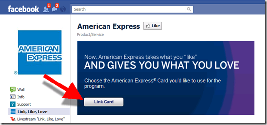
  • Step 1: Go to the American Express Facebook page
  • Step 2: Add “Link. Like. Love.” to your Facebook profile
  • Step 3: Link your AmEx card to the app
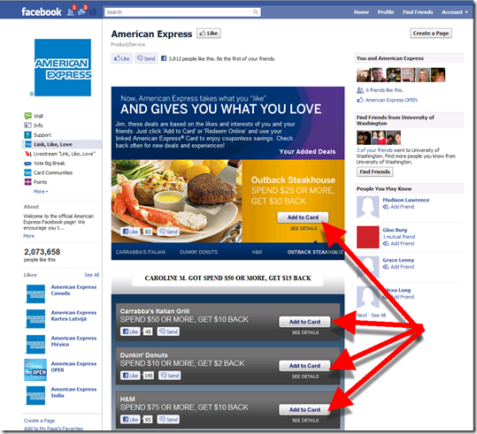
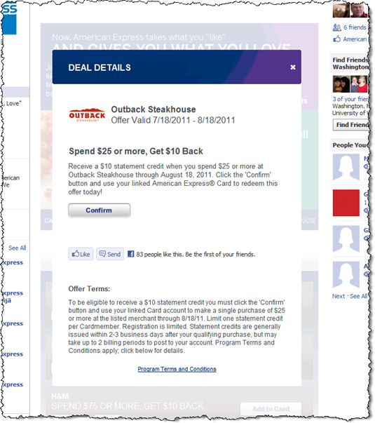
  • Step 4: Sign up for offers you like
  • Step 5: Visit the merchant (whenever you like) and pay with your AmEx card
  • Step 6: The discount will automatically appear as a statement credit on your card

_______________________________________________________________________

Analysis
______________________________________________________________

The AmEx program is very similar to bankcard-based, merchant-funded rewards, except for one huge difference. Instead of “liking the offer” during infrequent visits to your bank/card statement, you do it while on Facebook, which the typical user visits approximately a zillion times more than their bank (note 3).

MasterCard/Visa issuers will follow the same path, but AmEx bagged a ton of free publicity along with the first 2 million users. Like it, a lot.
——————————

Step 1: Visit American Express Facebook page
Note: 2 million “likes” (note 4)

Step 1: Visit American Express Facebook page

Step 2: Add the AmEx app

Step 2: Add the AmEx app

Step 3: Link card

Step 3: Link American Express card to Facebook

Step 3a: Complete form on AmEx webpage

Step 3a: Complete form on AmEx webpage

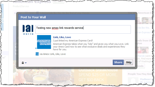
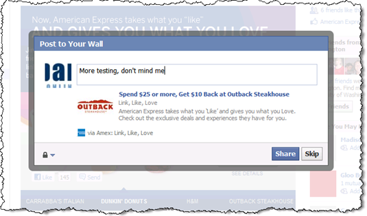
Step 3b: Share with friends (optional)

Step 4: Share with friends (optional)

Step 4: Activate offers with two clicks

Step 5: Activate Amex offers with single click

Step 4a: Confirm

Step 5a: Confirm

Step 4b: More optional sharing

Step 6: More sharing (optional)

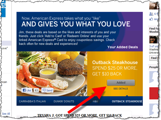
Final: Offer now shows “Added”

Final: Offer now shows "Added"

——————————

Notes:
1. Chase had the first “1+ million likes” financial promotion in early 2010 with its brilliant Community Giving program
2. We’ll see some great Facebook integration at FinvoateFall in two months. 
3. Presumably, I’ll be getting all kinds of Facebook and/or email messages from AmEx; although 2 hours post-signup, nothing was in either inbox.
4. During the 2 hours or so (4 to 6 PM Pacific) that elapsed while I was working on this post, the number of likes increased by more than 300. That translates to 3,000+ per day, or close to 100,000 per month. I don’t know how many likes AmEx had when the program launched, but it sounds like reasonable traction.

Is Prepaid the Durbin Antidote?

image Prepaid cards have been a bit of an afterthought for most banks and card issuers. Sure, they make the occasional appearance on banking sites in December as holiday gifts. But mainstream they are not.

But that was before traditional debit cards suddenly became unprofitable (note 1) thanks to the upcoming U.S. debit interchange price controls (see Durbin rant, note 2) combined with with last year’s reining in of overdraft fees.

It’s pretty easy to predict what happens next. Banks will do what any business would do when offering a popular, yet unprofitable product. Raise prices with new monthly/annual/transaction fees. And for customers that are fee adverse, banks will offer two alternatives:

  • Credit cards for the credit worthy
  • Prepaid cards for everyone else

Bottom line: Prepaid bankcards are about to become much more popular. Here’s why:

  • More interchange revenue to the issuer
  • Easier to sell online with fewer risk management and compliance issues
  • Great entry product for teens and pre-teens
  • Porting the prepaid “card” into mobile phones and other contactless form factors
  • Valuable service for underbanked segments
  • More utility: can be gifted, used for traveling, used to deliver allowance, and so on

———————————————–

Notes

1. The price controls apply only to banks of $10 billion or more.
2. I am really disappointed in the Durbin interchange price controls. I was sure Congress would delay the matter, but unfortunately I was wrong. My feeling is that price controls are an absolute last resort when there is not enough competition to create a free market price. I don’t think that was the case with debit interchange.

Long-term, the whole exercise is a zero-sum game for the businesses, merchants and banks, who will adjust their prices to cover costs and ensure a normal profit. The only likely loser is the consumer who will be deprived of innovations killed off by the dramatic shift in interchange.

Here’s my scorecard of the post-Durbin winners and losers: 

Short-term winners:

  • Merchants, obviously
  • Prepaid card issuers (which are not covered by Durbin price controls)
  • Consultants, lawyers, marketers and professional services firms involved in drafting and communicating new bank prices and policies 
  • Financial institutions exempted from Durbin (under $10 billion) could pick up share and/or be able to gain fee revenue by matching the large bank price increases

Short-term losers:

  • Large banks will see revenue declines until they can get new fees introduced and move transactions to credit/prepaid
  • Consumers who will see fee increases from banks faster than they’ll see price decreases from merchants
  • Payment startups and business consortiums whose business model was predicated on disrupting debit

Long-term unchanged:

  • Merchants who will eventually pass on the interchange savings due to price competition
  • Banks who will make up the revenue loss with new fees and/or by channeling transactions to higher-margin products
  • Consumers who will pay more in bank fees but less for goods and services, an overall wash

Chase Bank’s Jot App Shows the Future of Mobile Transaction Processing

image image I’ve been waiting for something like Chase Bank’s Jot (see note 1). It’s part of the "second wave" of mobile apps that demonstrate why mobile banking will soon be better than online banking.
_________________________________________________________________________________

Mobile banking phase 1: 2008 through 2011
________________________________________________________________________________

Mobile’s first wave was all about porting the most-used online functions, balance inquiry and statement viewing, to a smaller screen. That was convenient for smartphone owners on the go, but it didn’t add much to the overall user experience. 

The test of whether you’ve nailed the mobile UX is if that even if you are within arm’s reach of your laptop, you still pick up the mobile to perform a function. Most mobile banking systems fail that test, i.e. you only use mobile banking when online access is inconvenient or insecure.
________________________________________________________________________________

Mobile banking phase 2: 2011+
________________________________________________________________________________

The second wave is much more interesting. Your mobile phone can do financial chores that simply cannot be accomplished online, for example:

  • Deposit a paper check via mobile camera (USAA, Chase, PayPal and many more)
  • Transfer money to your friend by "bumping" phones (PayPal, ING Direct)
  • Alert you to special merchant offers in your exact location that are redeemable simply by using your bankcard (BankOns)
  • Pay your bill automatically by scanning the billing statement (Mitek)
  • Upload paper receipts and append them to expense reports (Expensify)

And the latest addition to that list:

  • Receive feed of transactions and tag them with categories for future reference and reporting (Chase Jot)

________________________________________________________________________________

How Jot works
________________________________________________________________________________

Chase’s new app (announced 1 June 2011) may not be as cool as remotely depositing a check, but it’s much more useful for most cardholders. The iPhone and Android app, which is currently available only for the bank’s Ink business credit card, sends push notifications of each transaction (see inset) and enables users to (relatively) quickly append transactions with category information, i.e. "tag" transactions. 

image One key Jot feature, missing in most mobile banking services, is a running list of the transactions waiting to be tagged (see right).

That way, when the business owner has a few spare moments, they can quickly get caught up with their categorizing work. This ongoing attention will reduce the quarterly game of "what’s that transaction" played when finalizing the company books.

So not only does Jot save time, it potentially improves the quality of the accounting data, always a good thing for business management. 

The app also includes other business credit card management functions such as basic reports by tag, the ability to change employee credit limits, and info on outstanding balances and payment due dates.

While the functionality is still pretty basic (e.g., there is no way to add more than one tag to a transaction), there are only 60 days of transactions available, and login needs to be simplified, overall Jot is a winner. We are tagging it with an A-.

—————————————————-

Notes:
1. The Jot landing page is well done and includes a series of four short demo videos.
2. For OBR subscribers, see our previous Online Banking Reports on mobile banking and payments.