Chase Bank Pitches Credit Card Balance Transfers at Login

image Chase has great graphic design panache (see previous post here and here). As I was logging in to my account last week to see what the bank had done with a pesky $2 balance remaining from my payoff a month ago (see note 1), I was presented with an eye-catching offer to transfer a balance (see first screenshot below). 

The balance-transfer options weren’t quite as enticing as they’ve been in the past:

  • 0.99% for six months plus 3% balance-transfer fee
  • 5.99% for a year plus 3% balance-transfer fee

This time last year, the 5.99% offer would have likely been for the life of the balance. However, under new regulations approved by Congress, where monthly payments must be allocated to the highest rates first, it no longer makes financial sense to offer a low rate for the life of the balance.

Note: Chase provided real-time chat support as I considered their balance-transfer offer (see second screenshot below).

Chase Bank’s login interstitial (16 June 2009)

image

Chase offered online chat via a popup window

image

Notes:
1. Kudos to the bank for automatically eliminating the $2 in extra interest accrued between the day I paid my balance in full online (at the Chase site) and when the payment posted. When I logged in I was afraid I might see a $39 late fee on the $2 remnant balance. 

2. For more info on post-login marketing, see our recent Online Banking Report on Selling Behind the Login.

Chase Uses Branch-Based WaMu Checking Account Offer at Credit Card Login

image I spent the past few weeks looking at cross-selling efforts from within the secure online banking zone. But unfortunately, I came across the following example too late to be included in our report (see note 1). 

When I logged in to pay my Chase consumer credit card online (note 2), I was greeted with the following interstitial page (aka “splash screen”) inserted before the main account-management area (see first screenshot).

Chase is offering a $125 incentive to open a WaMu-branded free checking account (note 3). This offer may have something to do with the fact that I’m located in Seattle, the former headquarters of WaMu. The same creative was used in a statement insert and a banner ad across the main account-management page (see third screenshot).

Lessons:

1. Serving “more info”: In this example, Chase handles the info-serving process a bit differently than others I’d looked at recently. When selecting More Info on the splash screen, the bank opened a new tab (in Firefox 3) for the landing page (see second screenshot below). And while the user read the offer details on that page, the original tab automatically loaded the original destination (account management page), and the interstitial ad disappeared.

On the one hand, it’s convenient for the user to be able to look at the offer details and then quickly navigate back to the area they were originally logging in to. However, for more experienced users expecting a pop-up screen that can be quickly closed after reading, it can be momentarily confusing. There’s a risk the user will inadvertently close the entire browser session by clicking the upper-right “x,” necessitating an annoying restart and re-login.  

I’m not sure there’s a single right answer, but another variable worth testing – something I’d prefer – is a popup running in a smaller window in front of the original Chase page.

2. Branch-only fulfillment: I was surprised to see the offer can be redeemed only in branch. There is no way to sign up online. The landing page is actually actually a coupon users are encouraged to print with the page-dominating blue “print” button (see second screenshot below).

I can understand the rationale for pushing people into branches where they can be upsold other services. But in this quick-start age, I’m surprised there isn’t at least an option to apply online. Perhaps this is a test to see how a branch-only offer compares to online-only ones.

Chase Bank splash screen (interstitial) immediately after login
(30 April 2009, 1:40 PM Pacific)

image

Landing page/coupon (opens in second tab in Firefox 3)

image

My Accounts page

image

Notes:
1. The results are compiled in our latest Online Banking Report: Selling Behind the Password
2. Tiny rant: I owed $2.45 left over from some extra finance charge even though I paid my bill in full online last month. It’s not so much that Chase didn’t earn the $2, that’s fine. What’s irritating is that they made me pay it right away by setting my min payment to $2.45. Come on Chase, I’ve had this account since the 1990s, you can float me the $2 until the next time I have a charge.
3. Interestingly, I already have a small business checking account at WaMu. Either the bank’s householding algorithm missed it, or Chase is making the offer to everyone in my Zip, or it still wants me to open a personal account to go with my biz one.

Chase Bank, Mint Top the Charts with New iPhone Apps

imageimage No one knows for sure how Apple compiles the list of its top-selling iPhone apps, but it’s related to how many are sold during the past few hours. I’ve seen speculation that the measurement period is 2 hours (see note 1).

But there is no doubt about the benefits of rising to the top. The winner receives prime exposure in the iTunes Store and on the iPhone itself (see screenshots below).

I’ve checked the Finance category rankings dozens of times since the store opened in July, and the top app had always been Bloomberg with Bank of America usually the runnerup.

But Friday, a new top seller emerged in the Free list in the Finance category (note 2), Chase Mobile  while Bloomberg and BofA were each knocked down a spot to numbers 2 and 3. The Chase app was released just one week ago (12 Dec). But by Saturday morning (20 Dec), Chase had already been replaced at the top by online personal finance startup Mint, which released its iPhone app Monday (15 Dec), but it didn’t show up in the iTunes store until 1 AM Friday.  Mint stayed at the top all weekend and is still number one now (10 AM Pacific, 22 Dec).

imageIn the screenshot below and right, you can see the free publicity derived from holding the top spot. Also, note that you should put your name into the application. Bank of America, ranked number 3, neglected to include its name in the title, so it loses some branding value. Although, they would have to use BofA to fit into the space.  

Chase App (link to iphone App)
The Chase app itself is attractive and is similar to Bank of America’s with a login button to the website and an ATM/branch-finder utility. As of this evening, 64 reviews have been posted with an average 3.5-star rating out of five, slightly better than the 3-star rating of Bank of America’s iPhone app with similar features.

Mint App (link to iPhone app)
As expected from a company that is carefully using design to help distinguish it from the pack, Mint’s new app is great looking. Across all aggregated accounts, the mobile app shows account balances, transactions, and progress towards budget goals. A nifty alerts icon on the bottom provides a convenient way for users to keep tabs on important info on the go.

Another difference from most banking apps: Mint lets users choose whether they want password protection enabled after their initial login. If you choose to log out, then the app erases all data in memory, and you must log back in next time. If you choose not to log out, then your data remains visible until the next visit with no login required (note 4). This is a great convenience, but something that may not be allowed at regulated financial institutions.

Some users have reported trouble with the app on older phones. On my first-generation iPhone running version 2.1 software, the Mint app wouldn’t download. But once I upgraded the iPhone software to version 2.2, it downloaded flawlessly and all functions worked perfectly. In Mint’s forum, some users were reporting problems with the Budget feature, but it seems to work fine for me (forum thread) (note 3).

Top Apps in the finance category of iTunes’ App Store
(7 PM Pacific, 19 Dec 2008) 

image

 Top free finance apps list displayed on iPhone:
          at 7 PM Pacific, Fri. Dec. 19                               at  2 PM Pacific, Sat. Dec. 20  image        image

Chase Mobile iPhone app                    Mint iPhone app main screen
main screen
(19 Dec 2009)                          (19 Dec 2009)

image       image

Notes:
1. That 2-hour window could be about right. When I made this screenshot, the new Mint app was at number 10; two hours later (9 PM) it had risen to number 5 (see screenshot above). By 9 AM Saturday morning (20 Dec) it had risen to number 1.

2. The App Store divides the top apps into two categories, free and paid. The top 20 free apps are listed on the right side and the top 20 paid apps are listed on the left. The apps in the middle are listed by newest first.

3. These operating system incompatibilities, a real problem in pre-1995 online banking services, had largely been left behind when banks embraced the Web in the mid-1990s. Unfortunately, mobile banking will add to your tech-support costs. 

4. Mint also reminds users that they can choose to lock their entire iPhone for extra security.

5. For more info on the market, see our Online Banking Report on Mobile Banking

Chase Bank Offers to Lower Auto Payments by $44

image It's a sign of the times. Instead of creating interest in auto loans by showing a sexy new convertible on a windy seaside road, Chase offers to help customers stay in their same vehicle with a lower monthly payment (see today's homepage below).

Interestingly, the $44 number in the headline is the actual average savings to Chase auto loan refinance customers in August (see note 1 for how Chase calculated the savings). That makes the whole ad much more believable than the usual what-if scenario.

Instead of burying that key fact in the fine print on the bottom of the landing page (second screenshot), Chase should make it the main headline of the landing page. The bank could go "social" with it by adding testimonials, a blog or forum, calculators (how about one for the iPhone?), a Facebook page, sweepstakes and even a scrolling activity ticker showing actual refinance savings as they happen, much like the Progressive auto insurance quotes (see note 2).

It's not going to help Detroit much, but it's smart marketing for the pre-holiday period. A $44 lower monthly payment translates into $500 in annual savings, enough to put a little something extra under the tree this year.

Chase Bank homepage (13 Nov 2008)

image


Landing page pop-up
(13 Nov 2008)

image

Notes:

1. Derivation of the $44 savings:

Monthly savings figure is for illustration purposes only. $44.43 is the average monthly amount saved by customers who lowered their rate by refinancing their auto loans with Chase during the period from 7/25/08 to 8/21/08 on which we have the information to determine savings. These customers started with an average balance of $17,500, with an average remaining term of 49 months at an average Annual Percentage Rate (APR) of 10.50% and refinanced on average for 53 months at an average new APR of 7.31%.

2. An activity ticker is one of our top-rated projects for next year as published last week in our Online Banking Report 2009 Planning Guide.

Visa Announces Android and P2P Mobile Initiatives

image Visa today put a stake in the ground to be viewed as the innovation leader, a position that American Express has claimed for some time with its chip cards, social media efforts, and even an online lab site. At today’s “innovation briefing” in NYC, Visa announced several pilots and upcoming initiatives.

Mobile person-to-person transfers
The most far-reaching announcement was the ability for Visa cardholders to transfer funds from one card to another via mobile device. So far, just one bank is participating in the pilot. US Bank says it will make the service available to a few thousand cardholders as a test later this year. PaymentsNews has more details here.

It sounds good, but as always the devil is in the details. For instance:

  • Through what hoops will cardholders have to jump to enable their card and phone for the service?
  • Will the transfers be treated as cash advances triggering fees and finance charges?
  • Will it be available to all cardholders using any mobile phones? 

Visa jumps on the android bandwagon
A more immediate innovation is a location-and-alert-based service built for Google’s android platform, a new mobile system launching in late October. Visa’s new service, to be rolled out initially by Chase Bank (no time frame given), promises some important new developments:

  • “Near real-time” purchase alerts (see note 1) so you can see immediately whether your server added an extra digit in front of your tip on that bar tab. The real-time alert pilot was announced a month ago (here) involving several thousand accounts at PNC Bank, SunTrust Bank, US Bank, Wachovia, Wells Fargo, Royal Bank of Canada, TD Bank, and Vancity.
  • Visa merchant finder based on your location-based/GPS technology  (nice!) with targeted marketing offers (hmmm??). The merchant locations will be integrated with Google Maps.

Again, PaymentsNews has the entire press release here.

Notes:
1. Visa says that the alerts will arrive “typically before (the consumer) leaves the store.”

2. For more information, see our Online Banking Report on Mobile Money & Payments.

Mobile Banking Uptake: Bank of America Closing in on 1 million Mobile Users

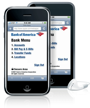
Bank of America iphone mobile bankingIn its latest quarterly financial results (here), Bank of America said it signed up 224,000 new users during the quarter to bring its active mobile banking base to 840,000. Assuming the 75,000/mo pace continues through second quarter, the bank should be over 900,000 now and will surpass 1 million in the next few weeks.
Although it’s a nice milestone, it’s only 4% of the bank’s 23+million active online banking users (here). Given that mobile is pushed frequently in the bank’s online banking area, one could argue that 4% adoption is pretty anemic. But according to M:Metrics, less than 14% of U.S. mobile phone users accessed info via the mobile Web in February. So 4% of a 14% universe is much more impressive, indicating the bank has tapped almost 1/3 of the short-term potential for mobile Web-based services, a good start.

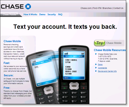
To really goose adoption, text-based solutions may need more emphasis (see Chase screenshot below). According to M:Metrics, U.S. text users outnumbered mobile Web users almost 4 to 1 in February, 110 million to 30 million.

Industry forecast update
These adoption rates are about what we expected. In the forecast published a year ago in our Online Banking Report on Mobile Banking, we were relatively bearish short term, projecting 900,000 mobile users by year-end 2007 growing to 2.5 million by the end of 2008.

With BofA reporting 840,000 and assuming they have about half of all users, the U.S. market has likely already passed the 1.5 million mark and will end the year at more than 3 million.

The adoption rate depends on how hard banks push mobile options. Along with BofA, Chase has been one of the most aggressive, showing mobile use in its advertising for several years now (previous coverage here). I love its “Text your account. It texts you back.” Just seven words conveying more than most 3-minute demos.


Chase Bank Text Mobile banking

Chase Goes with SMS for Mobile Banking

The virtual-ink had barely dried on our substantially lowered forecast for SMS banking adoption in the U.S. (here; check out the comments as well), than the ever-aware Brandon McGee had the scoop that Chase, the third-largest U.S. bank, had quietly made SMS banking available to its customers.

We still don't know if it's a market test, or a full-blown launch, but we do know that this puts SMS back on the table again in the United States. Here's the bank's clever tagline:

Text Your Account. It Texts You Back.

Although Chase hasn't yet linked its SMS banking to the home page, it's not too hard to find at <chase.com/mobile>.

Note: For more on SMS and other types of mobile banking, see our full Online Banking Report on the subject here.

Free Checking in the Internet Age

Bank of America and Chase, two of the three largest U.S. banks, are putting an online spin on free checking offers using online banking, security, and other benefits to encourage applications. On the surface, Bank of America's approach appears much more effective. And with no direct-deposit requirement, it surely generates more new accounts. However, without knowing how the free accounts convert to profitable relationships, it's impossible for an outsider to recommend one approach over another.    

Bank of America
Bank of America's free checking offer (see note 1) is difficult to overlook (screenshot below).  The top-of-the-page banner has animations that showcase the major benefits:

  • online banking
  • bill payment
  • "Keep the Change" debit card savings program
  • SiteKey security

The teaser "We're redefining Free Checking" creates interest while the bright blue "open an account" and "special online-only offer" further entice prospect to click through the banner.

BofA home page with free checking offer

The landing page (screenshot below) reiterates the online benefits and features a large laptop to reinforce the high-tech nature of the account. Two additional benefits are added to the list:

  • Free debit card with security protections
  • Free ATM access at 17,000 BofA machines 

BofA free checking landing page

Notes:

1. The free checking banner appeared in a visit to the homepage from a Seattle IP address at 10 AM Pacific time today. It did not appear on afternoon searches from several computers.

2. The bank uses a live chat popup after lingering on the application for a short time (click on image right for closeup).


Chase Bank
Chase's homepage banner uses the "kitchen sink" approach with an image of an ATM machine, debit card, paper checkbook, laptop, and PDA along the top. The mobile phone is a good addition, but the ATM machine and laptop are so small, they aren't easily recognizable in a quick scan (see screenshot below).

Another problem: the paper checkbook, which is centered and slightly larger than the others, seems to get an inordinate amount of attention. I'm not sure that the checkbook or the debit card add much value. U.S. consumers pretty much realize those are included in a checking account.

Chase's landing page leaves a lot to be desired. The benefits are listed in small, gray type that is relatively hard to read. And the only call to action, if you can describe it as one, is the last line in small blue type, with an underlined "apply online." No buttons + no color + no large font + no offer = no interest.  

Long-term Archive Update: Chase Credit Cards Provides Six Years

The folks at Chase Bank were on the ball today. Less than an hour after I wrote about Whitney Bank joining the long-term statement archive club (here), I received an email from a subscriber* at Chase letting me know they offer six years of online statements for credit cards. 

Below is the bank's announcement to cardholders. It's nicely designed with a green touch. And it reminds cardholders they will receive an email both when the statement is ready and when payment is due. And note the call to action: "TRY" paperless. That lets customers know they can always go back. Now that's the way to get fired up about saving trees, and the bank's cash. The only thing missing: a simple guarantee.

Grade: We score it an "A" 

Chase has been working hard to move customers out of paper. So far this year, the bank has run a $35,000 sweeps to go paperless (see post here) and they currently have a popup on the credit card homepage pitching estatements (see screenshot below).

January 2007 email to Chase credit card customers

Email to credit card customers pitching electronic statements

Popup at credit card site

Popup pitching paperless statements at Chase's credit card page

*He earns a Starbucks card for his responsiveness. Anyone else have five or more years of statements online? Add your comments or email me.

Chase Advertises Security Alerts in the NY Times

Chase ad in New York Times featuring mobile security alerts

Once again (previous post here), Chase used a three-quarter page color ad in the front section of the New York Times (p. 17, National Edition) to showcase its alert services (see partial screenshot right). The ad shows a man relaxing in the stands at some type of sporting event, Yankee Stadium perhaps.

The camera looks over his shoulder, focusing in on the image displayed on his Treo smartphone, which says "SECURITY ALERT" in large white letters on a light-blue background.

You had to feel for this poor guy, jarred from his leisure time with an urgent missive from the bank. Within a few seconds, three things likely crossed his mind: 

1. What the (expletive deleted)? Pretty poor timing to be interrupted at a baseball game with a security alert from the bank (which, these days is 99.9% likely to be a false positive, or a phishing attempt, see number 2).

2. Is this even from Chase? How do I know it's not a new kind of mobile phishing attach (mishing?). Should I ignore it? Does my liability go up if I don't respond immediately?

3. Now what? Can I click the message and find out if this was just a notification that I'd used my debit card to buy beer at a Yankees game, something I'd never done before, or has someone just transferred my 401k to a numbered account in the Jersey Islands? Or will I have to excuse myself and make a voice call, spending the 6th and even part of the 7th inning, talking to a Chase CSR, who may not even have enough info to explain why I got the alert? 

Analysis 
The ad demonstrates the pitfalls of using a very negative attribute, security breaches, in marketing your brand. But despite the uncomfortable thoughts that come to mind, we think it's an effective ad because it grabs attention and positions Chase as caring for the financial security of its customers. However, given that Chase's actual alerts look nothing like this, it's a bit of a stretch. I suppose they're allowed a bit of creative license; it's advertising after all. 

We'll give it an A-