Chase Bank’s Remodel: The Death of the “Swiss Army Knife” Banking Homepage?

chase mobile logo reflection.jpg

I’m still digesting Chase’s radical homepage
redesign (see screenshots 1 & 2). While I love the focus
on just three product messages, devoting 50% of the page (above the fold
even
) to the login button seems like a lost opportunity. Perhaps it’s a
temporary welcome area to ease users back onto the site.

chase dropdown.jpg

Only existing customers get the half-screen
login. Non-customers get an additional marketing message on about two-thirds of that
space (see screenshot 3).

The new site looks great on an iPad (portrait or landscape), but it’s not
served to iPhone users at this point. They still see the ultra-trim mobile
screen <m.chase.com>. 

The bank has drastically reduced navigation options. A single tab called
Products & Services launches a dropdown box with links to all the
product areas (see inset).

A second tab, Why Chase?, lays out the major benefits, the
missing tab
at most banking sites. And the final tab, which seems completely
redundant, causes a drop-down login box to appear.

Although I missed it initially, Chase has not done away with the
Personal/Business/Commercial designations. Tiny links in the upper left
allow users to head to the appropriate business version. Biz services are also
listed on the Products & Services dropdown (bottom of inset).

Bottom line: Chase has moved past trying to be all things to
all people on the homepage. That’s huge, and I hope it becomes a trend. Both
Citi and Bank of America have taken similar
paths recently. But Citi uses
striking photography
in the background to give it a more luxurious feel
(as does Salem
Five
). And Bank of America exposes more product areas across the top
(Bank, Borrow, Invest, Protect, Plan).

All in all, I applaud the streamlining after what must have been an epic
battle. But I don’t think the bank has completely hit the mark. Make it an A-  

——————————

1. Chase Bank homepage on first visit (4
Oct 2012; with customer cookies; via PC Chrome browser
)

Chase new site 1.jpg

2. Return visit
Note: Welcome to
our New Home Page replaced with Slate credit-card promo (lower-link portion of
page remains the same and is not shown below)

chase new site 2.jpg

3. Chase Bank homepage with no customer
cookies

chase newsite 3.jpg

4. Landing page explaining changes (link)

chase newpage lander.jpg


The End of Non-Automated-Teller Deposits

image

This month marked a turning point in my relationship with our business bank. Except for the odd check in a foreign currency, we’ve stopped using the teller to deposit checks.

We could use mobile remote capture, but since we walk or drive by a branch most days, it’s easier (and probably faster) to just stop by and make the deposit. But we no longer go inside to the teller line. All the Chase branches in our neighborhood have image-capture ATMs, they are rarely busy and are open 24/7.

We can feed in our usual stack of 6 or 7 checks in a minute or two, saving 4 or 5 minutes from doing it with a teller. And we walk away with a picture of the checks deposited, something you don’t get from the teller or your mobile phone. True, printed copies are redundant with the online images, but the paper records are reassuring for us and our bookkeeper.

image

Bottom line: I know that ATMs are enormously expensive to purchase, maintain and stock with fresh $20s. But it looks like their image-capture capability, combined with mobile remote deposit and check-image storage in online banking, has finally created a package that substantially reduces the need for the tellers they were named after.

Self-Serve: Chase Bank Allows Users to Create Their Own Billpay “Proof of Payment” Letters

image Last night, my son was having trouble convincing his college landlord that the Feb rent payment had been sent via online billpay. I was not happy, envisioning an extended conversation with bank customer service, something that is very, very low on my list of Monday night activities.

So I logged in to the Chase account to see if the check had cleared. At best, I expected to see that the payment had been sent via billpay, but no way to prove that the check had actually arrived. 

Bit I was pleasantly surprised. Not only could I see that the payment had cleared, the bank had posted an image of the check so I could see the landlord’s endorsement (see screenshot 1 and 2).

That was great on its own. But wait, there was more.

The bank offers a self-service “Note to Payee” function that automatically creates a letter to document payment details, including a copy of the check image (see screenshot 3). All you have to do is download the PDF and attach it to an email to the payee.

The only hitch in the system is finding these functions. They are located under the Payments & Transfers tab (see screenshot 1). That’s not bad, but it would be more intuitive to place a direct link from the the online statement (My Accounts) to the bill payment details. Also, the “Print to PDF” button is easily missed (screenshot 2).

Still, the entire process took less than two minutes. And I didn’t have to call customer service, a saving of 15 minutes of my time and $15-20 in customer service expense by the bank. 

The letter worked perfectly. Within an hour, the landlord had backed down, apologized for her error, and went back to her day job. This pretty much makes up for the unreadable bit of correspondence I got from the bank last week. 

——————-

1. Chase bill payment activity screen (14 Feb 2012)

Chase bill payment activity area within online banking

2. Chase proof-of-payment screen
Note: Print to PDF option

Chase bill payment details page


3. Chase automatically generated “Note to Payee” letter in PDF format

Chase proof of payment letter
——————————-

Note: See our Online Banking Report for more info on bill payment, messaging, customer service and much more.

Holiday Promotions at the Top-20 U.S. Banks

Since I began blogging in 2004, I’ve usually run a year-end post looking at the holiday marketing efforts of the top-20 U.S. banks (links below). This year, only 7 of the 20 banks are using holiday or seasonal imagery on their homepages. That’s a decrease of 3 over last year.

As usual, PNC Bank is the gold standard for holiday bank promotions, with its long-running (25+ years) “cost of Christmas index” which quantifies the cost of procuring all the items mentioned in the famous song, “12 Days of Christmas.” Following is a quick overview of the promotions, including a 1-to 5-bulb rating. 

Previous posts: 2010, 2009 part 1, 2009 part 2, 2007, 2006, 2006, 2004

_____________________________________________________________________

Big banks in the holiday spirit
(rated 1 to 5 bulbs)

PNC: Christmas cost index

  • Cost of Christmas based on the song 12 Days of Christmas

Score: imageimageimageimageimage

Homepage

image

Landing page: Amazing microsite, wonderful graphics, and slow loading (link)

image


Fifth Third: holiday sweeps

  • Pay Your Bills sweeps with holiday graphics
  • Small ad with a card wrapped with ribbon which directs users to branches for “holiday shopping made easy,” presumably for gift cards, but neither the ad nor the landing page make that clear

Score: imageimageimageimage

image

ING Direct: Mobile usage sweeps

  • 12 Days of Mobile sweeps

Score: imageimageimageimage

image

Landing page

image


Chase: sweeps and car loans

  • Winner Wonderland, credit card sweeps with one entry for every credit card purchase and 5 entries for every donation put on the Chase card
  • Add joy to your wallet, car refinance promotion

Score: imageimageimage

image


BB&T: Visa gift card

  • Small advertisement in lower right

Score: image image

Homepage

image

TD Bank: Visa gift card

  • Small advertisement in lower right (below the fold on my laptop)

Score: image

Homepage

image

Key Bank: gift cards

  • Very small gift-card promo, below the fold on my laptop and rotating with a half-dozen other items

Score: image

Homepage

image 

————

Notes:
1. No holiday imagery on the homepages of BofA, Wells Fargo, Citibank, HSBC, US Bank, SunTrust, Capital One, Citizens, Regions, Harris, Bank of the West, Union Bank, Comercia
2. Screenshots taken from Ft. Myers, FL, IP address, between 7 and 8 PM, 20 Dec 2011    
3. Credit: Happy Holidays animation from LayoutSparks.com

Notifying Card Issuers that You Are Out of the Country

image We were lucky enough to take a quick trip to Europe this summer and one of the many rituals of modern travel is convincing your card issuers not to block international transactions. The conventional wisdom is to notify issuers in advance. While not an absolute necessity, it is said to improve your odds.

The process is very straightforward. All the bank needs is your travel dates and where you are visiting. However, it is tedious over the phone due to redundant authentication requirements.

Consequently, it’s an ideal service to automate with online, or even better, mobile form. I wrote about it the last time I traveled. But this time I put a clock on the process, just to see exactly how much time was wasted, for both the consumer and bank, on the phone. 

Summary: It took about 1 minute per card to register online at Capital One and Chase. Over the phone, it took 6.5 minutes at Wells Fargo and 9.5 at U.S. Bank. No one has it in their mobile app yet (see details below).   

I realize that online travel notifications are not a high priority these days. But, it’s such a win-win service, I wish more banks offered it. However, the real end game is to build automatic location notification into mobile-banking apps. Even if customers won’t agree to being tracked 24/7, there could be a button in the app that users press to submit their GPS location whenever they land in a new city or country. 

That gives customers total control, but makes it super easy for them to communicate. And it gives you a highly  secure method of knowing your customers are in the same location as their card. 
__________________________________________________________________________________

Capital One: Online — 2 minutes to register 2 cards (see screenshots in previous post)
__________________________________________________________________________________

Luckily, Capital One, my go-to card abroad with no international transaction fee, has an online form to do this. It’s not easy to find, but I’d written about it before so I knew roughly where to look. The form is a little convoluted; if traveling to multiple countries, you have to keep pressing “add another destination,” but it took less than a minute to add the five countries were we passing through.

I have Capital One personal and business cards which are integrated into the same online banking platform. But unfortunately, you have to do each card separately, so total time expended, including login, was about 2 minutes.

Capital One gets extra credit for sending me an email on my scheduled departure day asking me whether I needed anything and providing their international call-center instructions. _________________________________________________________________________________

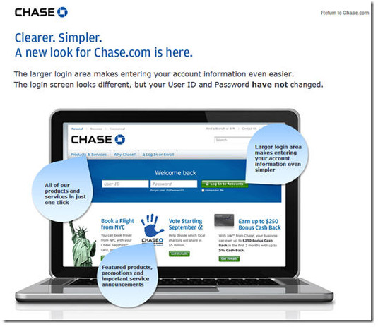
Chase Bank: Online — less than 1 minute for 2 cards (see screenshot in previous post)
__________________________________________________________________________________

I couldn’t remember whether Chase had an online option, so I logged in, didn’t see it on the right-hand column of common links. So I went to customer service and found it on the list of available tasks. The form was super-easy; I could do both of my cards at once and just free-form input the countries. Total form-completion time was under 10 seconds, but if counting login and function-search, it took just under a minute. __________________________________________________________________________________

U.S. Bank: Phone: 9.5 minutes on phone + 2 minutes searching online for 1 debit card (with 2 different account numbers)
___________________________________________________________________________________

I first checked online to see if travel notifications had been added since the last time I checked. No such luck, so about 2 minutes were wasted. Because we needed ATM access abroad, we had to have this card working, so I reluctantly called the 800 number on a Friday evening, and was told that wait times were approx 4 minutes. I think they were only half that, but it still took me a full 9.5 minutes to get my ATM cards registered. About one minute of that was spent finding my wife’s debit card, which I now know has a different number than mine.

Why the agent couldn’t handle both ATM cards from a joint account without needing the other number is beyond me, but he insisted.

Total time expended was 2 minutes online and 9.5 on the phone: 11.5 minutes total.

Extra credit goes to the U.S. Bank agent who activated my new debit card that had recently come in the mail. My old card would have expired during the trip.  
___________________________________________________________________________________

Wells Fargo: Phone: 6.5 minutes on the phone + 2 minutes searching online for 1 card
___________________________________________________________________________________

My wife carries a Wells card at all times, so usually she handles travel notifications. But since I was already on a roll, I took on the task. Although I didn’t recall ever seeing it, I assumed Wells would have an online option, but after a search of the site, I found that my hunch was wrong and that I’d wasted a few minutes.

I called the 800 number and was able to complete the process in about 6.5 minutes. Much of that time was spent listening to menu choices and current balance info (which I didn’t want). Had I known how to skip through the menus, it would have taken only about 3 minutes. The agent was friendly and efficient, although she twice asked if she could also activate my debit card even though I don’t have a checking account there. But I appreciate that she was trying to be thorough. ___________________________________________________________________________________

Bank of America: Phone — 2 minutes, 0 cards
___________________________________________________________________________________

I was going to take my Bank of America card along, but after searching customer service I could not find an online form to complete, so I decided to leave it at home. Score 1 for the more online-savvy approach at its competitors.

Chase Bank Offers 0% Balance Transfer and Easy Online Transfer

(Ed. note: The original promotion shown below was made by Chase in early April, right before U.S. income taxes were due. But the bank is still offering similar balance-transfer options, as outlined below).

imageWhen I logged in to my Chase credit card account, I was greeted with an imageattractive interstitial ad promising to save me money if I transferred a credit balance to the bank (see Figure 1).

The bank offers two or three choices of terms and rates. Obviously, you can’t beat 0%, but evidently some customers prefer to lock in a lower rate longer. Last week, we had the following choices:

  • 0% for 11 months (thru June 2012)
  • 1.99% for 17 months (thru Dec. 2012)
  • 5.99% for 22 months (thru May 2013)

Each choice also required an immediate 1% fee on the transferred amount (note 1).  
_____________________________________________________________________

Analysis
_____________________________________________________________________

The interstitial ad grabs your attention and the pricing is aggressive, so I expect Chase is getting good takeup. More interesting to me is the actual online transfer process which appeared flawless, though I didn’t actually move any money. My only major criticism is that the prices are a little hard to find, especially the transfer fee.

It’s a great offer and lets the customers see the total price right away. Overall, I give it an A-.

Good:

  • Great, eye-catching graphics
  • Copy is very concise, passing the 25-word “Google homepage” mark
  • Clear benefit, “save/saving” used twice in the 15-word ad
  • Clicking through leads directly to the transfer page where users can accept the offer (see Figure 2 and 3)

Not so great:

     On interstitial ad (Figure #1):

  • Not super clear where to click to take advantage of savings
  • The actual value of the “Great low rate” is not disclosed until after you click-through to transfer page (second screenshot)
  • The laptop graphic image is not particularly interesting

    On the transfer page (Figure #2), :

  • Two choices are virtually identical (0% though Feb. 2012 or 0% through March 2012) and one that’s clearly less appealing (2.99% through Aug. 2012).
  • There is no specific disclosure on the first page of the transfer fee (which I believe is 4%), just the famous “additional terms apply” (the fee comes in step 3, Figure 5)

Recent offers: On my original April 1 test (Figure 1 & 2), I didn’t go through the entire process. So I went back last week to see when Chase discloses the transfer fee. The user is told about the 1% transfer fee (see note 1) during the second step (Figure 5) when they are asked to agree to terms and conditions. The go-to rate after is also listed.
——————————————-

Figure 1: Chase interstitial ad at credit card login (1 April 2011, 8 PM Pacific)

Chase login ad

Figure 2: Landing page to begin balance-transfer process (1 April 2011)

Landing page after login

—————————————————–
Retesting the service
(21 July 2011; 10 PM Pacific)
Figure 3: Step 1 — Select an offer

Step 1: Chase credit card balance transfer process

Figure 4: Step 2 — Enter transfer details (card number and amount)

Step 2: Chase credit card balance transfer process

Figure 5: Step 3 — Agree to the terms and conditions

Step 3: Chase credit card balance transfer process

——

Note:
1. Chase’s 1% transfer fee is much lower than the 4% seen in most other offers. The bank should highlight that number since it’s a selling point.

Chase Bank’s Jot App Shows the Future of Mobile Transaction Processing

image image I’ve been waiting for something like Chase Bank’s Jot (see note 1). It’s part of the "second wave" of mobile apps that demonstrate why mobile banking will soon be better than online banking.
_________________________________________________________________________________

Mobile banking phase 1: 2008 through 2011
________________________________________________________________________________

Mobile’s first wave was all about porting the most-used online functions, balance inquiry and statement viewing, to a smaller screen. That was convenient for smartphone owners on the go, but it didn’t add much to the overall user experience. 

The test of whether you’ve nailed the mobile UX is if that even if you are within arm’s reach of your laptop, you still pick up the mobile to perform a function. Most mobile banking systems fail that test, i.e. you only use mobile banking when online access is inconvenient or insecure.
________________________________________________________________________________

Mobile banking phase 2: 2011+
________________________________________________________________________________

The second wave is much more interesting. Your mobile phone can do financial chores that simply cannot be accomplished online, for example:

  • Deposit a paper check via mobile camera (USAA, Chase, PayPal and many more)
  • Transfer money to your friend by "bumping" phones (PayPal, ING Direct)
  • Alert you to special merchant offers in your exact location that are redeemable simply by using your bankcard (BankOns)
  • Pay your bill automatically by scanning the billing statement (Mitek)
  • Upload paper receipts and append them to expense reports (Expensify)

And the latest addition to that list:

  • Receive feed of transactions and tag them with categories for future reference and reporting (Chase Jot)

________________________________________________________________________________

How Jot works
________________________________________________________________________________

Chase’s new app (announced 1 June 2011) may not be as cool as remotely depositing a check, but it’s much more useful for most cardholders. The iPhone and Android app, which is currently available only for the bank’s Ink business credit card, sends push notifications of each transaction (see inset) and enables users to (relatively) quickly append transactions with category information, i.e. "tag" transactions. 

image One key Jot feature, missing in most mobile banking services, is a running list of the transactions waiting to be tagged (see right).

That way, when the business owner has a few spare moments, they can quickly get caught up with their categorizing work. This ongoing attention will reduce the quarterly game of "what’s that transaction" played when finalizing the company books.

So not only does Jot save time, it potentially improves the quality of the accounting data, always a good thing for business management. 

The app also includes other business credit card management functions such as basic reports by tag, the ability to change employee credit limits, and info on outstanding balances and payment due dates.

While the functionality is still pretty basic (e.g., there is no way to add more than one tag to a transaction), there are only 60 days of transactions available, and login needs to be simplified, overall Jot is a winner. We are tagging it with an A-.

—————————————————-

Notes:
1. The Jot landing page is well done and includes a series of four short demo videos.
2. For OBR subscribers, see our previous Online Banking Reports on mobile banking and payments.

Chase Bank Plays the Ecommerce Card: Offers $100 Bonus for its "Instant Storefront" Solution

image Chase Bank is aggressively pushing its latest small biz initiative, Instant Storefront, billed as a way for old-school “9 to 5” businesses to sell online 24/7. Here’s where I ran across it last week: 

  • A radio ad a few days ago (in Seattle)
  • Full-page ad in the San Francisco Business Times (p. 24 of March 25-31 issue)
  • On the main account management page within online banking
  • Small ad on Chase’s business banking public page today (see last screenshot, note 1)
  • Email yesterday offering a $100 bonus to give it a try (see first screenshot, note 2). 

The email is short and sweet with a good subject line and appealing design. The green button leads to a landing page with more info (second screenshot). The page includes an old-school, and very effective lead-gen technique, offering to email the $100 coupon to interested visitors (third screenshot).

The cost is $30 per month, and the bank throws in a $350 POS terminal and waives $150 in startup fees for new Chase Paymentech merchant customers.

To redeem the offer, customers must visit with a business banking specialist in a Chase Branch. Ecommerce website development seems like a bit of a stretch for a business banker to be conversant with, but hopefully it’s very turn-key. And I like how the service positions Chase as an online partner to small biz, so it may be a brilliant branding tool.

Using a browser with cookies removed (note 1), I don’t see any mention of the new service on Chase’s website and searching for “storefront” in its site search returns nothing (note 3). So Instant Storefront may be a western market test.

———————————-

Chase Bank email to business customers about Instant Storefront (30 March 2011)

Chase Bank email to business customers about Instant Storefront (30 March 2011)

Landing page for Instant Storefront (link)

Landing page for Instant Storefronts

Lead-gen page where users enter their email address to get the $100 coupon

Chase Lead-gen page where users enter their email address to get the $100 coupon

Chase public business banking site (with Washington state customer cookie)

Chase public business banking site (with Washington state customer cookie)

—–
Notes:
1. The ad appears only on the browser I use to access my Chase account. On browser with cookies disabled, I do not see the Instant Storefront ad.
2. The print and radio ads also offer the $100 bonus.
3. The bank uses the URL: chase.com/storefront in its radio ad.
4. For more info, see Online Banking Report: Micro- and Small Business Online Banking (published Oct. 2009)

Set Travel Notifications Online at Capital One and Chase Bank

image Since I’m about to cross the Atlantic for our FinovateEurope conference, I wanted to warn my card issuers that they’ll soon be seeing unusual charges. Luckily, two of my issuers now allow customers to handle that online, saving time and money for the bank and me. Thank-you Capital One and Chase Bank (see screenshots below).

However, I was only batting .250 since six did not offer an online option (at least not for my account types): American Express, Bank of America, Citibank, Discover, US Bank and Wells Fargo.

Bottom line: In the not-to-distant future, this manual process will be rendered moot, because my issuers will know where I am via mobile phone GPS (see Finsphere posts). But until then, I appreciate the time savings of the online option and am more likely to use these two cards because of it.

Capital One “Set Travel Notification” link within Customer Service area (25 Jan. 2010)

Capital One "Set Travel Notification" within Customer Service Area

Capital One’s Set Travel Notification form

image

Chase Bank’s Travel Notification Form within Customer Center

Chase Bank's Travel Notification Form within Customer Service

Chase Bank’s Travel Notification Form

Chase Bank's Travel Notification Form

Chase Bank Uses QR Code in Homepage Banner

Here’s the first time I’ve seen a QR code used on a bank’s homepage. After an animation sequence (below) announcing Chase Bank’s new Android mobile banking app, the final graphic displays a code that Android smartphone users can scan to download the new app. Very clever.  

Chase Bank homepage (20 Jan. 2011)

Chase homepage announing android mobile banking app

Landing page (link)

Chase landing page for its new android mobile banking app

Animation graphic 1:

image

Animation graphic 2:

image

Animation graphic 3:

image

Charging More for Branch and Call-Center Transactions Compared to Online Ones

image Recently, I spent 34 frustrating minutes in a branch completing a single international wire transfer. And 22 minutes of that was with the branch manager. How much did that cost the bank compared to the same transaction online? 2x more? 5x more? 50x more? 

And more importantly, what’s the customer experience?  How much happier would I have been to do the transaction online in the comfort of my own home? 2x? 5x? 1000x?

In this particular case the question is moot, because my primary bank does not support online or call-center wires unless I upgrade to a much-pricier commercial checking account.

But for those financial institutions that do offer a choice, the math is pretty clear. It costs WAY less to complete a transaction online and (most) customers are WAY happier to complete routine transactions online, assuming sufficient security is in place.

Yet, many banks still price the services the same regardless of the channel. While this is understandable from a simplicity standpoint (and you don’t want to alienate branch/call center users), it’s time to start using price to reward self-service.

For example, in my most recent Chase business checking account statement, I noticed that the bank is instituting a new fee structure for stop-payment requests. Beginning Nov. 13, each request made in branch or over the phone will cost $32. In comparison, online requests will be $25 each, a 22% savings. Wires are also $5 cheaper online than in the branch (see below).

image

The downside is that customers may be outraged by a $20/$25 fee for a transaction they initiate themselves online. But the discount, combined with the time savings, should help ease the pain.