Chase Uses Branch-Based WaMu Checking Account Offer at Credit Card Login

image I spent the past few weeks looking at cross-selling efforts from within the secure online banking zone. But unfortunately, I came across the following example too late to be included in our report (see note 1). 

When I logged in to pay my Chase consumer credit card online (note 2), I was greeted with the following interstitial page (aka “splash screen”) inserted before the main account-management area (see first screenshot).

Chase is offering a $125 incentive to open a WaMu-branded free checking account (note 3). This offer may have something to do with the fact that I’m located in Seattle, the former headquarters of WaMu. The same creative was used in a statement insert and a banner ad across the main account-management page (see third screenshot).

Lessons:

1. Serving “more info”: In this example, Chase handles the info-serving process a bit differently than others I’d looked at recently. When selecting More Info on the splash screen, the bank opened a new tab (in Firefox 3) for the landing page (see second screenshot below). And while the user read the offer details on that page, the original tab automatically loaded the original destination (account management page), and the interstitial ad disappeared.

On the one hand, it’s convenient for the user to be able to look at the offer details and then quickly navigate back to the area they were originally logging in to. However, for more experienced users expecting a pop-up screen that can be quickly closed after reading, it can be momentarily confusing. There’s a risk the user will inadvertently close the entire browser session by clicking the upper-right “x,” necessitating an annoying restart and re-login.  

I’m not sure there’s a single right answer, but another variable worth testing – something I’d prefer – is a popup running in a smaller window in front of the original Chase page.

2. Branch-only fulfillment: I was surprised to see the offer can be redeemed only in branch. There is no way to sign up online. The landing page is actually actually a coupon users are encouraged to print with the page-dominating blue “print” button (see second screenshot below).

I can understand the rationale for pushing people into branches where they can be upsold other services. But in this quick-start age, I’m surprised there isn’t at least an option to apply online. Perhaps this is a test to see how a branch-only offer compares to online-only ones.

Chase Bank splash screen (interstitial) immediately after login
(30 April 2009, 1:40 PM Pacific)

image

Landing page/coupon (opens in second tab in Firefox 3)

image

My Accounts page

image

Notes:
1. The results are compiled in our latest Online Banking Report: Selling Behind the Password
2. Tiny rant: I owed $2.45 left over from some extra finance charge even though I paid my bill in full online last month. It’s not so much that Chase didn’t earn the $2, that’s fine. What’s irritating is that they made me pay it right away by setting my min payment to $2.45. Come on Chase, I’ve had this account since the 1990s, you can float me the $2 until the next time I have a charge.
3. Interestingly, I already have a small business checking account at WaMu. Either the bank’s householding algorithm missed it, or Chase is making the offer to everyone in my Zip, or it still wants me to open a personal account to go with my biz one.

Merging Online and Offline Channels via Twitter

image I’ve gradually come around to Twitter as both a communications and research tool. A year ago it could have been dismissed as a niche platform for a few hundred thousand hyper-social geeks. But now that adoption has tipped, with 14 million users last month (see chart), the power of the network is opening up new opportunities.

My favorite: Tweeting bakeries (note 1). A British company, Poke, has developed a little box that sits behind the counter at a bakery.  Whenever a new batch of rolls or pastries is ready to serve, the baker turns a dial to the specific item and presses a button. That automatically sends a pre-programmed Tweet to the bakery’s followers. It’s called, appropriately, BakerTweet.

Bank opportunities: Unless you merge operations with a bakery (maybe not such a bad idea), financial institutions have nothing nearly as exciting to Twitter about. However, there are useful items a branch could broadcast to its followers:

  • When the drive-thru lane was empty (or vice versa)
  • When branch queues have disappeared (or vice versa)
  • When platform officers are available
  • When specific specialists are available in the branch (e.g., home loan officer, small business banker, investment specialist)
  • When certain popular employees are working (could be tweeted to just the followers of that person)
  • Branch special offers
  • Local community events and specials

And if you really want to gain some global recognition, enable payments for the baked goods via Twitter (see TwitPay). For example, users could respond back to the bakery’s tweet with:

@bakerytweet hold 2 chocolates pay $2.45 via @twitbank

Assuming users were registered at BakeryTweet and Twitbank, that’s all it would take to order and pay for two warm rolls (note 2).

image

Notes:
1. Kudos to Springwise for finding this idea here
2. Yes, there are fraud, privacy and reliability issues to work through, but as long as purchases are kept under a certain floor, the exposure would be minimal. 
3. See also the Harvard Business article last week (9 April 2009) by John Sviokla, Twitter: A Marketer’s Duct Tape.

Bank of America Opens One New Checking Account per Branch per Day

The folks at BAI, using research by Raddon Financial, ran the numbers on new checking account sales per branch and found that Bank of America is opening 31 new checking accounts per branch per month, or just about one per day (article here). WaMu did better with 39 per month or 1.3/day. The article said community banks typically get only about one-fifth that,  just 2 new checking accounts per week per branch.

I'm not sure exactly what those numbers mean, but someday in a meeting when you are trying to make a case for new investment in your website, you can counter the, "but customers love the branches" with, "sure they do, but even BofA, who spends more than $200 million/year advertising, only manages to sell one checking account per day per branch" (see top 2005 advertisers here). It still might not mean anything, but it makes it sound like you've done your homework.

The problem with comparing branch-account openings to online-account openings is they are not separate ecosystems. Would the account have been opened online without a nearby branch? Or did that account, opened at the branch, come as a result of research conducted online by the customer? In the U.S., you need both channels for the foreseeable future, unless you sell a financial product that doesn't need physical support, like a savings account (see note 1).

Another wild card: How do you gauge the impact of increasingly prominent website offers like this one currently running on the checking account page at <bankofamerica.com> (see note 2)? Naturally, to get the $50 you have to open the account online.

Bank of America landing page for $50 checking account offer

Notes:

1. For more information on the future of the online channel vs. branch, see our report, The Demise of the Branch, published spring 2006 in Online Banking Report (OBR 128).

2. The offer was presented to a non-customer browsing the main Bank of America site from a Seattle IP address and indicating their state of residence was Nevada.

Paper-check Conversion is Bigger than just Business Remote Deposit Capture

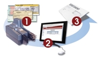
remote deposit capture Recently, we've focused on one aspect of paper-check conversion, so-called remote deposit capture, where a business deposits paper checks by converting them into electronic items instead of driving them to the bank. It's an important new service that benefits both the bank and the end user.  

However, there is more to this story than saving businesses at trip to the branch. There is also a significant opportunity for capture at branch locations, including:

  • Capture at the ATM (in-branch or off-site)
  • Capture by the teller
  • Capture by the customer at an in-branch kiosk)
  • Hybrid model with customer doing some of the work with the branch staff assisting 
  • Capturing in the branch back office (i.e., not at the teller line, but later in the process)
  • Capture at a third-party such as a UPS Store or check cashier

An insightful summary of the issues was published Friday by Gonzobanker's Terence Roche  http://www.gonzobanker.com/article.aspx?Article=314. Previous Netbanker coverage is here.

Who Cares about the Bank Branch “Experience”?

Editor's Note: I've been sitting on this post for a few weeks because I don't want to sound like I'm on a virtual soapbox. But since so many influential banking execs were in attendance, I feel it's important to provide an alternative view. So…

<Climbing on soapbox> Am I the only one who thought the "branch experience" keynote at November's BAI Retail Delivery Conference was about 5 to 10 years behind the times?

Sure, I like the Umpqua Bank story as much as the next person, probably more so. I went to CEO Ray Davis's talk in a back room at Retail Delivery about ten years ago and was blown away by his retail innovations. It's in the top four or five most memorable presentations I've ever heard, and I'm glad the strategy has worked so well for them.

And I'm all for remodeling branches to keep up with times, but the Microsoft-produced video he showed, which was shot in Umpqua's Pearl District branch in Portland, was so far-fetched it bordered on ludicrous. (Note: This was Microsoft's "vision" of banking's future, not the bank's. Umpqua merely provided the futuristic location. Here's Microsoft's press release.)

The video intended to demonstrate how in the future a fully networked high-tech, high-touch branch could serve customers better was visually appealing, and, if there was no Internet, it might even be on the mark. But why would the wired diva in the video pay $20 to take a cab to a branch to complete her mortgage application? Surely she would have logged in, perhaps via video conference if needed, and handled it from her home or office, saving not only the $40, but also the half-hour trip. 

Umpqua succeeded because it's a great community bank, not because it had its own brand of coffee and Starbucks-like interiors. Those gimmicks grabbed attention and brought in new customers, but the bank thrived because it created an environment where its front-line employees were able to pay attention to customers and serve them better than its mega-bank competitors.

But today it would be a waste of resources to embark on a strategy similar to Umpqua's. By the time it would become fully implemented, 2009/2010 at the earliest, the world will have moved still further from the old apply-for-your-mortgage-in-our-lovely-branch model.

What's far more important going forward is the "out-of-branch experience" online, phone, and mobile-phone hybrids. You will have ten, twenty, even 100 times more interactions with your customers outside the branch than inside.

Yes, those branch interactions are still vitally important, especially if they involve a new account or serious service issue. But branches will never again be the driver of customer satisfaction they once were. Bank on it. <Stepping down now>

For more information:

Bank-Anywhere.com Launches Branch Locator Mashup

For some time now, branch/ATM locators have been standard feature on banking websites. They began in the late 1990s as crude lists providing an address and maybe a phone number.

Today, locator tools are more robust, with branch hours, maps, pictures, and more. Still, many provide a simple listing instead of the locations pinpointed on a map. 

Sovereign Bank branch locator CLICK TO ENLARGEFor example, here's the output from a search at Sovereign Bank for all branches and ATMs in zip code 10019 (click on inset for closeup).

The list is well laid out, but you must wade through it to find the closest branch, then drill down through the links to find more details and a map.

Compare that to the tool at Bank-Anywhere.com <bank-anywhere.com>, a mashup of Google Maps and the FDIC branch location database <www.fdic.gov>. Here's a list of all banks in my zip code 98115. Clicking on the bank icon or the list on the right side triggers a pop-up callout with additional info.

Bank-Anywhere.com tool CLICK TO ENLARGE

Branch-Anywhere is in public beta after a Sept. 15 launch (see its blog). The company behind it is Dash Space, a Vancouver, BC-based developer with such a low profile they don't appear on Google searches. They did respond promptly to our email questions (email here).

Analysis
Financial institutions should consider using a similar approach on their websites and either program the function themselves, or outsource it to Bank-Anywhere.com or others. It is important for this logical link to make a good first impression with potential customers of your bank. The Ajax-based map not only looks more sophisticated and up-to-date, but also is easier to use.

Union National Bank’s Gold Cafe

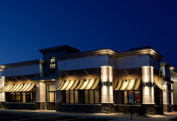
Unionnational_goldcafe_logoTalk about thinking outside the box: Instead of serving coffee in its branches, Union National Community Bank <uncb.com> is serving checking accounts in a cafe. Unionfinancial_goldcafe_pic_1The $400 million bank, headquartered in Mt. Joy, Penn., is using a strategy similar to ING Direct, except UNCB has gone as far as to remove its brand from the name, calling the financial store "Gold Cafe" (see picture right).

The cafe features a full retail coffee operation with coffee, lattes, tea, smoothies and so on priced at $1.45 to $4.45 and pastries and desserts from $1.75 to $2.25. The coffee service is run by Lancaster County Coffee Roasters.

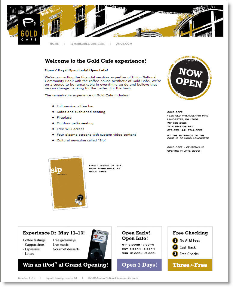
Unionnational_goldcafe_homepageThe branding has also been extended to its website, GoldCafes.com, where the concept is supported with an emphasis on the lengthy hours, 6:30 am to 7:00 pm, Monday through Saturday, and noon to 5:00 pm on Sundays, 82 hours in total. The website also features information on an iPod giveaway during its May 11-13 grand opening. The only banking product mentioned is free checking in the lower-right corner (see screenshot).

The branch, er cafe, located near a major community college in Lancaster, Penn., includes a coffee bar, couches, an outdoor patio, fireplace, free Wi-Fi, and the ubiquitous plasma screen monitors. The bank has also created Sip, a "cultural newszine" available only in the cafe. A second cafe is set to open later this year in Centerville.

Analysis
We can't predict whether this concept ultimately works. Although we like the new-age branch concept popularized by Umpqua and others, this might be over the top. One of the biggest reasons to build branches is for their advertising value, placing the bank's brand in front of thousands of commuters and errand-runners each day. By calling it the Gold Cafe, the UNCB loses the normal branding value, but the highly unusual strategy will generate a large amount of publicity, overcoming the initial customer confusion of using a bank named "Gold Cafe." However, this is a unique situation that wouldn't readily work for other financial institutions.

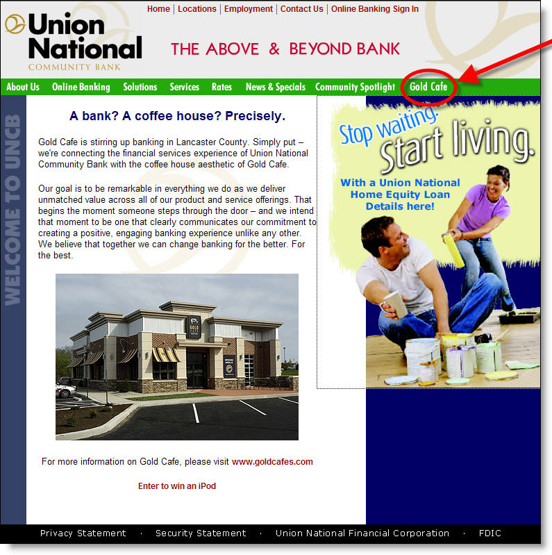
Unionnational_goldcafe_homeThe initial website is just a single page (see above) and badly needs an upgrade to cash in on all the publicity. At a minimum, prospective customers should be able to get a virtual tour of the cafe and open an account online. The site will be heavily visited by banking analysts and reporters and should do a better job supporting the publicity it's bound to attract, although the parent's home page does include a series of photos of the new concept along with a Gold Cafe link in the main navigation (see screenshot right).

If anyone has a chance to visit the branch, let me know what you think of it.

JB

Bank Branch Website Pages

Firstnorthern_thatsmybankIt's no secret that a vast population researches online and buys offline, as much as 50% of your customer base according to recent research by Yahoo Search Marketing (NetBanker April 24). Whether the practice has evolved from habit, security reasons, or a need for face-to-face interaction, it's an important dynamic for financial institutions that have billions invested in retail branch networks.

Until consumers are ready to give up the branch experience, an important function of financial institution websites is to funnel prospects into the branch. Most banks now have prominent branch/ATM search functions.

These tools, often outsourced, usually provide good utilitarian results: name, location, hours, phone, and directions. This is enough information for current customers just looking for the closest place to pick up $100 with no ATM fee or deposit the rebate check from Procter & Gamble.

But as a sales tool for prospects considering a major purchase such as a new checking account or mortgage, the typical "branch finder" leaves a lot to be desired.

Analysis
Considering how inexpensive it is to post content online, why is it that banks do so little to help their branches create a unique presence online? After all, bank "stores" are usually multi-million dollar operations with aggressive sales and profitability goals. Even our tiny US Bank branch, staffed with two or three employees, plus a security guard, is surrounded by $500,000+ homes where the largely middle-class owners often have equity of $300,000 or more.

Why doesn't my branch use every tool in the book to tap into this market? Just one or two additional home equity loans per year would pay for a killer website. 

We know the reasons banks keep branches from attempting their own creative marketing efforts: low-budget fliers may not align with company graphic standards; complicated disclosure rules must be followed; branch efforts might conflict with larger "branding efforts," and so on.

Those arguments don't hold as much weight online. Banks could employ a content-management system that allowed branches to customize their personal webpage for use in neighborhood marketing efforts, and that would be more likely to pull a website visitor into their branch.

While we've reported on several of these efforts over the years, it's still difficult to find a comprehensive "bricks-and-clicks" effort. We recently came across Thatsmybank.com from Sacramento-based First Northern Bank (click on screenshot upper left). While the bank does better than most with a branch page that includes a picture of the branch and branch manager along with the names of lending officers, it is still very basic. It doesn't even include the email address of the branch or any of the key contacts.

Huntington_mtg_loanofficerpagesMortgage banks have done a better job. Wells Fargo Home Loans has had individual Web pages for its lending offices for several years. Huntington Bank also provides each mortgage loan officer their own Web page (click on inset for closeup). The page is tightly controlled. The mortgage officer uploads a picture, fills in basic contact info, then adds a paragraph about themselves and their lending specialty.

The template is completed with a list of local links provided. The only interactive element is the mail-to link that allows visitors to send an email to the loan officer via the user's email client.

Action Items
We believe branches should have a larger Web presence than just name, address, and phone number. Consider installing a content manager that allows branches to input custom localized content. It's a cost effective way to help branches and loan officers leverage their community connections and unique expertise.

JB

Free Wi-Fi in Bank Branches? Wi not?

Freewifi_1 Providing free wi-fi is like offering a toll-free number 30 years agoa consumer-friendly way to make you stand out from the crowd. But unlike call centers, which have grown into multi-million dollar cost centers, free wi-fi only  runs about $50 per month per location, a price that is sure to fall over the coming years.

There are two ways to jump on the wi-fi bandwagon:

  1. Offering access to users in branch lobbies
  2. Sponsoring free access at local gathering spots such as coffee shops, community centers, or libraries

AnalysisUmpqua_lobby_3
If you are of the branch-as-a-retail-store mindset such as Washington Mutual's Occasio concept or Umpqua Bank's plasma-TV zones (see right), then free wi-fi is a great way to bring customers into the branch and keep them there (until presumably they buy something). Even more important than the opportunity to sell checking accounts to laptop-toting visitors, is the publicity you'll receive as the first bank in your area to offer such a trendy service. Only 15 U.S. bank branches currently offer wi-fi access according to JiWire (see Appendix below).

If you are concerned that high-schoolers looking for MySpace friends will inundate your lobby, you can let the coffee shop across the street provide the seating while you sponsor free Internet access (through a service provider).

With either approach you can require users to enter a bank-branded screen first, register, and create a wi-fi access username and password for subsequent access. You can then use this information to market your online banking and other services.

-JB

Appendix: Wi-fi in U.S. bank branches
JiWire lists 110,512 wireless Internet "hot spots" worldwide in its online database <jiwire.com>. Fewer than 1,000 are at bank locations, mostly in South Korea. In the United States, only 16 bank branchesout of about 80,000currently offer wireless Internet access to customers, at least according to JiWire (see list below), and six of those are in the San Francisco area:

US Bank – 2 branches in the SF Bay area
Citibank – 1 branch in the SF Bay area
Integra – 1 branch in Indianapolis, IN
Bank of America – 2 branches in the SF Bay area, 1 in Miami, 1 in Norwalk, CT (Fleet)
Union Bank of California – 1 branch in the SF Bay area
First National Bank – 1 branch in San Diego
First National Bank – 1 branch in Hutchinson, KS
Cass County Bank – 1 branch in Queen City, TX
Charter One Bank – 1 branch in Cleveland, OH and 1 branch in Albany, NY
Umpqua Bank – at least 1 branch in Portland (reported in the press, NOT in JiWire listing)

American Express Builds City Brands

Amex_inny_logoFinancial institutions have done amazing things with their websites since Bank of America launched the first major commercial banking site 11 years ago (Sept. 1994). However, other than single-market credit unions and community banks, there hasn’t been much attention paid to localizing the content to appeal to more narrow geographic segments, for example the customers in a single city or neighborhood.

Beginning a year ago, American Express began a campaign to bring specialized city-based cards to major metro areas. The cards are intended for the 25-to-35 year-old hip urbanites. The card design, marketing, and rewards all cater to the dining out, clubbing, and museum-going single scene.

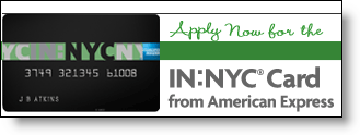
The first card, IN:NYC <innyc.com> launched a year ago (30 Sep 2004) and was discussed in a front-page WSJ article today. The company won’t disclose any results, but did say that 90% of its customers have not previously owned an American Express card, an important statistic for a company worried about cannibalizing its other products.

The IN:NYC card has its own look, website, and rewards program focusing on unique beyond-the-velvet-rope experiences in local clubs and eateries. In an interesting viral marketing strategy, friends are able to pool points in order to qualify for bigger rewards, such as a VIP table in a hot club.

The key cardmember benefits include:

  • 0% Introductory APR for 6 months on purchases and balance transfers
  • No annual fee
  • Option to carry a balance
  • One INSIDE Rewards point for every dollar spent
  • INSIDE Double points on City Essentials

Amex_inchicago_websiteThe second city card was launched this month (19 Sep 2005) in Chicago. The IN:Chicago website is still a static billboard (see inset). Another card is in the works for Los Angeles, IN:LA, which is expected to launch later this year, although the company has yet to secure the rights to the website, inla.com.

Action Items
Many large banks alter their website content by state. However, the customization generally does not extend beyond minor pricing differences.   

To better compete with local institutions, banks should use their websites to deliver highly-customized geographic content. Event calendars, discounts, and other local event marketing could create better brand recognition and more word-of-mouth advertising opportunities. It would also give local branch staff more ownership of "their" website. Banks could use an easily remembered URL such as <ny.wamu.com> to house their local versions.

JB

Leveraging the Paper Bank Statement for Marketing

When looking for ways to drive more customers online, don’t neglect your paper statements, especially the envelope.

We recently opened a Citibank checking account and were impressed with the online banking pitches on the back of the envelope carrying our first monthly statement.

On the rear flap:

Life is different from day to day.
         So is a bank account.
          citibankonline.com

Across the main body of the rear envelope:

Receive email and wireless banking alerts on balances, deposits, and checks cleared

See bank statements online up to 7 years back.

Track paid checks online shortly after they clear.

Move money across accounts in the US or abroad

And, this is very clever. On the INSIDE of the envelope, framed inside the front window (when the statement is removed):

citibankonline.com
Sign on today!

Finally, on the rear flap of the envelope that carries business credit card statements, our favorite:

If you saw your statement online,
you’d already know what’s in this envelope.

Analysis
Using the back of the envelope is hardly a major marketing initiative. But given that it’s essentially free, why not use it at the precise time when users are thinking about their account?

JB