Solving the False Positive Problem in Credit/Debit Authorizations

Solving the False Positive Problem in Credit/Debit Authorizations

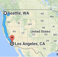
seattle_laFor the third year in a row, I traveled from Seattle to the L.A.-area to drop off my son at college. And for the third year in a row, Bank of America declined my card at Target, buying groceries and incidentals for him. And this time it was an EMV chip-card. Thank goodness I had my trusty Capital One card along, because it seems to do a far better job minimizing false positives (for fraud), at least for my account.

Capital One did have its concerns along the way, though. They sent the following email asking for confirmation that these gas-station authorizations were mine. And even though I didn’t respond right away, perhaps 12 to 18 hours later, they never shut off my card.
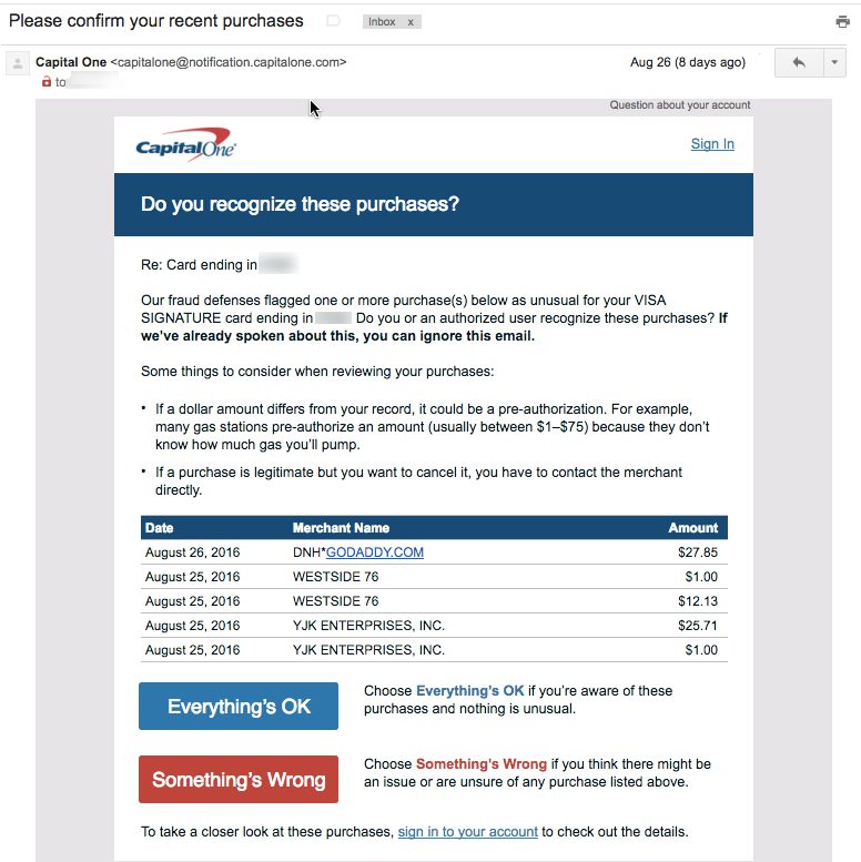
capital_one_charge_confirmation

Bank of America also sent a similar email, but it arrived AFTER the card was declined. I understand the bank’s need to terminate suspicious transactions, but is it really that suspicious? For three years running, I’ve shown up in Los Angeles the last week of August (along with visits in between) and gone on a bit of a spending spree to stock my son’s dorm and now apartment (you’re welcome, boys!). Furthermore, I had already used the card to book an L.A. hotel, make some low-level but consistent charges along the way, coffee at Seatac, lunch in West L.A., and so on. But when I try to buy $150 in groceries at Ralph’s or Target, the card is declined, and worse, completely shut off from further purchasing.

Bottom line: My point here isn’t to complain about one issuer’s fraud-handling (although it felt good to get that off my chest), but to implore once again for more integration with smartphones to reduce false negatives. Specifically:

  1. Talk to me on the most immediate channel. Both banks sent emails, but I’m on the road, not checking emails. Pop a notification on the screen and send me a text message. Also, in instances of two account holders, make sure fraud alerts go to both (BofA emailed only my wife).
  2. Know me better. I get that Target in Tustin is outside my normal spending bubble. But I have a history of making charges in that area for 2+ years, so cut me a little slack.
  3. Better yet, know where I am. How many hundreds of millions could BofA save by tracking cardholder whereabouts in the background? I let Starbucks, Google, Yelp, and so on track my location. The benefits of them knowing where I am outweigh the privacy risks. The same goes for my bank.

——————–

iContactHeaderFFNote: Looking forward to seeing everyone at Finovate this coming week. Let me know if there is anything you want to discuss (jim@finovate.com).

Marketing Minute: Optimizing Emails for the Small Screen

Marketing Minute: Optimizing Emails for the Small Screen

Recent email marketing research found that two-thirds of Americans regularly check email via smartphone and a significant number of total opens (as high as 70%) are now opened on a mobile device. Since most emails that look good on mobile look fine on a desktop (but NOT vice versa), you can pretty much disregard the desktop when creating a design template for your email alerts and marketing messages.

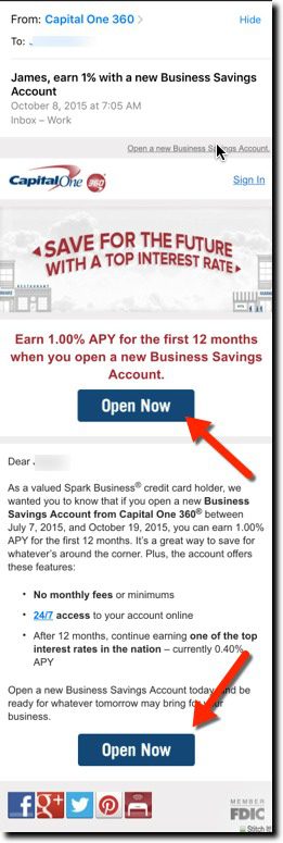
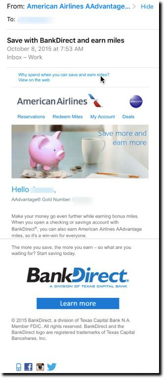
Here’s a few examples from my inbox during the past few weeks. Both Capital One and BBVA’s Simple use appropriate font size and a good mobile layout. Simple does an especially good job at grabbing attention with a small animation at the top of the message. In comparison, the BankDirect pitch is not well optimized for mobile, though it’s readable if you work at it. But it does nothing to grab your attention visually.

——–

Bank email samples (viewed on iPhone 6)

First: Business Savings account promo from Capital One
Easy to read opening line and big Open Now buttons on first screen and below the fold

Second: BankDirect to American AAdvantage mileage club members
Harder to read the small type, and call-to-action is below the fold

Third: Simple announces its 100%-no-fee policy change
Grabs attention with small animated graphic at top with big “Hi FirstName” visible on first screen. The remainder of message is in a font easily read on a mobile phone:

capitalone_email bankdirect_americanair_email simple_email2

FinDEVr Live: Capital One Enables Continuous Integration and Delivery for Developers in Regulated Environments

FinDEVr Live: Capital One Enables Continuous Integration and Delivery for Developers in Regulated Environments

CapitalOne_homepage_FinDEVr2015

capitalone.com | @CapitalOne

CapitalOne_FinDEVr2015_logoCapital One Financial Corporation is a financial holding company—subsidiaries include Capital One, N.A. and Capital One Bank (USA), N.A.—with $208.8 billion in deposits and $310.5 billion in total assets as of June 30, 2015. Headquartered in McLean, Virginia, Capital One offers a broad spectrum of financial products and services to consumers, small businesses and commercial clients through a variety of channels. Capital One, N.A. has branches located primarily in New York, New Jersey, Texas, Louisiana, Maryland, Virginia, and the District of Columbia. A Fortune 500 company, Capital One trades on the New York Stock Exchange under the symbol “COF” and is included in the S&P 100 index.

Continuous integration and delivery in a regulated environment
Financial institutions are required to comply with numerous regulations. Considering they are responsible for other people’s money, they should. While regulations are often seen as limiting the ability for a company to move quickly, this does not have to be the case. In this talk you will hear that it is possible to continuously integrate and deliver in a regulated environment, ways it can be done, and the lessons learned from an organization that is already making huge strikes in this area.

Key takeaways:

  • Continuous integration and delivery are possible in regulated environments
  • Things to consider if you are regulated and want to make the move to CI/CD
  • Challenges to be faced internally and with regulators on your journey

capitalone_findevr

Presenter: Gill Haus, Capital One’s Managing VP, Digital Innovation, Retail and Direct Bank
LinkedIn | @oronhaus

Haus is responsible for building and sustaining an innovative technology organization while fostering a culture of excellence in software engineering and digital product development.

Feature Friday: “Combine Usernames” from Capital One

Feature Friday: “Combine Usernames” from Capital One

Capital One just updated its Wallet iPhone app to include gift cards. That seemed like a good candidate for this week’s Feature Friday.

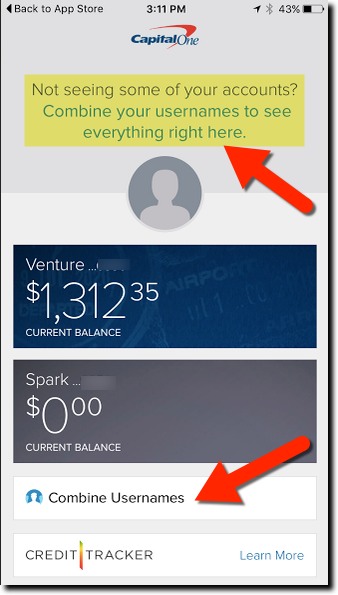
capital_one_combine_usernamesBut on the way to checking out the gift card feature, I ran into another new Capital One feature I love. It’s called Combine Usernames and it does just that. The option appeared automatically on the first screen when I first logged into the latest issuer’s standard mobile banking app (not the newer Wallet app) (see inset). The card giant noticed I had two usernames registered and offered to automatically combine them. It’s not something I’ve run into before, and it’s super convenient for those of us who can’t keep their digital life in sync. After selecting Combine Usernames near the bottom of the main screen, you are directed to a new screen with instructions to swipe to combine. I swiped and it worked immediately, although the page warned it could take up to 72 hours. I wasn’t sure what was lurking under my other username, but it turns out it was my old ING Direct (now Capital One 360) account. Now, everything’s visible on the app, and I’m in sync at Capital One. ———– I’ll cover the gift card function after I test it at Starbucks. Enjoy your weekend.

Mobile Monday: Helping Customers Understand EMV & Mobil Payments

Mobile Monday: Helping Customers Understand EMV & Mobil Payments

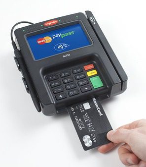
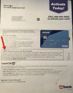
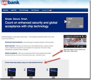
emv_dipThis week’s EMV “liability shift” in the United States is expected to be a boon for mobile payments. We are undergoing a massive expansion in number of NFC-enabled terminals, at a time when Apple and Android Pay are not only measurably faster than the more time-consuming “chip dip”, but also more secure. That’s a HUGE change in the “relative UX” between the two options.

Savvy issuers should seize on the negative publicity and confusion around EMV plastic cards and push NFC options, both within the native app and on desktop and mobile websites.

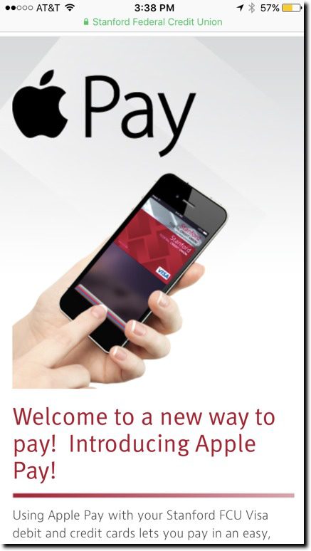
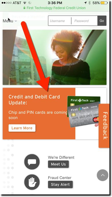
But from what I saw today during a tour of several dozen major bank and credit union mobile sites (using iPhone 6), very little is discussed about this change. In fact, none of the 25 largest banks address it on their mobile homepages. I finally found one mid-sized credit union that addressed EMV (First Tech Federal Credit Union) and another that mentioned Apple Pay, albeit a few screens down (Stanford Federal Credit Union), but neither of them addressed both issues (see screenshots below). Both CUs have responsive homepages, so the messaging was the same on both the desktop and mobile web.

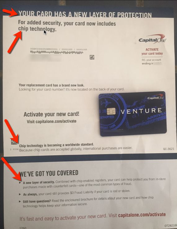
Most issuers address basic EMV questions when sending new chip-cards to customers. But I’m guessing that:

number of cardholders who read the EMV instructions
x
the number that understood it
x
the number that remember it
=
zero

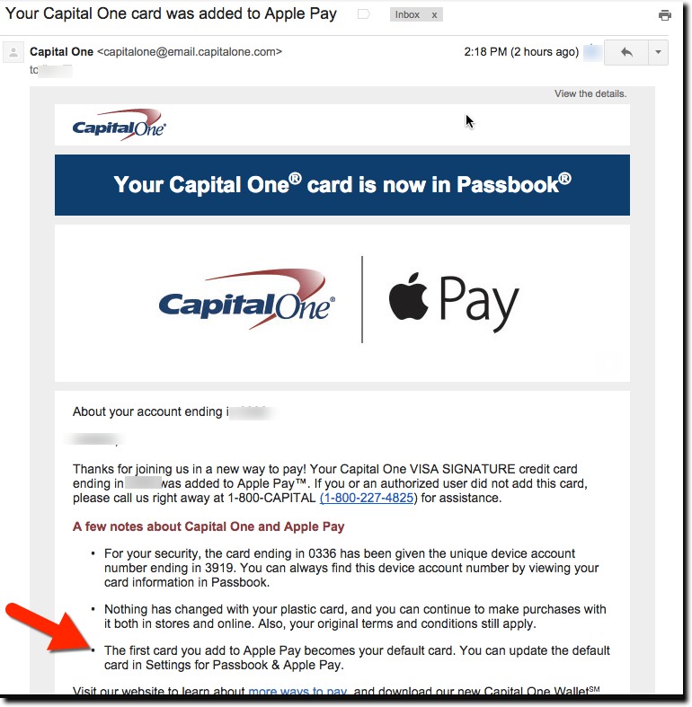
This is a good opportunity to get your cardholders on board with Apple Pay and Android Pay. And don’t forgot to help them understand how to make your card the default in the Apple Wallet (previously called Passbook). Refer to Capital One’s email explanation sent to cardholders after adding their card (screenshot below).

———–

Mobile website homepages from Stanford Federal Credit Union (left) and First Tech FCU (right)
As seen on iPhone 6 at noon, 28 Sep 2015

stanford_FCU_mobilehome 1sttech_mobilehome

———-

Capital One email sent to cardholder minutes after adding card to Apple Pay and authorizing through Capital One mobile app (28 Sep 2015)

capitalone_applepay_email2

——–

FinDEVr2015LogoV2DateWe will be addressing issues in EMV, mobile payments, and much more at Finovate’s second annual developers’ event, FinDEVr, 6/7 October in San Francisco.


Tuesday Tactics: The Art of Bank’s Own-Site Search

Tuesday Tactics: The Art of Bank’s Own-Site Search

37948595_sOne area that’s long been marked “needs improvement” on most banks’ digital report cards is site search. But it’s getting much better. Five of the 10 largest U.S. banks—BofA, Wells, Citi, Capital One, PNC—now offer “autocomplete suggestions” something even Google didn’t fully implement until 2008.

That’s great progress, but even at these digital leaders the search results can fall short. Most FIs still present a laundry list of results with some sorting for relevance. For easy searches such as “checking,” all the majors deliver relevant results. But only one takes it to the next level, Capital One (also an honorable mention to BB&T for including thumbnail pictures, making results look much more interesting, and to PNC, for including product recommendations for some searches, e.g., “checking”).

capitalone_search_suggest1

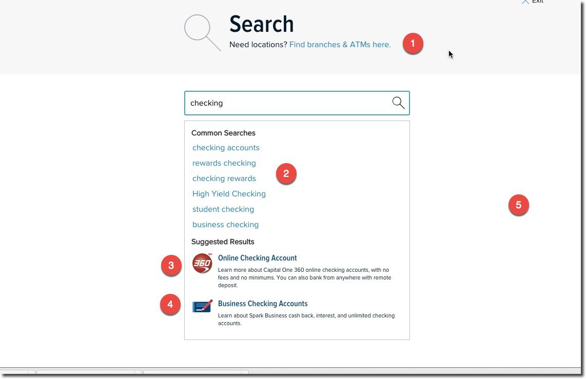
Of the 10 U.S. megabanks, Capital One is by far the winner in our search for good search. They do five things in the initial search that most others do not:

  1. Since search is often related to branches/ATMs the bank includes a link to that at the top of the search page (see #1 in screenshot)
  2. The suggested search terms are well curated (see #2)
  3. Most-likely product-results are included at bottom with eye-catching graphics (see #3)
  4. The bank does not automatically assume you are a consumer. In this example, they showed links to both consumer (interestingly, only to the 360 products inherited from ING Direct) and business checking (see #4)
  5. The UI is very Google-like with lots of white space and no distractions

————–

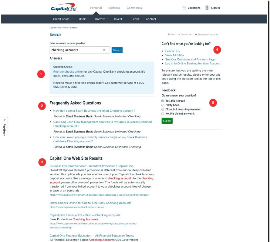
In addition, Capital One’s search-results page is laid out in a user-friendly manner:

capitalone_search1

There are five key sections (noted above):

  1. Capital One assumes all searches are “questions,” so it provides the most likely answer in a shaded box at the top of the search results
  2. Other curated FAQs related to the search-term
  3. Full site-search results
  4. Contact Us section for more help
  5. Feedback loop

———-

Interestingly, unlike the other nine mega-banks, Capital One does not offer site-search directly on the homepage. A search icon is prominently located on the top right, but the bank takes you to a separate page to begin the search. I prefer searching directly on the homepage, but that’s not nearly important as delivering relevant and well-structured results.

———

Note: We looked at these major U.S. retail banks: Bank of America, BB&T, Capital One, Chase, Citibank, HSBC, PNC Bank, Suntrust, US Bank, Wells Fargo

———-

FinDEVr2015LogoV2DateWe’ll be delving deep into issues like this at the second annual FinDEVr event for digital bank builders on 6/7 October in San Francisco.


Features: Capital One to Add Receipt Capture to Mobile App

Features: Capital One to Add Receipt Capture to Mobile App

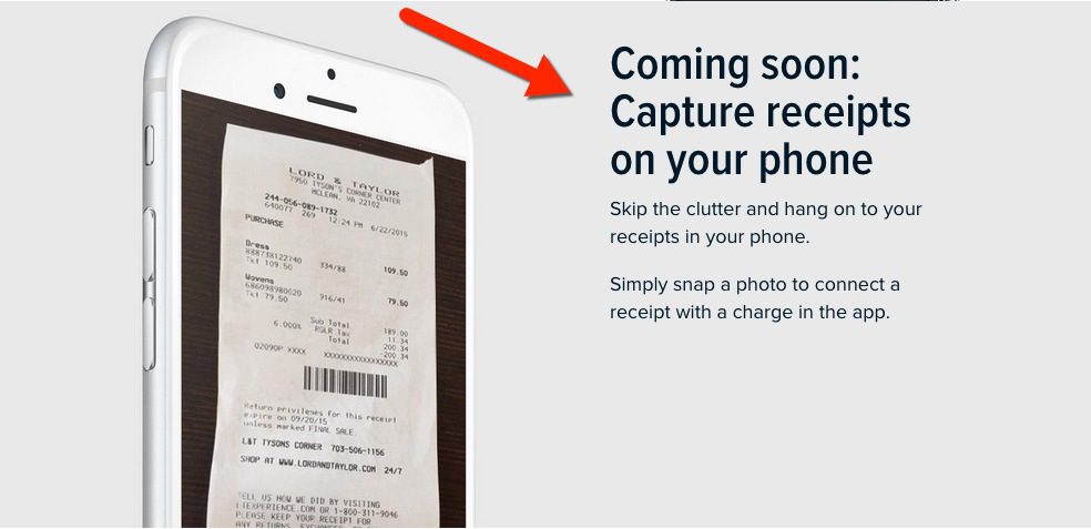
capitalone_reciept_capture

Capital One sent an email (see below) to customers two days ago promoting a new version of its Wallet mobile app. Although it’s not mentioned in the email copy, when you click “Get Started” the resulting webpage (see above) reveals that the bank is about to add receipt-capture to its app.

Normally, I’d save this news for a Feature Friday post. But I’m so excited to finally have integrated receipt capture on one of my cards, I just had to hit publish. Of course, it’s “coming soon” so I can’t give you any insight into how it works, or if there is an OCR component. But the website copy does mention some level of integration, just not whether it’s automatic (OCR) or manual:

Simply snap a photo to connect a receipt with a charge in the app.

American Express offers this capability, Chase on its Ink small-biz app, as well as Expensify and a few other fintech startups. But Capital One is the first big Visa/MasterCard consumer issuer (that I know of) with the feature. I’ll let you know how it works.

—–

Capital One email announcing the remodeled native Wallet app (31 Aug 2015):

capone_email_redesigned_app


—–

Update (3 Sep 2015): I omitted the Chase Ink card in the original post.

Feature Friday: Capital One Helps Users Identify Recurring Charges After Card Reissue

Feature Friday: Capital One Helps Users Identify Recurring Charges After Card Reissue

capitalone_mobileCard reissues after a data breach, or lost/stolen situation, are annoying for cardholders. But it’s even worse for the issuer who has to pay for a new card, hound the customer to activate it, handle customer-service calls, and then risk losing recurring revenues from now-broken automated pre-authorized charges.

So kudos to Capital One for taking an important step in solving this problem.

Earlier this week I received a new card and number from Capital One, presumably because my card had been involved in a breach. I am not aware of any unauthorized attempts to use it.

In a followup email this morning, the giant issuer reminded me to activate the new card. That’s a fairly typical technique these days. But the help didn’t end there. The bank provided a list of likely merchants where I may need to update card info to avoid the charge being denied (see screenshot below).

That’s great customer service and something I’ve not seen before. But of course I want more. The list I received was primarily merchants where I made one-off payments. Who has a recurring charge with United Airlines? So it needs to be scrubbed better. And it would help to include the most recent charge amount and number of charges to help identify actual recurring charges.

And ultimately, it would be even better if the process was semi-automatic. Let me respond to the email with a simple yes/no response for each merchant indicating if I wanted them to continue the automatic billing under the new card number. Or at least provide links to reduce the friction of the task.

But all-in-all, a welcome improvement.

———

Capital One email to cardholder (19 June 2015)

capitalone_email_recurring_new


Riding the Uber Wave: Capital One Rebates 20% for 1 Year

Riding the Uber Wave: Capital One Rebates 20% for 1 Year

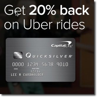
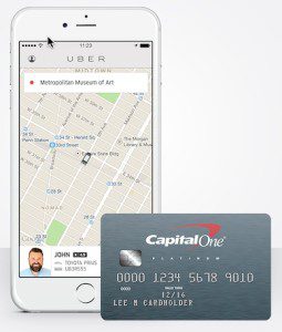
uber_capitalone_phoneLast week, Capital One launched a national marketing promotion with Uber that provides a 20% rebate on rides for one year. And unlike many (most?) card offers, it’s good for both new and existing Capital One customers. However, the ride-rebate applies only to the bank’s Quicksilver cash-back card, so I’m out of luck with my Capital One Venture card.

But they did throw us non-Quicksilver customers a bone yesterday, with an email (see below) offering two free Uber rides (up to $30 each). For me, that’s probably about the same as the 20% rebate, so I was ready to fire up the app and swap out my Bank of America card. But wait, there’s that pesky fine print again. It turns out the free rides are only for new Uber customers. Out of luck again.

capone_uber_landder

Analysis
Overall, this is a great promotion. The bank gets both new cardholders plus a pile of Capital One cards stored in Uber’s app, a great retention tool (the primary goal?) along with a long-term revenue stream (albeit, not enough to recoup the cost of the 20% rebates, unless Uber is picking up a big chunk of the rebate).

The only thing I don’t like is the disingenuous email to non-Quicksilver customers. Capital One alludes to the fact that the free rides are for new Uber users (see highlighted body copy in screenshot below). But that statement is easy to overlook or misinterpret. It’s only when you get to the tiny type below, which is further hidden in a gray background (see highlighted fine print below), that the “new Uber customer” requirement is explicitly stated.

Why not just come out and say it clearly in the body of the email (or even in the subject line)? Existing Uber customers are going to find it anyway when they try to redeem. Just be clear up front and save everyone the hassle! Better yet, don’t send the email to cardholders who are already using Uber (that could have been determined with an email match for me).

Final thought. Why not provide all cardholders an incentive to enter any Capital One card into the Uber app? Remind rewards cardholders that Uber rides can be paid with points (e.g., Purchase Eraser). Or how about a sweeps? For example, one out of every 100 rides (or 1,000) are free to Capital One cardholders until May 30, 2015. That could be funded through interchange alone.

——-

Capital One email to its Venture cardholders (23 April 2015)
Note: Highlighting mine

capitalone_uber_email

Capital One’s Well-Designed "Suspicious Activity" Email Alert

image I’ve used Capital One’s credit card fairly actively for the past 4 or 5 years. And they’ve rarely, if ever, declined a charge (and there has never been any fraud on the card). The last fraud message I can find in my email was in December 2011 (see last screenshot). But apparently our travel combined with extra holiday spending finally caused the banks’ fraud system to flag our account, rejecting a $100+ Target purchase a few days after Christmas.

I have Capital One’s mobile wallet installed which pushes near-real-time notifications to the lock screen (iOS). I did receive a notice I’d been declined, but no word on why or what to do about it. But luckily the issuer’s email system handled that task admirably. Within a few hours I received an excellent email detailing the five most recent charges, and providing a simple "all clear" button that was clickable within the email, a major improvement over issuers who merely tell you there is suspicious activity and make you call or login to find out the details.

___________________________

Analysis
___________________________

This is the best suspicious activity notice I’ve ever received. Typically, I receive message similar to Capital One’s "old" version imploring me to call the bank (see last screenshot). However, there is still room for improvement, especially in the reporting process.

As much as the fraud folks desire a concrete yes/no answer, the real world is often full of gray areas. In this case, I was sure that I’d make all these transactions, but often that’s not the case. Sometimes you don’t recognize a merchant or your spouse may have made the charge or you simply don’t recognize something you may have authorized a while ago. There needs to be a third option here, "I’m not sure." Furthermore, when faced with a list, users should be able to address each transaction individually.

In my case, clearly the Target purchase triggered the red flag. It was a large amount, I rarely shop there, and I’d just flown 2,000 miles from my previous transaction the day before. In reality, the other transactions were pretty meaningless to the fraud detection algorithm. Even if I couldn’t remember one of the previous four routine transactions, Capital One wouldn’t have wanted to shut my account down. They’d already lost a few dollars on the declined Target transaction, there was no reason to compound that loss with costly calls to customer service to vet the other transactions.

Finally, I’m not a fan of the web pages presented after clicking on the "Everything’s OK" or "There’s an issue" button (see second and third screenshots). The bank gets points for thanking me for my help, but they forget to apologize for the inconvenience of declining my purchase at Target. It’s pretty embarrassing to be standing at the checkout with a basket full of goods while everyone thinks you are a deadbeat.

The webpage responses don’t go very far it telling me what to do next. Even if I’d given the all clear, I still have questions. Which of the transactions, if any, were declined? Will the declined transaction go through now that I’ve said it’s OK? And how can I avoid this in the future.

And if I did have issues with one or more of the transactions, the only option is to call the bank, and there isn’t even a number supplied. Aren’t there self-service options at this point that could save everyone some time?

—————————–

Suspicious activity email from Capital One (28 Dec 2014)

image


Webpage after clicking "Everything’s OK" above

image

Webpage after clicking "There’s an issue" above

image

Previous Capital One Fraud Alert (16 Dec 2011)

image

Capital One Uses Email to Request Cardholder Income Update

I’m always on the lookout for digital process improvements, from the major to the minor. And this one definitely falls in the latter category. But in my 22 years of banking online, I don’t recall ever being prompted to update my income so that my card issuer could reconsider my line size.

But that’s exactly what I received this morning. At first blush, it almost sounded like a crafty fraud attempt. But Capital One wisely inserted my full name, the last four digits on the account, and promised to handle it in just 60 seconds (see first screenshot), so I’m pretty sure it’s legit. They also reassured me that it won’t require a credit bureau inquiry. 

Clicking through the email places the cardholder onto the normal online banking login screen. After logging in, you are sent directly to an account-update page (screenshot 2) to update income and employments status. After completing the two fields, you are thanked and can navigate to other areas or logout (screenshot 3). Total time expended = 87 seconds (Internet times were a little sluggish late afternoon on the West Coast).

Thoughts: This card dates back to 2010, so it’s possible they are on a four-year cycle to update income information; however, I just sent my W2 to Capital One two days ago for a mortgage refinance. So I have to believe this email was triggered by that; if so, it demonstrates solid CRM integration, although it seems curious that the bank wouldn’t just pull my income directly from the mortgage app.

All in all it was a painless experience, and I look forward to seeing whether the bank uses it to alter my credit line.

—————————————

Capital One email asking for an income update (2 Sep 2014)

image


Online banking page to enter info

image

After entering info

image