Skip to content

Finovate is part of the Informa Connect Division of Informa PLC

  • Informa PLC
  • About us
  • Investor relations
  • Talent

This site is operated by a business or businesses owned by Informa PLC and all copyright resides with them. Informa PLC's registered office is 5 Howick Place, London SW1P 1WG. Registered in England and Wales. Number 8860726.

More
  • Events▾
    • FinovateSpring
    • FinovateFall
    • FinovateAwards
    • FinovateEurope
  • Blog
  • Programs▾
    • Product Demos
    • Sustainable & Inclusive Demo Scholarships
    • Discounted Startup Access
    • Leadership Program
  • Best of Show
  • Videos▾
    • Demos
    • Finovate on Streamly
  • Podcast

Finovate Blog

Tracking fintech, banking & financial services innovations since 1994

Account opening

Feature Friday: Adding a New Authorized Card User

Feature Friday: Adding a New Authorized Card User
By Jim Bruene Posted on September 1, 2017
Categories: Account opening, Capital One, Credit/Debit Cards, Youth market

By my calculations, I’ve received more than 25,000 emails from financial institutions. But I don’t recall ever getting one, outside of an onboarding message, encouraging me to add an authorized user to my credit card account (see above). So congratulations to Capital One for finding something new to talk about in the last week of the real summer.

And it makes sense to push for new authorized users. It’s win-win. More revenues for the bank and improved convenience for the customer.

Case in point: I’ve been meaning to get a card for my son in college, so I’ll go with Capital One instead of my other options. It will cost the bank $2 for the chip card and mailer, maybe a few bucks for the credit check (though honestly, they don’t need one as I’m backing his spending) and some misc onboarding expenses. But with near-zero additional credit risk, most of the new interchange (and potential revolving) revenues will go right to the bottom. And they have a much better opportunity to turn my son into a long-time customer if they have a card in his hand now.

Bottom line: Capital One could improve the user experience once you click through the email (see UX analysis here). But overall, it’s a good effort.

Author: Jim Bruene (@netbanker) is Founder & Senior Advisor to Finovate as well as Principal of BUX Advisors, a financial services user-experience consultancy. 

Share this:

Send Post Twitter LinkedIn Facebook

Rocket Mortgage from Quicken Loans Provides Quick Takeoff for New Customers

Rocket Mortgage from Quicken Loans Provides Quick Takeoff for New Customers
By Jim Bruene Posted on March 28, 2017
Categories: Account opening, Mortgage, Refi & Home Equity, Quicken Loans

rocket mortgage homepage

Unless you are a hardcore cord cutter, you’ve seen a Rocket Mortgage spot since it’s big-budget launch at the 2016 Super Bowl. Quicken Loans has done a great job positioning itself as both quick, and easy, in the mortgage market. The new division accounted for $7 billion in mortgage volume last year, about 8% of the company’s total.

Last week I reviewed the UX/UI of its website. Other than the disconcerting upside down homepage graphic (which I admit, does align well with its advertising messages), the website does a great job engaging prospective customers and moving them through the sales funnel. I especially liked the beginning of the application process, which many banks and credit unions fumble.

rocket mortgage registration

Instead of trying to entice users to Apply, the mortgage lender simply asks them to Create your account, a simple and lightening-fast process that requires just name, email address and username/password (see above). Once that’s over, the lender can work on converting them to full applicants. This technique is especially important with a big considered purchase where consumers are tempted to procrastinate at every step of the risky and time consuming process of applying for a home loan.

Bottom line: Although Create your Account is much better than Apply as a first step, it would be even less intimidating if Rocket Mortgage just started with Registration, the universal first step for most sites.


Author: Jim Bruene is Founder & Senior Advisor to Finovate as well as
Principal of BUX Advisors, a financial services UX consultancy. 

Share this:

Send Post Twitter LinkedIn Facebook

Award-Winning First Tech Federal Credit Union Clearly Shows its Price Advantage

Award-Winning First Tech Federal Credit Union Clearly Shows its Price Advantage
By Jim Bruene Posted on November 3, 2016
Categories: Account opening, Account Switching, Credit Unions, Tech CU

money-best-bank

I’ve been following First Tech Federal Credit Union since my days as a Seattle-based banker. They were quite the thorn in our side, attracting all the Microsoft employees despite our integration with Microsoft Money.

Fast-forward two decades and the credit union is still going gangbusters, nearing $10 billion in assets and 425,000 members. Its latest coup was to nab a coveted “Best of” award from MONEY (aka Money Magazine). The publisher named First Tech The Best Credit Union for Everyone in its annual review of the best banks. First Tech was the only credit union mentioned. TD Bank and US Bank tied for Best Big Bank. Chase was named Most Convenient and First Internet Bank received top honors in the Online Bank category with Ally receiving an honorable mention.

Naturally, I headed over to First Tech to see for myself what had so impressed the Money editors, aside from great pricing. The CU has a bright and modern desktop site (although they still have some work to do on mobile). I especially loved the sales tool on the homepage (see below). The prospective member chooses their products, and the cumulative savings is shown on the right. It’s one of the best sales tools I’ve ever seen, although I would like to see a little more transparency on how the numbers were calculated.

first-tech-sales-tool

Bottom line: Consumers consistently rate switching banks as one of their least favorite tasks. To get someone to budge, you must get their attention with clear benefits. And if you are a low-cost, high-APY FI, there is no better way to do that than flaunting your money-savings benefits.

Share this:

Send Post Twitter LinkedIn Facebook

Capital One and US Bank Card Mailers Tout EMV Chip

Capital One and US Bank Card Mailers Tout EMV Chip
By Jim Bruene Posted on July 21, 2015
Categories: Account opening, Capital One, Credit/Debit Cards, Security & Privacy, Service, US Bank

Last week I received new credit cards from US Bank and Capital One, both containing microchips to support EMV terminals, the global standard finally rolling out in the United States over the next few years. Given the world’s obsession with tech, it’s a good time for issuers to toot their own horns a bit.

The Capital One card mailer did a good job doing just that. The entire mailing package was built to highligh the changes. The copywriting was excellent and there were multiple avenues for interested consumers to read more about the new technology. In addition to the expected copy on the front of the card mailer (Fig 1 below), there was an FAQ on the back (Fig 2 below), and a brochure included in the package (not pictured). Capital One built an explainer page on its website, but unlike US Bank (below), the URL is buried in FAQs on the back of the mailer.

capitalone_emv_mailer_front capitalone_emv_cardmailer_back

Fig 1: Capital One EMV card and mailer Fig 2: Capital One EMV card mailer back

US Bank, on the other hand, took a less-comprehensive approach with the mailer, but delivered much more on its website. The bank shoehorned an EMV explanation box onto the usual card mailer (Fig 3 below), and referred questions to an excellent explainer page on its website (Fig 4). Website visitors receive thorough explanations, how-to graphics, and a short video showing how to insert a chip card in a reader.

And the bank’s explanation of the new technology was a little verbose. It read:

NEW! Enhanced security with chip technology.
Your new card now features greater fraud protection—built right in. Whenever the chip card is used with a chip-enabled terminal, a unique one-time code is created for the purchase to be approved. This is nearly impossible for counterfeit cards to duplicate, so you can shop with confidence. Plus, with more merchants around the world installing chip-enabled terminals every day, you have a more secure way to pay—wherever you go.
See it in action at usbank.com/cardsecurity

That all could have been covered with one or two bullet points (for example, see Fig 1).

usbank_mailer usbank_emvcard_website

Fig 3: US Bank EMV card and mailer Fig 4: US Bank EMV card website explainer (link)

Recommended consumer messaging

Here’s what issuers should explain to their customers:

  • Your new card now contains a computer chip to help combat fraud
  • When you visit a retailer with new chip-reader technology, you may need to insert the chip-end of the card into the reader instead of swiping. Most likely the clerk will show you how to do it, but if you would like to see it now, watch a one-minute video at mybank.com/using-new-chip-card. If the retailer still has older equipment, just swipe your card as usual.
  • There are no changes as to how you use our card online or through your mobile phone.
  • No matter what technology the retailer is using, when using a US Bank card, you are always protected by our 100% fraud guarantee.
  • If you have questions, please email us at [email protected], visit mybank.com/chipcard, or call 1-800-mybanks

————

Notes:

  1. Click on any of the above images for a more detailed view.
  2. Nowhere does either bank mention whether it’s a debit card or credit card. For customers with both that should be clarified.
  3. Capital One moved the account number to the back, making for a very clean look. It’s also much easier to read when you manually input the card number into a website.
  4. I know it’s a pain from a support standpoint and probably has a horrible ROI, but I would sure appreciate an email address to ask specific questions. I have a “gold card” for a reason, an easy way to interact with customer service seems like a reasonable expectation.
  5. I recently received a new card from Simple, and surprisingly, it is not chip-enabled. That sure doesn’t fit with its high-tech positioning.
  6. Why is my US Bank “Visa Gold Card” now in 50 shades of blue (Fig 3, top left)? I like the new design, but seems like a name change is in order.

Share this:

Send Post Twitter LinkedIn Facebook

Mobile Monday: USAlliance Credit Union Puts Account Opening on Home Screen

Mobile Monday: USAlliance Credit Union Puts Account Opening on Home Screen
By Jim Bruene Posted on June 29, 2015
Categories: Account opening, Mobile Banking, UX

There is little doubt that mobile (and whatever it evolves to) is where the vast majority of customer interactions will take place in the not-so-distant future. So why do so many banking-app home screens look like they were overlooked in the design process?

To help you avoid the same mistake, and find inspiration, we’ll use our Mobile Monday to focus on native apps with interesting user interfaces or other distinguishing features. First out of the gate is the just-updated iOS app from Rye, NY-based USAlliance FCU. In its v1.2 update Friday, the 70,000-member credit union added a number of new features, iusalliance_mobile_home_newncluding Touch ID support.

But the key new development on the home screen was mobile account opening. The service is powered by Mobile Strategy Partners, a company founded by David Eads, who previously worked at mFoundry and Kony, both Finovate alums. USAlliance is the first of a number of clients the company has in the pipeline.

The USAlliance home screen is utilitarian and yet provides more functionality than 99% of other FIs, including most of the giants. Here are the key functions: Numbers correspond to the red number on the screenshot right:

  1. Contact Us: This is pretty common now, but is still hard to find on some apps.
  2. Apply: This is the big new addition, and rare among financial institutions.
  3. Onboarding help: There is usually a process to get logged on the first time. The CU has a large banner directing first-time users through the authentication process.
  4. Mobile banking functions menu: The bottom menu shows the functions available to logged-in members. Non-logged-in members get a message explaining the process.

Share this:

Send Post Twitter LinkedIn Facebook

Tuesday Tactics: Removing “Application” from your Deposit Account Sales Process

Tuesday Tactics: Removing “Application” from your Deposit Account Sales Process
By Jim Bruene Posted on May 20, 2015
Categories: Account opening, Deposits, Checking, Savings, CDs, Sales Techniques

chase_applynowIt has long been a pet peeve that financial institutions usually tell me to “apply” for a checking or deposit account. While I understand why it is an application, to the average consumer that verb choice seems so tone deaf. (Really? I’m sending you my money and you might not let me? I think I’ll move on to someone who actually wants my business).

Today, I was looking over a new digital checking accout from California Business Bank called MyCBB (press release) I noticed a centrally placed button on its home page that simply said: Enroll Now (see below, red arrow is mine).

mycbb_home

The new account features zero monthly fees, no minimum balance and a 0.79% APY, which is tops in the nation according to NerdWallet. It also comes with an unusual feature: No overdraft fee. But not because OD protection is built into a credit account. No, the account simply does not allow overdrafting. Period. All checks presented with insufficient funds are simply returned, with no charge to the account holder.

More verb usage
It turns out that many banks are making this wording change. Five of the top-10 U.S. banks, and the largest credit union, have also gotten rid of the word application as a first step in buying a checking account. Open Now is most common.

  • Wells Fargo >> Open Now
  • Bank of America >> Open Now
  • Suntrust >> Open an Account
  • Capital One (but not Capital One 360) >> Open Now
  • BB&T >> Open an Account
  • Navy Federal Credit Union >> OPEN NOW

If you are still using Apply, you might test some new verbs. If you have any trouble with compliance, just point them to BofA and Wells Fargo.

—————

Hat tip for the MyCBB launch: MyBankTracker

Share this:

Send Post Twitter LinkedIn Facebook

Tuesday Tactics: Creating a Winning Confirmation Page

By Jim Bruene Posted on February 17, 2015
Categories: Account opening, UX, Website Usability & Design

pelican_laptop.jpgOver the years I’ve rarely been impressed with the confirmation pages displayed after a user takes an action, especially completing an online loan or product application. Today, I came across a good example of a post-sale confirmation screen from RedBubble (see screenshot below), an online purveyor of smartphone cases, laptop skins, and so on (see inset).

Notice the things they do right:
1. Thanks for the order!
2. Mockup of the receipt with a big “PAID” stamp across it
3. Specific details on what happens next
4. Social sharing tool (may not be applicable to financial institutions, use at your own risk)
5. Links to key help areas (changing the order, determining shipping date)
6. Email address for Help (with order number clearly visible)
Other items a bank should consider:
1. Toll-free contact number
2. More personalization; for example, “Thanks Pat”
3. Detailed information on expected turnaround time for the application to be processed
4. Have a real person say the “thanks”
5. Navigation option back to an appropriate area on your website
6. Upsell messages
7. Security assurances
8. Privacy policies
confirmation_screen_redbubble_new2.jpg

Share this:

Send Post Twitter LinkedIn Facebook

The Best Time to Sign Up New College-Student Checking Accounts? High School or Earlier

By Jim Bruene Posted on September 2, 2014
Categories: Account opening, Deposits, Checking, Savings, CDs, Student Banking

image I’m just back from delivering my son to his first year of college. It was our second go-round, so most of the process was familiar. But one noticeable difference: No financial institutions on campus were seen signing up new student checking accounts. While it may just be the policy on this particular campus, selling checking accounts to college freshman is a dying practice (note 1).

In a digital banking world, there is little reason for an 18-year old to start a new bank account at a financial institution near their college. In fact, it might even be a poor choice. What’s the most important feature of a student bank account? No, it’s not ATMs, low fees or even a killer mobile-app. While those are desirable, the key feature, at least for kids still supported from home, is integration with their parents’ account for funds transfers and money management.

And the best way to get seamless integration is to open a companion account at the same bank/CU as mom and/or dad. So instead of sponsoring a booth on campus to pick up a bunch of low-dollar, money-losing, student checking accounts, FIs should concentrate on getting all their customers’ kids banking needs set up prior to college (for example, see F&M Bank teen banking account below). Then when you know you have a high-school senior on your books, help the family with the MUCH, MUCH bigger issue, financing those four years of advanced learning.

—————————

F&M Bank’s Varsity Checking is geared towards teens aged 12 to 17 (link) 
Note: The bank offers a downloadable financial education guide

 
image


—————————

Note:
1. I’m using the term “checking” account loosely here. Really, all most kids need is a debit card which does not allow overdrafting. Though, in the USA, the ability to write the occasional paper check is still a nice feature.
2. Varsity Debit card pictured is part of the Varsity Banking student package account from Farmers & Merchants Bank in California.

Share this:

Send Post Twitter LinkedIn Facebook

Fintech Four: T-Mobile, Stripe, Andera & Balanced Payments

By Jim Bruene Posted on January 27, 2014
Categories: Account opening, Alt Payments, Crowdfunding, Prepaid/gift cards

image 
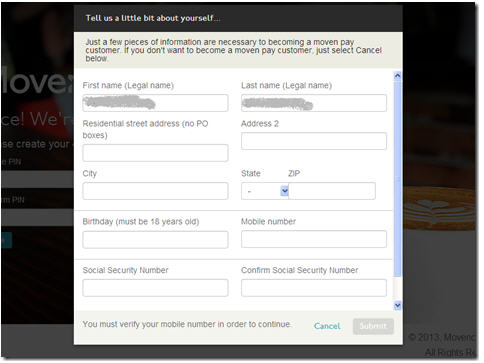
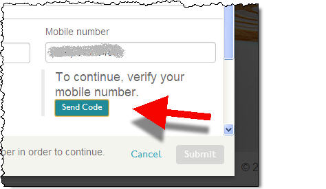
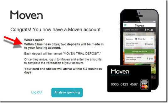
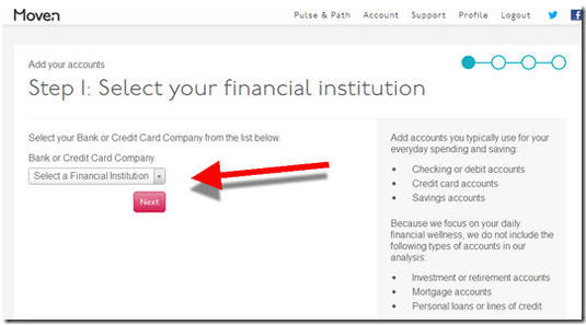
Wow, it was a whirlwind of fintech news in the past seven days. Here are four stories that spiked on our fin-o-meter:

________________________________

1. Stripe’s $80 million funding
_________________________________________

It’s not so much the amount of the funding, though that’s one of the biggest C-rounds we’ve seen in the space, rivaling Square’s $100 million round in June 2011. But the jaw-dropping aspect was the valuation, a reported $1.75 billion, double what PayPal just paid for Braintree, which is far bigger than Stripe.

But as PandoDaily’s Carmel DeAmicis and Michael Carney point out, it was favorable terms (2x liquidation-preference) that substantially boosted the valuation. Regardless of the funny VC math involved, it was a monster round for the small company.

Clear winners: Stripe founders and early investors
Potential winners: Other payment enablers who now have access to more funding
Potential losers: Square, which could have bought Stripe at a much lower valuation; PayPal; and other acquirers who now face an even stronger competitor

___________________________________________

2. T-Mobile teams up with Bancorp Bank & Blackhawk Network for branded prepaid card
___________________________________________

image An interesting play by T-Mobile – turning their 7,500 locations into cash-handling mini-branches – is its new Mobile Money prepaid card. I’m not sure that’s the business I would have entered if I were in charge, but it will be closely watched. If it’s wildly profitable (unlikely), it could put pressure on the entire U.S. branch banking system. More likely, its success will be moderate and will fizzle out in a few years when T-Mobile finds more lucrative ways to deploy its real estate and sales staff.

In any event, it will be closely watched by banks and non-bank retailers alike. (Potentially, T-Mobile could make more money reselling the consumer data from the effort, than from the prepaid business itself.)

Clear winners: Bancorp Bank (issuer) and Blackhawk (prepaid network)
Potential winners: T-Mobile (and other telcos that copy the strategy)
Potential losers: Wal-Mart, check cashing stores, and other players in the cash space

_________________________________________________________

3. Mobile account opening (MAO) used by 1 of every 4 Andera-powered applications
_________________________________________________________

Andera, the online account-opening powerhouse, this week published a useful report (free with registration) analyzing account-opening metrics across its 500 clients. The stat that caught my eye was the number of mobile applications already being received, despite the newness of the channel for financial transactions. One in four Andera-processed financial product applications are received from tablets or smartphones, up from one in 25 three years ago. And three-quarters of the mobile volume is from smartphones.  

Clear winners: Mobile leaders
Potential winners: Andera and other account-opening specialists
Potential losers: Bank branches, which will continue to be a major (albeit costly) source of new account applications

image

_______________________________________________________

4. Balanced Payments crowdfunds $50,000 to launch new feature
_______________________________________________________

I am a big fan of crowdfunding and expect massive growth (note 1), but I never thought I’d see it used by a fintech company to fund a new feature. But Balanced Payments, a Y Combinator-backed payment-startup serving online marketplaces, successfully raised more than $50,000 last week in about a day (Crowdhoster campaign). That surpassed its goal for adding a “push to debit card” (Techcrunch post).

It sounds too good to be true. But the startup used a clever incentive system for backers: prepaid fees. In other words, Balance customers could pledge a few thousand dollars for the feature, and then that money paid upfront would cover a given amount of transaction fees in the future. And the more that was pledged, the cheaper the transaction fees became. And there was a large incentive to pledge at the $10,000 level (see below).

Here’s the earnings table:

>> $1,000 pledge receives 1,000 prepaid transaction at $1 each
>> $2,500 pledge receives 3,333 transactions for $0.75 each
>> $10,000 pledge receives 40,000 transactions for $0.25 each

You could also toss in $25 for a T-shirt.

So far, there are 26 backers (25 if you don’t count my T-shirt pledge).

image

———-
Note: For much more on crowdfunding (debt and equity), see our May 2013 report (subscription).

Share this:

Send Post Twitter LinkedIn Facebook

First Look: Moven Bank’s Online Application

By Jim Bruene Posted on July 9, 2013
Categories: Account opening, Geezeo, Launches, Personal Financial Management

moven1.jpg

I finally received a Moven (bank) invite, first forwarded from a reader (thanks, Michael), then a few days later directly from the company (see screenshot #1). Yesterday, I went through the drop-dead simple application process (see screenshots 2-8) and as soon as my card arrives, I’ll start putting transactions into the system.

The application is well designed. Here are a few things other financial institutions can learn from my Moven experience:

  • After clicking through the invite (screenshot #1), I arrived on a personalized landing-page (ss #2) with simple instructions on what was required for signup. It also has Facebook integration (I was already registered with the Moven site, so it didn’t apply to me).
  • Key information is collected against a striking backdrop of a great-looking cappuccino (ss #3, #5).
  • As seen in the account disclosures (ss #4), the issuing bank is CBW, the same one working with Simple.  
  • The applicant’s mobile number is verified prior to completing the app (ss #7).
  • Account funding is not handled during the initial app; instead, the company asks for bank account info and then sends trial deposits to authenticate the user (ss #8). This step can be skipped, but it’s the only way to get money into the account, so it has to be completed eventually.
  • The application concludes with a clear thank-you that also outlines the next steps (ss #10).
  • Finally, something I’ve not seen before. The startup invites new customers to start managing their spending right away using its Geezeo-powered PFM module (lower-right on ss #10).
  • Within minutes a thank-you email arrives emphasizing the next steps (ss #11)

Bottom line: Going in, my expectations were high. And Moven still exceeded them. This was a near-perfect signup process as far as I was concerned. The only flaw was the slightly confusing Facebook authorization process. After clicking the Facebook button on the bottom of the first page (ss #2), I expected to see Facebook talking to me about what I wanted to share with Moven. But instead, I proceeded directly to the next page of Moven’s app with no mention of Facebook. I assume this happened because I’d already authorized Moven to access my Facebook account months ago when I registered at the site. But overall…impressive. 

——————————-

1. Moven invite (1 July 2013)

moven2.jpg  

2. Personalized landing page with Facebook integration (required)
Note: My email address is already lifted from the invite

moven3.jpg

3. Name and email confirmation

moven4.jpg 

4. Terms and conditions
Note: Issuer is CBW Bank

moven5.jpg 

5. Choose 4-digit PIN

moven6.jpg 

6. Personal info

moven7.jpg 

7. Verify mobile number

moven8.jpg 

8. Funding

moven9.jpg 

9. Confirmation
Note:
A.) Trial deposit system is explained
B.) PFM linkage

moven10.jpg 

10. PFM linkage

moven11.jpg 

11. Confirmation email

moven12.jpg 

——————————

Notes:
1. Picture from Moven’s FinovateSpring appearance, 15 May 2013 (video)
2. For more info on other Truly Virtual Banks, see our Oct 2011 Online Banking Report (subscription). For more on advanced PFM features, see Online Banking Report: PFM 4.0 (June 2012; subscription).

Share this:

Send Post Twitter LinkedIn Facebook

Chase Delivers Prepaid Liquid Cards Instantly In-Branch

By Jim Bruene Posted on April 16, 2013
Categories: Account opening, Branch Banking, Chase Bank, Prepaid/gift cards

image While I’m not a branch banking proponent, most of my experiences have been pleasant. But, I can’t remember a complex transaction or problem resolution that was handled "beyond my expectations." That said, the crew at Chase Bank (Wedgwood), treats us very well and even reads this blog (hi Ben), and that’s saying something.

But the Chase branch did beat expectation this past Saturday. My son was leaving on a school trip that night. I wanted to send him with a prepaid card for unforeseen travel expenses. I had a collection of cards in a drawer that I’d tested over the years. But for a variety of reasons they were all unusable (expired, dormant or just not working).

So, I figured I’d just buy him a throwaway card at Safeway. But I really wanted one that was easy to reload online in case he ran in to a cash jam (note 2). Since there is a Chase branch next to my usual Saturday coffee stop, I dropped by on the off-chance they could issue them on the spot.

I was shocked pleasantly surprised to find out the bank’s relatively new Liquid  card was in stock and the opening process took less than 10 minutes, faster than a trip to Safeway. And the card was immediately linked to my online banking where I could transfer funds into the card.

It was the ultimate in convenience: no new passwords to remember, new UI’s to traverse, or complex reloading procedures to figure out. The card does have a $4.95 monthly fee, but with no reloading costs, I think that’s fair (note 1).

Bottom line: While I can’t speak for the overall ROI of the branch on Saturday mornings (I was the only person there during my 10-15 min visit at 9:30 AM April 13), I was a very happy customer, who added another service to my Chase banking relationship, and created positive word of mouth (note 3). 

———————————

Notes:
1. After I’d already committed to buying, I found out the monthly fee would be waived based on our business relationship. But that wasn’t part of my purchasing decision.  
2. My son has apparently lost the card before I could even publish the blog post. So I will soon be experiencing Chase’s lost card customer service.
3. Disclosure: We do not accept blog advertising or affiliate deals, so this is not a paid endorsement. Chase is a Finovate customer (newsletter, event tickets) like many of the companies mentioned here.

Share this:

Send Post Twitter LinkedIn Facebook

American Express Launches Mobile App for its Bluebird Prepaid Card

By Jim Bruene Posted on October 16, 2012
Categories: Account opening, American Express, Credit/Debit Cards, Mobile Banking, Prepaid/gift cards

image Today, American Express released the iPhone app for its new Bluebird prepaid card which will be sold in Walmart stores and elsewhere. The app allows new customers to sign up for a Bluebird prepaid card, but in my test I was not able to get that to work (see below).

As you’d expect from American Express, the app is attractive and well designed. It includes imageimportant payment features (see inset):

  • Billpay
  • P2P payments 
  • Request money
  • Mobile remote deposit

My experience: I downloaded the 7MB app today. The only screen visible to non-cardholders is dominated by a login area. But it also has a Get Started button, which I learned was where you apply for a new card (see number 1 below). It would probably be better to call it “Get your card” or something more obvious.

This next screen contained an odd question, “do you have a Starter Card?” (with that capitalization)(see screenshot 2). Again, this is not the clearest way to make a sale. Why not just say “Do you want a new card?”

After I clicked “No,” the app took me through a standard three-step process for getting a card including name/address, SS number and disclosures (see screenshots 3-5). For some reason, my company email address did not work (an error message said I could not register with that email). But a standard @gmail address worked fine. The application also has the annoying requirement for a capital letter in the password which is overkill, especially on a mobile phone.

In all, it took almost five minutes to complete because of the various errors I made along the way.  

But despite being an Amex cardholder for two decades, the company could not “verify my information” (see screenshot 6) and I was declined for a prepaid card. I went back and re-entered everything with the same result. The final error message (which could use a rewrite) suggested that the issue might be my fault. But if I thought otherwise, feel free to give them a call.

Which I did. But after 3 or 4 minutes trying to explain to the rep what had happened, I gave up. She was picking up my keywords and reading the script. But she was clearly having trouble following my story. At the 3.5-minute mark mark she suggested I “download the mobile app.” That’s when I signed off.

Bottom line: It looks like a great app and I look forward to using it. And I’m willing to cut American Express some slack given how new it is. The app hasn’t even been officially announced, so I’m sure the kinks will be worked out shortly. 

———————————

1. Login screen                              2. Odd question

image     image

3. Application name/address          4. Application SSN/password

image      image 

5. Disclosures                                6. Error message

image       image

Share this:

Send Post Twitter LinkedIn Facebook

Posts navigation

  • 1
  • 2
  • 3
  • 4
  • Next →

Search

FinovateSpring 2025

FinovateSpring

FinovateFall-blog

FinovateFall

FinovateAwards

FinovateAwards

FinovateEurope 2026

FinovateEurope

Subscribe by Email

Want us to cover your news?

Contact [email protected]

Follow us on Twitter

Twitter Icon
Followers

Tags

#WomeninFinTech Alumni profile Analyst All Stars Atos Banking Credit Sesame Daily News Debt Goal Diversity DSwiss eMagazine Email Emerging technology Finovate Digital Week Finovate eMagazine FinovateEurope 2022 FinovateFall FinovateFall 2021 Finovate Live Finovate Marketing FinovateSpring 2022 FinovateSpring Takeover Finovate Webinar Identity Verification Innovation InterSystems Julie's Column Lending MSPs News payments PFM Plaid Ripple Labs SME lending Sponsored StreetShares Tradier Videos Wealth Management Platform Webinar Whitepaper Women in Fintech Xignite Yodlee

RSS Latest Finovate blog posts

  • FinovateSpring 2025 Best of Show Winners Announced
  • Finovate Global: Meet the International Alums of FinovateSpring 2025
  • Streamly Snapshot: Why “Data Is the New Blood” in the Future of Finance

About

Who We Are Sponsor Apply to Demo
RSS Feed Twitter LinkedIn

Events

FinovateEurope FinovateSpring FinovateFall FinovateAwards

Videos

Demo Videos

Podcast

Podcast Archives

  • Home
  • Cookies
  • Privacy
  • Terms


Copyright © 2007-2024 Finovate. All rights reserved.

Demo your latest fintech product or innovation in front of 1000+ decision makers including 600+ from banks and investors.

Apply Now!