Guess What I’ve Been Researching Online?

imageI realize that ads based on recent activity are effective. But it’s still slightly unnerving, wondering whether you’ve lost every last bit of privacy or that you’ve been hit by an adware virus. But overall, it’s good to get relevant offers, especially when one has a $10 bonus in it (see AmEx below).

Here’s the two ads tossed my way while I was checking the status of my son’s flight today:

Amex Serve and Geico ads

I wrote a blog post on Serve yesterday (see AmEx promo on top of the page) and have been banging around insurance sites (see Geico ad on right) for the past two weeks as I wrap up a report on the subject.

AmEx Serve offer
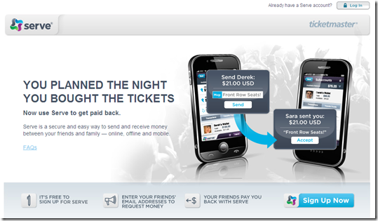
Perhaps because I didn’t sign up yesterday, American Express is throwing me $10 to try Serve, its P2P payments service. Here’s the excellent landing page (link):

American Express Servce landing page

After entering your email address, the button turns to a thank-you. It’s good feedback for the user and keeps them from accidentally submitting the form twice.

image

Here’s the email sent a few moments later:

American Express Serve email

———————-

Notes:
1. Button credit Zazzle.com
2. We covered P2P payments two years ago in our Online Banking Report (subscription).

American Express Serves Up P2P "Pay Me Back" on Ticketmaster

image It’s a problem as old as money itself. The person making a purchase on behalf of a group inevitably gets stuck with a larger share as others “forget” to pay him/her back (note 1).

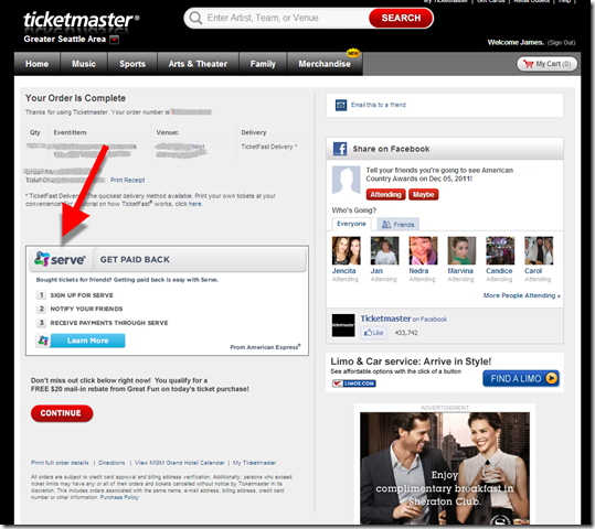
Two weeks ago, American Express launched a clever product tie-in on TicketMaster to help change that. After making a purchase, a prominently placed box suggests using Serve to “Get Paid Back.” Buyers are encouraged to use Serve to send money requests to friends for their share of the tickets. Given how social ticket purchasing is, it’s a great place to introduce P2P.

But there’s still the not-so-small problem of getting everyone signed up. Both sender and recipient must have Serve accounts. And while all transaction are currently free, the FAQs warn that coming Jan 1, there will be a fee of 2.9% + $0.30 per transaction funded via credit card. Checking account (ACH)-based transactions will remain free.

To beat PayPal at this game, the service needs more than just well-placed ads. For example, integration directly into the Ticketmaster shopping cart, where buyers could enter friends’ email addresses to automatically “charge” them their share (subject to their approval of course).

————————————-

Product placement after purchasing on Ticketmaster (11 Nov 2011)

image

Landing page

image
————————–

Note: We covered P2P payments two years ago in our Online Banking Report (subscription). 

Multi-Channel Messaging is a Mess

Image licensed from Shutterstock Last month, I reported that my “aha moment” at BAI’s Retail Delivery was the realization of just how challenging it had become to manage customer messaging across multiple channels and products.

Consider this 9×12 matrix of 108 product/message options a bank could conceivably use to reach a couple about their banking and loans. The whiteboard in the marketing conference room just won’t cut it any more as the master scheduling tool. 

Product/
Channel

DDA

Card #1

Card #2

OLB

Loan #1

Loan #2

Mtg

Invest

Insure

Voice home                  
Voice mobile (Sue)                  
Voice mobile (Joe)                  
Email pers (Sue)                  
Email pers (Joe)                  
Email work (Sue)                  
Email work (Joe)                  
Website message                  
Text (Sue)                  
Text (Joe)                  
App (Sue)                  
App (Joe)                  

If that wasn’t complicated enough, unique regulations can govern each channel and/or product.  Some exa
mples: new mortgage rules for a single source of contact; time-of-day preferences (don’t text me while I’m asleep); and privacy issues (don’t alert my spouse to card charges).

And this table gets bigger if you add mail, in-branch, ATM messages or more products such as small business accounts, savings/CDs, and accounts held jointly with other family members. You could also add inbound vs. outbound calls/messages.

But one person’s mess is another’s opportunity. Fintech companies are hard at work on  solutions that turn multi-channel snarls into opportunities to increase satisfaction and/or cut costs.

imageOne key player is Seattle-based Varolii, which delivered my aha moment last month. In a followup last week, I had a chance to sit down with CEO David McCann and have a wide-ranging conversation about customer messaging in the age of the voice/email/text/notifications. I was impressed, both with the enormity of the challenge of coordinating customer messaging, and with the solutions it offers (note 1).

image Then yesterday, I met with Amit Ashman, Marketing Director at Nice, who happened to be here on a whirlwind visit from their headquarters in Israel. His company, which booked $200 million in revenues last quarter, provides call-center technology for large U.S. financial institutions. They have developed a very cool call-center/mobile-app solution about to be unleashed on the world. It blends self-service with agent support in a relatively seamless fashion that I suspect will be the industry standard five years from now.

It’s convinced me to write a report on Multi-Channel Customer Support for our Online Banking Report (note 2). We are also looking to recruit more companies in this area to 2012 Finovate events. So, please email suggestions for solutions providers and/or financial institutions who are tackling the problem.  

————————————-

Notes:
1. Great tagline, “Better return on interactions”
2. The multi-channel report won’t be published until early next year. However, we’ve tackled remote customer service and messaging a number of times in previous issues of our Online Banking Report. The last one was Live Help earlier this year.

Square Updates its Merchant Platform

image In 15+ years of accepting credit cards, there have been few notable communications from our acquiring bank or payments gateway, other than normal transactional messages (note 1). Square looks to be changing that with a focus on merchant (and end user) experience.

For example, today I received an email outlining Square’s latest platform enhancements (see first screenshot). The message included an enticing Open for Business with an invitation to watch a 70-second video outlining enhancements to its merchant platform, including built-in rewards capabilities (note 2). 

The company has grown quickly. Basically starting at zero at the beginning of the year, they are now doing up to $11 million per day in card volume. More impressively, they are up to 800,000 merchants. Assuming a $65 to $70 average ticket, that’s around 150,000 transactions per day, or 4 to 5 million per month. But that also means the average merchant is only doing 1 transaction every 5 or 6 days. 

imageAnd the user experience is far from perfect. Square has suffered growing pains as it learns to manage a business fraught with fraud and uncertainty. We tried to use Square at Finovate last May and couldn’t get transactions authorized, apparently due to tight account limits in force then.

Four months later at FinovateFall, most transactions were authorized, much to the delight of attendees who used it. But unbeknownst to us (note 3), the money just sat in the Square account waiting for us to confirm our bank account. One small test-transaction had been sitting there since May.

Bottom line: The company flat-out does a great job with design and UX, very Apple-esque. I expect to see a lot of innovation out of Square given its funding, valuation, and celebrity founder. The promise of turning transaction receipts into a dynamic communication is especially interesting (previous post).

—————————

Email from Square (received 1PM Pacific, 15 Nov 2011)

image

Landing page (not logged in; link)

image

—————————-

Notes:
image1. It could be that I’ve simply forgotten messages received years ago. But I can say for sure that there have been very marketing/customer service messages, because I pay attention to them. My acquirer is not one of the major players. 
2. TechCrunch has a good rundown of the new features.
3. In fairness to Square, they did mention on the merchant receipt that we needed to verify the bank account. But during the heat of the conference, I never noticed that. Click on inset to see the company’s transaction receipt (highlighting mine).  
4. I wonder what it will take to convince Japan’s Square-Enix Holdings, creator of Final Fantasy (video game) to part with the Square.com domain name (which is currently unused). 

WV United FCU Offering Both Square and Dwolla Payments

imageDuring an an onstage interview at The Wall Street Journal’s AsiaD conference, Jack Dorsey said he was working with banks to distribute Square readers/accounts directly to bank customers.

image

Since it was Honk Kong, I was thinking OCBC or HSBC. But it turns out the first financial institution (note 1) to take Jack up on his offer, is WV United FCU, a 5,000-member CU headquartered in Charleston, West Virginia. If that name sounds familiar, it’s because it was the first financial institution in the world to implement mobile remote check deposit in August 2009 (previous post). WV United is also featuring Dwolla P2P/alt-payments on its homepage.   

  • Square: The CU is promoting Square on its home page (see screenshot #1 below). Square is the first of five promotions that rotate across the top (see also Dwolla below). The promotion features the 2.75% merchant rate and uses the @square Twitter feed to make it more interesting. The landing page invites members to signup for Square and redirects them to the startup’s webpage. It doesn’t appear there are any official affiliate arrangements. But Square allows payments to be transferred to any bank account, so WV United members can have the proceeds automatically deposited to the CU account.
  • Dwolla: The Dwolla connection is more integrated, with a co-branded online account opening page (screenshot #4). There is also more info loaded onto the CU’s page including a short video, the @dwolla Twitter feed, and a features/benefits section.

Bottom line: No one is going to accuse 11-employee WV United FCU of not keeping up, innovation-wise, with the big banks. In fact, it’s setting the pace in some areas, albeit in a more "bolted on" fashion (note 2). Granted there’s little, if any, direct revenue from these efforts. But they also require no infrastructure investment. So, if they keep members satisfied and employees excited, then it’s a win.

—————————————-

1. WV United FCU homepage (14 Nov 2011)
Note: The credit union leveraged Bank Transfer Day for another 10 days (lower right). Smart.

WV United FCU homepage includes Square promotion

2. Landing page for Square promo (14 Nov 2011, link)
Note: Square Twitter feed on right

WV United FCU landing page for Square promo

3. Landing page for Dwolla promo (link)

Landing page for Dwolla promo

4. Co-branded online account opening (link)

WV United CU and Dwolla online account signup

Notes:
1. They are the first that I’ve heard of. There could be others linking to Square in a similar fashion.
2. When I say "bolted on" I mean that the experience isn’t integrated with other WV United online offerings. Integrated is best, but bolted on is a good way to test the market and keep costs down.
3. For more info on P2P payments and other topics, see our subscription service, Online Banking Report.

11/11/11 Promotion at Notre Dame Federal Credit Union

image

Today is a big day for number nerds (note 1), as 11/11/11 makes its once-per-century appearance. So last night, I started looking for banks or credit unions using the date for a price promotion (note 2). With U.S. interest rates hovering around the 1% mark, I figured it would be pretty easy to find financial institutions offering CD specials at 1.11% APY, hopefully the 11-month variety.

But after googling for at least an hour, I came up empty. I found a few 1.11% APYs for longer-term CDs, but no one that was promoting it as a Nov 11 special. I was about to give up, but tried “1.11% discount” and up popped Notre Dame Federal Credit Union going all in on the 11/11/11 theme. 

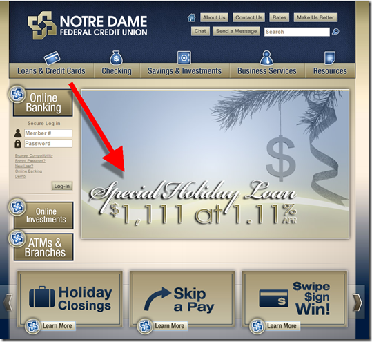
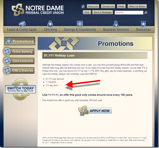
The home page (below) features a huge ad for its 1.11% APR holiday loan of exactly $1,111. And can you guess the term of the loan? Yep, 111 days! Thank you NDFCU marketing dept, you rock.

image Fine print: There is one small catch. To get the loan, members must apply for and be approved for the credit union’s Visa Platinum card (presumably you can still get the holiday loan if you already have the CU’s card). So it’s really a credit card promotion in disguise, but that seems fair. It’s a good price, and allows for a little expansion of the holiday budget, but with the discipline of a loan that must be repaid before April tax time (note 3).   

The offer is good through the end of November. And the loan application can be made online.

————————————–

Notre Dame FCU hits all 1’s on its homepage (11 Nov 2011)

Notre Dame FCU hits all 1's on its homepage (11 Nov 2011)

1.11% loan landing page (link)

1.11% loan landing page NDFCU

Notes:
1. I’ve been one for a long time. When I got my first calculator, I pressed “+1” on it 111,111 times just to fill the screen with 1s, the hard way.  
image2. Most U.S. financial institutions are closed today for Veterans Day, making it less likely to have a special one-day promotion. 
3.  Members also have the options of rolling the balance onto their NDFCU credit card at the end of the term.
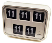
4. Digital clock image from UK’s Daily Telegraph which had a 9-hour head start on the day.
5. Other 11/11/11 news:
NY Times looks at 11/11/11 promotions
– DealerTrack marked the day with a press release about hitting the 1,111 lender milestone.
– The only promotional email I received using the day was from Starwood hotels (see inset)

Wells Fargo Pitching Wachovia’s Way2Save Account at Login

imageWells Fargo generally does a good job with its login product pitches. I like how the bank provides a "Remind me later" and "No thanks" option next to "Apply Now."

However, in today’s pitch for the rebranded Wachovia Way2Save account (see old logo, inset), the bank seems to have forgotten an important part of consumer decision process: explaining what the account is. There is no Learn More button to be found on the ad or landing page.

I had to leave the app and search the Wells Fargo website to determine the rate and unique features of Way2Save (see note 1). The main benefit: users receive a 3% APY on the first $500 in the account for one year, provided they use one or these automated savings features:

  • $25+ per month or $1+ per day transferred from Wells Fargo checking (outside accounts not an option, except for initial account funding)
  • Automatic $1 transfer from WF checking to savings with every debit card purchase or pre-authorized debit  

After one-year interest drops to the prevailing rate, currently just 5 basis points, 1/60th the premium rate. 

Online application process: Choosing Apply Now on the interstitial drops users directly into the bank’s generic online app where’s it’s difficult to even confirm what you are applying for (see upper right corner of second screenshot). 

Since I only have a Wells Fargo credit card, the bank offers me a $5/mo checking account, which is free if I have direct deposit or $1500 on deposit. But the checking account is not required. You can setup a standalone savings account, though it won’t qualify for the interest rate bonus or be able to use the automation tools.

On the final page users can fund the account with a transfer from a Wells or non-Wells deposit account or they can deposit up to $500 via credit or debit card. 

Bottom line: Automatic savings are a win-win. And offering a $15 interest bonus is a good way to improve signups. But Wells needs to explain the offer better so that customers customers are motivated to complete the application.    

————————–

Wells Fargo interstitial login ad for Way2Save (10 Nov 2011)

Wells Fargo interstitial login ad for Way2Save


Landing page, which is the first page of the online application (link)

Landing page, which is the first page of the online application

Wells Fargo online application (page 2)
Note: The bank is still disclosing at $3 debit card usage fee

image

—————————-

Notes:
image1. Way2Save was inherited from Wachovia (previous posts). Here’s the cached 6 Nov page from Google. The page now redirects to Wells Fargo savings.
2. Wells Fargo acquired Wachovia in 2008.
2. For info on online account opening, deposit gathering and much more, see our subscription newsletter, Online Banking Report.

Capital One Driving Mobile Use with Sweepstakes

imageBoosting mobile engagement has a promising ROI. Among other benefits, the potential $6+ saved per displaced call center inquiry can have a meaningful impact on the bottom line (note 1).

And while volumes are growing, Capital One says mobile usage is up 5-fold compared to last year, it’s still a lightly used channel compared to phone (voice) and online.

Yet, for a card issuer, mobile is THE most important channel for the NFC/Square/GoogleWallet future.

So it makes a ton of sense to pull out the stops now to get customers using the bank’s mobile app. Capital One in particular, as one of the last majors to get into the app store, likely has an awareness problem with mobile cardholders. Even if the CapOne native app was downloaded, it’s buried so deep on the iPhone’s screens, that users forget about it. In my case, it’s on screen number eight and I rarely see it even though I use my card almost every day.

To attract more mobile uptake, the card giant launched a usage sweeps today. Between now and Jan 6, each cardholder will get one sweepstakes entry every day they log in to the mobile app or mobile web (SMS activity does not appear to count). One person will win a 16GB Wifi iPad2 each day. And a grand prize of a Chevy Volt will be awarded at the end (full rules). The total prize package is $80,000, less than the cost of one 30-second spot on an about-to-be-cancelled sitcom. 

The sweeps is being promoted with a small homepage link and a prominent mention on the main mobile banking page (see second screenshot below).

——————————————

Capital One mobile sweeps landing page (link, 9 Nov 2011)
Note: The call to action, text “power” to 80101, was not working in my test. 
Update 10 Nov: Fixed 


image

Main mobile banking page (link)

Main mobile banking page Capital One

Notes:
1. Of course, you also have to put in place a mobile channel strategy that actually does displace call-center inquiries. That’s easier said than done. Also, financial institutions paying mobile vendors for each active user, may not want to boost mobile usage in this way. 
2. Despite the name of our subscription newsletter, Online Banking Report, we cover mobile issues almost every month. 

Top 10 Reasons Why BankSimple Dropped the Bank

Simple login area

When I started my company in 1994, I was told by the state that I couldn’t have “bank” in the name unless I was one. So one of the first questions I asked BankSimple founder Josh Reich early last year was how they were getting past that issue. He said it was not a problem since BankSimple was just a brand name. The company name was, and still is, Simple Finance Technology Corp.

So evidently, the startup wasn’t forced to change. That got me to thinking about why they moved away from BankSimple, which is a great description of their initial product set. Here is what I came up with.

_____________________________________________________________________________

Top 10 Reason for Changing the Name from BankSimple to Simple
______________________________________________________________________________

10. While it may be OK in the United States for a non-bank to use “bank” in a brand name, that may not be the case in other markets the startup hopes to eventually conquer

9. There’s been lots of bank bashing the last few years; so it avoids negative connotations

8. One word names are cooler than two-word mashups

7. It allows them to move into other less “bankish” areas such as payments and offers

6. It allows them to partner with credit unions, card companies, and other non-bank financial companies

5. Can add any other word to “simple” to create great product names, e.g., “Simple Billpay”

4. The generic word, beginning with S, is being used by the highest-valued fintech startup in the world, Square

3. Much easier to riff off of “simple” for killer taglines (see login screen above)

2. They don’t have to worry about anyone saying “occupy simple”

And the most important reason (drum roll):

1. Tweets can have 4 more characters (ba dump bump)

Yes, BankSimple made a good strategic move, though I’ll miss the old name, which had a nice oxymoron-ish quality to it.

Credit Karma Launches "Hands Free" Account Aggregation

Everyone likes the idea of an online PFM, but relatively few will take the time to enter the necessary account numbers and passwords. Fewer still will keep it running smoothly by coming back periodically to update passwords, provide security question responses, and so on. That friction means it’s not benefiting as many people as it could. 

But Credit Karma removes the friction, at least on the credit side, with its latest feature, My Accounts (see first screenshot below; see fourth screenshot for today’s email announcement). The startup parses credit bureau data to automatically present each user with an aggregated look at their debt over time. The service requires ZERO account info from the user, they simply sign up with Credit Karma to get free credit report info.

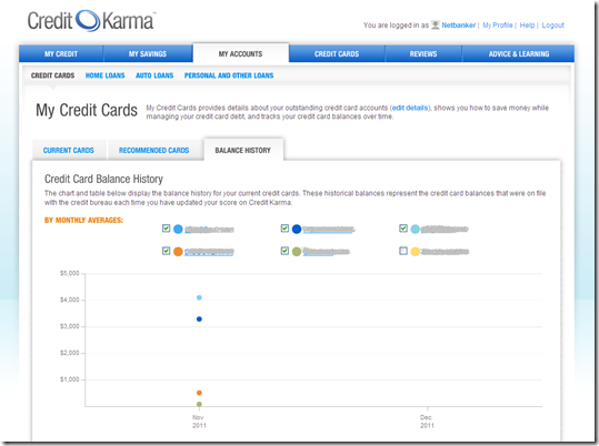
Historical data is captured each time the user updates their credit info at Credit Karma. Since it’s new, there’s just a single data point on my account (see second screenshot).

To earn advertising and referral income, Credit Karma integrates card offers into My Accounts with a Recommended Cards tab in the tertiary navigation (third screenshot). Cross selling is also woven into other areas as well (first screenshot). Credit Karma also covers home loans, auto loans, and personal loans. Each has their own tab in the secondary navigation.

The company has 3.5 million registered users and is adding 500,000 every quarter.

Bottom line: Keeping closer tabs on debt has huge benefits for many households. Credit Karma’s "no data input" method makes it easier. The last remaining hurdle is integrating the data into online banking so it’s not forgotten (see UW Credit Union post).  

—————————————

Credit Karma "My Accounts" (7 Nov 2011)

Credit Karma "My Accounts"

Balance history is tracked for each card
Note: Only one data point, since this was my first time using the new feature

Balance history is tracked for each card

Integrated offers drive revenue

image

Email announcement of new feature

Credit Karma's email announcement of My Accounts

—————————–

Note: We’ve have written a number of reports on PFM and related issues in our subscription service, Online Banking Report.

New Online Banking Report Published: True Virtual Banking Has Arrived

image I still remember the day in early 1999 when I met with Elon Musk and his 3-person team in a borrowed conference room in Palo Alto. They were plotting the complete and total disruption of the banking industry and fully expected to be one of the largest five U.S. banks by now.

The startup was named X.com and its original business plan was to acquire one or more existing banks to provide the credibility, and deposit insurance, of a traditional bank. While I was in awe of their ambition, I thought the plan had a flaw. I told them they’d be better off staying virtual, with no bank ownership slowing down their decision making and ability to take risks.

I’ll never know if they would have listened to me, because soon thereafter X.com began experimenting with P2P payments via email, and they saw that it was going to be huge. So they jettisoned banking, merged with PayPal, and the rest is history.

Why the reminiscing? That was the last attempt by a major tech startup to take on the U.S. retail banking industry via virtual channels (note 1).

Fast-forward to 2011: At this year’s FinovateFall, we saw the launch of not one, but two well-funded attempts at disrupting the incumbents. One through debit/checking/savings and the other through wealth management:

  • BankSimple: DNA from Twitter, analytics, and consulting
  • Personal Capital : DNA from Intuit, PayPal, Everbank and Fidelity Investments

Both companies are what I call True Virtual Financial Institutions, meaning they are complete front-ends to your money, including transaction capabilities and customer service, but they outsource the actual holding of customer funds to fully-regulated partners which pass FDIC/SIPA protections. This allows the newcomers to focus on user experience and service while moving much faster without the regulatory friction experienced by traditional financial institutions.

Others well-known companies using virtual models: Betterment (also profiled in the report), iBankUp.com (Plastyc) and Perkstreet.

Note to bankers: True virtual banking needn’t be limited to tech startups. These techniques can be employed by traditional companies to expand beyond regional or industry boundaries. The report outlines seven models for doing just that.

__________________________________________________________________

About the report
__________________________________________________________________

True Virtual Banking Has Arrived (link)
BankSimple, Personal Capital, Betterment and others go branchless,
paperless and “bank-less”

Author: Jim Bruene, Editor & Founder

Published: 1 Nov 2011

Length: 48 pages

Cost: No extra charge to OBR subscribers, $395 for others here

____________________________________________________________________

Notes:
1. I should add that Lending Club, Prosper, Zopa qualify as major entrants bound on disrupting banking from the lending side.
2. BankSimple, Betterment, Personal Capital and Plastyc FinovateFall 2011 demo videos are available here.