Banking Opportunity: Synced Joint Accounts

Banking Opportunity: Synced Joint Accounts

simple shared account

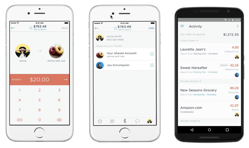
One thing we are looking forward to this year is the launch of Simple’s (part of BBVA) Simple Shared checking account. When the beta was announced last September (2016) and the company said it would be launching “some time in 2017.” See screenshots above.

The account promises to help users track their individual purchases, while also maintaining a shared transaction area and goal(s) that includes an Our Safe-to-Spend number across both users. Users would be able to simply transfer money to each other as well. And interestingly, it appears that any two people (and maybe more?) will be able to sync their Simple accounts together, it won’t have to be an actual legal joint account. That’s exactly how it should be.

Innovating in the Deposit Business
The deposit business is relatively straightforward. There are checking accounts, debit cards, and savings accounts (most paying a negligible amount of interest). So how does a bank differentiate itself in this absurdly low interest-rate environment? Branding, trust and location have been the traditional drivers and are still vital. And every decade or so a new technology comes along and there is some jostling along the way until everyone offers it (ATMs, VRUs, debit cards, online banking, mobile banking, etc.).

But even in a world where every FI offers the same basic product lineup, there are still ways to add value and increase market share and/or margins. Synced joint accounts, like Simple’s Shared Account. Married couples are the biggest opportunity, but there are other segments as well: Parents that need to sync with their kids. adults that need to sync with their aging parents, employers with employees, advisors with their clients, and so on.

There has been progress on this front. Many (most?) business accounts offer ways to enable third-party accountant/advisor access. Person-to-person transfers make it easy to send money to kids at college. And PFM solutions such as Mint, allow money-tracker couples to keep an eye on their spending across multiple accounts.

Bottom line: Existing solutions are often difficult to use, missing key features, and not fully integrated within big-name financial brands. Simple, which already offers a state-of-the-art checking account with Safe to Spend balance forecasting, natural-language search, and overall great UI, is expected to raise the bar considerably when Shared Accounts launches. I look forward to using it.


Author: Jim Bruene is Founder & Senior Advisor to Finovate as well as
Principal of BUX Advisors, a financial services UX consultancy. 
Mobile Paths

Mobile Paths

mobile banking clipMobile has been an important part of banking for six or seven years, but have you recently thought through the longer-term strategic implications?

For younger customers, the relationship with their bank, like with most large tech companies, is through their phone. Young customers don’t even think about the people behind the service. As long as it’s working.

Given this reality you have two choices.

  1. Embrace the anonymous service provider model of Google, Microsoft, Facebook and most big tech companies. Go for scale, low costs, and state-of-the-art digital services. Offer robo-savings, automated chat bots, and self-service. Hire great programmers.
  2. Go in the other direction. Humanize your service by inviting customers to connect with people at your financial institution, either in person (traditional banking model, also used by Apple with its hardware) or through chat services (Amazon). Optimize around people and connections with the customer. Have new customers in for a chat, invest in social networking and custom interfaces. Hire great account reps.

It’s easier to stay anonymous. You avoid all those messy interactions with customers. But it may be harder to gain loyalty, cross sales and referrals as a no-name service provider. Another concern on the credit side, is whether that anonymity comes at a price in terms of higher loan defaults?

Building a human connection can cement customers possibly for generations, but has higher costs in terms of staffing, customer service, and brick and mortar investment.

Either way is a legitimate strategy. But you need to choose.


Author: Jim Bruene is Founder & Senior Advisor to Finovate as well as
Principal of BUX Advisors, a financial services UX consultancy. 


Notes:

1. Picture by 123rf.com (licensed)
2. Inspiration by Seth Godin

Mobile Monday: Starbucks Adds Floating Balance to Mobile App

Mobile Monday: Starbucks Adds Floating Balance to Mobile App

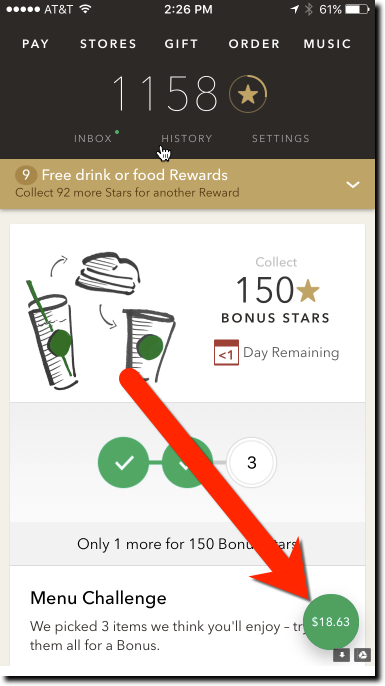
starbucks mobile balanceIn a major update last week (v4.3.2, 30 Jan 2017), Starbucks added a floating balance to its mobile app main page. So instead of navigating to the pay tab within the app, users always see their card balance as soon as they launch the app. And the balance stays floating in the lower right corner no matter how far down the page you scroll.

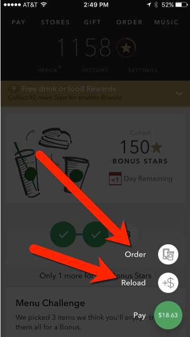
Furthermore, clicking the green button grays out the page and brings up two options tethered to the green button (see screenshot below):

  • Order
  • Reload

It’s a small thing, but it helps users know before they get to the front of the line whether they have enough funds in their prepaid account. It is also a good shortcut to the card reload function, though I’m not sure how many users will know/remember it’s there.

Bottom line: Banks should make sure that the balance is visible on all areas of their debit card interfaces. It’s an even worse user experience to find out you don’t have the funds after you’ve ordered your meal or rung up your grocery store purchases.

starbucks mobile reload order


Author: Jim Bruene is Founder & Senior Advisor to Finovate as well as
Principal of BUX Advisors, a financial services UX consultancy. 
Startup Watch: Clarity Money Makes a New Run at PFM

Startup Watch: Clarity Money Makes a New Run at PFM

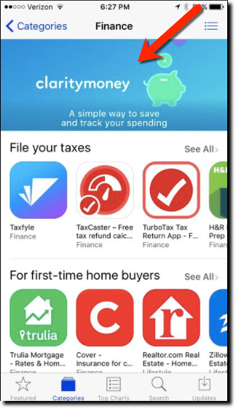
clarity money in ios app storeWhile the term PFM is dead, the concept, employing software to watch over your finances, is more widespread than ever. It’s just called AI, spending management, or nothing at all since it’s now baked into many digital banking offerings.

However, automated spending management is still not widely used by customers because the big players don’t make it available by default, except Wells Fargo’s My Spending Report. So there is still room for new companies in this arena, especially if they invoke AI in their value proposition. And it doesn’t hurt to have celebrity business connections either.

Enter Clarity Money into the crowded field. But with Michael Dell’s brother Adam as founder, and $3.5 million in funding from VC heavyweights Soros Fund, Maveron Partners and Bessemer Venture Capital, the mobile PFM startup has attracted a slew of press mentions (NY Times, TechCrunch, Business Insider, Bank Innovations, and a dozen more). But the biggest help to the fledgling business came a few weeks ago when Apple namclaritymoney_mint aded it a “new app we love” that pushed the app from nowhere to #16 (USA app store, free Finance apps). Today it is number 56 (see above).

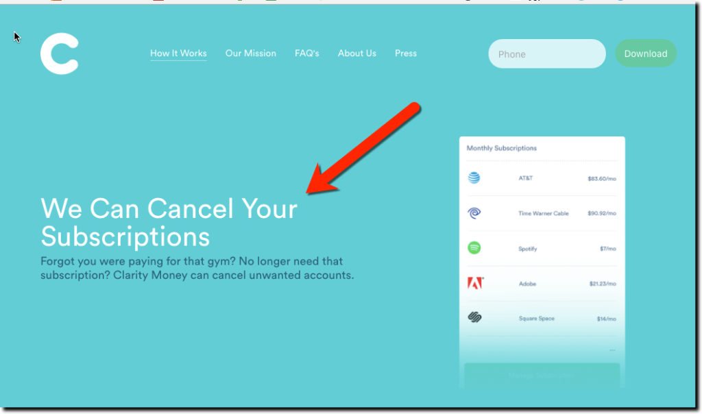
The mobile-only free service reminds us of BillGuard (acquired by Prosper) married to Moven, with a sprig of Mint on the side (see image posted to Clarity’s Instagram left). The value proposition is around monitoring transactions to save money on unneeded recurring services and/or bloated bills (in which the company takes a one-time commission on savings) while building a small nest egg in an integrated FDIC-insured savings account.

Bottom line: There’s much to learn from Clarity’s marketing messages, value proposition, and mobile-first build. If you don’t offer these benefits for customers, someone else will.


claritymoney value prop 1Consumer value prop

  • Save money on bills
  • Build a savings account
  • Don’t get ripped off by unauthorized or unneeded recurring charges
  • Keep your spending organizes

Business model

  • Consumer loan lead gen (e.g., a Chase credit card is shown on a screenshot)
  • Deposit spread
  • Commission on bill savings
  • Offers

Team (co-f0unders)

  • Adam Dell, CEO, brother of Michael Dell (yes, THAT Michael Dell)
  • Hossein Azari, Chief Data Scientist and formerly of Google Research
  • Matt Jacob, VP of Engineering, formerly of CommonBond

Service providers:

  • BillShark for bill savings
  • Experian for credit and transaction monitoring
  • Wells Fargo for savings accounts

Advisors:

Product roadmap

  • Investing
  • 401(k)s

Author: Jim Bruene is Founder & Senior Advisor to Finovate as well as
Principal of BUX Advisors, a financial services UX consultancy. 
Startup Watch: Qonto Launching European Direct Business Bank out of Paris

Startup Watch: Qonto Launching European Direct Business Bank out of Paris

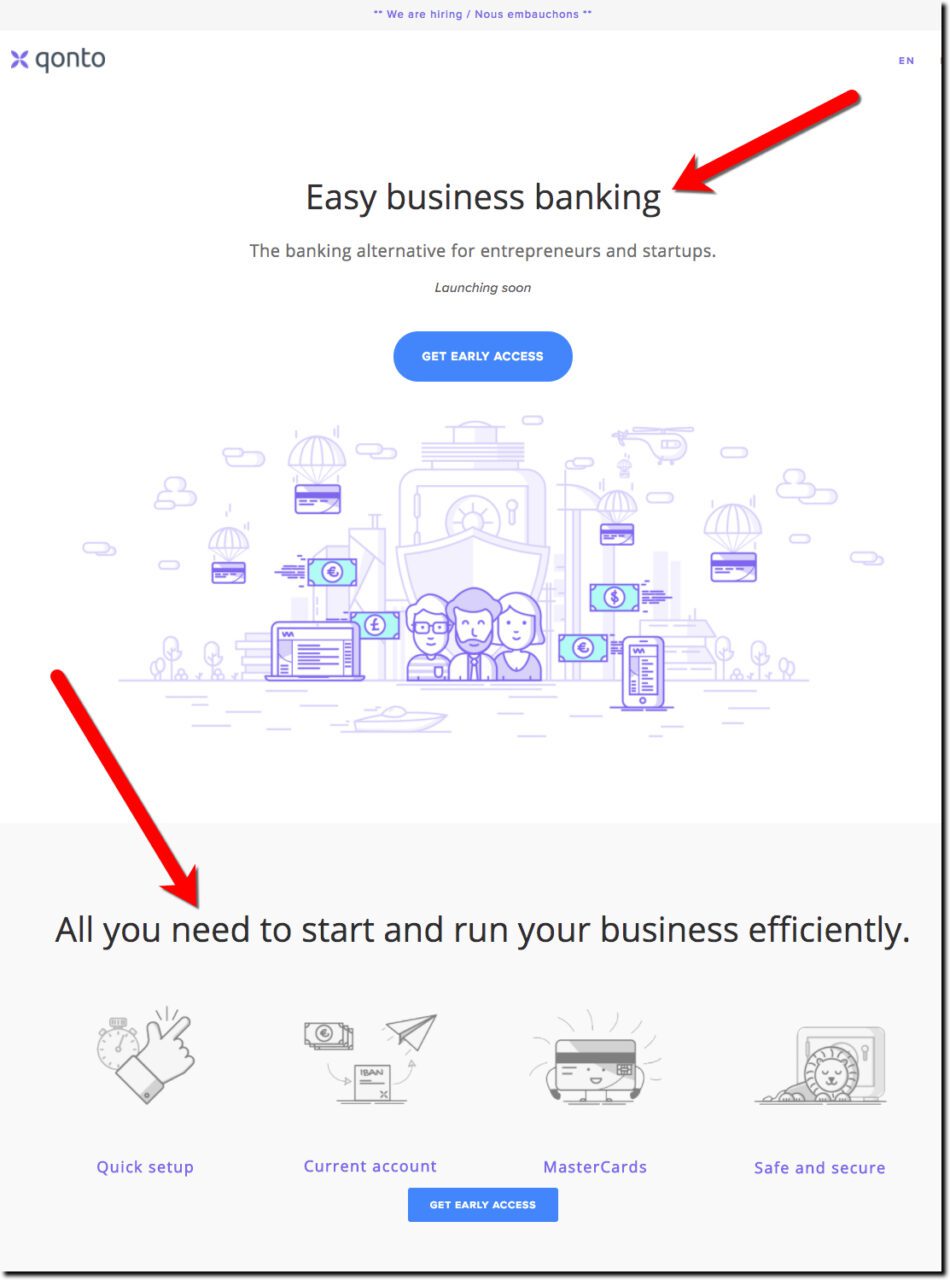
qonto home

When it comes to startups, it seems that consumer services get all the attention, while the enterprise plays get the revenue. Or so Qonto hopes as they target business customers for their new direct bank opening in second quarter. The Paris-based startup (with an .eu web address) is targeting business with their more intensive expense-tracking needs and promises “easy business banking,” a compelling slogan.

The startup is not technically a bank, chartered under the French payments company regulations, but it offers debit cards, current accounts, and international transfers. The only big thing missing are commercial loans, and no doubt those are on the product roadmap, once they get some traction on the expense management side.

Qonto is currently concentrating on the front-end customer experience, off loading the nuts and bolts of payments to Treezor, a French white-label payments provider. Treezor is able to provide instant MasterCard numbers to Qonto customers, with the plastic arriving within 5 days. That helps get the new business customer onboarded immediately, a great first impression.

A few Finovate alums are pursuing this market, but none in France.

The company was in the news last week with their first fundraising, snagging $1.7 million from Alven Capital and Peter Thiel’s Valar Ventures, which also invested in N26 and TransferWise.

Bottom line: Supplying businesses, even smaller ones, is a lucrative proposition. They are not as price sensitive as they appear, because few owners have the time or patience to shop for banking services. Once they settle on a provider, you have a good chance of keeping them for the life of their business, IF you can meet their needs as they grow, especially credit. And startups are uniquely positioned to appeal to small business customers, because as a small biz themselves, they understand the customer like no large bank can.

Holiday Spirit Missing at Big Banks (redux)

Holiday Spirit Missing at Big Banks (redux)

tex-tech-cu-xmas-2016

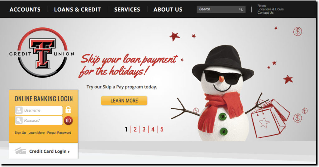
Happy holidays everyone! The holiday spirit is everywhere, except it seems, at the big U.S. banks. I get that budgets are busted, employees on vacation, and you don’t want to offend anyone by mentioning (or NOT mentioning) Christmas. Still, how hard would it be to throw a couple non-denominational snowflakes on top of your logo and wish everyone a happy holiday? Or better yet, how about a little bonus, like the holiday skip-payment offer similar to that featured on Texas Tech Federal Credit Union’s homepage (see above).
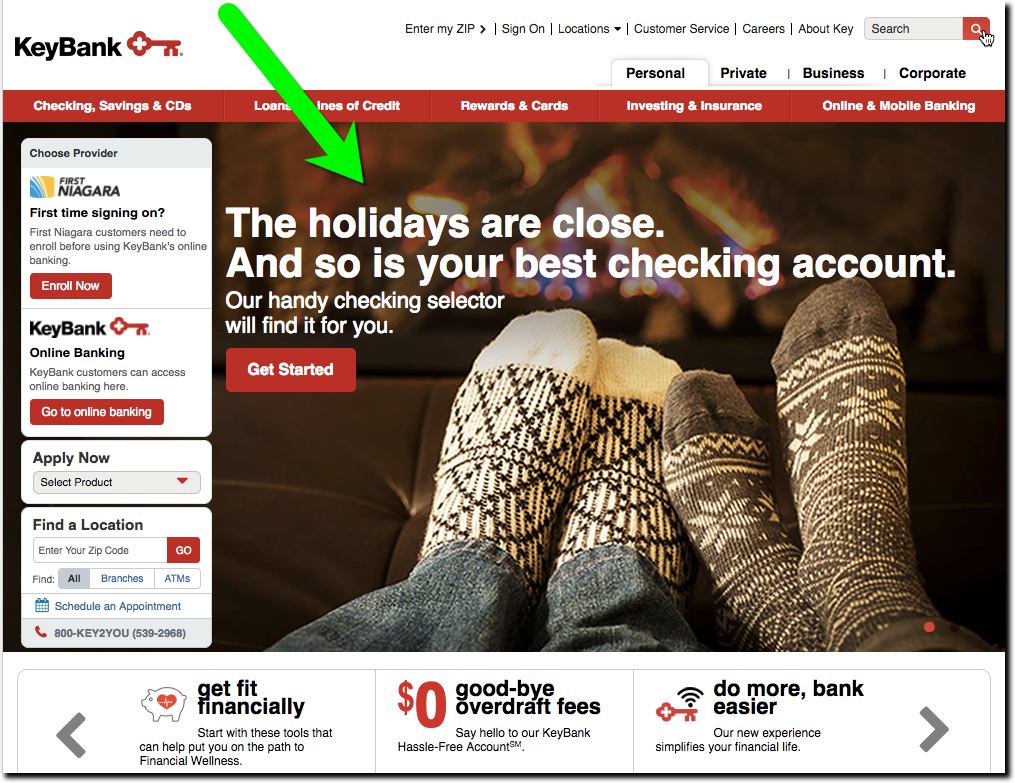
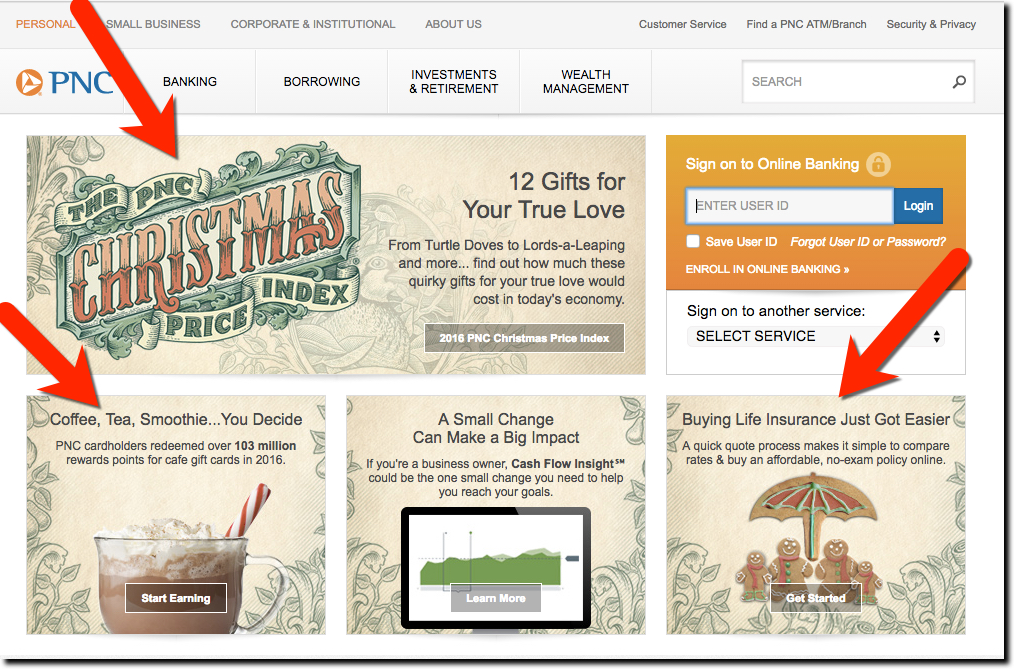
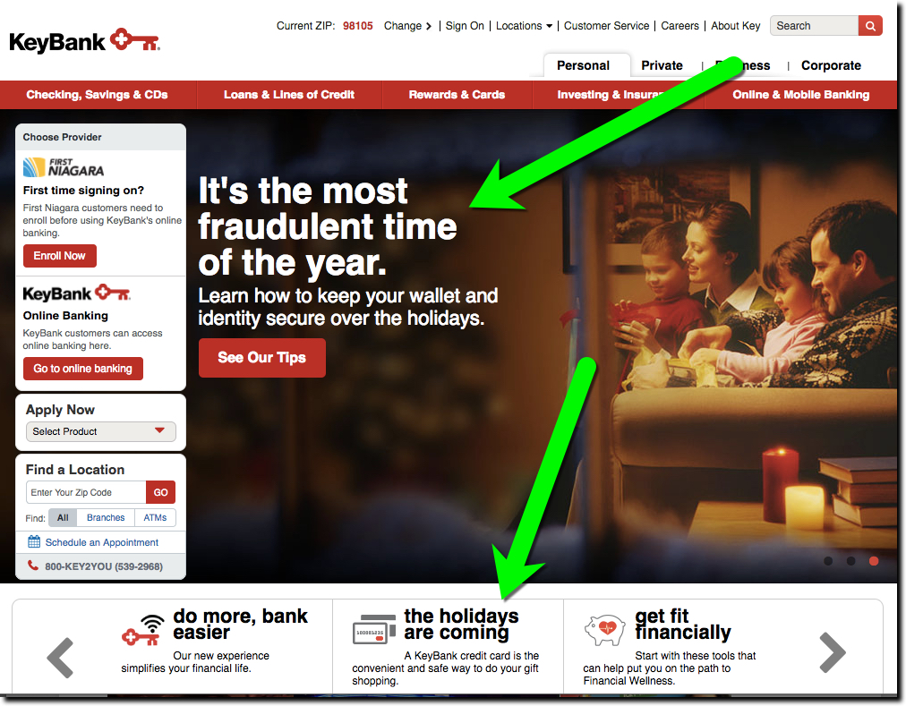
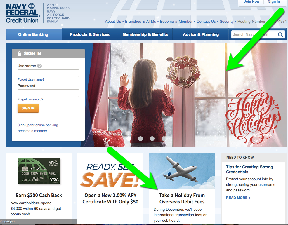
In our annual holiday survey of the 25 largest banks, we found only two, PNC Bank and Key, that acknowledged the year-end holidays on their homepages. And while they are just barely outside the 25 largest, Navy Federal FCU was in the holiday spirit as well.

That’s a pretty poor showing, dramatically down from the 8 to 10 participants in years past (see links below). Caveat: The historical comparison is not perfect due to timing. I was tardy this year and didn’t take my holiday tour until 27 Dec, so I may have missed some decorations that had already been stored in the banks’ virtual attics.

Previous year-end holiday posts: 2015, 2014, 2013, 2012, 2011 (big banks); 2011(credit unions/community banks); 2009 part 1, 2009 part 2, 2007, 2006, 2006, 2004.

———-

Holiday 2016 messages

PNC Bank: PNC continues to go all-in with its long-running and clever cost analysis of the items from the 12 Days of Christmas song.

pnc-12-days-2016

Key Bank: Key has also consistently added holiday bling to its website. This year, running two holiday-themed items, one for checking and the other a broad security warning.

key-xmas-2016-2


key-xmas-2016

Honorable mention: While just outside the top-25 in size, Navy Federal FCU showed its holiday spirit with a classy page-dominating graphic along with a nice message about lack of fees on international purchases.

navy-fcu-xmas-2016


It’s Holiday Loan Time

It’s Holiday Loan Time
MembersPlus Credit Union Holiday Loan Promotion (#2 of 3 in rotation)


I’ve been slightly obsessed with holiday-themed marketing, actually the lack of it, over the years. It’s not that I think putting a bow on your website will magically improve your return on equity (ROE). It’s that by not doing anything, it seems like you are just not trying. You put holiday decorations up in branches, why wouldn’t you extend that same thinking to your digital look and feel?

And it doesn’t have to be an extra cost (like those in-branch decorations). You can push holiday-themed promotions to cover the costs of the website changes and then some. One example, primarily offered by U.S. credit unions, is the so-called Holiday Loan (see other examples in our past coverage). These are small (usually under $5,000, sometimes just $1,000) unsecured installment loans to help families with surging holiday expenses. These loans typically must be repaid within 12 months so they are not outstanding next Christmas.

In poking around the web this afternoon, we saw a number of examples at credit unions (and the lone bank). My favorite was this promotion from MembersPlus Credit Union, a 10,000-member CU in the Boston area. Its Holiday Loan is currently featured on the homepage with a good supporting holiday graphic. The 7.99% APR is fair and undercuts most bank revolving credit and the 1-year payback schedule is good for helping members repay the debt before it becomes a burden a year from now. The maximum loan amount is $5,000.

Have a great weekend and don’t forget the hot chocolate!

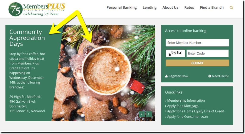
The MemberPlus homepage currently display an eye-catching promo for its upcoming Member Appreciation Days (promo #1 of 3 in rotation).
The MembersPlus homepage currently displays an eye-catching promo for its upcoming Member Appreciation Days (promo #1 of 3 in rotation).

Marketing: Bank of America Reinforces Digital Banking Features, Benefits

Marketing: Bank of America Reinforces Digital Banking Features, Benefits
Hotels.com spokesperson "Captain Obvious"
Hotels.com spokesperson “Captain Obvious”


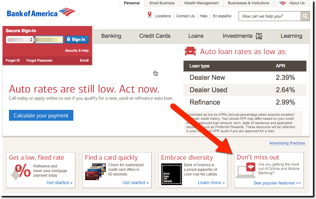
Sometimes, the most obvious things are easiest to overlook. For example, despite the importance of mobile (and desktop) functionality for website visitors, some banks, even major ones (Chase I’m looking at you), don’t bother to reinforce their features and benefits. That is probably less of an issue for big brands where most customers assume state-of-the-art digital features are readily available. But community banks and credit unions should have mobile and/or online banking listed in primary or secondary navigation. US Bank has always been good at doing just that.

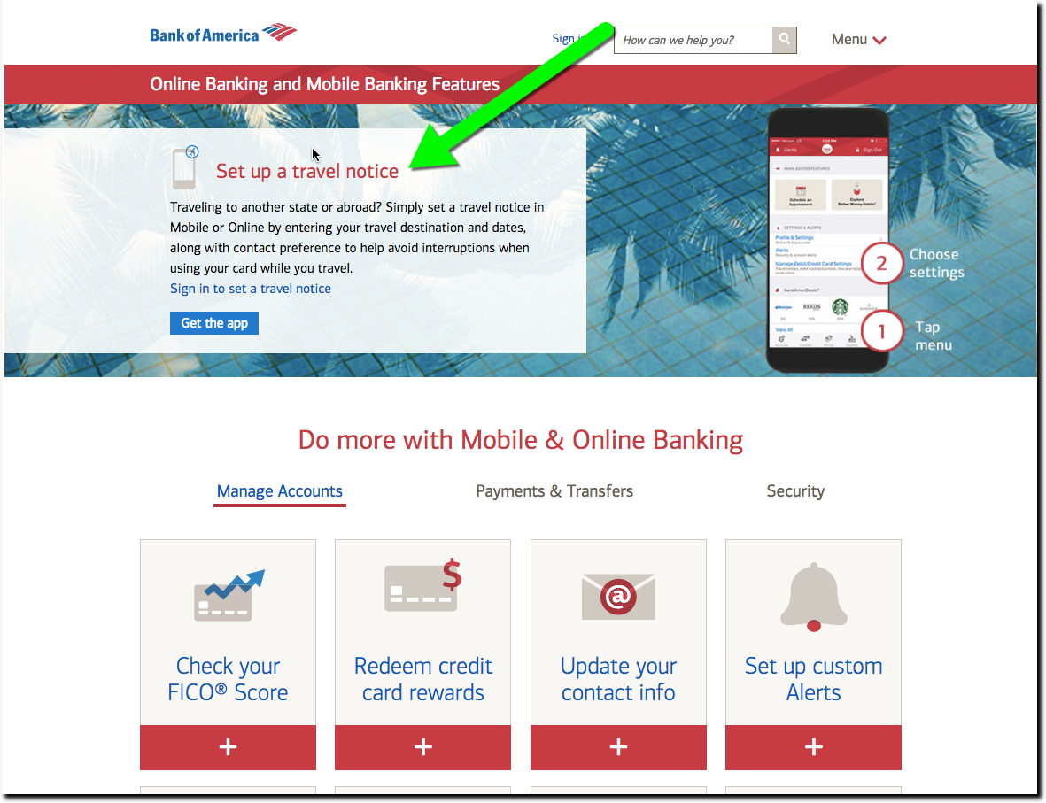
Recently, BofA has been promoting its online/mobile features with a homepage promotion (see screenshot #1 below). I first noticed it while paying my BofA card Friday, but I don’t know how long it’s been running. Clicking the See popular features link delivers you to a page touting features across three categories: Manage Accounts, Payments and Transfers, and Security. The first five are visible on screenshot #2 below:

  • Set up a travel notice (currently the featured feature across top-half of screen)
  • Check your FICO score
  • Redeem credit card rewards
  • Update your contact info
  • Set up custom alerts

The other 11 (not shown in screenshot):

  • Replace card
  • Go paperless
  • Direct Deposit
  • Reorder Checks
  • Bill pay
  • Transfer and send money
  • Pay with a digital wallet
  • Mobile Check Deposit
  • Lock or unlock your debit card
  • Fingerprint sign-in
  • Security Center

Note: I’m surprised Bank of America’s “deals” aren’t one of the 16 features highlighted. Even though you can’t really make it out, the mobile phone at the top of the landing page (screenshot 2) has the BankAmeriDeals section open along the bottom (note the Starbucks logo).

Bottom line: A good explanation of digital features and benefits should be easy to find on your website and mobile app. Even though the features seem straightforward to power users like yourself, it’s all a big mystery to 95+% of your customers who just want to spend as little time as possible banking.


Bank of America invites customers to check out its digital features.
Bank of America invites customers to check out its digital features


Bank of America's extensive digital features explainer.
Bank of America’s extensive digital features explainer (link)

Friday Favorites: Financial Institutions Honor Veterans

Friday Favorites: Financial Institutions Honor Veterans

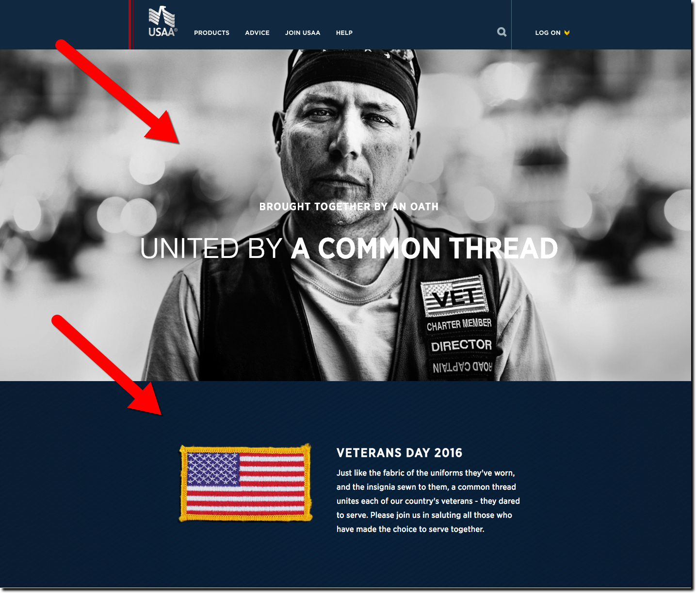
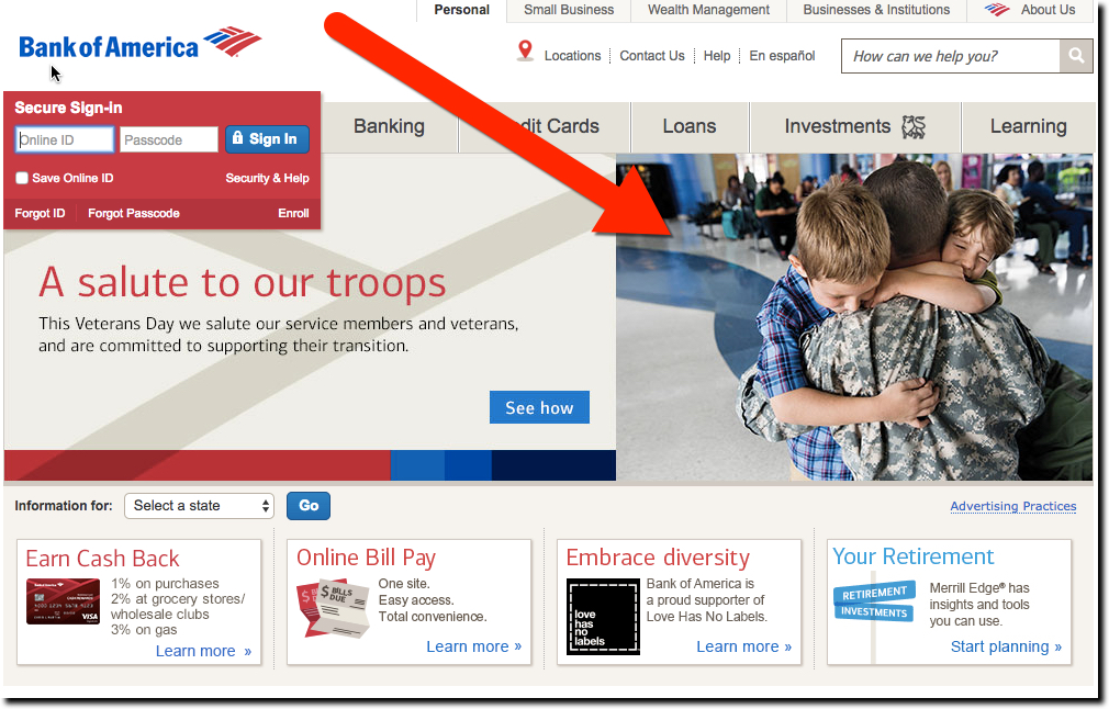
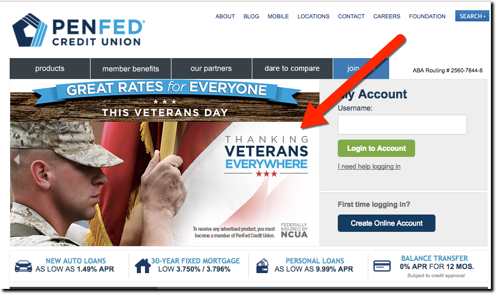
If there’s one thing Americans can agree on, it’s honoring and celebrating the service of our veterans both past and present. Given the contentious election week in the United States, you’d think U.S. financial institutions would be rolling out the red, white and blue on their websites on Veterans Day today. But there was surprisingly little activity at the major banks. Most had the same old-same old on their homepages. Even Navy Federal Credit Union passed on adding anything extra for the day.

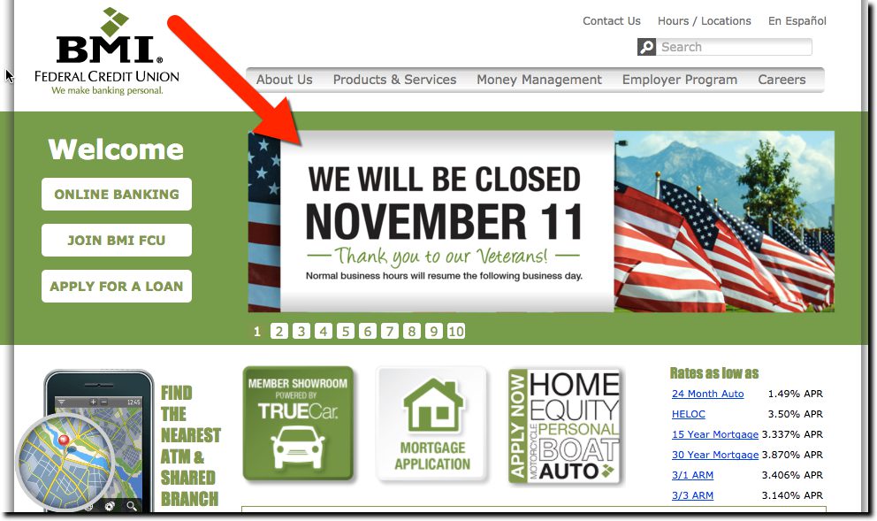
The only top-50 banks with Veterans Day graphics were Bank of America, Zions and of course USAA, all displaying page-dominating graphics on their homepages (see below). We also looked at a few credit unions (at random) and found BMI Federal Credit Union and PenFed honoring vets (see below).

Zions bank homepage featuring Veterans Day homage
Zions bank homepage featuring Veterans Day homage (11 Nov 2016)


USAA homepage on Veterans Day (11 Nov 2016)


Bank of America Veterans Day image on homepage (11 Nov 2016)


penfed-veterans-day-homepage
PenFed Credit Union homepage on Veterans Day (11 Nov 2016)


bmi-fcu-vets-day
BMI Federal Credit Union leads with a Veterans Day announcement (11 Nov 2016)

Mobile UX: A First Look at “Second Look” Transaction Alerts from Capital One

Mobile UX: A First Look at “Second Look” Transaction Alerts from Capital One

capital-one-labs-home

A paradox of the early digital banking era (1995 to 2007) was: Why is Capital One a laggard? The new company (spun out from Signet Bank in 1994) was widely revered as a data-analytics and marketing master. But it was practically a digital no-show for more than a decade, offering just a minimum level of functionality online. As recently as 2010, Capital One was the last major bank to launch a native mobile banking app.

Fast-forward six years. Capital One owns the innovation mantle, at least in the United States. It has Capital One Labs; it runs an innovation center in the Bay Area; and it now offers the most advanced set of mobile apps in the card-issuing business.

Its latest innovation? The first proactive service from a major issuer that alerts cardholders to deviations in spending with recurring charges. It’s called Second Look, and it certainly deserves one.

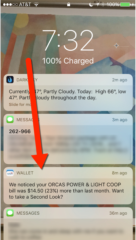
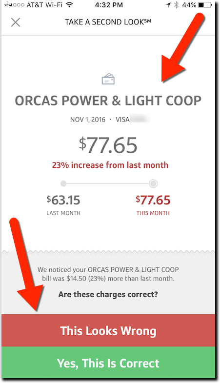
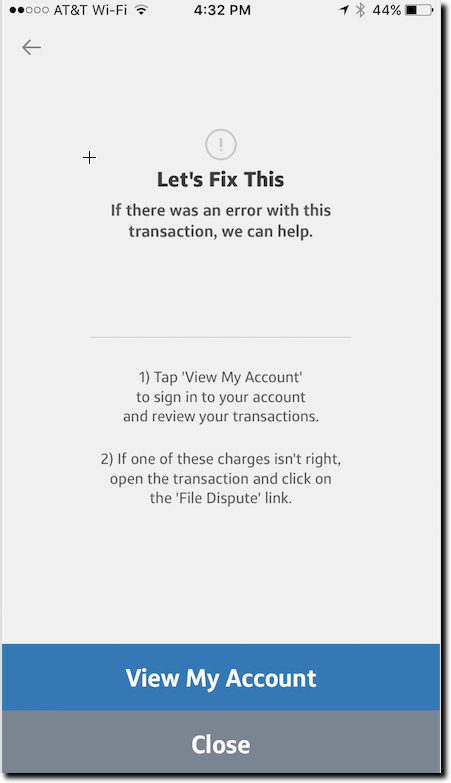
I was introduced to the new feature this week when I received a notification on my iPhone alerting me to a spending increase on my power bill (screenshot 1 below). After swiping through it and logging in via TouchID, the app displayed a chart showing how much my bill had increased last month (screenshot 2). And I was asked whether I was OK with the charge or not (bottom of screenshot 2). If not, the bank provided instructions on how to dispute the charge (screenshot 3). Customers can also elect to receive the alerts through email.

Another thing I really appreciated: The bank gave me enough info in the notification to make an intelligent decision whether I even needed to log in. The bane of the mobile-user experience is dealing with (ultimately ignoring) all the false positives you get through most notification services. I clicked through the notice out of curiosity. But thanks to the detail, I already knew that the $14 increase wasn’t a major problem.

Bottom line: This is just one example of a more proactive approach to helping customers deal with day-to-day finances. It’s still a relatively manual user experience, especially if you want to dispute a charge. However, as banks layer AI on top of their data hordes, outside APIs, and location-based info, we’ll see much, much more. Kudos to Capital One for leading the way.

(1) Second Look notification from Capital One
Exhibit 1: “Second Look” notification from Capital One


Exhibit 2: Second Look transaction analysis
Exhibit 2: Second Look’s transaction analysis


Exhibit 3: Second Look's taking action screen
Exhibit 3: The manual process to dispute a Second Look-flagged charge


Launching: “The Guarantors” Helps NYC Renters Qualify for an Apartment

Launching: “The Guarantors” Helps NYC Renters Qualify for an Apartment

theguarantor-homepage

As a blogger/analyst/entrepreneur, it’s a mixed blessing when someone delivers on a market need you’ve been ranting about (here and here). You feel vindicated and you have a blog post that writes itself, but it knocks one thing off the top of your businesses-to-start list.

So begrudgingly, I introduce you to The Guarantors, an N.Y.C.-based startup that is stepping up to meet the needs of renters trying to qualify for an apartment in New York City, and eventually other markets such as Boston, Chicago and California. I was directly involved in one such qualification excercise two months ago.

The company essentially acts as your parent (if your parents could fill out reams of paperwork within 12 hours, were extremely well heeled and backed by surety bonds), stepping in to co-sign and guarantee your rental agreement. To make landlords trust the stand-in parent arrangement, the startup backstops its guarantees with insurance from The Hanover Insurance Company. If the renter does not fulfill the terms of the lease, The Guarantors, makes the landlords whole. It is a brilliant idea, and perfect for financial institutions to license or build themselves.

The only problem is cost. Depending on risk profiles, The Guarantor charges U.S. citizens 5% to 7% and international renters 7% to 10% of the annual rent, about 3 to 4 weeks’ rent to backstop a 12-month lease; leases up to 18 months are a higher rate). But by eliminating deposits that can equal that amount or more, it can be cash-flow-positive to the renter. Though, unlike a deposit, that money is gone for good. So it doesn’t help first-time renters without the initial cash surplus of two-month’s rent. However, a financial institution offering the service could loan the renter all or part of that. There is no cost to the landlord.

The company, currently operating in NYC, is open only to renters with a 630 or higher FICO score and annual income at least 27x the rent. Alternatively, the company allows co-signers with at least 45x the monthly income, or liquid assets of 75x the monthly rent, to guarantee the guarantee. Applications are approved with 12 hours.

The company launched in 2014 and spent 18 months nailing down the insurance deal with Hanover. It has taken a seed investment of an undisclosed amount from nine investors (50 Partners, Alven Capital, Arnaud Achour, Fides+Ratio, Kima Ventures, Partech Ventures, Residence Ventures, Silvertech Ventures and White Star Capital).

Bottom line: Renter financing/assistance is a promising new lending/customer service for financial institutions. You not only get new customers, new loans, new checking accounts, a foothold in the millennial market, a unique service to offer employers, satisfied renters (and their parents), but also become a local hero with write-ups in every newspaper, blog, and housing forum in your market. And, with a phone call or two, you will be on the nightly TV news every fall when it’s “apartment hunting” season.

Contact The Guarantors now and offer to be their first distribution partner outside New York City, or their first strategic investor. And if you are Wells Fargo, Capital One, American Express, or Chase, just buy them outright already.

Have a fantastic weekend all!