What the Real-Time Web Means for Banking

imageOne of the most important trends in the online/mobile world is the so-called real-time Web. Here’s how Wikipedia defines it:

…technologies and practices which enable users to receive information as soon as it’s published, rather than requiring that they check a source periodically for updates.

Online banking should have gone
real-time long ago, but privacy concerns and a legacy of batch
processing — not to mention the 100-year credit crisis — have kept
info delivery in very non-real-time at most financial institutions (note
1
).

As balance/transaction email alerts appeared on the scene in 1996/1997, the perfect solution to keep consumers informed on a timely basis seemed assured. But for most users, financial alerts have not lived up to their promise. Why?

1. Users must remember to establish alerts while they are banking online

2. Users must establish proper parameters so they are not overwhelmed with alerts, or receive too little info

3. Those parameters must be tweaked as necessary

4. Users must select the proper email inbox(es) for the alerts

5. Users must read the alerts in a timely fashion

6. And of course, act on them if necessary

Frankly, that’s just too much work for most online bankers. Sending alerts to a mobile device may help since it is typically more immediate than email. But that depends on the user and whether they really want banking messages in their text-message stream.

But we think many users, now accustomed to viewing a stream of info all day from Facebook, Twitter, FriendFeed, RSS, and so on, will want similar delivery of financial info. Some will want their financial info to stream into their overall news feed (e.g., via Facebook, Twitter, etc.), others will prefer a separate dedicated channel (e.g., Blippy note 2, Strings). And the old-school folk will still prefer email or text-message feeds.

Once the feed is established, users will want to interact with the data, for example:

  • Tagging entries for budgeting/tax purposes
  • Sharing specific transactions with friends, spouses, accountants
  • Forwarding transactions to bookkeeping or managers for reimbursement
  • Replying to the bank/merchant regarding incorrect transactions  
  • Flagging transactions for later review

The real-time Web turns online banking on its head. Creating a daily dialogue with customers, rather than one-time sessions where users log in every few days, then hope nothing goes wrong before their next login.

There are advantages in both models, but it’s not really your choice which one to offer. The world has gone real-time: You can either join in or have your customers migrate to Mint/Blippy/Wesabe to tap their financial feed.

Notes:
1. This is characterization of the U.S. situation; many other countries are much further ahead, and have been operating under real-time info-flow for years. 
2. We believe there are a number of practical applications for Blippy’s technology; see our previous post.
3. For more info on financial messaging and alerts, Online Banking Report subscribers should review our 2003 report on the subject.

Twittering Vantage Credit Union Taps Geezeo for Online PFM

imageLast October, Vantage Credit Union launched one of the most novel banking services of 2009 (or ever for that matter), transactional banking through Twitter direct messaging (see note 1). The CU earned our OBR Best of the Web designation for its creativity.

Unfortunately, it doesn’t appear the service has gained much traction yet. The 103,000-member St. Louis, MO-based CU has 322 Twitter followers on its public feed and about 200 on its protected TweetMyMoney feed where the t-banking takes place (Note: Updated per comment). The majority of public feed followers are analysts, bloggers, and other credit unions.

But Vantage’s Twitter move isn’t about number of users. It’s about keeping its brand relevant with its social networking members. And splashing Twitter across your homepage is a great way to do that (see screenshot below).

Now Vantage is back at it, partnering with Finovate-alum, Geezeo to offer state-of-the-art online personal financial management (press release). It will be fun to see what VCU EVP Eric Acree, a Filene i3 member, does with the Geezeo platform. I think it’s safe to say that they will put a novel spin on PFM.   

VCU is Geezeo’s fourth white-label credit union client; the other three are Stanford Federal Credit Union (previous post, note 1), Alliant Credit Union, and 1st Advantage FCU. The company is also working with 1st Mariner Bank (updated March 1 per comments).

Vantage CU continues to promote its Twitter features on its homepage
(26 Feb. 2010)

image

Notes:
1. Stanford FCU’s website still says Geezeo-powered MyMo is “coming soon” (link to the Oct. 31, 2009, dated announcement), but the link to the new service has been pulled from the SFCU homepage. 
2. For more info, see our Online Banking Report: Leveraging Twitter (May 2009)

Mint.com Traffic Soars Under Intuit Ownership

image I don’t know if it has anything to do with the publicity Mint received in recent months following its acquisition by Intuit or the promotional links from Quicken’s website, but the online PFM juggernaut just blew the roof off its monthly traffic. According to Compete, in January, Mint had 1.7 million unique visitors, 600,000 more than a year earlier.

To provide a little context, not counting the Dec. to April tax-time traffic spike at Intuit, Mint’s traffic is now slightly HIGHER than that of its parent company (see chart #1 below). That gives you a little understanding of why Intuit coughed up $170 million for the startup.

Another way to look at it: Mint now has as much traffic as the tenth largest U.S. retail bank, BB&T (see chart #2).

The interesting question for 2010: Now that Mint is part of the establishment, what startup will rise up to challenge it? Or will the banks, back on a path to profitability, fill the need going forward? 

Chart 1: Mint’s traffic is now similar to Intuit’s non-tax-time traffic

image
Source: Compete (link)

Chart 2: Mint now has about the same number of visitors as the tenth largest U.S. retail bank, BB&T
Note: Mint is blue line below

image 
Source: Compete (link)

Note: For more information on the PFM space, see our Online Banking Report on Personal Finance Features.

Citibank, Microsoft Join Forces with Bundle, a Personal Finance Site with a Data Bent

image I had been intrigued about rumors that Microsoft and Citibank were partnering on a joint personal-finance venture called Bundle. I was hoping for the financial services version of an Apple launch.

OK, that’s a little too high of a bar to set. I was really just hoping for the next Mint or at least something we hadn’t seen before. To some extent, Bundle delivered, with Mint-like attention to design and deeper data than we’ve seen previously. But in other ways it’s just a me-too personal finance site, FiLife 2.0. Bottom line, Bundle has been open only a week so it’s way too early to predict where it’s going or how it makes money. 

imageBundle is a personal finance startup backed by Citibank, Microsoft, and Morningstar. Two of the key execs, including CEO Jaidev Shergill, are from Citi Growth Ventures, the group charged with commercializing products and ideas that have bubbled up within the banking giant. The startup also enlisted professional journalists, including Janet Paskin who’s written for Dow Jones’s SmartMoney Magazine among others.

Given that pedigree, the new site is kind of a SmartMoney Magazine meets your credit card statement with some social networking thrown in the mix.  

What distinguishes it from most personal finance content providers is that Bundle showcases proprietary data, sourced from Citibank’s massive card-spending warehouse. The site gives center stage to data and shows household spending personalized to your specific location.

There’s also professional personal finance advice mixed with stories and comment from the community. Even the articles use the database to illustrate points (screenshot 3). 

image Naturally, it’s well-integrated to Facebook. You cannot even comment unless you log in via Facebook Connect. You can follow Bundle on Twitter, of course, but surprisingly there is no blog or RSS feed.

And Bundle already has its own iPhone app called Vice Tracker (iTunes link) that makes shopping for non-essentials into a tongue-in-cheek game. The unique app was added to the store two weeks ago in the Lifestyle category. 

According to the FAQs, Bundle’s business model is advertising, but there are no ads on the site yet, other than the logos of the backers (Microsoft is using its MSN Money brand). Presumably, they are looking for financial advertisers, but the Citibank connection might make that a harder sell.

Analysis
I like what Bundle is doing, creating a consumer-facing company around Citibank’s cardholder data. But I can’t figure out who they are targeting. Maybe they haven’t decided yet.

If they want to attract data junkies like myself, the data needs to be more transparent and they need more robust tools to play with it. I enjoyed being able to compare the spending of my Seattle neighbors against that of my home town in Iowa (it’s surprisingly similar). But I was left with a number of questions: 

  • Where does the spending data come from? The FAQs are vague on saying that it comes from Citibank card data, government sources and “other third parties.” 
  • If it’s primarily Citibank card data, is it really representative of the entire town or just the people that hold Citibank cards? For example, Bundle tells me (screenshot #3)  that the average dining out expense in Seattle is $115 and the most common spot is Starbucks followed by McDonalds. Something seems wrong with that.  
  • And furthermore, are these estimates of all spending or just that on Citibank cards? And which Citi portfolios are included? What about business cards?
  • The graphical bubbles are nice, but I like to view data in tables, especially when trying to drill down and do meaningful analysis. Is there some way to see the underlying numbers?

On the other hand, if Bundle is trying to attract readers looking for personal finance advice and discussion, the data is kind of in the way, more window dressing than anything else.

Final thoughts
The graphics are great and the spending data is interesting. But why would I come back? There’s only so many times in one’s life that you want to compare the shopping habits of your city vs. somewhere else.

Presumably, future versions will allow you to compare your actual spending to the Bundle averages using account-aggregation technology. This is a popular feature of Wesabe, and is one of the major tenets of what we’ve called “social personal finance” (note 1, 2).

I also expect they’ll integrate Bundle into the Citibank cardholder site so its customers can do online comparisons while they are checking their statement online.  If Citi can document a spending lift from bundled Bundle, then the startup has proven its value. Armed with that success, it could be licensed to other big card issuers, increasing the value of the Bundle data for all users, attracting more users and more advertisers. The network effect. Perhaps that’s the end game here. 

#1: Main Bundle page after selecting “Seattle” as location to show spending (29 Jan. 2010)

image

#2: Main page after drilling down through the “Food & Drink” bubble (link)
Note: Top five restaurants for dining out in Seattle are Starbucks, McDonalds, Subway, Red Robin and Cheesecake Factory. That sounds possible, but then the average purchase size is listed at $115. That’s a lot of lattes or Big Macs.

image

#3: The ever-present “spending balls” hover above an article by Bundle Managing Editor Janet Paskin’s short post. The balls compare the spending in Brooklyn with her hometown Seattle 
Note: Brooklyn comes out cheaper, see the solid circles (Brooklyn) in front of the cross-hatched ones (Seattle).

image

Notes:
1. See our previous reports on Social Personal Finance (2007) and Online Investment Communities (2008).
2. Wesabe would seem to be a great acquisition if Bundle wants to add the aggregation technology piece and jump-start its user base.  Blippy-like features would also make the site more sticky.
3. For more background on the software tools being used, see the article on Bundle in Microsoft’s Financial Services publication published 22 Nov. 2009.

Blippy Demonstrates the Power of Real-Time Streaming of Financial Transaction Data

image Blippy has been one of the more controversial financial entrants in the past few years. Observers have called it the “end of privacy as we know it,” a way to take “oversharing to a dizzying new level,” and a “great tool for phishers.” And those are just the people who like it.

Blippy, a kind of Twitter meets Yodlee service, allows users to stream their purchase activity to the startup’s website. Users can choose to publish data from credit and debit cards, bank accounts, and/or directly from purchase activity at ecommerce-partners sites (see list below). It’s the ecommerce transaction stream that provides the richest data describing the actual product purchased or rented rather than just a dollar total.

For example, here’s an entry from @Julia who’s connected her Amazon account directly to Blippy (note 1)  As you can see the Amazon purchases are shown in detail and one of the items, a giraffe teether, has elicited a question/comment from a friend (highlighting ours):

image

In comparison, credit card transactions list only the merchant name and not what was purchased. However, Blippy allows users to annotate their transactions to add that detail, as you can see in the following entry. 

image

One of the most common ways Blippy is used is to stream media consumption via iTunes and Netflix. Here are the three Netflix movies on their way to @crobertsjr:

image

The Palo Alto-based startup received a $1.6 million angel round in January 2010 from Ron Conway, Jason Calacanis, Twitter’s Evan Williams, Sequoia Capital, Charles River Ventures, and others. 

How it works
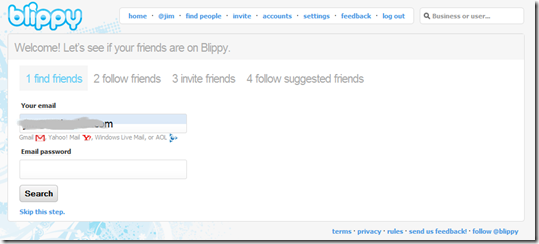
I got my first taste of Blippy after it opened to the public on Jan. 14. It’s simple to get started, calling for just an email address, screenname and password. You also have the option of finding friends using your email address book or choosing from a list of 13 suggested people including Blippy founder Philip Kaplan (@PUD) and interstar Jason Calacanis (@jason).

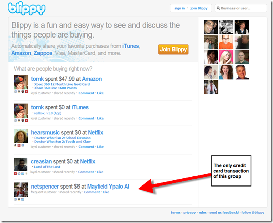
But you don’t even need to register for Blippy to see it in action. There’s a live stream on the homepage that anyone can watch (see screenshot below). If Blippy follows the Twitter/Facebook model, they will soon have an API available that will let outside developers tap the data stream.

Usage stats

  • Number of beta users: More than 5,000 who streamed $4.5 million worth of transactions
  • Most-streamed merchant: Netflix with 54,000 entries
  • Most prolific spender (that I ran across): Foo Bar (@foo), who does not identify himself other than CEO at a gaming startup, has linked his business credit card and streamed more than 350 purchases worth more than $300,000 (he’s a big online advertiser at Google, MySpace, Facebook).
  • Most-followed user: Leo Laporte (@leolaporte), from the Premiere Radio Network, with more than 2,600 followers

Features/benefits

Data sharing within workgroups:

  • Ability to share financial transactions within a family, a workgroup, or small business. It would be a great way for financial gatekeepers, e.g., the bookkeeper, CFO, or even board members/investors to keep tabs on company spending (see @foo above).
  • Ability to annotate expense streams. Users can add short descriptions to expense items so their followers can see the specifics.
  • Ability to discuss/comment on expense items. For example, CFO can ask “why did our Google AdWords expense spike yesterday?” and anyone in the group can comment back with an answer or speculation. We use Yammer in our company for this type of back and forth. 

Product research/social networking:

  • Ability to find other customers of the same store
  • Ability to discuss product or media purchases with friends or strangers
  • Ability to post positive/negative info about purchases (yours or others)
  • Ability to find previous purchasers of a product you are considering (currently not supported through search)
  • Ability to compare how much people paid for a certain item (not currently supported through search)

Personal financial management:

  • Ability to annotate expenses for future reporting (e.g., marking taxable items)
  • Store transactions free for as long as Blippy keeps the servers running
  • Ability to search own transactions

Financial institution opportunities
1. Card companies and banks should create similar sharing functionality for alerts; especially for small business clients. While public posting of purchase data may never have mass appeal, there are many private uses for real-time transaction data.

2. PFM’s should be building this functionality now to get out in front of Mint/Intuit who could simply acquire Blippy and incorporate real-time data flow within weeks. 

3. Once the Blippy API becomes available, banks should tap it to allow their customers to use it directly from within online banking.

Analysis
Whether Blippy lives on as a standalone service is difficult to predict. It depends on whether these capabilities are incorporated into other social networks, particularly, Facebook (note 2) and Twitter. And how fast card issuers move to make real-time transaction info easily available to their own customers.

image But regardless of where the company nets out, Blippy should be credited with pioneering real-time financial transaction flow, something every financial institution and ecommerce company will support in the coming years. As a result, we are awarding Blippy an OBR Best of the Web award, our first of 2010 and just the third in the past 14 months (note 3, previous winners).   

Blippy Homepage (14 Jan. 2010 7 PM Pacific)
image

 Optional sign-in to Gmail, Yahoo or AOL to locate friends on Blippy 
image

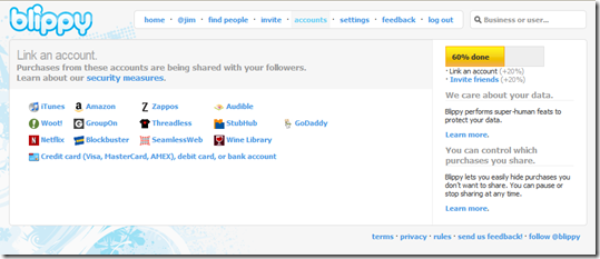
Purchases/activity at these merchants can be automatically tracked
Note: 13 ecommerce merchants currently participate (Amazon, Apple iTunes, Audible, Blockbuster, GoDaddy, GroupOn, Netflix, SeamlessWeb, Stubhub, Threadless, Wine Library, Woot, Zappos)
image

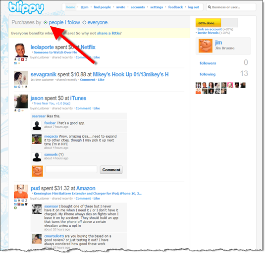
The Blippy real-time transaction stream
Note: You can choose to watch all activity or just that of the people you are following
image

Notes:
1. If she hadn’t given Blippy her Amazon login info and linked only her credit card, there would be no product detail. It would just show as $80.95 spent at Amazon.
2. Blippy is similar to Facebook’s ill-fated Beacon service launched in Nov. 2007. The service was quickly toned down, then eventually dismantled, due to the privacy brouhaha that ensued. Blippy is very different because its users are signing up specifically to share purchase info. 
3. OBR Best of the Web awards, from Online Banking Report, are given periodically to companies that pioneer new online and mobile banking features. It is not an endorsement of the company or product, just recognition for what we believe is an important development. Blippy is the 76th recipient since we began awarding it in 1997. There were just two winners in 2009.

Stanford Federal Credit Union Readies Launch of Geezeo-Powered MyMo PFM

image It looks like we are just days away from the launch of the first Geezeo-powered private-branded online PFM. Fifty-thousand-member Stanford Federal Credit Union, one of the first financial institutions in the world to offer Internet banking in the mid-90s, has been promoting the soon-to-be-launched personal financial manager for several months.

The service, called MyMo is currently in final testing with SFCU employees. It will run both online (screenshot 1 and 2, below) and through a mobile app (inset).

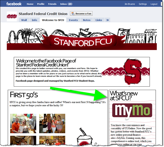
imageMyMo has been the lead story in the CU’s in-house newsletter for two months running (see screenshots 3 and 4). In November, the service was said to coming “this month.” Then in December, it hedged with a “coming soon” message. There’s still no specific info on when MyMo will launch, but there’s a promotion running on the middle of the SFCU’s homepage and Facebook page (see screenshots below), so it must be soon (note 1).  

The future: While private-branded online PFM is not new, Bank of America has several million users of its Yodlee-powered solution, the concept appears to be gaining momentum. Intuit/Digital Insight are now powering hundred of FIs while Wesabe and Jwaala have also made in-roads into the CU world. We’ll see lots of innovation in this area in the coming decade (see note 2).

1. MyMo desktop: Dashboard view (link)

image

2. MyMo desktop: Add a goal

image

3. SFCU’s November 2009 newsletter (link)

image

4. SFCU’s December 2009 newsletter (link)

image

5. SFCU homepage (17 Dec. 2009)

image

6. SFCU Facebook page (link)

image 

Notes:
1. While I think it makes sense to run a teaser campaign for a new product, SFCU should provide more detail on when the service will launch and why it’s been delayed. Members want the service to be fully tested, so they won’t mind waiting a bit longer as long as the CU is upfront with them about the timing.
2. For more information on the PFM space, see our Online Banking Report on Personal Finance Features.

Blippy: Do We Really Want to Automatically Tweet our Purchase Transactions?

image I love startups. Just when you think you’ve seen everything, along comes someone doing something that no one would have ever thought of five years ago, or in this case one year ago.

image The latest inspiration: Blippy. The service allows you to automatically broadcast your credit or debit card purchases using the Twitter/Facebook model (see screenshot below; note 1).

The first question everyone asks is why? (see comments at TechCrunch) But really, it’s not much different than broadcasting personal details via Twitter or your whereabouts via Foursquare, especially if you limit viewing to friends. The founder, serial entrepreneur, Philip Kaplan explains in the TechCrunch interview, that he has one credit card for “social purchases” broadcast on Blippy and another for purchases he prefers to keep private.

Blippy will contain privacy controls that allow users to share everything or keep it within a closed loop of friends. The company also envisions many other privacy controls to turn the service off and on, allow users to approve transactions before publishing, suppress certain merchants, or merchant categories, and so on.

The use cases shown so far are centered around media purchases, for example using it to automatically tweet (blip?) what song or movie you bought on iTunes or social “check ins” where the service lets people know you just bought coffee at Starbucks. But I can see where it would be helpful for spouses to “broadcast” purchases only to each other. Or for a salesperson to broadcast their purchases to their assistant to build expense reports on the fly. 

The service is in closed alpha (only in use by a handful of friends and family, note 2) as the three-person company gears up for a launch. You can follow Kaplan on Twitter (@pud) for more info.

My take: I like the idea of easily sharing purchases with joint-account holders or a bookkeeper. But many (most?) online banking systems and PFMs already allow this through the alerts system. You may want to boost education efforts on this capability.

imageAs for Tweeting about songs downloaded via iTunes, wouldn’t most users prefer to maintain more control over that by simply using Twitter or Facebook to directly type a short note? But we know from experience, if there’s a way to do something with less effort, it stands a good chance of succeeding.  

I’m not expecting widespread adoption any time soon, but I think there is a market for sharing spending transactions.

Here’s something for innovative FIs to consider: Add a “share this” button next to credit/debit card transaction and let users send the info via email, Twitter or Facebook with a couple keystrokes (see inset from FiLife).

I know it sounds far-fetched, but it might be just the thing to make your card stand out with heavy users of social media.

Blippy homepage showing spending stream (16 Dec. 2009)

image

Note:
1. For more info in Twitter, see our Online Banking Report on the technology published in May.
2. Twitter’s Evan Williams is using Blippy as shown in screenshot taken by CNET’s Rafe Needleman in his article earlier this week.

Intuit’s New Quicken Site Sprouts Some Mint

image If anyone still wondered how serious Intuit is about incorporating the Mint brand into its portfolio after its $170 million acquisition, take a look at the latest version of the Quicken sales site. Mint is prominently featured (see first screenshot below), especially if you scroll one “ad spot” over (second screenshot).

I also found Mint mentioned at PayTrust, Intuit’s bill management site (third screenshot). There’s even a small plug on the Quicken Online login page (fourth screenshot).

However, on Mint’s site the co-branding is not reciprocated. Quicken is not mentioned at all and Intuit is relegated to 8-point type at the bottom of the page (fourth screenshot).

The latest traffic figures from Compete support the theory that Intuit is de-emphasizing Quicken Online in favor of Mint. Traffic to <quicken.intuit.com> fell 50% in November to about 400,000, while Mint held steady at about 3x that, 1.2 million unique visitors.

image
Source: Compete, 10 Dec 2009 (link)

Quicken homepage on default choice, Quicken 2010 (link; 9 Dec. 2009, 11 PM)

image

Quicken homepage with Mint.com selected from scrolling choices
Note: Yellow highlight is mine

image

Intuit PayTrust homepage (link)

image

Quicken Online login page (link)

image

Mint homepage
Intuit mentioned twice at bottom of page (yellow highlight is mine). 

image 

Note: For more information on the PFM space, see our Online Banking Report on Personal Finance Features.

Chase Bank’s Second iPhone App: Gift Planner

imageA few days ago, we predicted there would be tens of thousands of financial institution iPhone apps as the big banks released dozens to support their major business lines. PNC Bank and Wells Fargo were the two examples we cited.

There’s another multi-app bank: Chase. In our search for an iPhone gift planner to replace the web-based Zions Bank service, we ran discovered the bank’s Gift Planner (iTunes link).

Version 1.0 was released in time for the holidays last year (3 Dec. 2008), but it looks like Chase didn’t take over ownership/sponsorship until release 2.0 in August. The app is supported by an excellent small website at yourgiftplanner.com that displays the app and solicits feedback.

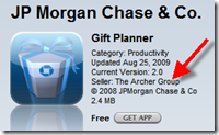
image The app and website are 100% Chase branded. The only indication that a third party is involved is a notation in the iTunes store that the app is sold by The Archer Group (inset), a Wilmington, DE-based digital agency.

Evidently, the app didn’t show up on our radar because it’s placed in the App Store Productivity category instead of Financial. The app doesn’t appear to be mentioned on the Chase main website. A site search there came up blank.

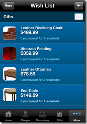
Review: It’s great looking app that can be used for any holiday. The app supports “shake for help,” an advanced feature. The integration with your contact list makes it easy to add new contacts without typing, although you must wade through your entire list. And, the imageprocess of adding gifts is a bit tedious. You have to add a gift to the master gift list, then go to each person and add the gift to their profile. It would be better if you could simply type a gift on the fly.

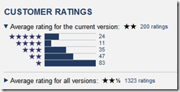
iPhone users have been relatively unimpressed, giving the latest version a 2-star rating out of five; pretty low for a professional app (see inset).

It’s a good branding tool for Chase, but it the app itself could use retooling.

Gift Planner iPhone screenshots (24 Nov 2009)

image   image   image

Gift Planner website (link)

image

Note: For more info on mobile banking on the iPhone see our March Online Banking Report.

Zions Bank Replaces Holiday Gift Planner with eZ Budget Site

image Last year, I discovered a cool little web-based PFM app from Zions Bank, the Holiday Gift Planner (see previous post). It helps plan and track holiday gift lists and purchases (see second screenshot below).

I used it to track 2008 holiday purchases for our kids. I credit the app with not only keeping us on budget, but making the process a little less harried. I liked it so much, I awarded it with an OBR Best of the Web award. My only complaint: it should be an iPhone app.

But this weekend when I clicked my bookmark for the site to enter my son’s “wish list”, I received an error message, “site not found.” I was afraid Zions had discontinued the service. After a search, I found that the site had been replaced by a similar, but more advanced PFM site, called Zions Bank eZ Budget (running on its own URL).

eZ Budget remains free and open to anyone, customers or non-customers. It still has the gift planner module which is very similar to last year’s model (second screenshot). One addition: integrated links to the Zions website to see savings or financing options (see top-left in screenshot 2). And like last year, a Zions banner ad runs across the top.

But it’s been expanded to have three other robust planning modules:

  • Monthly planner (screenshot 3)
  • Project planner (screenshot 4)
  • Event planner (screenshot 5)

Unlike last year when the gift planner was plugged on its homepage, there is no mention of the PFM module on the bank’s website. However, eZ Budget is prominently mentioned on the bank’s Facebook page (screenshot 6). And according to Compete, the new site has about double the traffic, 4,000 unique visitors, compared to 2,000 a year ago.

 image
Source: Compete, 23 Nov 2009

My take: This is a simple and cost-effective way to provide basic budgeting tools to bank customers. I wish Zions had also kept the standalone Holiday Gift Planner which had an attractive holiday look and was less daunting to begin using. But I can understand why the bank would not want to support two planning tools. More importantly, the iPhone version is still on my wish list. More on that tomorrow. 

1. Zions eZ Budget homepage (23 Nov 2009)

image

2. Gift Planner module
Note: Default setting is “Christmas”; but can choose Birthday, Valentines, Wedding, Mother’s day, Father’s day, Hanukkah, or create your own.

image

3. Monthly Planner module

image

4. Project planner module
Note: Default setting is “home remodel”; but can choose landscaping, baby room, or create your own.

image

5. Event planner module
Note: Default setting is “wedding”; but can choose birthday, vacation, or bridal shower or create your own.

image

6. Zions Facebook page (link)
Note: Zions is giving away a $100 Best Buy card each month to new Facebook fans.

image 

Note:
1. For more information on the PFM space, see our Online Banking Report on Personal Finance Features.

Bank of America’s Launches Personal Finance Tips Site

image Bank of America’s latest online effort is a personal finance educational site at <learn.bankofamerica.com> that includes consumer polls, money savings tips, videos and articles. Bank products are sprinkled throughout but the marketing is relatively restrained.

It’s a solid effort. Good, concise copy married to an attractive graphical layout. And for a bank the size of Bank of America, it makes perfect business sense. The site moves a little product, builds the brand, shows off the bank’s consumer-friendly side, provides material for PR campaigns, and gains some CRA credit (note 1). 

But I’m not sure how much usage it will get other than the curious driven to it from banners within online banking. That’s how ended up there today after paying my BofA credit card bill online (see second screenshot below).

Given Bank of America’s 30 million online banking customers, they must not be driving much traffic to the site yet. According to Compete, traffic surpassed 100,000 for the first time in October. July was the first month that traffic was registered at the site.

Unique monthly visitors to BofA’s personal finance tips site (July through October, 2009)

image
Source: Compete

Other than enabling an RSS feed for article updates, the site has no Web 2.0 or social media features. No blog. No forum. It’s just a very pretty face on personal finance 101 material. It will be interesting to see where they take it.

Learn.BankofAmerica.com homepage (link, 13 Nov. 2009)
Note: I completed the poll on the middle of the page, so the results are shown rather than the poll question.

image

Logoff screen (13 Nov 2009, 3 PM Pacific)

image

Note:
1. CRA = Community Reinvestment Act which requires banks to help meet the financial and credit needs of low- to-moderate-income consumers.

The Missing Link for Small Businesses: Banking, Finance & CRM Dashboard

I finally finished our latest report on small business online banking last night. Just as I was about to upload it, I realized there was something missing in the “dream online banking solution” for small businesses.

So I stopped the “presses” and added it to the report. What was the missing piece? A financial and business management dashboard integrated with online banking.

I poked around the web today and found a few interesting products (see update below), none of which were quite what I was looking for, and had no direct connection to financial institutions:

  • image MyBizHomepage has a dashboard that integrates with QuickBooks and sounds pretty slick. But there website hasn’t been updated for more than a year, so not sure if this is a viable business or just a hobby site. I have an inquiry in to the owner.
  • image DreamFactory Software also offers QuickBooks-integrated dashboards. I found it in the new Intuit App Center for QuickBooks add-ins (here). It’s a powerful program, but not the kind of plug-and-play dashboard I’m looking for.
  • image iDashboards: Has impressive sample dashboards to view. None integrate directly with online banking, but many include financial data (see screenshot below).

So I’m still looking for financial institution examples. Know any? Comment below or email me. It’s too late to make our report, but we’ll report it here.

iDashboards mockup of a healthcare “billing scorecard” (link, 28 Oct 2009)

image 

Update (29 Oct 2009):

Here’s another QuickBooks dashboard from QuickGauge.com:

image