Design: Three Fixes Needed to Make Mobile Banking as Widely Used as a Weather App

image Today I noticed something in Square’s latest Card Case app that I’d missed when it was announced last month. It’s a feature they call "tilt to map" which means that if you turn the phone sideways you see a map of nearby locations using Square (see inset, note 1).  

That’s one of those slick, mobile tricks (like remote deposit) that you can’t quite duplicate on the desktop. However, none of the mobile features have pulled me away from desktop banking, yet.

Why? Partly, it’s because I have a laptop with me 24/7 and am almost always in a wifi zone. But even so, I’ve switched to mobile for most other low-bandwidth information services such as weather, traffic, maps, sports scores, movie times, Twitter feed, flight tracking, concert calendar, renting movies, and so on.

What will it take to get banking on this list?

Three fundamental issues need to be solved (with relative magnitude in parenthesis):

1. Make it much easier to login (60%)
None of of the mobile info services I use regularly require any type of login (after initial registration). Banks often allow the username to be saved, which helps, but the typical 8+ digit alphanumeric password is still not a good user experience on mobile. A four or five-digit numerical PIN would solve 80% of this problem. Or even better, install read-only access to certain data. 

2. Make it easier to navigate (30%)
There should be almost no navigation required to see my balance and transaction stream. Square’s "tilt-to" function could be used by a bank to display account balances in portrait mode and a transaction stream in landscape.  

3. Provide security education & guarantees (10%)
This is not an issue for me. In general, I think mobile banking is more secure than desktop (see note 2). But the general public is still unsure about mobile security. You can change this by providing understandable security guarantees for mobile users.

—–

Notes:
1. ING Direct also uses the same trick, displaying links to its social media sites when the app is tilted to landscape mode.
2. For more improving security perceptions, see our latest Online Banking Report.

Capital One Add Rewards to Mobile App, Includes Ability to Redeem for PREVIOUS Travel

Capital One mobile rewards main page Although it was one of the last major banks to launch an iPhone app, Capital One is now positioning itself to be a leader in mobile. Its April 5 iPhone app update included a new rewards function that’s the best I’ve seen.

Rewards point totals are clearly shown on an old-school “flip number” display (see screenshot right). But the novel part, and this may be an industry first, is the ability to redeem rewards in real-time, for travel purchases you’ve ALREADY MADE. (You can also redeem for cash or gift cards.)

I thought this was some kind of typo when I first saw it in the marketing material. So I tested it myself this morning. And sure enough it does exactly what it says.

Previous travel purchases made on the Capital One card are displayed in the app. Users select the one(s) they want to redeem for mileage points and Capital One provides a statement credit to refund the user for the purchase. Brilliant!

———————-

Capital One’s mobile reward redemption for previous travel (20 April 2012)
Note: Select a transaction (below left), confirm (below right).

Capital One mobile rewards screen      Capital One mobile rewards redemption confirm      


imageI also like Capital One’s new app “home page.” Instead of forcing a login before users can do anything, the bank offers several non-secure content areas:

  • Browse our products
  • Find branch/ATM
  • Mobile banking FAQ
  • Contact us

These are useful for customers who can’t or don’t want to log in. And of course, for prospects kicking the “mobile tires” at the bank.

Mobile Banking & Payments by the Numbers

Statement rewards provider and BillShrink parent, Truaxis, published a nice summary of mobile banking and payments on its blog (reprinted with permission below).

A few Industry Players metrics at the bottom of the infographic have recently been updated:

  • Starbucks said this week it has processed 42 million mobile payments, up from 26 million (Venture Beat, 9 April 2012)
  • Square has now shipped 1 million readers, up from 500,000; and is now processing $11 million per day, up from $4 mil (Splatf, 5 March 2012)

Mobile banking & payment infographic

Out of the Inbox: Mobile Banking Marketing Messages from Wells Fargo and Bank of America

image Yesterday was mobile day in my inbox. In the span of two hours, both Wells Fargo and Bank of America hit me up with email reminders of how great their mobile services were. 

Of the two, Wells Fargo’s was the more interesting, telling me about its revamped, mobile-optimized site, <wf.com> (see first screenshot). But since I’ve been using their iPhone app for three years, I’m not sure why I’d be super-interested in its mobile site.

In fact, the message is confusing for app users. Until I reread it for this blog post, I thought the bank was touting a new and improved app, which I was looking forward to checking out.

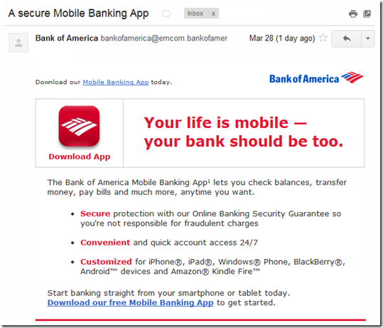
Bank of America’s message was completely generic, saying that mobile banking is secure, convenient, and customized. And the call to action was to download its app, which I did almost four years ago, so I’m not sure why I received this message (note 1). I have also used the bank’s iPad app and Kindle app.

Bottom line: The email messages were well-designed and short, so the creative scores well. But the targeting was sub-par, especially BofA, which seemed to completely miss the mark. And while Wells Fargo’s message could have been better adapted for app users, the bank gets points for acknowledging that I use the mobile channel (note 2). 

——————————————-

Wells Fargo customer email (28 March 2012, 11:37 AM Pacific)
From address: wellsfargo@wellsconnect.wellsfargo.com
Note: Account holder name blurred out.

Wells Fargo customer email

Bank of America general mobile banking customer email (28 March 2012, 1:34 PM)
From address: bankofamerica@emcom.bankofamerica.com

image

Notes:
1. A month ago I had to replace my BofA card (again!) due to fraud, so possibly this was a misguided on-boarding message.
2. The Wells Fargo message was clearly targeted to mobile users: “Thanks to suggestions from mobile users like you.”

Westpac NZ Makes it Mobile Savings Transfers Easy with Impulse Saver

image There are two schools of thought when it comes to mobile app design:

  1. Put everything in a single app for each platform (note 1), so your customers aren’t confused about which app to download
  2. Create specialized apps for various market segments and/or apps that focus on a single function

American Express (7 for iOS, note 2); JP Morgan Chase (3 for iOS); Zions Bank (3 for iOS); Southern Bancorp (2 for iOS); and a handful of other banks have launched multiple apps. But it’s still the exception: More than 99% of banks have no more than one app for each platform. 

Westpac NZ has joined the multi-app group, though oddly it has yet to launch a full-featured mobile banking app (note 3). Yesterday, we wrote about Westpac’s clever Cash Tank, that provides a no-login gauge to monitor account balances.

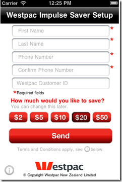
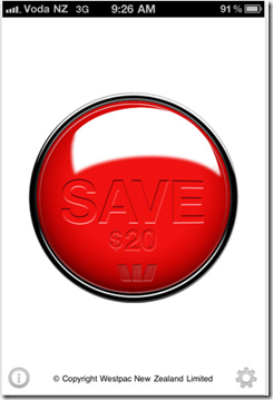
The bank has another cool single-use app, Impulse Saver, which is basically just one huge red button that users press to make a transfer from their checking account to a savings account.

obr_bestofwebThe amount of each transfer, from $2 to $50, is preset using the app settings (see second screenshot).
Bottom line: With Impulse Saver and Cash Tank, Westpac NZ has raised the bar for simple no-login mobile banking, earning an OBR Best of the Web (note 4).  
————————————-

Westpac’s Impulse Saver iPhone app (20 March 2012)

 image     image

———

Notes:
1. By single app, we mean one app per major platform, i.e., one app for iPhones, one for Android, one for iPad, etc.
2. In addition, American Express offers at least six more content apps through American Express publishing.
3. A number of reviewers in Apple’s App Store have been criticized for not having a full-featured app. For example, in June 2011 “crazfulla” wrote, “This is a great idea; however, we need a real app that has all the banking capabilities.”
4. Since 1997, our Online Banking Report has periodically given OBR Best of the Web awards to companies that pioneer new online or mobile banking features. It is not an endorsement of the company or product, just recognition for what we believe is an important industry development. If anyone knows of other financial institutions offering a similar feature, let us know and we’ll update the post. Westpac is is the 86th company to win the award and the third in 2012. Recent winners are profiled in the Netbanker archives.

Cash Tank from Westpac NZ, a Mobile No-Login Balance Display

image As mobile banking approaches its fourth birthday (note 1), we are starting to see the more interesting “version 2.0” builds from the major players. Last week, we looked at Commonwealth Bank’s Simple Balance, with its pull-down balance option.

Customers don’t want to spend more than a few seconds retrieving their balance when on the go, so the no-login option imagesignificantly improves the mobile banking user experience.

In response to that post, several readers pointed out the recently launched app from Westpac New Zealand unit. The app, Cash Tank, is an elegant solution to the same need. It’s a full standalone app that does just one thing, shows the balance in the selected account on a “fuel gauge” (see first screenshot below). 

Users set their own high and low settings so the gauge could show empty when there is still a cash cushion remaining. And users have the option of showing the actual dollar amount available or simply relying on the gauge reading for more privacy. The Cash Tank can show the balance from just one account.  

Under the gauge is a link to the bank’s mobile website where users must log in to conduct transaction. The bank does not currently offer a full-featured mobile app in New Zealand (note 2).

The app is available for iPhone and Android. 

Update Mar 20: We are awarding Westpac an OBR Best of the Web for its Cash Tank and Impulse Saver apps (Mar 21 post).

Update Mar 21: I neglected to mention that Southern Bancorp launched a no-login savings balance app a year ago called “Shake to Bank.”

————————————

Cash Tank from Westpac NZ is a standalone mobile gauge to your account balance (link)

image           image    

Cash Tank is featured on the Westpac NZ homepage (21 Mar 2012)

image

———-

Notes:
1. The dawn of the industry, at least in the United States, was in July 2008 when Apple opened the iPhone to third-party apps. There were huge strides made around the globe, e.g. M-Pesa, much earlier. But we’re referring here to the modern smartphone-based services.
2. A full-featured mobile banking app has been available to Westpac Australia customers since Dec 2008. But it does not offer the read-only Cash Tank option. 

Commonwealth Bank’s Kaching App Has No-Login Option, Simple Balance

imageThere are two problems with the current state of online/mobile login:

  • It’s too hard for customers to log in to their own accounts, especially using mobile keyboards
  • Yet, it’s too easy for crooks to log in to other people’s accounts

Since the dawn of online banking, the industry has struggled to balance user experience with security. And tiny mobile keyboards make the login experience even more frustrating.

But it doesn’t have to be that way.

A number of banks are using 4-digit passcodes making mobile login a breeze. But Commonwealth Bank (Australia) has gone one step further, with no-login pulldown access to account balances in its new Kaching (ka-ching) mobile app (note 2). 
(Update 16 Mar: New Zealand’s Westpac also has a no-login mobile option called Cash Tank). 

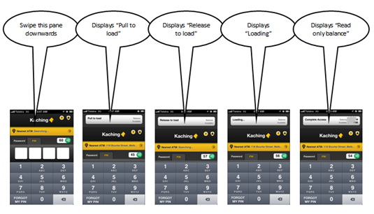
obr_bestofwebCommonwealth calls the no-login option Simple Balance. With a quick swipe users pull down a read-only account balance (see screenshot below). The no-login option must be  enabled within the app before the first use. See it in action here (at the 29-second and 54-second marks).

We are awarding Simple Balance our second OBR Best of the Web award for the year (note 3). While it may not be as novel as City Bank’s debit card on/off switch, it’s likely to be used 100x more.

Bottom line: Requiring full username and password to see your account balance is antiquated, or at least it’s rapidly headed that way. The four-digit PIN is a good first step. But ultimately, it needs to get even easier than that for low-risk activities (note 4).

—————————————–

A single swipe on the top of the Kaching app allows users to download their account balance (click to enlarge, see note 2)

Pull down Simple Balance on Commonwealth Kaching

———————————-

Notes:
1. Many thanks to Australian reader Saif Hazarika, Innovation Manager at Australia Post, for clueing us in on the Kaching feature and creating the illustration above.
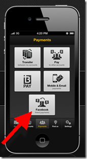
Facebook integration into Kaching's P2P payments area2. The Financial Brand published a good overview of Kaching several weeks ago.
3. Since 1997, our Online Banking Report has periodically given OBR Best of the Web awards to companies that pioneer new online or mobile banking features. It is not an endorsement of the company or product, just recognition for what we believe is an important industry development. If anyone knows of other financial institutions offering a similar feature, let us know and we’ll update the post. Commonwealth Bank is is the 85th company to win the award and the second in 2012. Recent winners are profiled in the Netbanker archives.
4. USAA’s “stay logged in” option is another promising approach, though not quite as user friendly as the Kaching swipe.
5. The Kaching app (inset, click to enlarge) includes integration to the user’s Facebook friends to facilitate P2P payments. A cool feature that I will add to the 50 or so discussed in last month’s Banking on Facebook report (OBR subscription).

Mobile Banking Increases Need for Read-Only Account Access

image It had been a while since I’d logged in to Mint.com from my iPhone and I had forgotten just how easy it is. The online PFM pioneer has boiled the process down to the bare minimum (assuming you’ve enabled "passcodes," see note 1).

Logging in takes just four numerical "keystrokes." You don’t even have to press a login or done button (inset). As soon as you press the last digit, you are automatically logged in.

As an added bonus, PIN authentication is handled on the phone instead of the server, so you get an immediate error message if you type in the wrong one.It’s a great user experience, though I wish Mint still supported the stay-logged-in option, which is fine when accessing a "read only" data file (note 2).

This brings me to my main point (finally!). Banks need a "read-only" account access option (note 3). Than means no account numbers are shown. No check images are accessible. No personal info is available. And of course, you can’t perform any transactions (note 4). And the read-only password should be different than the "normal" one.

The read-only option would make customers feel more secure about banking online, especially from:

  • Mobile phones
  • Tablets
  • Wifi hotspots
  • Hotel rooms
  • Friend’s house
  • Public terminals
  • Home (if you don’t trust your own network)
  • PFM or third-party programs (note 3)

With read-only services, bank security folk can ease up on unwieldy password requirements for mobile access. And it might even prevent a crook or two from gaining full account access due.

———————

Notes:
1. The four-digit PIN option is for users that have enabled passcodes for login from the Settings area in the Mint.com app. Otherwise, users must enter their full Mint username and password.  
2. While it’s a privacy concern, read-only account access with no login should be an option for a PFM. Of course, you must make it absolutely clear to users the danger of non-password protected data.
3. ING Direct offers read-only access to PFM programs
4. Funds transfers among existing accounts or even to existing billers could be OK, but it muddies the waters a bit from the perspective of the user.

Op Ed: Rise of the Feenix

by Michael Nuciforo

Editor’s note: This post was written by Michael Nuciforo, a Mobile Banking Consultant at Keatan. He previously worked at ANZ on a number of developments, including goMoney, and more recently was Head of Mobile Banking at RBS managing the UK Retail portfolio.

image Banks has perfected what I refer to as the ‘negative pricing model.’ In simple terms, fees are charged when customers make mistakes. We are all familiar with it. It is the annoying cost of returning a DVD late, or staying too long in your parking space.

At present, banks rely significantly on revenue generated from fees when customers fall afoul of their terms and conditions. Amongst all the doom and gloom of regulatory pressure, the euro debt crises, and record low margins, could mobile banking be the right service to implement a ‘positive pricing model’?

Tiered charges for access to additional features and content have become common due to the popularity of games such as FarmVille and Sims. This is great news for banks as the market has likely reached the right point of innovation, access and acceptance to allow for the monetization of mobile banking.

Now that most banks have launched first-generation mobile services, new features are perfect for tiered pricing. Areas such as NFC payments and remote deposit-capture are a great place to start. They are tangibly more convenient than existing processes, and are designed to leverage the specific capabilities of a mobile device.

But can banks pull this off? Or will it just be seen as yet another annoying banking fee?

When implementing a pricing model, banks need to be clear about their strategy and objectives. For the model to work, it is critical that unique, mobile-specific services are delivered to warrant the cost. And banks shouldn’t charge for services that they already offer for free today. This will only anger existing users. They should also avoid charging for services available in other channels for free, although some exceptions could apply. Banks need pricing that is fair, transparent and that rewards loyalty as well.

Any new fee will disappoint some customers. Banks should also expect negative media attention at first. This will happen any time bank and fee are included in the same sentence. Banks need to be proactive about engaging regulators during the process and communicating actively to customers. It is important that fees are integrated seamlessly into the customer journey. Regular enhancements should also be made to the service. Success will ultimately rely on the quality of new features.

With traditional revenue streams under attack, and investment in mobile growing, pressure will come on mobile leaders to justify the costs. The honeymoon period for mobile banking will be tested at some stage. Customer retention and transaction migration are fine, but are they enough for your senior executives? And can they be accurately proven?

With customers now familiar with this pricing model in other facets of their everyday life, it is important that banks also take the opportunity to do this now. Otherwise mobile banking, like online banking, will become a free channel for life.

Mobile: USAA Introduces "Stay Logged On" Option for iPhone App

imageI’m not sure if this is normal or not, but I enjoy the process of updating the 100-some apps on my iPhone. I’m always interested in what’s changed and how the company communicates the new info to users. I’ve noted before that banks aren’t good at leveraging this customer touchpoint, but they are getting better.

USAA mobile banking update v4.0 wit "stay logged on" In the latest round of app updates, I noticed a nice improvement from USAA (see inset; note 1). Instead of automatically logging you off whenever you move out of the app, say to take a call or fire off a text, the bank provides the option of staying logged in for up to 20 minutes.

Sure, there’s a tiny risk that if you were to lose your phone or loan it to someone during that time, they could get into your account. But your average smartphone thief is unlikely to click on the USAA button during those first 20 minutes. And even if they did, it’s unlikely they could do much with the info.

Bottom line: I want this option on all my banking apps.

———————

Notes:
1. This iPhone update (v. 4.0) was pushed out, 8 Nov 2011
2. For more on mobile banking, see our subscription publication, Online Banking Report.

Pageonce Adds Billpay; Showcases Multiple Mobile Apps on Single Page

image Last week, we looked at how Square makes a single webpage look great across various mobile platforms. Today, we look at the exact opposite problem. How to showcase your various mobile apps on a single webpage. 

Pageonce does it as well as we’ve seen, using a single showcase panel that includes all five of its mobile app platforms across the top: iPhone, iPad, Android, BlackBerry and Windows. Users can scroll horizontally to see two sets of screenshots for each platform.

The company also includes version number, date of the last update, and app size in the lower right corner. And of course, there’s a link to download the appropriate marketplace to download the app. The Android page uses a QR code instead of a link.

In other news, Pageonce added bill payment to its iPhone and Android app today, moving ahead of Mint in the features arm race. The new Gold service, which we haven’t tested yet, is priced at $4.99/mo, good news for fee-starved online financial providers. Mint says it has bill payment coming too. It will be interesting to see if they put a fee on it.

Relevance for Netbankers: The addition of transactional services such as bill payment makes third-party PFMs, or virtual banks such as BankSimple, bigger threats to mainstream banks and credit unions. As uber-consultant Richard Crone always says, "He who enrolls, controls."

————————– 

Pageonce iPhone app

Pageonce iphone app showcased on its website

iPad

Pageonce on ipad

Android

Pageonce on Android

BlackBerry

Pageonce on BlackBerry

Windows

Pageonce on windows phone

———————

Note: We cover mobile banking and payments periodically in our Online Banking Report (subscription).

PG&E’s Convenient Mobile Bill Payment App

image Skimming my news feeds in the post-Finovate logjam, I flagged a news release about a new app that just landed in the Android Market (the iPhone version rolled out last December). The app allows Californians to easily pay their PG&E power bills from their mobile phone using a credit/debit card or checking/savings account. It’s powered by Tio Networks

And while you’d think that three years into mobile app era, there’d be hundreds, if not thousands of similar apps, a quick search of the Apple App Store came up empty (see note 1). 

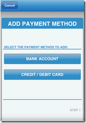
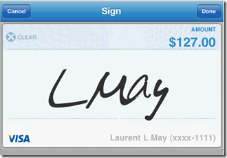
The app is drop-dead simple to use, as it should be (see screenshots below). The amount owed (across multiple PG&E accounts if necessary) is shown. Then, users select payment method, "sign" the screen with their finger, and submit. An email confirms the transaction.

TIO levies a $1.45 transaction fee per payment (well disclosed, see second screenshot below), which is a buck more than a stamp, but it also gives customers the option of paying by card, something that can’t be done in the mail, online or in person. And payments received by 5pm are posted the same day, an important benefit for the large segment of the population that prefers to pay bills at the last minute.

Summary: Company specific same-day billpay apps are a great convenience for the majority of customers who pay their bill upon receipt (rather than relying on automated options). We expect to see many more like this. FIs and payment processors that serve billers would be wise to help them mobilize their payments.

——————————————–

PG&E mobile billpay screenshots (iPhone version)

image  image  image

image    image

——–

Notes:
1. There are likely at least a few others that I didn’t find. The app search tools are not super sophisticated.
2. As of 7 July 2011, there are more than 425,000 available apps and more than 15 billion cumulative downloads.