BillGuard is First Financial Service to Integrate with the New iPhone Passbook Wallet

imageApple’s Passbook is a massive wildcard in the race for mobile payments, banking and rewards. Will the iPhone’s massive user base take to it like they did iTunes, or will it be one of those ideas that sounded good on the drawing board, but just doesn’t resonate with consumers?

imageNo one knows if it will stick (although I got pretty carried away with the possibilities when it was announced in June), but given the potential upside, it seems a solid bet.

Starbucks is about to push its massive mobile base onto Passbook, a pretty strong endorsement. American Express has thrown in its support. No word yet from other financial players. 

Except BillGuard, which gets to lay claim to being first. CEO Yaron Samid emailed yesterday announcing beta support for Passbook. The startup built a landing page for the new service at <passbook.billguard.com/> (see first screenshot) and is even testing some Google Adwords spending around the feature.

BillGuard users can now view each of their monitored credit cards within the Apple Passbook application. It’s a two-step process to get the cards added to the Passbook utility.

  1. Users click on “Add to Passbook” at top of BillGuard’s normal online dashboard (see second screenshot)
  2. BillGuard sends an email with a “pass” attached for each card. Users view the email on their iPhone, then click each attachment to add to the iPhone utility (see third screenshot)

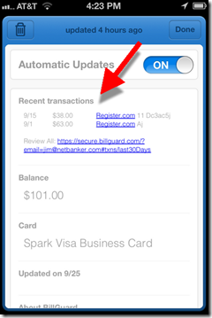
Once added, user can view their current card balance and recent transactions from the Passbook card (see last screenshots).

Bottom line: It’s a great move for BillGuard, especially since it does not yet have a native mobile app. Now I can click on the Passbook icon and without logging in, quickly see the activity on all my registered cards, and whether there are any suspicious charges.

Banks could do something similar. Basically, creating a no-login card mini-app that aligns their brand with the iPhone 5. However, one area to consider is security. Anyone who got a hold of the email BillGuard sent me could start monitoring my card(s) through Passbook without my knowledge. For a bit more security, passes can be distributed directly through native apps and websites.

————————————–

BillGuard Passbook landing page (link, 25 Sep 2012)
Note: Example is a Chase card “protected by BillGuard” image

Step 1: Click the “Add to Passbook” button on top of BillGuard’s main online dashboard

image

Step 2: BillGuard emails a “pass” for each card on file. Users open the email from their iPhone and click the attachment(s) to add each card to Passbook

image

Results: Each pass has its own “virtual card” in Passbook, with a “front” and “back”
Front includes current balance                     Back includes recent transactions

image     image 

Note: The placeholder barcode displayed in the BillGuard pass is a customer referral form according to MyBankTracker. When Starbucks unveils its Passbook support next week, I’m sure the barcode will be usable to make a mobile payment at the Starbucks counter.

Numbers: Sunny Outlook for Mobile Banking (U.S.)

image ComScore’s latest mobile usage numbers provide useful context as you head in to the 2013 business planning cycle. With 42 million monthly smartphone users, mobile banking penetration (38%) is similar to other specialized information services such as sports (39%), news (49%), and movie info (30%).

Granted, banking still trails the gold standard of info services, the weather button, but it’s gaining ground.

————————————

Table: Information services accessed by U.S. mobile users
2012, Q2 monthly average

  Smartphone % Using All Mobile % Using
Total audience 110 mil 100% 230 mil 100%
Weather 75 mil 67% 90 mil 38%
Facebook, Twitter* 71 mil 64% 86 mil 37%
Search 67 mil 60% 80 mil 34%
Map 59 mil 53% 68 mil 29%
News 54 mil 49% 64 mil 27%
Sports 43 mil 39% 51 mil 22%
Bank account 42 mil 38% 49 mil 21%
Entertainment news 42 mil 38% 51 mil 22%
Movie info 34 mil 30% 40 mil 17%

Source: ComScore MobileLens as cited in Advertising Age, 20 Aug 2012; 3-month average ending in June 2012; usage counted is the user accessed info in the category at least once in past 30 days; *any social networking site; percentages may be off by 1% due to rounding of the numbers to two significant digits

Op Ed: When Push (notifications) Comes to Shove

by Michael Nuciforo

Michael Nuciforo is a Mobile Banking Consultant at Keatan. He previously worked at ANZ on a number of developments, including goMoney, and more recently managed the UK retail portfolio as Head of Mobile Banking at RBS.

——————————–

imageOne of the last relics from the dawn of mobile banking, SMS alerts, is fast approaching the end of its use-by date. The service has become a victim of its own success: Consumers embraced the ability to be informed, and costs have risen exorbitantly. SMS alerts were the first tentative steps that most banks took in delivering mobile services. They have now been pushed aside, quite literally, by their younger, more attractive successor – push notifications. The move from SMS to push shouldn’t just be about saving money, however. It’s an opportunity for banks to engage customers in a much more effective fashion.

It is almost impossible to find a bank that doesn’t offer some form of SMS bank alerts. It was easy to deploy, simple to set up for customers, and the costs were negligible (at least in the beginning). Most banks forecast low usage so they did not pass along the cost to consumers. Banks signed pay-per-alert contracts with suppliers that in hindsight were the wrong choice. It was the information age, but banks completely underestimated customers’ insatiable desire to stay informed. Alert volumes grew and grew and the pay-per-alert model suddenly wasn’t so attractive. It was also costing the bank overdue/overdraft fees because customers were more financially informed.

The success of SMS alerts laid the path for the future investment in mobile apps. It validated the long held belief that consumers would adopt mobile banking in droves. As the mobile channel has matured, banks have started to evaluate what worked and what didn’t. At the same time as SMS costs were becoming a concern, push notifications started to hit the mainstream. The pupil was challenging the teacher.

Push notifications are a native capability most prevalently used on Apple’s iOS platform. Push has become so popular that almost every new application asks you to accept their use upon download. They are free and operationally much cheaper to maintain than SMS. Cost reduction, however, is only the beginning of the story. The ability to engage customers at a different level is the main benefit push notifications offer banks. Push allows developers to integrate a notification message deeply into a follow-up activity on an app. This means a consumer can complete an action directly from an alert. There is no copy and paste, selecting links or opening an app. It’s all tied together. Information can be sent, and a customer can act with the tap of a button.

Push notification allows banks to move away from being a one-way communication channel. It allows banks to take advantage of the opportunity to be proactive and engage customers about what is important to them. Customers can move beyond receiving alerts about balances or transactions. Instead, banks can start telling the customer what they should do with their money. I can imagine the day when my rent is due, and if I don’t have enough in my current/checking account, I get sent a push notification asking whether the bank can transfer the necessary amount from savings. I click accept and see the confirmation screen within the app. Problem solved.

The great thing about push is that the business case writes itself. Cut costs and do something more effectively = instant business case-approval. There will be an initial implementation fee, and ongoing management, but beyond that, it’s free, nada, zero. Think about that. Your future most-powerful communications channel is broadly free. Click-through rates on push are higher than traditional channels and messages can be sent in the context of your customer’s situation, location, time and even weather. It can also be used by all parts of the bank, including products, security and insurance.

When push comes to shove, the move away from SMS reflects the broader change required throughout the banking industry. Banking needs to evolve away from just being a set of customer-initiated activities. Banks need to be proactive and do the banking for the customer. Push notifications deliver a simple a contextual banking experience that lifts the mobile banking channel from being useful to indispensable.

Mobile Marketing: Leveraging the iPhone App Update Process

image As customers have adopted ever-more convenient delivery methods, the customer communications process has changed dramatically. Each channel has its own ways of communicating with customers:

  • Branch/mail: Signage, statement inserts, chance conversations in line, direct sales pitches
  • Phone: On-hold messages, prompts on the phone tree, direct sales pitches
  • Online: Email, interstitials, display ads, website content, popups, online chat
  • Mobile: Similar to online plus notifications, text messages and app updates (see below)

In the mobile channel, the process for updating native apps provides a unique marketing opportunity that is virtually without cost and guaranteed to be read by a large portion of your mobile customers (previous post). App publishers have a screen of free real estate to explain the benefits of the new feature(s).

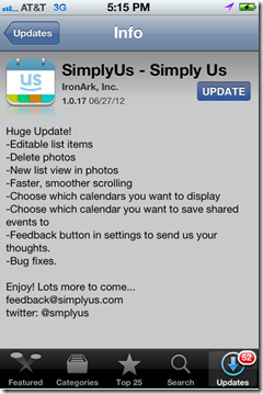
I’ve read thousands of these update descriptions and there is huge variety of approaches. Some publishers take maximum advantage of the “free publicity” to engage their customers (see Yelp below), pump up the new features (see USAA), and seek additional feedback (see Redfin, SimplyUs examples).

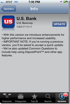
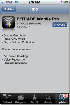
Other publishers don’t pay enough attention to readability (Wells, Bank of America, US Bank examples, see note 1) or just put the minimum effort into a bulleted list (E*Trade). 

Bottom line: Each time you push out a new update, use it as an opportunity to educate users and reinforce your mobile brand.

——————————-

iPhone App Update Examples

Good
———

Yelp reinforces its playful brand with        USAA is more matter of fact, but  
enthusiastic and humorous copy                   does a good job highlighting new
announcing its v.6.0.                                           features in its v.4.9.

image     image

Redfin released a minor bug fix in             SimplyUs gets right to its bullet
v.3.3.2 but includes its email address        list of features, with just enough
to report any issues.                                           info to explain the v.1.0.17 update.
Nice touch!                                                            Plus email and Twitter handle.

image     image

Need work
——————

Wells does an OK job, but the first               Similarly, Bank of America has an
bullet reads like something lifted from        acceptable message for its v.3.3.351. 
project checklist. And the second                  But the copy is a little confusing and
is too long-winded. Plus, a floating             has an asterisked point floating mid-page.                       “Bug fixes” hovers at  the bottom                        
of its v.2.1 update.

image     image

US Bank’s v. 1.6.8 message is                    E*Trade’s 2.6 update sounds like it
confusing. Something about being             has a bunch of new features, but
asked to accept a quick update, but 
         it did nothing but list them with
no specifics on why or what has                no explanations.
changed.

image    image

—————–

Note:
1. These examples were all taken from updates I downloaded today. They are not necessarily indicative of every update from these companies. At major releases (such as Yelp’s v6.0), most publishers will step up the copy-writing quality.

Westpac Launches iPad Banking with Drag-and-Drop Transfers

image Touchscreen technology isn’t particularly game changing in banking. For the most part, users simply look at transactions, type a few numbers, and press a button or two. Touchscreen or mouse, it works pretty much the same. 

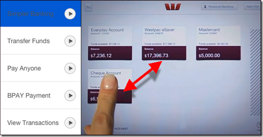
However, Australia’s Westpac Bank (creators of Cash Tank and Impulse Saver) has figured out a way to use the swipe motion to simplify the funds transfer process. In its new iPad app (launched today), each account is shown on the screen in a small summary box.

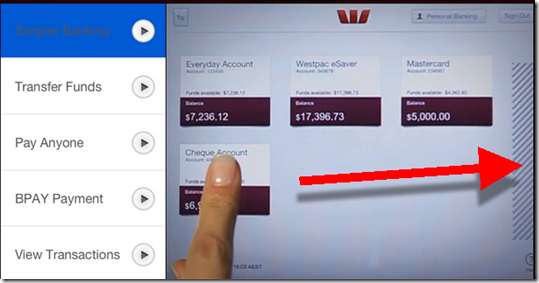
To initiate a funds transfer, users move the summary box for account A over the summary box for account B, then type in the amount (see first screenshot below). Similarly, to initiate a payment, users drag the summary box over to the “payments zone” on the right to begin a bill payment (second screenshot).

Bottom line: While pushing a box around on a screen may not be faster than using a mouse in desktop online banking, it’s an intuitive way to use an iPad app. Kudos to Westpac for incorporating it into their app.

—————————-

Westpac (AU) iPad funds transfer (10 July 2012)
Simply drag the “from” account box over “to” account to begin the funds transfer

image

Westpac (AU) bill-payment process
Drag to “from” account over to the payment zone on the far right to begin a payment

image

Personal Financial Management for Couples

image Although, I’ve been married since Ghostbusters was in the theatres, I still (sort of) remember what it was like to have just one person’s finances to manage. If I recall correctly, it went something like this:

Money in. Money out. Then hopefully, a dollar or two leftover.

But then you get married, and even if you have separate accounts (we don’t), there is quite a bit more to it:

Money in. Discuss. Money out. Discuss. Oops, too much money out. Point fingers. Discuss a lot. Compromise. Try to do better next month.

imageAnd then you have kids and it gets even more complicated.

So why are PFMs all about the data and do little to help you collaborate about your money? Because they were mostly designed by single, urban, 20-somethings (I know that’s not entirely true, but you get the point).

What we need is the “Facebook of PFMs” where you can share appropriate financial details with your spouse, family, parents and other financial stakeholders in your life (CPA, bank, advisor, etc). The same concept extends to businesses who have even more stakeholders to communicate with.

While I haven’t seen anything that does this in the PFM space yet. There are some interesting web apps being developed that help couples sync their lives together. The first one I heard about was Pair, which has gotten quite a bit of press.

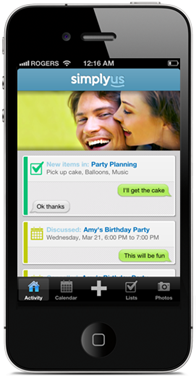
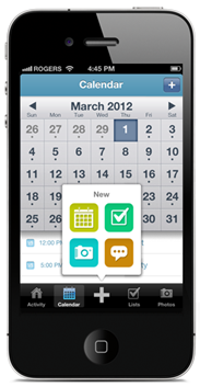
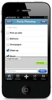
But there’s a new entry, Toronto-based SimplyUs is more of an organizational tool that a photo sharing app (note 1). Right now it focuses on calendar and todo list sharing (screenshots inset & below). That’s a great start, but an obvious next step is financial collaboration.

Bottom line: There is a large unmet need for collaboration tools linked to transaction accounts (for more info, see note 2). The opportunity is both for families and also micro and small businesses who will pay monthly fees for the service.

No tool can make financial management as simple as it was for our 23-year-old single self. But by harnessing the power of the synced mobile banking app, it should be much more manageable. 

———

SimplyUs iPhone app (25 May 2012)

 SimplyUs iphone app     image

——————————-

Notes:
1. For more info on SimplyUs, see last week’s TechCrunch post. 
2. For more info on the importance of banking the kids, see our Online Banking Report on Family Banking (July 2011). For more on financial collaboration, see Bank Transaction Alerts & Streaming (July 2010). And finally, our last PFM report is here (May 2010; subscription required for all).

Simple Releases First Mobile Banking App, Hits #13 in Finance Category of iPhone App Store

image The much-anticipated launch of the first truly virtual consumer bank is fast approaching. How do we know? From its tweets, of course (see inset).

Bank Simple tells a twitter follower when to expect a beta inviteCustomers who joined the wait list in 2010 are being told publically that they will receive invites “before spring is over.” Others are being told “early summer,” “mid-to-late summer,” “early fall” and “fall.”  Based on those responses, it looks the company plans to work through its entire 100,000 wait list within the next 6 months.

A critical piece of the grand opening is pushing the Simple mobile app past the gatekeepers at Apple. That happened last week (9 May). Within 48 hours, the app had already jumped to 13th-most-popular in the finance section, despite the fact that no one but a few early testers could actually use it. Today, it’s fallen back to 53rd in the rankings.

In terms of how it works, all we can do now is drool over the half-dozen screenshots published in the store and on the Simple website. We especially like how they’ve anchored the forward-looking “Safe-to-Spend” balance in the top-center of every page (see below). The app also includes remote check deposit, something the startup has talked about before.

We’ll look at it in much more detail once we get our Simple account, presumably in the next three to four weeks.

————————–

Simple mobile banking app, v1.3.1 (14 May 2011)
Itemized transaction with                     Extra authentication code
Safe-to-Spend balance on top               for higher-value transfers

image          image

Feature Friday: Wow! More City Bank Texas Mobile Controls for Debit Cards

imageLuckily, I ran into Jim Simpson, SVP IT at City Bank Texas, at Finovate Tuesday, or I might have missed his bank’s significant new app update this week.

imageI am so impressed with what they are doing down there in Lubbock. First, it was the debit card on/off switch a few months ago. And now they just added three new control switches (see inset):

  • Increase daily withdrawal limit at the ATM
  • Increase daily debit card purchasing limit
  • Allow foreign transactions

All three controls temporarily increase limits so customers can easily approve their own authorization exceptions (within limits). 

Bottom line: Putting more control into the customers’ hands is what mobile banking is all about. And City Bank has taken the lead.

But they are just getting started. From what Jim told me this week, they have plenty of other ideas in the hopper. Keep an eye on these guys. 

Update 17 May: I neglected to mention that the software is from Austin, TX-based Malauzai Software.

Feature Friday: Ally’s Mobile Cash-Bank Finder & Call-Center-Hold-Time Meter

imageAlly Bank jumped into the mobile fray launching a pair of apps last week, one for customers with account access, and the other an "ATM & Cash-Back Finder," the anyone can use.

imageThe apps are well designed, as you’d expect from a direct bank with 1 million customers and $30 billion on deposit (note 1). But there were two novel features worth highlighting:

1. Real-time wait time in the call center: The mobile app contains a very prominent real-time indicator of just how long you’ll be on hold if you call Ally Bank. I’ve already raved about the Website version of this feature, so I won’t go into much detail. But it makes even more sense to place it front and center on an app on a mobile phone used to call the bank (see left screenshot below).   

2. Cash-back locations included with ATM finder: While I’m not sure if this is an industry first, but after a fairly extensive search in the Apple App Store came up empty, I know it’s not common. Ally combines ATM locations and places where you can get cash back at the POS into a single map and/or list view (see right screenshot below).   

Ally mobile banking app                  Ally ATM & Cash Finder app 
for customers                                              for anyone                           

Call Ally feature in mobile app      Mobile map from Ally shows ATM and cash-back POS locations

Ally also makes sure its website visitors know they’ve gone mobile with a clever graphic in the middle-right of the homepage.

Ally homepage featuring new mobile offering (3 May 2012)

Ally Bank homepage announces new mobile apps

————

Notes:
1. Ally announced the 1-million-customer milestone along with mobile apps (press release). Compared to a year ago, accounts were up 30% and deposits grew 25%.
2. While this could increase call-center calls, Ally must believe the customer advocacy positioning makes up for the increased costs.

First Look: U.S. Bank’s New iPad App

image Yesterday, U.S. Bank became the fifth top-10 United States bank to release an iPad app and only the second  to include remote check deposit (Chase was first). The new app is not listed on the bank’s website yet, but became available in the Apple App Store on May 1.

I’ve been testing it for a day now and find it attractive, well laid out, and practical. It’s a genuine native tablet app, and not an enlarged version of its iPhone app. 

Here’s what I liked:

  • Remote deposit: A cool feature that creates a nice point of differentiation for now. 
  • Person-to-person payments (which I didn’t test because I needed to first enroll online)
  • Different portrait vs. landscape mode looks: The layout changes slightly depending on what position you use the app.
  • Built-in calculator and calendar: The lower-right corner contains a calculator/calendar widget.
  • Pinned account summary: Account balances are displayed in the upper-right corner on all pages.
  • Offers section: The bank has created an offers area in the middle of the page. Presumably this is where the bank will display card-linked offers from its partnership with FreeMonee, along with bank-product specials. Unfortunately, it’s empty, at least for my account (note 1). Unless, the box can be hidden, there should be at least one offer in it at all times (especially at app launch).
  • Contact info: The bank’s phone number and email address are prominently displayed.
  • Integrated location map: In landscape mode, the nearest US Bank branch and ATM locations are always displayed in the upper right corner (note 2).
  • Branding/advertising in front of login: Not everyone who downloads your app, is ready and/or able to login. Talk to them. Service them.
  • Full site access via button in right-hand column. 

What’s missing:

  • Simplified login: U.S. Bank’s table login is 25% harder than its desktop banking login. It uses full username and password. There’s no option to remember username. And unlike the desktop, where the curser is automatically positioned in the fields, tablet users must touch the empty box before typing.
  • Financial management/PFM: There is no ability to sort, annotate, or interact with the data in any way.
  • Chat: There is no way to interact in real time online.
  • Search: There is no way to search transactions or any other info.
  • Security assurances: No security section to assure users that it’s safe to bank via tablet.
  • Content (other than account info): There is little content outside bank account info and the ATM/branch locator. 
  • Visual interest: The app is attractive and functional. However, it’s fairly bland by iPad standards. Within the secure site, there are no photos, no interesting graphics, along with the aforementioned empty offers box.

Final grade: The app supports the brand, is easy to navigate and does a great job covering the important basics. Plus it has a few advanced features: offers, P2P payments, and remote deposit. Overall, I’ll give it an A-. Nice work. 

———————

U.S. Bank iPad app pre-login (2 May 2012)
Note: Graphical images promoting the bank and its remote deposit service

image

U.S. Bank iPad main "Accounts" page in landscape mode
Note: Empty "offers" box; link to full site; calculator in lower right

U.S. Bank iPad main "Accounts" page in landscape mode

U.S. Bank iPad main "Accounts" page in landscape mode
Note: Empty "offers" box

U.S. Bank iPad main "Accounts" page in landscape mode

———————

Notes:
1. I’m a long-time customer with six current accounts plus a closed home equity line.
2. While the map makes a nice visual, it doesn’t have much use for the 97% of the time the user is logging in to mobile banking from their home or work. So it might be too prominent. This is only an issue in landscape mode. In portrait mode, the map is not displayed.