Chase Bank’s Second iPhone App: Gift Planner

imageA few days ago, we predicted there would be tens of thousands of financial institution iPhone apps as the big banks released dozens to support their major business lines. PNC Bank and Wells Fargo were the two examples we cited.

There’s another multi-app bank: Chase. In our search for an iPhone gift planner to replace the web-based Zions Bank service, we ran discovered the bank’s Gift Planner (iTunes link).

Version 1.0 was released in time for the holidays last year (3 Dec. 2008), but it looks like Chase didn’t take over ownership/sponsorship until release 2.0 in August. The app is supported by an excellent small website at yourgiftplanner.com that displays the app and solicits feedback.

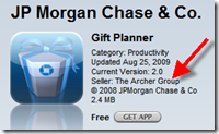
image The app and website are 100% Chase branded. The only indication that a third party is involved is a notation in the iTunes store that the app is sold by The Archer Group (inset), a Wilmington, DE-based digital agency.

Evidently, the app didn’t show up on our radar because it’s placed in the App Store Productivity category instead of Financial. The app doesn’t appear to be mentioned on the Chase main website. A site search there came up blank.

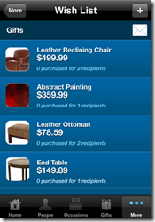
Review: It’s great looking app that can be used for any holiday. The app supports “shake for help,” an advanced feature. The integration with your contact list makes it easy to add new contacts without typing, although you must wade through your entire list. And, the imageprocess of adding gifts is a bit tedious. You have to add a gift to the master gift list, then go to each person and add the gift to their profile. It would be better if you could simply type a gift on the fly.

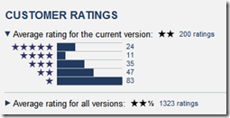
iPhone users have been relatively unimpressed, giving the latest version a 2-star rating out of five; pretty low for a professional app (see inset).

It’s a good branding tool for Chase, but it the app itself could use retooling.

Gift Planner iPhone screenshots (24 Nov 2009)

image   image   image

Gift Planner website (link)

image

Note: For more info on mobile banking on the iPhone see our March Online Banking Report.

How Many iPhone Banking Apps Will There Be?

image Are you tired of hearing “there’s an app for that” yet? Well, get used to it, we are still at the beginning of the great app rollout

Even as recently as our iPhone Banking Report published in March, I assumed most financial institutions would have a single iPhone app. One bank. One app. It’s how the Web worked, for the most part.  

But when Starbucks unveiled a dedicated app just for its stored-value card (separate from the main Starbucks brand app), I realized that I wasn’t thinking big enough.

For example, in August PNC Bank become the first U.S. financial institution to offer multiple apps when it released an app for its Gen-Y-focused Virtual Wallet. That was followed last week by Wells Fargo when it unveiled its cash-management app for larger businesses, CEO Mobile (screenshot below; press release).

image

image Now, I believe that each major bank will roll out dozens of apps, perhaps hundreds, to support their business lines, major products and large segments. There will be an app for each major affinity credit/debit card, one for students, one for small businesses, one for large business, one for senior checking, one for home equity lines, and so on.

And, if that’s not enough, there could be a dedicated app for each stock broker, loan officer and mortgage broker. There could be one app for every branch, neighborhood, or region. Right now the search-and-discovery tools at Apple would implode under the weight of all these apps. But they’ll figure that out. It’s worth billions to them. 

Today, more than 100,000 apps are available for the iPhone. But fewer than 20 are for U.S. financial institutions. It’s conceivable that in the banking vertical itself, well over 10,000 apps could be developed, possibly many tens of thousands (see notes 1, 2). 

Wells Fargo is first U.S. bank with a cash management iPhone app (12 Nov 2009)

image          image

Notes:
1. They won’t all be iPhone apps. The mobile market is too big to have it all consolidated at one player. 
2. It’s also conceivable that we’ll move away from the dedicated app framework, and users will be able to configure their phones with hundreds of info feeds without needing to install an app for each one. More like the iGoogle portal model.  It will be fascinating to see how it plays out.

Quotes: Mercantile Bank on Using PayPal for P2P Payments

image The biggest surprise of the year in the world of alt-payments is PayPal’s newfound reach into banking circles as evidenced by their agreements with S1, FIS, and FirstData announced at last week’s Retail Delivery conference.

But a huge question remains: Will banks play ball with PayPal or will they provide the same functions via home-grown solutions or non-PayPal alternatives such as CashEdge, Fiserv, or Visa/MasterCard?

I don’t think anyone has that answer yet. There are simply too many variables. But if you believe there’s no way a bank would use a “powered by PayPal” solution, read this quote by Mercantile Bank of Michigan’s CIO, who plans on launching the S1/PayPal person-to-person mobile service next year (note 1):

“(PayPal) is a network, it doesn’t scare me at all. They’re never going to steal significant deposits out of our bank and keep [them] in PayPal accounts. Visa and MasterCard probably look at PayPal as the enemy, and they probably should, but that’s their problem, not mine.”
   — John Schulte, CIO Mercantile Bank of Michigan in a
      
Nov. 10 article from Digital Transactions

Note:
1. You might remember Mercantile Bank from our May post lauding its fee-based consumer positive-pay service.

Numbers: Remote Deposit Penetration at Randolph-Brooks FCU

image In an article in today’s Austin Business Journal about the coming launch of mShift-powered mobile remote deposit at Randolph-Brooks Federal Credit Union, the CU revealed its penetration number in its EasCorp-powered, home-scanner-based service, eDeposits:

Total members: 300,000
Total checking account customers: 202,000
% of checking using remote deposit: 5%
Number of remote deposit users: 10,000 (derived)
% of members using remote deposit: 3+% (derived)

The San Antonio, TX-based credit union expects more mobile users than in-home users. The product, which debuted at Finovate on Sep. 29, is currently being tested with employees before it rolls out to select customers.

imageUSAA was the first major financial institution to launch mobile remote deposits in August.  But WV United beat them to market in July earning our OBR Best in the Web award. And this week, speaking at BAI Retail Delivery, Bank of America’s Doug Brown was bullish on the feature, leading many to believe that the giant would add the feature to its mobile offering at some point (see note). And if that happens, it’s not inconceivable the feature could show up in television commercials, either from BofA or Apple.

Note:
1. In response to an audience question after his presentation, Brown said that the bank was seeing 1 million envelope-free deposits made at ATMs every day, and “there was an obvious use-case in mobile”. Note that he did not specifically say, or even directly imply, that BofA would launch it, but he also didn’t dismiss the idea. 

Bank of America App Shown in Sprint Android Microsite

image Once again, the first mover gets the attention. Bank of America, long a fixture in Apple iPhone advertising, now figures prominently in Sprint’s marketing for the Google’s Android marketplace.

In a whirling dervish of apps on the Sprint microsite, Bank of America’s mobile banking app appears in the second set of four apps displayed (see screenshot below). 

Spring microsite featuring BofA app (link, 21 Oct 2009)

image

Android market has BofA mobile banking on the second page of top free apps (link)

image

Note: For more info on mobile banking via apps, see our Online Banking Report: Mobile Banking via iPhone (March 2009)

The Impact of Always-On Mobile Banking

image

There was an interesting piece by Jessica Vascellaro in the Technology supplement of today’s Wall Street Journal. The title says it all, “Why Email No Longer Rules….and what that means for the way we communicate.”

The primary thesis:

  • Old-school email is a passive way to communicate, more like a letter, and has been overrun by more information than the technology can manage.
  • It will be replaced by more active services (e.g., Twitter, Facebook) that are akin to a conversation with filtering technology to keep noise levels down.

But Techcrunch’s MG Siegler’s take on the matter is even more profound. He argues that the winning technology will be something that combines both active and passive communication, such as Google Wave (see inset; short video explanation here). Users will be able to choose between active or passive, or anything in between, depending on the situation.

Relevance for Netbankers
The passive vs. active communication metaphor is a good one for banking too. Passive banking is the old way of doing things. We waited for our monthly statement, balanced the account, and walked in to the branch or called customer service if there was a problem, usually many weeks after the fact.

Passive banking is not a bad thing. As long as there are no problems or financial shortfalls, it’s the desired state for most customers. 

Telephone banking, then online banking, made it much easier to keep closer tabs on your account. Instead of reviewing transaction activity once per month, most users log in at least once per week to review activity. This helps ease anxiety during the intervals between looking at your data.  

But it’s still passive in the sense that a user deals with banking only when the choice is made to log in. And that passive nature limits the usefulness of online banking in situations where a user needs to pay attention NOW! For example, security issues, low-balance alerts, over-budget warnings, and so on.

Enter mobile banking. With text messages or direct-to-the-phone alerts, users can have an always-on, or active, connection to their accounts. This is great for those infrequent, yet urgent, events such as authorizing an unusual card transaction.

But most users will want to be in active banking mode as little as possible. So the challenge for financial institutions will be to make it easy for mobile users to balance “active banking” (alerts, warnings) with “passive banking” (logging in, requesting more data, changing settings and preferences).

Ultimately, companies that well manage this communication challenge will have customers for life.

Notes: For more info on mobile banking, see our Online Banking Report: Mobile Banking via iPhone (March 2009) as well as our earlier reports on Mobile Banking (Feb 2007) and Mobile Payments (April 2007).

Mercedes-Benz Financial Launches Car Finance iPhone App

imageAs an analyst who covers new developments in online and mobile finance, I will forever be grateful to Apple for opening up the mobile-phone platform, thereby unleashing a rush of innovations sure to rival the Internet circa 1995 to 2001 (note 1).

The latest financial app is from none other than Mercedes-Benz. The luxury-car maker has several iPhone apps available to its fans, but the latest, which appeared in the App Store last Tuesday, is specifically designed for its finance customers (iTunes link to app). It’s the first captive finance company with its own app, at least in the U.S.

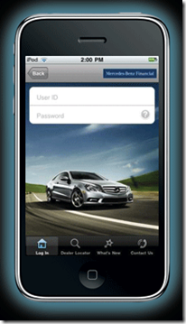
Other than the striking homepage image, the app is pretty pedestrian so far. It allows registered users (note 2) to make a car payment, calculate the pay-off amount, and find dealers and customer service numbers. In other words, it’s a lot like the company’s website ten years ago (note 3).

But that’s OK, for now. Financial brands should take advantage of the free publicity of the iPhone App Store and  post something, even if it’s just a window to their Web app (worked for Bank of America).

Along those lines, SunTrust (iTunes link) is the latest megabank to join the store (last week), leaving US Bank, Capital One, BB&T, and HSBC as the remaining top-10 U.S. retail banks without their own iPhone app. Who will be the last one in?

Mercedes-Benz Financial’s homepage includes iPhone link (6 Oct 2009)

image

iPhone landing page (link)

 image

Notes:
1. For more info on the market, see our Online Banking Report: Mobile Banking via iPhone (March 2009)
2. Users must set up a profile online at Mercedes-BenzFinancial.com  before accessing their accounts via iPhone.
3. But I’m kind of surprised MB didn’t include a payments calculator, standard fare at most car sites.

Best of Web: Vantage Credit Union is First to Tap Twitter for Transactional Banking

imageIn 2006, we predicted that every major bank and credit union would someday have a blog (note 1). That prediction was looking downright awful until Twitter came along. The popular, and much-hyped service, is part blog, part social network, and part text-messaging.

Financial institutions have embraced Twitter much faster than blogging because it’s low cost, drop-dead simple to implement, and relatively cost-effective to staff and manage. Our good friend, Christophe Langlois, who has been tracking social media implementations at Visible-Banking for several years, has identified 120 financial institution blogs worldwide. In comparison, Christophe is tracking more than 700 Twitter accounts. Similarly, Jeffry Pilcher’s exhaustive Twitter directory at The Financial Brand lists about 600 Twitter accounts in use by financial institutions.

Vantage CU takes the Twitter plunge
image Although Twitter can successfully be used as a simple one-way broadcast medium (i.e., microblog), it’s also a powerful two-way and group communication service (note 2). Wesabe, in 2008, and Xpenser, earlier this year, were the first online PFMs to leverage Twitter for posting transaction info to user accounts. But St. Louis, Missouri-based Vantage Credit Union took that one step further by allowing users not only to query their accounts, but also to move money between them.

At the core, Vantage CU’s Twitter service is little different than hundreds of SMS/text-message mobile-banking services already in use around the world. But for Twitter users, it allows account queries from anywhere a Twitter client is loaded: smartphone, laptop, or desktop (note 3).   

How it works
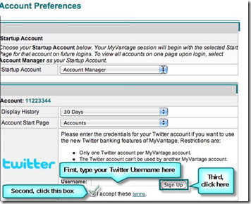
image Vantage CU posted videos showing how it works. But if you are a Twitter user, you can skip the tutorial. You’ll understand right away: After signing up for the service at Vantage (inset), simply follow the CU on Twitter (@myvcu) and send them a direct message whenever you want to see your balance, recent transactions, or to initiate a funds transfer.

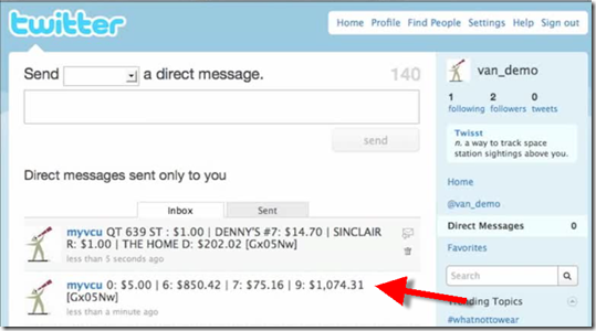
While the process is relatively intuitive for Twitter users, the command-code language limits the usefulness. The results look like a throwback to the DOS command line circa 1985 (see first screenshot below). It would be much simpler if the CU offered plain English commands and account nicknames, e.g., “transfer $500 from wifechecking to mychecking” instead of “#trans f9 t0”. Ideally, the CU would support short codes for its power users and plain English commands for everyone else.

That said, it’s pretty simple to remember how to make a checking account balance inquiry, “#bal 9” (9 is the code for checking), which is the primary way the service will be used.
image

Website implementation
Few members will actually use Twitter banking, at least initially. The main reason to embrace Twitter is for the publicity and brand value, especially when you are first.  Vantage takes full advantage of its first-mover position, placing a headline on its homepage, along with a Twitter feed directly below.

Other things Vantage CU does right:

  • Posted four how-to videos (although, the CU needs to choose a faster host for the videos because the Screencast-based videos run way too slow)
  • Posted FAQs, instructions, and screenshots
  • Wrote a blog post about the new service
  • Proactively reached out to bloggers resulting in great initial coverage (Financial Brand, Everything CU, and Currency Marketing) which can help bring mainstream press coverage later
  • Allows users to subscribe to the Twitter feed via RSS (directly from the CU’s homepage)

Analysis

image The PR value alone should more than justify the expense of Vantage CU’s Twitter service. And if Twitter continues to work its way into the fabric of consumers’ daily lives, the service could attract a decent following.

In keeping with our 10-year tradition of recognizing new online “firsts,” we are awarding Vantage a 2009 Best of the Web award (note 4) for being the first in the world with full-service Twitter banking.

Vantage Credit Union homepage featuring new Twitter service (5 Oct 2009)

image

Notes:
1. See our Online Banking Report: Bank 2.0 (Nov. 2006).
2. For more info, see our Online Banking Report: Leveraging Twitter (May 2009)
3. However, text-messaging users would likely prefer to make balance inquiries directly from their phone’s SMS function, rather than t
aking the time to open the Twitter app or website. The most likely user is someone already using Twitter who decides to do a quick banking inquiry while Tweeting. 
4. OBR Best of the Web awards are given periodically to companies that pioneer new online and mobile banking features. It is not an endorsement of the company or product, just recognition for what we believe is an important development. Vantage Credit Union is the 75th recipient since we began awarding it in 1997.

Mobile Banking Awareness at Financial Institutions: The Grades Are In

image Two days ago (here), I wrote about Citibank’s smartphone banking awareness campaign on its homepage. Coincidentally, ABI Research yesterday published a rating of 17 U.S. major retail banks plus a dozen community banks (see note 1) on “discoverability” and “accessibility” of their mobile banking services (press release).

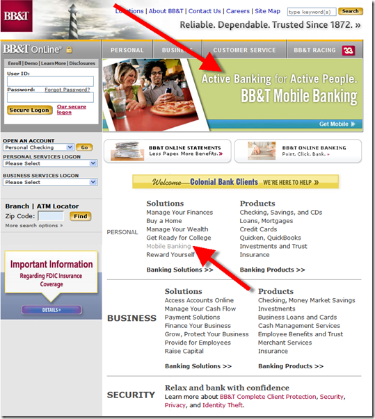
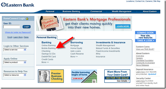
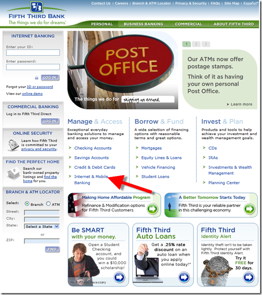
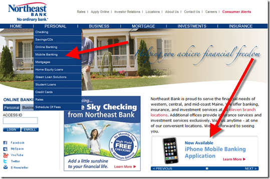
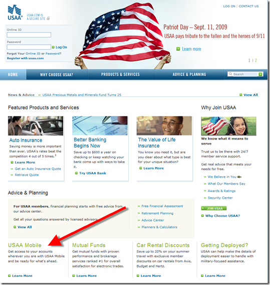
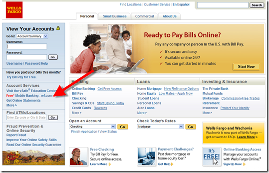
Surprisingly, ABI rated Citibank “average.” I’m not sure what Citi did wrong (note 2) to get a “C,” but one common technique of all ABI’s A-students (see table below), is a “mobile banking” link on the homepage (see screenshots below).

Observations:

  • Wells Fargo is the only bank to publicize a short mobile URL, wf.com (see final screenshot)
  • USAA is the only one of the six with an iPhone-optimized page rendered for users visiting its regular URL (see note 3) from the iPhone browser; this would be a minimal requirement for an A on our scorecard (if we were to make one)
  • Two of the six A-rated banks, BB&T and Northeast Bank, were also rotating a mobile banner ad on the homepage (see screenshots below).

Here are the ABI Research ratings:

Grade Bank Names
A BB&T, Eastern Bank, Fifth Third Bank, Northeast Bank, USAA, Wells Fargo
  B+ Bank of America, Chase Bank
B Capital One, US Bank, Huntington Bank
C America First, Bancorp South, Citibank, PNC, Wachovia
D Carolina First, 1st Bank, IBC Bank, Mercantile Bank, Regions Bank, SunTrust, Synovus
F M&T Bank, Provident Bank

The A students (all screenshots from 10 Sep 2009)

BB&T

image

Eastern Bank

image

Fifth Third Bank

image

Northeast Bank

image

USAA

image

Wells Fargo

image

image Notes:
1. Another community bank with great mobile awareness is Farmers State Bank (click on inset right for a larger screenshot). Thanks to Laurie Goodlock at the bank for the tip.
2. We’ve requested the full report.
3. wf.com visitors also see a mobile-optimized site in their iPhone browser
4. Reference: Online Banking Report on Mobile Banking (Feb 2007) and Online Banking Report: Mobile Banking via iPhone (Mar 2009)

Mobile Awareness: Let Your Customers Know They Can Bank Online via Smartphone Now

image Yesterday, Apple announced it has shipped 50 million iPhone/iPod Touches in the past two years. And they are not even the smartphone leader. You can bet that many (most?) new smartphone-owning-online-banking-using customers haven’t a clue how to connect to their financial institution through their mobile. And even if they know how, there’s still that nagging doubt as to whether it’s a safe/smart thing to do.

Therefore, if you want to drive significant mobile usage, there are a number of steps to take (see note 1). But one of the most important is user education, especially through online information, screenshots, and demos. 

Citibank recently elevated general smartphone awareness to its homepage (see first screenshot below). Yesterday, the bank was rotating an “Introducing CitiMobile for Smartphone” banner across the top of the homepage. The banner led to an educational page (see second screenshot, note 2), that led to clear instructions on how to bank via a mobile browser:

  • Open browser
  • Go to citi.com (note 3)
  • Log in using your same online banking credentials

While brevity is admirable, I think customers need a little more info than that. For a non-user, the process sounds almost too good to be true. The bank should elaborate on some key questions such as:

  • Is it secure? (see update below)
  • What does it cost?
  • Does it work on my phone?
  • What if I lose my phone?

Luckily, interested users can go to the well-designed demo that takes users through a semi-guided tour of the mobile banking functions. The Flash-based demo is partially interactive, allowing users to click buttons on a smartphone emulator (see third screenshot). After clicking on a new function, the demo takes over, completing the data entry and going forward to the next screen. Check it out here

Update (22 Sep 2009): An email from a Citi Mobile employee pointed out that I missed the security and other info in the right-hand column of the landing page below. I apologize for the omission. 

Citibank homepage (9 Sep 09)

image

Citi Mobile for Smartphones landing page (link)

image

Citibank mobile demo with interactive emulator

image

imageNotes:
1. For more info, see Online Banking Report on Mobile Banking (Feb 2007) and Online Banking Report: Mobile Banking via iPhone (Mar 2009)
2. The bank has separate pages for: Citi Mobile for iPhone and Citi Mobile for Other Models
3. Citi still has some work to do on optimizing the mobile Web experience (see update below). I navigated via my iPhone to its homepage (see inset) which looks terrible: The page is rendered impossibly tiny (requiring finger zooming), and because the two Flash-based animations don’t work on iPhones, the top of the page is dominated by two empty boxes.

Update (22 Sep 2009): The site is now rendering perfectly on my iPhone. I see a mobile-optimized site similar to the Citi iPhone app. I’m not sure what was going on Sep 10 when I took this screenshot. It’s possible I got the wrong page by navigating to Citi through the Google app. 

ING Direct Releases Home Loan Toolkit for the iPhone

imageHave I mentioned that the iPhone is amazing? I’m not sure if it’s because it’s so useful having a computer in my pocket 24/7, or that it gives me so much material for Netbanker and Online Banking Report (probably the latter).

Now that we are beginning the second year of the App Store, we are starting to see some more interesting things on the finance front. For the first year it was all about tip calculators, balance inquiry, ATM locators, and manual-entry expense trackers.

This summer, we’re beginning to see the bigger potential with the launch of remote check depositing from WV United Credit Union and USAA (which also loaded helpful auto insurance features into its app). And Apple’s new OS 3.0, which supports push notifications, will be a boon to mobile banking apps.

But that’s just the beginning. There will be an app for anything you might want to do with your finances. The latest: a free Home Loan Toolkit for prospective home buyers from ING Direct Australia. The app appeared in the U.S. App Store yesterday (here).  There’s no mention of it on the bank’s website yet, but Google pointed me to the well-designed microsite (here) supporting the app (screenshot below).  

It’s pretty straightforward with just three functions:

  • Calculators to determine how much you can afford to borrow and what the payments would be
  • A call-me request form
  • Average home prices by area

Screenshots from ING Direct Australia’s new iPhone app (3 Sep 2009)

image   image   image

 image       image 

ING Direct Australia iPhone Home Loan Toolkit microsite (link, 3 Sep 2009)
Note: The five iPhone screenshots (above) rotate through the iPhone pictured below. Alternatively, users can scroll through the screens with the control under the phone.

image

————————————————————————-

Note: For more info on the native iPhone apps, see Online Banking Report: Mobile Banking via iPhone.:

Don’t Waste the Marketing & Communication Benefits of an iPhone App Update

image I’ve written plenty about the importance of the iPhone App Store, both here and in Online Banking Report (note 1). But there’s one subtle side benefit I hadn’t thought too much about previously. 

Every time a new version of a native app is released, users must take action to download it if they want the new features. While this process used to be a nightmare in the desktop software days where users had to use floppy disks, CDs or large downloads to reinstall the software, it’s an absolute breeze on the iPhone and usually takes less than a minute from start to finish. And there’s no restarting the iPhone or choosing installation options. It’s just a one-click process plus the input of your iTunes password if you weren’t already logged in.

So why is this process a benefit? Because each time a new release is available a little icon shows on top of the App Store icon (see screenshot 1 below). Users then press the App Store icon, choose update, and they see a list of applications with updates available (screenshot 2). At that point users choose to update them all or look at them individually.

We believe most users are interested enough in their financial apps to take a look at the update, at least until the novelty of the mobile app wears off some years in the future. This provides financial institutions a free marketing opportunity to not only explain the new features of the app, but also deliver other marketing messages. You are much more likely to make an impression with your customers during the update process, compared to sending out a random marketing email.

In the three bank examples below, only USAA (screenshot 3) uses the opportunity to further cement its relationship with mobile customers, touting its new remote deposit capabilities along with several other enhancements. Wells Fargo (screenshot 4) takes a matter-of-fact, “we’re fixing bugs” approach that is OK, but still misses the chance to communicate with users. But Chase (screenshot 5) completely annoys users with two sentences of marketing speak that says nothing about the update. 

Lessons for financial & mobile marketers: Whenever you release an update for your mobile app (note 2), take the opportunity to communicate with your customers as follows:

  • Clearly explain the benefits of the changes to the app
  • Highlight one or two related benefits of the app
  • Mention any related news or promotions
  • Strike a good balance between disseminating technical info and marketing new benefits

Screenshots

1. Main iPhone screen shows                        2. The Updates page shows the 4 apps
    that 4 app updates are                                       that have new versions available.
    available (right side halfway down).

image      image

3. USAA’s latest update explains the specific changes made and provides several new benefits to using the app.

image

4 & 5. On the other hand, the Wells Fargo and Chase update messages are sparse. The Wells Fargo update appears to be a minor bug fix, so we’ll cut them some slack for the terse message. However, Chase, with a minor update (2.0.1 update) to its major 2.0 release (released Aug 25), says absolutely nothing in 24 words of marketing-speak: 

We’re listening — You asked for a fully native iPhone banking application. This Chase iPhone app is built exclusively for iPhone and iPod touch users.

Seriously Chase, this is the best you could come up for the tens of thousands, if not hundreds of thousands, of iPhone users waiting for your updated app? At least the bank gets points for brevity.

                   Screenshot 4                                                             Screenshot 5

image       image

Note:
1. For more info on the importance of a native iPhone app see Online Banking Report: Mobile Banking via iPhone.
2. The same advice holds true for communicating online banking improvements as well, although the communication methods are different (email, newsletter, statement insert, blog, interstitials, log-off messages, etc.).