FinovateSpring: Cyber Security, Branch Banking, Partnerships, Financial Wellness, and More

Cyber security is finally at the frontline of conversations, but is it that easy?

Today we chatted with Sean Sposito, Security Analyst at Javelin Strategy, about the challenges that financial services companies have when dealing with cyber security. While awareness of cyber security has never been higher, Sposito asks whether that really equals an impenetrable safe wall?

Banks: who do you want to be when you grow up?

We ask John Waupsh, Chief Innovation Officer at Kasasa, where the branch stands? “Consumers, including millennials, still want to go into the branch and talk to somebody,” Waupsh says. But he counters with the fact that banks should be investing in a future of embedded banking.

FI + Core Vendor + Fintech: What it takes to make the partnership work

Tina Giorgio, President & CEO of ICBA Bancard, speaks with us live at FinovateSpring 2018 about the three Ts  – time, talent, and treasure –  that can guide community banks as they seek to adopt new technologies.

Financial wellness first: transforming the digital experience

“As a financial services industry, we have not yet been able to help a customer understand that the decisions that they make today impact their short and long-term goals,” says Tiffani Montez, Retail Banking Senior Analyst for Aite Group. Taking a new perspective on the digital experience, Montez addresses the key themes that can be facilitated by keeping financial wellness at the forefront: mobile experience, the role of the branch, and reinventing the checking account.

Security scars are key to innovation

“What’s your surface area and what are you defending?” is the first question you should be asking yourself when considering cyber security, according to Ben Johnson, CTO & Co-Founder, Obsidian Security. We speak to him live at FinovateSpring 2018 about the best practice and innovations in cyber security today.

“Banks can’t be everything for everyone”

We speak to Alex Jimenez, Vice President Senior Strategist, Zions Bancorporation about the key takeaways from the panels he participated in that addresses payments and platformization.
 

Feature Friday: Getting Phygital with Fintech Startup Root Banking

Feature Friday: Getting Phygital with Fintech Startup Root Banking

Phygital may not be heading for inclusion in the Oxford Dictionary anytime soon. But it does attract attention to your fintech startup, especially when you are specializing in integrating digital and physical channels.

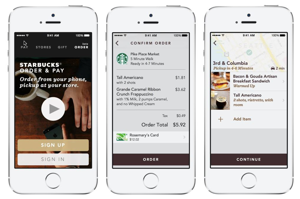
Enter Root Banking, a San Francisco-based startup from industry veteran Matt Krogstad (see note 1). I met Matt when he was at mobile banking pioneer M-Com (acquired by Fiserv in 2011). Fast forward six years, and after stints at Bank of the West and First Republic, Matt is back in the fintech startup world, with a service designed to bring Starbucks-level channel integration to banking.

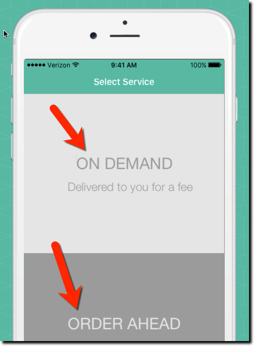
Root Banking’s service connects mobile customers to their branch to order ahead. For example, last Friday I needed a money order to pay a local tax bill when my ACH was inadvertently returned. This was double frustrating. First, my bank fumbles the electronic transaction, then I had to make a trip to the branch and wait in line, then wait at the teller station while they printed up a money order. Had I been able to order it in advance, and just picked it up, the whole thing would have been less unpleasant.

The other primary use cast for Root Banking is mobile delivery. Imagine if my bank would have dropped the money order off at my home (or better yet, mailed it to the City of Seattle treasurer). I probably would have opted to avoid a delivery fee, but it would be nice to have the option.

The startup hopes to integrate their phygital services into the FI’s existing mobile app. But Root will make a standalone app available if necessary. Several banks are piloting the service and are not yet integrating the requests into branch systems, instead simply delivering the requests through secure digital channels.

Bottom line: To me, the order ahead use case is most interesting. Most times I’ve needed to visit the branch (usually for small business matters), there is paperwork that could have been uploaded in advance to reduce my time at the branch by an order of magnitude. Not only is that good for customers, it potentially drives costs out of the system at the branch level. A win-win.


Contributor: Jim Bruene (@netbanker) is Founder & Advisor at Finovate as well as Principal of BUX Certified, a financial services user-experience accreditation program. 


Note:
1. For reference, see Penny Crosman’s 10 January article in American Banker 

Friday Fun: Searching for “Mobile Banks”

Friday Fun: Searching for “Mobile Banks”

If you could choose one banking term to dominate in Google searches, “mobile bank” would be near the top of your list. In the past two months, Google has served 1 million searches for the term (see chart above). And not surprisingly, 75% were conducted from mobile devices.

So who’s on the first page today? When searching “mobile bank” from my Seattle IP address I expected to see the usual mega-banks. And yes, they were there. Among organic results (see desktop screenshot below, mobile search results were similar), US Bank was #2, BofA was #3 & #4, PNC was #5 (despite no branch network in Washington state), Citizen’s Bank was #7 (also with no branches here) with Key Bank, Union Bank, and TCF finishing off the first page.

Nothing too surprising there, other than perhaps the omission of Chase and Wells, which evidently need to boost SEO efforts. But what did surprise me was who finished #1 AND #6, BankMobile from Customers Bank. Next year, the mobile bank is expected to be spun-off in a $110 million merger with Flagship Community Bank, which is wisely keeping the BankMobile name.

Bottom line: Thinking about it, I shouldn’t have been surprised by the results. BankMobile has 1.8 million mobile accounts, ranking it among the 10 largest U.S. mobile banks (after BofA, Chase, Wells, US Bank, Capital One, Discover, Amex and perhaps Barclays and/or TD Bank), I guess Google had it right after all. Enjoy your weekend!

Author: Jim Bruene (@netbanker) is Founder & Senior Advisor at Finovate as well as Principal of BUX Advisors, a financial services user-experience consultancy. 


Google search results for mobile bank (17 Nov 2017, Seattle IP address)

Mobile Paths

Mobile Paths

mobile banking clipMobile has been an important part of banking for six or seven years, but have you recently thought through the longer-term strategic implications?

For younger customers, the relationship with their bank, like with most large tech companies, is through their phone. Young customers don’t even think about the people behind the service. As long as it’s working.

Given this reality you have two choices.

  1. Embrace the anonymous service provider model of Google, Microsoft, Facebook and most big tech companies. Go for scale, low costs, and state-of-the-art digital services. Offer robo-savings, automated chat bots, and self-service. Hire great programmers.
  2. Go in the other direction. Humanize your service by inviting customers to connect with people at your financial institution, either in person (traditional banking model, also used by Apple with its hardware) or through chat services (Amazon). Optimize around people and connections with the customer. Have new customers in for a chat, invest in social networking and custom interfaces. Hire great account reps.

It’s easier to stay anonymous. You avoid all those messy interactions with customers. But it may be harder to gain loyalty, cross sales and referrals as a no-name service provider. Another concern on the credit side, is whether that anonymity comes at a price in terms of higher loan defaults?

Building a human connection can cement customers possibly for generations, but has higher costs in terms of staffing, customer service, and brick and mortar investment.

Either way is a legitimate strategy. But you need to choose.


Author: Jim Bruene is Founder & Senior Advisor to Finovate as well as
Principal of BUX Advisors, a financial services UX consultancy. 


Notes:

1. Picture by 123rf.com (licensed)
2. Inspiration by Seth Godin

Mobile Monday: Starbucks Adds Floating Balance to Mobile App

Mobile Monday: Starbucks Adds Floating Balance to Mobile App

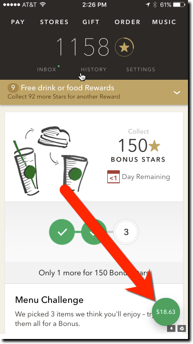
starbucks mobile balanceIn a major update last week (v4.3.2, 30 Jan 2017), Starbucks added a floating balance to its mobile app main page. So instead of navigating to the pay tab within the app, users always see their card balance as soon as they launch the app. And the balance stays floating in the lower right corner no matter how far down the page you scroll.

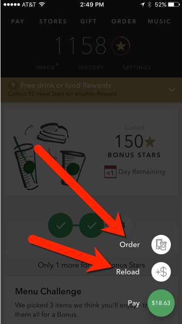
Furthermore, clicking the green button grays out the page and brings up two options tethered to the green button (see screenshot below):

  • Order
  • Reload

It’s a small thing, but it helps users know before they get to the front of the line whether they have enough funds in their prepaid account. It is also a good shortcut to the card reload function, though I’m not sure how many users will know/remember it’s there.

Bottom line: Banks should make sure that the balance is visible on all areas of their debit card interfaces. It’s an even worse user experience to find out you don’t have the funds after you’ve ordered your meal or rung up your grocery store purchases.

starbucks mobile reload order


Author: Jim Bruene is Founder & Senior Advisor to Finovate as well as
Principal of BUX Advisors, a financial services UX consultancy. 

Startup Watch: Clarity Money Makes a New Run at PFM

Startup Watch: Clarity Money Makes a New Run at PFM

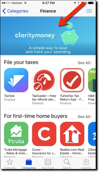
clarity money in ios app storeWhile the term PFM is dead, the concept, employing software to watch over your finances, is more widespread than ever. It’s just called AI, spending management, or nothing at all since it’s now baked into many digital banking offerings.
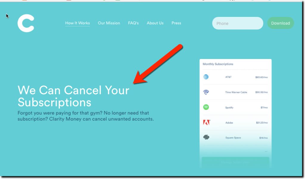
However, automated spending management is still not widely used by customers because the big players don’t make it available by default, except Wells Fargo’s My Spending Report. So there is still room for new companies in this arena, especially if they invoke AI in their value proposition. And it doesn’t hurt to have celebrity business connections either.

Enter Clarity Money into the crowded field. But with Michael Dell’s brother Adam as founder, and $3.5 million in funding from VC heavyweights Soros Fund, Maveron Partners and Bessemer Venture Capital, the mobile PFM startup has attracted a slew of press mentions (NY Times, TechCrunch, Business Insider, Bank Innovations, and a dozen more). But the biggest help to the fledgling business came a few weeks ago when Apple namclaritymoney_mint aded it a “new app we love” that pushed the app from nowhere to #16 (USA app store, free Finance apps). Today it is number 56 (see above).

The mobile-only free service reminds us of BillGuard (acquired by Prosper) married to Moven, with a sprig of Mint on the side (see image posted to Clarity’s Instagram left). The value proposition is around monitoring transactions to save money on unneeded recurring services and/or bloated bills (in which the company takes a one-time commission on savings) while building a small nest egg in an integrated FDIC-insured savings account.

Bottom line: There’s much to learn from Clarity’s marketing messages, value proposition, and mobile-first build. If you don’t offer these benefits for customers, someone else will.


claritymoney value prop 1Consumer value prop

  • Save money on bills
  • Build a savings account
  • Don’t get ripped off by unauthorized or unneeded recurring charges
  • Keep your spending organizes

Business model

  • Consumer loan lead gen (e.g., a Chase credit card is shown on a screenshot)
  • Deposit spread
  • Commission on bill savings
  • Offers

Team (co-f0unders)

  • Adam Dell, CEO, brother of Michael Dell (yes, THAT Michael Dell)
  • Hossein Azari, Chief Data Scientist and formerly of Google Research
  • Matt Jacob, VP of Engineering, formerly of CommonBond

Service providers:

  • BillShark for bill savings
  • Experian for credit and transaction monitoring
  • Wells Fargo for savings accounts

Advisors:

Product roadmap

  • Investing
  • 401(k)s

Author: Jim Bruene is Founder & Senior Advisor to Finovate as well as
Principal of BUX Advisors, a financial services UX consultancy. 

Video of the Week: Bank of America Demos AI Chatbot “Erica”

Via a chatbot named Erica, Bank of America this week demo’d its upcoming mobile AI capabilities. The feature will be available to the 21 million users of its mobile app via voice or text commands “in late 2017.” While it’s unusual for a major bank to discuss technology a year away from deployment, with all the hype around artificial intelligence and chatbots, BofA must have figured it was a good PR move.

The bank did not disclose whether it was building or buying the technology, but my guess is the latter. We saw a number of Finovate demos last month in this area and expect many more in 2017.

For more info, check out the American Banker story yesterday (free access).

Mobile Monday: The Bank of America “Help” Button

Mobile Monday: The Bank of America “Help” Button

bofa_help_top

I love the minutiae of digital banking. Others may be fascinated with how the blockchain will disrupt global payments or the impact of Dodd-Frank on debit-card rewards. Me, I just need a shiny new button to make my day. And as luck would have it, Bank of America obliged in its latest iOS update (Sep 22, v7.1).

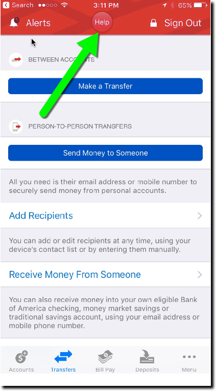
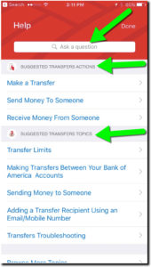
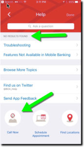
The bank added a Help button centered at the top of the screen on most pages (see above and first screenshot below). Pressing the button leads to a slightly context-sensitive, self-service menu with an “Ask a question” box on top (second screenshot). The search failed my advanced search stress test (Do you have SEP IRAs?, third screenshot), but otherwise seemed serviceable. And it was relatively straightforward to find the right button to connect to an actual human at the call center.

Bottom line: Locating a Help button in a prime position is a good way to show that you care about the customer’s experience. It would be nice if the BofA button led to a better search function, complete with an audio option, and better context-sensitive results (note in screenshot 3, the top result from my SEP-IRA question is “Troubleshooting”). And if I was being totally honest, the button is a little hard to see on a tiny screen, the red on red. But regardless, it’s a good start.

New "Help" button on BofA mobile "transfer" screen
New “Help” button on BofA mobile “transfer” screen
Screen shown after pressing "Help" on Transfer page
Screen shown after pressing “Help” on “transfer” page
Result of search for "SEP IRA" on Help page
Result of search for “SEP IRA” on “Help” page

Mobile UI: Capital One Wallet Reverts to Old-School Navigation

Mobile UI: Capital One Wallet Reverts to Old-School Navigation

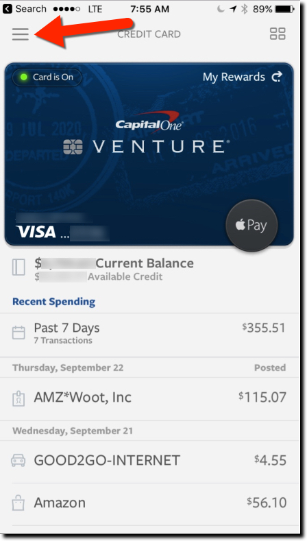
hamburger-menuI am not a huge fan of the hamburger navigation menu. If you are a smartphone native, I’m sure your eyes go right to the little pack of horizontal lines in the corner. But if you got your first smartphone in your 40s, you probably could use a little more help.

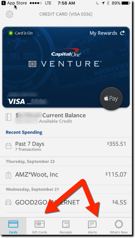
So I applaud Capital One, recently named in Fast Company as one of the best-designed mobile apps (see note 1), which in a 7 September iOS update ditched the so-called hamburger menu for something that’s actually visible on the page. See Fig 1 before and Fig. 2 after. I also learned today that Key Bank made the same decision to ditch the burger, but instead of a lower nav bar, they went with the more web-centric look of a near-the-top nav (Fig 3).
(Update 29 Sep: A reader informed me many banks are ditching the hamburger menu in light of Apple’s design advice here, here and here.)

Capital One Wallet iOS Previous
Fig 1. Capital One Wallet iOS
Previous


Capital One Wallet iOS Current
Fig 2. Capital One Wallet iOS
Current

Unless you are Facebook, Instagram, or other apps where customers spend hours every week, you need to make it easy for infrequent users to find their way through your app. And even though mobile banking is relatively simple, many providers make it needlessly hard to navigate with cute, hidden menus.

I understand why designers minimize the navigation, mobile real estate is precious, and even a half-centimeter devoted to on-screen navigation is a lot. But what’s more important, showing more transactions on the main screen or how to actually do something meaningful?

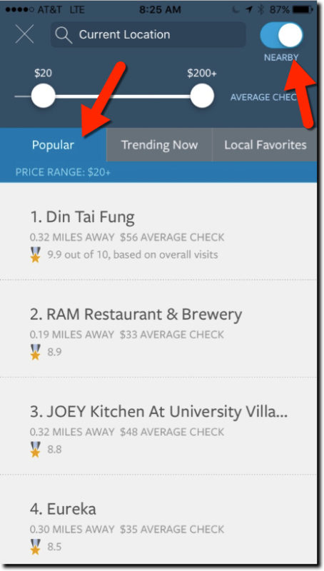
The update also included a new restaurant finder to identify popular eating establishments based on transaction data across all Capital One cardholders (Fig 4). It’s reminiscent of the Citigroup/Microsoft/Morningstar joint venture Bundle (F10), which, not coincidentally, was acquired by Capital One four years ago.

Key Bank iOS app with top navigation
Fig 3. Key Bank iOS app with top navigation


capital-one-wallet-restuarant-finder
Fig 4. Restaurant Finder in Capital One Wallet (iOS)

———-

Notes:
1. Only two financial companies were named in Fast Company’s list of 100+ best-designed products or apps in the October issue. The other was RobinHood, the simple, mobile stock-trading app.

Mobile: Going All-in with PFM in Mobile Banking

Mobile: Going All-in with PFM in Mobile Banking

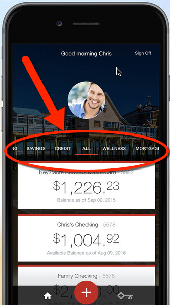
becu_mx_mobileThe ongoing migration to mobile provides financial institutions a chance to reboot their approach to delivering information digitally. Digital banking v1.0 (desktop online banking) was primarily about porting paper-based statements into an online format. It was a huge change and made banking more convenient, though not really any more effective than the paper-and-call-center system it replaced.

Digital banking v2.0 (mobile banking) is where modern processing power and machine intelligence pays off. Banking becomes not only more convenient, but much simpler, less time consuming, and helps consumers make better financial decisions. But to get to those payoffs, FIs need to provide advanced features, that we in the industry call PFM (personal financial management).

But it’s hard to transition entrenched desktop-banking users to the more powerful PFM platforms. Many customers have been happily using desktop-online banking for a decade or more. And it’s a painful process to move them into what looks initially like a more complicated system.

So some FIs are gently pushing users into the future by offering ONLY a PFM-based native app. The largest U.S. financial institution to use that approach is Seattle-based BECU, the fourth largest credit union in the nation, with nearly 1 million members and 350,000 using mobile banking (up 75% in the past year).

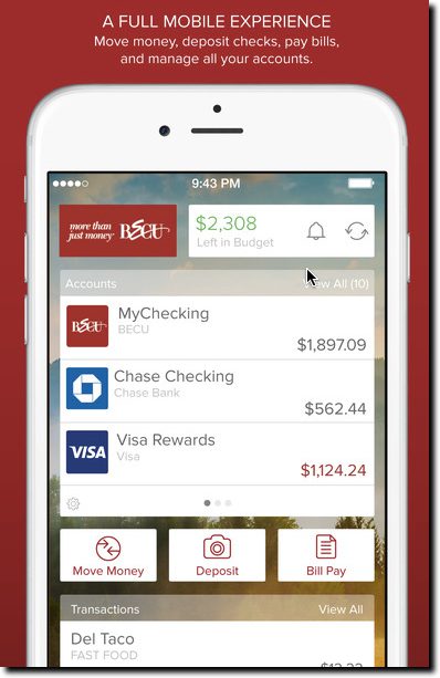
A year ago, the credit union replaced its simple mobile-banking app with a fully PFM-integrated version powered by MX (see them at FinovateFall next week). CU members using native apps (Apple, Android, Windows) now do all their banking through a full PFM interface.

becu_mob_money_homeIt’s a good long-term move. Users expect, and need, more functionality than simple balance lookup and funds transfer. But making such a big change all at once carries risks too. With more than 200,000 users at conversion time, there ensued some initial member grumbling, inevitable with such a big change. But the latest version released in May 2016 carries the highest 5-star rating, so apparently users have come to grips with the change. You can see the reviews in the iTunes and Google Play stores. Check out the MX case study for more details.

The full-conversion approach used by BECU may be the fastest way to move customers into the future. But to minimize initial pushback and work out any UX hiccups, grandfathering the old app could provide some breathing room. Or call the new version “Pro,” charge $1.50/mo for it (waived for a few months), and let both versions live side by side indefinitely. TD Bank in Canada offers the Moven-powered MySpend app as an add-in to its regular mobile banking app (see Moven at FinovateFall next week).

Alternatively, users turned off by a the full-featured app can be referred to the mobile website with instructions on how to save it as an icon on their phone. As long as you have a reasonably responsive, well-designed site, non-power user customers will be satisfied.

—–

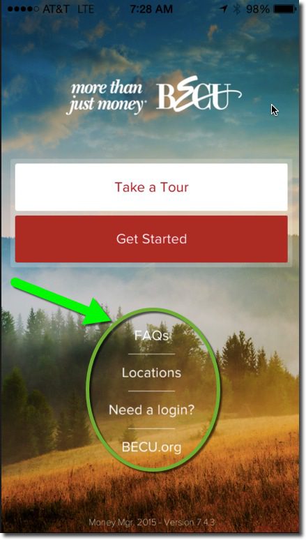
The BECU Money Manager has a start page (inset) that includes links to a tour, FAQs, new member application, online banking enrollment (required for mobile banking), location finder, and a link to the full mobile website.

——

Here’s a 3-minute MX-produced video of BECU exec Howie Wu discussing the desktop PFM platform and integration:

BECU on MX

Mobile: One-Size-Fits-All vs. Niche Banking Apps

Mobile: One-Size-Fits-All vs. Niche Banking Apps

us bank itunes iphone apps

US Bank’s iOS app lineup 


Early on in the smartphone era there was a debate as to whether native apps or the mobile web would carry the day. As an early iPhone user, I was solidly in the native apps camp. Some day there will be a better interface, but until then it’s an app world (though not every headline writer agrees). And now the question for financial institutions is not whether you need a native app, it’s how many do you need?

Until recently, most financial institutions hoped to have a one-size-fits-all mobile app, just like on the desktop. That’s the option that lowers development costs, simplifies tech support, and makes digital banking easier to manage. But since most financial institutions serve many customer segments, bundling too many features into one UI really gums up the overall experience.

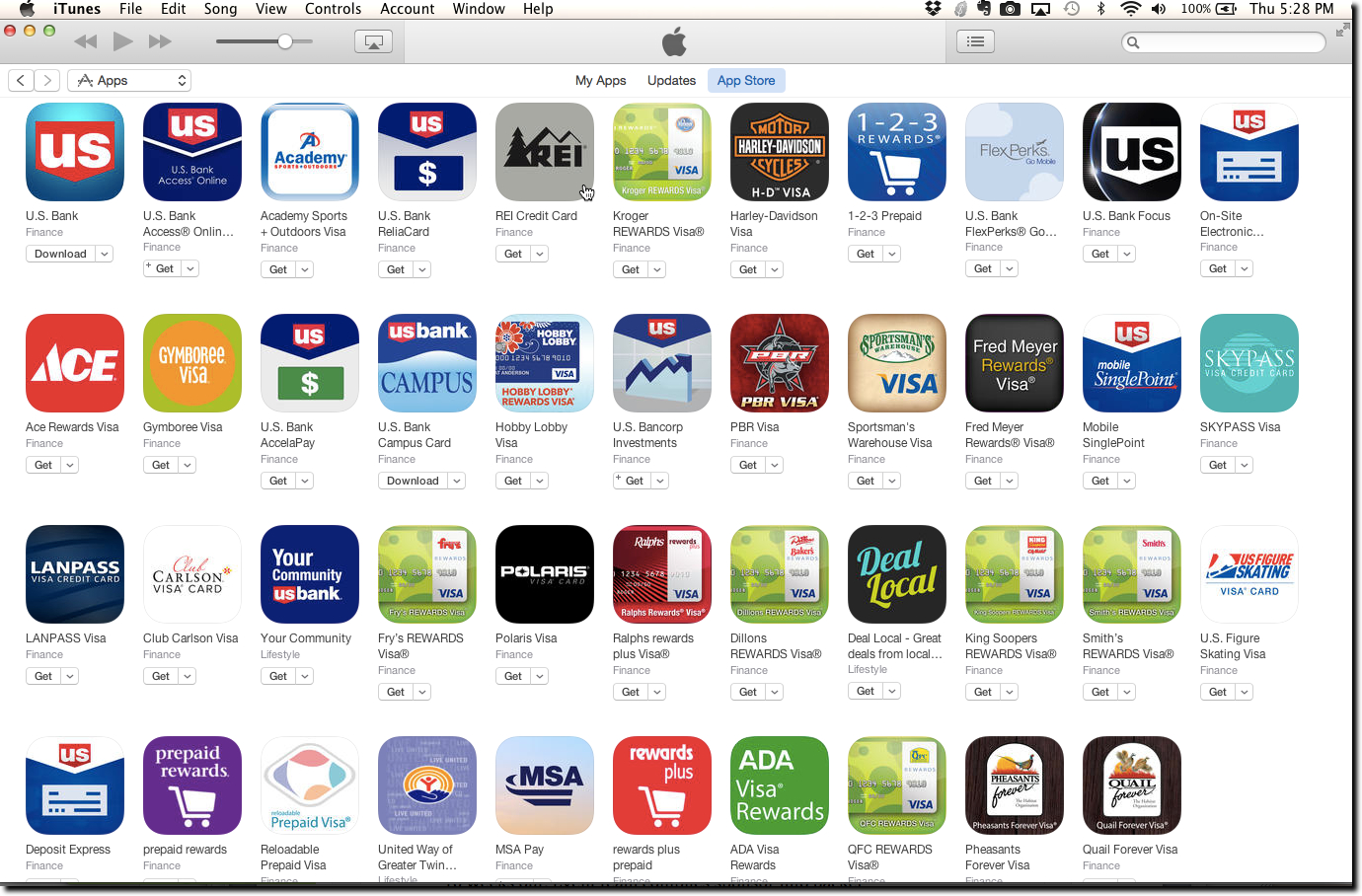
So we are seeing more and more financial companies developing multiple native apps to support distinct business groups, customer segments, and even charitable activities. The most prolific? US Bancorp with 43 iOS apps alone, 28 of which are white-labeled for its affinity credit-card customers (see screenshot above).

Delving deeper, let’s look at the 25 most-popular free finance apps in the U.S. Apple App Store (data is from mid-March, when I started this post). The 13 financial institutions in that group have a combined 123 apps, for an average of nearly 10 per bank. However, excluding US Bank’s 28 white-label apps, the total is 93, or 7.2 per FI.

Bottom line: You may not need 7 or 8 apps, but it’s clear that multiple apps optimized for individual use have an advantage in usability and focus (ROI is a much more difficult question of course). In addition to a core mobile-banking app, most mid-size and larger FIs should evaluate dedicated apps for the following segments:

  • Youth
  • Small businesses
  • Mobile wallet/cards (credit/debit/prepaid)
  • Saving/budgeting/personal finance
  • Home buyers/mortgage/home equity
  • Car buying/auto loans
  • College financing/student loans
  • Retirement/wealth management/investing
  • Optional: Insurance, HSA, any other stand-alone business line

——————–

Table: Number of iOS apps per financial services provider

Banks & Card Issuers: Total of 123 apps across 13 financial institutions

  • US Bank: 43 (14 branded, 28 white-labeled affinity partners, 1 nonprofit)
  • PNC Bank: 14 (all branded)
  • Chase: 11 (6 Chase branded, 5 JPMorgan branded)
  • American Express: 10 (8 branded, Plenti, Expert Care)
  • Citibank: 10 (all branded)
  • Bank of America: 9 (4 BofA branded, 5 Merrill Lynch branded)
  • Capital One: 8 (7 branded, 1 CreditWise)
  • Wells Fargo: 5 (all branded)
  • TD Bank: 3 (all branded)
  • Discover: 3 (1 branded, 2 Diners Club)
  • Navy FCU: 2 (all branded)
  • BB&T: 2 (all branded)
  • USAA: 2 (1 branded, Savings Coach)

Payments: 15 apps across 4 companies

  • PayPal: 9 (7 branded, Venmo, Xoom)
  • Square: 4 (all branded)
  • Western Union: 1
  • Google Wallet: 1

Insurance: 2 apps from 2 companies

  • Progressive: 1
  • Geico: 1

Personal finance/investing: 18 apps across 6 companies

  • Intuit: 13 (12 branded, Mint)
  • Credit Karma: 1
  • Digit: 1
  • Acorns: 1
  • Prosper: 1
  • Robinhood: 1

The Art of Mobile Banking Engagement

The Art of Mobile Banking Engagement

Customer engagement word cloudIt’s been fascinating to watch mobile banking take hold. The path has been much the same as online (desktop) banking a decade earlier, but at about double the pace (at least in the parts of the world that are highly banked).

Modern online banking started 21 years ago this month, when Wells Fargo began web banking in May 1995. It took 12 years before Mint came along and made it all look good and introduced the masses to more advanced concepts such as account aggregation, goal-oriented online budgeting, and expense tracking.

Mobile banking, which got its start in the post-iPhone App Store era (2008), took only about five years before it was “Minted” by Simple and then others. And in fewer than eight years mobile banking is already far better than desktop by almost every measure. From touchID access, to location awareness, to that very useful camera for depositing checks, there is just no way desktop online banking can compete.

But we have just barely scratched the surface of its biggest advantage: the always-on, always-with-you benefits. Account and transaction security is one of the first features having huge impact both on consumers (peace of mind, less hassle) and financial institutions (fewer false negatives, lower fraud costs, less customer-service expense).

Another area where huge benefits exist? Proactive communications about finances. Simple, Moven and Capital One’s Level Money are on the forefront with tools that help mobile customers know where they stand BEFORE they drop another $12 for a fancy cocktail or $35 on Uber.

And while monitoring spending in real-time has big theoretical benefits, it’s universally loathed by most consumers as the ultimate buzz-kill, kind of like having your parents hovering over you at point of sale. A more exciting always-on benefit is guidance to achieve bigger aspirations, like replacing your aging vehicle, trading up from your dinky apartment, or buying a house.

Take home buying. Many of our readers have been through this multiple times. But do you remember how little you knew about it back in the day? It’s a daunting task today even forHip_Pocket_Art0 the financially savvy.

That’s why I love tools that help people understand all aspects of the home-buying process: the mortgage, the purchase, and dealing with all of the ancillary expenses. We’ve seen a number of companies working on various aspects of the mortgage process. And next week at FinovateSpring, you’ll be treated to demos by two of the new breed of mortgage startups: Blend Labs which powers mortgage processing on the back-end and Roostify which helps consumers through the process.

And as luck would have it, last week Mark Zmarzly from Hip Pocket visited Seattle to present at a CU event, and was able to spare a few minutes to meet me for coffee. Mark wowed the crowd when he demo’d at FinovateSpring last year. Hip Pocket’s first product is a mobile app that allows anyone to input mortgage rate and monthly payment to see how their company stacks up against its peers (see inset).

The Hip Pocket mortgage app is a compelling value-prop for users, and potentially a great lead-gen tool for banks and credit unions. While Hip Pocket has had some great traction since then, it is still looking for additional seed funding to build more tools and fine-tune its customer-acquisition model. Hip Pocket is in a sweet part of the market—mobile mortgage (MoMo)—and is at a point in their company arc where relatively small dollars can make a big impact. They are a great candidate for “bank strategic seed funding.”