ING Direct’s Electric Orange Checking Gets Bill-Payment Facelift

image ING Direct’s (USA) paperless-checking account, Electric Orange, will get a new bill-pay user interface over the weekend (see first screenshot). The direct banking giant has also jazzed up the logo (inset) for its online checking option introduced in early 2007 (previous post).

The new GUI attempts to make bill payment more understandable. With paper and electronic delivery to merchants, person-to-person payments (also paper or electronic), and expedited payments thrown in the mix, it was hard for users to know exactly which option to select (see second screenshot for old user interface). 

ING Direct has reorganized payments into four functions and clearly identified the free (#1-3) vs. fee (#4):

1. Bill pay (paying merchants)
2. Person2Person (sending to an individual’s bank account)
3. Send a paper check
4. Overnight a check (for $20)

The company is also adding the following features (see third screenshot):

  • Electronic bill statements (ebills)
  • Email due-date reminders
  • New sorting options
  • Expanded recurring payment options
  • Simplified navigation
  • Clearly shows estimated payment arrival date

Customers have been notified through two emails that various aspects of bill pay will not be functioning beginning over the three-day weekend as the system is converted. 

Analysis: Overall, it’s a significant improvement, but there are still confusing aspects for novice users. For example, how do I decide between Person2Person and Send a Check? (see note 1) Why should I pay $20 for overnight, when the same delivery terms seem to be available in free bill pay? I’ll withhold final judgment until I have a chance to use it next week.  

1. New bill-pay interface (link, begins 25 July 2009)

image

2. Previous user interface (22 July 2009)

image

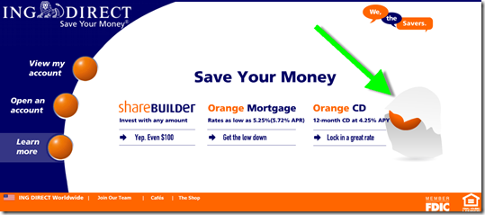
3. Landing page describing the changes (link, 23 July 2009)

image

Notes:
1. Answer: You have to have the person’s bank account info to use the P2P option.
2. For more on bill payment, see our Online Banking Report on Epayments (also part 1) (published in 2005) and the Online Banking Report 2009 through 2018 Forecast (published Jan 2009). 

Out of the Inbox: ShareBuilder Email Thanks Customers After Second Month of Automated Investments

image This is the first time we’ve seen a financial services company reach out and congratulate users for a job well done. In this case, ING Direct’s U.S. retail investments unit, ShareBuilder, sent a congratulatory email message to me after two months of investing through its Automatic Investment Program, which pulls money from outside checking accounts.  

The message has several purposes:

  • To reinforce the investment decision
  • To encourage customers to use ShareBuilder Research
  • To incent users to move other brokerage accounts to ShareBuilder with the $100 bonus offer (see landing page, second screenshot)

Analysis
What’s not to like here? It’s timely, relevant, to-the-point (only 75 words in the main body copy) and makes users feel good about themselves. The same thing could be done with loan payments, debt reduction, savings account balance growth, and so on.

Email: ShareBuilder automated savings congratulations
(3 July 2009, 6:41 AM Pacific Time)

image

Landing page for $100-bonus offer
Note: The offer is co-branded with Wells Fargo, which is where I originally set up the ShareBuilder account eight or nine years ago.

image

Side note: Online account opening warning box
When looking at the new account application, we encountered this popup when attempting to leave the unfinished app and navigate to the ShareBuilder homepage (see note 1).  

image

Note:
1. For more info on the subject of online apps, see our Online Banking Report: Online Account Opening, published two weeks ago. 

Progress Bank’s Novel Homepage Design

image There’s been substantial progress made in website design by banks. Sure, there’s still the occasional clunker, but most we look at today (see note 1) rate solid grades in the B+ to A- range. That’s up from many Cs and Ds at the turn of the century.

However, as good as banking websites have become, they still tend to be relatively busy, making visitors spend more time than necessary finding their way through the site (note 2). It’s rare to find a financial institution that dares to follow Google’s “less-is-more” approach.

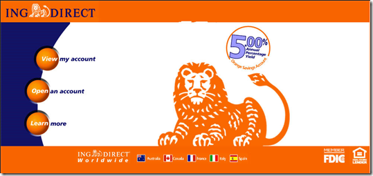
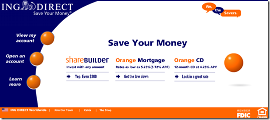
The lone major bank in the U.S. with a 25-word or less homepage is ING Direct, which like Google, has maintained the same look and feel since launch (see screenshots below, today and eight years ago). NextCard (prior coverage) also did less is more, but in its case, that mantra unfortunately was also embraced by its underwriting department, and the company failed in 2002.

But now we have another example: Progress Bank (note 3). While the depth of its online capabilities could be improved (how about online account opening?), the homepage is brilliant (screenshot below).

The Florida-based community bank uses just 26 words to describe its five major areas AND pitch a high-yield checking account. Each major area: online banking login, personal banking, business banking, and About Us, has its own circle. And as you mouse over each one, the image in the center circle changes. It’s quite striking.

In addition, the brightly colored circle in the lower left contains a pitch for the bank’s featured product, its green 5% APR checking account (note 5).

Bottom line: I love the look, although I hope they did some A-B testing before springing it on users. It’s a great branding statement, but it is also so different, there’s a risk that customers might not perceive the bank to be as trustworthy as one with a more traditional layout.

Progress Bank homepage (11 May 2009)

image

ING Direct homepage (12 May 2009)

image

ING Direct homepage (2001)

image

NextCard homepage (2001)

 image

Notes:
1. Online Banking Report All-Access subscribers are entitled to a complimentary high-level website review. Please email our website analyst to schedule a  review.
2. The exception is online banking login visibility, which is very good. Most financial institutions follow the industry standard of displaying a prominent login area in the upper left or right.
3. Credit Jeffry Pilcher at The Financial Brand for the find.
4. For more info, see our Online Banking Report on Website Usability.
5. Unfortunately, the ingenuity disappears as soon as you click on the offer. The pitch is then delivered via a bloated 2-page brochure in PDF format. And there is no ability to apply or inquire about the account online.

Out of the Inbox: ING Direct’s ShareBuilder Offers $90 Bonus through Costco Email

image It’s that time of year again when U.S. banks and investment companies get a temporary boost from federal income tax refunds and stimulus checks.

This year, much of that largesse is expected to go towards paying down debt or stashed away into FDIC-insured deposits. But there are still some folks looking for better longer-term returns, so ING’s ShareBuilder investment service is giving them a nudge with a $90 new-account bonus  offer (note 1) delivered in the March 25 email to Costco customers. This is higher than the $25 to $50 bonuses we’ve seen from them in the past.

The ShareBuilder offer was near the bottom of a lengthy email that arrived at 5:30 PM Pacific time yesterday. In total there were 54 products featured. ShareBuilder was the only financial product. 

Email from Costco (25 March 2009)

image

ShareBuilder landing page (link, 25 March 2009)

image

Note:
1. The $90 rebate applies to Costco Executive members. Business and Gold members receive $70. In addition, Executive members receive a 25% rebate in ongoing investing fees; Business/Gold receive a 10% fee rebate.

ING’s Ultra-ATM Finder Android App Uses Augmented Reality (AR)

image While working my way through the RSS backlog tonight,
I found a post from Rob Findley at The Bank Channel, I wish I’d seen a week ago. It would have made a nice example in our latest Online Banking Report on the iPhone and other mobile applications

image Last month, Dutch giant ING released a Google Android mobile application called ING Wegwijzer (see translated page below), that goes one step beyond the iPhone’s GPS-enabled ATM finder apps.

In the ING (Netherlands) version, you have three choices of how to view the nearest ATMs (see below):

  • List
  • Map (regular or satellite)
  • Camera

The camera option is very cutting edge. Users point the camera in their G1 mobile phone camera (inset) and the app overlays a pointer to the nearest ATM (see below). The application works for all ATMs, ING-owned and others, but only in The Netherlands. 

The application was developed for ING by SprxMobile using technology from Australia’s Austria’s Mobilizy.

I saw a Japanese startup demonstrate a broader mobile shopping app at TechCrunch50 last September, the Sekai camera from Tonchidot, but this is the first production app I’ve seen using the technology.

Bottom line: This is probably overkill in terms of a mobile ATM finder. However, it shows the power and versatility that’s rapidly being engineered into mobile phones.   

ATM location as pointed out by ING app running in camera viewfinder

image

ATM locations also displayed via typical mapping

image       image

ING landing page for the Wegwijzer (link) (Google translation, 18 March 2009)

image

ING Direct Delivers a Small Online Banking Treat with Halloween Homepage Animation

image I’ve written about ING Direct’s holiday animations before. While they won’t win any new business by themselves, they are part of a brand image that ING Direct cultivates. And it works because many consumers respond positively to a sense of humor even from institutions that are supposed to be serious.

With consumer confidence at an all-time low, and banks not exactly on anyone’s holiday-card list, it’s probably not a good time to create a whimsical branding campaign. But if you are ING Direct, which has built its image on bright-orange graphics and hip advertising, you can still have a little fun with the bank’s favorite orange holiday, Halloween.

Visitors to the direct bank’s homepage this week initially see white space where the bouncing orange ball normally does its thing. Within a few seconds an orange-eyed ghost comes out of the background (see first screenshot below). It comes towards you, then reveals the orange ball underneath the white “costume” (see second screenshot). Then it ends with the usual homepage (see third screenshot; note 1).

Very clever (I’d even say LOL, but I’ve vowed to never to use that term professionally).

ING Direct homepage (28 Oct. 2008)

image

image

image

Notes:
1. The animation runs just once. That’s an important element of restraint to preserve the viewing experience. Don’t endlessly cycle animations or you’ll annoy your visitors. They can refresh themselves if they want to see it again. 

ING Direct Launches "We, the Savers" Manifesto & Microsite

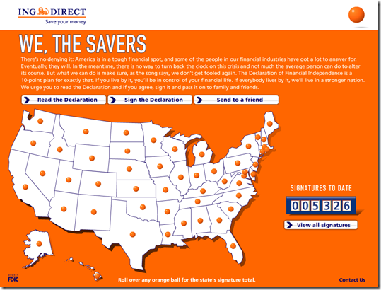
imageI noticed a new graphic on the ING Direct homepage today, “We, the Savers” in the upper-right corner. It leads to a banking version of the Clue Train Manifesto called The Declaration of Financial Independence operated by the bank at <wethesavers.com>.

imageAt the microsite visitors can read the 10-point declaration and sign the manifesto online. The U.S. map includes orange balls in each state that when moused over reveal the number of signers. So far, more than 5,300 consumers have signed since it went live Oct. 10th. All signers can be viewed at the site, but you have the option of leaving only your last initial for privacy.

When you sign the declaration, a little orange ball bounces over to the map and updates the state count in real time. As a final touch, signers qualify for a free “I save” bumper sticker from the bank’s online store.

The effort is well conceived and well executed, as we’ve come to expect from ING Direct.

Wethesavers.com microsite from ING Direct (28 Oct 2008)

image

“We, the Savers” link on ING Direct homepage (28 Oct 2008)

image

ING Direct’s $1 Million in FDIC Coverage (email)

image It’s not easy deciding what messages to send to customers these days (note 1), but there’s no doubt a clear email about increased FDIC coverage is a winner. For example, ING Direct does a great job with this simple and very clear message outlining the temporary increase in U.S. deposit insurance coverage.

I especially like how they demonstrate how easy it is for joint account holders to get $1 million in coverage (note 2). It’s so much easier seeing it laid out in a table. Here’s the email sent to customers this afternoon under the subject:

Subject: Your FDIC coverage just went up

ING Direct customer email announcing new $250,000 FDIC coverage (8 Oct 2008)

Notes:
1. Jeffry Pilcher posted some interesting quotes with differing perspectives on how to approach “crisis communications” in his Financial Brand blog today.

2. Not that many people need that, but it’s still somehow comforting to know that if you had to deposit your lottery proceeds, or if you were Mark Cuban and you shorted the DJIA at 1100 with 8% of your net worth, you wouldn’t have to spend so much time opening accounts to deposit your windfall.

Online Banking Report Looks at New Security Technologies that Promise More Peace of Mind

image With bad news pouring down from all corners of the financial services world, it’s a difficult time to be a bank marketer no matter what condition your financial institution is in (see note 1).

imageBut besides sending reassuring emails to your customers, highlighting your strong balance sheet on your website (see inset), and for the few with blogs, dropping the occasional rosy post into the RSS or Twitter feed (note 2), what’s a banker to do?

When fear is rampant, little things can make a difference. Your customers have long been nervous about banking online. Most aren’t afraid enough not to use it, but lingering doubt remains.

Now might be a great time to follow the lead of ING Direct, Firstrade, and Muriel Siebert and introduce a software solution that provides extra security for online banking. While it won’t make a Fannie Mae shareholder any happier, it’s reassuring in these times that at least there are no crooks stealing your username and password.

obr_bestofwebOnline Banking Report publishes Security 4.0 (note 3)
In the latest Online Banking Report, we look at several promising software solutions that allow even malware-infested users to connect safely to their bank. Both solutions earned OBR Best of the Web designations (note 4): 

  • Rapport from Trusteer, now being distributed by ING Direct in the United States and Canada (previous post here)
  • SafeCentral from Authentium, being distributed by Firstrade and in testing at several major banks (Finovate Startup demo video here)

Online Banking Report: Security 4.0 Tabl of Contents Sep 2008We also take a closer look at Bank of America’s SafePass (previous post here), which is an easy way for customers to add an extra security layer to their login, although it won’t prevent certain malware to hijack the session. See the inset for the complete Table of Contents.

Online Banking Report subscribers may download it now here. Others may download abstract here, or purchase here. Cost is US$495. 

Notes:
1. But be thankful if your financial institution is not in the headlines right now. I’m in the hometown of WaMu and the headlines this morning were not pretty.
2. Blog post from Verity CU on 16 Sept.; Twitter update from First Federal today   
3. Our fourth full Online Banking Report on security/privacy; previous reports were #119, #93/94, and #48
4. OBR Best of the Web awards are given periodically to pioneering online banking features. It is not an endorsement of the company or product, just recognition for what we believe is an important development. Trusteer and Authentium were the 71st and 72nd recipients of the designation since we began awarding them in 1997.

Who Has the Holiday Spirit?

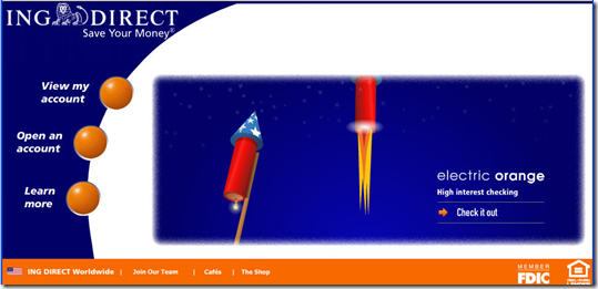
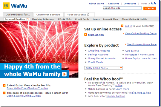
image With consumer confidence diving, the banking industry reeling, and even Starbucks closing 600 stores, what we need is a national holiday! Well, happy Fourth of July to U.S. readers, and happy Friday to everyone else.

What are the big banks doing to celebrate the holiday online? Not much it seems. We are 25 hours away from the birthday, and of the 30 largest banks, only ING Direct and WaMu (in the Seattle area at least) are showing the red, white and blue.

Anyone else know of a financial institution with an Independence Day theme on its homepage? Drop it in the comments. Enjoy!

ING Direct’s homepage features a fireworks animation (2 July 2008)

ING Direct homepage with july 4th theme (2 July 2008)

WaMu trumpets its July 4 Seattle fireworks sponsorship (2 July 2008)

WaMu homepage (Seattle cookie) 2 July 2008

Enliven Your Website with Streaming Activity, Tickers, or Counters

One thing hard to approximate online is the hubbub of a busy branch, retail outlet, or event. Other than the occasional popup inviting you to chat about whatever financial product you’re viewing, most financial websites are lonely experiences. Sure, Web-based video can personalize the online experience, but that’s still a one-on-one experience. That’s why building an online community is so important in the long run (see note 1).

Zillow mortgage rate quote ticker 18 June 2008

Geezeo public newsfeed 18 June 2008One way to demonstrate just how much activity takes place at your website or through electronic banking, is to show a stream of real-time activity. For example, Zillow’s new mortgage marketplace shows realtime mortgage quotes as they come in from the mortgage brokers using the site (see above).

Geezeo recently added a public news feed to its site, similar to what social media users experience at Facebook.

And ING Direct has counted up the interest in pays customer in a little meter within online banking, as of a few minutes ago it was $4.5 million shy of $9 billion. 

ING Direct interest paid counter 18 June 2008

But the most daring example is Progressive Insurance which displays actual specific rate comparisons to its competitors in the center of its homepage
(see screenshot below). 

Progressive Insurance quote feed on homepage 18 June 2008

Financial institutions could show streams of activity in the following areas:

  • credit/debit card transaction data: $63.42 at JC Penney’s Minneapolis, MN
  • bill payment transaction data (only to major merchants): $124.22 to PGE, LA, CA
  • funds transfers: A.C. transferred $1500 from checking to savings
  • results from online calculators: $15,000 vehicle at 6.5% for 5 years = $432/mo
  • mortgage quotes/locks: $572,000 purchase mortgage locked today at 6.375% with 1% fee
  • insurance quotes: $1,000,000 10-year level term for 42-year-old nonsmoker for A.E. in  Tampa for $1123/yr
  • interest paid on deposits, checks processed, loans funded, website visits, online banking login, bills paid
  • comments in blogs/forums
  • search terms used on-site and possibly the top results
  • questions asked/answered online

Of course, you’ll need to make certain there is absolutely no data streamed that could be traced back to an individual user.

Note:
1. See the following Online Banking Reports for more information:

ING Direct to Offer Desktop Security Plug-in from Trusteer

image While everyone wants better online banking security, the business case for most solutions is elusive. Even the simple step of adding an password in front of sensitive transactions can cost millions in customer service, enrollment procedures, employee training, and other soft costs.

So financial institutions, especially in the U.S., have taken a pragmatic approach to security, adding behind-the-scenes monitoring and making it difficult to transfer large amounts of cash out of the bank, rather than incur the expense of more robust login security. Banks have been especially reluctant to get involved in the security of the customer’s desktop due to the potential tech support costs and liability issues.

That’s what makes ING Direct’s new solution especially novel. The large U.S. direct bank, which has pioneered several security procedures, including multi-factor login and PINpad data entry, will offer a downloadable 400k plugin that creates a “secure tunnel” from the user’s computer to the bank (more analysis from Gartner’s Avivah Litan here). 

According to the software provider, Israel-based Trusteer, even if the user’s computer is infected with malware, the company’s Rapport software defeats all attempts to view, capture, or take over the transaction. It also encrypts keyboard entry without impacting the speed of the interaction with the bank. If it works as billed, it could be a boon for online banking security. 

The optional plug-in is expected to be made available to the direct bank’s 14 million customers worldwide, including 6.5 million in the U.S. The software is already in use by U.S. brokerage Muriel Siebert & Co. which mentions it in the What’s New section of its homepage (see screenshot below; read more here).

” width=”539″ height=”378″>

Cost
The software is now available here. It is free-of-charge to communicate with ING Direct and three other websites. Users will likely have the option to purchase a premium version that communicates with a larger number of websites. 

This so-called freemium business model should help minimize the cost of the software to the financial institution. But the bigger cost issue for the bank is the customer service expense. ING Direct, which has famously kept customer-service costs down by focusing on serving only profitable customers, likely will offload as much of the tech-support burden as possible to Trusteer. But there’s no such thing as zero impact. So it will be interesting to see if they can make the ROI work across 6.5 million customers, many of whom haven’t a clue about safe computing basics.

A competing system, Safe Central from Authentium, was showcased at our Finovate Startup conference in April. The full-length demo of the program will be available here within a few days.