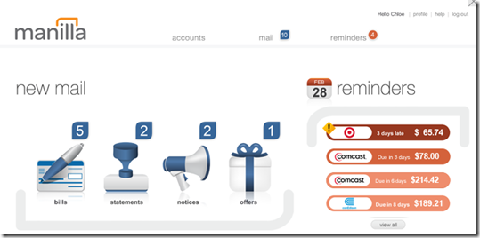
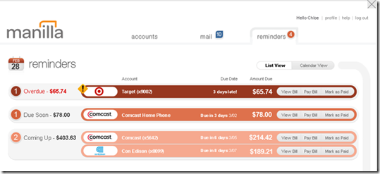
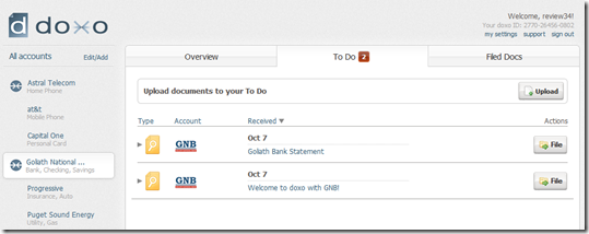
 There are a number of financial startups and trail-blazing FIs bringing modern user interfaces to banking. We see dozens of great examples at every Finovate (note 1). And we expect a slew of remodels in the new year as responsive design and other techniques take hold.
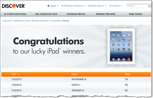
But I continue to call out Discover’s design work (previous posts). Partly because I have an account there and see it often and partly because it’s instructive to see how a large full-service bank handles design tradeoffs.
Yesterday’s email from DIscover, reminding me that my monthly statement was ready, shows how the card giant marries good design with useful information.
Most statement alerts are simple one liners asking the user to do all the work: login, find the right tab, click on the correct button, and so on. Discover, on the other hand, positions key summary information right within the body of the email (see screenshot below):
- Statement end date
- Statement balance
- Credit available
- Minimum payment due
- Due date
The company includes a button to view the statement at the top, but somewhat buries the payment link near the bottom.
Analysis: This is one of the better (maybe best) statement-available message I get from the major brands (note 2). But it could still be improved:
- Include a Pay Now button.
- Remind me that I’m on autopay and when to expect the payment in full to be deducted from my bank account.
- Reword and fix the bottom link. Currently it says “Late and Minimum Payment Warning.” That sounds like there must be a problem with my account. But there isn’t, so I assume that is supposed to link to the alerts maintenance area. However, that link wasn’t working, so I just was dumped onto the main secure account page. It was very confusing.
- Add a link to customer service, both self-serve and human powered.
- Add the amount of rewards earned this period. It’s always nice to be reminded of free money received.
————————
Notes:
1. For example, a recent crowd favorites was from Poland’s mBank which demoed alongside Accenture at FinovateFall in September (demo video).
2. We dug deep into this area a few years ago in our reports (subscription):
– Email Banking: Revitalizing the Channel (August 2010)
– Alerts & Streaming (July 2010)
– Paperless Billing & Banking (Nov. 2010)


