Feature Friday: Discover’s Interactive Checking Account Comparison

Feature Friday: Discover’s Interactive Checking Account Comparison

discover checking comparison

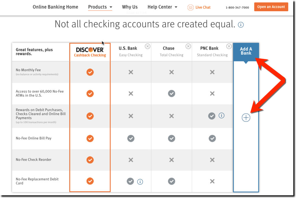
Discover’s responsive page dedicated to selling its Cashback Checking is a thing of beauty from top to bottom (though we have some suggestions on a few of the finer points of the UX). We especially like the interactive comparison to the competition. Discovers starts by comparing its fees to Chase, Citi, and BofA. But the card giant makes it easy to compare against four other major brands (US Bank, Wells, Capital One and Fifth Third). Simply click on the + sign in the empty fifth column on the right and choose one of the brands from the popup (see below).

The table works on smaller screens including smartphones. But you can only compare to one other bank at a time. Users select the competitor with from a drop-down box.

Bottom line: If you clearly offer better price/value, then by all means flaunt it. While Discover makes a great case here for its Cashback Checking, it could be even better with more benefits listed (e.g., mobile deposit for one) and a tool to calculate financial savings and rewards. But overall, excellent work!


Author: Jim Bruene is Founder & Senior Advisor to Finovate as well as
Principal of BUX Advisors, a financial services UX consultancy. 

Email Design: Discover Card’s “Statement Available” Message

image There are a number of financial startups and trail-blazing FIs bringing modern user interfaces to banking. We see dozens of great examples at every Finovate (note 1). And we expect a slew of remodels in the new year as responsive design and other techniques take hold.

But I continue to call out Discover’s design work (previous posts). Partly because I have an account there and see it often and partly because it’s instructive to see how a large full-service bank handles design tradeoffs.

Yesterday’s email from DIscover, reminding me that my monthly statement was ready, shows how the card giant marries good design with useful information.

Most statement alerts are simple one liners asking the user to do all the work: login, find the right tab, click on the correct button, and so on. Discover, on the other hand, positions key summary information right within the body of the email (see screenshot below):

  • Statement end date
  • Statement balance
  • Credit available
  • Minimum payment due
  • Due date

The company includes a button to view the statement at the top, but somewhat buries the payment link near the bottom. 

Analysis: This is one of the better (maybe best) statement-available message I get from the major brands (note 2). But it could still be improved: 

  • Include a Pay Now button.
  • Remind me that I’m on autopay and when to expect the payment in full to be deducted from my bank account.
  • Reword and fix the bottom link. Currently it says “Late and Minimum Payment Warning.” That sounds like there must be a problem with my account. But there isn’t, so I assume that is supposed to link to the alerts maintenance area. However, that link wasn’t working, so I just was dumped onto the main secure account page. It was very confusing.
  • Add a link to customer service, both self-serve and human powered.
  • Add the amount of rewards earned this period. It’s always nice to be reminded of free money received. 

image

————————
Notes:
1. For example, a recent crowd favorites was from Poland’s mBank which demoed alongside Accenture at FinovateFall in September (demo video).
2. We dug deep into this area a few years ago in our reports (subscription):
Email Banking: Revitalizing the Channel (August 2010)
Alerts & Streaming (July 2010)
Paperless Billing & Banking (Nov. 2010)

The Contactless Sticker as a Mobile Wallet Trojan Horse

imageI’ve had Discover’s Zip contactless sticker pasted to the back of my iPhone for a few years. Although I don’t run across very many places to use it in Seattle, I enjoy the user experience when it works. It’s not a huge time saver, but it’s easier to wave my phone than dig the right card out of my “analog wallet.” And it usually is interesting to the clerk, since “paying by phone” is still a novelty. 

Whether Discover has benefited from issuing me a sticker is debatable. Stickers are issued only by request (at least on my account). Discover not only had to pay an extra $3 or $4 for the sticker (note 1), but also paid a customer service rep to answer the phone and take my request. Assuming they incurred an admin cost of $7 to $10 to process and mail the sticker would make the total cost to Discover $10 to $15. Therefore, my measly $300 in incremental spending hasn’t yet given them a positive return. But if more terminals were around, I’d have put thousands on it, and they’d be ecstatic.

The reason I’m writing about stickers again, is that my Moven card and sticker package arrived last week (see pictures below; previous post; note 2). And I thought how much more impressive the startup’s card mailer looked with the Moven sticker (and supporting mobile banking graphics) than the typical bank card mailer (Simple excluded, of course).

I know the extra $3 to $5 it would cost to toss a sticker into the card mailer is a huge expense. But I think the potential benefits makes it worth considering, at least for a portion of your customer base. (And if you add the sticker as part of a premium package, you might even convince customers to pay for it.)

Financial institution benefits:

  • Increased POS transactions: Move your card to the top of wallet instantly when users are at a working, contactless terminal.
  • Increased online transactions: If you print the card number, expiry date, and security code on the sticker, cardholders would turn to your card more often when arriving at check-out at ecommerce sites. It also would work for mobile commerce, although not as well since users would have to flip the phone around to read the numbers.
  • Increased loyalty/referrals: Once that sticker is placed on a phone, it’s a constant reminder of your bank and card. It also makes it easy to show off to a friend.
  • 1st gen mobile wallet: The sticker, combined with your mobile banking app and/or SMS alerts, provides a fairly solid “mobile wallet experience” to compete with Google and others.
  • Seamless transition to NFC (or whatever): When the day arrives that the contactless capability is embedded in most handsets (yeah, Apple, we are looking at you), you simply tell customers to pull off the sticker and keep on waving that phone at the terminal. 
  • Competitive advantage: You differentiate yourself and earn referrals from a certain group of customers who are impressed with tech innovations.

Bottom line: Increasing costs with a contactless sticker is not for everyone. But if you are looking for a tangible point of differentiation that also builds your tech-cred, this is one possible solution. Moven, for one, is banking on it. 

————————————

Moven outside envelope (13 July 2013)
Note: I know this is good for security reasons, but I was expecting something a little snazzier. Luckily, the inside card carrier was the best I’ve ever seen (see below).

image

Moven card carrier
Note: Sticker is on left, plastic on right

image

————————————

Notes
1. I’ve seen a wide range of prices quoted for contactless stickers, but I believe the relevant range for most issuers is $3 to $7 each, depending on quantity.
2. I can’t report on actual Moven account transactions because I haven’t verified the trial deposits. While this is a clever and relatively simple authentication technique, it does require users to log in to another bank account days later, so it is easy to neglect. Moven sent me a reminder two days after my application, but that was two weeks ago. Clearly, they will have to follow up with procrastinators like me again.
3. For more info on fee-based banking services, our Online Banking Report on fee-based online services (subscription, May 2011). For more info on the “near bank” or “meta bank” phenomena see our  report on Truly Virtual Banks (subscription, Oct 2011).

Discover Card’s Email Balance Alert is a Thing of Beauty

image While it will never hang in the Louvre, Discover Card’s email alert is a true masterpiece (at least to fintech geeks). The message is nicely laid out with plenty of white space and it’s chock full of links to get more information.

Here’s eight specific elements I like (in no particular order). See the corresponding number on screenshot below:

1. Personalized with first name, last name and last four digits of account number; an important anti-phishing security precaution

2. Big orange button that leads to detailed transaction info

3. Table outlining the key data (yellow highlight is ours):
     – Date of notice
     – Balance limit set by user
     – Current account balance
     – Total credit line

4. Email subject line that explains exactly what’s in the message (important for scanning email messages), "Your balance exceeds the limit you set". Also, note how they ease your fears by saying it’s over the limit "YOU SET," which is much less of a problem than if it was over the card limit

5. Brief explanation of factors that might be impacting the balance (such as car rental holds)

6. Concise pitch for Discover’s mobile app, with text message option

7. Link to log in to adjust alert settings

8. Navigational links to: Statements | Payments | Rewards

—————————

Discover Card email balance alert (4 May 2013)
Note: Yellow highlighting is ours

Discover Card email balance alert

———————————

Notes:
1. We previously blogged about Discover Card alerts here
2. For more info see our report, Email Banking: Revitalizing the Channel (published 2010, subscription).

PayPal’s “Plastic Wallet” May be a Popular NFC Work-Around Model for Next Few Years

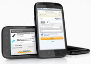
imagePayPal has been working on enabling in-store payments for much of its corporate life. It launched a debit card in January 2001, less than 18 months after the company launched. The card was used to tap funds held in PayPal accounts. 

Fast-forward 12 years. We are now entering the era of the digital wallet which features the ability to store multiple payment cards that can be changed manually or automatically at the point of sale. PayPal is well positioned here, since its core product has offered that capability for a dozen years. 

It’s easy to see how PayPal becomes a major, if not dominant, mobile-payments player. But it’s still a few years before NFC (or whichever) handsets and POS terminals become mainstream (see our latest report for more info, note 1).

So what can the company do now to make more inroads at the point-of-sale?
Plenty, it turns out:

  • PayPal Anywhere is a plastic debit card attached to an individual’s PayPal account. But unlike the company’s previous debit card, this one can facilitate PayPal Anywhere brochure at LA Jamba Juicepayment from any bank account, debit card or credit card linked to the user’s PayPal account. Users can even change the routing of the charge later that same day.
  • Partnership with NCR: In an announcement made at January’s national retail tradeshow, PayPal will be made available to more than a million locations using NCR’s POS system.
  • Marketing at the point-of-sale: Last week, we noticed PayPal brochures at the counter of an LA-area Jamba Juice (see inset).

And, the big one, still in the planning stages:

Bottom line: PayPal, Google, Moven(bank), UMB (powered by Dynamics), Wallaby, and others aren’t waiting for NFC. It’s work-around time, at least in the United States. A promising tactic, at least for users, is the “plastic wallet,” a traditional mag-stripe card (MasterCard, Visa or Discover) for point-of-sale use. Then, like PayPal Anywhere, the user routes the transaction to an outside deposit account, or another card, pre-registered in the system (note 2).

—————————————–

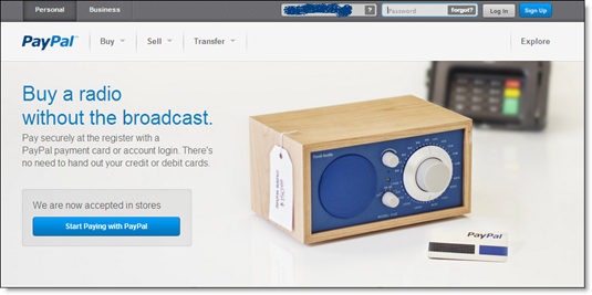
Landing page for PayPal’s plastic wallet “PayPal Anywhere” (23 Feb 2013)

PayPal Anywhere landing page

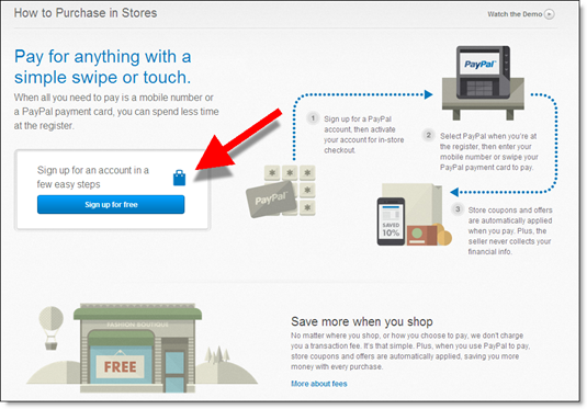
Pitch for in-store payments served after logging out 

Paypal anywhere pitch after logout

Landing page after clicking the “start” button above

Beginning of PayPal signup process for payment card

———————————————-
Notes:
1. See our Online Banking Report on Digital Wallets (published Feb 2013, subscription).
2. The business model of the plastic wallet is a challenge. It could be workable if all transactions are routed directly to deposit accounts via ACH (aka “decoupled debit”). Also, advertising (Google Wallet) and/or interest charges (PayPal’s Bill Me Later) can prop up the P&L.

Discover Card Gives Away an iPad per Day to Paperless Cardholders

image After adding my Discover Card to Google’s mobile wallet, I was automatically logged off after a period of inactivity (or what I prefer to call blogging). On the resulting page, the card issuer explained what happened on the left side and told me about their current estatement incentive program on the right (see first screenshot below).

Discover is giving away an iPad every day to its paperless customers (landing page) from June 1 to Nov 30. That’s a total of 183 iPads (official rules). Both new enrollees and existing ones are eligible.

Since I’m a sucker for online sweepstakes, I pressed the button, only to find out that I was already enrolled (see second screenshot). Not only is this annoying and somewhat confusing (am I still in the running for the iPad?), it could be counterproductive. Users are given the option on this page to turn paper statements back on. So customers might mistakenly turn the paper back on thinking that’s how you enter the sweeps. To prevent that, Discover needs to reinforce the sweeps on this page. 

Bottom line: Periodic paperless incentives are a win-win. You show gratitude to existing paperless customers while pushing a few more paper holdouts over the edge. However, be careful how you handle already-enrolled users.

———————————-

Discover Card logoff screen publicizing its iPad giveaway to paperless customers (17 Aug 2012

image

 
After clicking on the "Go Paperless" button I was sent to this screen
Note: Discover should remind me that I’m still eligible for the prizes

image

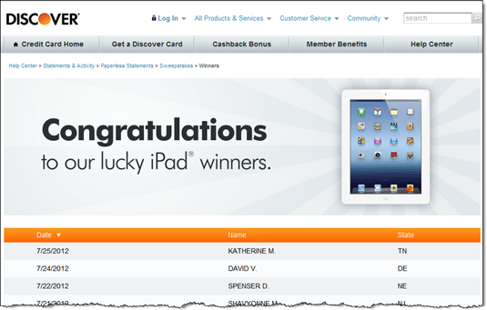
Discover publicizes the winners (link)

image 

———————————–

Note: For more ideas, see our report on paperless billing and banking (Nov. 2010, subscription).

First Look: Google’s Save-to-Wallet API at Discover Card

image This week, Discover became the first to use Google’s new Save-to-Wallet API to seamlessly add its card to the wallet directly from its secure site. This API supports the recent expansion of Google’s wallet to all US-based credit cards. 

To see how it works, I logged in to my Discover Card tonight and looked through account settings and the Help area for details. Coming up empty, I searched for "Google wallet" within the secure site and found a prominent link to the function (see first screenshot below).

The API worked even better than I expected, taking just 15-20 seconds (after I found the right page). Here’s the 3-step process:

  • Press Add Your Card from within the Discover Card secure site (screenshot #2)
  • Enter your Google password into the Google popup page (screen #3; I was already logged into Gmail, so Google had prefilled my username)
  • Accept the API request from Discover (screen #4)

That’s all it there was to it.

Optionally, users can go back to Google through the link on the Discover page (screen #5) to make it the preferred payment card (screen #6). Finally, Discover closes the loop with an immediate confirmation email thanking me for adding the card (screen #7). Well done.

Bottom line: Unless you are big enough to negotiate financial considerations from Google and/or build your own mobile wallet, you might as well drop this API into your secure site now. It gives your debit/credit card a fighting chance to be the default card in the wallet. While that might provide a slight spending lift, the major benefit is associating yourself with mobile wallets in general and Google in particular.

—————————–

1. Search results for "Google wallet" within Discover Card secure card management (16 Aug 2012)

Search results at Discover Card for "google wallet"


2. Landing page at Discover Card for adding it to Google Wallet

Discover Card landing page for adding to Google Wallet


3. Popup to login to Google account (at Google.com)

Login to Google Wallet through your Google account 

4. Authorization screen (at Google.com)

Google "Add Card to Wallet" API confirmation 

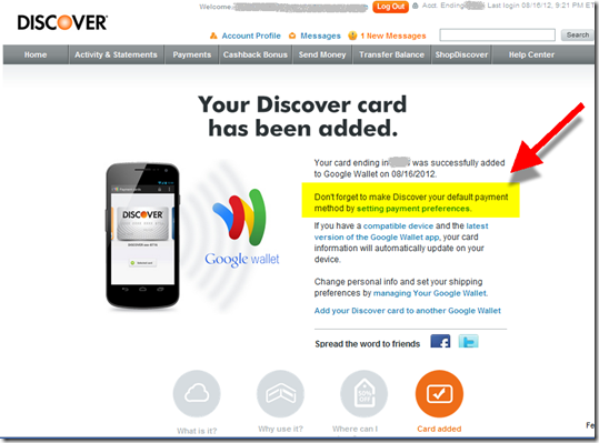
5. Confirmation screen with suggestion that cardholder go to Google to make Discover the default payment card
Note: Highlighting and arrow added for emphasis

Confirmation screen that Discover has been added to Google Wallet 

6. My Google Wallet contains the Discover Card on top

Note: The expired MasterCard below is a remnant of the old Google Checkout that has been replaced by the Wallet

Google wallet containing Discover Card 

7. Confirmation and thank-you email from Discover

Email from Discover Card confirming addition to Google Wallet

Design: Financial Websites that Work on PC Monitors, Laptops, Tablets and Smartphones

imageThe browser was supposed to make web design simple, at least in terms of page layout. But it’s always been tough to keep up with changing screen sizes, varying resolutions, and frustrating differences between browsers.

Liquid layouts that adjust automatically to the available screen real estate have been a huge help. But then along came the mobile browser, complicating everything both by their small size and by the two viewing modes, portrait and landscape. 

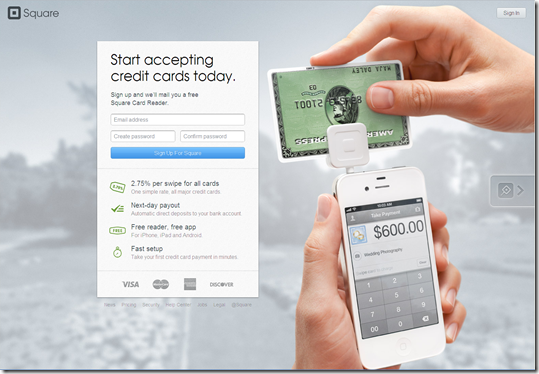
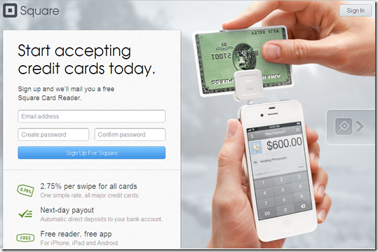
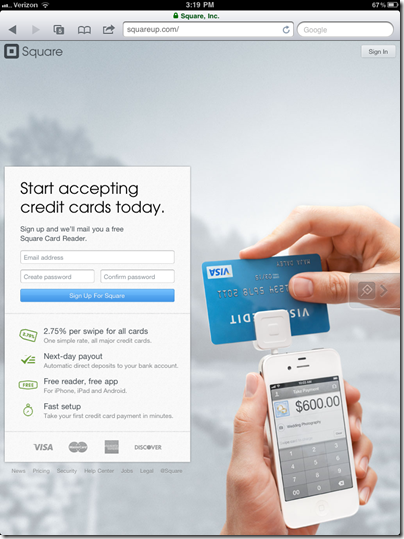
But it’s not an insurmountable problem. Square is one financial company that’s doing it right. It’s website looks just as good on a 10-inch iPad2 screen as it does on a 24-inch monitor (see screenshot #1 to 4 below).

To make it work, copy and navigation options must be kept to a bare minimum. Square uses a catchy background image of its reader in use, then has an info box that "floats" depending on the screen size. It even works in portrait mode on the iPad (screenshot #4).

Of course, it’s much easier to pull off for a one-product company like Square than for a commercial bank with dozens of business lines.

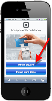
But even Square had to make compromises on its smartphone layout (see inset above). Instead of asking for contact info, the company simply instructs users to download one or both of its apps: Square or Card Case.

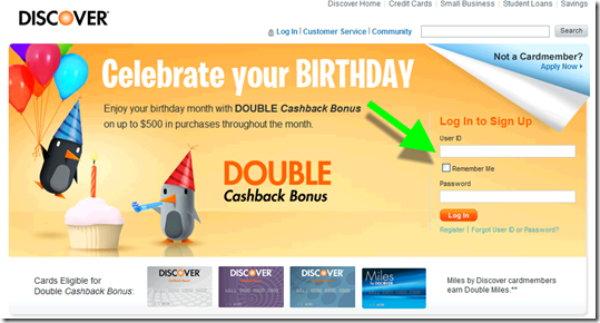
Relevance for Netbankers: We are about to see a flood of redesigned websites using new design and programming techniques (e.g. HTML5). Citibank was the first major U.S. bank to simplify its design. Discover just emailed users today with a sneak preview of its pared down design (screenshot #6). And it already had a relatively clean design (screenshot #5).

—————————-

1. Square homepage on 24-inch monitor

Square homepage on 24-inch monitor

2. Square on 12-inch laptop

Square homepage on 12-inch laptop

3. Square iPad landscape

 Square homepage on iPad landscape

4. Square iPad portrait

 Square on ipad (portrait)

5. Discover homepage (current)

Discover current homepage (18 Oct 2011)

6. Discover new (coming soon)

New Discover homepage

————————————–

Note: We cover financial website and mobile design issues periodically in our Online Banking Report (subscription).

Capital One Pays to Play in Zynga’s Virtual Worlds

imageLike most, I’ve been amazed at how fast Zynga was able to build a 250+ million user base for its social games. But I’d never actually played one.

Until now. So make that 250 million and one users, because I couldn’t resist checking up on Capital One’s new product placement in three Zynga games (more on what players could do). The bank’s Facebook page, which has grown to 2.3 million likes, has details on the promotions (screenshot 1).

image Although, it appears I may have missed my chance to interact with the CapOne goat, Visigoth statute or a virtual branch (the promo only ran one week), there are still credit card ads and mystery gifts available, at least in Farmville, the only game I tested.

Capital One viral gift & banner ads
Capital One may have ended the in-game elements for now, but they still have a presence in the game. Starting Farmville for the first time, I was greeted by a number of social elements, one of which is sending a Capital One gift (screenshot 2). There is no indication of what the gift actually is. Maybe that’s part of the fun, but it seems like a weakness to me. Am I sending someone a virtual goat or a solicitation for a CapOne card (mystery solved)? 

The company is also running banner ads within the game (screenshots 5 & 6). Clicking on them takes users to the usual Capital One pre-approval page within a separate browser window (screenshot 7). Once you land on the CapOne site there is no mention of Farmville.

Discover Card & Citibank bonus offers
Game players are encouraged to buy all kinds of virtual goods. They can earn virtual currency in a number of ways, including using real world cash to buy credits. But users can also earn currency by participating in sponsored activities.

Both Citi and Discover are offering users virtual cash to apply, and be approved, for a credit card. Discover is offering virtual currency worth about $75 and Citi is handing out about $50.

My take: With 250 million users, the large brands owe it to their shareholders to see if they can make hay in Farmville and any other popular virtual world. And I suspect there will be a positive ROI for the right mix of promotion/offer. I have no idea what the magic formula is, but you know the direct marketing wizards at CapOne, Citi and the others will figure it out sooner rather than later (note 1).

———————————————

1. Capital One Facebook page (27 Sep 2011)
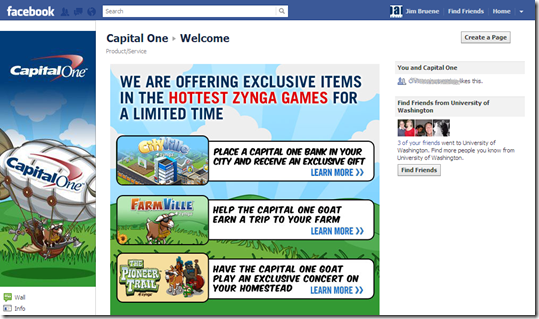
1. Capital One Facebook page

2. Capital One "free gift" in Farmville (27 Sep 2011)
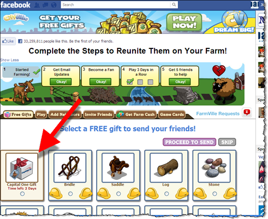
Capital One "free gift" in Farmville (27 Sep 2011)

3. Choose friends you want to receive the gift

2. Choose friends you want to send the gift to

4. Before you send the gift, you have the opportunity to see what the notice looks like to the recipient, and you can add a personal note
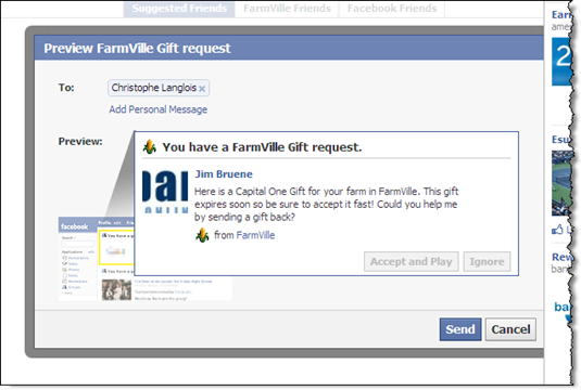
3. Before you send the gift, you have the opportunity to see what the notice looks like to the recipient, and you can add a personal note

5. When I got back to the game, there was a large Capital One banner
Note: Starbucks promotion in lower right
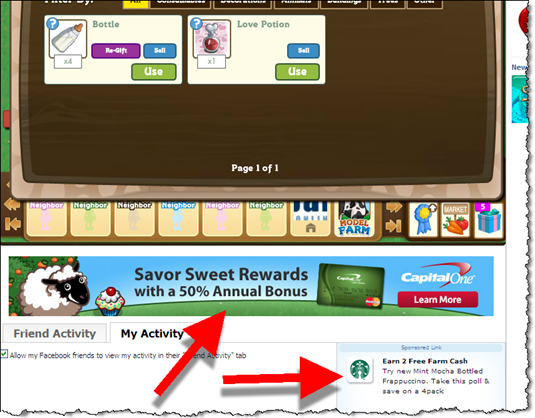
4. When I got back to the game, there was a large Capital One banner

6. Another Capital One banner ad served while playing Farmville
Note: Bank of Internet ad on right
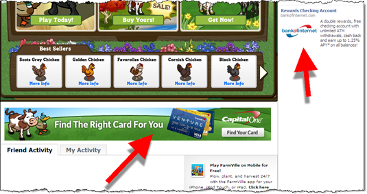
5. Another Capital One banner ad served while playing Farmville

7. The banner ad in Farmville, led to Capital One’s usual pre-qualification form
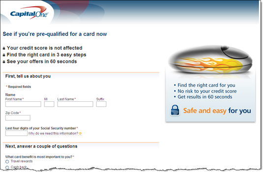
6. The banner ad in Farmville, led to Capital One's usual pre-qualification form

8. Discover Card and Citibank have powerful offers in the "earn cash" area.
Note: Discover offers 475 Farm Cash (worth about $75) for card approval, Citibank 300 (about $50). 

image

9. The first screen after choosing Discover’s offer

7. Discover Card and Citibank have more powerful offers, though it's buried in the "earn cash" area. Discover offers 475 Farm Cash (worth about $75) for card approval, Citibank 300 (about $50).

10. Clicking Continue above leads to standard Discover Card app (in new browser window)

8. Clicking Continue above leads to standard Discover Card app (in new browser window)

———————-

Note: If you are interested in a fictional look at where the commercialization of Internet gaming is headed, I highly recommend Cory Doctorow’s For the Win.

Out of the Inbox: Discover Card’s Birthday Present

Although worth only $5 at most, Discover Card’s month-long Double Cashback Bonus (on the first $500 spent) sure sounds impressive. And combined with the cute penguin visuals, it’s an effective birthday greeting. And probably the first one you’ll get since it’s sent two weeks in advance of the first day of the month of your birthday.

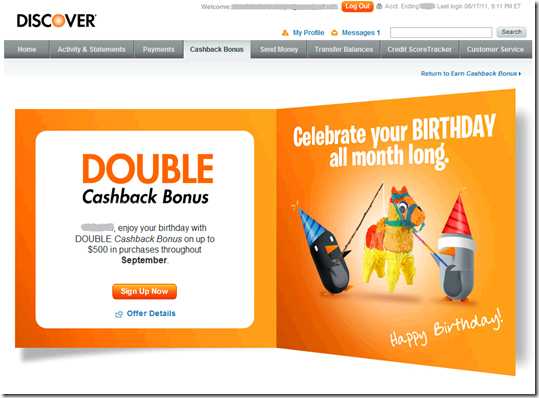
Recipients must register to receive the bonus, a common technique to keep costs down. The card issuer continues to display dazzling graphics throughout and even sends a confirmation email (below). Great attention to detail.

It would be nice if you didn’t have to do a full login to register. But for extra reward points, most users will put up with the hassle.

Grade = A-

Discover Card birthday email (18 Aug. 2011, 2 weeks in advance of the birthday month)

Discover Card birthday email (18 Aug 2011)

First landing page: Log in (link)

Discover landing page

Second landing page: Register (link, must be logged in to your Discover account)

Second landing page: Register

Confirmation screen

image 

Confirmation email

image

Amazon.com Shoppers Prompted to Select Discover Card as Default Payment Option, with a $1 Million Carrot

image A few months ago, American Express provided five free song downloads as incentive for its cardholders to make Amex the default card option within the iTunes store (previous post).

Today, I noticed Discover offering an eye-opening incentive to get their card listed as the default option for one-click purchases on Amazon.com:

A chance to win $1 million every time you pay

This offer is part of the year-long Discover Everyday Giveaway usage sweeps. 

———————————

Discover Card’s $1 million promotion on Amazon.com (12 Aug. 2011)
Note: A small ad first appeared in the upper-right part of the screen, this is what it looked like after I chose “Expand”

 Discover Card's $1 million promotion on Amazon.com

How it works (link)
Note: This screen presented when clicking on “Learn more” from above banner

image

Account Alerts: Discover Card Helps Users Visualize the Options

image We are approaching the 15-year anniversary of the first retail banking account alert. Britton & Koontz Bank was the first to offer them in the summer of 1996 (note 1). But alerts didn’t become widely available until a few years later. 

Back then, you’d be lucky if you had three or four different alerts to choose from. And of course, there was no such thing as a mobile alert.

Today, banks and card issuers offer a dozen or more alert types capable of going to multiple email addresses, multiple mobile devices, or even to your land-line via voice message. Consumers are better served overall, but the wide range of options can be confusing.   

One solution is to use default selections. Users can select their preferred profile, and the bank establishes a set of recommended alerts. This profile selection could be made during online banking registration. For example:

  • Normal alerts
  • More alerts
  • Less alerts

Another helpful practice is to show examples so users can visualize what they are signing up for. Discover Card uses this technique in its card-management area with popups that show both the email and text-message version of each alert type (see screenshot below).

Alerts are a vital part of online and mobile banking, so take time to educate users on the appropriate mix (note 2). It’s also a great topic to cover in your blog or Twitter feed. 

————————————–

Discover allows users to review samples of each alert type (28 April 2011)

Discover Card allows users to review samples of each alert type (28 April 2011)

Notes:
1. Signet Bank was the first major to offer email account alerts. We covered it in OBR 22 (Feb 1997).
2. For more information on alerts and messaging, refer to this Online Banking Report published in 2003.