 The browser was supposed to make web design simple, at least in terms of page layout. But it’s always been tough to keep up with changing screen sizes, varying resolutions, and frustrating differences between browsers.
Liquid layouts that adjust automatically to the available screen real estate have been a huge help. But then along came the mobile browser, complicating everything both by their small size and by the two viewing modes, portrait and landscape.
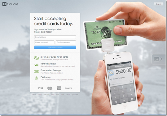
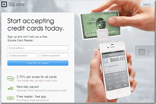
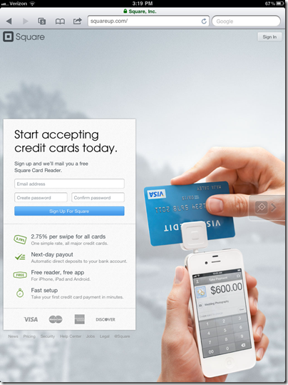
But it’s not an insurmountable problem. Square is one financial company that’s doing it right. It’s website looks just as good on a 10-inch iPad2 screen as it does on a 24-inch monitor (see screenshot #1 to 4 below).
To make it work, copy and navigation options must be kept to a bare minimum. Square uses a catchy background image of its reader in use, then has an info box that "floats" depending on the screen size. It even works in portrait mode on the iPad (screenshot #4).
Of course, it’s much easier to pull off for a one-product company like Square than for a commercial bank with dozens of business lines.
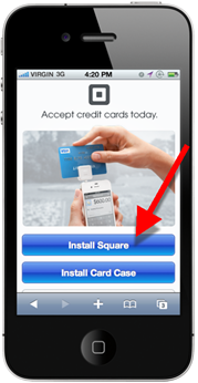
But even Square had to make compromises on its smartphone layout (see inset above). Instead of asking for contact info, the company simply instructs users to download one or both of its apps: Square or Card Case.
Relevance for Netbankers: We are about to see a flood of redesigned websites using new design and programming techniques (e.g. HTML5). Citibank was the first major U.S. bank to simplify its design. Discover just emailed users today with a sneak preview of its pared down design (screenshot #6). And it already had a relatively clean design (screenshot #5).
—————————-
1. Square homepage on 24-inch monitor
2. Square on 12-inch laptop
3. Square iPad landscape
4. Square iPad portrait
5. Discover homepage (current)
6. Discover new (coming soon)
————————————–
Note: We cover financial website and mobile design issues periodically in our Online Banking Report (subscription).


