USAA Promotes Teen Checking Accounts

image

In doing some initial research for a report we are planning for Q1 on “family bank accounts,” I started where I usually do, on Google. The only financial institution advertising specifically on the term “teen banking” was USAA (see note 1).

The top-of-the-page ad led to a well-designed landing page devoted to Teen Checking (see screenshots below) with a clever call to action: 

We won’t take any of your teen’s allowance.
Teen checking without hidden fees.

USAA even has a dedicated site with its own URL to support its youth-banking efforts: https://my.usaa.com

Relevance for NetBankers: Teenagers may be one of the most lucrative segments to attract to your financial institution. They not only spend billions themselves, but also could literally stick with you for a lifetime.

The thinking goes something like this:

  1. Attracting the children of your customers helps you retain the parents
  2. Retaining the parents helps you retain the kids as they become young adults
  3. Young adults become parents
  4. Repeat

This didn’t work so well in the old branch-based world because one of the first things the kids did when they moved away was open a checking account at the closest branch to their new apartment or dorm room. In an online/mobile-centric world, that no longer has to happen. 

Google search for “teen banking” (see note 1; search conducted at 5:00 PM on 11 Jan. 2011 from Seattle IP address)

Google search for "teen banking"

USAA’s “Teen Checking” landing page

USAA's "Teen Checking" landing page

Notes:
1. First-page organic results included (note, search was limited to items posted in past month) 
— Fremont FCU
— North Shore Bank
— Coast Hills FCU
— U.S. Bank (Visa Buxx)
— S.T.A.R Community Credit Union
— American Riviera Bank (my new favorite bank name)
2. If anyone wants to point out great examples of teen/youth/family banking efforts, please drop me an email jim@netbanker.com or leave it in the comments. Thanks.

Out of the Inbox: Cascade Bank Drives Customers to Branch with One-Day iPad Giveaway

image I’ve long been an admirer of Cascade Bank, a $1.7 billion bank headquartered in Everett, WA. A friend was marketing director there for a number of years, and I learned a lot from her about community bank marketing and management.

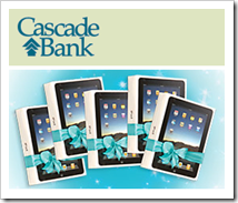
While I used to have a mortgage at Cascade, I don’t have any accounts now; hence, the email I received earlier this week. The bank invited prospective customers to come to one of its 22 branches (today only) and enter their name in a drawing to win an iPad. Five iPads were being given away bank wide.

And while in the branch, hoping to pick up a free ipad, the bank dangled an attractive duffel bag in front of visitors as a premium for opening a new checking account. And Cascade promised to drop an extra $25 in your account if you traded in your old check register from the competition.

Bottom line: Thanks to the iPad and some great graphic design, the mailing had a stunning visual, good title, and compelling offer. Excellent work.

Email announcing the giveaway (received 30 Nov. 2010)

Cascade Bank Email announcing the giveaway (received 30 Nov 2010)

Cascade Bank homepage (3 Dec. 2010)

Cascade Bank homepage (3 Dec 2010)

Landing page pitches free checking with duffel bag premium and $25 bonus 

Cascade Bank Landing page pitches free checking with duffel bag premium and $25 bonus

Note: For more ideas, see Online Banking Report: Growing Deposits in a Digital Age.

Service Credit Union Doubles Up on Black Friday Hoopla, Also Promoting Cyber Monday Offers

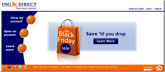
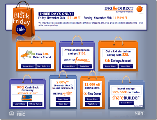
imageING Direct ran a slew of Black Friday offers again this year (see screenshots below; last year’s coverage). And they weren’t the only one. Service Credit Union also ran a homepage-dominating ad for its 6 AM-to-noon “doorbuster deals” today:

  • 10% APY 3-month CD with maximum deposit of $1000…$23 in extra interest compared to its regular CD (pre-tax)
  • Fee-free Visa gift cards (limit 5)
  • 1% rate reduction on new personal loans
  • $25 Visa gift card for opening a new credit card
  • Unspecified “in-branch checking account specials”

The credit union’s U.S. branches opened at 6:00 AM to mimic the retail craziness on the day after Thanksgiving. Specials were available until noon only, and all required a branch visit to redeem.

I was going to say something about the lack of online-redemption options, but luckily I checked back after noon and found that a Cyber Monday promotion had taken the place of the Black Friday ad. Online users are being offered similar specials on this coming Monday (aka Cyber Monday):

  • 7% APY 3-month CD with $1000 max deposit (a $17 interest bonus)
  • $100 bonus for opening a new checking account (requires direct deposit and estatements)
  • $25 Visa gift card for opening a new credit card
  • Free personalized credit card design for first 100 members ($9.95 value)
  • $25 Visa gift card for a referral

Bottom line: The dual promotion was a clever way to involve both online and in-branch members.

Service Credit Union placed a bold advertisement on its homepage promoting its Black Friday deals (10:00 AM Pacific, 26 Nov. 2010)

image

Later in the day, the CU posted Cyber Monday specials on the homepage (1:00 PM Pacific)

image

Landing page (link)

image

ING Direct homepage on Black Friday (26 Nov. 2010

image

Landing page (link)
Note: Offers are good for the entire weekend

image

ING Direct Adds Kids Savings Accounts

imageWe first opened an account at ING Direct back in 2001, not long after it opened for business in the United States. Almost since the beginning, my wife and I used it to store money and handle allowance bookkeeping for our kids. To keep things simple, we  created sub-accounts from our main savings account.

That made for a super-easy setup since it takes about 20 seconds (I’ve timed it) at ING Direct to create a new sub-account. The sub-accounts are nicknamed for each child and automatic transfers drop their allowance in so we no longer had to remember that every week. It’s a great system. 

However, the above approach doesn’t officially put the money into the child’s name, which could have tax and other advantages. And if you want to provide your kids with online account access, you have to turn over your own username/password. And if you do that, there’s nothing to keep enterprising youngsters from making an extra transfer or two into their own accounts. While I’m sure that wouldn’t happen in our house (right, boys?), it’s not an ideal setup.

ING Direct solved those limitations in October when it launched special kids savings accounts, which are joint accounts with an adult. But the child gets his own login-info separate from the adult. Kids can log in to check their balance, but only the adult can make transfers.

The ING Direct kids account pays the same rate as the adult version, currently 1.1%. And there are no fees, an ING Direct custom. The only downside, you have to complete a small application process, which took 3.5 minutes, not much, but still a bit of a chore compared to the 15-second, sub-account set-up process.

Once established, the new savings account shows up on the adult’s main account menu like any other account.

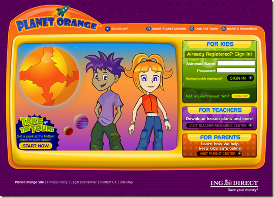
Bottom line: It’s a nice addition to the ING Direct lineup. While relatively bare bones in terms of features and functions, it will be interesting to see what the bank does with it over time such as integrating with Planet Orange, the bank’s financial education effort (see screenshot below).

Landing page for more info on Kids Savings Accounts ( link, 23 Nov. 2010)

ING Direct Landing page for more info on Kids Savings Accounts

Kids account application, for adding to an existing adult account
Note (not shown): On the second step, you choose a 6-10 digit unique PIN for the child and on the third step, you fund the account with a minimum opening deposit of $1.

ING Direct Kids account application, for adding to an existing adult account

Planet Orange is the bank’s financial education resource <orangekids.com> Note: So far, no integration with Kids Savings

Planet Orange is ING Direct's financial education resource

Hat tip: DepositAccounts.com

Certificate of Deposit Renewal Letters in the Digital Age

image Today I received a letter from a large credit union (note 1) informing me that my certificate of deposit was up for renewal. I was given six choices at the bottom of a form (note 2) along with a postage-paid return envelope. 

Had I received that letter in 1988, I would have considered it state of the art. But in the modern world of instant communications and researching rates via Google, the communication was inadequate and reflects poorly on the CU’s brand:

  • No current rate info: I realize that rates are subject to change and are miserably low, but at least tell me what they are today so I have some idea of what’s going on. While you are at it, remind me of what my rate was. Avoiding naming the specific rate is a huge red flag that yours is probably not so competitive. Plus, it’s irritating when it’s obvious how easy it would be to program current rates into the form letter. The CU did at least direct me to its website and call center to find current rates. However, the call center had no main menu option for rates, so you had to guess which number made the most sense. 
  • No email/call center option for choosing: The only way to communicate my investment choice is to return a postage-paid envelope. How about an email address, phone number of even a simple URL?
  • No email notification: I signed up for this account online, and the bank’s marketing messages arrive via email. Why didn’t I get an email asking me which option I prefer?
  • No clear info on what happens next: According to the fine print buried in the accompanying Truth-in-Savings disclosure, my certificate will automatically renew if I take no action. But nowhere in the main letter does it say that, nor is the deadline for taking action spelled out. The “current maturity date” is provided, but that’s using banking lingo that could be clearer.
  • No niceties (or even a sales pitch): The letter was bare bones with just two sentences and an info box about my CD (note 3). There was no salutation, no signature, no thank-you, no names of anyone at the CU, no local branch info, no encouragement to renew, and so on. 

————————————————–

Notes:
1. As previously noted, we generally avoid posting the name of financial institutions that we criticize here; but we’ll privately tell readers so long as it’s not posted online (email me if you are curious).
2. The choices:
     A. Change term to 6, 12, 24 or 36 months (it was already 12 months, so that was a
          bit confusing, too). 
     B. Deposit to another account with a blank for writing in the account number
         (and no instructions on whether that had to be an account at the CU)
     C. Send a check for the balance (but with no ability to take a partial payout)
3. My CD is small ($500) and was set up online through a now-defunct third-party. So it’s very possible that there are different communications sent to larger CD holders, and/or those that were acquired by a specific branch.

Debit Card Overdraft Protection: 2 Steps Forward, 1.9 Back

image So far, I’m underwhelmed with the industry’s online marketing response to the new opt-in debit card OD protection regulations. I expected to see new pricing models transforming small overdrafts into a value-add for debit card users, rather than the onerous penalty they had become over the past few years.

On the positive side, the elimination of OD charges for small transactions is a good first step. Three of the five FIs in our mini-survey have dropped fees on ODs of less than $5 (PNC and GTE Federal) or $10 (U.S. Bank). And Wells even makes a bit of a game out of it: Customers who cover the OD during the same day incur no fee.

And Bank of America has just thrown in the towel on the whole notion, running full-page ads (p. A11 in today’s WSJ; Overdraft Control landing page) saying they’ll just deny any attempt to overdraw via debit card. The retail giant joins Citibank and ING Direct, which already followed the same approach.

But financial institutions are missing an opportunity here. Take Wells Fargo, for example. When I ran across the bank’s new homepage ad for debit card OD protection (see first screenshot), I expected to click through and find a novel take on the new federally mandated opt-in requirement (see second screenshot).

Wells does a good job explaining how the new rules benefit customers (the two steps forward): 

  • The bank’s website copy is understandable and nicely outlines the lower-cost credit line, and savings account transfer options are offered
  • The toll-free number to sign up is prominent, although where’s the online signup option? 
  • Great to see online and mobile balance-tracking tools offered up to help avoid overdrafts in the first place
  • My favorite: Customers are allowed to cover the overdraft during the same day and avoid the charge

But much of that uptick in consumer goodwill is negated when you get to the pricing:

  • Debit card overdrafts are $35 each, with a maximum of 4 per day, or a $140 daily penalty if you opt in and make a mistake coffee-shop (or more likely bar-) hopping some weekend.

In a spot check of other financial institutions, it’s clear that Wells Fargo is far from alone in the $30 per item price range:

  • US Bank will charge $10 per overdraft of $20 or less and $33 for all others; it will charge for up to 3 ODs and 3 returned items for up to 6 per day; there’s a $25 fee if you don’t pay back within a week, but no charge for any item that results in less than $10 in total negative balance.
  • Fifth Third Bank will charge $25 for the first overdraft each year, $33 for the next three, then $37 each after that; maximum of 10 per day; $8 per day after the third day it’s not paid back; no OD charge if negative balance is $5 or less.
  • PNC Bank charges $36 per item up to 4 per day, plus $7/day the account is overdrawn for a maximum of 14 days.
  • GTE Federal Credit Union is charging $29 each, with no charge on under-$5 items (blog post, Facebook post)

I just don’t see customers being too pleased with the price/value here. Wouldn’t customers, and shareholders, be better served with a value-based pricing strategy? How about $5 each for an under-$100 mistake? Or follow the telecom model and sell debit card overdraft protection as a $4.95/mo subscription.

By my simple math, a million customers paying $5/mo is a whole lot more revenue than a few thousand paying $35 a pop. Then there are all the side benefits: customer goodwill, reduced customer service headaches, positive word-of-mouth, and the PR/marketing value of making debit overdrafts into a real service.

Debit card OD link on Wells Fargo homepage (13 July 2010)

Wells Fargo homepage showing debit card OD ad

Landing page (link)
Click to enlarge

Wells Fargo debit overdraft landing page

image Note: Upper-right graphic from Horizons North Credit Union, which is charging $25 per item, with no limit on the number. The opt-in ad is a huge part of its current homepage (inset, click to enlarge).

Launches: Piggymojo Taps Twitter and SMS to Track Everyday Savings Success

image Who hasn’t played this game? “If I give up x, I can justify buying y.” At our house, after two decades the game is mostly now limited to big-ticket items. For example, “If we don’t replace our 11-year old Toyota, we can take a summer trip to the U.S. Open.”

The basic premise is that the extra three grand you DON’T spend on the new car essentially pays for the vacation, making it seemingly “free” and more guilt-free. It’s a common and powerful principal of consumer behavior.     

Piggymojo’s just-launched service taps into this psychology and gives it a mobile twist. The startup uses text/Tweet-based data input so it’s easy to track all the expenses you’ve avoided during the day. And because it takes just a few seconds to tap out a message, the principal can be used to track even trivial daily savings that can add up over time.

For example, if you decide to start brown bagging lunch instead of hitting your normal lunch spots, you can track the savings by Tweeting/texting to your Piggy Mojo account:

Packed own lunch, saved $5 (or on Twitter, “d piggymojo 5 lunch not out”)

Drank free office coffee, saved $2.75

Read office newspaper, saved $1

The service collects all these messages and tracks the total amount “saved.” The totals can be applied to various savings goals to measure progress. The site uses a unique photo mosaic to visually represent goal progress. You can choose from dozens of exisiting photos or upload your own. As you build your savings, the photo gradually fills in until it’s complete (see screenshot below).

You can add your spouse/partner to the account so both of you can contribute towards the savings. There’s also a way to set up “recurring savings” so you don’t have to constantly text repetitive items. For example, if you cancelled your cable TV, you can input the amount saved once at the Piggymojo site and it will automatically credit your account each month (see second screenshot).

There’s also a social piece, allowing you to bring friends and family into the fold. Piggy Mojo will automatically send them a weekly progress report on your goal, providing that all-important peer pressure to your spending discipline.

Relevance for netbankers
Currently, the site is not hooked to an actual bank/CU savings account. The user is responsible for actually moving these fictitious savings amounts to a real savings account for later use. But this concept would be much more powerful if every time you texted “saved $6 at lunch” that six bucks were actually transferred from checking to savings.

Piggy mojo goal-tracking via completing picture of your goal (1 June 2010)
Note: The arrows point to the color sections that have been completed, visually demonstrating that I’m about 7% of the way to the goal

image

Recurring savings input form

image

Notes:
1. HT: Credit Karma blog
2. For more info, see our Online Banking Report, where we wrote about various ways to leverage your online/mobile channel to boost deposits in late 2008 (here).

Out of the Inbox: $50,000 "Goal Savings" Sweeps from ING Direct

On April 16, the day after 2009 U.S. income taxes were due, ING Direct emailed customers with a little incentive to establish an automatic savings plan or direct deposit (see first screenshot below).

Any ING Direct savings or checking account customer who has at least $100 automatically deposited into their account is eligible for monthly drawings of $5,000 (April through Sep.). And one grand prize winner takes home $50,000 on October 1st (total prizes awarded = $80,000; full terms and conditions here; FAQs here).

With interest rates so low, it’s a good idea to provide extra incentives to keep the savings habit alive. And April 16 is the second best day of the year to make a systematic savings appeal (the first business day after Jan. 1 has to be the best).

The sweeps is not mentioned on the bank’s main website or within online banking. This seems odd, given that any account holder can win. Perhaps it’s coming to the website.

ING Direct email to existing customers (16 April)

image

Landing page includes interactive smartphone app graphic (link)
Note: Users can drag and drop icons onto the phone’s list to simulate a savings plan

image

Note: For more ideas on driving deposits online, see our Online Banking Report: Growing Deposits in the Digital Age (Dec. 2008).

PNC Bank’s Virtual Wallet Offers Three Ways to Put Your Savings on Autopilot

imageIf PNC Bank’s Virtual Wallet, launched in July 2008 (previous post), worked with any bank account instead of just PNC’s, it would have hundreds of thousands of users instead of the 60,000 or so estimated by Compete.

From the outside it’s hard to know whether the strategy has paid off for PNC. It depends on the profitability of these customers, how many were new to the bank, and how much was invested in the effort. 

imageThe Virtual Wallet contains several superb products wrapped in an inviting user interface.  No wonder it’s won so many awards, including an OBR Best of the Web from us. The eight awards are shown in a scrollbar at the bottom of the homepage (see inset).

One thing the wallet does better than most is try to make savings less painful or even fun (see last week’s post about making banking fun). There are three ways users can boost their savings rate (see inset from PNC’s demo):

  • imageEstablish automated savings transfers at various times of the month
  • Set up a savings amount to be transferred every time a bill is paid (same concept as Bank of America’s Keep the Change)
  • And my favorite, Punch the Pig. Every time you hit the animated pig, a certain amount of cash is transferred to the Growth (savings) account.


Note
: For more information on the PFM space, see our Online Banking Report on Personal Finance Features (new report available in April). For more on deposits, see Online Banking Report: Growing Your Deposits in the Digital Age (Dec. 2008).

ING Direct Black Friday Screenshots

As a followup to our pre-Thanksgiving post, here’s what the ING Direct website looked like on Black Friday (the day after Thanksgiving).

ING Direct Black Friday homepage (27 Nov 2009, 1 PM Pacific)

image

Black Friday deals landing page <ingdirect.com/blackfriday>
Note: All the “Learn more” links went to the regular product pages

 image

Another Black Friday Banking Special: Service Credit Union

imageING Direct wasn’t the only one with a Black Friday promotion (yesterday’s post).

Portsmouth, NH-based Service Credit Union also took advantage of the U.S. vacation day to promote a special 10% APY 3-month CD ($1,000 max deposit) and 1% off loan rates (promo page). But unlike ING Direct, the CU’s special offers were redeemable only in its branches, which opened at 5 AM to mimic giant retailer early-morning specials.

The offer was promoted in a rotating banner on the homepage (see inset and screenshot below). And it had its own landing page (see screenshot below).

I like the creativity, so I’ll give them an A for effort. But seriously, opening at 5 AM? Maybe they were hoping for PR exposure, but it’s just not right (note 1). I understand (sort of), heading to Best Buy in the middle of the night to save a couple hundred on a TV. But who would go to their bank at 5 AM to make an extra $20 on a CD (note 2) or apply for a car loan (note 3)?

But there was one offer in the fine print that was more valuable for a typical Black Friday shopper, fee-free gift cards until noon. Although, I’m not sure why they limited the number to five per customer. 

Hat tip: Bank Deals blog

Service Credit Union Black Friday promo page (link, 27 Nov. 2009, 9 AM Pacific)

image

Service Credit Union homepage

image 

Notes:
1. Now if you have in-store branches, it’s another matter. Desert Schools FCU opened its 24 WalMart branches at 5 AM along with the retailer.
2. Extra interest on a $1000 CD for 3 months is about $7 per month, or $20 total. And that’s before tax.
3. The almost unreadable type on the bottom of the small banner mention great prizes and giveaways, but the landing page makes no mentions of prizes. Now, free stuff would make it worth a trip to the branch, so I wonder why the CU didn’t mention that on the promo page? Maybe they didn’t want people to show up only for the prizes?