Virgin Money Joins UnCrunch America

image UnCrunch America, the peer-to-peer lending educational/marketing campaign spearheaded by Lending Club (note 1) got a big boost with the addition of Virgin Money USA.
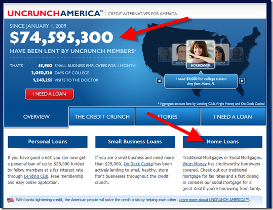
Not only does Virgin brings its considerable brand recognition, it legitimizes the effort as a true cooperative project, and adds a huge new category to the site, home loans. Plus, they get a much bigger number to put on the top of the homepage (below): $74 million instead of $1 million.

Other financial services participants include: Credit Karma (note 1), On Deck Capital and Geezeo. The campaign has its official launch today, although the website has been active since December (previous post).

The timing of the UnCrunch launch is perfect, following President Obama’s assertion last night that lending was the “lifeblood” of the economy. All active lenders, especially credit unions, should consider joining this effort or using similar themes in their marketing.

UnCrunch home page (25 Feb 2009)

image


Virgin Money UnCrunch landing page
(link, 25 Feb 2009)

image

 Notes:
1. Lending Club and Credit Karma will be participating in our upcoming Finovate Startup conference April 28 (see full lineup here).
2. For more info on the market, see our Online Banking Report on P2P Lending.

Visiting the Center for Future Banking

imageYesterday, while visiting Boston, we had the opportunity to tour the Bank of America-sponsored Center for Future Banking, a part of the famed MIT Media Lab.

We talked to researchers looking at:

  • consumer behavior in budgeting and managing their finances
  • mobile ecommerce tagging
  • artificial intelligence at the point of purchase

It’s always energizing to be on campus and see what the bright minds are up to. It’s a great reminder that creative thinking, new ideas, and new technology always propel us forward.

The BofA folks were doing a great job maintaining a positive attitude, but it was also obvious that the events of the past six months have taken a toll. Hopefully, that’s temporary. 

A couple interesting conversation points:

  • The Center is absolutely open source, dedicated to helping move the industry forward, not just BofA; they hope more banks and industry players will at some point join their research efforts.
  • There may be more startups and more innovations due to the economic downturn as otherwise unemployed individuals start new companies. 
  • There’s more need than ever to rethink traditional models.
  • This could be the absolute best time to start a financial services company.  

Thanks to Abhishek Mehta, who splits his time between Bank of America in Charlotte and the MIT Media Laboratory, for spearheading the visit. Thanks also to Jeff Carter, Srini Nallasivan, and David Price from Bank of America for the inspiring conversation. And a special thanks to the grad students and staff at the lab for allowing us to interrupt their work and learn about their projects: Kwan Hong Lee, Katherine Krumme, Nathan Greenslit, and Sajid Sadi.

Mobile Banking Stats: 40% of Bank of America’s 2 million Mobile Bankers Use iPhone or iPod Touch

image Bank of America has been making the rounds with the press touting the runaway success of its mobile banking solutions. Major stories ran in American Banker and The Wall Street Journal this week.

The bank, with 29 million online banking users, reports numbers just shy of the 2-million mark in mobile. That’s up from one million early this summer (post here). While it’s still less than 10% of online banking customers, it’s an impressive number considering fewer than 4 million mobile banking households exist in the entire country (see note 1).

Several other interesting stats from BofA:

  • More than 40% of active mobile bankers
     
    someone who’s logged in within the past 90 days
     
    use an iPhone or iPod touch. That’s about double the usage you’d expect given Apple’s 23% share of the U.S. installed smart phone base (note 2, 3).
  • The bank believes the mobile channel is driving some new business to the bank with 8% to 10% of mobile bankers, almost 200,000, having signed up for the service within 90 days of opening a BofA account (note 4).

image

Source: ChangeWave Research, survey of 3,800 cell phone users fielded Dec. 9 – 15, 2008 (link)

Notes:
1. See our latest Online Banking Report: Online & Mobile Forecast for more details.
2. The 23% figure does not include iPod Touch.
3. One other bank provided its usage numbers to the WSJ: Mississippi’s BankPlus reported 4,000 users with 60% of the usage (2,400) coming from iPhone users.
4. That number doesn’t seem all that surprising. You’d expect new customers would be somewhat more likely to sign up for new delivery channels than the existing base. And given typical banking churn, 10% to 20% of a bank’s customer base are new every year.

Bank of America’s Second Blog Supports Mobile Banking

image When researching yesterday’s post on BofA’s iPhone app, I searched Google for “Bank of America mobile banking” and ended up at the bank’s mobile banking news blog (see screenshot below).

This is the second blog the bank has launched in recent months. The first supports its MIT Center for Future Banking (post here).   

While purists may claim this latest effort is not really a blog because there are no community features such as comments, it’s updated infrequently (5 posts in 3 months, see note 1) and appears purely promotional in nature. The bank doesn’t even refer to it as a blog. The official title is: Mobile Banking Media Center for Bank of America.

But it’s laid out like a blog. The content is arranged in reverse chronological postings, with categories/tagging/permalinks. The variety of content includes YouTube videos, and you can subscribe via RSS feeds.

That’s a blog to me, and a very good one at that. While the core audience consists of press and analysts, it’s a great resource for anyone interested in the bank’s mobile offerings. And as my search yesterday proved, Google has rewarded it with a high organic result, the first position on my search. That can potentially save the bank hundreds of thousands of dollars in search-engine advertising.

Bottom line: Call it what you will, but BofA demonstrates one of the most effective uses of the blog-like format: supporting PR and educational efforts for a new strategic effort (mobile banking) in an easy-to-follow and easy-to-administer format (see note 2).

 Bank of America mobile banking blog (21 Jan 2009)

Notes:
1. There are five posts on the homepage, but if you drill into the top categories, you’ll find some older press releases.

2. For more ideas, see our Online Banking Report on Bank 2.0 Techniques

3. BofA’s new Blackberry app is shown at the top of this post.

Bank of America Knocks Mint Off Top of iPhone App Store Finance Category

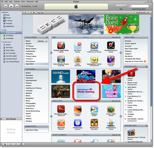
image Bank of America, which has been at or near the top of the Finance category (free apps) in the iPhone App Store since its July 11 launch, was back at the top today (12:45 PM Pacific). Mint, which has been number one since its Dec. 22 launch, moved to number two.

Contributing to the rise in the App Store standing is BofA’s purchase of a feature spot in the iTunes store (see screenshot below). The release of a new version Dec. 28, is also helping the download count. 

The BofA application now leverages the location-based capabilities of the iPhone, automatically showing nearby ATMs without inputting a Zip code (see video below, posted in the BofA mobile media center here).


iTunes App Store main page
(20 Jan. 2009)

image

Note: For more info on the market, see our Online Banking Report on Mobile Banking.

Bank of America Launches a Blog…Finally

image What better way to start the new year than to blog about a blog. And it’s big news. Bank of America, through its Center for Future Banking (see note 1), launched a blog called The Future Banking Blog. The blog, quietly began after Thanksgiving (note 2), has averaged about 2 posts per week,  about right for a banking blog (note 3).

The content so far has been wholly unrelated to Bank of America or its products. The blog is part academic, part strategic, bringing insights from the Center’s joint team of MIT academics and BofA business execs.

The design however, is pure Bank of America (see below). It uses the BofA color palette and includes a prominent powered by logo in the upper right. It’s also housed under a bank URL <futurebanking.bankofamerica.com>.

All in all it’s a good effort, positioning BofA as a thought leader in the upside-down world of commercial banking circa 2009.

image

Note:
1. The Center is seeking an Executive Director. The position was posted on Dec. 16, but given the holiday, it’s not too late to toss your name in the hat.

2. Hat tip to Colin Henderson at The Bankwatch for writing about it.  

3. For more info on financial institution bloggin, see our Online Banking Report on Banking and Social Media.

Bank of America Sponsoring Popular iPhone Tip Calculator CheckPlease

image Like much of the Internet, many free iPhone apps have embedded advertising as their revenue model. The most popular tip calculator, and third-most-popular app in the finance category, CheckPlease, added advertising across the top of its calculator in its version 3.3 release (Nov. 12).

The current sponsor? Bank of America mobile banking, which has the second-most-popular finance app in the iPhone App Store. The advertising is handled by Mobclix, an advertising network focused on the iPhone and Android markets that debuted at TechCrunch50 in September. In a half-dozen visits, I’ve seen only the BofA ad. But the developer, Hardy Macia, says he’s seen several movies advertised on the app. 

Clicking on the BofA ad (first screenshot) takes users to the BofA landing page (second screenshot on right) hosted within the App Store environment, i.e., the pages are not displayed within the normal Safari environment. The only navigation options are:

  • Learn more (see 3rd screenshot)
  • Download (see 4th screenshot)
  • Visit bofa.mobi
  • Close (the X in the lower-right) which takes you back to the CheckPlease app

CheckPlease is a product of Catamount Software which has developed mobile personal finance software since 1994, when it launched PocketMoney for the Apple Newton. PocketMoney is now available for the Palm and iPhone. The company just added an ad-free version of CheckPlease for $0.99.

The free CheckPlease iPhone app has been downloaded more than 200,000 times according to its developer and owner of Catamount Software, Hardy Macia.

      CheckPlease iPhone App                       BofA landing page

  photo (2)          photo 

          Learn More page                                 Download page (note 1)

  photo (3)         photo (4)

Note:
1. Surprisingly, the buttons on this page are not clickable. To download the BofA app, iPhone users must close this screen and open the App Store button on the home screen(s) of their iPhone.

Wells Fargo is Second Online Personal Finance Provider to Join the 1-million Club

imageIn April, we reported on the robust adoption of Bank of America's online personal finance manager, My Portfolio (see note 1), used by 10% of the bank's 25 million online bankers. The results are especially impressive given that it's a full-featured module accessible via online banking, but not particularly well integrated.

imageIn comparison, Wells Fargo offers a completely integrated PFM tool, My Spending Report, that's extremely simple to use, but offers limited functionality. On Oct. 29, the bank made an important improvement, adding a basic budgeting tool, Budget Watch, to what had been essentially a list of transactions divided by category.

The bank told me last week they have 1 million monthly users, making it the second online PFM provider to break the 1-million mark (after BofA). Wells has about 15% of its online banking base (note 2) using the tool, a slightly higher penetration than BofA. Again, not surprising considering how well it is integrated. The budget tools should boost penetration.

Who'll be the next one to join the 1-million club? Mint, with about 500,000 users in its first 15 months in business, is headed that way, possibly as early as late next year.  Chase/WaMu could get there in a few weeks, if they added online personal finance to their feature set. Quicken Online, now that it's free, should get there relatively quickly as well.

Note:
1. BofA's My Portfolio is powered by Yodlee.

2. Excluding Wachovia accounts.

Google’s G1/Android Phone Launches Today; Bank of America Mobile Banking is First Finance App

Bank of America Google Android G1 menu with mobile banking app loaded (22 Oct 2008) A few hours ago, I talked to a friend who’d just purchased the T-Mobile G1 phone this morning in Atlanta. He was pleased with it so far and said he was impressed to see Bank of America available on day one through Googles Android Market.

Apparently, BofA was the only app in the Finance section this morning (see inset). However, that will change rapidly as the store opens to other developers next week. Thanks to Alan Martin for the screenshots.

The bank’s Android app looks like the other mobile versions. It includes online banking access and an ATM/branch locator that uses built-in, location-based services (see pictures below).

I also read several blog reports of successful downloads  of the BofA app. However, when visiting the Android market website, the BofA app is not shown amongst the 40-some programs currently available. Apparently, the public market website is different than the app market accessible through the phone. I guess I’ll have to hit the T-Mobile store tomorrow to see for myself.

Congratulations to BofA for again beating its U.S. competitors in mobile deployment. It now has a three-peat in recent smartphone application launches:

For more info on the market, see our Online Banking Report on Mobile Banking.

Bank of America Google Android App main menu (22 Oct 2008) Bank of America Google Android App online banking signin (22 Oct 2008)

Bank of America Google Android App branch locator (22 Oct 2008) image Bank of America Google Android G! App bank branch map (22 Oct 2008) Bank of America Google Android G1 App more info (22 Oct 2008)

Bank of America Google Android App bank services (22 Oct 2008)

Top 20 Finance & Banking Apps in Apple’s App Store

image It’s been almost a month since Apple launched its App Store for native iPhone apps. According to the company, 25 million have been downloaded, an impressive one-million-per-day pace (11 Aug update: The company reported 60 million downloads, with $30 million in sales, during the first 30 days.)

Luckily for banking geeks, Apple added a Finance category (see screenshot below), so it’s easier to track what’s popular in our sector. As of early today, a total of 42 finance apps were listed. The 20 most popular were (note 1): 

Rank Name Type Price Release* Rating** Num***
1 Bloomberg News Free 16 July 4 337
2 CheckPlease Tool to split dinner bills Free 31 July 3 77
3 Mobile Banking (BofA) Banking Free 4 July 2.5 323
4 PayPal Payments Free 1 July 2 85
5 Balance Expense register Free 30 July 4.5 41
6 Puluwai Real Estate Search Real estate Free 20 Jun 3.5 38
7 3in1 Mortgage Calc Calculator Free 30 Jul 3.5 7
8 TipCalc Tip calculator Free 19 Jul 3.5 6
9 TipTap Tip calculator $0.99 1 Aug 4 30
10 Budget Personal finance mgr $1.99 24 Jul 3.5 37
11 MyAccounts to Go View accounting info Free 15 Jul 2.5 16
12 Swissquote Stock quotes Free 17 Jul 3 2
13 LoanCalc Calculator $0.99 26 Jul 3 18
14 Mortgage Payment Calc Calculator $0.99 2 Aug 3 9
15 Day Bank Expense register $3.99 14 Jul 3.5 64
16 SplashMoney Banking & PFM (note 2) $9.99 24 Jul 3 84
17 iXpenselt Expense register $4.99 9 Jul 3.5 52
18 PocketMoney Personal finance mgr $9.99 1 Aug 3 55
19 LoanShark Calculator $4.99 30 Jul 4.5 5
20 Tipulator Tip calc $0.99 30 Jul 4 33

Source: Netbanker/Online Banking Report analysis of Apple App Store data, 5 Aug 2008
PFM = Personal financial management
Bank of America iphone app (5 Aug 2008)*Release date of latest version; there may have been previous versions released earlier; currently reviews carry over from previous versions
**Average user rating on 1-to-5 point scale
***Number of user reviews posted

 What’s notable:

  • Nine apps have a download fee ranging from $0.99 to $9.99
  • Only four have a user-rating of 4.0 or better (on a five-point scale): Balance (4.5), Bloomberg (4.0), LoanShark (4.5) and TipTap (4.0)
  • Three apps, including two of the most popular, are rated below 3.0: BofA (2.5), PayPal (2.0) and MyAccounts to Go (2.5)
  • The most-reviewed apps are Bloomberg (337 user reviews) and BofA’s mobile banking (323) (see previous coverage)

What’s innovative:
I haven’t used any of the apps yet, but from reading the descriptions, there’s not much new here (notes 3, 4). The apps fall into four main categories:

  • Tip calculators
  • Other financial calculators such as loan payments
  • Expense/check registers
  • Personal finance tracking apps

Even though these functions aren’t very advanced, the ability to access them easily from your mobile phone makes them more interesting. And banks looking to create a useful iPhone app should take note. BofA was criticized in early user reviews for posting little more than a landing page for its normal mobile banking screen (see screenshot above).

Financial institutions would likely find a more receptive audience if a couple useful functions were added to the application besides an online banking login screen. It would be relatively trivial to add an expense register, tip calculator and other calculator functions to the banking app. 

Apple App Store Finance category (5 Aug 2008)

Notes:
1. Apple does not provide any metrics on how many times the apps have been downloaded. It just lists them in rank order.

2. Download transactions from more than 200 financial institutions supporting Intuit’s DirectConnect

3. The most interesting app is SplashMoney’s account aggregation app that allows you to download transactions from more than 200 financial institutions that support Intuit’s Direct Connect.

4. See our Online Banking Report on Mobile Banking for more info.

Login, Logoff Marketing Messages from Bank of America, PayPal, US Bank, WaMu and Wells Fargo

image After returning from some R&R in Iowa and Kansas, I logged into my banking and credit card accounts to see what I'd forgotten to attend to before leaving town. Luckily, everything seemed in order this time.

Always on the lookout for online marketing examples, I thought it would be  interesting to compare and contrast the marketing messages presented to users as they logged in and logged out of five major banking sites. 

  • Bank of America (business and personal credit cards): BofA typically has a marketing message at login and logoff.
    Login  The bank's brokerage division is pitching free Morningstar mutual fund research. I haven't seen this one before, and it seems a bit wordy, so it may be the first time for this offer (see screenshot #1 below)
    Logout  A pitch for a cash-back business credit card. It's a good offer, but perplexing, given that I already have a business and personal card with BofA. Not sure why they want me to have three (screenshot #2).
  • PayPal (verified account): PayPal has used log-in splash-screens almost since it began in 1999 with a mix of marketing and service messages. But they don't overuse the technique, so it's noticeable when they have a new splash-screen running.
    Login  No marketing, just direct entry to main screen
    Logout  No marketing, just a landing at the usual PayPal merchant emporium (screenshot #3)
  • US Bank (multiple accounts): I don't think I've ever seen a marketing message from US Bank at login or logoff. I believe I've seen a service message at login a few times over the years, but it's extremely rare.
    Login  No marketing, just dropped on main account page as usual
    Logout  No marketing, just a brief "you've been logged out" message
  • WaMu (business checking): I've had the account only a few months, but WaMu has frequently posted marketing messages at login, and they've been relatively creative, as you'd expect.
    Login  Pitching its WaMu Live concert promotion which provides exclusive access to summer events to WaMu credit and debit card holders (screenshot #4). 
    Logout  No marketing, just a solid recap of security precautions, a good message to leave with online banking users (screenshot #5).
  • Wells Fargo (credit card): Wells uses marketing messages frequently at both login and logout.
    Login  Electronic statement (paper turnoff), something I've not done yet (screenshot #6).
    Logoff  Home equity loans (screenshot #7)

What's Innovative?
There wasn't anything particularly enlightening in these examples. The WaMu Live pitch was the only truly unique message. For the most part, they were typical, well-crafted marketing messages you'd expect from these major players. That's fine now, since most customers don't yet have "banner fatigue" at their online banking site. But going forward, the messages will need to be more targeted and more interesting to get attention and action from jaded online users.

The other issue is frequency. You'll figure this out through testing, but there's a line you don't want to cross where a splash-screen message presented at every login ceases to be effective and is just plain annoying.

Finally, for financial institutions, such as US Bank, still not using this login real estate for sales messages, your customers thank you; however, quick-loading, targeted messaging, used with discretion, should benefit your bottom line.   

1. Bank of America login screen for business-credit-card only account (1 Aug 2008)image

2. Bank of America logoff screen (1 Aug 2008)

image

3. PayPal logout (1 Aug 2008)

image

4. WaMu login screen (31 July 2008)image 

5. WaMu logout screen (1 August 2008)image

6. Wells Fargo login splash screen (1 Aug 2008)

image

7. Wells Fargo logoff screen (1 Aug 2008)

image

Bank of America iPhone Mobile Banking App Criticized in Early-User Reviews

image The good news: Of the 135 free applications in the new iTunes App Store, Bank of America’s is a solid number 20, three spots ahead of PayPal, according to rankings within iTunes this morning.

The bad news: The first batch of reviewers hated the app. Their main complaint: It’s not really a native app, just a front door to the bank’s existing mobile site.

The reviews: On a 5-star scale with one star the lowest choice, the app has only a 1.5-star rating (see note 1). Of the 81 reviews, only 19 rated it above one star. Throwing out the five 5-star ratings which are probably from people associated with the product, that leaves only 14 above the bottom rating, an abysmal score by any standard. Following is the breakdown:

Stars Number of Votes                            My Comments
*****             5 I’m skeptical of the objectivity of these reviews
  ****              0 Other than the suspect 5-star fans above, no one was willing to go 4 stars
   ***               6 Only six legit users were even OK with the app
    **             8 Most of these were critical in their comments
     *                62 one star is the lowest choice on the review form

Source: Online Banking Report review of iTunes data, 11AM PST, 11 July 2008

What’s innovative?
1. I was astounded to see 81 reviews in the App Store already. It just opened this morning! It should be noted that you don’t have to actually download the app to post a review. So if and when you post an app here, be prepared for criticism. Even more important, this demonstrates the impact the user voice will have going forward (see note 2).

2. Early adopters, especially techies, can be brutally honest, especially with large corporate efforts deemed lame. But even though the overall grade was very poor, a number of reviewers pointed out that the automatic ATM locator was a significant improvement.

3. BofA needs to upgrade this app ASAP. Some of the criticisms about font size and design can be fixed relatively easily.

Summary
Despite the harsh criticism from the first batch of reviewers, I think BofA did the right thing strategically. It’s too bad they didn’t have something a little flashier, but the bank will get far more mileage by being the first bank in the App Store that it will lose by disappointing the mobile early adopters. It’s unlikely they will lose any business from the negative reviews. They are mostly in the “you should have done better” category, not the “BofA sucks” variety.

You have only one chance to be first, and BofA took it. No one else will ever be able to say they were the first bank in the iPhone (who’s going to be the first credit union?). But the bank better get cracking on version 2.0! (see note 3)

Notes:
1. The only other app from a financial services company was Paypal, which mustered a meager 2-star rating. But it elicited only one-sixth the number of reviewers, just 13. Because you don’t have to actually download the app to post a review, BofA may be getting slammed by people just reading the reviews and jumping on the bandwagon with me-too critiques.

2. See our latest Online Banking Report for more on the growing importance of user reviews. We’ve also published reports on Mobile Banking and Mobile Payments.

3. This post marks the end of iPhone week at Netbanker. We’ll get back to our regularly scheduled programming next week.