Crossing Channels: Email Confirmation of Call-Center Conversations

image Someone in our house dropped their precious iPhone onto the floor Friday and cracked the screen into a hundred pieces (note 1). So after grabbing a new 4S model, I proceeded to do the online upgrade. Unfortunately, the new phone was unable to connect to AT&T. So, after a bit of Googling turned up no solid clues for a DIY solution, I was forced to dial the carrier’s 800 number.

It turned out to be an easy fix, simply reading off a pair of of 21-digit numbers from the iPhone box while the CSR flipped a few switches on her end (note 2). And I really liked the AT&T rep, who managed to be efficient yet personable (note 3), so it was a net positive experience with the carrier.

But what really impressed me was the followup email I received shortly after completing the call (see below). It outlined what had transpired and provided several useful links to help in the migration from the old phone to the new. In addition, the company wisely encouraged self-service account management with several links below the signature line. Finally, the company inserted the name of the actual rep I’d talked to at the bottom.

Bottom line: I’m a huge fan of email for financial services communications (note 4). It’s timely, it’s searchable, it’s easy to use, it’s instantly archived, it works on every device and it helps the customer feel like their bank/CU/card issuer is holding itself accountable. And if done right, it can save additional costly service calls. All this goodness for virtually no cost.

—————————————–

AT&T email confirmation of call-center service change (11 Aug 2012)

AT&T call center confirmation email

Notes:
1. I’m not naming names, but she knows who she is.
2. Memo to Apple/AT&T: If you must use 21 digits, please insert some spaces so a human can read them.
3. Even though I have a personal account, I ended up in the "Business Solutions" call center, so their may be a higher level of service in this area.
4. See our report, Email Banking: Revitalizing the Channel published two summers ago (subscription).

Op Ed: When Push (notifications) Comes to Shove

by Michael Nuciforo

Michael Nuciforo is a Mobile Banking Consultant at Keatan. He previously worked at ANZ on a number of developments, including goMoney, and more recently managed the UK retail portfolio as Head of Mobile Banking at RBS.

——————————–

imageOne of the last relics from the dawn of mobile banking, SMS alerts, is fast approaching the end of its use-by date. The service has become a victim of its own success: Consumers embraced the ability to be informed, and costs have risen exorbitantly. SMS alerts were the first tentative steps that most banks took in delivering mobile services. They have now been pushed aside, quite literally, by their younger, more attractive successor – push notifications. The move from SMS to push shouldn’t just be about saving money, however. It’s an opportunity for banks to engage customers in a much more effective fashion.

It is almost impossible to find a bank that doesn’t offer some form of SMS bank alerts. It was easy to deploy, simple to set up for customers, and the costs were negligible (at least in the beginning). Most banks forecast low usage so they did not pass along the cost to consumers. Banks signed pay-per-alert contracts with suppliers that in hindsight were the wrong choice. It was the information age, but banks completely underestimated customers’ insatiable desire to stay informed. Alert volumes grew and grew and the pay-per-alert model suddenly wasn’t so attractive. It was also costing the bank overdue/overdraft fees because customers were more financially informed.

The success of SMS alerts laid the path for the future investment in mobile apps. It validated the long held belief that consumers would adopt mobile banking in droves. As the mobile channel has matured, banks have started to evaluate what worked and what didn’t. At the same time as SMS costs were becoming a concern, push notifications started to hit the mainstream. The pupil was challenging the teacher.

Push notifications are a native capability most prevalently used on Apple’s iOS platform. Push has become so popular that almost every new application asks you to accept their use upon download. They are free and operationally much cheaper to maintain than SMS. Cost reduction, however, is only the beginning of the story. The ability to engage customers at a different level is the main benefit push notifications offer banks. Push allows developers to integrate a notification message deeply into a follow-up activity on an app. This means a consumer can complete an action directly from an alert. There is no copy and paste, selecting links or opening an app. It’s all tied together. Information can be sent, and a customer can act with the tap of a button.

Push notification allows banks to move away from being a one-way communication channel. It allows banks to take advantage of the opportunity to be proactive and engage customers about what is important to them. Customers can move beyond receiving alerts about balances or transactions. Instead, banks can start telling the customer what they should do with their money. I can imagine the day when my rent is due, and if I don’t have enough in my current/checking account, I get sent a push notification asking whether the bank can transfer the necessary amount from savings. I click accept and see the confirmation screen within the app. Problem solved.

The great thing about push is that the business case writes itself. Cut costs and do something more effectively = instant business case-approval. There will be an initial implementation fee, and ongoing management, but beyond that, it’s free, nada, zero. Think about that. Your future most-powerful communications channel is broadly free. Click-through rates on push are higher than traditional channels and messages can be sent in the context of your customer’s situation, location, time and even weather. It can also be used by all parts of the bank, including products, security and insurance.

When push comes to shove, the move away from SMS reflects the broader change required throughout the banking industry. Banking needs to evolve away from just being a set of customer-initiated activities. Banks need to be proactive and do the banking for the customer. Push notifications deliver a simple a contextual banking experience that lifts the mobile banking channel from being useful to indispensable.

Everbank Takes Gold in Change Sciences Ranking of Small Biz Banking Online Sales, BB&T is Runner-up

Small Biz Banking Ranking from Change SciencesI’ve had a consumer account at Everbank since shortly after it launched in 1998. And I’ve continued to be a fan, both of the bank, and of its co-founder and product-guru Rob Foregger’s subsequent work at Personal Capital and others. But I hadn’t realized that Everbank excelled on the small biz side.

Change Sciences, which quantifies and compares bank user experience in various verticals, ranked Everbank #1 in its just-published report (subscription) on online sales of small-business banking services.

As you can see from the methodology below, Change Sciences is looking at the discovery and sales process for small biz banking, not the actual online banking experience itself.

Everbank took first by a solid 3-point margin over runner-up BB&T. Most of the big banks were bunched just below BB&T. PNC Bank and US Bank were just a point lower and BofA was just two points lower. SunTrust and Wells also finished four points under BB&T.
————————————

Everbank offers an extensive menu of business benefits via mouseover dropdown menu (6 Aug 2012)

image

————————————

Note: Change Sciences methodology (from its website)

Each site is evaluated (via desktop browser) against a series of criteria by a Change Sciences analyst. The analyst reviews pages and screens that are part of a critical user task. As the tasks are evaluated, the analyst does three things:
• Looks for predefined user-experience characteristics and features.
• Evaluates the page for ease of use or usability, and applies heuristics accordingly.
• Looks for unexpected enhancements, which we call pleasant surprises.

Tasks evaluated:
• Getting a first impression
• Learning about the bank’s approach to its small-business customers
• Finding out about checking and lending products
• Learning about online banking
• Getting to apply options

US Bank Adds Debit Card Section to Online Banking

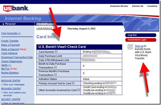
imageUS Bank, which has been busy building new online features of late, recently (note 1) added a debit card section to its online banking site. The new Check Cards & ATM Cards section is displayed on the default Your Accounts main page (see first screenshot). 

Clicking on the debit card name takes users to an info page which outlines debit card withdrawal and purchase limits along with the accounts accessible through the card. I’ve banked there for 20 years and today is the first time I’ve ever known my daily limits.

The bank included embedded “help” bubbles around some of the key terms. But there are no direct links that explain the options or how to alter them (e.g., request an increase to my daily limit). 

Bottom line: Treating debit cards like their own “product” makes good strategic sense. Users benefit from the added transparency, and it helps position the card as a value-add, something that could even support fees for premium options (e.g., a higher withdrawal limit, rewards, multi-account access, etc.). 

———————————–

US Bank’s main online banking view now includes a debit card section (2 Aug 2012)

US Bank online banking features a debit card section

Users can click through to see the specific limits associated with the debit card
Note: On the right, the bank upsells Visa Money Transfer, a $1.95 per transaction P2P payment option

US Bank debit card info box

———————————

Note:
1. I’m not sure when it was added, but today was the first time I noticed it.

Mobile Marketing: Leveraging the iPhone App Update Process

image As customers have adopted ever-more convenient delivery methods, the customer communications process has changed dramatically. Each channel has its own ways of communicating with customers:

  • Branch/mail: Signage, statement inserts, chance conversations in line, direct sales pitches
  • Phone: On-hold messages, prompts on the phone tree, direct sales pitches
  • Online: Email, interstitials, display ads, website content, popups, online chat
  • Mobile: Similar to online plus notifications, text messages and app updates (see below)

In the mobile channel, the process for updating native apps provides a unique marketing opportunity that is virtually without cost and guaranteed to be read by a large portion of your mobile customers (previous post). App publishers have a screen of free real estate to explain the benefits of the new feature(s).

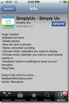
I’ve read thousands of these update descriptions and there is huge variety of approaches. Some publishers take maximum advantage of the “free publicity” to engage their customers (see Yelp below), pump up the new features (see USAA), and seek additional feedback (see Redfin, SimplyUs examples).

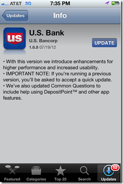
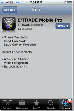
Other publishers don’t pay enough attention to readability (Wells, Bank of America, US Bank examples, see note 1) or just put the minimum effort into a bulleted list (E*Trade). 

Bottom line: Each time you push out a new update, use it as an opportunity to educate users and reinforce your mobile brand.

——————————-

iPhone App Update Examples

Good
———

Yelp reinforces its playful brand with        USAA is more matter of fact, but  
enthusiastic and humorous copy                   does a good job highlighting new
announcing its v.6.0.                                           features in its v.4.9.

image     image

Redfin released a minor bug fix in             SimplyUs gets right to its bullet
v.3.3.2 but includes its email address        list of features, with just enough
to report any issues.                                           info to explain the v.1.0.17 update.
Nice touch!                                                            Plus email and Twitter handle.

image     image

Need work
——————

Wells does an OK job, but the first               Similarly, Bank of America has an
bullet reads like something lifted from        acceptable message for its v.3.3.351. 
project checklist. And the second                  But the copy is a little confusing and
is too long-winded. Plus, a floating             has an asterisked point floating mid-page.                       “Bug fixes” hovers at  the bottom                        
of its v.2.1 update.

image     image

US Bank’s v. 1.6.8 message is                    E*Trade’s 2.6 update sounds like it
confusing. Something about being             has a bunch of new features, but
asked to accept a quick update, but 
         it did nothing but list them with
no specifics on why or what has                no explanations.
changed.

image    image

—————–

Note:
1. These examples were all taken from updates I downloaded today. They are not necessarily indicative of every update from these companies. At major releases (such as Yelp’s v6.0), most publishers will step up the copy-writing quality.

Fee-Based Features: Document Registration and Storage Services

image Consumers hate fees, of course. But that doesn’t stop them from paying $1,000 per year for their iPhones. It’s all about perceived value. 

No one will ever confuse a bank with Apple. But there are hundreds of value-added services that financial institutions could offer customers for a fee (note 1).

For example, document registration. There couldn’t be a more mundane service than document registration. Yet, it fills a real need for the constantly unorganized, and their heirs.

Four years ago (see May 2008 post), we wrote about FindYourPolicy.com, a startup that had created a service to help people keep better track of their life insurance and beneficiaries. According to the company $1 billion in insurance policies go unclaimed each year due to unknown or lost beneficiaries. Although it sounds simple, tracking down beneficiaries can be a timely and expensive process. Outsourcing some or all of that is an appealing idea.

In 2008, the company was trying to get consumers to pay $25 to $50/year for the service. We didn’t expect that fee to stick and later that year the company abandoned that model. Now they allow users to register life insurance policies free of charge, then assess heirs $9.95 to search the database for potential policies. It would be a good business if it gained a critical mass of users, but that won’t be easy.

However, life insurance recording would be an excellent value-add for online banking. It’s a bit of a stretch to think you’d be able to get a fee for just that. However, if you expand the service to include more document types such as wills, titles, and contracts, it begins to have more potential for fee income.

imageBut to really bring value to the service, you’ll likely want a storage piece as well. Although Wells Fargo shuttered its vSafe service in March (post), several large credit unions are moving into the storage space, including Northwest Federal Credit Union which is providing its 68,000 e-statement users with 100MB of free storage space powered by DigitalMailer (note 2, 3, 4).

————————————-

Northwest FCU showcases its new My Virtual Strongbox storage service in a homepage ad (15 July 2012)

image

—————————————-

Notes
1. For info on fee-based financial services, see the Online Banking Report (subscription) on fee-based online services (May 2011); paperless banking and online storage (late 2010); and lifetime statement archives (2005).
2. We looked at DigitalMailer’s new My Virtual StrongBox in our April report (subscription).
3. Members using e-statements get 100 MB free storage and can pay a fee for additional space.
4. DigitalMailer will be demoing VirtualStrongbox at FinovateFall 2012.

Infographic: Internet Banking Vendor Timeline, 1997 to 2012

Here is a monster infographic from our friends at Mindful Insights LLC, a boutique consulting firm in the digital finance space (previous post). You can click on the image for a larger version, or better yet, grab the PDF version here. We appreciate the opportunity to publish it.

image

Mint Launches Mac App: Mint QuickView

imageI’ve been a big fan of apps ever since I first pressed the weather button on the iPhone in 2007. After 12 years of http://www.blahblah.com/blah.htm, it was refreshing to just press a button and get the necessary information quickly, perfectly rendered and distraction free.

So I like Mint’s latest move, putting a similar user experience onto the desktop (see note 1) with an app for the Mac (link) that provides a quick overview of balances, transactions and alerts (see email announcement below).

Once installed, Mac users simply click on the Mint icon on the top and/or bottom of their desktop, and it immediately opens to a display of the latest balance-and-transaction info. Like iPhone apps, the icon also shows the number of unread alerts on the badge (see first screenshot). 

Other novel features:

  • A search bar along the top of the transaction search
  • Optional password protection: You can choose to look at your data without logging in (after the first time)
  • Timed password protection: Users can select how long they can look at the data before the password prompt is shown  

I’ve used it for only a few minutes, but it looks like it will become my primary method of accessing Mint. Unless you need to run a report, it has most of what you need available immediately, shaving 30 to 40 seconds or more off the time to retrieve info from the full website version.  

image Bottom line: Mint is the first PFM or banking app to hit the Mac store, beating all the major financial brands to the punch. And it’s been rewarded with “featured app” status which has propelled it to the very top of the Free Apps ranking in the Mac App Store (see inset above).

Because it raises the bar in the delivery of banking info, we are bestowing it with our fourth OBR Best of the Web award for 2012 (see note 2). 

———————————–

Mint QuickView app pops up after clicking on icon along the top

Mint QuickView uses dropdown from top icon on Mac


Transaction search from top line

Mint QuickView features prominent transaction search

Net income view

Mint QuickView


Email from Mint announcing Mac QuickView
(16 July 2012)

image

Notes:
1. We wrote about moving online banking info to the PC desktop in our Online Banking Report in 2002 (subscription).
2. Since 1997, our Online Banking Report has periodically given OBR Best of the Web awards to companies that pioneer new online- or mobile-banking features. It is not an endorsement of the company or product, just recognition for what we believe is an important industry development. If anyone knows of other financial institutions offering a similar feature, let us know and we’ll update the post. In total, 86 companies have won the award including Mint in 2007. Recent winners are profiled in the Netbanker archives.

Westpac Launches iPad Banking with Drag-and-Drop Transfers

image Touchscreen technology isn’t particularly game changing in banking. For the most part, users simply look at transactions, type a few numbers, and press a button or two. Touchscreen or mouse, it works pretty much the same. 

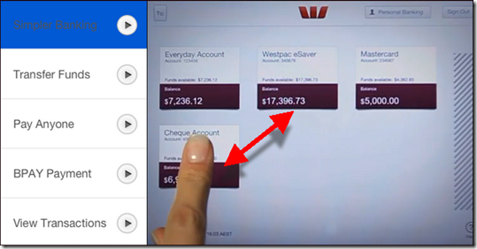
However, Australia’s Westpac Bank (creators of Cash Tank and Impulse Saver) has figured out a way to use the swipe motion to simplify the funds transfer process. In its new iPad app (launched today), each account is shown on the screen in a small summary box.

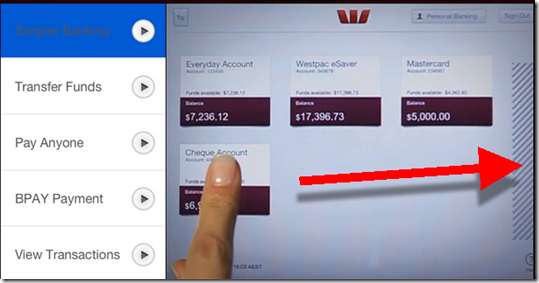
To initiate a funds transfer, users move the summary box for account A over the summary box for account B, then type in the amount (see first screenshot below). Similarly, to initiate a payment, users drag the summary box over to the “payments zone” on the right to begin a bill payment (second screenshot).

Bottom line: While pushing a box around on a screen may not be faster than using a mouse in desktop online banking, it’s an intuitive way to use an iPad app. Kudos to Westpac for incorporating it into their app.

—————————-

Westpac (AU) iPad funds transfer (10 July 2012)
Simply drag the “from” account box over “to” account to begin the funds transfer

image

Westpac (AU) bill-payment process
Drag to “from” account over to the payment zone on the far right to begin a payment

image

Design: PayPal’s New Website (with before and after screenshots)

PayPal has always had one of the better financial sites. It started out very simple in 1999, but over the years it became a bit bloated with competing messages for its various constituencies. And the overall look, while true to its roots, looked a little 2007-ish, which makes complete sense since that’s when the company last remodeled.

So a major overhaul was due. Here’s a quick look at the biggest changes. It’s a good roadmap for any financial website, though PayPal’s status as a payments platform makes some of its design decisions different than what a retail bank should do.

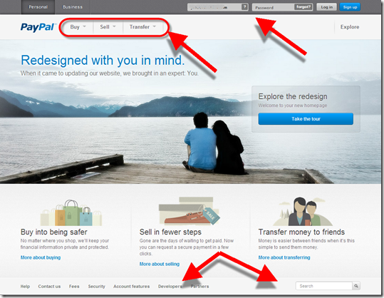
The main homepage makes a better first impression now that it mimics the trendy design feature of a large peaceful background image (used by Citibank, Square, Salem Five and many others). The page is also significantly simplified.

But the biggest change is in the primary action words used for transactions:

Before: Pay Online | Send | Get Money
Now: Buy | Sell | Transfer

The new verbs are short and to-the-point, but regular users will miss the Send (originally it was called Beam Money) and Get Money (aka Request Money prior to 2007) names which have been around for more than a decade.

Overall, it’s a great change and helps PayPal maintain parity with Square and a number of other hip payments upstarts. 

________________________________________________

Personal homepage
________________________________________________

In addition to the above, there are a number of other changes:

  • Instead of tabs, PayPal now uses text to indicate top-level navigation of Personal and Business (it also eliminated the redundant Home tab)
  • Moved login from an upper-left box (typical for banks) to the top line in the upper right (typical for newer ecommerce sites)
  • Dropdown arrows are used to uncover sub-navigation items below Buy/Sell/Transfer
  • Moved the utility functions (Contact Us, Search, etc. down to the bottom instead of along the top)

Before (19 June 2012)

PayPal homepage before July 2012

After (9 July 2012)

New PayPal personal homepage (July 2012)

________________________________________________

Business homepage
________________________________________________

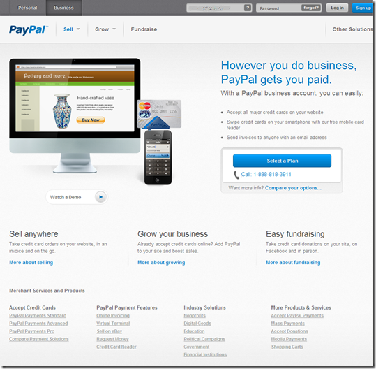
The Business page changes weren’t as dramatic because it’s mostly a marketing page:

  • The three main navigation items changed from Solutions | Industries | Partners to Sell | Grow | Fundraise, a nice improvement.
  • There is now a direct login on the page in the exact same spot as on the Personal page
  • The PayPal Here dongle is now pictured in the middle

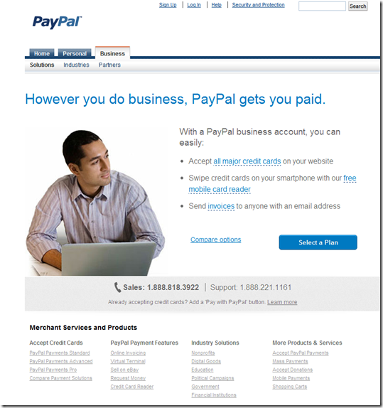
Before

PayPal business homepage before July 2012

After

PayPal new design business homepage (July 2912) 

_________________________________________

Other functions
__________________________________________
Note: Click on any of the thumbnails to enlarge

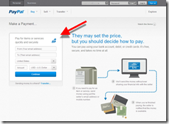
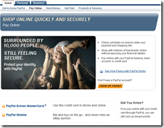
Before: Pay Online                       After: Make a Payment

PayPal pay online page before July 2012   

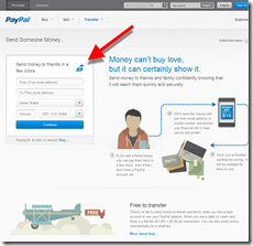
 Before: Send Money        After: Transfer | Send Someone Money

PayPal Send Money page before July 2012    PayPal new Transfer funds page July 2012

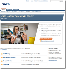
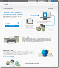
Before: Get Paid                         After: Request a Payment

PayPal Get Paid page before July 2012     PayPal new request a payment page July 2012

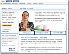
Before: Get to know PayPal            After: Account Features

PayPal products page before July 2012      PayPal new Account Features page July 2012

————————————

Note: We cover financial website and mobile design issues periodically in our Online Banking Report (subscription).