Card Transaction Data is Rich, Who Will Help Users Mine It?

image A few days ago, my wife and I were trying to remember the name of a restaurant where we ate on vacation several years ago.

The answer didn’t really matter, but I shouldn’t have needed to tax my meager memory cells because someone with perfect recall already knows its name, location, and how much was spent. In this case, Bank of America. I used its credit card.

I should be able to hit BofA’s mobile app, type or speak “orlando,” and instantly see the dozen or so charges I’ve made in Central Florida. Even better, I should be able to access the entire paper trail of card charges from that trip and to get a quick refresher of our itinerary four years ago.

Yes, this is the vision of personal financial management and we are slowly getting there. But it’s still a lot of work to manage the data flowing to third-party PFMs. And logging in to yet another program to find a small bit of info can be tedious (see note 1).

Bottom line: We can debate all we want about how many people will use the mythical thing called PFM. But most people want to know something about a past transaction at least once in a while. They shouldn’t have to subscribe to a third-party service find it.

So, listen up, financial institutions. Follow Simple’s lead (and Jwaala which pioneered it five years ago), and make long-term searchable transaction archives a core part of online and mobile banking (notes 2, 3).

———————————–

Simple’s natural-language search is an important feature (15 Jan 2013)
Note: Hashtags make subsequent searches even more powerful

image

Jwaala search

image

——————————–

Notes:
1. Though, for me, Mint’s QuickView Mac app, has made transaction look-up much faster by doing away with the login.
2. And you can make “transaction search” a profit center. See Google’s business results for ideas.
3. For info on fee-based financial services, see the Online Banking Report (subscription) on fee-based online services (May 2011); paperless banking and online storage (late 2010); and lifetime statement archives (2005).

Mobile Monday: USAA Taps the Mobile Camera for New Account Opening

USAA ipad app offers mobile check deposit The smartphone has already changed the way we work, communicate, find information, and behave. But it’s had a limited role so far in bank-account opening (note 1).

But leave it to USAA, the pioneering bank for all things mobile (note 2) to lead the way again. First reported this week in American Banker, USAA is testing the use of “blank check” capture to make it easier for certain new customers (note 3) to make their initial deposit (note 4).

Customers can snap a picture of a blank check from their old account and then enter the amount to be transferred electronically (note 5). It’s not really any faster, actually probably slower, than simply typing in a checking account and routing number (twice). But given how frustrating data entry can be on a mobile, some users will love it.

More importantly, it introduces users immediately to mobile capture and removes one more barrier to getting that first deposit on the books. And it makes USAA look cool.

—————————————–

Notes:
1. At Finovate, we’ve seen the mobile camera used in a number of interesting ways. oFlows (now a part of Andera), wowed the crowd in 2009/2010 with various paperless account-opening and -processing technologies (for example, check out its FinovateSpring 2010 “Best of Show” demo).
2. USAA launched mobile remote deposit 18 months before any other major bank and a full 3 years before Bank of America (see our 2009 post).    
3. Only certain USAA members are eligible to use mobile deposit (generally, those with military service or their family members who have acceptable credit).
4. Unfortunately, USAA doesn’t yet support full mobile account opening. New customers must first go online and establish a new account and register a username and password. Then they must go to USAA mobile banking, log in, then take a picture of the blank check. Furthermore, only certain USAA members are eligible to use mobile deposit.
5. In the United States, the funds are moved via ACH, a little-understood system that banks could do a better job explaining to customers. See a rundown of the mysteries of ACH from the customer’s standpoint in this enlightening Deposit Account post from yesterday.

Crowdfunding (aka P2P Lending): The First Pure Internet-Induced Disruption in Financial Services

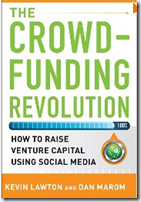
image I am an unabashed fan of peer-to-peer (P2P) finance (see notes 1, 2). In theory, it makes so much sense to tap Internet efficiencies to match the buyers and sellers of money. On the other hand, there are good reasons to have highly regulated intermediaries, although that system is far from perfect as well.  So, I’m looking forward to the hybrids we’ll be seeing in the next few decades.

Back to the present day. In the last 12 years of writing Online Banking Report, only two product launches have made me stop what I was doing and immediately start writing a new report:

  • PayPal’s launch of P2P payments in 1999 (OBR 54)
  • Prosper’s launch of P2P lending in 2006 (OBR 127; note 3)

And I believe P2P lending is way more disruptive than what PayPal has done. PayPal introduced a vastly improved front-end to bank checking accounts and credit cards. The company created an extremely valuable franchise (note 4), but the banking system is still intimately involved in most transactions. PayPal stole revenues from acquirers and held a few deposits, but for the most part, had little impact on card issuers.

That’s competition.

However, Prosper, Zopa, Lending Club and the other P2P lending pioneers created virtual banks (taking in deposits and lending the money out) completely separate from existing financial institutions.

That’s disruption.

And it’s about to get way more interesting as the concept takes off in the business financing/investing arena via what’s been called “crowdfunding” (note 5).

Bottom line: If you are a bank, learn to love crowdfunding and P2P. It’s disruptive, yes, but you can harness it to both help those who don’t qualify under your existing underwriting and increase your bottom line (note 6).

————————————

Notes:
Graphic: One of more than 50 books for sale at Amazon about Crowdfunding and  Kickstarter.
1. Unfortunately, I’ve backed only one loan so far, earning a nice return on my $100 loan in 2006.
2. We have published three reports in this area (OBR 127 in 2006, 148/149 in 2007, and SR-5 in 2009). We are working on our fourth. It will focus more on equity and debt crowdfunding for small and mid-sized businesses.
3. Zopa 2005 launch in the United Kingdom beat Prosper to market by almost a year.
4. eBay’s market cap is $60 billion, of which a significant chunk is attributed to PayPal.
5. There are hundreds of companies entering this space. We are most familiar with two Finovate alums involved in debt-based crowdfunding (SoMoLend and Rebirth Financial). And we’ve written about equity-crowdfunder CircleUp, which was also featured in the NY Times along with SoMoLend this week.     
6. Our latest P2P lending market forecast is contained in the current Online Banking Report here (Jan 2013, subscription).

New Online Banking Report Published: Online & Mobile Forecast Through 2022

imageOur latest research is now available: Online Banking Report 2013 to 2022 Forecast. The report includes our latest 10-year online banking, mobile banking and bill-pay forecast for the U.S. market. Online banking remains relatively flat, growing less than 5%, while mobile expanded by 40% last year (see note 1).

Based on recent mobile growth, we now project that in 2019, mobile account access will equal online account access in the United States (based on household penetration of each service).

The report also includes a revised 10-year forecast for U.S. peer-to-peer lending. After growing almost fifteen-fold in the past three years (2012 vs. 2009), we expect continued strong growth of nearly 30% compounded annually through 2022.

Finally, we took one last look at 2012 and documented the top-10 innovations or trends of the year (see below). We also updated our top-10 project priorities for 2013.

__________________________________________________________________

Top innovations & trends of 2012
__________________________________________________________

The report includes a summary of the top-10 innovations or trends during the past year (in alphabetic order):

  • Alt-biz lending disrupts commercial lending for the smaller business
  • Balance forecasting launched by Simple and Key Bank
  • Banking websites get “simple” makeovers
  • Digital (cloud) wallets find a value proposition, best-case routing
  • iPads appear at the POS and new accounts desk
  • Mobile deposit goes mainstream
  • P2P lending pops!
  • Pay As You Go auto insurance launched by MetroMile
  • Prepaid cards gain as “basic checking”
  • Virtual gift cards get a boost as Square launches 200,000 in a single day

__________________________________________________________________

New entrants to the OBR Hall of Fame
__________________________________________________________________

Each year we rank the top online/mobile innovations of all time (North America). A total of 48 achievements are listed from 50 companies:

  • 17 banks
  • 5 credit unions
  • 11 non-bank financial services companies
  • 17 fintech companies

The class of 2012 included two new entrants:

  • City Bank of Texas’s mobile on/off switch for debit cards (powered by Malauzai)
  • Simple and Key Bank both launched real-time balance forecast tools 

__________________________________________________________________

About the report
__________________________________________________________________

Online & Mobile Banking Forecast (link)
The next 10 years: 2013 through 2022

Author: Jim Bruene, Editor & Founder

Published: 7 Jan 2013

Length: 32 pages, 26 tables, 12,000 words

Cost: No extra charge to OBR subscribers, US$495 for others here

————————-

Report excerpt:

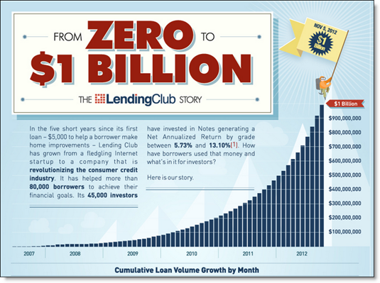
Lending Club is the biggest fintech startup success of 2012 
The company originated nearly three-quarter billion dollars in new loans in 2012 and surpassed $1 billion in cumulative originations in November.

 image

Mobile Monday: Top 50 iPhone and iPad Apps in the Finance Category

app store logo.jpg

I knocked around Apple App Store last week researching our year-end Online Banking Report. Below are the current top free finance apps in the U.S. store (note 1). While there are not a whole lot of surprises, several are notable:

  • Credit Karma maintains its top-10 ranking (#9)
  • Intuit has three of the top-10 apps (#4, 6, 8) plus #30
  • Two of the top-5 financial institution iPhone app providers (PayPal and Capital One) do not yet have iPad apps
  • Three credit-monitoring apps are in the top 32 (Credit Karma #9, Intersections #23 and Experian #32)
  • Two banks each have two apps in the top 50: Capital One (#6 and #34) and PNC (#25 and #42)
  • Five fintech startups made the top 22 (Credit Karma #9, LearnVest #15, Lemon #19, Pageonce #20, Manilla #22); all but Lemon are Finovate alums (note 2)

Methodology: I first listed the top 50 iPhone apps from the “Free Finance” category (column 2). Then I went to the iPad store and found their corresponding iPad app rank (column 3). I then listed all the remaining iPad apps in the top 50 and their corresponding iPhone rank (last 20 rows below).

———————————-

Top iPhone/iPad Finance Apps in Apple App Store (USA)

Company iPhone Rank iPad Rank
PayPal 1 none
Chase 2 3
Bank of America 3 1
Mint (Intuit) 4 5
Wells Fargo 5 2
TurboTax (Intuit) 6 31
Capital One 7 none
TaxCaster (Intuit) 8 16
Credit Karma 9 none
American Express 10 7
Discover 11 13
Citibank 12 10
USAA 13 8
State Farm 14 47
LearnVest 15 none
Yahoo Finance 16 11
Easy Envelope Budget 17 42
US Bank 18 26
Lemon 19 none
Pageonce 20 23
Fidelity 21 12
Manilla 22 none
Identity Guard (Intersections) 23 none
Navy Federal FCU 24 none
PNC 25 19
iSpending 26 116
Barclaycard 27 35
Mortgage Calc (Zillow) 28 20
TD Bank 29 none
Quicken Money Management (Intuit) 30 17
TD Ameritrade 31 27
FreeCreditScore.com (Experian) 32 55
Pocket Expense 33 15
ING Direct (Capital One) 34 none
Quicken Loans 35 none
E*Trade 36 33
Spending Tracker 37 28
SunTrust 38 none
Western Union 39 none
iSpreadsheet 40 9
BB&T 41 46
Virtual Wallet (PNC) 42 40
Bloomberg 43 22
Budget 44 none
Expensify 45 53
Ally Bank 46 none
HSBC Personal 47 none
H&R Block 48 24
Bluebird (AmEx) 49 none
Seeking Alpha 50 none
Below top 50 iPhone    
Craigslist mobile not in finance 4
Money Magazine none 6
ShareBuilder (Capital One) 114 14
CNBC 55 18
Real-time stock tracker 64 21
Vanguard 58 25
Morningstar Stockinvestor 198 29
Personal Capital 92 30
Regions Bank 54 32
Visual Budget 62 34
Merrill Lynch 84 36
Bloomberg TV 125 37
Mortgage calculator (Trulia) 102 38
SmartMoney Retirement Planner (Dow Jones) none 39
Bills for iPad (iBear) not in top 300 41
Budgets for iPad (iBear) 162 43
Checkbook free 53 44
Smart Budget 120 45
TD Ameritrade Mobile Tracker 86 48
EZ Financial Calculators 63 49
Schwab 60 50

Source: Netbanker observation of Apple App Store directly from iPad and iPhone around 6 PM Pacific, 7 Jan 2013

None = No app listed with the App Store for that device

——————————

Note:
1. The Apple ranking system is a bit of a black box. But it’s generally believed to weigh heavily recent download activity.
2. Easy Envelope Budgeting (#18) is from a San Francisco-based Web developer Dayspring Technologies founded in 1998.

Feature Friday: Fifth Third Combines Debit & Credit on DUO Card

image Transactional banking is fairly straightforward. There are electronic payments, ATM withdrawals, debit card payments, credit card charges, and checks.

When a technology comes along that offers to combine three of those in a familiar form factor (plastic card), you would think it would catch quickly. 

But combined credit/debit cards have not gained much of a following yet. With one big exception: Fifth Third Bank.

In 2011, the Cincinnati-based bank, the 15th largest U.S. retail bank with $120 billion in assets, launched a combined credit/debit card called DUO. According to American Banker this week, “(DUO) has recently accounted for about 25% of new credit card accounts” at the bank.

My take: That may or may not be a large number depending on the bank’s overall card marketing efforts, but it’s a good indication that there is at least some consumer demand for the so-called hybrid card. Personally, I stopped carrying an ATM card years ago, so I would love having ATM access added to the credit cards I tote around. I would even pay a modest fee for the convenience (note 2).  

True, the mobile wallet holds the promise of combining everything into one grand app. However, it’s a long, long road to mass adoption. Seventeen years into online banking, it’s still used regularly at less than 60% of U.S. households (note 3).

So bring on the hybrid cards, but make sure there is also a killer mobile app supporting them.

————————

Fifth Third landing page for its combo DUO card (link)

Fifth Third landing page for its combo DUO card

——————————

Notes:
1. It’s been 17 years since Web access was first launched by Wells Fargo (May 1995). Dial-up online banking predates that by more than a decade, but it was used by such a small group that it doesn’t really rate a mention.
2. “Modest” would be in the $1/mo neighborhood, unless there more features were added.
3. Source is our annual forecast (subscription, Jan 2012) which we are in the process of updating and will be available in a few days. 

Zions Bank Supports its Brand with Holiday Graphics

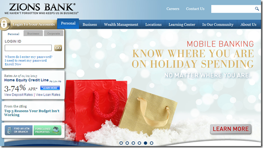
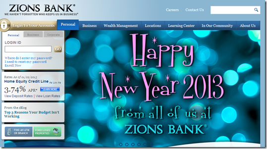
image Before we move on to more weighty matters, here’s one last example from Holiday 2012.  Zions Bank had the most decked out website we’ve observed in the past two weeks. Because it ranks just outside the 20 largest U.S. banks, it didn’t make last week’s holiday roundup. But since it was so decked out, I thought it was worth a followup.

On New Years Day, Zions had holiday-related messages playing on three of its six rotating homepage themes.

  • EZ Budget, its budgeting tool that helps track and manage spending for an event (previous coverage of the tool)
  • General mobile banking pitch with a “tracking holiday spending” use case
  • Happy New Year greeting

Bottom line: Without breaking the bank, Zions projects a timely, modern look that supports its brand.

——————————–

Zions Bank hompage featuring EZ Budget spending tracker (1 Jan 2012)

image 

Zions Bank homepage featuring mobile banking wrapped in holiday theme

image

Zions Bank homepage with “Happy New Year” greeting

image

Happy New Year: Stanford Federal Credit Union Offers Refi Auto Loans to Start the Year Right

image Besides losing weight and hitting the gym more often, financial matters dominate the New Year’s resolution list. Spend less. Save more. And in general, just be smarter about your money. During this brief window of rational thinking, financial institutions would be wise to promote these smart products and services.

But in a fairly exhaustive search today (31 Dec 2012), looking at the 40 largest U.S. banks and at least that many credit unions (note 1), we found only  one New Year-themed promotion (note 2), a 1.49% auto-refi offer from Stanford Federal Credit Union (see below).

—————————————

Stanford FCU homepage (31 Dec 2012)

image

Landing page for New Year promo

image

———————————-

Notes:
1. The first 40 to 50 credit unions listed in the Google results when searching “credit union” from a Seattle IP address.
2. Several credit unions posted well wishes and holiday hours on their homepages. Also, Fifth Third has a “celebrate 2013” message on its homepage as we reported last week.
3. Picture from New Year email and infographic by Finovate alum, Kiboo

Holiday Website Promos at the Top-20 Banks

In my annual look at holiday offerings from major banks, I found that Scrooge still roams the halls at many of the big names. Only eight of the 20 largest U.S. banks are using holiday-themed promotions or graphics (note 1). That’s one more than last year, but still two less than 2010.
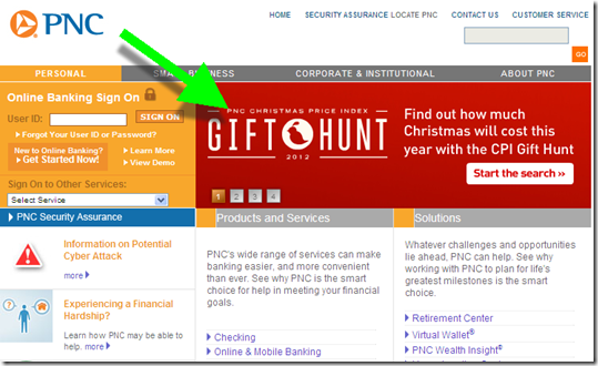
As usual, PNC Bank is the exception with their two-decade long holiday CPI (Christmas present index). BB&T, Comerica and Fifth Third are also festive this year with gift card promotions supported by seasonal graphics. And US Bank, Citi, Key and Regions Bank used some holiday imagery.   

The scrooge list: top-20 banks with no holiday promotions or graphics on Dec. 20): 
Bank of America, Bank of the West (BNP Paribas), Capital One, Chase, Citizens (RBS), Harris Bank (BMO), HSBC, ING Direct (Capital One), SunTrust, TD Bank, Union Bank (Mitsubishi UFJ), Wells Fargo

Following is a quick overview of the promotions, including a 1-to 5-bulb rating.

Previous year-end holiday posts: 2011 (big banks), 2011 (CUs/community banks), 2009 part 1, 2009 part 2, 2007, 2006, 2006, 2004

_____________________________________________________________________

Big banks in the holiday spirit
(rated 1 to 5 bulbs; screenshots from Thursday, Dec 20)

PNC Bank

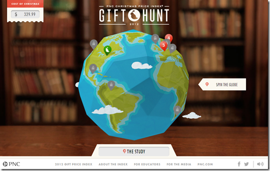
  • Gift Hunt tied to its Christmas CPI (based on the song 12 Days of Christmas)
  • Visa Gift Card promo (in rotation of four homepage promotions)

Score: imageimageimageimageimage

Hompage: PNC is leading with its 12 days of Christmas price index

image

PNC Bank microsite with gift hunt link

image

Also running gift card promo in rotation

image

———————————————–
BB&T (20 Dec 2012)

  • Holiday themed graphic featuring mobile check deposit
  • Small ad for gift cards

imageimageimageimage

image

————————————

Fifth Third

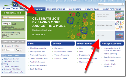
  • Rotation of three holiday themed promotions
    — Holiday billpay sweeps
    — New Years savings pro
    mo
    — Gift cards

imageimageimageimage

image

—————————

Comerica

  • Prominent gift card promo across page and in lower-left corner

imageimageimageimage

image

—————————

Key Bank

  • Holiday graphic, but no product promotion

imageimage

image

—————————-

Citibank

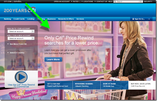
  • Toy shopping background image

imageimage

image

———————————

US Bank

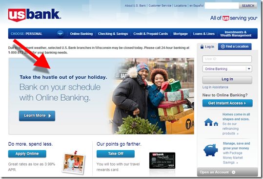
  • Pitch for online banking, convenient while shopping

image

————————————-

Regions Bank

  • Small saving money tips

image

image

——————-

Notes:
1. Observations taken between 2pm and 3pm Pacific on Thurs Dec 20 from Seattle IP address, Chrome browser with no cookies
2. Animation from http://www.millan.net/anims/christmas.html#

Making Banking Interesting

image When did banking become boring? Probably when all the gold doubloons and pieces of eight were replaced by paper checks and computer bits.

But it doesn’t have to be this way. Most people have at least a passing interest in where their money is going. Sure, there are some negative issues around money, but the place where you track your spending and savings should at least be engaging. And that’s rarely the case today.

But Bank Simple (and others) are making good progress.

______________________________________________________

Simple Innovation #8: Full transaction annotation
with on-the-fly categories

______________________________________________________

As the startup continues to push the UI envelope (see note 1), it now lets users annotate transactions with uploaded images or PDF files (for a pic of that tantalizing dinner or the receipt for expense reimbursement), free-form memos, and categories created on the fly (#category like on Twitter).

That allows customers to create a historical record around their purchases. Or as Mechanics Bank’s Bradley Leimer put it:

“I love it. It’s like Pinterest or Instagram in your banking application.”

For a more thorough look at the UI, check out the new video posted on the Simple blog.

——————————————

Fully annotated transaction at Simple (19 Dec 2012)

image

————————–
Notes:
1. See previous seven Simple innovations here.
2. Expensify offers similar photo capture and memo annotation capabilities
3. For more info on Simple and other Truly Virtual Banks, see our Oct 2011 Online Banking Report (subscription). image
For more on balance forecasting and other advanced PFM features, see our recent Online Banking Report: PFM 4.0 (June 2012; subscription).
4. According to Apple iTunes, Simple app downloaders are also “buying” Schwab, PageOnce, and Mint apps.

Design: Pelican State Credit Union Reinforces Auto Loan Mailer with Homepage Notification

image Integrating offline marketing with online fulfillment is a promising way to improve ROI. Pelican State Credit Union grabs member attention with a temporary yellow bar across the top of the page (see screenshot below). It directs members that received an auto loan direct mailer to an online application.

I like this approach. It garners attention for the offer, but the narrow banner disappears permanently once users click the X in the upper-right corner. 

However, this extra attention can be a mixed blessing. It’s great for those members that received the offer (and remembered they did). But for everyone else, they are left scratching their heads after clicking "more info." 

The landing page doesn’t mention how to check whether you were one of the chosen recipients or how you might otherwise qualify for the deal. It also does nothing to reinforce the offer, which apparently was for an auto refinance. The slim copy simply points everyone to the generic online application. 

Bottom line: The yellow bar across the top is a great way to grab attention. But, you need to answer basic questions about the promo or you risk irritating members (see note.

————————————

Off topic: The CU is nicely decked out for the holidays with three timely messages among its five rotating promos: 

  • Visa Gift Cards, which unfortunately, require a trip to the branch to purchase (see first screenshot)
  • Double rewards points for using its Visa card in December
  • General holiday greeting, which leads to a YouTube picture collage with music

——————————————

Pelican State Credit Union adds an Auto loan promo reminder at top of page (18 Dec 2012
Note: The CU also is nicely decked out for the holidays.

image

Landing page for Auto Loan Refinance mailer
Note: Blank box on left makes the page look like something is broken.

image

———————————
Note:
1. The CU has a prominent "chat now" button, so interested members could potentially get a quick answer there, assuming CSRs manning the chat are equipped to determine eligibility.

Guess Who’s Back? NetBank

imageIt’s been 5 years since NetBank failed (see our post). At the time it was the largest bank failure in 14 years. But little did we know then (Sep 2007), that the $110 million taxpayers coughed up to cover its deposits was nothing compared to what was about to happen in the financial markets (note 1).

After the failure, ING Direct bought the NetBank retail deposit business and took ownership of the domain netbank.com. But they never did anything with it besides forwarding the URL it its homepage. 

But evidently Capital One didn’t want to be associated with that failed endeavor and/or it thought the "net" was too limiting for the mobile world. So, the Netbank URL and name were sold sometime this year to Bank of Internet (note 2). The URL has pointed to BofI since at least September. No word on the purchase price, but given that investing.com just sold for $2.5 million, I’m guessing it was in the $500,000 to $1 million range. 

Anyway, the back story matters little anymore. It’s a good name, and once the Google search results no longer have those 5-year-old "failure" articles on the first page, the baggage should be reduced to almost nothing (note 3).

As you can see from the banner running across the homepage (see second screenshot below), the new NetBank is targeting the account towards the "underbanked" (note 4). But the account is positioned as "real checking" as opposed to a prepaid card.

And it has one key feature that sets it apart from most checking accounts: the ability to deposit cash into the account via Green Dot’s MoneyPak.

The checking account costs $6.95/mo with direct deposit, or $8.95 per month. It pays 0.25% interest and is loaded with all the important account features (checks, debit card, p2p transfers, rewards, PFM, mobile remote deposit and so on).

It’s a good value compared to many alt-banking products. However, consumers in good standing with the U.S. banking system and willing to forego the MoneyPak option, would save with BofI’s free checking with no overdraft charges

Bottom line: It’s good to have the brand back in the game. Now, when will someone revive NextCard’s name?

——————————-

Before: Last known screenshot of bank before failure (20 Aug 2007, from Archive.org)

image

After: NetBank’s new homepage (13 Dec 2012)

image

—————————–

Notes:
1. For those that want to relive those dark days, here is the 54-page U.S. Treasury audit of why Netbank failed (published 23 April 2008).
2. I don’t know whether Capital One acquired netbank.com in its ING Direct acquisition or whether ING Direct sold it directly to BofI. It was not a material asset in the $9 billion deal.
3. Someone needs to do BofI a favor and get that Wikipedia entry updated ASAP. 
4. Or at least those currently locked out of the banking system due to bad ChexSystem scores.