Mobile Monday: Bank of the West is First in USA with No-Login Pulldown Balance Lookup

imageTwo years ago the above headline would have sounded suspiciously like an April Fool’s post. But it’s no joke, we really are seeing banks offering no-login options and I hope it spreads. The latest innovator: Bank of the West.

Last week, the bank’s mobile exec Matt Krogstad gave me a behind-the-scenes look at their new mobile banking service. In February, the bank replaced its previous mobile banking service with a new one powered by Fiserv (formerly M-com, see note 1). In the process, the bank added four important new features:

  • Mobile remote check deposit: A mobile requirement in 2013.
  • Bill payment: Another needed feature for users who prefer go mobile only, a number approaching 30% at first movers such as BofA and Chase
  • Single PIN login option: Users have the option of logging in with their full online banking credentials or selecting a six-digit PIN to replace both the username and password
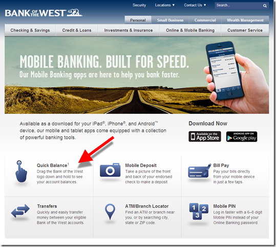
  • No-login "pulldown" balance option: Swiping the Bank of the West logo down reveals the account balance of up to two accounts (see next section).

The bank also increased its mobile presence with Android and iPad versions.

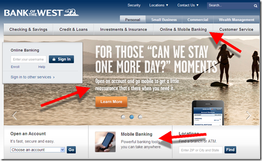
The initial results are impressive. In less than two months, Bank of the West has had a 70% increase in active mobile users and a tripling of logins per day. And that was before the bank began pushing it last week (see website screenshots below).   

Bank of the West pioneers no-login option in USA
Bank of the West is the first U.S. bank with a no-login mobile balance lookup option (see others who have it here). After it’s been enabled, users can simple pull down the logo at the imagetop of the home screen. Within 1 to 3 seconds (depending on connection speeds), the balance from up to two accounts is revealed at the top of the page.

Requiring users to swipe before showing the balance provides a nice mix between privacy and usability. It is super simple to use, yet it leaves your balance "hidden" if your kids, or friends, pick up your phone. 

Since, no-login lookup is basically the same as an SMS balance inquiry (something the bank already offered), the bank’s security folks were able to approve it. Naturally, it’s turned off by default. Users must enable it within mobile banking, something that about 5% of mobile users have done in the first month or so.

————————————

Bank of the West mobile users "pull" the logo down to reveal account balances (1 April 2013)

image     image

Bank of the West’s homepage has strong mobile branding (1 April 2013)
Note: Surprisingly few banks or credit unions have elevated mobile banking (or online banking for that matter), to the primary navigation

image

Bank of the West mobile banking landing page (link)

image

————————————–

Note:
1. Matt Krogstad was an early employee at M-com, which Fiserv acquired several years ago. He was involved in biz dev at Fiserv until his move to Bank of the West a year ago.

Metrics: Mobile Traffic at the 10 Largest U.S. Banks

imagecomScore just enhanced its website traffic reporting by showing both the mobile and desktop  audience at major websites. They call it Media Metrix Multi-Platform. The top-50 U.S. sites are available here.

Unfortunately, there are no banks in the top-50 and just one fintech company (Intuit, note 1). But comScore forwarded us a list of the top-10 banks to share with readers (thanks, see table below).

Highlights:

  • The mobile-only group is becoming a significant segment, amounting to about 20% of the desktop banking group (across all banks)
  • However, BofA and Chase have much higher mobile-only groups, 50% higher than any other top-10 bank
  • Across all banks, 40% of mobile users are “mobile-only” while 60% also use desktop online banking
  • But at BofA and Chase, about 2/3 of their mobile base is “mobile-only”

Bottom line: It is no surprise that mobile usage is significant. But what I didn’t realize is how quickly mobile users are giving up desktop online banking. Look at Chase and BofA, which have had mobile the longest. Only 1/3 of their mobile users went to the desktop during February. Partly, that’s because many are single-service credit card customers. But it’s strong evidence for what many have hypothesized: once users become accustomed to mobile convenience, they have much less need for desktop access.

——————————-

Table: U.S. desktop and mobile traffic at the top-10 busiest U.S. banks
millions of unique visitors, age 18+ (Feb 2013)

Feb 2013 (USA) Total Desktop Mobile* Mobile Only Mobile Incremental**
Total U.S. Internet 236 221 127 14.5 7%
Banking total 102 85.1 39.1 16.4 19%
1. Bank of America 31.5 24.1 11.7 7.4 31%
2. JPMorgan Chase 28.3 21.9 9.9 6.3 29%
3. Wells Fargo 22.2 20.0 3.5 2.2 11%
4. Capital One 15.4 12.7 3.8 2.8 22%
5. Amex 15.3 12.6 3.8 2.7 21%
6. Citi 11.8 10.4 2.0 1.4 13%
7. Discover 7.8 6.5 1.7 1.3 20%
8. HSBC 6.5 5.5 1.3 1.0 19%
9. US Bank 5.5 4.8 0.9 0.7 14%
10. PNC 4.8 3.9 1.1 0.8 21%

Source: comScore, March 2013 (methodology)
*Includes smartphone and tablets, native apps and mobile Internet
**Mobile-only divided by desktop base

———————————————–

Notes:
1. Intuit placed #42 of all U.S. digital properties with mobile audience of 15 mil, desktop of 29 mil, and total 38 million. It had 8.9 million mobile-only users, 31% of its desktop base.

Mobile UX: Barclaycard Adds No-Login Transaction “Peek”

One of my pet peeves is burdensome login procedures on smartphones. There is no rational reason to force cardholders to log in to see basic transaction data (unless they want to). We’ve covered it here, here, and here.

imageBut this is the first time a major U.S. issuer has opened up mobile transactions. Barclaycard’s iPhone app update released today (v. 3.1.4267, see inset), contains the new Peek feature which:

….provides a quick-view of key
account details prior to login 
(selected cardholders only)
 

It’s not discussed on the Barclaycard (U.S.) website, so I don’t have an action screenshot. And the “selected cardholders only” probably means its not available across all of its 35 different portfolios.

Bottom line: No-login transaction history is a good way to improve customer satisfaction, help move your card top of wallet, and possibly reduce costs from fewer password resets, fraud, and customer calls. I hope we see other major issuers follow suit soon.  

Wealthfront Simplifies Investing with Low-Fee Asset Choices and a 25bps Asset Management Fee

image When I was in business school, the professors and their data convinced me that it was foolish to try to beat the market by purchasing individual stocks. The optimal plan is to stay fully invested across a mix of assets, minimize fees with index funds, and rebalance over time.

That was more than 20 years ago, and back then unless you were super-wealthy and could afford to spend 1% to 2% annually on a wealth manager, you had to do most of the work yourself. But today, web-based tools and advisors are available to fulfill my professor’s wishes at a fraction of the cost.

We’ve written about Betterment, FutureAdvisor, and Personal Capital (Update: See also, JemStep, demoing at FinovateSpring 2013). All are approaching the market with diverse investment choices (primarily ETFs) provided at much lower cost than the old-school wealth manager.

Another company gaining traction, along with a $20-million VC round last week, is Wealthfront (previously known as KaChing). It is a Palo Alto, CA-based startup targeting the 25- to 40-year olds in the tech industry. According to its Feb SEC filing it had 2,100 customers with $130 million of assets under management (AUM). That’s a solid $60,000 average account balance. In its latest press release, the company says it now has $170 million AUM (perhaps that includes the latest venture round).

Wealthfront provides a balanced portfolio of domestic and foreign-equity ETFs and bonds, depending on your risk tolerances. It also includes real estate (REITs), something Betterment does not currently offer. The startup manages your first $10,000 imagefree of charge, then it charges 0.25% of your assets under management, similar to Betterment (note 1). The minimum investment is $5,000.

The company takes an active role in helping customers determine their risk tolerance. A series of 10 simple questions (screenshot 2) places customers into a portfolio optimized for their age, assets, income and risk-tolerance (screenshot 3). And the whole thing is overseen by a very biz-school-approved Chief Investment Officer, Burton Malkiel, the author of one of my college textbooks.

Bottom line: Banks and credit unions absolutely should be offering simple investment tools such as those found at WealthFront, Betterment and others. The problem, of course, is that investment accounts cannibalize deposits. There is just no way of getting around the fact that $20,000 transferred into an ETF (with a 25 basis-point fee) is $20,000 you can’t loan out (at a 4%-plus spread).

But consumers won’t be risk-averse forever. Eventually, those five-figure balances will find their way into something other than a 0.2% savings account. You might as well be the financial institution where customers make intelligent savings AND investment choices.

—————————-

Wealthfront’s homepage emphasizes value-investing basics (25 March 2013)

Wealthfront homepage explains value investing

Wealthfront risk-assessment question, number 1 of 10

Wealthfront 10-question risk profile

Wealthfront-recommended portfolio

wealthfront sample portfolio recommendation

————————————–

Notes:
1. Betterment charges a sliding scale depending on your minimum balance, 0.35% for accounts under $10,000, 0.25% for those under $100,000 or 0.15% for those above $100,000.
2. For a comparison of Betterment vs. Wealthfront, see the Quora debate.
3. For more info on bank-appropriate investment products, see our last report on online investing (May 2008, subscription). We also looked at Betterment, Simple and Personal Capital, in our True Virtual Banking Has Arrived (Oct 2011, subscription).

Feature Friday: Capital One 360 Offers Remote Check Deposit via Simple File Upload (no smartphone required)

image I don’t know how I missed this small, but meaningful, improvement to the remote deposit state of the art. Since last April, Capital One 360 (formerly ING Direct) has allowed customers to make deposit via the mobile phone app, and (drum roll) via file upload.  

Yes, you heard it right. Simply snap a picture of the check (front and back), save the files, upload to CapOne360, and your deposit is complete (see screenshot below). That means check deposit is available to everyone, not just those with smartphones or scanners.

Does that mean more work for Capital One operations? Sure, processing an uploaded .jpg will take more time. But for the relatively low deposit volume of its savings-account-heavy base, it’s probably not material. And the idea here is to get more deposits, not save on transaction costs.

Will there be more fraud? There will likely be more garbage (duplicate pictures, fuzzy images, and perhaps even a few suspicious attempts to deposit duplicate images). But will file uploads create a statistically significant amount of actual fraud losses? It seems unlikely, though I’m making an educated guess.

image Bottom line: The decision to accept any old .jpg was brilliant. Make it as easy as possible to do business with you. That’s been a driving force behind ING Direct’s success (that and the bouncing orange ball, RIP).

While it’s not going to make our Digital Banking Hall of Fame (note 1), it’s important enough to grab a belated OBR Best of the Web for “raising the bar” in remote banking (note 2). Nice work.

——————————-

Capital One 360 landing page for its CheckMate remote deposit service (22 Mar 2013)

Capital One 360 checkmate remote depost landing page

Step 1: Users must enter check amount ($) and which account to deposit to (and optional memo)

image

Step 2: Interim instruction page

image

Step 3: Agree to the terms and conditions

image


Step 4: Choose images for front and back of check
Note: Example images, since I didn’t have any checks on my machine

image

Step 5: Review images & click “Deposit Now”

image

——————————-

Notes:
1. The Digital Banking Hall of Fame is updated annually and published in our year-end Online Banking Report (subscription).
2.  Since 1997, our Online Banking Report has periodically given OBR Best of the Web awards to companies that pioneer new online- or mobile-banking features. It is not an endorsement of the company or product, just recognition for what we believe is an important industry development. In total, 89 companies have won the award. This is the second for Capital One (previous winner). ING Direct also won previously. Recent winners are profiled in the Netbanker archives.

Communicating Downtime and Other Tech Problems to Banking Customers

image While digital delivery is pretty stable these days, every business has the occasional service interruption, slowdown or hiccup. Even when inconvenienced, most customers are tolerant if you do a good job of communicating during the crisis.

So, what do good communications look like? It depends on the problem of course, but standard tools include:

  • Tweets and Facebook status updates every hour or two (especially if your main website is down, or crippled)
  • Emails or text messages (depending on customer preferences) at least once per day, or more frequently if there is new info
  • Proactive communications to press and other stakeholders (method varies depends on severity of the problem and communication preferences of recipient)
  • Scripts and on-hold messages on the VRU
  • YouTube video
  • Status updates, FAQs and contact info hosted on alternative website (during an outage)
  • Post-crisis FAQ posted on main website for those impacted to read about how it was resolved

Choosing the medium is the easy part. Crafting the content is much harder. Make sure you cover the basics:

1. Concise explanation of the problem and who felt the impact

2. Apologize for the inconvenience

3. Details of what is being done to fix it

4. Timetable for a fix

5. Where to look for periodic updates to above

6. Contact info for questions

Anecdotally, most financial institutions do pretty good on this scale, hitting three or four of the six. But few get them all.

_____________________________________________________________________

Mini-Case Study: Capital One 360 Mortgage Conversion
_____________________________________________________________________

The most recent example of a service glitch in my accounts came from Capital One 360 (formerly ING Direct USA) a few days ago (note 1). As you can see from the screenshot below, they did a good job of owning up to the situation, providing a special email address for questions, and keeping the message short and sincere. That said, the bank failed to explain the problem, its severity and who was affected. And, inexplicably, they forget the A word, as in “I apologize.” But overall, I’ll rate this a B or B+ in glitch response.

I have a mortgage at Capital One 360 and had no idea there was a problem until I got the message (even Google doesn’t know, according to my recent search). So naturally, the first thing I did was log in to my account. There I found no message or indication that anything was amiss. That was reassuring, but now, I’m triply irritated and slightly concerned that I may have been scammed.

So I used the special customer service email address provided in the customer email (the only contact option provided) which easily could have mitigated my negative feelings. But it’s been 33 hours, and I’ve yet to receive a response (not even an automated reply), so that’s not making me feel any better (note 2).

Bottom line: The Internet (and mobile) gave us the gift of an instant, and virtually cost-free, direct communication line to customers. Use it wisely.

———————————-

Email from Capital One 360 regarding home loan problems (18 Mar 2013)
Note: Special email address for questions

image

—————————

Picture credit: Short Stories for Tech Geeks

Notes:
1. Capital One (and ING Direct) are better than most in the communications area (this one for example) and I’ve never had any complaints during my three years as a mortgage holder. So I apologize in advance for using them to illustrate this post.  
2. The original message was sent to Capital One at 11:20 AM (Pacific) on 20 Mar 2103. Perhaps my email never made it through. Or maybe it’s in their spam folder. It’s a sample of one, so you can’t read too much into it.
3. We’ve tackled remote banking customer service and messaging a number of times in previous Online Banking Reports. The last one was Live Help published in 2011 (subscription).

Feature Friday: Capital One Offers $20 Incentive to Try ShopSavvy Mobile Wallet

image I have been fascinated with mobile wallets for a while (note 4). They’ve been “just a few years out” since the first Finovate (Oct 2007), where multiple mobile banking pioneers laid out their product roadmaps. And now we are starting to see real implementations. Not just Square and Starbucks. But financial institutions are moving forward. 

ShopSavvy app with single-slide purchasingThe latest rollout, the Capital One and ShopSavvy deal, was announced last month (press release). Capital One has already partnered with several major card-linked offers providers (and acquired one), but apparently it is still looking to boost its mobile efforts (note 1).

ShopSavvy is a San Francisco-based startup which has built a mobile wallet, shopping and deals apps. It has raised $11 million, two-thirds from Facebook co-founder Eduardo Saverin.

The company has integrations with a number of online merchants including Walmart, Barnes & Noble, Overstock.com, Target, Best Buy and others (note 2). Those links allow users find online prices, either by scanning a bar code in-store or in-app search, then purchase online with a single slide (see inset).

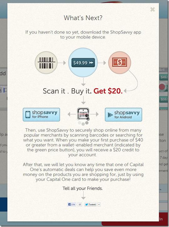
I got the invite from Capital One Wednesday morning with an eye-catching $20-off offer (see first screenshot below). But this wasn’t like a straightforward card-linked offer where cardholders activate the deal and then buy. 

To bank this savings, users had to power through a three-stage process:

1. Sign up for an account at ShopSavvy using the link in the email. It’s a relatively painless process, taking just a minute or two. None of my personal info was prepopulated (see screenshot #3-5 below).

2. Add the app to your mobile phone by locating the ShopSavvy app in the App store, downloading and opening.

3. Activate the ShopSavvy app by entering your username and password and repeating the info you’d entered online to set up your profile.

Altogether, it’s a somewhat convoluted 5- to 6-minute process, but one that is probably acceptable for early adopters. I did have intermittent problems with the app, network errors, crashes and bizarre search results (note 3). But it seems to have stabilized now after the initial usage spike. 

Bottom line: Once it started working properly, the ShopSavvy features were impressive. The simple search combined with one-click purchasing would make a nice addition to a bank or card issuer’s mobile app. I’m still a little surprised that Capital One is endorsing a third-party wallet. But by getting its card “top of e-wallet,” the giant issuer boosts charge volume, mobilizes its card-linked offers, and gets a foothold in the wallet space.

——————————

Capital One email to customers offering a $20 statement credit to use the ShopSavvy wallet (12 March 2013)

Capital One email offering $20 discount forthe first use of ShopSavvy wallet

Landing page at ShopSavvy (link)

ShopSavvy Capital One landing page

Step 1: Join ShopSavvy

ShopSavvy signup process

Step 2: Add Capital One credit card

ShopSavvy signup, enter Capital one card

Step 3: Locate, download and activate the ShopSavvy mobile wallet app

ShopSavvy download instructions

——————————–

Notes:
1. Or perhaps this is more of a straight revenue-play for Capital One, with ShopSavvy paying the card issuer for each new customer.
2. Unfortunately, ShopSavvy’s one-click experience does not extend to Amazon.com, but the app does display Amazon prices and it’s just a few more clicks to buy there.
3. Initially, I tried the app with a few barcodes I found at home and it worked, but only on the media stuff. Since I didn’t want to buy anything I already owned, I went to the last remaining bookstore in northeast Seattle and gave it a try. Unfortunately, this store covers the regular barcode with its own, which are not indexed in the ShopSavvy database. But when I tried it again last night, the search function was working so I was able to easily find a DVD set and buy it from Target.com for a competitive price (even before the $20 statement credit). 
4. For mo
re info on mobile wallets, see our most recent Online Banking Report: Mobile & Cloud Wallets (Feb 2013, subscription)

Website Winners: Logix Federal Credit Union

imageThe Financial Brand today published a list of 50 “spectacular websites” from banks and credit unions. While their methodology wasn’t disclosed (see note 1), the winners appear to share one major trait, stunning homepage visuals. The first 20 are especially notable. (BTW, I would have put Citibank and Square in the top 20.)

We’ve already written about ten of the top 20: Salem Five (#1), Simple (#5), PNC Virtual Wallet (#7), USAA (#10), Mango (#12), Perkstreet (#14), Virgin Money (#15), Mint (#16), Movenbank (#18) and Comerica (#19).

But I wasn’t familiar with most of the other top-20, and as a huge admirer of Mr. Pilcher’s tastes in all things financial, I can’t wait to visit the others and report back.

Let’s start with the one that first caught my eye in the screenshot rundown:
Logix Federal Credit Union (Burbank, CA; $3.5 bil; 110,000 members), which for 75 years (until last July) was known as Lockheed Aircraft FCU (screenshot #1).

Observations:

  • The CU, which has the challenge of getting members to accept its new name, has adopted this cute orange robot (Robix) as its brand ambassador and has developed a number of contests and promotions around it. It’s a great way to send a youthful, innovative vibe that fits well with the CU’s North Hollywood location. And it makes for an engaging graphic image. Weber Marketing provided the name change and rebranding package. Extractable did the website design.
  • The website uses a nonstandard primary navigation bar running across the middle of the page. The design uses different background colors above and below the nav bar which helps draw attention to the navigation. The primary nav bar reverts back to the top after leaving the homepage.
  • Secondary navigation pops up in a megamenu below the main nav bar. This works pretty well, though some of the choices were below the fold on my 12-inch laptop, making them hard to get to. But users who are annoyed by megamenu popups can click on the primary items (Banking, Loans, Investments & Insurance, Business) and find all the secondary nav items on a single page arranged in standard HTML format. 
  • There are four versions of the homepage, which I discovered with a page refresh. The second version includes a closeup shot of the robot and features a different promotion in the top-right promotion area (see second screenshot below).
  • Headline copy is cute and concise.
  • The robot branding is carried to its Facebook page which has garnered about 1,500 likes.

Bottom line: The delightful robot image (high-tech, yet playful), orange color scheme, and ample use of white space are great attention-grabbers. Great work and very refreshing.

————————————

Logix Federal Credit Union homepage #1 (11 March 2013)

 image  


Logix Federal Credit Union homepage #2

Note: The “Bright Futures” promotion for youth checking.

image

Logix Federal Credit Union homepage #3

image

Logix Federal Credit Union homepage #4

image

Logix Federal Credit Union Facebook page (link)

image

Note:
1. Update (3 PM, 11 March): Jeffry Pilcher, Editor (and owner) of The Financial Brand, told me that it is a collection of websites that he was fond of design-wise. And that the numbering is not a precise measure of their standing, but more a loose indicator, i.e., #2 is ahead of #40, but there is not necessarily a material difference between #2 and #12. 

First Financial, US Bank Launch First Photo Billpay Services

imageI started this post Monday, before I knew US Bank would be making headlines today as the first “major” bank with photo billpay. I got that news last night, when I updated my US Bank iPhone app (see inset).

But First Financial Bank (Abilene, TX; $3.7 billion deposits) actually imagebeat US Bank ($235 billion) to market by more than a month with its 22 Jan 2013 launch (press release; YouTube video). The bank said it had 12,000 bill uploads during the first 10-days of availability.

 US Bank mobile photo billpayBoth services use the Mitek engine to read the image and handle the OCR work. But First Financial also uses Allied Payment Network to process images that don’t get properly digitized on the first pass and Malauzai Software for app development. 

Like remote check deposit, the system will improve over time as it learns the nuances of the thousands of billing statements fed into the front end. But today, there is still work to be done on the minority of statements that don’t read correctly (see note 1).

First Financial features the new service front and center on its homepage (see first screenshot below) with a clever:

Tell your bills to say, “Cheese.”

US Bank has no mention of it on the front page (nor in site search), but if you navigate to its mobile banking page, you can’t miss it (third screenshot below).

image Bottom line: I’m not sure how many people will ultimately use photo billpay (though First Financial seems to be off to a good start). It’s an interim technology until we can convert the country to ebills.

But since that may be a decade from now, using your smartphone to snap-and-pay is the best answer for now. So, we are bestowing our first OBR Best of the Web of 2013 to First Financial  for raising the bar in remote delivery (notes 2, 3). And an honorable mention to US Bank for getting it out to a broader market.  

——————————————

First Financial features its new photo billpay on its homepage (6 Mar 2013)

First Financial Bank homepage featuring photo billpay powerd by Mitek


First Financial landing page (link)

First Financial Bank landing page for photo billpay

US Bank’s mobile page features photo billpay prominently (link)

US Bank mobile banking page featuring photo bill pay

—————————-

Notes:
1. Just today, the Chase ATM couldn’t read the amount on a computer-generated check we fed into its deposit slot. So we had to manually add.    
2. This Best of the Web goes to First Financial since it was first. Mitek already won when it introduced the technology in 2010 (see our Online Banking Report on Paperless Banking (subscription).
3. Since 1997, our Online Banking Report has periodically given OBR Best of the Web awards to companies that pioneer new online- or mobile-banking features. It is not an endorsement of the company or product, just recognition for what we believe is an important industry development. In total, 89 companies have won the award. This is the first for First Financial. Recent winners are profiled in the Netbanker archives.

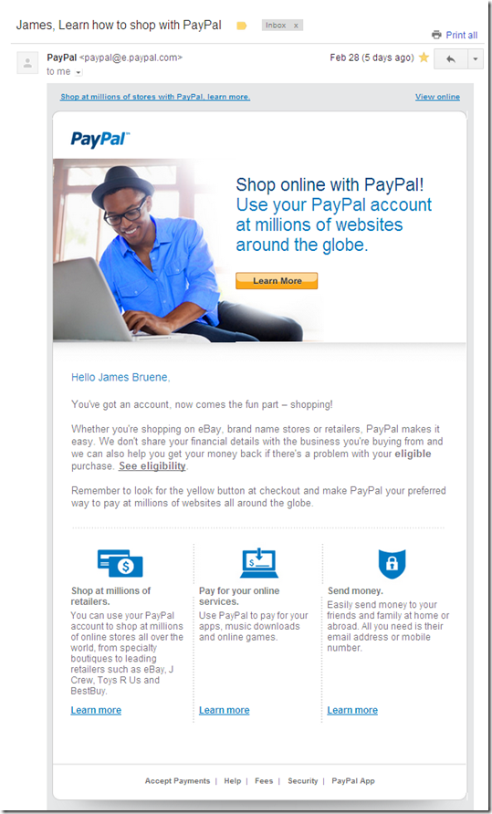
PayPal Onboarding Email Messages

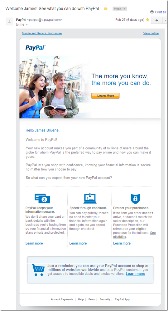
image As a followup to last week’s post on the signup process at PayPal, I thought I’d share the onboarding messages received during the first 10 days. There have been three so far (see screenshots below):

1) Day 0: Welcome message

2) Day 3: General message about PayPal benefits

3) Day 4: More specific message about shopping with PayPal

I’ve yet to link a credit card or bank account, so I expect more messages in the near future.

Bottom line: Onboarding is one of those areas that is impossible to perfect. It’s an art and you’ll be forever tweaking it. That said, there are some basics tenets to follow: a friendly, immediate welcome message and prompt followups with benefit-laden messages. PayPal ticks the boxes here, though they could add a bit more visual punch and tighter copy.

——————————–

Initial confirmation message from PayPal (24 Feb 2013)

image

Day 3: Followup message outlining PayPal benefits
image


Day 4: Followup details shopping opportunities with PayPal

image

Crowdfunding a Better Future: Pave

image If you’ve ever worked in lending (or for a nonprofit), you know there’s always far more need than funds that are available. That is unlikely to change at a macro level. But that doesn’t mean we can’t reach tens of millions more by deploying capital more widely and more efficiently (and at a profit). 

Enter crowdfunding, and the subset, P2P lending.

I’ve been a huge fan since it burst on the scene in 2006, authoring several reports (note 1) along with the only open letter in my life when the SEC squelched P2P in 2008/2009. I just could not believe that something with so much potential for good was curtailed while in its infancy.

But luckily, the tide is turning. Even though last year’s Jobs Act is being held up (by guess who again), I’m encouraged that our government is seeing the light, although I wish Washington would embrace P2P like the Brits have.

And despite onerous disclosure requirements, Lending Club is on fire (with a $1.4 billion run rate in Feb) and proving to investors, and industry observers, that crowdfunding works. For the sake of the nascent industry, let’s hope it doesn’t stumble.

image We are working on a new report on the space (note 1), but in advance of that, take a look at Pave (see below), one of hundreds of newcomers. Maybe I’m a just a sucker for the drama, but it absolutely gives me chills to see web-based investment/lending platforms helping to move deserving folk forward. It’s like a virtual credit union. 

At Pave, backers pledge money to prospects and form a team. In return, backers receive a portion of the prospects’ future income. It’s like angel investing, but focused on careers. Pave is just getting started, with eight funded teams, but the stories are compelling and the future is bright, just as it is for the whole industry. 

———————————————

Pave brings mentors/benefactors together with talented individuals needing support (28 Feb 2013)

  image

Pave prospects

image

Pave backers

image

Pave teams

image

———————————–

Notes:  
1. We have published three reports in this area (OBR 127 in 2006, 148/149 in 2007, and SR-5 in 2009). We are working on our fourth. It will focus more on equity and debt crowdfunding for small and mid-sized businesses. Our latest P2P lending market forecast is contained in the current Online Banking Report here (Jan 2013, subscription).

PayPal Integrates Bill Me Later “Application” into New Account Signup Process

image As I was researching yesterday’s post on PayPal’s “plastic wallet,” I attempted to sign up for the company’s Anywhere card. Surprisingly, you are unable to get one if you have a business designation on your PayPal account.

So, I signed up for a new PayPal personal account. The process has changed considerably since I last signed up, 13 years ago. One of the most interesting improvements is how it positions the Bill Me Later credit option.

After putting in my name, mail address, mobile number, email address and desired password in the first screen, I was instantly set up with a new PayPal account. At the top of the confirmation page (see below) was a prominent, “Use your account instantly.” Then, users are prompted to add their birth date and Social Security Number, and to agree to the terms.  

This Bill Me Later add-on is not required to use PayPal. There is a small gray button in the lower right to defer the credit app. But the application is so seamless, and so painless, I bet most users complete it (note 1).

Bottom line: This could be an effective way for banks and credit unions to upsell overdraft credit lines or credit cards during the checking account opening process. 

————————————————

Bill Me Later option presented during new PayPal (U.S.) account signup (22 Feb 2013)

Bill Me Later application served in-line with PayPal new account signup

———————————-

Note:
1. In my case, I left my computer for some time and my session timed out, so I lost the opportunity.