Everbank Previews its New Homepage

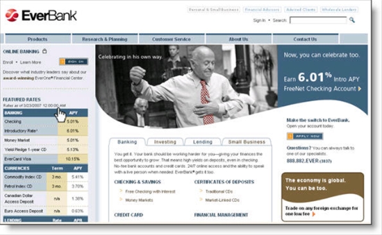
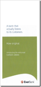
Everbank brochure front Everbank customers received snail mail today (see inset) announcing a newly designed website and multi-factor login procedure that debuts May 20. The company also changed its corporate "look," adopting a sage green and slate blue that looks modern, but more serious than the lime-green and orange Web 2.0 pallet.

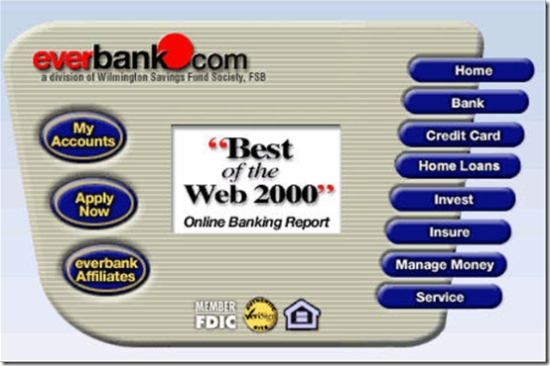
While we'll miss the old look, which featured our Online Banking Report Best of the Web logo in two places (see screenshot below), it was time to move forward. The old look not only was a bit dated, but also too cluttered.

The new design can be previewed now via a well-done, though slightly too long, video at <everbank.com/preview>. The key functional change in the new design is the move from a product-oriented main navigation to a more take-oriented approach. The five main navigation choices in the top bar are:

  • Products
  • Research & Planning
  • Customer Service
  • About Us
  • Contact Us

Secondary navigation is provided by tabs in the middle of the page.

From a marketing perspective, the homepage now features a single product in a highly visible spot. The upper graphic stands out well with the sweeping lower border (reminiscent of the famous Nike swoosh), while the three lower "banner ads" have been eliminated. The overall effect is a much more focused homepage which should drive more applicants to the core offer, which in the preview is the bank's 6.01% FreeNet checking 

A few other details Everbank cleaned up with the new design:

  • Single sign-on button instead of choice of four
  • Site-search box, instead of a link to the search function
  • Exposure to more rates across more products
  • Site map added in to link at bottom of page (not shown below)

One thing that surprised me about the new design was the removal of the toll-free telephone number which is prominently displayed in two spots on the about-to-be-replaced homepage (in the top-right corner and in a bold red font, about halfway down the right side). Perhaps, the bank is attempting to "right-channel" more visitors into the online application. It will be interesting to see if the bank brings the number back after a few months with the new design.

Grade: Overall, it looks like it will be an A or A-, but I will hold off final judgement until it goes live and can be fully evaluated. Maybe it's just me, but I still like the page they used six years ago (see last screenshot). It was short-lived, so it must not have driven enough sales, but it sure was a refreshing look compared to the typical bank website, especially six years ago. For more info, see our Online Banking Report on homepage design here and previous coverage of the topic here.  

New Everbank homepage design

New Everbank homepage coming 20 May 2007

Previous design

Current Everbank homepage 26 April 2007

Everbank circa 2001 (April)

Old Everbank homepage April 2001

Snail mail brochure (inside)

New Blog: Comala Connection from Comala Credit Union

Comala Credit Union: <comalacreditunion.blogspot.com>

comalacu_blog_home.jpg

Overview:

In our view, any blog is better than no blog; however, Comala Credit Union's new blog puts that hypothesis to a test. It's only been online for two weeks, so we'll cut them some slack, but they need to spruce it up a bit if they want members to trust it as a reliable resource.

Thanks to Ron Shevlin for posting the first link to the blog (here).
Update: Apparently, Morriss at Everthing CU had it first. Both posts were on the same day, but I doubt Ron posted his before the 12:19 AM entry at EverythingCU (here).

Metrics:

First post: 12 April 2007

Number of posts in April (April 1 to 25): 3

Comments in April: 3

Comments related to blog content or CU: 1

Traffic: not available

Score: 7 out of 18 (Grade = C-)

  • CU branding: No (just a small picture of what must be headquarters)
  • About this blog area: No
  • Relevant content: Not enough info (just 3 posts)
  • Appropriate post frequency: Not enough info 
  • Acceptable blog "tone": Yes
  • Prominent link to main CU website: No (buried in link list on lower right)
  • Email address for author or CU: No
  • Author name: No
  • Author bio: No 
  • Posts dated: Yes
  • Categories: Yes
  • Blog search: Yes
  • Professional look and feel: No (standard free Blogger template)
  • Comments: Yes 
  • CU response to comments: Yes
  • RSS signup: No (small Atom link at very bottom does allow feed signup; but it is difficult to find)
  • Email signup: No
  • Links to other appropriate resources: No
  • Prominent mention on main CU homepage: Yes (big time…and it blinks!)
  • Supplements text with occasional pictures/graphics: No

For more info on financial blogging:

Schwab Does Social Networking, Sponsors Gather.com

The social networking phenomena has left financial services mostly behind. Aside from a few banner ads here and there (see E*Trade's clever animated ad on MySpace here), financial institutions have stayed away. The risks of a poor brand association have so far outweighed the benefits of putting the bank name in front of millions of younger users. An added problem: Do banks have enough street cred on these sites to make even a small advertising investment pay off?

Wells Fargo is the only major U.S bank to dare try. With four blogs, a MySpace page, an early Second Life presence, and even a placeholder on Twitter, the bank is dipping its toes in social media (see coverage here). 

But not all social networks are about music and dating. Gather.com, the self-proclaimed "leader in social media for adults," boasts 210,000 members across nine channels: books, food, health, movies, music, news, politics, travel, and last but not least, money. The money channel, where I became member number 9,619 yesterday, has member posts in the usual areas: personal finance, investments, real estate, taxes and so on.   

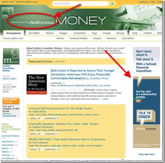
Last month, the company announced strategic advertising partnerships with five companies including Starbucks, Sony and Charles Schwab who implemented an impressive branding of the website's Money channel <money.gather.com> (see screenshot below). 

Analysis
According to Compete, more than 11% of the nation's online time is now logged at MySpace. Let me repeat: across all 200 million or so U.S. Internet users, more than 11% of the time is spent at MySpace. In terms of pageviews, it's even more dramatic, with the site accounting for 16% of all pageviews in December.

That level of usage is astounding. It's more than the combined total of eBay, Amazon, Google, MSN, AOL, and YouTube. Only Yahoo has anything close, with just under 9% share of time online. The only financial company cracking the top-20 was Bank of America, number 15 with 0.34% (see the full table at Compete's blog here).

Top 5 Websites in Attention
% of total time spent online in United States (Jan 2007)

  1. 11.3 % myspace.com  
  2. 8.6% yahoo.com   
  3. 3.5% ebay.com
  4. 3.4% msn.com
  5. 2.1% google.com

Source: Compete.com, Feb. 2007

There is no way that advertisers will ignore this much traffic. Financial institutions will eventually jump into social media sponsorships, especially as specialized areas are developed, such as Gather's Money channel. Advertising dollars follow the eyeballs so long as there is a viable advertising platform. And you can bet the large media companies that own the social networks will make sure they "monetize" the attention as effectively as possible.  

Schwab "owns" the main Money page at Gather.com 

Schwab has two large banners on Gather.com's money page

Note:

1. For those of you who haven't looked at the company financials recently, Schwab has about 7 million accounts and 300 branches. Here's the details from the press release (here):

The Charles Schwab Corporation (Nasdaq: SCHW) has more than 300 offices and 6.8 million client brokerage accounts, 570,000 corporate retirement plan participants, 149,000 banking accounts, and $1.3 trillion in client assets as of January 31, 2007.

iKobo and Nationwide Insurance Use Website Videos, with Very Different Results

With the majority of U.S. banking customers accessing the Internet via broadband, there is no longer any reason to restrict content to simple HTML. The success of YouTube and other video sites shows that consumers are more than willing to watch online video under the right circumstances.

Here are three ways to use video in your online marketing:

1. Viral marketing: Financial institutions are unlikely candidates to make a great impression on YouTube. More likely, any video involving a bank that happens to make the most-watched list will be satire. For example, the BofA/MBNA merger cover of U2 was big last year, with more than 500,000 views if you count the parodies of the original (here). But "good" viral marketing can happen. As we reported last week (here), Intuit's winning Tax Rap video has more than a quarter-million views.

2. How-to educational clips and demos: Flash animations and other interactive techniques have long been staples of online demos. Although they can cost a bit more, adding audio and video explanations to a screenshot-based demo can make them more effective. For example, CashAdvance.com does a good job explaining the process of requesting an online advance with the spokesperson at right (see here). CashAdvance provides the ability to "turn the guide off," an important option for those who prefer a quicker trip through the demo.   

3. Video as primary navigation: This is an entirely new use of video we haven't seen much in the financial services area. Instead of burying video and flash deep in "learn more" areas a few clicks off the main drag, companies such as consumer money-transfer specialist iKobo (see screenshot below) have replaced much of the HTML in their websites with audio-visual presentations. It's riskier, but if done right, it can be very effective, especially for more difficult financial information, such as international remittances, the core of iKobo's online money-transfer service.


How to do it right (or not)

The key to good Web-based video is speed. YouTube has forever altered the perception of how long one should wait for on-screen video to play. Even during the middle of the day on a popular clip, the first visual appears in less than a second and about a second later, the video starts; it's basically instantaneous. It's not DVD quality, or even close, but speed is generally far more important that screen resolution or size, especially for a sales pitch or demo. That's why the iKobo site (above) works so well. The mid-page videos usually take no more than a second to begin playing, less time than it would take for a new static HTML page to load.

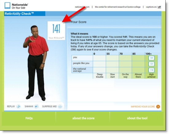
Nationwide RetirAbility check banner in Retirement section of its website Compare that experience to the Nationwide Insurance's new RetirAbility Check. The new tool was discussed last week at the Net.Finance conference (see our coverage here and screenshots below) in a joint presentation by Susan McManus, AVP Internet Corporate Marketing, and Eric Cantini from its rich-media vendor, Brulant

The tool is well conceived and looks stunning in a Powerpoint demo. And for those willing to commit up to 10 minutes to the process, it should help them learn more about the important topic of retirement planning. Depending on their answers along the way, eight short video clips are selected from a library of 235 and played for the user. Users are matched with an on-screen educator that coincides with their age and gender.  

The video clips are well done with believable dialogue and good acting; however, I found the entire thing a bit too slow and too cumbersome. Had I not been researching for this blog, I don't know if I would have made it all the way through. But the insurance company has added a clever incentive that might have kept me at it. Users receive a "score" at the end of the process designed to show how will prepared you are for retirement. It adds a bit of intrigue to the tool, motivating the highly-competitive American to keep at it to see if he or she is a retirement "winner."

And despite my reservations, it seems to be working. The company said that 68% of users who click START end up completing the tool even though it can take as long as 10 minutes to complete, and rarely less than 5 or 6 minutes. However, during a 6-week period after its 20 Oct 2006 launch (press release here), the company awarded more than $100,000 in prize money, including a $50,000 grand prize, for those completing the tool and entering the sweepstakes (see contest rules here). That has likely goosed the "finishing" number considerably. Currently, the tool is reached via a link on a homepage list (left side), or from the Retirement section. 

Unfortunately, the results of the RetirAbility Check cannot be stored online. Nationwide will email the results, but there is no way to come back later and see how your score has changed. Nor can you go back into the tool and change your answers to do "what-if" calculations on your savings or income. The company says it hopes to upgrade the tool so that it ties d
irectly into a secure area where users can return and see how their score changes over time.

The company might want to consider a low-bandwidth version for those with slow Internet connections and/or short attention spans. I doubt I'm the only one who would prefer to run through the retirement calculator in the more normal 45-second pace and skip the video rah-rah.

Nationwide RetirAbility final results page with score

Advice on improving your score

Blog Sighting: Member Connect from Piedmont Credit Union

Piedmont Credit Union: <piedmontcu.blogspot.com>

Comments:

It's a good start for Piedmont. The subject matter and writing style are good and it follows most "best practice" guidelines for financial institution blogging, scoring 13 out of 20 on our blog scorecard below. The blog is mentioned on the CU's homepage <piedmontcu.org> which helps introduce members to the new resource. Upgrading from the "blogger template" would make it more professional looking, and an email option would benefit the members and employees who want to follow the blog. Thanks to Trabian for posting the first link to the blog.

Metrics:

First post: March 2007

Number of posts in April (April 1 to 24): 10

Comments in April: 1

Comments related to blog content or CU: 0

Traffic: not available

Score: 13 out of 20 (Grade = B)

  • CU branding: Yes
  • About this blog area: No
  • Relevant content: Yes
  • Appropriate post frequency: Yes (2 to 3 per week)
  • Acceptable blog "tone": Yes
  • Prominent link to main CU website: No (buried in link list on lower right)
  • Email address for author or CU: Yes
  • Author name: Yes
  • Author bio: No 
  • Posts dated: Yes
  • Categories: Yes
  • Blog search: Yes
  • Professional look and feel: No (standard free blogger template)
  • Comments: Yes 
  • CU response to comments: Yes
  • RSS signup: No (small Atom link at very bottom does allow feed signup; but it is difficult to find)
  • Email signup: No
  • Links to other appropriate resources: Yes
  • Prominent mention on main CU homepage: Yes
  • Supplements text with occasional pictures/graphics: No (only one graphic used so far)

For more info on financial blogging:


Bank of America’s "Paid Placement" at Verizon Wireless Bill Payment

Update: It turns out that this was NOT a paid placement, but a joint marketing program. See April 27 post here.  

Here's an interesting twist on marketing bill payment services, Bank of America's  presence  on the Verizon Wireless post-login account page (see note 1). Here's how it works, according to a long-time reader and Verizon customer:

When Verizon wireless customers log in to their Verizon account online, the main page has a banner encouraging them to pay their bills at Bank of America's online billpay site (see below). Verizon also hosts a page on the benefits of paying through Bank of America and a link to the bank's login screen (see below).

I haven't seen this before, but since it all takes place behind Verizon's login, it's not visible to the outside world. I checked out the Verizon website this morning and Bank of America is not mentioned in the public areas. Has anyone seen this at other merchant sites? Leave a comment or email jim@netbanker.com.

Analysis
Everyone assumes that merchants want the bills paid directly on their site to maintain full control of the customer relationship. But evidently, even large merchants can be convinced to share the payment relationship if given proper incentives. 
 

Bank of America Banner on Verizon Main Account Page

Verizon Wireless account page with BofA billpay


More-info Page Hosted by Verizon Wireless

Verizon Wireless pitch for BofA bill pay  

Note:

1. I am assuming Bank of America is paying for the linkage; but it could be a joint marketing relationship where the bank pitches Verizon Wireless services in return for the exposure. The screenshots were submitted in early April.

Future Friday: Verity Credit Union’s Earth Day Tie-in

It's quite likely that energy consumption and environmental issues will grow in importance over the remainder of this decade and well into the next one. Financial institutions can play a positive role in promoting environmental causes both by their actions, such as Vancity's pledge to be carbon neutral by 2010, and by offering products that reduce paper consumption, such as eStatements and electronic payments (note 1). 

Seattle's Verity Credit Union <veritycu.com> demonstrates another approach: offering an environmentally friendly premium for home equity applicants. The free compact fluorescent light bulbs are relatively low-cost but have a lasting value to the customer. Finally, the credit union wraps it all up neatly with a tie-in to the upcoming Earth Day (see homepage screenshot below and note 2).

Verity Credit Union homepage

Notes:

1. Because saving paper also saves the bank money, be just a bit careful that you don't come off as overly self-serving when promoting estatement options. Passing on some of the savings to the end-user and/or donating a portion of the savings to a good cause, could ease any criticism you might get.

2. The Earth Day promotion was one of five promotions offered in the main ad box, accessed via a Seattle IP address at 4 PM April 20, 2007.   

Online Banking and Marketing Statistics from Net.Finance

Net.Finance 20007 landing page Since I'm a numbers junkie, whenever I'm at a conference, I try to note as many meaningful statistics as possible. By meaningful, I mean a number that provides an outsider with some insight into the business. Merely saying, "we beat our expectations by 63%" does NOT qualify, unless the speaker also shared their expectations. 

The flow of numbers was about a bit below average during the three days I attended Net.Finance, but the two professional researchers on the agenda, Jim Van Dyke of Javelin Strategy and Asaf Buchner of Jupiter Research, delivered slides chock full of statistics. I will check with them to see if they are willing to share with our readers. 

Here's some of the nuggets buried in the presentations from the other experts on stage: 

Most Eye-Opening Stat

  • Link to Prosper homepageDuring the past 14 months, more than 280,000 messages have been posted on the Prosper.com discussion forum, according to CEO Chris Larsen (see here for Colin Henderson's complete notes on this session).

    My take: That's an amazing level of consumer engagement with the new lending platform. To put that in perspective, Wells Fargo's Student Loandown blog has received 98 total comments during its eight months online.

Best Stat to Drop in a Business Case:

  • Link to VerityCU homepageShari Storm, CMO, Verity Credit Union, said that 1% of its new members named the blog when asked how they heard about Verity; the new members had an average of 2.7 accounts with $9,000 in deposits and $11,500 in loans (excluding mortgage); furthermore, the CU's blog, launched in Dec. 2004, now has 1,000 readers (see here for Colin Henderson's complete notes on this session)

    My take: While I don't recommend trying to turn this single data point into an ROI calculation, it's the first time I've heard a financial exec say something about blogging that the finance folks will appreciate (chalk up another first for Verity).

Stat that Most Contradicts My Previous Position:

  • Link to Vancity's changeeverything blogVancity's ChangeEverything.ca blog, launched commercially in Sept 2006, now has 1,000 registered users who've generated more than 2,000 blog entries and comments; in total, the site has had 45,000 unique visitors according to William Azaroff, Interactive Marketing Manager (see here for Colin Henderson's complete notes on this session)

    My take: Despite my reservations about whether it would gain traction without a financial services perspective (see our Online Banking Report on Bank 2.0 here), Vancity's unique blog has gained a small, but growing, worldwide following, and, more importantly, has contributed measurably to Vancity's efforts to help its community and create positive brand positioning for the CU. Nice work.  

Blogging/Podcasting:

  • Key Bank's most popular podcast, top stock picks by John Caldwell, has recorded 70,000 visits and 12,000 unique users, according to Interactive Marketing Manager Mickey Mencin
  • Colin Henderson, BankWatch blogger and former BMO exec, mentioned that 39% of Canadians are now reading blogs 

Online Marketing:

  • Colin Henderson also cited Forrester findings that 50% of recent financial buyers did 100% of their research online; 30% performed both on- and offline research; and just 20% conducted all the research offline. In Citibank's late 2005 new checking account promotion, the bank gave away 275,000 iPods, according to Charles DeFelice, SVP customer information environment (it wasn't specified if this was the POTENTIAL or ACTUAL number given away, since consumers had to follow through with a number of electronic activities over a period of months in order to qualify for the freebie
  • Jon Kaplan, head of Google's financial services group, said that 60% of Google users have a personalized (Google) page and that 20% of Google search volume originates from these pages
  • GE Money's SVP of Strategy Vincenzo Picone said the company has 300 million customers with $190 billion in assets across 54 countries which led to a net profit of $3.5 billion in 2006; the company has 2010 targets for 300 million unique visitors; $20 billion in online originations and 1 billion transactions via the online and mobile channel
  • U.K.'s Lloyds TSB experienced a 71% revenue lift (against a control) on its homepage by implementing Touch Clarity's (now Omniture) targeted ad server which uses a number of variables to determine which ads should be shown to an individual visitor; according to Omniture's Brent Hieggelke who showed results from a case study presented by Lloyds TSB at a recent conference

Mobile Banking:

  • Jennifer Vos, director of Citi Mobile, Citibank's new mobile banking service, said that one-third of current Citi customers have input mobile phone numbers into the bank's alert system; furthermore, the new mobile offering was piloted by 100 employees, who have recently been joined by another hundred users in the southern California market

Small Business Banking:

  • Wells Fargo has 150,000 "very active" small-business online banking users according to Eskander Matta, SVP of internet services group; businesses are making $45 million in payments per month with the bank's DirectPay servic
    e launched just a year ago

Branding:

  • 94% of ING Direct's customers would recommend it to a friend, according to John Owens, Head of Marketing

Online Banking:

  • Customer satisfaction in online banking, while on the rise, still trails online retailing by five percentage points, 78% vs. 83%, according to Larry Freed, CEO Foresee Results

Zopa Provides Update on U.S. Launch Plans

Zopa email 19 April 2007 update on US launch plans Without providing specific dates, Zopa sent an email to its house list today providing a progress report on its upcoming U.S. launch (see inset). The person-to-person lending exchange now expects a national launch rather than the state-by-state approach previously announced.

The company said it's completed its site redesign, underwriting system, ID verification system and product lineup. And signaling the importance of its U.S. launch, Zopa named a new CEO, Doug Dolton, who will run both the U.S. and U.K. operations out of San Francisco.  

The email raised more questions about the exact business model to be employed, saying only that it's "made adjustments to Zopa necessary for launching in the U.S." Zopa has been talking to credit unions about partnering, but no announcements have been made (previous coverage here).

Intuit Scores Viral Hit with The Tax Rap

Link to Intuit's webpage At WBR's Net.Finance conference yesterday, Jon Kaplan, head of Google's Financial Services Group, showcased ways to work with Google that were NOT related to search. He showed some cool and free ways to showcase your brand on Google Earth, Google Gadgets, Google Calendar, and more. We'll look at those in future posts, but by far the most entertaining example is Intuit's refreshingly creative TurboTax Rap promotion.

The company sponsored a contest that ended on the traditional U.S. tax day, April 15, that offered a top prize of $25,000 to the best YouTube video featuring TurboTax. Intuit also gave the first runner-up $5,000 and the third place video $1,000. And anyone who uploaded a video entry received a free copy of TurboTax. Intuit hired 1980's rapper Vanilla Ice to do the intro and announce the winner.  

To promote the contest, Intuit created a special-purpose website (see screenshot below) and built a YouTube page (see below). The winning entry, showcased on Intuit's YouTube page, has more than 250,000 views. That's enough to put it on YouTube's most-viewed page (currently, it's number 13 on this week's most viewed), which really turbocharges the viewership. In comparison, the two runner-ups have less than 9,000 views.

This is brilliant work by Intuit. Although it was a costly promotion, it was still less than a major print buy and more importantly, it introduced the TurboTax brand to a whole new group of younger customers who'll be buying tax software for many decades. It will be interesting to see if Intuit makes this an annual event.

YouTube page  <youtube.com/thetaxrap>

Intuit's TurboTax Rap YouTube homepage

Website home <turbotax.intuit.com/taxrap>

Turbotax rap home page at Intuit

Mobile Money & Payments 2.0 Released: The Latest from Online Banking Report

Mobile Money & Payments 2.0 from Online Banking ReportOur parent publication, Online Banking Report, has just released its latest in-depth report: Mobile Money & Payments 2.0: Why credit & debit card issuers should embrace mobile delivery now

  • Link to the full report here
  • Link to the abstract here

The report builds on last month's Mobile Banking Report (report here), this time looking at the rollout of mobile payments in North America. The report recommends tactical and strategic options for financial institutions both in the short-term and into the next decade. In addition, several innovators are highlighted including Obopay, PayPal Mobile, and NTT DoCoMo.

The Title Says it All: "Online Banking: Protecting the Earth and Yourself"

A few days after our recent post on pro-environment banking programs (here), we were greeted with this headline in yesterday's Seattle P-I:

Seattle PI article on online banking benefits

The tide has definitely turned in media perceptions of online banking. Here's a short history of the mass media view of online banking:

1994 to 1997: Sounds good, but what is it?

1998 to 1999: All things online are great

2000 to 2002: All things online are over-hyped

2003 to 2006: Is it really secure?

2007 to ???: Protecting the earth and yourself 

Naturally, I think online banking is great, but I never expected to see it elevated to motherhood-and-apple-pie status. The PI article (here) uses recent NACHA and Javelin numbers to recommend online banking both for its paper-saving and identity-theft prevention benefits. Time Magazine (April 9 issue) also listed "paying your bills online" as one of 51 things consumers can do now to help the environment (here).

However, Time might need to beef up the math skills on its fact-checking team. The article says paying all bills online would save 1.6 billion tons of paper. That would be more than 2,000 pounds every month for every U.S. household, even I don't get that much junk mail. I'm guessing they meant 1.6 billion pounds not tons, which would be about 15 pounds of bills per year per household.