Before and After: Wells Fargo’s New Website Design

image Two weeks ago, Wells Fargo rolled out a new homepage design. Based on a quick Google news search, it doesn’t seem to have received any negative comments. And that’s good.

Wells Fargo has maintained its overall good design for almost ten years (see previous versions below), so most visitors are accustomed to the bank’s no-nonsense approach to content and navigation. The new site maintains the look and feel of previous generations, while overhauling top-level navigation. While it may not win design awards, the new layout works really well, and that’s very good.

The most noticeable change shows that Wells finally eliminated its mid-page “link farm” navigation, in use since 2004 (see screenshots). It was replaced by fly-out “mega menus” that expand over the top half of the page when a cursor hovers over a primary navigation item. While these menus can be annoying when they hide content you were looking at, most website users are accustomed to them, and they are a good way to expose the broad offerings of a large commercial bank.

The other big change is something more unique to Wells Fargo: the “financial needs ribbon” (Wells calls it a “carousel”). It’s a swipe-able/clickable link to seven major financial topics:

  • Home Lending (see arrows, example below): Mortgages and first-time buyer education
  • Banking Made Easy: Pitching checking, savings and online/mobile banking
  • Borrowing and Credit: Promotes entry-level credit services
  • Retirement: Savings, IRA, etc.
  • Protect What Counts: Insurance
  • Fraud Information Center: Security and identity-theft protection
  • Going to College: Budgeting, scholarships and student loans

On a desktop, my first impression of the ribbon was that it cluttered the page with redundant links. But the more I looked at it, especially after being briefed by the Wells Fargo homepage team this week (note 1), the more it makes sense.

The drop-down menu and/or the search box are efficient for visitors who know exactly what they are looking for. But for those that are not thinking in specific banking-product terms, the needs-based terminology may strike a chord, e.g., “Protect What Counts” instead of “Insurance.” The ribbon also allows the bank to showcase important services more prominently and more thoroughly.

But to truly appreciate the new approach, you must open the site on a tablet (I tested on full iPad). On a touch-screen, the ribbon, and the underlying content, are smoothly swiped from left-to-right or right-to-left, making for a very professional looking tablet-website.

Bottom line: While the homepage is still slightly cluttered for my tastes (do they really need 4+ “happy family” shots on the homepage?), I think the bank has done a good job managing the tradeoff between simplicity and exposing all that it has to offer. And the touchscreen-friendly content-ribbon is a design innovation I think we’ll see at other financial institutions in the future.

———————————–

New Design: Launched June 8, 2013

image

Before: June 2012

image

Before: June 2008

image

Before: June 2004

 image

—————————

Notes:
1. For a more thorough recap of the Wells Fargo redesign, see Mary Wisniewski’s American Banker interview of Shannon Lundgren, Wells Fargo VP Product Management of Digital Sales & Service.     
2. Hopefully, I can convince my friends at comScore to send over some before-and-after data once they’ve had a few months to measure the new site’s performance.  
3. We continually look at website design and UX in our industry subscription service, Online Banking Report. All-Access subscribers are entitled to a complimentary high-level website review each year. 

TD Bank Launches Dynamic Login Page

image It’s no secret that a first-time online banking visitor has far different needs than the power user returning for login #1,712. But most banking sites provide the same visual login treatment for all users.

That forces new users to search out buried "getting started" or "register" links. Or they will make time-consuming, and expensive, phone calls to customer service for guidance.

And the one-size-fits-all approach is not optimal for experienced users either. As they skim by the static boilerplate in the banking version of banner blindness, power users miss the chance to learn more about new features and promotions.

The new design unveiled last week (4 June 2013; see old look in last screenshot below) from TD Canada Trust aims to solve both problems: 

  • After selecting login on the homepage, new users are shown a page with prominent help on how to get started along with links to register, take a tour, get help and so on (see first screenshot below).
  • Previously logged in visitors see a page featuring a banner below the login box emphasizing a single online banking feature and contextual links on the right (see second screenshot).

Bottom line: I like the concept. And eventually the bank can segment even tighter showing different looks for intermediate users, mobile-primary customers, French-speaking customers, and so on. Even in this first iteration, TD could make it better by:

  • Greeting/welcoming the customer
  • Providing more detailed instructions (e.g. What’s the optional "description" box for?, Why are they asking for access card number or username?)
  • Adding more graphical emphasis to draw the user’s attention

For reference, see how Chase Bank handles new and existing visitors.

——————————————

TD Canada Trust login page: First-time user (4 June 2013)
Note: Getting started info placed in right column

TD Bank login page: new user

TD Canada Trust login page: Existing user
Note: Online banking tips are displayed under the login box and contextual links are shown on right, in this case a link to the mobile app

TD Canada Trust login page: Existing user

Previous login page (3 June 2013)

Previous login page prior to june 4 2013

FinDesign: Making it Easy for Visitors to Find Online/Mobile Banking Features

image I know our readers have passed graduate level coursework in digital banking. But sometimes, even the PhD candidates need a refresher in the basics. Here’s a fundamental that too many financial institutions neglect:

Make it super easy for visitors (non-customers especially) to find information about online and mobile banking

Just about every bank has an obvious login button in the top-right or top-left corners (or Chase who has it plastered in the middle). That’s fine for existing customers. But what about those simply shopping banks? You would think that online/mobile capabilities are pretty important to someone checking you out online!

The big-four U.S. banks do a good job exposing online and mobile features. Citibank is especially focused with its “bank online….make memories offline” tagline mid-page (screenshot below).

But finding the online banking features often requires menu hunting (see BofA, Chase, and Wells below) and/or promotion scanning (see Citibank, Wells and Atlantic Regional FCU below). And sometimes, it’s below the fold (Sterling Bank, BECU) or a screen away (see Comerica below).

Bottom line: You don’t want to get too cute with the fundamentals. That’s why we like the direct approach of both U.S. Bank and Bank of American Fork who position Online Banking as the first tab in their primary navigation (screenshots below). Alternatively, startups Moven and Simple use page-dominating screenshots of their mobile app to position themselves with mobile bankers (see below).

————————————-

Bank of American Fork
No, that’s not a typo. This community bank blankets American Fork, Utah, with its 13 branches. It places online banking in its own tab, plus it launches a huge mega-menu detailing all the personal and business online and mobile features. (Plus it has cookies, the kind you eat, in one of the four rotating promotions).

image


US Bank
US Bank is the only one with an “online banking” tab. And it’s positioned in the pole position. Mobile banking is listed in the mega-menu.

image

_____________________________
The big 4 (alpha order)

Bank of America
While it’s not in the main tab, both online and mobile are mentioned on mega-menu displayed when you hover over the “Bank” tab. And there is an online banking promo in the lower left.

image

Chase
Similar approach to Bank of America. However, online and mobile are buried pretty far down the popup mega-menu.

image

Citibank
Citi does not beat around the bush. Their entire homepage is devoted to driving users to online banking (first screenshot). And those that launch the mega-menu, see online banking, billpay & Popmoney at the top (second screenshot). However, the bank has no mention of “mobile” anywhere.

image

image

Wells Fargo
Online & mobile have the top position under “Banking” on the homepage. In addition, there are promotions and links scattered about the homepage.

image

_____________________________
Other examples

Atlantic Regional Federal Credit Union (link)
If you don’t have online banking in the main nav, you need to compensate elsewhere. Atlantic Regional’s BancVue-designed site uses the fashionable full-page graphic to draw attention to its four rotating promotions. Number 2 leads shown below leads directly to online banking info. The CU is also running a mobile banking announcement across the top of the page.

image

Bank Simple
Simple turns the double-play with an excellent welcome video and a snazzy shot of its iPhone app in action.

image

Moven Bank
Moven is all about the mobile, and visitors can’t miss that with the page-dominating visual.

image

Comerica
The bank currently has no mention of online banking on its homepage. However, once a visitor goes to the Personal or Small Business page, it is listed on the drop-down mega-menu.

image

—————————

Note: We cover financial website and mobile design issues periodically in our Online Banking Report (subscription).

Website Winners: Logix Federal Credit Union

imageThe Financial Brand today published a list of 50 “spectacular websites” from banks and credit unions. While their methodology wasn’t disclosed (see note 1), the winners appear to share one major trait, stunning homepage visuals. The first 20 are especially notable. (BTW, I would have put Citibank and Square in the top 20.)

We’ve already written about ten of the top 20: Salem Five (#1), Simple (#5), PNC Virtual Wallet (#7), USAA (#10), Mango (#12), Perkstreet (#14), Virgin Money (#15), Mint (#16), Movenbank (#18) and Comerica (#19).

But I wasn’t familiar with most of the other top-20, and as a huge admirer of Mr. Pilcher’s tastes in all things financial, I can’t wait to visit the others and report back.

Let’s start with the one that first caught my eye in the screenshot rundown:
Logix Federal Credit Union (Burbank, CA; $3.5 bil; 110,000 members), which for 75 years (until last July) was known as Lockheed Aircraft FCU (screenshot #1).

Observations:

  • The CU, which has the challenge of getting members to accept its new name, has adopted this cute orange robot (Robix) as its brand ambassador and has developed a number of contests and promotions around it. It’s a great way to send a youthful, innovative vibe that fits well with the CU’s North Hollywood location. And it makes for an engaging graphic image. Weber Marketing provided the name change and rebranding package. Extractable did the website design.
  • The website uses a nonstandard primary navigation bar running across the middle of the page. The design uses different background colors above and below the nav bar which helps draw attention to the navigation. The primary nav bar reverts back to the top after leaving the homepage.
  • Secondary navigation pops up in a megamenu below the main nav bar. This works pretty well, though some of the choices were below the fold on my 12-inch laptop, making them hard to get to. But users who are annoyed by megamenu popups can click on the primary items (Banking, Loans, Investments & Insurance, Business) and find all the secondary nav items on a single page arranged in standard HTML format. 
  • There are four versions of the homepage, which I discovered with a page refresh. The second version includes a closeup shot of the robot and features a different promotion in the top-right promotion area (see second screenshot below).
  • Headline copy is cute and concise.
  • The robot branding is carried to its Facebook page which has garnered about 1,500 likes.

Bottom line: The delightful robot image (high-tech, yet playful), orange color scheme, and ample use of white space are great attention-grabbers. Great work and very refreshing.

————————————

Logix Federal Credit Union homepage #1 (11 March 2013)

 image  


Logix Federal Credit Union homepage #2

Note: The “Bright Futures” promotion for youth checking.

image

Logix Federal Credit Union homepage #3

image

Logix Federal Credit Union homepage #4

image

Logix Federal Credit Union Facebook page (link)

image

Note:
1. Update (3 PM, 11 March): Jeffry Pilcher, Editor (and owner) of The Financial Brand, told me that it is a collection of websites that he was fond of design-wise. And that the numbering is not a precise measure of their standing, but more a loose indicator, i.e., #2 is ahead of #40, but there is not necessarily a material difference between #2 and #12. 

Chase Bank’s Remodel: The Death of the “Swiss Army Knife” Banking Homepage?

chase mobile logo reflection.jpg

I’m still digesting Chase’s radical homepage
redesign (see screenshots 1 & 2). While I love the focus
on just three product messages, devoting 50% of the page (above the fold
even
) to the login button seems like a lost opportunity. Perhaps it’s a
temporary welcome area to ease users back onto the site.

chase dropdown.jpg

Only existing customers get the half-screen
login. Non-customers get an additional marketing message on about two-thirds of that
space (see screenshot 3).

The new site looks great on an iPad (portrait or landscape), but it’s not
served to iPhone users at this point. They still see the ultra-trim mobile
screen <m.chase.com>. 

The bank has drastically reduced navigation options. A single tab called
Products & Services launches a dropdown box with links to all the
product areas (see inset).

A second tab, Why Chase?, lays out the major benefits, the
missing tab
at most banking sites. And the final tab, which seems completely
redundant, causes a drop-down login box to appear.

Although I missed it initially, Chase has not done away with the
Personal/Business/Commercial designations. Tiny links in the upper left
allow users to head to the appropriate business version. Biz services are also
listed on the Products & Services dropdown (bottom of inset).

Bottom line: Chase has moved past trying to be all things to
all people on the homepage. That’s huge, and I hope it becomes a trend. Both
Citi and Bank of America have taken similar
paths recently. But Citi uses
striking photography
in the background to give it a more luxurious feel
(as does Salem
Five
). And Bank of America exposes more product areas across the top
(Bank, Borrow, Invest, Protect, Plan).

All in all, I applaud the streamlining after what must have been an epic
battle. But I don’t think the bank has completely hit the mark. Make it an A-  

——————————

1. Chase Bank homepage on first visit (4
Oct 2012; with customer cookies; via PC Chrome browser
)

Chase new site 1.jpg

2. Return visit
Note: Welcome to
our New Home Page replaced with Slate credit-card promo (lower-link portion of
page remains the same and is not shown below)

chase new site 2.jpg

3. Chase Bank homepage with no customer
cookies

chase newsite 3.jpg

4. Landing page explaining changes (link)

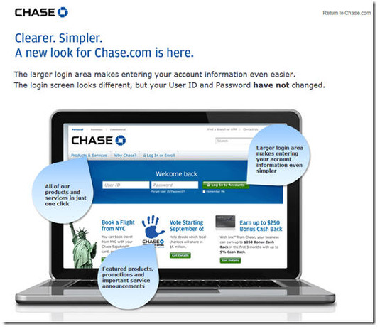
chase newpage lander.jpg


Bank Simple Innovations #5 and #6: Message Badge & Message Center

image Following it the third installment on the innovations from Simple. The onboarding process was covered in the first two segments, now we move to the online UI.

Part 1: Innovations #1 and #2: Demo mode after login
Part 2: Innovations #3 and #4: Debit-card mailer

________________________________________________

#5 Red message-waiting badge
________________________________________________

This week, Simple launched Goals, its first budgeting/savings feature. Customers were alerted to the new feature via email (see note 1) and online message. Within online banking, users are notified of new messages by a red badge over the Support button on the top-nav (see first screenshot).

Clicking the button causes the right-side of the screen to turn into an integrated message center (see below).

________________________________________________

#6 Integrated message center
________________________________________________

The Simple message center is integrated into the main online banking UI better than most (screenshot 2). Users have three choices to click on:

  • Call Us launches a popup with a large toll-free number that no user could overlook (screenshot 5)
  • Start a Conversation launches a blank email form integrated into the UI (screenshot 3)
  • 1 Unread Message which then displays the full message along with a place to respond, even for this marketing message (screenshot 4)

The message notification badge is intuitive, especially for iPhone users. And the way it contrasts with the gray nav bar really makes it pop. The integrated message center takes a little getting used to, because it’s not at all what I expected. For example, I thought “start a conversation” would lead to an online chat. And initially I didn’t see where the full message was located. The “1 Unread Message” button looks more like an indicator, not so much a clickable item.

Bottom line: Once I figured out where to click, I appreciated the integrated approach. It is nice to be able to respond to messages without losing site of my main task, checking my balance and transactions.

—————————————-

1. Simple’s main online banking page shows a red number badge in right-hand corner when an unread message is waiting (22 Aug 2012)
Note: Transaction listing includes a tag showing when a tip has been added

Simple's main online banking page shows a red number badge in right-hand corner when an unread message is waiting

2. Simple’s integrated message center

2. Simple's integrated message center

2a. Message center close-up              3. Create new message
Note: All message center functions remain pinned to the right-side of the main online banking page

image       image

4. Full message

image

5. Simple “Call Us” popup

Simple "Call Us" popup

———————————————-

Notes:
1. The email itself was a let down, a generic message requesting that I log in to see what was up.
2. For more info on Simple, see our look at Truly Virtual Banks in our Oct 2011 Online Banking Report (subscription).
3. We’ve tackled remote banking customer service and messaging a number of times in previous Online Banking Reports. The last one was Live Help published last year.

Everbank Takes Gold in Change Sciences Ranking of Small Biz Banking Online Sales, BB&T is Runner-up

Small Biz Banking Ranking from Change SciencesI’ve had a consumer account at Everbank since shortly after it launched in 1998. And I’ve continued to be a fan, both of the bank, and of its co-founder and product-guru Rob Foregger’s subsequent work at Personal Capital and others. But I hadn’t realized that Everbank excelled on the small biz side.

Change Sciences, which quantifies and compares bank user experience in various verticals, ranked Everbank #1 in its just-published report (subscription) on online sales of small-business banking services.

As you can see from the methodology below, Change Sciences is looking at the discovery and sales process for small biz banking, not the actual online banking experience itself.

Everbank took first by a solid 3-point margin over runner-up BB&T. Most of the big banks were bunched just below BB&T. PNC Bank and US Bank were just a point lower and BofA was just two points lower. SunTrust and Wells also finished four points under BB&T.

————————————

Everbank offers an extensive menu of business benefits via mouseover dropdown menu (6 Aug 2012)

image

————————————

Note: Change Sciences methodology (from its website)

Each site is evaluated (via desktop browser) against a series of criteria by a Change Sciences analyst. The analyst reviews pages and screens that are part of a critical user task. As the tasks are evaluated, the analyst does three things:
• Looks for predefined user-experience characteristics and features.
• Evaluates the page for ease of use or usability, and applies heuristics accordingly.
• Looks for unexpected enhancements, which we call pleasant surprises.

Tasks evaluated:
• Getting a first impression
• Learning about the bank’s approach to its small-business customers
• Finding out about checking and lending products
• Learning about online banking
• Getting to apply options

Design: PayPal’s New Website (with before and after screenshots)

PayPal has always had one of the better financial sites. It started out very simple in 1999, but over the years it became a bit bloated with competing messages for its various constituencies. And the overall look, while true to its roots, looked a little 2007-ish, which makes complete sense since that’s when the company last remodeled.

So a major overhaul was due. Here’s a quick look at the biggest changes. It’s a good roadmap for any financial website, though PayPal’s status as a payments platform makes some of its design decisions different than what a retail bank should do.

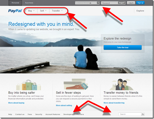
The main homepage makes a better first impression now that it mimics the trendy design feature of a large peaceful background image (used by Citibank, Square, Salem Five and many others). The page is also significantly simplified.

But the biggest change is in the primary action words used for transactions:

Before: Pay Online | Send | Get Money
Now: Buy | Sell | Transfer

The new verbs are short and to-the-point, but regular users will miss the Send (originally it was called Beam Money) and Get Money (aka Request Money prior to 2007) names which have been around for more than a decade.

Overall, it’s a great change and helps PayPal maintain parity with Square and a number of other hip payments upstarts. 

________________________________________________

Personal homepage
________________________________________________

In addition to the above, there are a number of other changes:

  • Instead of tabs, PayPal now uses text to indicate top-level navigation of Personal and Business (it also eliminated the redundant Home tab)
  • Moved login from an upper-left box (typical for banks) to the top line in the upper right (typical for newer ecommerce sites)
  • Dropdown arrows are used to uncover sub-navigation items below Buy/Sell/Transfer
  • Moved the utility functions (Contact Us, Search, etc. down to the bottom instead of along the top)

Before (19 June 2012)

PayPal homepage before July 2012

After (9 July 2012)

New PayPal personal homepage (July 2012)

________________________________________________

Business homepage
________________________________________________

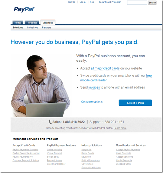
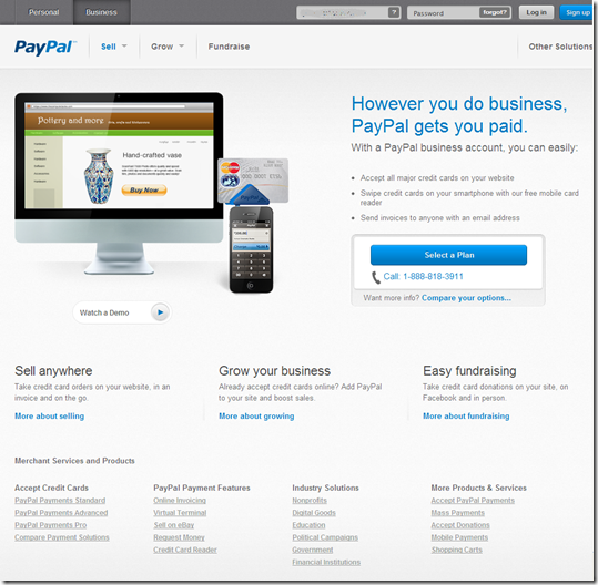
The Business page changes weren’t as dramatic because it’s mostly a marketing page:

  • The three main navigation items changed from Solutions | Industries | Partners to Sell | Grow | Fundraise, a nice improvement.
  • There is now a direct login on the page in the exact same spot as on the Personal page
  • The PayPal Here dongle is now pictured in the middle

Before

PayPal business homepage before July 2012

After

PayPal new design business homepage (July 2912) 

_________________________________________

Other functions
__________________________________________
Note: Click on any of the thumbnails to enlarge

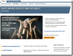
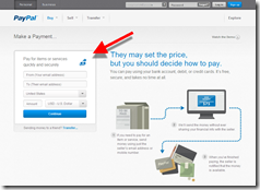
Before: Pay Online                       After: Make a Payment

PayPal pay online page before July 2012   

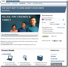
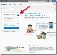
 Before: Send Money        After: Transfer | Send Someone Money

PayPal Send Money page before July 2012    PayPal new Transfer funds page July 2012

Before: Get Paid                         After: Request a Payment

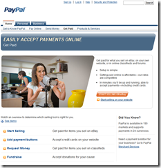
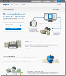
PayPal Get Paid page before July 2012     PayPal new request a payment page July 2012

Before: Get to know PayPal            After: Account Features

PayPal products page before July 2012      PayPal new Account Features page July 2012

————————————

Note: We cover financial website and mobile design issues periodically in our Online Banking Report (subscription).

Feature Friday: Bank Balance Forecast

imageAs Simple begins the 6-month process of converting its 100,000-person wait list into paying customers, I expect much attention will be given to its flagship UI innovation, a forecast of your “free cash” after accounting for upcoming transaction. Simple has trademarked the feature as the Safe-to-Spend balance (screenshot below).

We’ve discussed it a number of times in our Online Banking Report (subscription), but we haven’t explored it in Netbanker. Here’s why balance forecasting is so important:

  • Intuitive UI: Hundreds of millions of people worldwide log in to their bank accounts at least weekly. Why? To see their balance and to make a mental calculation of whether things are on track. Whether they consciously think it or not, they are making their own calculation of what’s left in the account to spend. And given how horrible the average person is at making complex math calculations in their head, it makes so much sense to put that number right in from of them at all times.
  • Advocacy: Doesn’t everyone want to believe that the place where they entrust their live savings is looking out for their best interests? But events of the past five years have seriously eroded consumer confidence in financial institutions, especially large banks. Providing a new tool that really helps consumer understand their financial position, and reduce the chances of overdrafting, could go a long way in restoring confidence that the bank is not the enemy.
  • Gateway to advanced PFM services: Doing important calculations on the consumer’s behalf is what PFM is all about. So showing that you have the wherewithal to make this important calculation, can be the entry point for delivering more advanced PFM services, hopefully at a profitable monthly fee (note 1).
  • Great competitive weapon: Want to compete with Bank Simple? Want to show you are ahead of the curve. This is a perfect, tangible feature/benefit.

Bottom line: This is not the easiest feature to add. Maybe one of the hardest. And you should expect to spend quite a bit of time explaining it to employees and customers. But it absolutely will be part of every online banking system and third-party PFM service (see also, HelloWallet’s “left to spend below).
————————

Simple makes it impossible to miss your “Safe-to-Spend” balance (22 June 2012)

Bank Simple "Safe to Spend" balance

HelloWallet’s mobile app has a “Left to Spend” balance for both in total and for the specific budget category (22 June 2012)

image

—————————

Note:
1. We are putting the finishing touches on an update of our PFM report (May 2010, subscription). You’ll see an announcement here next week.

First Arkansas Homepage Goes All In with Social Media

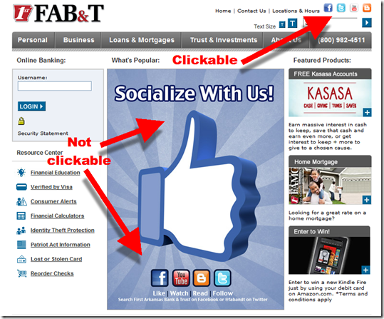
image I don’t know how long First Arkansas Bank & Trust has had a big Facebook-like image dominating its homepage (see below), but it’s timely given all the attention the social network has received of late. Despite a little blip with the IPO, Facebook is one of most significant brands on the planet. So associating your financial brand with it is a good move.

FAB&T is using the homepage to create awareness of its four social network outlets:

  • Facebook | Like
  • Twitter | Follow
  • YouTube | Watch
  • Blog | Read

The huge Socialize With Us image is eye-catching and would garner a fair number of clicks, except for one problem. The entire center graphic, including the social media icons, are not clickable. The only way to get to the sites is to click on their icons in the upper right corner of the homepage (note 1). This is a strange design decision.  

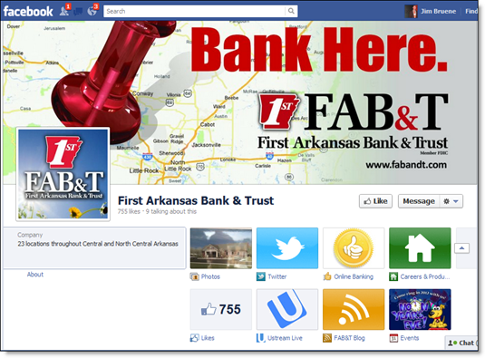
Bottom line: While I like the approach of exposing all the trendy social media icons, I’m not sure FAB&T should be sending people to all four. The bank’s Facebook page is good, with a modern design, frequent updates, and 755 fans (see second screenshot). So, it makes sense to encourage users to visit and like it.

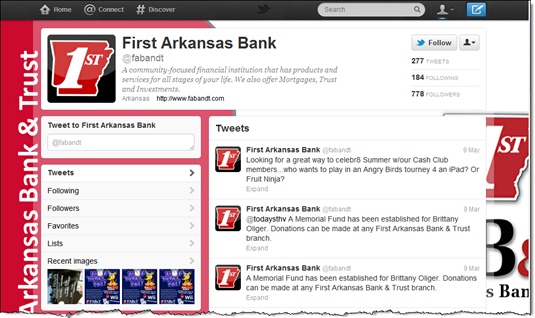
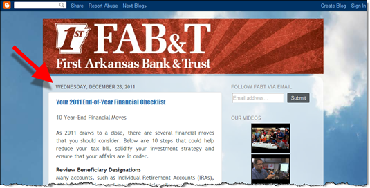
However, the other social media sites are a little anemic. The blog hasn’t been updated since the end of 2011; there has only been one tweet in the past 2 months; and the YouTube channel has limited content.

Like most financial institutions, FAB&T would probably be better served by focusing on Facebook (note 2) and letting the other sites go, or at least stop referring customers to them from the homepage. 

————————————————

First Arkansas Bank homepage (31 May 2012)

First Arkansas Bank homepage (31 May 2012)

First Arkansas Bank Facebook page (link)

FAB&T Facebook page  

First Arkansas Bank Twitter page (link)
Note: The bank had one tweet in May, zero in April and a couple in March.

image

First Arkansas Bank Blog (link)
Note: The last post was almost six months ago. And the site is hosted on the Google’s free blogging platform, Blogger, which doesn’t really do much to help with the brand image.

image

————————————

Notes:
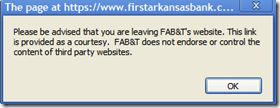
image 1. And those all require users to click through a "third-party warning" before redirecting the user to the social network sites. That further gums up the user experience.
2. See our Online Banking Report "Banking in Facebook" published in Feb. 2012 (subscription).

Design: Three Fixes Needed to Make Mobile Banking as Widely Used as a Weather App

image Today I noticed something in Square’s latest Card Case app that I’d missed when it was announced last month. It’s a feature they call "tilt to map" which means that if you turn the phone sideways you see a map of nearby locations using Square (see inset, note 1).  

That’s one of those slick, mobile tricks (like remote deposit) that you can’t quite duplicate on the desktop. However, none of the mobile features have pulled me away from desktop banking, yet.

Why? Partly, it’s because I have a laptop with me 24/7 and am almost always in a wifi zone. But even so, I’ve switched to mobile for most other low-bandwidth information services such as weather, traffic, maps, sports scores, movie times, Twitter feed, flight tracking, concert calendar, renting movies, and so on.

What will it take to get banking on this list?

Three fundamental issues need to be solved (with relative magnitude in parenthesis):

1. Make it much easier to login (60%)
None of of the mobile info services I use regularly require any type of login (after initial registration). Banks often allow the username to be saved, which helps, but the typical 8+ digit alphanumeric password is still not a good user experience on mobile. A four or five-digit numerical PIN would solve 80% of this problem. Or even better, install read-only access to certain data. 

2. Make it easier to navigate (30%)
There should be almost no navigation required to see my balance and transaction stream. Square’s "tilt-to" function could be used by a bank to display account balances in portrait mode and a transaction stream in landscape.  

3. Provide security education & guarantees (10%)
This is not an issue for me. In general, I think mobile banking is more secure than desktop (see note 2). But the general public is still unsure about mobile security. You can change this by providing understandable security guarantees for mobile users.

—–

Notes:
1. ING Direct also uses the same trick, displaying links to its social media sites when the app is tilted to landscape mode.
2. For more improving security perceptions, see our latest Online Banking Report.

The Missing Tab at Banking Websites

image You can debate whether branches are dead or simply need a good pruning, but there is no argument about the importance of a well-designed website where prospective customers can learn about what you have to offer. 

Financial institutions do a good job showcasing products, rates, and available accounts. But shoppers, especially ones not already familiar with you, want to understand what it’s like to bank with you and whether you’ll be there for them if there’s a problem.

That’s something you can get a feel for when visiting a the brick-and-mortar branch. But try figuring that out online. Product info is everywhere, but what’s it REALLY like to bank there? 

So along with your usual product and line-of-business tabs, consider adding a tab on the primary navigation leading to a section highlighting the benefits of your bank or credit union. Many companies have an About page, but that’s often an afterthought and usually doesn’t make a strong case.

Here are two examples we found in a quick search, not coincidentally from web-only financial companies that don’t have the luxury of branch staff to explain their benefits:

  • Banking with Ally (first screenshot)
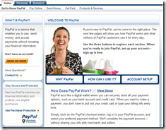
  • Get to know PayPal (second screenshot)  

Bottom line: It will be one of the more difficult sections to build. But also one of the more important.

—————————

Ally Bank “Banking with Ally” (see screenshot below):

 image


PayPal “Get to Know PayPal” (15 March 2012)

image