I’m still digesting Chase’s radical homepage
redesign (see screenshots 1 & 2). While I love the focus
on just three product messages, devoting 50% of the page (above the fold
even) to the login button seems like a lost opportunity. Perhaps it’s a
temporary welcome area to ease users back onto the site.

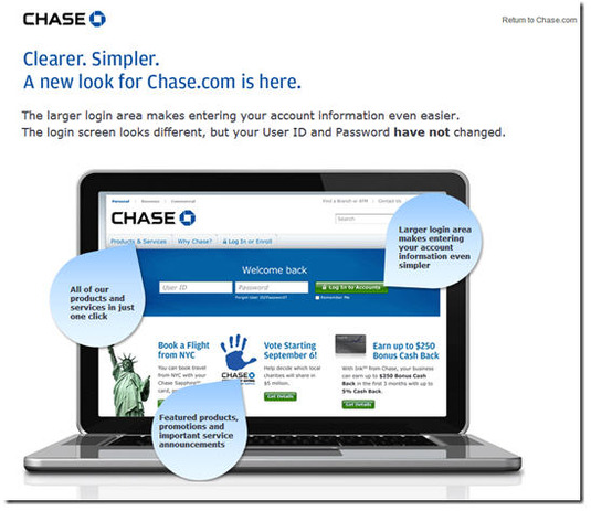
Only existing customers get the half-screen
login. Non-customers get an additional marketing message on about two-thirds of that
space (see screenshot 3).
The new site looks great on an iPad (portrait or landscape), but it’s not
served to iPhone users at this point. They still see the ultra-trim mobile
screen <m.chase.com>.
The bank has drastically reduced navigation options. A single tab called
Products & Services launches a dropdown box with links to all the
product areas (see inset).
A second tab, Why Chase?, lays out the major benefits, the
missing tab at most banking sites. And the final tab, which seems completely
redundant, causes a drop-down login box to appear.
Although I missed it initially, Chase has not done away with the
Personal/Business/Commercial designations. Tiny links in the upper left
allow users to head to the appropriate business version. Biz services are also
listed on the Products & Services dropdown (bottom of inset).
Bottom line: Chase has moved past trying to be all things to
all people on the homepage. That’s huge, and I hope it becomes a trend. Both
Citi and Bank of America have taken similar
paths recently. But Citi uses
striking photography in the background to give it a more luxurious feel
(as does Salem
Five). And Bank of America exposes more product areas across the top
(Bank, Borrow, Invest, Protect, Plan).
All in all, I applaud the streamlining after what must have been an epic
battle. But I don’t think the bank has completely hit the mark. Make it an A-
——————————
1. Chase Bank homepage on first visit (4
Oct 2012; with customer cookies; via PC Chrome browser)

2. Return visit
Note: Welcome to
our New Home Page replaced with Slate credit-card promo (lower-link portion of
page remains the same and is not shown below)

3. Chase Bank homepage with no customer
cookies

4. Landing page explaining changes (link)