Put an End to “3 Strikes and You’re Out” Password Management

3_strikesPassword management is a pain and only promises to get worse as banks and other ecommerce providers tighten up access controls due to sophisticated fraud attacks.

However there is one area where some banks are still "penny-wise and pound foolish." Specifically, the old-fashioned notion of locking an account after three unsuccessful password attempts.

It’s just too easy for to miss three times. Here’s what just happened to me at Bank One’s credit card site:

1. Correct username, incorrect password
2. Correct username, retype same (incorrect) password in case I made an inadvertent typo the first time (since the password is masked and I can’t see what I typed the first time)
3. Correct username, another shot at the password which turned out to be incorrect (probably because I changed it last time I was locked out)

RESULT: Locked out and in need of an account reset, which luckily you can do online if you have the card number, expiration date, 3-digit code, and primary social security number.

Analysis
The last time we took an in-depth survey, in our April 2003 report on Security & Privacy (OBR 93/94), 4 of the 14 major financial institutions we tested locked users out after just three attempts, while 6 of 14 fell within the recommended range of 5 to 10 attempts.

We recommend that you allow at least five unsuccessful logins, and preferably closer to 10, prior to freezing the account. The amount of fraud deterred between locking out at three attempts vs. locking out at six is so small as to be virtually unmeasurable. However, there is a real cost in customer service and consumer dissatisfaction for constantly requiring password resets.

OK, I feel better now. Thanks for listening.

JB

Communicating through RSS/XML feeds

Looking for an alternative to email for marketing and service communications?

Bank_of_montreal_newsfeedAs more users subscribe to RSS (Rich Site Summary or Really Simple Syndication) or XML feeds to automate the process of reading online news, blogs, and other information, they will expect their financial institution to support this communications technique.

Bmo_xmlfeeds_allThe only bank XML feed we’ve seen so far is Bank of Montreal, which publishes its Online Banking News as an XML feed. Bank of Montreal has published 15 items since the feed became available in early March, including interest rate changes, usage tips, and security warnings (click on the thumbnail left to see all 15 items published).

The bank pubicizes the feed on its online banking login page (see inset right). Bmo_feeds_link

Analysis
According to the Pew Internet Project, only six million U.S. users were receiving RSS feeds in November, 2004, approximately 5% of total Internet users. Even if that number has doubled by now, it still a small minority of users.

However, now that Firefox and Apple’s Safari browser contain built-in RSS readers, it’s only a matter of time before Internet Explorer supports this feature. IE users can still use RSS feeds, but they must download a toolbar add-in such as Feed Scout (www.bytescout.com), use an aggregation site such as BlogLines (www.bloglines.com), or download a standalone newsreader such as Feed Demon (www.download.com). 

Once newsreaders become incorporated in most browsers, we expect usage to skyrocket. Most ecommerce players are expected to published feeds to support customer service and sales. For example, Amazon already offers XML feeds in more than 100 categories, updating users on new items in everything from mystery books, to hip-hop CDs, and action-figure toys.

Banks looking to project a modern image might as well get ahead of the curve and start sending service messages via XML feeds in 2005. It’s a good way to get information out to users who no longer receive or trust your email messages. Producing an XML feed is a relatively inexpensive project with little downside. If resources are too tight, make sure you add it to your 2006 plan.

For more information:
Wikipedia definition
Walt Mossberg’s Personal Technology column (5/5/05 Wall Street Journal)

JB

Banking Bill Payment Guarantees

Checkfree_logoWe believe a strong bill payment guarantee is crucial, not only to the credibility of your epayments program, but by implication, to your entire online banking offering. CheckFree has offered its logo up for years, but your customers want to know what YOU will do for them; most would prefer to know nothing about CheckFree.

And your guarantee needs to be visible to both online banking users and those just thinking about it. One of the best ways to increase visibility is by creating a "bill-pay guarantee" icon that users can click through to learn more about it.

Citi_billpay_logo_1 One of the better examples is at Citibank (inset) on its logon page. When you click on the logo, a small popup appears (click on the thumbnail below):

Citi_billpay_guarantee_1*

This guarantee has great copy, you can tell the marketing department was heavily involved. Rather than just reiterating the rather droll performance guarantee,* the bank also highlights several benefits:

  • No hidden charges, in other words, unlike "free checking," bill pay really is free
  • 24/7 service with "fast response"

*Citi’s bill-pay guarantee states that payments will be processed within 24-hours and delivered to payees according to the schedule, or the bank will pay for any fees incurred.

JB

Charter One Bank Screws Up their Email Messaging

Charter_one_message I first wrote about the benefits of email alerts in the third issue of Online Banking Report nearly ten years ago (OBR 3, June 1995). Since then I’ve enjoyed watching the service unfold, and I’ve never met an alert I didn’t like — until this week.

An email messaging pioneer, Charter One Bank, with a suite of email/fax/voice alerts named OBR Best of the Web in 2003, laid an egg this week.

I’ve had an account there for years and have received seven or eight hundred daily mini-statements in that time. Surprisingly, those daily messages have remained absolutely the same. No advertising, no service messages, no cross-sales. Not even a holiday greeting.

Imagine my surprise when last week I received, in addition to my daily statement, a New Message Alert (click on screenshot above) that said in part:

On March 21 a new message was delivered to your Online Banking Message Center. Please click here to view this important message.

Surprisingly, it didn’t occur to me that this could be a phish (it wasn’t). I really was afraid something had gone terribly wrong with my account. I couldn’t remember my username or password and the "lost password" function returned an error message. So I had to wait until I was home where it was written down.

As I anxiously logged into my account, expecting the worst, I wondered how I would cover the check I’d just written off the account. The first thing I did was check my balance. Phew, it was what I expected, just enough to avoid monthly fees. Then I crossed my fingers and navigated to the secure message center where the all-important message waited.

Imagine my "customer experience" when I found that Charter One had sent me on this harrowing chase only to inform me that (click on screenshot below):

Effective April 10, 2005, Charter One Bank’s Online
Banking service will no longer process one-time or
recurring online transfers to or from a passbook
savings account.

Charter_one_message_center_1 Not only do I not have a passbook savings account, I have no other accounts beside checking, so I am ineligible to make any type of transfer on the system. What a terrible waste of my time.

Seven days later, I get yet another message insisting that I log back into the site for another "important message." This one wasn’t much better. The bank was alerting me to an upcoming bill payment service slowdown. Never mind that I had never sent a bill payment nor activated the service in more than two years of maintaining an account at Charter One.

Moral of the Story
As a consumer, after enduring two false alarms, I feel this way about the bank:

1. They do not know me as a customer.
2. They do not care if they waste my time.
3. They have no ability to send targeted email.
4. They lack a basic level of common sense.
5. They do not know how to communicate through email.

Analysis
It would have been so easy to keep this from happening. The bank could have done any of the following:
a) Sent these message only to users of the specific accounts/functions
b) Assuming their system doesn’t allow (A), they could have sent the entire message to my Internet email address so I didn’t have to login to see it
c) Not sent the message at all to my Internet email and simply posted the message within the online banking area

Takeaways
The email relationship with your customer is powerful, yet extremely fragile. A few irrelevant "important information" messages, especially if a website login is required to access the message, can kill the entire channel.

JB

Making Online Chat Pay for Financial Websites

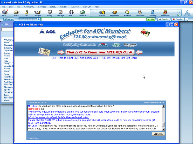
Aol_chat_xsell_click_to_enlarge After giving AOL for Broadband a try, we decided to switch back to our old $4.95/mo plan we’ve been on for the last 5 or 6 years. Since it wasn’t listed as a choice in the normal pricing plan area, we clicked on the "live chat" button.

Within in few seconds we were live with an AOL rep, and within another minute or two, the rep had us switched back to our old plan. It was a very satisfactory experience.

Action Items
During the chat process we noticed two things that financial institutions should consider adding to their live chat functions:

1. Copy/print button in the lower-right allows users to print or save a transcript of the chat session. A great tool for satisfying the finicky customer who wants a record of their customer service interactions.

2. End-of-the-session cross-sell: After fixing our problem, the chat session automatically presented us with an opportunity to purchase an ancillary service at a special discount. The offer was delivered both in text in the chat window and through a banner above the chat area (click on the screenshot above to see more detail). This could be an effective sales technique so long as it’s delivered in the spirit of helping the customer.

JB

Competitive Comparisons of Services (e.g. Mortgage Rates)

Indy_mac_click_to_enlarge_2

There is one marketing technique that is much easier to do online than through other media — competitive comparisons.

In the old print world, you might be able to update your brochure or ad once or twice per year. Online you can do it in near-real-time.

We’ve long been a fan of IndyMac’s mortgage comparison, first writing about it in Online Banking Report #72 (June 2001). The mortgage lender shows the total mortgage cost at various major competitors, even daring to include examples where it’s not the lowest overall price.

These competitive price comparisons are great, and if you consistently have lower prices, then you should use this approach.

But what about companies that compete on service more than price? After all, most consumers aren’t going to choose a bank, simply to save a buck a month on fees.

Idea
If your service is markedly better than your competition, create a comparison chart showing your service standards and capabilities stacked up against the competition.

Even better, hire an independent researcher to document search times, wait times, response times, resolution times, and so on, and post them to your website on a frequent basis. Not only will this impress prospects, its excellent reinforcement to your current customers and employees that you are measurably better than the rest.

JB

Secure Bank Message Area Grows in Importance

One way around the rapidly declining effectiveness of email communications is to prominently post new messages within the secure online banking area. Not only is it useful to create an archive of bank communications, it also provides reassurance that no message(s) have been missed.

Ebay recently added this capability to its the My eBay platform, where users can login to track account activity. Ebay keeps messages for 60 days. Financial institutions should allow storage for far longer, one year at least.

Because bank messages are often time sensitive, you should also send the message, or a message notification to the user’s standard email account. Better yet, allow users to receive message notifications at multiple email accounts, therefore increasing the chances that one will go through.

Action Item
Many banks already have this capability, but it may be overlooked by customers, as they have become accustomed to receiving messages over the Internet.

Now would be a good time to remind customers to look in their message folder periodically. You might run a sweepstakes or treasure hunt that requires looking into message folders to win.

If you’d like to learn more about the future of online bank messaging, check out the Online Banking & Bill Pay Forecast: Current, future and historical usage: 1994 to 2016 from our sister publication, The Online Banking Report.

Improving the “Look and Feel” of Bank Emails

In our most recent tests, we found great improvement in the quality and
timeliness of responses to Web-based queries. However, we found that the “look
and feel” of email responses left a lot to be desired. The typical bank response
was a few lines of text and perhaps a link or two to general information. And
because of poor choices in the FROM and SUBJECT fields, the responses looked
spam like and easily overlooked.


Compare those bank messages to email responses from leading Web-based
retailers and service providers such as GoDaddy, an Internet domain name
registrar (screenshot below). Most savvy retailers use graphically
appealing HTML messages to get their point across effectively, and when
appropriate, up-sell the user on a solution that solves their problem. In the
GoDaddy example below, I asked a question about website capabilities and
received an excellent response along with an appropriate upsell into their
$3.95/mo hosting option (see note point 4 on the screenshot below).


GoDaddy knows shows their savvy in responding to customer service inquiries.
Not only is it good looking and answers my question, it arrived eight minutes
after the question was submitted, beating by three minutes the
expected call center hold time listed on the website. That’s how to deliver
e-service, faster than alternative channels. The email response grabs your
attention with a well-designed layout including the following (see
corresponding numbers above
):

1.      Answer to my question (at the top)

2.      A real person responding to the question

3.      Link to a privacy
policy                                                 
                                                                

4.      Banner to select the service upgrade about which I had inquired

5.      Phone numbers for customer support

6.      Repeat of my original question (not visible on the
screenshot)          

My only major complaint with GoDaddy’s message is that it fails to identify
itself in either the email From field (it used “Support”) or the
Subject
field (it used: “Other: One page website incident 040506-001360”). 

Bank Examples

In comparison, the typical bank response is delivered in plain text with few
helpful links. Following are examples of banks responses to a general
non-customer query via their websites.  

The question posed: Do you offer overdraft protection that does not
charge for each advance?

Email response from Chase to a question about whether they
offered no-fee overdraft protection: The speedy response, 41 minutes, answered
the question correctly and concisely and provided a phone number for more
information. However, there were no links in case I wanted to sign right up for
the account I asked about. Score: A for service, D for sales. (09 Apr 2004)

Teller-Assisted Self-Service Platform : “Truly Automated Teller Machines”

04-dec-b01.jpg

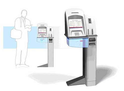
Teller-assist terminals from Source Technologies could be deployed as a pod
around a human. This mock-up from the company’s website shows a relatively tight
arrangement. Initially, customers are likely to want a bit more privacy to feel
comfortable using the semi-self-service terminals.

 Teller-assist terminals can also be installed as standalone terminals
anywhere in a branch, or like traditional ATMs, in an off-site location.


U.S. Bancorp’s Stingy Email Storage

Usually we discuss innovations, this is an exception. We’ll call this a non-innovation, non-ovation for short.

In a time where all the huge Web-based email providers, led by Google’s free 1 GB of storage, U.S. Bank decides to delete emails sitting in customer in-boxes (within their online banking platform) after just 30 days. This includes estatement notifications.

Assuming the average customer gets one message per month, and each message is 2k in length, that saves about 20k in storage costs per customer, compared to keeping the messages for one year. Assuming the marginal cost for disk space is $10 per GB, that policy change will save an awesome 2 one-hundredths of a cent per customer per year, or $200 per 1 million customers.

Extensive online archive space is one of the biggest benefits of banking online. Don’t be pinch pennies on one of the lowest-cost aspects of your online Usually we discuss innovations, this is an exception. We’ll call this a non-innovation, nonovation for short.

In a time where all the huge Web-based email providers, led by Google’s free 1 GB of storage, U.S. Bank decides to delete emails sitting in customer in-boxes (within their online banking platform) after just 30 days. This includes estatement notifications.

Assuming the average customer gets one message per month, and each message is 2k in length, that saves about 20k in storage costs per customer. Assuming the marginal cost for disk space is $10 per GB, that policy change will save an awesome 2 one-hundredths of a cent per customer per year, or $2,000 per 1 million customers.

Extensive online archive space is one of the biggest benefits of banking online. Don’t be pinch pennies on one of the lowest-cost aspects of your online presence.

JB

——————————————————–
The full text of the message is repeated below:
——————————————————–

Date: 09/14/04
To: Jim Bruene
From: U.S. Bank

Subject: Messages now refreshed after 30 days

In an effort to populate the message center with current information, all messages, including ones related to online statements, will be deleted after 30 days. However, online statements will continue to be available for up to 90 days and can be accessed in the Recent Statement area at the top and bottom of each account Transaction History page. Online statement customers will continue to receive a message in the Message Center when a new statement is available.

——————————————————–
If you’d like to learn more about the future of online bank messaging, check out the Online Banking & Bill Pay Forecast: Current, future and historical usage: 1994 to 2016 from our sister publication, The Online Banking Report.

Electronic Messaging Opportunities and How to use for Cost-Reduction Benefits

Electronic messaging is wide-open for innovation. The content, delivery, and
style of your electronic messaging provide numerous points of differentiation,
and the business case is positive with potential retention, cross-sale, and
cost-reduction benefits (see OBR 91/92 for a complete analysis).


Source: Online Banking Report, 9/04
 

Who Has the Best E-Service?

It’s difficult for outsiders to judge a bank’s service levels unless you
interview a number of customers as Vividence and others are doing or use the
bank’s products yourself. However, the bank’s website does provide clues to
the relative value placed on e-service. Here are the things we would look
for as a prospective customer, all of which are affordable even to the
smallest organization:

Table 35

Ten Clues You Are Dealing with a Top E-Service
Organization

1.       Help function accessible from every page

2.       Easy-to-find prices (not buried on the eighth page of the
account agreement)

3.       Contact Us or About Us section prominently
displays telephone numbers, email,
and mail addresses

4.       Service standards and guarantees prominently posted

5.       Detailed and up-to-date FAQs

6.       Customer feedback encouraged; for example, suggestion box or
satisfaction survey

7.       Third-party endorsements/affiliations displayed, such as
Member Better Business Bureau
, Chamber of Commerce, TrustE,
etc.

8.       Hours of operation displayed in appropriate areas

9.       Customer service staff and/or line management (especially branch
managers) identified by name with online bios/pictures

10.    Customer testimonials and/or Q&A forums with actual customer
questions

Source: Online Banking Report, 3/04


Table 36

Customer Experience at Major U.S. Card Issuers*

Rank

Card Issuer

1

Capital One

2

American Express

3

Discover Card

4

Citibank

5

Wells Fargo

6

Bank of America

7

Chase

8

Bank One (First USA)

9

MBNA

10

Fleet

Source: Vividence, 4/04; Evaluations took place in July and August 2003;
Banks evaluated but not making the top 5 were: Fleet, US Bank, Wachovia


In terms of actual service experiences, we can only judge the companies
we’ve personally used, they include: American Bank, American Express, Bank
One (card only), Bank of America (card only), Capital One, Centura,
CharterOne, Chase (card only), Citibank (card and account aggregation),
DeepGreen Bank, Everbank, ING Direct, Juniper Bank, National City
(aggregation only), NextCard, Providian, Security First Network Bank, U.S.
Bank, Wells Fargo (card only), X.com/PayPal. Many of these accounts are
little-used, so we don’t have much opportunity to experience the entirety of
the company’s service efforts. However, among those accounts only ING
Direct, PayPal, and before they went out of business, NextCard, standout in
terms of overall online delivery. Other places do a great job servicing our
accounts online, but have not provided a truly memorable experience, the
kind of performance that generates unsolicited word-of-mouth referrals.  

A number of third parties evaluate financial website usability and
service. One of the most thorough is Vividence,* which evaluates
customer experience at the 10 largest banks and ten largest card issuers. In
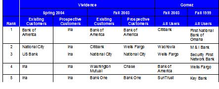
its latest analysis completed this month, Vividence ranked Bank of
America
tops in customer experience for existing customers, National
City
was second, and US Bank third.

The longest-running service evaluation is by Gomez Advisors (now
owned by WatchFire), which ranks online banks across five categories,
including customer confidence. Gomez determines the customer
confidence score by evaluating the bank’s website and mystery shopping
customer service. The most recent Gomez scorecard ranked Citibank first,
Wachovia second, and Wells Fargo third.              


Table 37

Ranking Customer Experience at Major U.S. Banks
04-april-b05.jpg

Sources: Vividence and Gomez, see below for details

Vividence, 4/04 & 9/03; Evaluations took place in July and August 2003;
Banks evaluated but not making the top 5 were: Fleet, US Bank, Wachovia;
Vividence Customer Experience Rankings are benchmarking studies using
proprietary software tracking behavior and opinions across a 2000-user
panel.

Watchfire Gomez Pro 10/03 & 10/99; Banks evaluated in Fall 2003 but not
making the top 5: American Bank/pcbanker.com, American Express-Banking,
Associated Bank (WI), Bank One, Chase, Charter One Bank, Citizens Bank,
Commerce Bank (NJ), E*TRADE Bank, First Internet Bank of Indiana, First
National Bank of Omaha, First Tennessee Bank, Fleet, Hibernia National Bank,
Huntington, NetBank, National City Bank, Key Bank, HSBC, PNC Bank,
SouthTrust Bank, U.S. Bank, Union Bank of California, Washington Mutual,
Webster Bank