Feature Friday: Free Financial Consults for BankMobile VIPs

Feature Friday: Free Financial Consults for BankMobile VIPs

bankmobile_watchYou can’t imagine how many times I’ve gone to Google looking for results to “bank + VIP” and similar searches. The bifurcation of digital banking into a free standard service and a fee-based gold version has been one of my longest-standing, and so far, lousiest predictions (for example, my 2006 rant). So I was pretty intrigued when I saw the email pitch from BankMobile’s PR folks about its new VIP offering (press release).

The digital-bank division of Pennsylvania-based Customers Bank (powered by Finovate alum, Malauzai), which has grabbed 3,000 accounts in its first four months, added two perks to anyone who drops $1,500 or more into their checking account each month:

  1. ATM rebates: Unlimited reimbursement for use of any of 400,000 U.S. ATMs
  2. Free Financial Coach: Unlimited consults with a financial adviser

The ATM rebate is pretty standard and makes sense for a digital-only player. But the unlimited free financial coaching is a unique feature I’ve not seen before.

On the surface, it’s an awesome benefit. Who doesn’t want the ability to check in with “a person with a wealth of knowledge and tools to help you reach your financial goals”? But, it’s going to take some effort to convince BankMobile’s young customer base to trust these advisers. I am hopeful the bank will get those folks blogging, tweeting, facebooking, instagramming and just generally answering customer questions in public to build credibility.

Final thoughts: I think BankMobile is on to something here: recognizing loyal direct-deposit users with additional benefits. But I also think the bank should add a monthly or annual fee for the VIP option. Like many card programs, the fee can (should?) be waived the first year (or more). The fee would give the account more credibility, more perceived value and eventually measurable revenue that can be plowed back into more value-adds.

Delivering High-touch Service without Breaking the Bank

Delivering High-touch Service without Breaking the Bank

idea_bank_mobiledeposit_car_rightThere continues to be a healthy debate about the future of bank branches. Usually the focus is on whether bank customers of the future will go to physical branches for help. The answer to that depends not only on consumer preferences—clearly a large segment desires a branch option— but also on costs to deliver on those preferences.

The bigger question: To what extent do consumers want to interact with humans to optimize their financial experiences? And if human interaction is still needed/desired/preferred, how can it be most effectively delivered accounting for cost, effectiveness, customer satisfaction, revenue generation, and so on.

We’ve looked at technology solutions—chat, call backs, IVR, etc.—over the years. But one area we haven’t explored here is the idea of delivering the human help at the customer’s location instead of at the bank’s. I got to thinking about it after hearing an interview with Ron Johnson at today’s Collision conference. Johnson, the mastermind of Apple’s retail stores, and former JCPenney CEO, just launched Enjoy, which adds a human component to the buying process for higher-end electronics (screenshot below, news coverage).

enjoy_homepage

Like Best Buy’s Geek Squad, when you buy something online at Enjoy, one of its employees actually delivers and sets up your new equipment (currently only in San Francisco and NYC) at no extra cost over retail prices. When pressed on how they could make money doing this, Johnson said they were taking all the overhead expense of a brick-and-mortar location and instead investing it into talented employees who can deliver a better experience at the customer’s location—or at a nearby coffee shop.

Banks can do the same thing. If someone wants to open an account and doesn’t want to, or can’t, do it online, the bank can dispatch someone to take care of it at a location chosen by the customer. Already a typical model for many financial professionals—e.g., mortgage brokers, insurance brokers, business bankers, stock brokers, financial planners, etc.—the key to making it work is to simultaneously downsize physical brand costs; otherwise, mobile bankers are just an added expense.

You can see this idea playing out in Poland, where small-biz focused Idea Bank has deployed four high-tech electric BMW i3 cars (see inset above) to collect deposits from small business customers via an ATM built into the side (see demo here). As with Uber, visits from the roving depositories are scheduled via smartphone app. Security-wise, I’m not sure this is the best way to handle cash, but I do like the idea of mobilized bankers.

Bottom line: Branch or no branch, many customers still need occasional hand-holding. It will be interesting to see how that plays out with a smartphone-wielding customer base.

Transaction Alerts Need to Get Smarter

fraud word cloud.jpgMy inbox is far from normal. With 25 active financial accounts, all set to maximum notifications, I am drowning in email alerts, push notifications and other helpful communications. But who isn’t overloaded with missives from social media, news feeds, spambots and whatever else is competing for your attention.

Banks need to help users cut down on the noise, by offering smart alerts that don’t bog you down in trivial details. Not to pick on anyone in particular, because all my providers do pretty much the same thing (with the notable exception of BillGuard), but this alert from Bank of America today (see below) is a good example of info overload.
Yes, I’m sure I asked the bank to notify me of any card-not-present transactions. Given the amount of times my card number has been breached in the past five years, it’s a good early warning. But really, do you think it’s necessary to tell me for the 89th consecutive month that you paid my $8.75 Netflix monthly fee? Really, I just want to be informed if it were to suddenly go up or be repeated.
BofA would probably want my permission to stop sending me this monthly alert. So how about a little button that says, “Don’t tell me about this charge if it’s the same next month” or something along those lines. And this should also be an option in the bank’s alert dashboard: “Please don’t alert me to repetitive monthly fees, unless they change.”

Thanks for listening.

——-
Bank of America email alert (18 Feb 2015)
bofa_alert.jpg
——-
Source: Fraud artwork above from NCUA’s MyCreditUnion

Call Centers Still Integral to Digital Banking

Guest post by Jeanne Capachin, Founder & Principal of CAPACHIN Research.

————————-

image What do you do after you’ve led the call center for the White House? For Les Boothby, you run an amazing contact center for Elevations Credit Union, headquartered in Boulder, Colorado. There are several things about Les and what he does that point to the future of banking in a digital-first world.

First, Les is passionate about his people and about member service. At Elevations, the contact center is a vibrant, engaging place to work. Les and his leadership team’s attitude and Elevations’ focus on service are in full view. This focus is borne out by the Just Say Yes attitude of the staff. Even if it means calls that last over an hour, or visits to a member’s home, they own the relationships and are prepared to do what it takes to solidify relationships.

A great demonstration of Elevations’ commitment came during my visit with Les and the Contact Center team last month. I was a few minutes early, and Les ended up being a few minutes late. Why? Because he was working with a member of his team and with a gentleman who couldn’t get into his online banking application. The call was escalated to Les when the inquiry became technically complex. The member had updated his operating system and anti-virus software which changed some advanced browser settings. They worked with this member for over 90 minutes checking software version updates and changing browser configuration settings and eventually succeeded. The payoff was a satisfied member able to continue banking online through his preferred browser.

While the credit union’s service may be above and beyond what other institutions provide, this is what it takes to serve members and customers in a digital world. A significant portion of call center volume is about online, mobile, and tablet banking. At Elevations, technology-related calls were just 8% of the total in 2011, now they are 25%.

But when members call, they don’t want to talk to the Geek Squad. They are looking for a sympathetic person who can explain to them in plain English how to solve their problems. Elevations call center staff aren’t divided into technology and/or product specialists. Members have just two choices when they dial in: Member Services or Loan Information. With generalist call center staff focused on relationships, members needn’t navigate through a complex decision tree.

In addition to telephone support, the contact center also supports secure chat through the online channel. But the CU finds that members prefer picking up the phone. So as members embrace new technology for transactions, they turn to the oldest remote channel, the telephone, for more complex queries.

In its mission to serve its members anywhere and anytime, Elevations has also opened two new branches that are less branch, and more member advice/support center. These branches look more like a hotel lobby. There are tablets to walk members through digital banking services, an ATM, and a counter with a cash handler and two terminals. Through conversation and social interactions, the branch staff learn more about their member’s financial needs, and can introduce them to financial or technology products. If staff are in their offices, they happily bound out to greet members. The credit union embraces an omni-channel experience, and is using their physical locations to subtly transition members to digital channels.

__________________________________

Bottom line
__________________________________

As we build out omni-channel banking, the call center still plays a central role. It has long been the catch-all for complex issues, both technical and transaction related. Contact center representatives, like those at Elevations, must be able to think on their feet and make judgment calls. They must understand when to waive fees, when to offer additional services, probe to find root issues, and really own the problem.

At Elevations, hiring for attitude is key, and they empower their staff to solve problems. The CU has a comprehensive, month-long training program to educate all staff on member service, products, and technology. Contact center staff are briefed on all marketing programs before they are conducted, and educated on all digital solutions before they are introduced to the member base. Metrics in the contact center focus on enhancing and stabilizing relationships. Call volume is important, but more critical is the ability to retain members and sell appropriate products.

As institutions examine their omni-channel strategies, a refresh of the contact center should be part of the effort. If Elevations is an example of where we’re headed, we’ll be in good hands.

—————–

Figure 1: This is a Call Center?

Macintosh HD:Users:jeannecapachin:Pictures:iPhoto Library.photolibrary:Masters:2014:04:03:20140403-154230:photo 1.JPG

Figure 2 Genius Bar at an Elevations Branch

Macintosh HD:Users:jeannecapachin:Pictures:iPhoto Library.photolibrary:Masters:2014:04:03:20140403-154214:Genius Bar.jpg


—————–

Author: CAPACHIN Research founder and principal Jeanne Capachin has been working in the financial services industry for more than 30 years. Working with financial institutions, research providers, and technology vendors, Ms. Capachin educates and informs her clients and helps them grow their businesses. You can reach her at jeanne@capachin.com.

Mobile Monday: Reminding Customers to Make Mobile Number Primary

image Now that mobile is on its way to becoming the dominant banking interaction channel, we are going to obsess on the nitty-gritty details this year, both here and in our Online Banking Report newsletter. 

First up: How to get better mobile data into your CRM. By now many (most?) readers do a good job grabbing mobile numbers during new customer onboarding. But are you doing the same with existing customers? And even if you have a mobile number on file, is it the primary phone number on the customer’s account?

Capital One 360 (formerly ING Direct) is reminding customers at login to take a look at their account info on file. And furthermore, the bank has added a small reminder to make your mobile number primary, if desired (see screenshot below).

Bottom line: Having the best primary phone number is a small, but important, part of servicing customers effectively. My only quibble with Capital One’s implementation is that the reminder is easy to overlook as it’s buried mid-page in a small font with a blue “i” graphic. A more dramatic graphical treatment would improve the results.

——————————————

Capital One 360 login reminder page (30 Dec 2013)

image

—————

Image source: Mobile First webinar by Ken Fang posted on Howto.gov

Communicating Downtime and Other Tech Problems to Banking Customers

image While digital delivery is pretty stable these days, every business has the occasional service interruption, slowdown or hiccup. Even when inconvenienced, most customers are tolerant if you do a good job of communicating during the crisis.

So, what do good communications look like? It depends on the problem of course, but standard tools include:

  • Tweets and Facebook status updates every hour or two (especially if your main website is down, or crippled)
  • Emails or text messages (depending on customer preferences) at least once per day, or more frequently if there is new info
  • Proactive communications to press and other stakeholders (method varies depends on severity of the problem and communication preferences of recipient)
  • Scripts and on-hold messages on the VRU
  • YouTube video
  • Status updates, FAQs and contact info hosted on alternative website (during an outage)
  • Post-crisis FAQ posted on main website for those impacted to read about how it was resolved

Choosing the medium is the easy part. Crafting the content is much harder. Make sure you cover the basics:

1. Concise explanation of the problem and who felt the impact

2. Apologize for the inconvenience

3. Details of what is being done to fix it

4. Timetable for a fix

5. Where to look for periodic updates to above

6. Contact info for questions

Anecdotally, most financial institutions do pretty good on this scale, hitting three or four of the six. But few get them all.

_____________________________________________________________________

Mini-Case Study: Capital One 360 Mortgage Conversion
_____________________________________________________________________

The most recent example of a service glitch in my accounts came from Capital One 360 (formerly ING Direct USA) a few days ago (note 1). As you can see from the screenshot below, they did a good job of owning up to the situation, providing a special email address for questions, and keeping the message short and sincere. That said, the bank failed to explain the problem, its severity and who was affected. And, inexplicably, they forget the A word, as in “I apologize.” But overall, I’ll rate this a B or B+ in glitch response.

I have a mortgage at Capital One 360 and had no idea there was a problem until I got the message (even Google doesn’t know, according to my recent search). So naturally, the first thing I did was log in to my account. There I found no message or indication that anything was amiss. That was reassuring, but now, I’m triply irritated and slightly concerned that I may have been scammed.

So I used the special customer service email address provided in the customer email (the only contact option provided) which easily could have mitigated my negative feelings. But it’s been 33 hours, and I’ve yet to receive a response (not even an automated reply), so that’s not making me feel any better (note 2).

Bottom line: The Internet (and mobile) gave us the gift of an instant, and virtually cost-free, direct communication line to customers. Use it wisely.

———————————-

Email from Capital One 360 regarding home loan problems (18 Mar 2013)
Note: Special email address for questions

image

—————————

Picture credit: Short Stories for Tech Geeks

Notes:
1. Capital One (and ING Direct) are better than most in the communications area (this one for example) and I’ve never had any complaints during my three years as a mortgage holder. So I apologize in advance for using them to illustrate this post.  
2. The original message was sent to Capital One at 11:20 AM (Pacific) on 20 Mar 2103. Perhaps my email never made it through. Or maybe it’s in their spam folder. It’s a sample of one, so you can’t read too much into it.
3. We’ve tackled remote banking customer service and messaging a number of times in previous Online Banking Reports. The last one was Live Help published in 2011 (subscription).

Simple’s Twitter Feed Teems with Customer Problems

A month ago, our favorite discerning-technologist-masquerading-as-a-banker Bradley Leimer penned a fascinating post that looked deep into (bank) Simple’s Twitter feed. He drew a dozen conclusions parsing the startup’s back-and-forth with customers over Twitter. Here are a few more thoughts on Simple’s approach.

—————————————–  

imageSimple is the first (virtual) bank to go “open” by entertaining customers’ wants, needs, problems, and various crazy requests on its Twitter feed. The chatter exposes the ugly underbelly of transaction processing, points out the startup’s painful process of scaling up, eats up way too much staff time, and is just a royal pain in the you-know-where.

And I love it.

With every Tweet, the startup shows that it cares, that it is technically savvy, and most importantly, that it has a devoted following.

Bottom line: Customers have many detailed questions that go unasked, and unresolved, because there is no convenient or timely way to get answers. Answering questions in public via Twitter, user forum, blog, Facebook page, etc., can be an effective way to solve them (note 1).

Simple has a unique positioning that is unlikely to be copied by existing banks and credit unions. But everyone can learn from its experiment in openness, frank talk, and use of humor.

———————————-

Simple’s Twitter page (link)

Simple's Twitter page

———————-
Note:
1. We’ve covered various social media outlets in our Online Banking Report during the past few years, including: Banking on Facebook (Feb 2012), Connecting to Customers with Twitter (May 2009), and Bank 2.0 (Nov. 2006). Subscription required.

Bank Simple Innovations #5 and #6: Message Badge & Message Center

image Following it the third installment on the innovations from Simple. The onboarding process was covered in the first two segments, now we move to the online UI.

Part 1: Innovations #1 and #2: Demo mode after login
Part 2: Innovations #3 and #4: Debit-card mailer

________________________________________________

#5 Red message-waiting badge
________________________________________________

This week, Simple launched Goals, its first budgeting/savings feature. Customers were alerted to the new feature via email (see note 1) and online message. Within online banking, users are notified of new messages by a red badge over the Support button on the top-nav (see first screenshot).

Clicking the button causes the right-side of the screen to turn into an integrated message center (see below).

________________________________________________

#6 Integrated message center
________________________________________________

The Simple message center is integrated into the main online banking UI better than most (screenshot 2). Users have three choices to click on:

  • Call Us launches a popup with a large toll-free number that no user could overlook (screenshot 5)
  • Start a Conversation launches a blank email form integrated into the UI (screenshot 3)
  • 1 Unread Message which then displays the full message along with a place to respond, even for this marketing message (screenshot 4)

The message notification badge is intuitive, especially for iPhone users. And the way it contrasts with the gray nav bar really makes it pop. The integrated message center takes a little getting used to, because it’s not at all what I expected. For example, I thought “start a conversation” would lead to an online chat. And initially I didn’t see where the full message was located. The “1 Unread Message” button looks more like an indicator, not so much a clickable item.

Bottom line: Once I figured out where to click, I appreciated the integrated approach. It is nice to be able to respond to messages without losing site of my main task, checking my balance and transactions.

—————————————-

1. Simple’s main online banking page shows a red number badge in right-hand corner when an unread message is waiting (22 Aug 2012)
Note: Transaction listing includes a tag showing when a tip has been added

Simple's main online banking page shows a red number badge in right-hand corner when an unread message is waiting

2. Simple’s integrated message center

2. Simple's integrated message center

2a. Message center close-up              3. Create new message
Note: All message center functions remain pinned to the right-side of the main online banking page

image       image

4. Full message

image

5. Simple “Call Us” popup

Simple "Call Us" popup

———————————————-

Notes:
1. The email itself was a let down, a generic message requesting that I log in to see what was up.
2. For more info on Simple, see our look at Truly Virtual Banks in our Oct 2011 Online Banking Report (subscription).
3. We’ve tackled remote banking customer service and messaging a number of times in previous Online Banking Reports. The last one was Live Help published last year.

Crossing Channels: Email Confirmation of Call-Center Conversations

image Someone in our house dropped their precious iPhone onto the floor Friday and cracked the screen into a hundred pieces (note 1). So after grabbing a new 4S model, I proceeded to do the online upgrade. Unfortunately, the new phone was unable to connect to AT&T. So, after a bit of Googling turned up no solid clues for a DIY solution, I was forced to dial the carrier’s 800 number.

It turned out to be an easy fix, simply reading off a pair of of 21-digit numbers from the iPhone box while the CSR flipped a few switches on her end (note 2). And I really liked the AT&T rep, who managed to be efficient yet personable (note 3), so it was a net positive experience with the carrier.

But what really impressed me was the followup email I received shortly after completing the call (see below). It outlined what had transpired and provided several useful links to help in the migration from the old phone to the new. In addition, the company wisely encouraged self-service account management with several links below the signature line. Finally, the company inserted the name of the actual rep I’d talked to at the bottom.

Bottom line: I’m a huge fan of email for financial services communications (note 4). It’s timely, it’s searchable, it’s easy to use, it’s instantly archived, it works on every device and it helps the customer feel like their bank/CU/card issuer is holding itself accountable. And if done right, it can save additional costly service calls. All this goodness for virtually no cost.

—————————————–

AT&T email confirmation of call-center service change (11 Aug 2012)

AT&T call center confirmation email

Notes:
1. I’m not naming names, but she knows who she is.
2. Memo to Apple/AT&T: If you must use 21 digits, please insert some spaces so a human can read them.
3. Even though I have a personal account, I ended up in the "Business Solutions" call center, so their may be a higher level of service in this area.
4. See our report, Email Banking: Revitalizing the Channel published two summers ago (subscription).

Feature Friday: Branch Wait-Time Widget

image The inspiration for today’s installment is from The Financial Brand which wrote about a new app from branch automation provider, Better Branches. The widget shows the real-time queue at various branches so customers can better time their visit. The company offers a mobile and online version (screenshot below; see note 1).

While, I’m not convinced the branch feature would be used that often (Really? How many branch-centric customers are going to query their iPhone or hit the website before heading out?), I like the overall concept for these reasons:

  • Differentiates your online/mobile services
  • Shows your concern over the customer’s time
  • Reinforces your branch footprint
  • Demonstrates your tech chops

What is much more helpful for most online/mobile customers is call-center wait times, something Ally Bank positions clearly on its homepage and recently launched in its mobile app.

————————————

Better Branches wait-time mobile app and desktop widget (29 June 2012)

image

—————————–

Note: No financial institution users were cited in the article. But according to a comment left by Brett King, of Bank 2.0 fame, RBS offers this feature in the UK.

Feature Friday: Ally’s Mobile Cash-Bank Finder & Call-Center-Hold-Time Meter

imageAlly Bank jumped into the mobile fray launching a pair of apps last week, one for customers with account access, and the other an "ATM & Cash-Back Finder," the anyone can use.

imageThe apps are well designed, as you’d expect from a direct bank with 1 million customers and $30 billion on deposit (note 1). But there were two novel features worth highlighting:

1. Real-time wait time in the call center: The mobile app contains a very prominent real-time indicator of just how long you’ll be on hold if you call Ally Bank. I’ve already raved about the Website version of this feature, so I won’t go into much detail. But it makes even more sense to place it front and center on an app on a mobile phone used to call the bank (see left screenshot below).   

2. Cash-back locations included with ATM finder: While I’m not sure if this is an industry first, but after a fairly extensive search in the Apple App Store came up empty, I know it’s not common. Ally combines ATM locations and places where you can get cash back at the POS into a single map and/or list view (see right screenshot below).   

Ally mobile banking app                  Ally ATM & Cash Finder app 
for customers                                              for anyone                           

Call Ally feature in mobile app      Mobile map from Ally shows ATM and cash-back POS locations

Ally also makes sure its website visitors know they’ve gone mobile with a clever graphic in the middle-right of the homepage.

Ally homepage featuring new mobile offering (3 May 2012)

Ally Bank homepage announces new mobile apps

————

Notes:
1. Ally announced the 1-million-customer milestone along with mobile apps (press release). Compared to a year ago, accounts were up 30% and deposits grew 25%.
2. While this could increase call-center calls, Ally must believe the customer advocacy positioning makes up for the increased costs.

Self-Serve: Chase Bank Allows Users to Create Their Own Billpay “Proof of Payment” Letters

image Last night, my son was having trouble convincing his college landlord that the Feb rent payment had been sent via online billpay. I was not happy, envisioning an extended conversation with bank customer service, something that is very, very low on my list of Monday night activities.

So I logged in to the Chase account to see if the check had cleared. At best, I expected to see that the payment had been sent via billpay, but no way to prove that the check had actually arrived. 

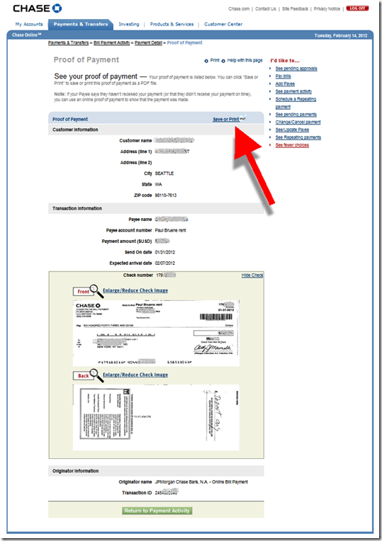
Bit I was pleasantly surprised. Not only could I see that the payment had cleared, the bank had posted an image of the check so I could see the landlord’s endorsement (see screenshot 1 and 2).

That was great on its own. But wait, there was more.

The bank offers a self-service “Note to Payee” function that automatically creates a letter to document payment details, including a copy of the check image (see screenshot 3). All you have to do is download the PDF and attach it to an email to the payee.

The only hitch in the system is finding these functions. They are located under the Payments & Transfers tab (see screenshot 1). That’s not bad, but it would be more intuitive to place a direct link from the the online statement (My Accounts) to the bill payment details. Also, the “Print to PDF” button is easily missed (screenshot 2).

Still, the entire process took less than two minutes. And I didn’t have to call customer service, a saving of 15 minutes of my time and $15-20 in customer service expense by the bank. 

The letter worked perfectly. Within an hour, the landlord had backed down, apologized for her error, and went back to her day job. This pretty much makes up for the unreadable bit of correspondence I got from the bank last week. 

——————-

1. Chase bill payment activity screen (14 Feb 2012)

Chase bill payment activity area within online banking

2. Chase proof-of-payment screen
Note: Print to PDF option

Chase bill payment details page


3. Chase automatically generated “Note to Payee” letter in PDF format

Chase proof of payment letter
——————————-

Note: See our Online Banking Report for more info on bill payment, messaging, customer service and much more.