Cyber Monday in Banking

imageI’ve written about Black Friday promotions at ING Direct (see note 1), Service Credit Union, and the growing Small Business Saturday event spearheaded by American Express (which even earned a tweet from  Obama).

This year I also noticed a trickle of activity on Cyber Monday as well. It’s probably better than Black Friday for online/mobile campaigns. Better yet, use the approach of Visions FCU (screenshot 2 & 3) and use the entire weekend to maximize the impact. 

Cyber Monday promos:

  • 50% off credit-monitoring products from Quizzle, the spinout from Quicken Loans (see email below)
  • Visions Federal Credit Union offered a loan special from Black Friday through Cyber Monday (screenshot below). The CU reported $10 million in loans on Friday alone.
  • Navy Federal Credit Union offered bonus rewards-points for purchases made online

——————————————-

Cyber Monday email from Quizzle (link; Monday, 7 AM Pacific, 28 Nov 2011)

Cyber Monday email from Quizzle

Visions Federal Credit Union Thanksgiving weekend loan special (28 Nov 2011)

Visions Federal Credit Union Thanksgiving weekend loan special

Visions landing page (link)

Visions FCU landing page Black Friday landing page

Navy Federal Cyber Monday cashRewards promo (link)
Note: Given the date shown, this page is likely a carryover from 2010. But it’s still available via “Cyber Monday” searches on Navy Federal’s website.

Navy Federal Credit Union Cyber Monday landing page

Notes:
1. ING Direct was at it again with seven offers over the Thanksgiving weekend (Deposit Accounts has the full rundown). However, the specials did not extend into Cyber Monday.   
2. 1st Financial Federal Credit Union ($210 million, Wentzville, MO) and Heritage Community Credit Union ($200 million, Sacramento, CA) offered loan deals on Black Friday according to CreditUnionsOnline.com

Out of the Inbox: First Tech CU Pitches Auto Loans

image As the country heads back to work and school, it’s a great time to remind customers that you have killer rates for auto loans. So, First Tech Federal Credit Union’s marketing email to members yesterday promoting a 2.99% rate was well timed. And I love how the message is direct and to the point.

While the email could use a little more visual punch (graphics/typography), First Tech nailed the timing, product, price, and headline. So it is 90% there even before reading the copy. However, that’s where the effort falls a bit short. Here’s why (numbers correspond to screenshot below):

Minor issues in copywriting:
1. The second sentence in the opening paragraph is awkward because the phrase “keep that new auto loan payment in check…” is hard to understand. If you pair “check” with “payment,” it sounds like you are referring to a checking account, not a low-payment amount.

2. Be careful with how you talk about rate discounts. They way First Tech wrote it, “.25% rate discount” sounds like the loan rate is going to be chopped by a full 25% instead of 25 basis points. It would be better to put a zero in front of rate, e.g., “0.25%” and perhaps call it a “rate reduction” instead of discount to be perfectly clear. 

Weak “offer acceptance:”
3. It’s too hard to find the loan application in order to take advantage of the great rate. Members are directed back to the First Tech homepage where they must search for an loan app. The CU should either take members directly to a specific landing page for this offer, or at least drop them on the auto loan page. It does help that one of the four rotating homepage banners is for auto loans, but it’s third in the rotation and only stays in view for 15 seconds or so.

In addition, not everyone wants to research and/or apply online. A phone number, at least for more information, would be a welcome addition to the message.

Finally, there is no sense of urgency, e.g., “the rate is guaranteed through the weekend” or even “act now before rates increase.”

Overall grade: B

———————–

First Tech Credit Union email to members promoting 2.99% auto loans (31 Aug. 2011; 9:28 AM Pacific)

First Tech Credit Union email to members promoting 2.99% auto loans (31 Aug 2011; 9:28 AM Pacific)

U.S. Peer-to-Peer Lending Hits Record High for Seventh Month in a Row

This guest post was written by Peter Renton, (@SocialLoans), Editor & Publisher of peer-to-peer lending blog, Social Lending Network.

————————————-

With the launch of Prosper in Feb. 2006, peer to peer (P2P) lending arrived in the United States with great fanfare. Borrowers no longer needed banks. Individual investors could be the banker and earn great returns.

But, there have been challenges along the way. In 2008, the SEC decided P2P lending should be regulated as a securities business and both Prosper and Lending Club, which launched in mid-2007, were shuttered for half a year as they retooled. Both companies also initially struggled with higher-than-expected default rates.

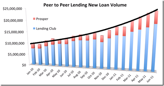
It is only now that P2P lending appears to be living up to that initial promise. Last month was the best ever as lending volumes broke the record for the seventh month in a row. The combined volume of Prosper and Lending Club amounted to $25.6 million in June compared with $12.2 million a year ago, a 110% gain. As you can see in the chart below, the growth curve has been getting steeper.

image 
Source: Companies, July 2011
___________________________________________________________________________________________________

What is driving the growth?
_______________________________________________________________________

1. Credit card interest rates remain high
The most common type of loan by far, on both Lending Club and Prosper, is debt consolidation. People are trying to dig themselves out of credit card debt where rates can climb north of 30% if a payment is missed. In comparison, someone with good credit can get a 36-month P2P loan at 12% to pay off their credit cards in three years.

2. Home equity loans are very difficult to get
Before the real estate bust, banks pushed home-equity loans aggressively. No more. It now takes great credit and substantial equity to qualify. Last month Lending Club reported that 14% of its loans were used to fund home-improvement projects. Prosper said that number was 12%.

3. Investors can earn double-digit returns
It has been two-and-a-half years now since the Federal Reserve dropped its target-funds rate to zero. Fixed-income investors have been stuck with returns in the low single digits. Investors are looking for yield and some are considering alternative asset classes like P2P lending where returns are averaging around 10%, though it’s yet to be seen if that return holds as the loans season.

Prosper CEO Chris Larsen attributes the high investor returns to the startup’s five years of experience. He said, “Since re-launching our platform in July 2009, we’ve delivered returns of 10.4% and default rates of 5.3% and lenders are responding favorably.” Their recent performance backs up these statements.

4. Institutional investors are taking notice
Lending Club says that currently about one-third of investor money comes from institutional investors. In May, Prosper took on a new institutional lender who has invested close to $2 million in just two months and has pledged a whopping $150 million in the future. Prosper expects the balance of individual to institutional investor to resemble more of a 50/50 split as the category continues to grow. Clearly some of the big-money players are starting to allocate assets to P2P loans.

5. The IRA option
For a couple years now, Lending Club has offered an IRA option they say has proven to be popular. “Investors planning retirement are less concerned with near-term liquidity and are more interested in consistent returns and the ability of an investment to generate cash flow,” explained Scott Sanborn, CMO at Lending Club, “and we find existing investors who have been pleased with their returns who are opening larger IRA accounts to let their investment grow tax deferred.” Prosper does not officially offer an IRA although it is possible to set up a self-directed IRA with Prosper.

Prosper is Back in the Game, Lands First Private Equity Lender

imageA few weeks ago, I caught up with Chris Larsen, CEO & founder of Prosper. I’ve been a huge fan of his work for more than a decade. His ventures,
E-Loan and Prosper, have been pioneers in the lending space, both earning OBR Best of Web awards and Prosper also taking Best of Show in our first Finovate in Oct. 2007 (note 1).

But it’s been a rocky few years for Prosper (see Netbanker archives), as it’s been for most consumer lenders. The company even lost its lead in the U.S. P2P loan space to Lending Club, which is currently originating about three times as many loans.

But Prosper survived and appears to be back on a path to live up to its name. Some recent milestones:

  • Its first private equity lender (updated 16 June, 2011, per comment below) is coming on board, pledging $150 million to fund loans on the Prosper platform. This is an important development and fulfills a goal that the company sought since its 2006 launch. It will also help Prosper keep up with Lending Club which has had major institutional investors for a while. Prosper hopes to keep a healthy mix of retail and institutional investment (“50/50 would be fine”).
  • $17.2 million in new venture funding from Draper Fisher Jurvetson and Crosslink Capital (announced 7 June, link)
  • Achieving double-digit returns for investors, a far cry from the negative returns some lenders experienced in the “trial & error” era before (note 4
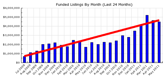
  • Achieving large year-over-year loan growth, although the company is still running less than half the pace of the pre-SEC days (note 3)

Prosper loan growth

image

Source: Eric’s Credit Community, 15 June 2011

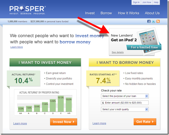
Prosper’s homepage is a model of Web 2.0 simplicity
Note: New lenders are offered an iPad for investing $20,000 or more (15 June 2011)

Prosper's homepage is a model of Web 2.0 simplicity

Both Prosper and Lending Club are averaging about 200,000 monthly unique visitors

image

Source: Compete, 19 May 2011

——————————————–

Notes:
1. E-Loan was named OBR Best of the Web in July 1997 for launching the first online mortgage brokerage.    
2. Prosper was named OBR Best of the Web in March 2006 for launching the first P2P loan service in the United States, and the first anywhere to use competitive bidding to set rates, a model they recently abandoned.  
3. Before the SEC forced the company to restructure its business as a securities issuer in Oct 2008.
4. The average total return for the 2006 to 2008 loans (most of which are now off the books) was a negative 5.4%

Out of the Inbox: ING Direct Raises Price on Overdraft Credit Line by 55%, Still Undercuts Competition by 99%

image This has to be the best notification of a price increase I’ve ever seen (see first screenshot).

ING Direct  (USA) famously does not charge OD/NSF fees on its checking account, Electric Orange. But that’s a bit of a moot point since the bank doesn’t offer paper checks, making it difficult to inadvertently go negative.

However, the bank does allow overdrawing by few hundred dollars if you so choose. And it charges interest on those "overdrafts" at a variable rate equal to 4% above prime, currently 7.25%. The bank reinforces the no-fee pricing in its standard low-balance alert (see second screenshot below).

But that low APR is heading upwards. Last night I received an email notification that effective May 15, the variable rate will be increasing to 8% above prime, or 11.25% today, a 55% increase. That’s still relatively reasonable for unsecured credit.

But the bank’s email doesn’t focus on APR. After clearly disclosing the price increase, it lays out a comparison of what a $100 overdraft would cost the average U.S. consumer for one week, $31, vs. the $0.31 you’d owe ING Direct after 7 days. There are no other fees, transaction or annual, for the ING credit line (complete terms here).

Well played.

ING Direct email disclosing OD credit line APR increase (21 March 2011)


ING Direct email disclosing OD credit line APR increase (21 March 2011)

Overdraft notice (22 March 2011)
The bank reinforces its no-fee policy in its email OD alert.

ING Direct (USA) Overdraft notice (22 March 2011)

Out of the Inbox: Lending Club’s “Idle Cash Alert”

image Lending Club, which recently surpassed $12 million in monthly P2P loan volume (see below), does a great job concisely communicating important account info. The startup earned an “A” in our recent report on transaction alerts (note 1).

Below is another example of its exemplary email alerts. In just 30 words, the company reinforces my impressive rate of return and my account balance. Then it seamlessly goes for the sale, encouraging me to put my cash balance to work by making more loans.

The only improvement I’d suggest is making the call to action, “Browse available Notes,” more prominent. First, it’s not clear that it’s a link. Second, what does that even mean? Ideally, it would be Lend Now, although I understand that terminology is not “SEC friendly,” so Invest Now, should work.  

Bottom line: It’s a win-win to provide encouragement every now and then about how customers might put their idle balances to work. Just don’t overdue it.

Lending Club “Idle Cash Alert” (27 Sep. 2010)

image

Lending Club loan volume: Aug. 2009 through Sep. 2010

Lending Club loan volume: Aug. 2009 through Sept. 2010

Note:
1. See previous post on OBR 181/182 published July 2010

Let’s Do a Better Job Handling Rejected Online Loan Applicants

image If you’ve ever worked at a financial institution, you’ve no doubt heard the often-true horror stories from the loan department. You know the ones, where senator so-and-so’s spouse or the CEO’s brother were turned down for a car loan (see note 1).

The problem with automated loan systems is that there is no human doing a reality check on denied applications. Was it really a deadbeat applying or did someone just make a mistake on the application form? You can bet if a senator’s spouse had applied for the loan in person the loan officer would have picked up some clues that maybe this app deserved some extra scrutiny.

But the flip side to human involvement is discrimination, whether intentional or not. A huge benefit to automated loan decisioning is the virtual elimination of certain biases from the process. Computer algorithms only evaluate the factors they’ve been told to look at. Nothing more. Nothing less. 

And because computer analysis has put more science into the underwriting process (notwithstanding the recent housing bubble), most people agree that it’s generally been good for the bank and (most) consumers. But even the best system will generate a certain number of false negatives leading to the occasional embarrassing decline.

So it’s worth considering installing a second-look system in your online process, providing wrongly denied applicants another chance at proving themselves worthy, before they end up embarrassing your CEO at their next family gathering.  

And why might I be thinking these thoughts? Yesterday, I went online to accept the direct mail offer from a major credit card issuer who’s sent me more than 100 solicitations over the past decade (note 2). And I was flat-out rejected. Either I fell victim to a false negative or the issuer’s underwriting is not in sync with their marketing.

The application process = great
The online acceptance process itself was flawless. I typed in my registration code, answered a few questions, and hit enter. It had taken about 3 minutes up to that point. Then wham! Twenty-four seconds later, the application was denied (note 3).

The rejection process = sucks 
And even though I could live without the card (note 4), it’s frustrating and disappointing to be turned down flat with no recourse. Especially after being aggressively solicited for years.

And the company pretty much disowns you after the bad news. The website returns a two-sentence rejection thanking you for your interest, saying that they couldn’t approve the request, and that they’ll followup in writing in a couple weeks explaining their reasoning. And BTW, please don’t apply again for at least 45 days. No apology. No email. No phone (or even email) to contact for more info. No referral to the credit bureaus or other resources. Just a simple, cold brush-off.

So I went back to the direct mail letter and called the number listed there. The bank rep said there was no way to look at the app I’d entered minutes earlier to see why it was denied. All he could do was take another new app, but he warned that the system wouldn’t like seeing multiple apps and would likely reject it again.

Recommendations: You cannot avoid making credit denials, lots of them. And you can’t avoid the occasional false negative. But you can, and should, create a way for online applicants to ask for a second look, and perhaps correct any errors that they might have made. And if you can’t do that, at least be compassionate with the immediate messaging and try to offer some helpful resources.  

My three-step, face-saving, loan-denial process:

1. Thank the applicant and apologize for not meeting their needs. Say this both on the website and in a followup email.

2. Explain that although you’re not perfect, there appears to be circumstances in the application that preclude you from offering credit at this time. Refer them to Credit Karma, Quizzle, or other credit resources to view their credit score and learn more.

3. Provide a second-chance option either through email or telephone for applicants with strong credit to ask for a human review. 

Optional: For customers you must turn down now, but who you think might be good future prospects for loans and/or other products, or who are already profitable existing customers, consider sending a consolation prize: $5 statement credit, a Starbucks card, two-for-one movie certificate, etc. 

Second-look apps would need a higher level of scrutiny to ensure against those trying to game the system. But there will likely be some gems uncovered in the process. 

————————————–

Notes:
1. My favorite personal story of botched celebrity banking happened at First Interstate Bank of Washington where I worked in the late 1980s. Bill Gates, whose mom was on our board, supposedly used what was then our “state-of-the-art” telephone bill-payment service. Apparently, we didn’t send off his mortgage payment and the late fee we ate was more revenue than the entire bill-pay program generated in a month. It happened a few months before I started working there, so I can’t vouch 100% for its accuracy. But I can tell you it was a popular story within the bank with a “failed tech” angle and a juicy tidbit about the outlandish size of the mortgage on the Gates property.    
2. This is a rare situation where I’m not naming the company in a public blogpost because a credit denial is such an individual thing. It doesn’t seem fair to single them out for one incident which is most likely not indicative of the normal experience there. However, I will disclose the name on an individual basis if you email me and promise not to post it publicly.  
3. I’m not sure what went wrong with the application. I have several decades of excellent credit, zero inquiries in the past 6 months, reasonable debt-to-income, and a decent level of household income. And I checked all three bureaus recently and everything was fine. However, the bureaus do have inconsistent, and partially incorrect, info about my employment history. But the application did not ask for employer name, so I don’t see how that could have sunk it.  
4. I actually planned to use the card frequently; it had better terms than the one I was hoping to replace.

Making Debit Overdrafts into a Real Service Again

imageIn 1988, as a new product manager at a long-since-merged-away bank, one of the first things I did was send a memo to my superiors pointing out that our overdraft fee of $8 was significantly less than our peers. And that we might want to consider raising ours to the industry standard $10. That little change added a million dollars to our bottom line and wasn’t a half-bad start to my career there. 

So I’ve always understood how difficult it is to resist the temptation to raise OD fees. That said, there was no excuse for the debit-card excesses that led to the opt-in regulations taking effect this summer. No one should have to pay $39 extra for their morning coffee/donut fix.  

So as much as I detest price controls, I’ll have to admit I’ve been looking forward to the industry efforts to turn debit overdrafts into a value-added service instead of the huge negative penalty they had become.

Ultimately, I see small overdrafts being priced more like mini-loans with a combination of withdrawal fees in the same range as foreign-ATM fees ($2 to $4 each) plus an interest rate or nominal daily fee based on the outstanding balance. Then, if I’m at the store and need $40 more for dinner groceries, I can decide to take the loan, pay the extra $5, and go about with my evening plans.

It’s a win-win. I’m happy the bank/credit union gave extended me a little credit in a tight situation, and the bank makes some much-needed fee income, albeit in $3 increments, instead of $39. While the lower prices won’t replace lost fee income dollar for dollar, and underwriting/credit issues must be addressed, customers will be happier and more loyal, employees will feel better about the value delivered, and in the long-term, things can get back to a more normal price/value relationship.

I’ll be chronicling some of the most interesting implementations of value-added OD protection during the rest of the summer. I looked at Truliant Federal Credit Union a few weeks ago (here). Next up, Wells Fargo.

Truliant FCU Raises Fear of Being Declined in New Website Pitch for Opt-in Debit Card Overdraft Protection

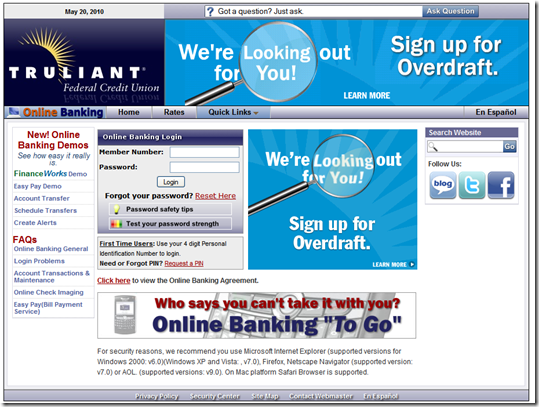
image Three weeks ago I noticed that North Carolina-based Truliant Federal Credit Union had posted a highly visible opt-in overdraft pitch on its login page (see screenshot #5, below). I checked back today and found that the CU is still running a login page ad, albeit smaller (ss #2), and has also taken the message to its homepage (ss #1).

The new ads are more fear-based compared to the previous friend-of-the-customer approach (see note 1). In addition, the 180,000-member CU has moved to an online opt-in form (ss #4). Previously, customers could only ask for someone to contact them (ss #6).

Truliant has considerably simplified the landing-page message. In May, it offered a credit line option in addition to the simple $29-per-item system (ss #6). Apparently, that wasn’t working as well as hoped. Now, members clicking on either the homepage or login-page promo receive a short, semi-urgent message (ss #3) that links to the online opt-in form.

Analysis: While I think the CU does an adequate job explaining the new opt-in options (see note 2 for suggested improvements), I’m disappointed it moved away from giving the credit line option equal billing. With an APR of 6.5% to 11.5% and no transaction/advance fees, it’s a much more cost-effective option (note 3).

1. Truliant FCU homepage visitors receive a large homepage pitch to opt-in for overdraft protection (10 June 2010)
Note: It must be a brand new banner since the underlying hyperlink, after the ads have cycled once, has a typo causing it to lead to an error page (9:25 AM PDT)

image

2. Overdraft protection message on login page (link, 10 June 2010)

image

3. Landing page (link, 10 June 2010)       4. Opt-in form (link,10 June 2010)
Click to enlarge                                           Click to enlarge

image    image

5. Previous login page had two ads for OD protection (20 May 2010)

image

6. Previous landing page included a line-of-credit option (link, 20 May 2010)
Note: In May there was no online opt-in form; interested members could only select a “contact me” button. The landing page now links to the form shown in #4 above.

image

Notes:
I hate singling out Truliant for this post. It has one of the best blogs in all of banking that does a great job educating and connecting with members. And because the CU has done a decent job with the overdraft opt-in process, I’d give it a B or B- grade. But my job is to look for potential improvements, so here goes.

1. Is making members afraid of using their Truliant debit card really a good way to endear them to the brand? Sure, the ads are likely to produce clickthroughs and they definitely don’t cross over into the misleading category, but is there a little “crying wolf” here? Something to think about.

2. Other suggestions for improvement:

  • The three choices on the online form are not as clear as they could be. The most popular choice, number 2, has both a YES and NO in it. That’s the kind of wording that gives your members a headache. It would be far simpler if you just asked customers to tell you which types of transactions they want covered:
    A. Paper checks and automatic drafts (yes/no)
    B. Debit card transactions that don’t require a PIN (yes/no)
  • The landing page confuses the matter by using three different terms (debit without PIN, debit, and signature debit) without providing a detailed definition. At minimum, a link to a clear definition of the term should be included.
  • The landing pag
    e says you have to “opt in again by August 15.” That sounds like I need to do something now and something again later this summer.
  • The “nightmare” scenario presented on the landing page, being denied at the grocery store POS when you have a hungry family to feed, is a good example of the downside of not electing to have debit-card OD protection. And even though the $29 charge is mentioned in the previous paragraph, members skimming the landing page may still not understand it will cost them $29 to avoid this embarrassment/hassle. I’d go overboard here and place an asterisk by this line and disclose the $29 fee again in fine print at the bottom.

3. If the problem is that it’s too hard to qualify for the credit line, the CU should consider a higher-APR and/or more-fee version for riskier members.

Mercedes-Benz Financial Launches Car Finance iPhone App

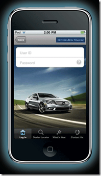
imageAs an analyst who covers new developments in online and mobile finance, I will forever be grateful to Apple for opening up the mobile-phone platform, thereby unleashing a rush of innovations sure to rival the Internet circa 1995 to 2001 (note 1).

The latest financial app is from none other than Mercedes-Benz. The luxury-car maker has several iPhone apps available to its fans, but the latest, which appeared in the App Store last Tuesday, is specifically designed for its finance customers (iTunes link to app). It’s the first captive finance company with its own app, at least in the U.S.

Other than the striking homepage image, the app is pretty pedestrian so far. It allows registered users (note 2) to make a car payment, calculate the pay-off amount, and find dealers and customer service numbers. In other words, it’s a lot like the company’s website ten years ago (note 3).

But that’s OK, for now. Financial brands should take advantage of the free publicity of the iPhone App Store and  post something, even if it’s just a window to their Web app (worked for Bank of America).

Along those lines, SunTrust (iTunes link) is the latest megabank to join the store (last week), leaving US Bank, Capital One, BB&T, and HSBC as the remaining top-10 U.S. retail banks without their own iPhone app. Who will be the last one in?

Mercedes-Benz Financial’s homepage includes iPhone link (6 Oct 2009)

image

iPhone landing page (link)

 image

Notes:
1. For more info on the market, see our Online Banking Report: Mobile Banking via iPhone (March 2009)
2. Users must set up a profile online at Mercedes-BenzFinancial.com  before accessing their accounts via iPhone.
3. But I’m kind of surprised MB didn’t include a payments calculator, standard fare at most car sites.